Hand painted floral square
Posted: May 25, 2020 Filed under: Hand painted, Penny Black | Tags: Hand painted, Penny Black stamps, sennelier watercolours 13 Comments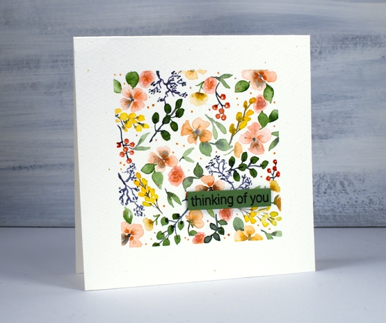
I’ve been doing a bit more watercolour painting. When I started this one I didn’t intend to make all the elements so teeny tiny; it took a while to fill the square. I started by taping a square frame on a folded piece of cold pressed watercolour paper to make a one layer card.
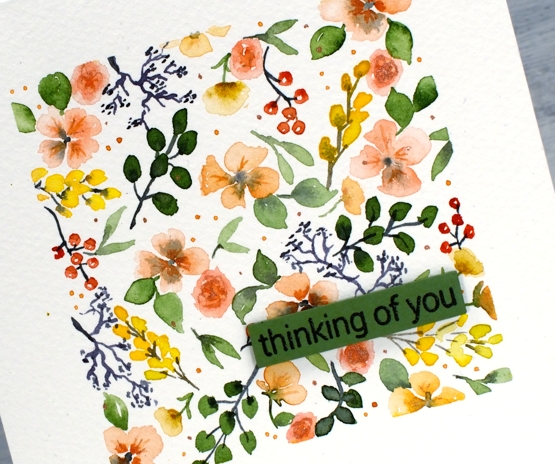
I used my Sennelier watercolour paints and as you can imagine a fairly small round watercolour brush to fill the square with flowers and foliage. I kept the colour palette limited and added a few shimmer highlights at the end with some coliro pearlescent paint.
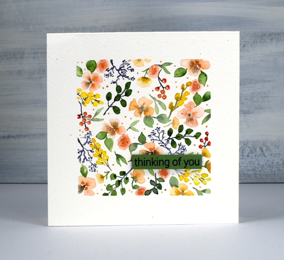
Peeling the tape off the paper to reveal a clean straight edge was very satisfying then I finished it off with a PB sentiment stamped on a co-ordinating green cardstock.
Supplies
https://linkdeli.com/widget.js?id=f5e8378456858c916708
Alluring Cut Up
Posted: May 22, 2020 Filed under: Alluring, Penny Black | Tags: Fabriano Watercolour Paper, Penny Black stamps, Ranger Distress inks 10 Comments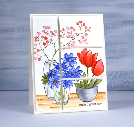
This watercoloured panel stamped with the PB ‘alluring’ stamp has been sitting around for a long time. I’ve been trying to come up with a slightly different way to turn it into a card. I create a great many cards with one large stamped and painted panel and little else so I wanted to mix things up a little with this one. I finally decided to slice up the panel then pop it up on foam backing.
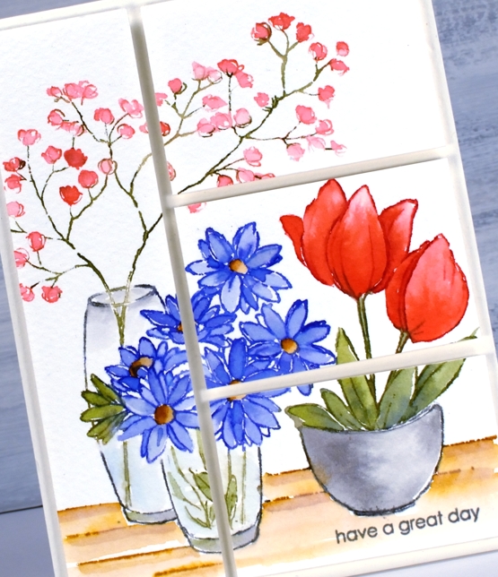
I stamped the original panel on cold pressed watercolour paper and used one of my favourite watercolour techniques. Instead of stamping in a pale water soluble ink then painting with ink or watercolour paint I ink the different parts of the scene with different inkpads or markers, spritz the ink with water then stamp. With some extra ink handy on my glass mat I use a paint brush to blend the stamped ink into the petals, leaves and other shapes adding extra ink where needed.
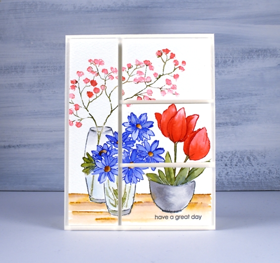
When slicing it up I took care to divide it unevenly while making sure some elements carried across to adjacent sections. That way the eye moves across the panel and doesn’t come to halt in the middle. I’ve listed the inks I used below, all distress inks in either ink cube or marker form. Oh and by the way have you seen the new distress colour? ‘Speckled Egg’ looks like it might be a blue green or even better a grey blue; I wonder how it compares with tumbled glass and broken china. Regardless, it’s part of the blue family so yes, I will be getting it in a few different forms. How about you?
Supplies
Planting time
Posted: May 19, 2020 Filed under: a garden, bench, buckets of flowers, hanging planters, Papertrey Inks, Penny Black | Tags: Papertrey ink, Penny Black creative dies, Penny Black stamps 2 Comments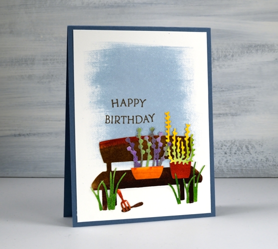
We’ve had all kinds of weather around here lately as we wait for the May long weekend before which outdoor planting is considered very risky! My daughter has been starting seeds inside so we have quite a few little plants ready for the great outdoors as well as an order of seedlings to come.
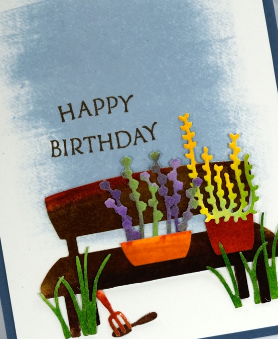
These plants are looking pretty healthy, probably because they are not relying on me remembering to water them! I used papertrey ink cubes to colour left over pieces of hot pressed watercolour paper. I swiped the ink cubes across the paper in colour groups, they are juicy little inkpads so they work well direct to paper. I did a panel of two browns, also some greens, another with purples and one with orange, yellow, green. After inking the paper I spritzed water onto it until the ink moved and blended a bit, covering more of the panel and making some light and dark areas.
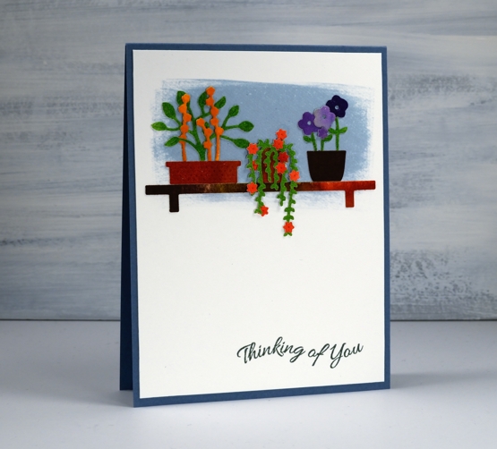
Once all the panels dried I used several die sets from Penny Black featuring little plants, pots and tools (they’re all linked below). I also cut out the cute little bench die to be part of my scene. I could have cut all the elements from coloured cardstock but I love the variation of colour and depth achieved with watercolour.
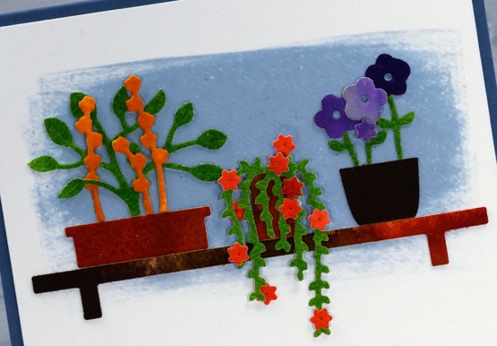
I created two backdrops on hot pressed watercolour paper by swiping the spring rain ink cube back and forth to create a solid blue patch. Over the blue I arranged and rearranged my tiny die cuts until I had two little scenes. I used a jewel picker and liquid glue to attach all the elements, making a few errors in the process resulting in some more painting and die-cutting to make replacement pieces. Once everything was attached I hunted through my cardstock to find a matching blue for card bases and added a couple of sentiments from PB ‘banner sentiments’ set.
As I write this the long weekend is drawing to a close and I can report some planting has been done. A couple of readers shared on my last post their planting plans and routines; I’d love to know more plus any clues for keeping the critters away!
Supplies
https://linkdeli.com/widget.js?id=f5e8378456858c916708
Country Charisma
Posted: May 15, 2020 Filed under: country charisma, Penny Black | Tags: Fabriano Watercolour Paper, Papertrey ink, Penny Black stamps 13 Comments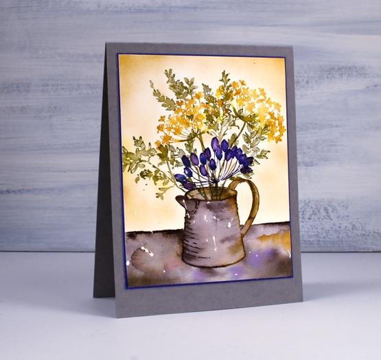
This rustic style card features a few stamps from the Penny Black ‘country charisma’ set. The clear set includes a jug, a watering can and four floral/foliage stamps to pop in the jug. I had a rough plan in my head as I started stamping but it didn’t work quite how I had hoped. I almost quit half way through but I remembered a tip I had heard from the talented Jenna Rainey in one of her recent videos where she recommended not stopping too soon. Sometimes a painting or card can look unappealing part way through but balanced and complete when more detail, colour or texture is added.
I worked on hot pressed watercolour paper with some masking fluid splattered on it. I stamped the jug first in papertrey ink cubes ‘smokey shadow’ and ‘cocoa bean’. I blended the inks to fill the jug, adding extra ink from my glass mat where necessary. I let the jug dry before adding flowers and foliage. The leaves and flowers I inked with bright buttercup and olive twist ink cubes. I spritzed them lightly with water before stamping and did minimal blending with a very small brush on the panel. At this point it looked a little ho-hum so I took a chance and stamped another flower in ‘royal velvet’ and ‘enchanted evening’. Can we take a second to wonder how these delightful ink names are chosen? I think I would have fun with that job! The purple flowers definitely added some contrast but it was still a bit of a patchy design; it lacked depth. I ruled a line of black soot ink across the panel then blended the ink downwards adding cocoa bean and stormy sea inks I’d already used and a few drops of the buttercup and royal velvet.
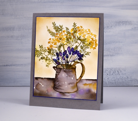
With the jug grounded I felt I was almost there but the background needed a little something. Trying to watercolour around all those little leaves was not an option so I pulled out the blending brushes and blended some bright buttercup ink around the edges and a little bit over the flowers. It is possible to add a very pale layer with a blending brush which was exactly what I needed for this design. I removed the masking fluid to reveal the white blotches adding to the overall rustic look.
To finish off the card I added a very narrow mat in the purply blue colour and attached that to a new fave, ‘luxe grey cardstock’. I think I mentioned recently the lovely luxe white textured cardstock from the Foiled Fox; it’s a creamy colour that works well with my watercolour paper. The same textured cardstock comes in grey; I rarely use grey card bases but I think that might change with this lovely luxe grey.
Have a great weekend, friends.
Supplies
Secret Garden
Posted: May 13, 2020 Filed under: Papertrey Inks, Penny Black, secret garden, subtle | Tags: Papertrey ink, Penny Black stamps 10 Comments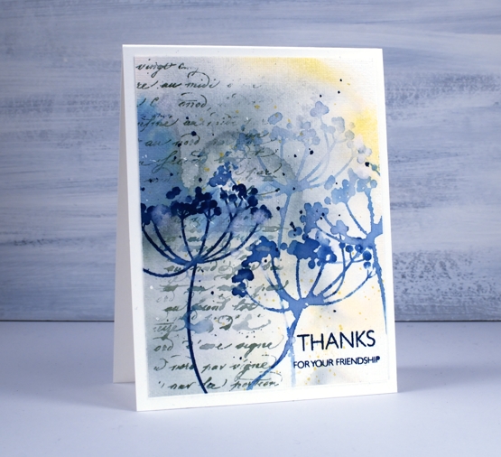
Before I chit chat about today’s cards I just want to thank you for your feedback on my wreath card. I loved reading your kind words and thoughts on the sentiment question. In the end I left the front of the card sentiment free (I really didn’t want to mess it up!) and made a envelope out of watercolour paper onto which I will add roses and hand-lettering. When I do another wreath I will hand letter the sentiment first then proceed with the flowers, that way I won’t be afraid of messing up a finished wreath with a wonky letter. Now, back to our scheduled programming.
Last week I created a couple of abstract watercolour background panels to create coffee themed cards; I used the same approach for today’s floral cards. My method for creating the background was the same, I smooshed three colours of dye ink on my glass mat then spritzed them generously with water to make them move and blend a little. I had a large panel of hot pressed watercolour paper ready with some masking fluid already dotted over it. The colours I used were papertrey ink cubes lemon tart, enchanted evening and stormy sea (yellow, blue and grey).
I cut the panel into four and chose to work with stamps from the PB ‘secret garden’ clear set. My plan was to stamp the flowers in the same colours I used for the background, maybe use all three colours or just one or two. After fiddling around with some stamping I decided I liked just the flowers in the blue, stamped and restamped for paler impressions. I guess you’re not surprised I settled on blue, the lemon is very pretty but too pale to stand out and the grey was, well, not quite pretty enough.
Both floral stamps I chose had long skinny stems that I was able to rearrange on the lid of the MISTI to go in the directions I wanted. I did some water stamping too which just means misting the stamp with water and pressing it down on an inked area (the darker the better) and holding it there for a little longer than normal to let the water soak in then dabbing away the water to reveal a stamped ‘watermark’.
Once I had the flowers all stamped the panels still didn’t look quite finished so I turned to two elements I like to add when a card needs a little something. I used the PB ‘script’ stamp down the side of both panels in blue, grey and watermark then ran the panels through my diecutting machine with a rather cool embossing folder from Sizzix (sold by SU) called ‘subtle’. It gave the panels a canvas look. To add sentiments I used the ever useful ‘million thanks’ set and the lovely ‘SHE builder’ set both from Penny Black.
Supplies

Pencil colouring on kraft paper
Posted: May 1, 2020 Filed under: Alluring, Coloured pencil, Penny Black, Tutorial | Tags: Faber-Castell Polychromos Colour Pencil, Penny Black creative dies, Penny Black stamps, Tutorial, video 11 Comments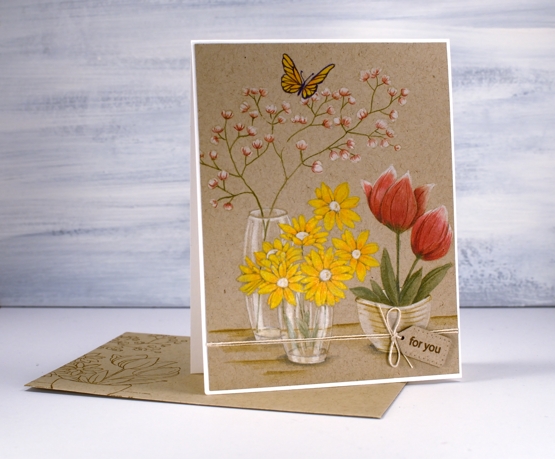
I’ve been doing some coloured pencil work, nothing too fancy but definitely satisfying to see it come together. I filmed as I coloured so you can see how I approached each flower as well as the glass vases. I don’t often complete a whole card with coloured pencils, I’m more likely to bring them in at the end to add details and shading but this time they are took the starring role. I like the look of pencil on kraft paper too, I find it a bit less intimidating than bright white paper.
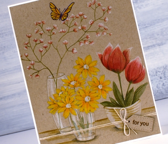
It took me a long time to finish the colouring so I’m sure you won’t be surprised to hear I didn’t include every last second of footage. I sped it up and chopped it up so it wouldn’t be too long but I made sure to include my process for each element. I even did one part more than once!?! but I’ll tell you about that during the video. Towards the end of the video I referred to colouring wizard Kathy Racoosin, if you haven’t checked out her blog and wonderfully instructive youtube channel, make sure you do.
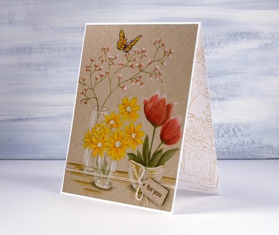
As you can see I stamped a print on a matching envelope and on the inside of the card too. It is always best to do this while the stamp and inks are still on the table, buy you already knew that didn’t you?
When I showed this one to my daughter she absolutely made my day by saying it reminded her of story books she would read and reread as a child because she enjoyed the illustrations so much!
Supplies
Petal Profiles
Posted: April 30, 2020 Filed under: Papertrey Inks, petal profiles, secret garden | Tags: Papertrey ink, Penny Black creative dies, Penny Black stamps 5 Comments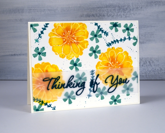
Even though I would never choose yellow as a favourite colour, the inks for these big bright flowers are definitely a happy sight. I have a complete (gasp…I know, very lucky) set of papertrey ink cubes now so of course I have to try them all out. Featured here are bright buttercup, canyon clay, aqua mist and tropical teal.
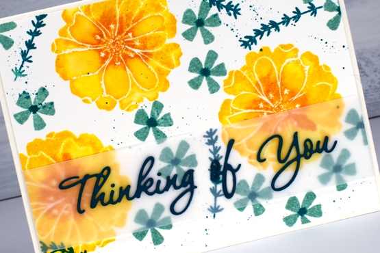
The sentiment is cut from teal cardstock even though it looks like it could be black. I inked the large flowers from Penny Black’s ‘petal profiles’ acrylic set in buttercup then dabbed some canyon clay in the centre before spritzing and stamping. I then used a paintbrush to blend all the petals because I tend to like them blended rather than see the texture of the paper. Not always but often. I inked the smaller flowers with aqua mist, spritzed then stamped and while the ink was still damp on the paper I dropped a dot of tropical teal ink in the centre of each flower. The longer foliage from PB ‘secret garden’ set is also stamped in tropical teal and the splatter is the same. To pick up ink for centres and splatter I just smooshed the inkcube face down on my glass mat and added a drop of water.
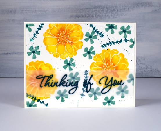
I cut a strip of vellum and wrapped it round the stamped panel so I could add the die cut sentiment on top. The background is busy so a vellum separator helps it stand out enough to be readable. I used ‘stick it’ on the back of the sentiment from PB ‘wishes’. The base is a lovely cream cardstock with some texture which matches my watercolour panels nicely, I was very happy when the Foiled Fox sent some my way. It’s called ‘luxe white textured’ and it pleases my matchy-matchy heart.
Blooming in my garden now are several violets and star flowers along with one happy daffodil. I’m thinking perhaps the snow is gone for good…
Supplies
Meadow blossoms
Posted: April 27, 2020 Filed under: Concord & 9th, Inktense pencils, meadow blossoms, Peerless watercolours, Penny Black | Tags: Concord & 9th, Fabriano Watercolour Paper, Inktense, Peerless Transparent Watercolors, Penny Black creative dies, Penny Black stamps 6 Comments
I attended a class not too long ago taught by my clever friend, Liane, where we used paint chips to make cards. Some paint chips have colours from the same family displayed but others have colour combinations that are suggestions when painting and decorating a room. I used one such card to choose the colours for this blue floral card. The paint chip featured colours called nautica, blizzard and tahini. I found similar colours on my peerless watercolour palette and did some no-line watercolour.
I started by stamping C&9 ‘meadow blossoms’ floral stamp in Gina K ‘whisper’ ink. The ink is a pale beige/grey dye ink which disappeared nicely as I painted with peerless watercolour paint over the top. I worked on non adjacent petals so the paint and water would not bleed from one area to the next. On the largest flowers I painted a dab of ‘Alice blue’ paint then blended it with water to fill the petal.
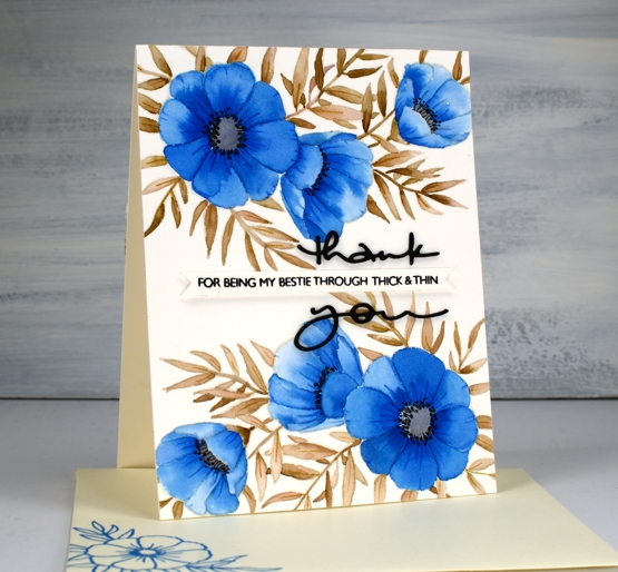
On the smaller flowers I switched the order and painted each petal with water first then dabbed in some blue paint. The second method resulted in slightly paler flowers. I painted all the leaves and stems in ‘warm sepia’ and the flower centres in ‘pearl grey’. Once all the paint was dry I used two inktense pencils to add veins and shading to the leaves and petals. I painted black dots in the flower centres then drew tiny stems to the dots with a very fine tip black pen. The black thank you die cut is from the PB ‘many thanks’ die set cut from black cardstock and stacked for extra dimension. I think it works well either side of the cute phrase from the PB ‘million thanks’ set which is stamped in nocturne black on a strip cut with the Taylored Expressions ‘simple strips’ die.
If you are stuck for a colour combo try some paint chip inspiration; I don’t think I would have thought up the blue, brown, grey combo without the inspiration on the chip. And call your bestie!
Supplies
Purple Dazzle
Posted: April 20, 2020 Filed under: dazzle 7 Comments
I have a quick and easy technique for colouring these tulips so they have a little depth and variation in both petals and leaves. Sometimes I spend quite a bit of time with brushstroke stamps, adding depth bit by bit in a stamp positioner. This time I added all the colour then stamped once.
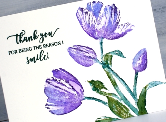
I inked the tulips with shaded lilac and wilted violet distress inks, just dabs of colour to cover the flower head. The leaves I did with markers, a peeled paint and a pine needles. Then, before stamping I spritzed the stamp with water then stamped on hot pressed watercolour paper. In a few places I blended the inks with a paint brush afterwards but really not much at all. You can still see plenty of white space on the tulips and a little on the leaves.
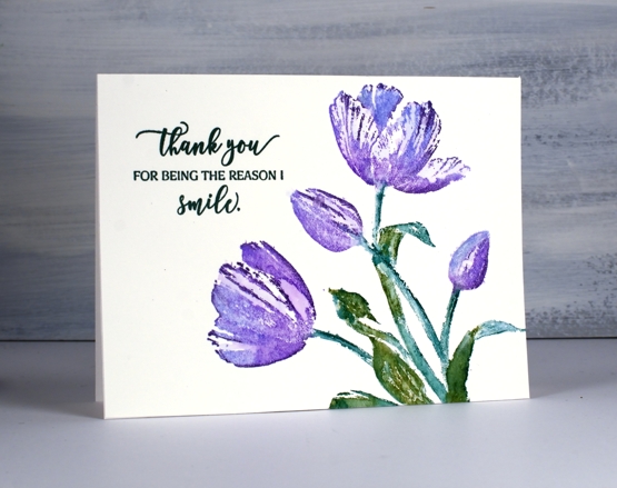
I kept the whole layout clean with just a sentiment from ‘magical friendship’ stamped in versafine nocturne ink.
To see a totally different look with this stamp click over to a couple of cards I posted last month.
Supplies

https://linkdeli.com/widget.js?id=36e575d4b4503edd8f9a
Stamping with Arteza Real Brush pens
Posted: April 17, 2020 Filed under: Arteza, nature's glory, Penny Black, Tutorial, Watercolour, watercolour real brush pens | Tags: Arteza, Fabriano Watercolour Paper, Penny Black stamps, Tutorial, video 10 Comments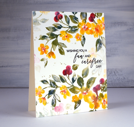
Hi there, this pretty stamp, ‘nature’s glory’ is making its second appearance on the blog and I’ve paired it up with Arteza real brush pens. I did all the inking with the brush pens and made a video to give you an idea of the process. One of the tricky steps when creating watercolour cards with stamps is when, where and how much water to add, hopefully the video will give you an idea.
You probably noticed in the video the way the brush pen bristles were able to easily get into small sections of the stamp so I could ink the flowers, berries and leaves. I spritzed the stamp before pressing onto the hot pressed watercolour paper so the inks would blend on the stamp rather than me blending them on the paper. I love the softness of the blends including the areas that get more water and the ones that look a little dry because they got less water.
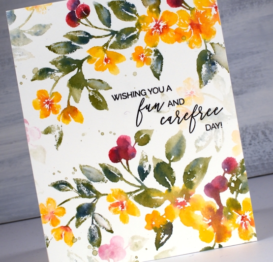
The soft background leaves and flowers were all stamped with ink left on the stamp after doing the bold images. The ink is certainly intense enough that an extra spritz of water is all you need in order to stamp the pale images that appear to be further back between the branches. Dabbing these pale images with a paper towel after stamping makes them even paler and removes any liquid sitting on the surface.

I even had enough ink on the stamp to get a pale print on my envelope then finished with splatter as you know I like to do.
The card below was done with the same stamping technique but I created the soft coloured background at the beginning of my process. I scribbled the blue, yellow and green pens on my glass mat first, spritzed with water then swiped the hot pressed watercolour panel through the ink picking up sections of diluted colour which I dried before transferring the panel to my stamp positioner to do all the flowers. If you are wondering about the sentiment, it is for one of my friends who was told this by a student! When she relayed the experience to me I knew it had to become a card. I did a bit of partial stamping with MFT ‘birdie brown greeting stamps’ then cut the letters b, a, b, y from dark green cardstock (I know it looks black ) with MFT ‘little lowercase dies’.
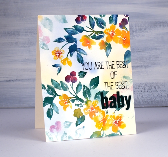
If you are a teacher connecting with your students on line, encouraging them and trying to come up with methods that work in the current situation please know I think you are the best of the best…baby!
Supplies