
The map card
Posted: October 21, 2025 Filed under: Collage cards, cricut, Spellbinders | Tags: collage, cricut, Spellbinders 6 Comments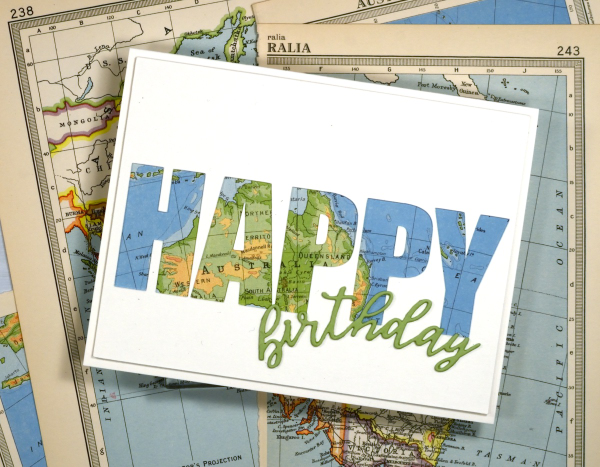
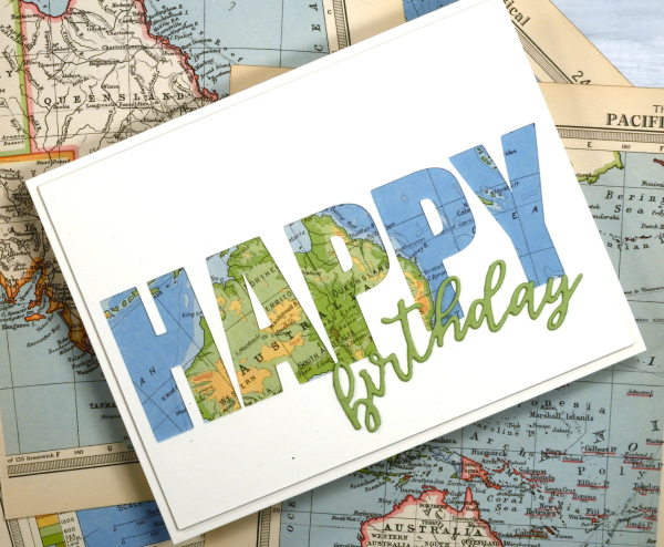
I’ve recently been using the cricut to cut letters in different fonts to complete my cards. I took the process a little further by cutting words out of the card front in order to reveal some coloured paper behind. This one shows a vintage map; tomorrow’s card features some patterned paper from a magazine.
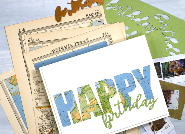
To create this birthday card for my son who just returned from visiting our family in Australia I had fun positioning the map behind the cut out to reveal some of the places he stayed. The map page is from an old atlas I am using for collage. The birthday die-cut is from the Spellbinders ‘serenade sentiments’ set which also has co-ordinating shadow dies. (currently the shadow for the word ‘birthday’ is missing somewhere in my work room!)
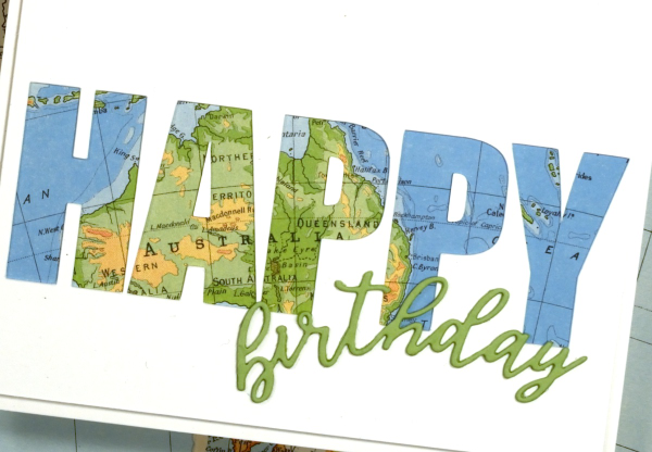
I wish I could tell you which font I used on the cricut but it appears I didn’t record that important information, something tall and bold! You could also do this technique with alphabet dies, the trick is to have dies open enough to show a decent amount of the paper behind. When cutting the letters out of course I am saving them in case I can use them on another card.
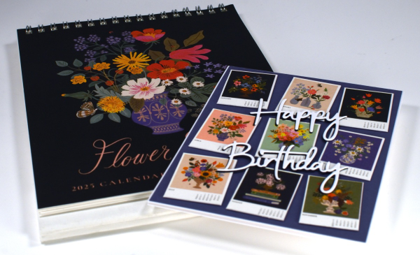
The Calendar Card
Posted: January 9, 2025 Filed under: Collage cards, simply perfect mix & match sentiments, Spellbinders | Tags: collage, Spellbinders 8 Comments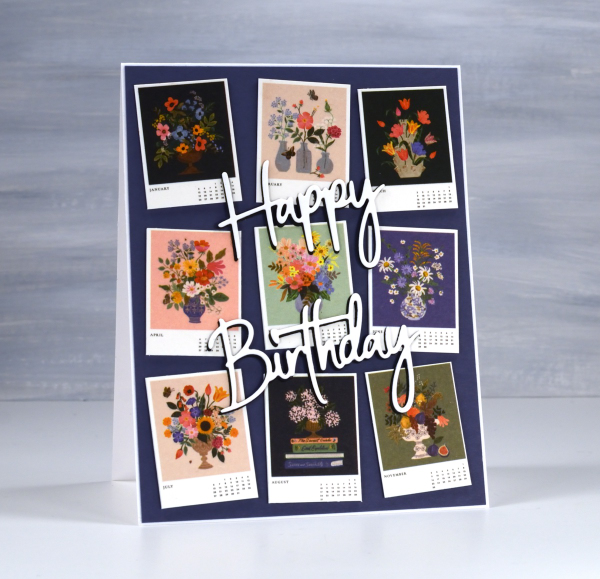
I’ve always liked the thumbnail page on a calendar. There’s something about seeing all the pictures in miniature which I find very cute. So when I bought a desktop calendar for a friend’s birthday I decided to remove the thumbnail page and create the card from the tiny month images.
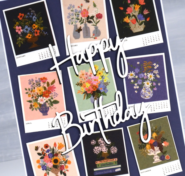
The calendar is made by the Rifle Paper company and the paintings are quite delightful.
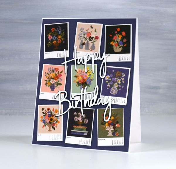
I stacked a white die-cut sentiment on a black one to help it stand out against the busy background. The dies are Spellbinders ‘simply perfect mix & match’ sentiment dies.
This gift has the added feature that if the recipient wishes, she can give me back the calendar pages as the months pass and I will turn them into cards for her to use. I enjoyed coming up with this card and idea and will be going through my calendar collection in the future to find both thumbnails and full pages I can turn into cards. In some ways I have come full circle; I made cards from calendars when I first started card making as a child.
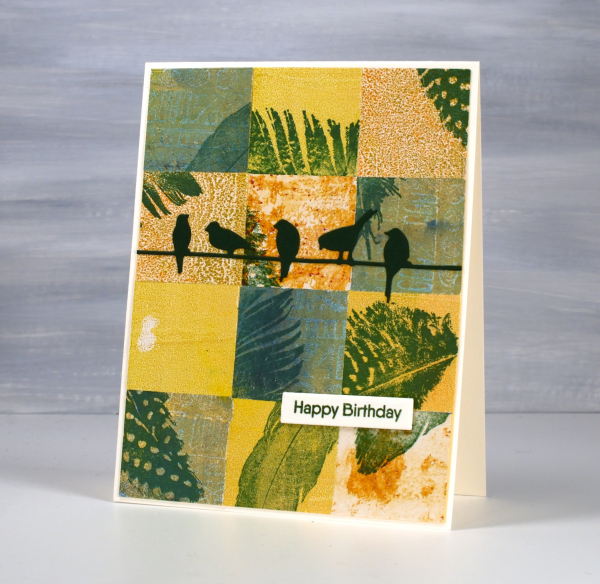
Birds & Feathers
Posted: June 5, 2024 Filed under: Collage cards, Darkroom Door, Feathers, gel press, on a wire, Penny Black | Tags: Darkroom Door stamps, gel printing, Penny Black creative dies 2 Comments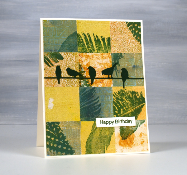
Same concept, different colour palette. I’ve been sharing my collaged gel print cards over recent weeks featuring a lot of blue prints. You know I love blue but it isn’t the only colour I print with. Although I have gel-printed with feathers, the ones featured here were all stamped. You can add interest to your prints with stamping or stenciling or other techniques; you don’t have to leave them just the way they pulled off the plate.
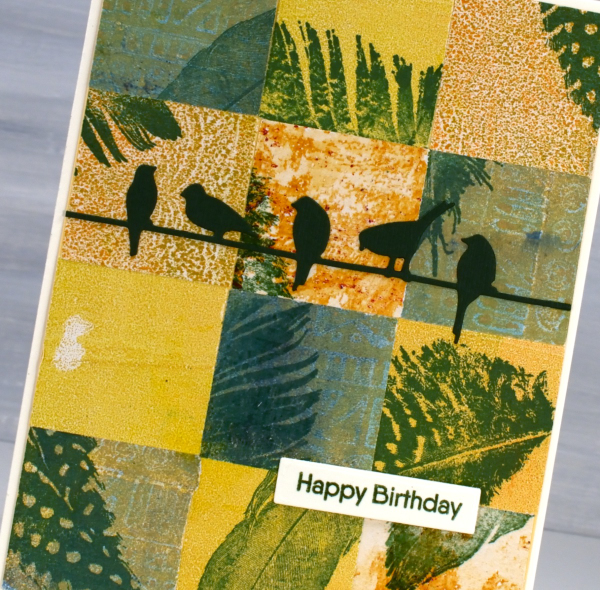
For this bird themed card I chose yellow, orange and greenish prints then stamped feathers on them before cutting them into squares. To make the squares I sometimes use a square punch, but often tear the panels with a metal edge ruler so I get some white of the paper on the edge. The feather stamps are from Darkroom Door ‘Feathers’ set. The birds die is called ‘on a wire’ and it’s from Penny Black.
Pink & Blue Squares
Posted: May 18, 2024 Filed under: Collage cards, Dies, gel press, gift card pocket, Penny Black, Tim Holtz, wild flowers #1 | Tags: collage, gel printing, Penny Black creative dies, Tim Holtz 3 Comments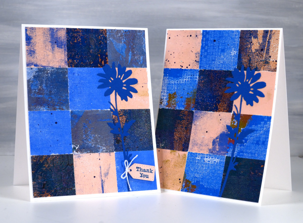
As mentioned in previous posts my stash of gel prints is considerable. I am always on the look out for ways to use them. Large prints are great for covers on handmade books; I use many smaller prints for card fronts and collage.
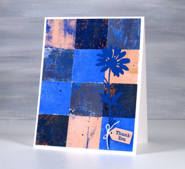
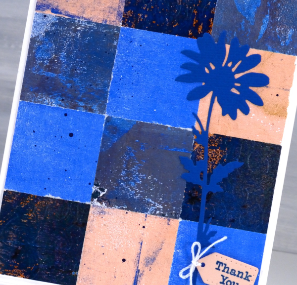
These two collage cards are made from four or five different gel prints. I punched the squares with a 1 3/8″ punch then fiddled around with the layout until I was happy with it. Because I love things to match all the prints had some blue in them and there is some repetition of pink as well.
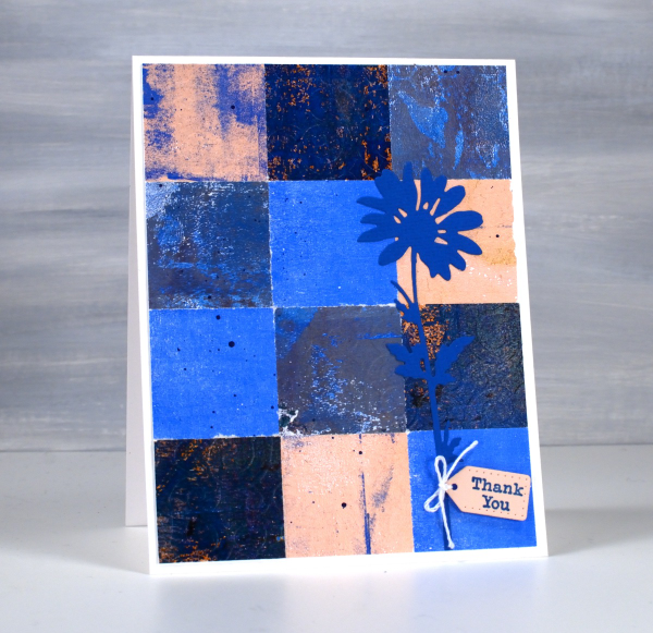
The prints were part of my stash and were not made specifically for these cards so some have patterns and others were probably second or third pulls to clean off a plate. Once I had them arranged to my satisfaction I die-cut Tim Holtz wildflowers and added a tiny Penny Black tag. You’ll see more of this style in the next few weeks as I made them in several different colour combinations. Those of you who know me might have noticed the dark blue splatter on the both cards; I always think a bit of splatter ties thing s together.
Tiles
Posted: April 26, 2024 Filed under: Collage cards, gel press, Tim Holtz, vault wildflowers | Tags: gel press, gel printing, Penny Black stamps, Tim Holtz 5 Comments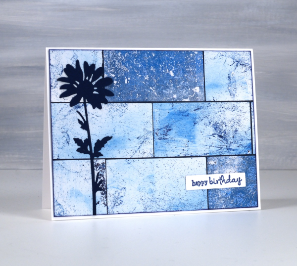
Do you have more gel prints than you know what to do with? Are some of them not very interesting or only partial prints? I definitely answer yes to both those questions. I keep finding though, that the grungy prints make really nice backgrounds for journal pages and cards.

I have many of my gel prints sorted by colour so I pulled several 6 x 6 prints from the blue folder and used them on a few different cards. I also had green, yellow and gold toned prints on hand to make some multicoloured cards; I’ll share them another day. To create this card I cut the blue gel prints with a rectangle die then arranged them like tiles over a navy background before trimming end to fit.
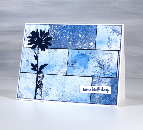
I added a die-cut flower from the Tim Holtz vault wildflowers set and a little Penny Black sentiment. If you like blue then maybe this multi-print collage will please you as much as it did me! This post includes affiliate links from Foiled Fox. If you buy through these links I receive a small commission at no extra cost to you.
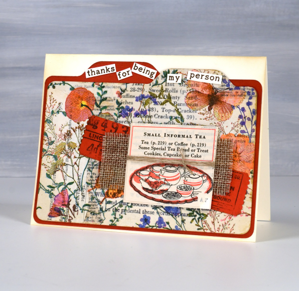
Floral Collage Cards
Posted: April 8, 2024 Filed under: A Pocket Full, Collage cards, Dies, Penny Black, Taylored Expressions, this way | Tags: collage, Darkroom Door stamps, Penny Black creative dies, Penny Black stamps, Taylored Expressions 2 Comments
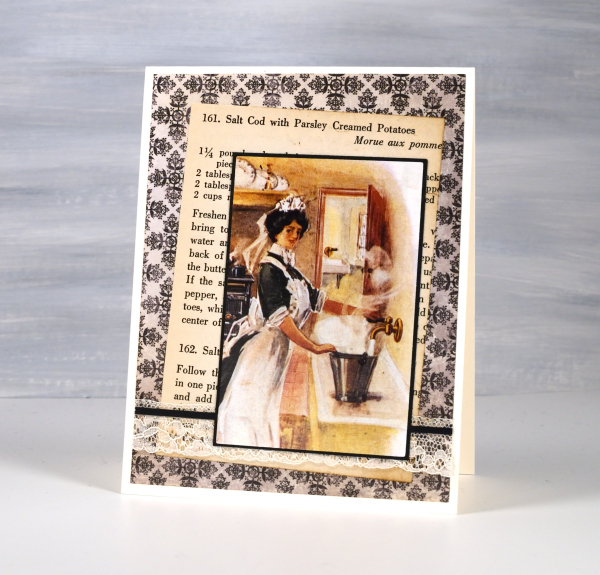
The collage and ephemera cards just keep coming. Today’s cards feature old book page collage overlaid with one layer of a floral napkin. I have a few collaged ‘mini masterboards’ made so I can cut elements or backgrounds out when I need them. For the card above I picked the rusty orange from the napkin to be the accent colour.
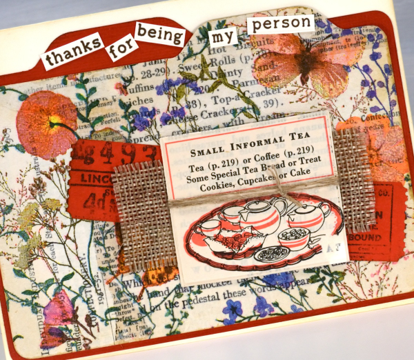
I recently bought a notch punch so I can create file dividers of any size; in the card above I made the blank orange one a little larger to show behind the floral & collage one. I added tickets stamped and die-cut, a scrap of hessian and a cut out from an old Betty Crocker ‘Good and Easy Cook Book‘!
On the second card I used an aged book page as the background and added the paper napkin layer to the mini notebook page with some mulberry paper for framing and contrast. The little green postage stamp is real and the vintage label is stamped.
For the recent collage cards I have pulled out some supplies that I’d almost forgotten, the pretty label border stamps, the mulberry paper and the ‘office’ type dies from Penny Black are in the current rotation.
The file dividers on the card below remind me of a recipe card box which is why it ended up with the little recipe book snippet on it. The sentiment is from Taylored Expressions ‘Simple Strips – Thanks’ but I chopped it up to add to the file tabs.
This post includes affiliate links from Foiled Fox and Scrap’n’Stamp . If you buy through these links I receive a small commission at no extra cost to you.
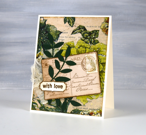
Greenery Collage Cards
Posted: April 3, 2024 Filed under: Collage cards, Darkroom Door, Dies, Finetec paints, gift card pocket, global postmarks, Leaves, measuring tape, Mixed Media, paris postcard, Penny Black, Tim Holtz, wild flowers #1 | Tags: collage, Darkroom Door stamps, Finetec artist mica watercolour paint, Mixed Media, Penny Black creative dies, Penny Black stamps, Tim Holtz 6 Comments
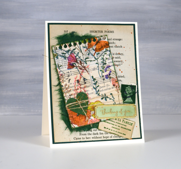
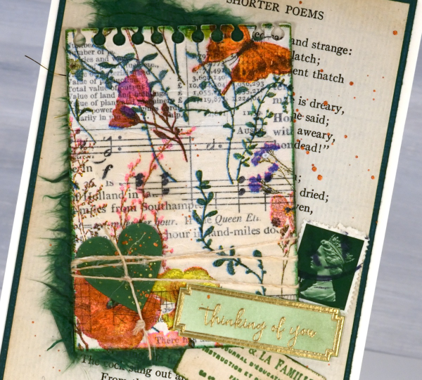
Continuing with the collage theme I have three cards featuring greenery from a paper napkin. I know people have been creating with paper napkins for years but I am new to the game. I have a small collection of pretty paper napkins to use on cards, book covers and journal pages. The green ones featured here are large dinner napkins found at Winners, probably in that tempting ‘just before the checkout’ area!

I glued the printed layer of the napkin over book pages to make my main panels and aged the edges with green and brown inks. I created a couple of little vintage postcards with the Paris postcard stamp, a background with the Measuring Tape stamp, sentiments and postmarks all from Darkroom Door.
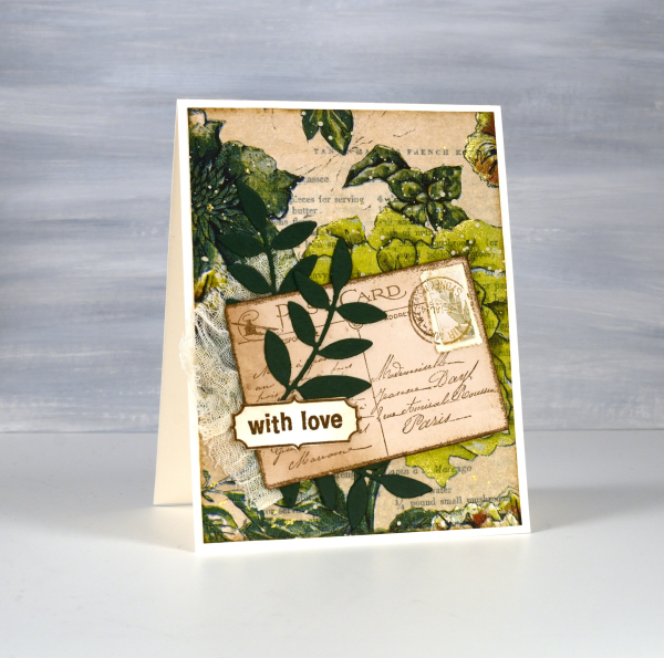
Once again I used some cute dies from Penny Black to cut tickets, file divider, tag and leaves adding blending around the edges for the vintage look.
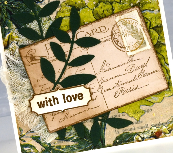
The scrap of cheesecloth, the lace and the grosgrain ribbon were all found around here, maybe the ribbon is actually vintage; it looks a bit discoloured from age which meant it co-ordinated well.

The lovely Queen Anne’s lace die is from the Tim Holtz ‘wildflowers #1 set.
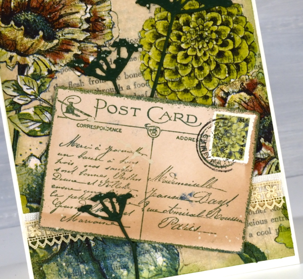
I did make my own little postage stamps for the postcards because I’m still in love with faux postage. These ones had to be quite small so I didn’t use a die I just punched tiny holes with a needle to perforate the edges. You can see a bit of splatter here and there with ivory paint and there are touches of gold watercolour paint on the petals of a few flowers too!
This post includes affiliate links from Foiled Fox and Scrap’n’Stamp . If you buy through these links I receive a small commission at no extra cost to you.
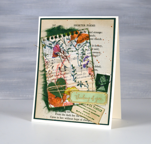
Vintage Collage Cards
Posted: April 1, 2024 Filed under: Collage cards, Darkroom Door, Dies, gift card pocket, handwritten ledger, Mixed Media, number medley, Penny Black, Tagged | Tags: Darkroom Door stamps, Mixed Media, Penny Black creative dies, Ranger archival inks 6 Comments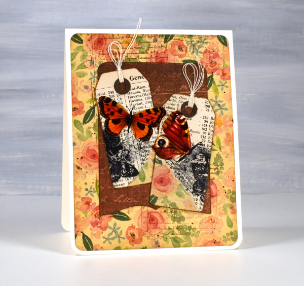
I’ve recently fallen down an vintage ephemera rabbit hole and emerged to make some of my own backgrounds and elements. There are companies that make beautiful co-ordinating ephemera, papers, chipboard pieces, etc. but I am committed to ‘using what I have’ so I’m pulling from old books, calendars, greeting cards, sewing patterns and scrapbooking paper along with a few handy tools.
I’m not going to list every die, ink or paper but I will mention some of my favourite resources. The old books that I am removing pages from include music books, dictionaries, atlases, novels, poetry and recipe books. I also have some lovely papers and vintage pages that friends have given me, so it is fun putting them to use.

The inks I reach for are the distress brown tones from Ranger, not always the dye inks, but often the archival inks as they don’t dilute or smudge when I add glue or stamp on glossy paper.

I have a bunch of background stamps and sets from Darkroom Door which give me vintage style text, patterns and elements including but not limited to the ‘handwritten ledger‘ and ‘number medley‘.

I found amongst my Penny Black dies a file folder, notebook page, several tags, tickets, pockets and decorative borders. I also treated myself to a corner rounding punch that punches in three different sizes and of course the postage stamp die set I’ve featured a few times recently.
I pulled out twine, ribbon and lace for finishing touches and some vintage butterfly cut-outs that were all joined together by little tabs. I have had them for years ever since I inherited my mother’s teaching resources. You can seem them in the close up below.

Now just in case you are worried, I am not ripping pages out of beloved old books, but I am putting to use some books I inherited and don’t have a personal attachment to. Anne, Heidi, Jo March, Jane, Ratty and Mole are all safe! Old calendars, diaries, magazines and greeting cards are fair game because honestly, I’ve held onto some of them for a very long time. This post includes affiliate links from Foiled Fox and Scrap’n’Stamp . If you buy through these links I receive a small commission at no extra cost to you.
Vintage collage
Posted: July 16, 2013 Filed under: Background Stamps, Collage cards, Delicate Florals, Watercolour | Tags: Faber Castell gelatos, Penny Black stamps, Tsukineko Memento inks 21 Comments
Once again I hesitate to try and describe the process involved in creating this card because it is a combination of experiments and errors!
I started with a large piece of watercolour paper on which I was stamping all the flowers from the Delicate Florals set and experimenting with ways to colour them. The tulips above were stamped with Memento Angel Pink and Bamboo leaves. I then did the colouring with gelatos. I made a little watercolour paint by colouring with the gelato on a plastic sheet then blending in some water. I also picked up colour directly from the gelato with an aqua painter as well as applying gelato onto the tulip then blending. At this point I had a circle made from two tulips and no plan in place. I cut it into a square, masked the tulip flowers and added the letter background. I think it was about this point that I tipped over the bamboo leaves ink pad onto the panel creating some of those random lines you see on the right hand side. (It was also around then that I knocked tomorrow’s OLW card over onto an inked stamp and ruined it but that’s another story.)
So after dragging the edge of the ink pad over the panel a few times to add more vintagy effects I decided to add a little corner of Divine Pattern and a whole lot of pink sponging. Almost happy by this time I settled on one more element: one corner of the frame stamp. The panel was a square but I decided not to make a square card; instead I sliced it up and laid it out on a 5½” x 4¼” cardbase. Even after spacing it out there was still empty space which didn’t look quite right so I created the oval tab, slipped it under the last panel and decided to make a smaller card with the tab sticking out.
Thanks for dropping by; I will be back tomorrow with hopefully my fourth and final attempt at this week’s One Layer Wednesday challenge card.
Supplies:
Stamps: Delicate Florals, Letter Background, Divine Pattern, With Florish, Eloquence (PB)
Inks: Memento Bamboo leaves, Angel Pink, Love letter
Cardstock: Fabriano 25% cotton hot pressed watercolour paper,
Also: Faber Castell gelatos
Analogous collage
Posted: January 15, 2013 Filed under: Background Stamps, Berry Branch, CAS, Collage cards 22 Comments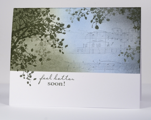
I have another collage card today, this one with a colour scheme more common in my work but probably not as striking as the previous contrasting scheme. An analogous colour scheme is one made up of colours side by side on the colour wheel. An analogous colour scheme works well for a sympathy or get well card because it is more soothing and harmonious than a contrasting one.
To create this card I positioned a mask across the lower third of the card and stamped the branch around the edges, lifting the mask once so a twig could fall below the line. I stamped a couple of times without re-inking to get that misty background look. I partially inked the music background in grey and stamped to the right of the panel then added the blue and green sponging with a little grey on the right.
My older daughter and I were discussing the sentiment; she felt that it always seems a little odd to send a card saying “get well soon” or “feel better soon” as it sounds like a command! As if someone wouldn’t feel better if they could. I guess it is probably short for “I hope you feel better soon”. That is the meaning behind this card made for my son’s writing class teacher who has fractured her wrist.
Supplies:
Stamps: Berry Branch, Music Background, Feel Better (Penny Black)
Inks: Memento London Fog, Summer Sky, Olive Grove (Tsukineko)


