
To give you a hug
Posted: February 28, 2019 Filed under: flutterby, Penny Black, square frames | Tags: Penny Black creative dies, Penny Black stamps, Ranger Distress stains 10 Comments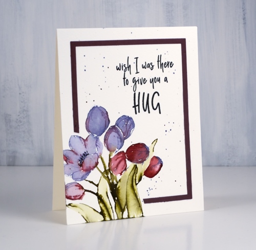
‘Tis the season for new floral stamps, even if it is not the season yet for new florals! I used my tried and true distress stain watercolour method for this little bunch of tulips. I inked the petals with dusty concord and festive berries distress stain. I often use a brush now and paint stain onto the stamp. That way I don’t contaminate the dauber top of my distress stains with other colours and if I’m using the spray stain I can just dip my paintbrush into the stain I have sprayed into a palette.
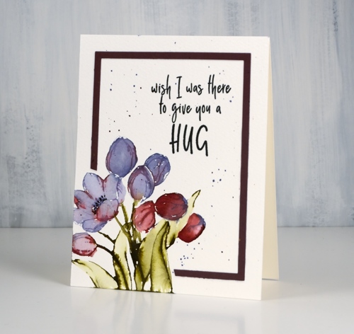
I try to paint straight after stamping so the stain is still wet on the watercolour paper and can be blended very easily to fill the petals and leaves.
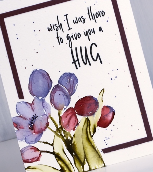
I added some splatter around the panel as my image was confined to one corner leaving a lot of empty space elsewhere. I used the ‘negative frame’ which is a bonus when I cut the whole set of ‘square frames’ from cardstock. I have kept my new square dies joined together in pairs so I can get these ‘negative frames’ easily. I didn’t want to cover my corner flowers so I snipped off some of the frame to wrap around the image instead.
Isn’t this a sweet sentiment?
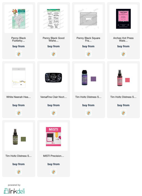
Supplies
Timeless
Posted: February 27, 2019 Filed under: square frames, timeless | Tags: Penny Black creative dies, Penny Black stamps, Ranger Distress stains 9 Comments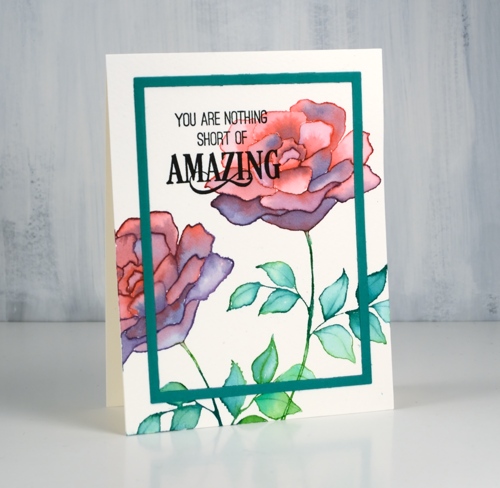
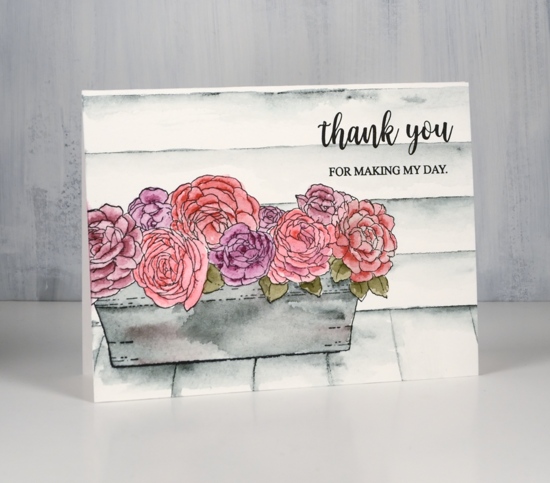
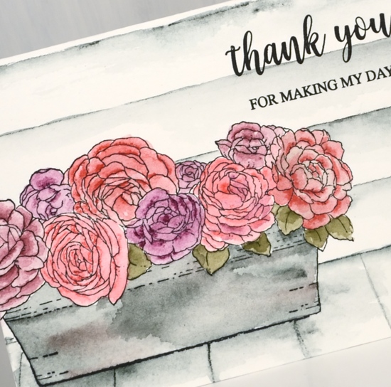
Today’s card features the ‘title stamp’ (like title track) from the new Penny Black release.This big bold rose stamp, ‘Timeless‘, is such a versatile one. I used blended distress stain for my card but it will be great for embossing, no-line colouring and pencil colouring as well.
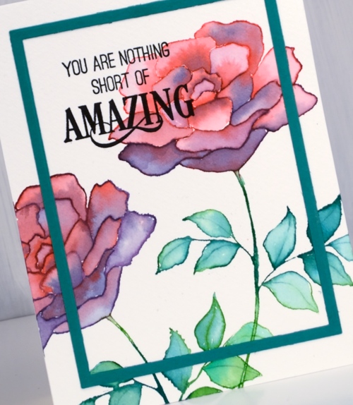
I used my stamp positioner so I could work with a few colours at a time but it would work without a positioner. I inked the top petals in festive berries distress stain, stamped on cold pressed watercolour paper then inked the lower petals with dusty concord stain and stamped again. If you still have the daubers you can ink direct to stamp but if you have the sprays you need to paint some stain on your stamp for this technique. You could use inks or markers but I like how wet the stamped image is when I use stain. I am able to use a brush and water immediately to blend the stain to fill the petals. You can see on some of the petals I added extra stain for shadow and depth
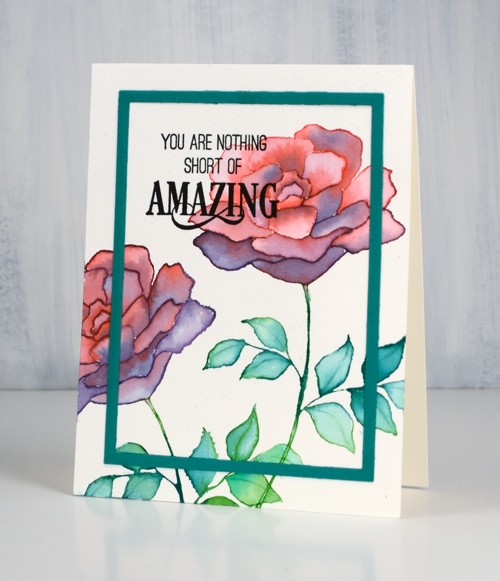
I stamped the leaves in two green stains and blended them also. I finished the panel off with a cool new sentiment then added a frame cut with the new ‘square frames‘ dies. I have kept my dies joined together so I will get both the decorative frames and the plain frames when I run it through the machine. It does mean that I get several frames each time I use it but that’s ok; I’m keeping them in reserve.
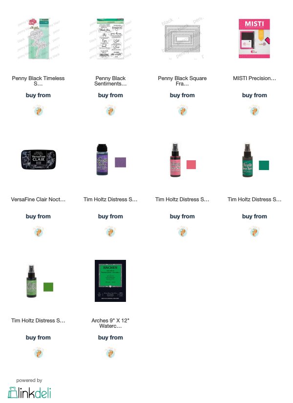
Supplies
Blue & blue
Posted: February 25, 2019 Filed under: Penny Black, radiant, together | Tags: Penny Black creative dies, Penny Black stamps, Ranger Distress stains, Tsukineko Versafine inks 7 Comments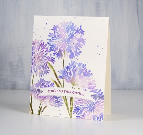
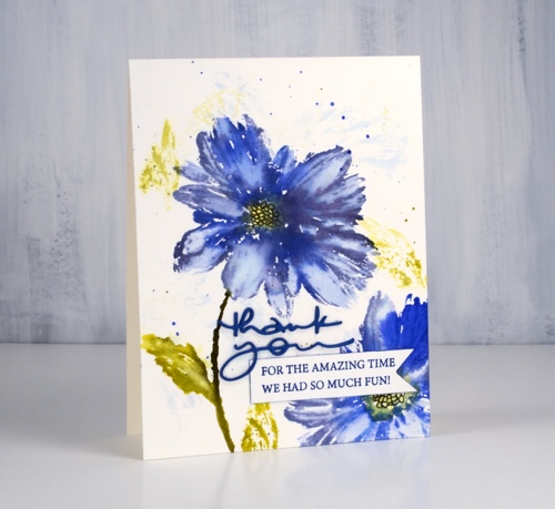
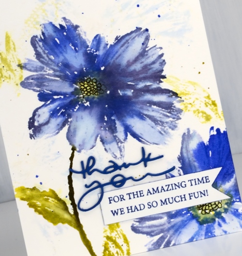
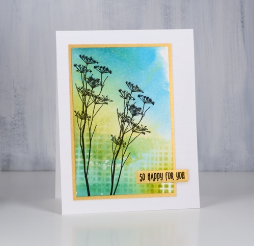
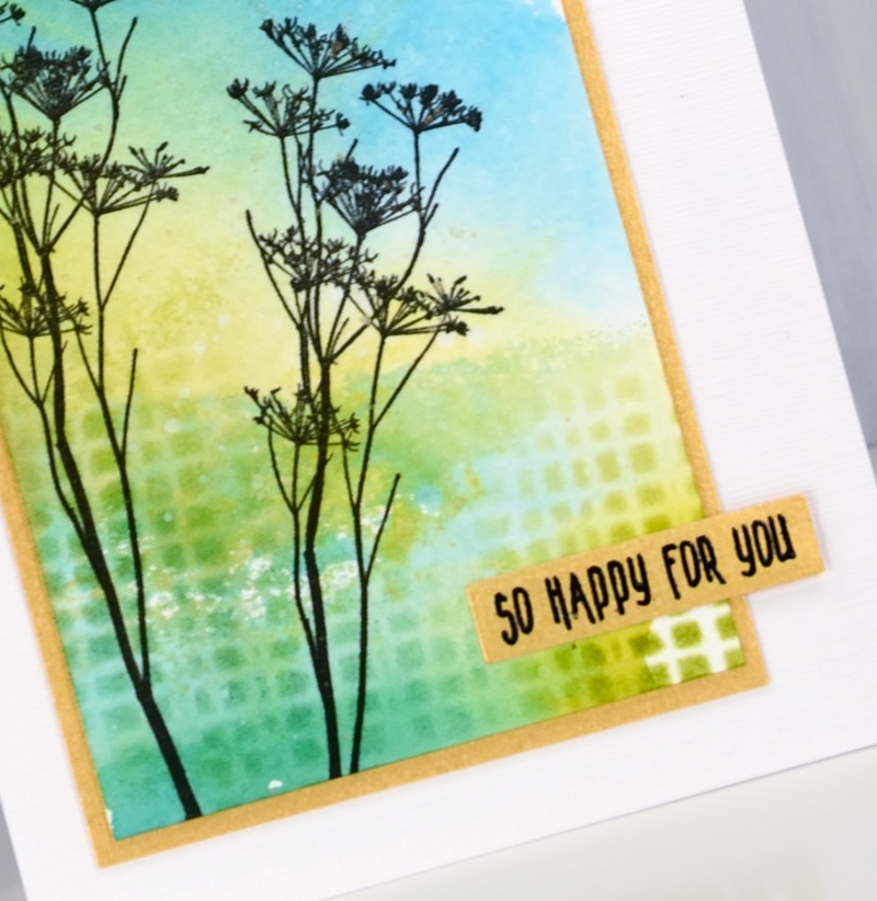
Blue flowers might just be my favourite, so of course I chose blue for some of the new flower stamps from Penny Black. My first card features the ‘Together‘ stamp which is lovely and reminds me of the agapanthus my parents often grew in their flower gardens.
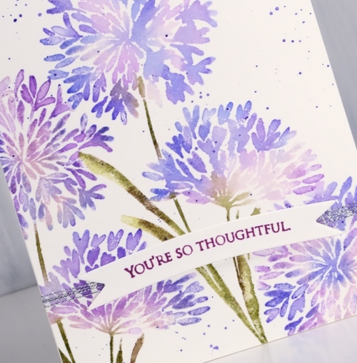
Both of today’s cards were made with distress stains either painted on or applied straight from the dauber.
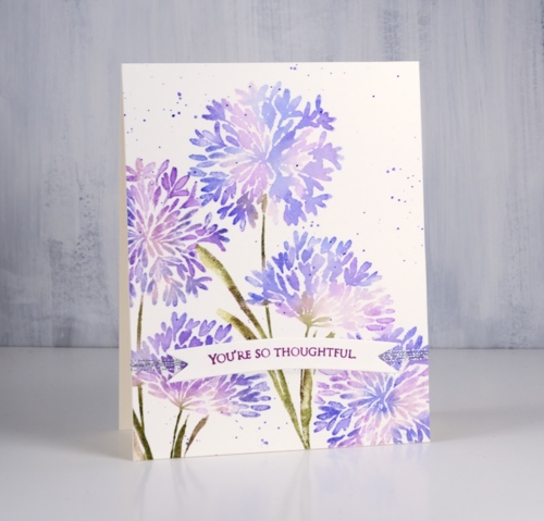
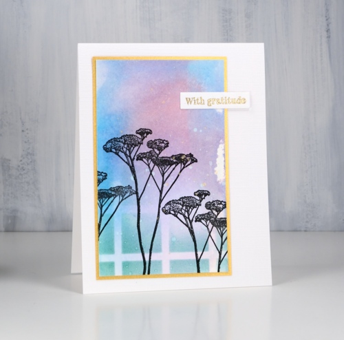
I start by painting the lightest stain onto the stamp then stamping. I clean the stamp and add another colour and stamp again. To protect a detailed area like a flower centre I wipe the ink off the stamp in that spot so I can use ink or marker later. When the image has all been stamped I blend petals and leaves with a paint brush and water. For both blue floral cards I splattered some stain over the panel to complete the design then stamped a sentiment on a banner in a co-ordinating colored ink. Both sentiments are from the delightful new ‘grateful sentiments‘ set
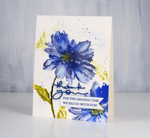
This large blue flower stamp is called ‘Radiant‘. For this card I started by wetting the watercolor panel so when I stamped on it with milled lavender and crushed olive distress inks I would get a diluted abstract print. I dried the panel before putting it in the stamp positioner to work on the bold print. For the bold stamping I used shaded lilac, blueprint sketch, dusty concord, crushed olive and scattered straw stains. Once the stain was dry I drew the centre of the flower with a black marker.
People often ask me if distress re-inkers can be used to create the same effects as the stains. I don’t own any re-inkers so I can’t tell you. I think it is probably time I got a few and did some comparisons. Stay tuned.
I am trialing a new supply linking system right now which looks and operates a little differently from what I was using. If you click on any of the supplies pictured below you will be taken to a complete list image where another click will take you to the Foiled Fox store. Buying through my affiliate links to the Foiled Fox store does not cost you any extra but earns me a commission. Please let me know if you have any thoughts or concerns with the new system. It is a trial and I am interested to know what you think.
Thanks for dropping by today.
Supplies
Floral corners
Posted: February 22, 2019 Filed under: a floral twist, painter's vase, Penny Black | Tags: Penny Black stamps, Ranger Distress inks, Tsukineko Versafine inks 10 Comments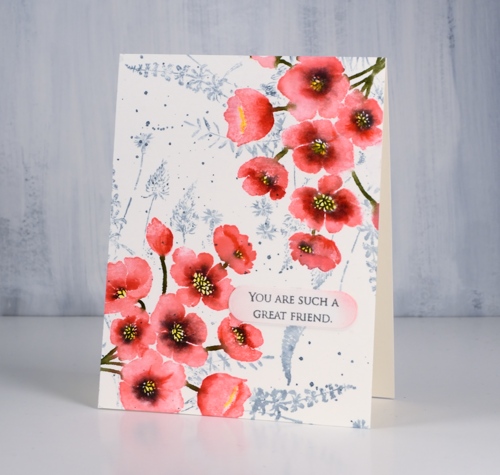
Today’s card features two new brushstroke stamps from Penny Black. The pink flowers in two corners of my panel are from a vase + flowers set called ‘painter’s vase’. I just used the flower stamp but there is a vase stamp I’ll use another day.
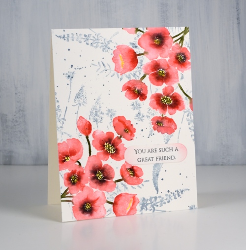
I used my stamp positioning tool (MISTI) and placed the flower stamp overlapping one corner of the hot pressed watercolour panel. I stamped the whole image in worn lipstick distress ink knowing the forest moss ink would be bold enough to cover the pink later. Without moving stamp or panel I inked centres and edges of the flowers with candied apple distress ink, stamped then blended the two pinks with water. I then added black soot ink to the flower centres, stamped and let the panel dry. I coloured in the flower centres with a sun yellow inktense pencil and shaded some of the flower centres and edges with poppy red. Then I flipped the panel 180° and repeated the whole process.
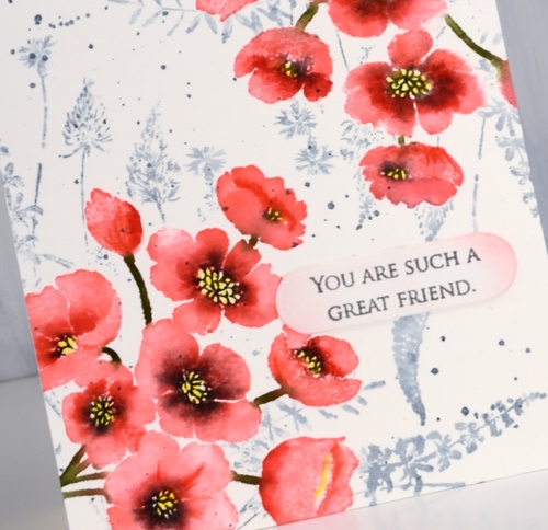
To add a background I had to mask the flowers so I stamped them on masking paper, cut them out and covered my completed corners while I stamped ‘a floral twist‘ stamp in weathered wood distress ink and added a few splatters too. All that was left was to add a sentiment; I decided on something small from ‘grateful sentiments’ on a little die cut label with the edges sponged in worn lipstick ink.
Thanks for dropping by today; it is great to be blogging with a bit of regularity again.
Supplies
Rose garden
Posted: February 21, 2019 Filed under: Inktense pencils, Penny Black, rose garden | Tags: Inktense, Penny Black stamps, Tsukineko Versafine inks 7 Comments
I am hanging out on the Foiled Fox blog today with some new Penny Black floral loveliness along with some new to me inktensity!
I have been trying out some inktense pencils lately. Friends have raved about them and Shauna from the Foiled Fox loves them and kindly sent me some to try. Inktense pencils and blocks are permanent once dry so it is possible to blend then add another layer without diluting the first layer. Some watercolours are not permanent so they blend with subsequent layers applied. I was happy to see how easy it is to ‘paint’ with these pencils.
Supplies
Blooming boots!
Posted: February 20, 2019 Filed under: blooming boots, square frames | Tags: Penny Black creative dies, Penny Black stamps, Ranger Distress stains 6 Comments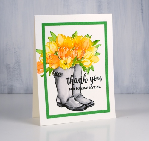
Penny Black has a new release; you probably saw some sneak peeks on the PB social media or maybe you saw this card as a peek on my instagram. The new release is called ‘Timeless‘ and it is full of spring and summer loveliness. To celebrate Penny Black is hosting a giveaway.
Isn’t this a cute stamp? Blooming boots! I guess boots could work as a vase if they were waterproof. I used distress stains to stamp this happy colour scheme but you could use any water soluble ink that blends well after stamping. I inked the tulips with mustard seed and spiced marmalade distress stains. Now that the daubers are discontinued I paint stain onto the stamp with a brush. After stamping the tulips I wiped the stamp and inked the leaves with mowed lawn stain. While the stamped stain was still damp I blended it with a brush and water then dried the panel.
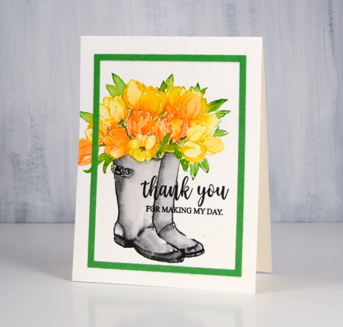
I painted black soot stain onto the boot part of the stamp then stamped and blended to fill the boots. By drying the rest of the stamping first I prevented the black stain from bleeding into the flowers and leaves. I used the new die set ‘square frames’ to cut a green frame. As my dies are not divided up they cut not only the decorative frames but also plain rectangles and that is what I used here. I finished the card with a sentiment from the super-useful new set ‘grateful sentiments’ in black versafine ink.
I am currently enjoying not tulips but a giant amaryllis; it is 80cm tall and each one of the five flowers measures 20cm across. It is huge and beautiful!
Supplies
Tall Flowers
Posted: February 19, 2019 Filed under: Darkroom Door, Leaves, Nature Walk, tall flowers | Tags: Darkroom Door stamps, Ranger Distress inks, Ranger Distress stains 9 Comments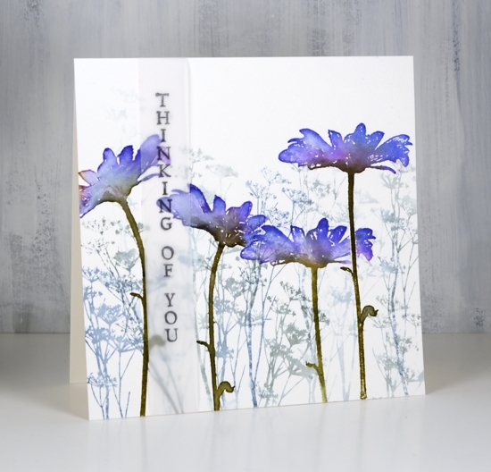
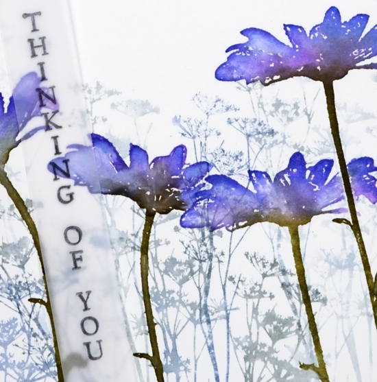
I am excited to feature some new stamps from Darkroom Door today. The tall flowers are from the new ‘Tall Flowers’ set and the background flowers are from the delightful ‘Nature Walk’ set. I am a guest over on the Darkroom Door blog today, if you haven’t visited you definitely should check out all the inspiration shared there.
My first card features a cold pressed watercolour panel filled with one of the stamps from ‘nature walk’ set inked in iced spruce and stormy sky distress inks. I diluted the ink with a spritz of water and stamped first, second and third generation impressions. Over the top I stamped the tall daisy from ‘tall flowers’ four times with wilted violet, blueprint sketch and forest moss distress inks. Because the stems are long and thin I was able to orient them in different directions. I used a mask a couple of times to overlap the daisies. Once stamped I blended the colours with a paintbrush and water.
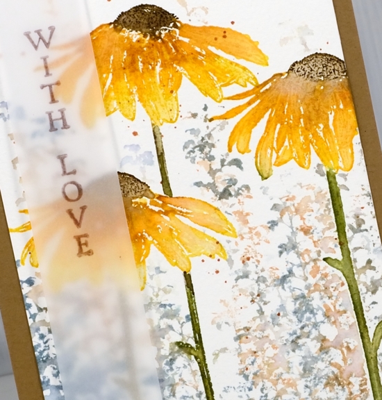
I used a similar process to create the orange toned daisy card but this time I did the background foliage after the foreground flowers by using stamped and cut out masks. The daisies are stamped in peeled paint and fossilized amber distress inks. I added extra colours one at a time with spiced marmalade marker, rusty hinge marker close to flower centre and finally ground espresso marker on the centre of the flower. I blended the inks with water then after it was dry stamped the centres again to add some texture back in. The background stamping is another stamp from the DD ‘nature walk’ set stamped with weathered wood and tea dye distress inks. I added some splatter because, well, why not!
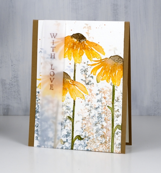
On both the daisy cards I decided to add the sentiment on a vellum strip. I liked the floral scenes too much to stamp words over them so the vellum seemed like a subtle way to do it. The recipient could even snip the sentiment off and have a picture to display if they wanted to. For this tall thin panel I used the kraft card base to frame it on two sides.
The last card is a little different; I used the small flower from ‘tall flowers’ and some little leaves from ‘leaves’ set to make a wreath.
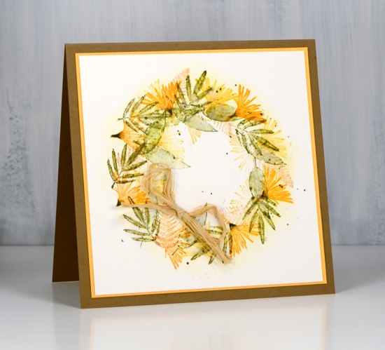
To guide my stamping I traced a circle onto my watercolour panel. I sponged fossilized amber distress ink around circle then erased the pencil line. With the sponging as a guide, I stamped the small flower heads from ‘Tall Flowers’ set round the circle in carved pumpkin ink, holding the stamp so only flower(not stem) was inked and stamped. I repeated the process with small leaves and ferns from ‘Leaves’ set in fossilized amber, peeled paint, forest moss and tea dye distress inks. You know I splattered forest moss ink over wreath because that’s what I do then matted the panel in orange cardstock, attached to a kraft card base and added a raffia bow.
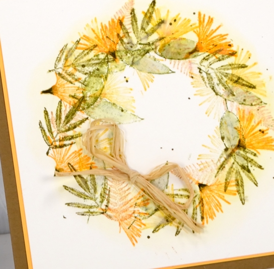
I loved creating with these beautiful tall flower stamps and couldn’t help myself from using the ‘nature walk’ stamps again because they work so well together!
Supplies
Stamps: tall flowers, nature walk, leaves


Inks: stormy sky, iced spruce, blueprint sketch, wilted violet, forest moss (purple flower card)


fossilized amber, peeled paint, weathered wood, tea dye & distress markers: spiced marmalade, rusty hinge, forest moss, ground espresso (orange flowers)


fossilized amber, peeled paint, carved pumpkin, forest moss, tea dye (flower wreath)

Papers: hot pressed watercolour, cold pressed watercolour, vellum, kraft


Also: stamp positioner, raffia

Nature walk portraits
Posted: February 5, 2019 Filed under: Avery Elle, boxes, mesh, Nature Walk, simple sentiments | Tags: Avery Elle, Darkroom Door stamps, Darkroom Door stencils, Kuretake Gansai Tambi watercolour paints, Ranger Distress inks 6 Comments
I have mentioned before how beautiful these Darkroom Door ‘nature walk’ images are but have I mentioned how easy it is to create pretty cards with them. Each card today features just one image, stamped twice over a quick watercolour background.
I created the backgrounds with my glass mat and some distress inks. I squished the ink pads down on the mat side by side (three or four colours at a time), spritzed with water then swiped my hot pressed watercolour panel through the diluted ink a few times until there was good coverage on the panel. I dried the panel with a heat tool before sponging one or two of the distress inks through a section of stencil then added splots of water for some added texture. The panels were all different, all pretty and done within minutes.
I used the MISTI for stamping because the texture of the watercolour paper makes it necessary to stamp a few times to get a solid image. I used versafine clair nocturne ink which always gives me a crisp print. Once the ink was dry I splattered gold paint from the gansai tambi starry colours palette. The gold splatter might just be my favourite part of these cards; unfortunately it’s not very obvious in the photos.
To draw more attention to the gold splatter I matted with gold and stamped the sentiments either on gold cardstock or with embossed in gold powder. The sentiments are from Darkroom Door’s new sentiment strips. The sentiments are in list format and I have kept the stamp uncut. I stamp on a cardstock panel and cut out the sentiment I want. I now have a handy die set from the Foiled Fox which neatly cuts out the smaller fonts and I always love sentiments in small fonts! The set is called ‘simple sentiments’ and it has ten lengths of sentiment strip dies.
In putting together the cards I used one more happy new product. I am always searching for textured white cardstock. Today’s cards feature a linen texture with enough depth to be seen by the camera. It is in 8½ “x11” sheets so one sheet did four card fronts, no waste. This is the first time I’ve used it so there will be more testing to come with dies, inks etc but so far, so good.
Thanks for listening to me prattle on about this and that. I hope you are enjoying some ‘nature walks’ even if they are of the snowy variety! While we have been experiencing extreme cold followed by loads of snow, friends and family on the other side of the world are experiencing extreme heat and flooding!
Supplies
Stamps: nature walk, (DD)


Stencils: mesh, boxes 12 up


Dies: Simple Sentiment (Avery Elle)

Distress inks: crushed olive, pine needles, blue print sketch, milled lavender, stormy sky, mermaid lagoon, wilted violet, worn lipstick
.


Inks: versamark, nocturne versafine clair,


Paint: gansai tambi starry colours

Paper: hot pressed watercolour paper, snowbound textured white cardstock, gold cardstock, neenah solar white

![]()

Also: Cutterpillar glass mat, MISTI, gold embossing powder


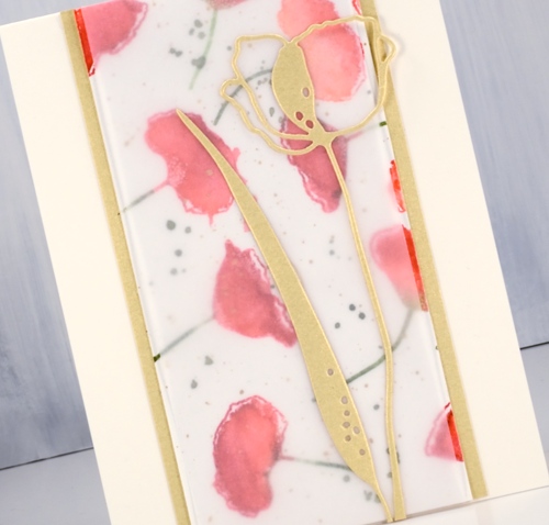
Alexandra Renke Poppies
Posted: January 28, 2019 Filed under: poppy flower dies, poppy flower stamps | Tags: Alexandra Renke, Penny Black stamps 4 Comments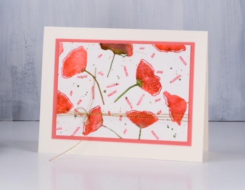
After making a gift set of cards with the ‘blissbloss’ stamp I was inspired follow the same process with another stamp set. This time I used Alexandra Renke’s pretty poppy stamp set and her poppy dies. I used Catherine Pooler inks for the watercolour effect on the poppies and for the tiny sentiments.
I started with a 10″x7″ panel of hot pressed watercolour paper. There are five poppy stamps in the set so I positioned them randomly over the panel while in the stamp positioner. I inked the petals first in samba ink then dabbed some rockin’ red ink on the sides or edges but not covering the whole flower. I spritzed then stamped. I wiped off the stamps then inked the stems in eucalyptus ink and stamped again. I moved the panel and repeated the process to fill the panel with poppies. In order to get even spacing I had to clean and reposition the stamps a couple of times but eventually I had the panel covered. At this point I changed my mind and crowded in a few more flowers in a couple of areas using the CP bellini ink along with CP samba to make paler poppies. I added some eucalyptus ink splatter and some gold splatter using one of the gansai tambi gold paints then called it complete.
To create the cards I cut some panels to 5 ½” so they would stretch the length or height of the card and used co-ordinating cardstock to frame and mat the panels. I also cut several poppies using the Alexandra Renke poppy flower dies in light peach, dark peach and light gold cardstock. I don’t have a formula for creating five cards from the panel; basically I played with ideas until they looked ok!
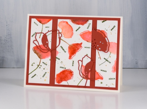
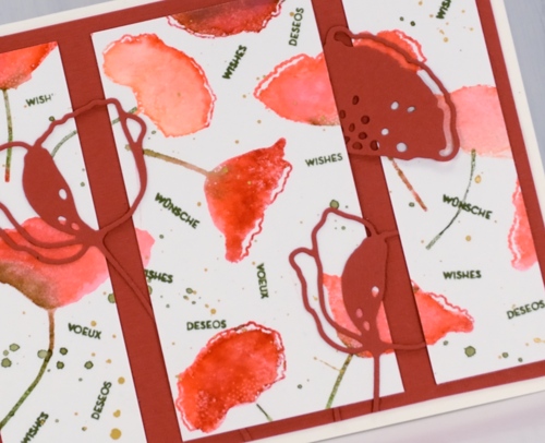
The poppy stamp set has the same seven sentiments in English, French, German and Spanish so I stamped sentiments on a few of the panels using the same word in four languages to fill spaces between the poppies. On one card I needed a larger sentiment so I used a Penny Black stamp from the ‘happy snippets’ set.
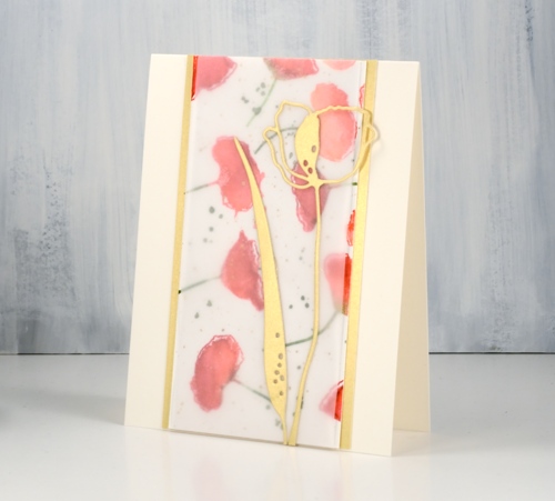
I used light weight vellum over one of the watercolour panels to soften the colours and make the die cuts stand out.
I’m hoping to sell cards at a market in the not too distant future so having a few gift sets might be a good idea.
Supplies
Stamps: poppy flower set (Alexandra Renke)


Dies: poppy flower dies (Alexandra Renke)

Cardstock: hot pressed watercolour, Neenah cream, light weight vellum, light gold, dark peach, light peach

Inks: samba, rockin’ red, bellini, eucalyptus (Catherine Pooler)


Paint: gansai tambi starry colours
Also: stamp positioner, diamond glaze, gold cord

Starry Amazing
Posted: January 22, 2019 Filed under: Altenew, My Favorite Things, Star turnabout die, Star turnabout set, Watercolour paints 36 | Tags: Altenew, Concord & 9th, Cutterpillar, My Favorite Things 2 Comments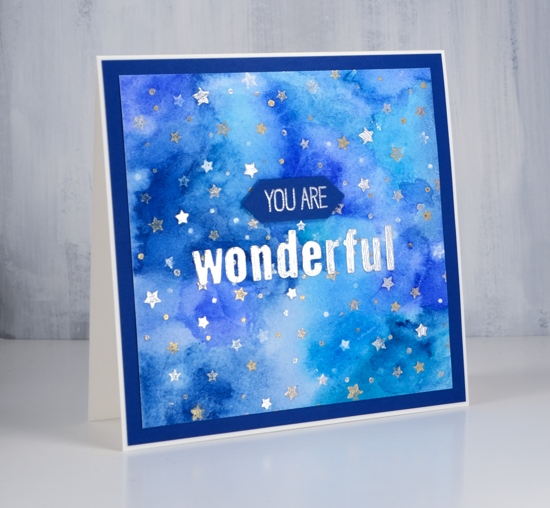
I am over on the Foiled Fox blog today; make sure you pop over there for more details and for a browse through their recent blog posts.
I have shared cards made with ‘turnabout’ stamps before but the look on this one is a bit different. My other turnabout stamps from Concord & 9th fill the space a lot more than this starry one. ‘Star Turnabout’ is a two part stamp which means you can do a small area of stars with the centre of the stamp, a large border of stars with the the outside of the stamp or, as I did, a large square covered in stars by using both stamps at the same time. There is now a jig available which makes the turnabout process easier.
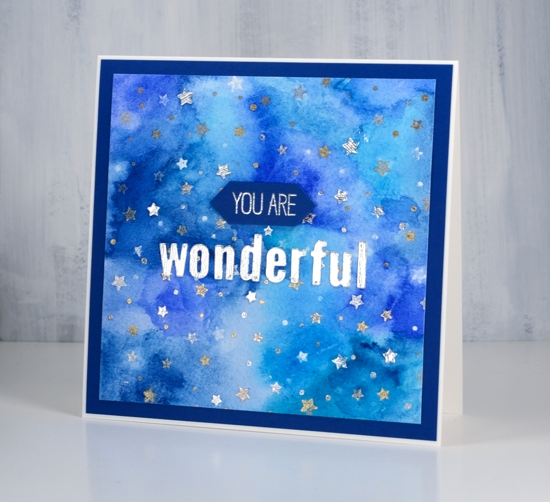
I worked on a 6″x6″ piece of cold pressed watercolour paper in my MISTI. I started by stamping in versamark and embossing in clear powder. Then after turning my panel 90° I stamped again with versamark then embossed in gold. With a turnabout stamp you turn the panel three times and stamp each time. I embossed with clear, gold, silver and lastly platinum. Once the stamping was done I taped the panel down on my glass mat to paint it. I used Altenew’s watercolour paint set, limiting myself to blues and aquas. I painted the colours randomly over the whole panel, blending them together and diluting if necessary with some water.

While the paint dried I die cut the word ‘wonderful’ using the MFT little lower case dies and some Tonic silver cardstock. C&9 have a co-ordinating star die which I used to cut a few little stars from the same silver cardstock so I could add them here and there over the panel. To complete the card I framed it with blue cardstock and stamped a small banner using a MFT sentiment set.
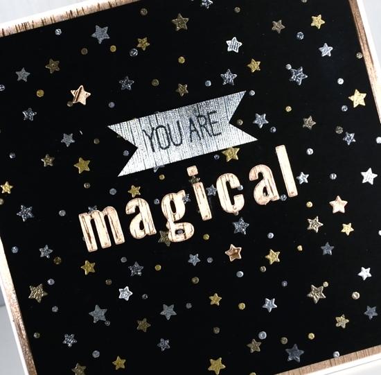
With the stamps and embossing powders out on my messy desk I decided to do a few more panels including this black one.
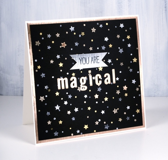
I used neenah black cardstock, silver, gold, platinum and gun metal embossing powders then added words on tonic silver and gold embossed cardstocks.
Thank you for dropping by today. All the products I used are linked below. I use affiliate links to the Foiled Fox store in my blog posts. At no extra cost to you I receive a commission when you use the links.
Supplies
Stamps: star turnabout stamp set (C&9), birdie brown greetings galore (MFT)


Dies: Star Turnabout Die (C&9), little lower case letters (MFT)


Ink: versamark, versafine clair nocturne

Paints: Altenew watercolour set

Cardstock: cold pressed watercolour paper, Craft Perfect Luxury Embossed Card – Golden Satin & Silver Silk Luxury Embossed card (Tonic), Neenah black, Neenah cream, Whirlypop blue


Embossing powders: metallic gold rich embossing powder, platinum embossing powder, clear embossing powder, silver embossing powder, gun metal embossing powder


![]()


Also: MISTI, T-ruler, glass mat


