Artful August
Posted: August 23, 2021 Filed under: bookworm, Darkroom Door, gel press, Hand drawn | Tags: Darkroom Door stamps, gel printing, Hand drawn 4 Comments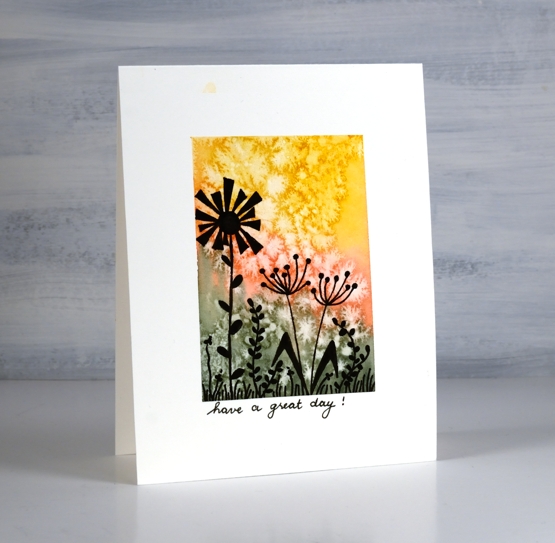
During August Rachel Greig from Darkroom Door has been hosting a challenge with prompts everyday to be interpreted in any artsy way you like. I haven’t managed to participate regularly but I have enjoyed making a few simple cards along with some gel prints and a journal page.
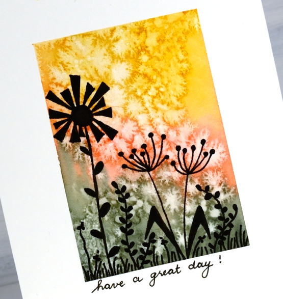
The card above was made for the silhouette prompt. I painted a watercolour background, sprinkled salt and then drew the silhouette flowers after the watercolour dried.
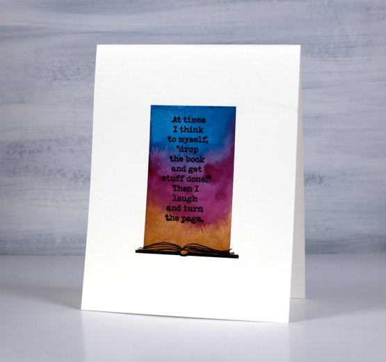
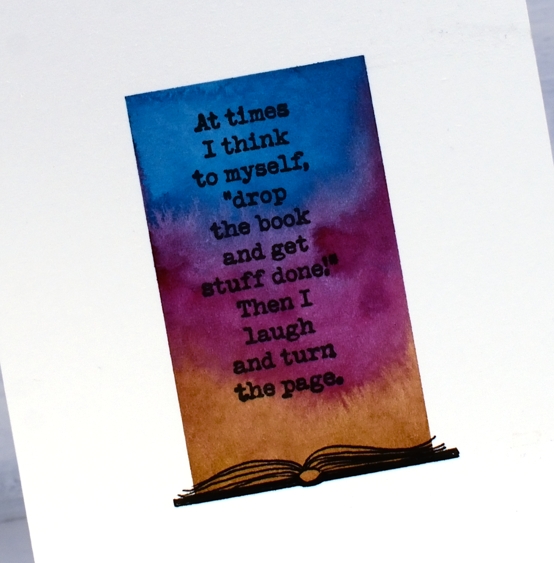
This one was for the words prompt. I am such a reader these days I thought of books when I saw the prompt. Once again I did a watercolour background then add the Darkroom Door book stamp and drew a book at the bottom.
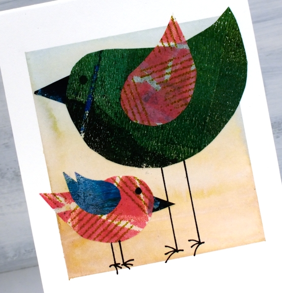
The next prompt I followed was birds. I cut body, wings and beak shapes from gel print pages then glued them over a pale watercoloured background
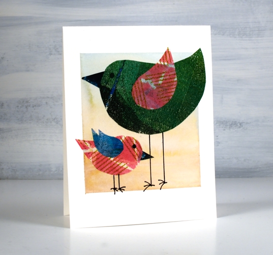
All these three cards began with the same masked and painted background. I found it was a simple way to start the projects and they are all one layer on hot pressed watercolour paper.
The prompts featured here are all from last week. I haven’t participated over the last few days but I plan to jump in again today with the butterflies prompt. If you are interested in seeing the wide range of projects hop over to instagram and check out the #artfulaugust and #rachelgreigartfulaugustchallenge
See you soon.
Supplies
(Compensated affiliate links used when possible)
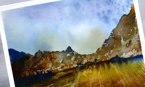
Mountain Farm
Posted: August 20, 2021 Filed under: farmland, Penny Black, picturesque, Stamped Landscapes, Uncategorized | Tags: Penny Black stamps, Ranger Distress inks 3 Comments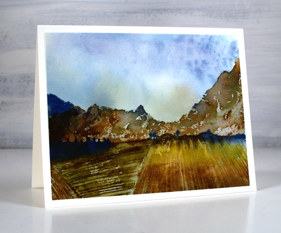
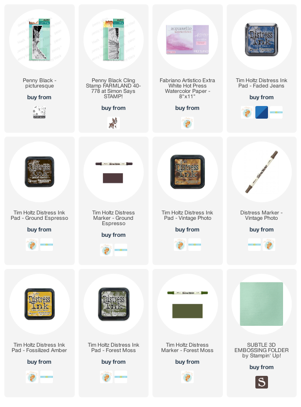
More mountains, this time the ‘picturesque’ stamp is paired with the ‘farmland’ stamp, once again in a blue and brown colour scheme. I began by making a smooshed ink background with faded jeans and fossilized amber inks.
Once the background was dry I inked the mountains in vintage photo, faded jeans and ground espresso inks taking care not to ink to the bottom of the stamp but instead leaving the lower edge unevenly inked. I did some blending with a paintbrush after stamping to make the mountains less defined.
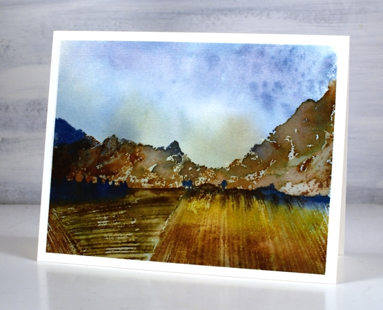
I inked the farmland stamp in faded jeans along the top then fossilized amber, forest moss and vintage photo in the fields. Again I did a little blending with a paintbrush. Once finished I ran the panel through my die cutting machine with the ‘subtle’ embossing folder from SU to give it a canvas look; you can see the texture in the close up photo.
I hope you have enjoyed all the scenery on the blog lately. What are you hoping to see next? I won’t promise to deliver straight away but I’d love to know what interests you.
Supplies
(Compensated affiliate links used when possible)
Mountain moonrise
Posted: August 19, 2021 Filed under: mountain magic, Penny Black, picturesque, Stamped Landscapes | Tags: Penny Black stamps, Ranger Distress inks 8 Comments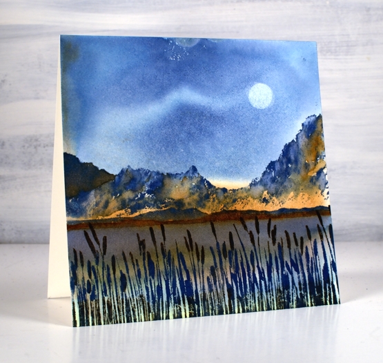
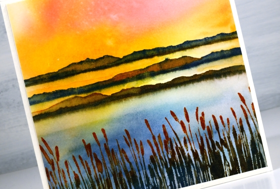
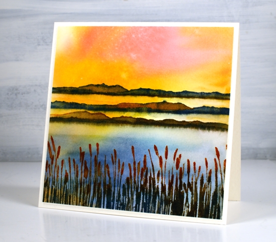
Here is the mountain stamp again, this time paired with the rushes and hills from the mountain magic set. Blue and brown is a favourite colour combo for me at present which works well as long as there are some pale tones or white in the mix.
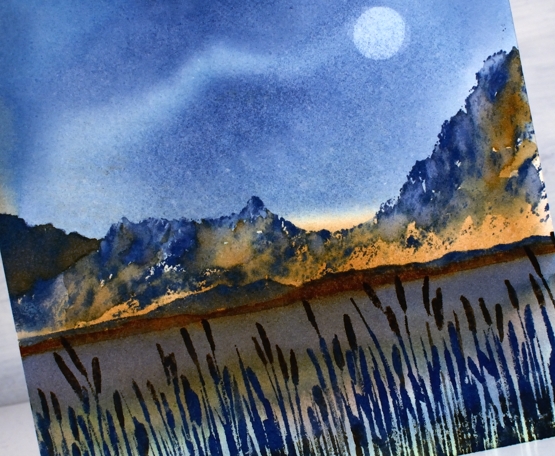
Once again I began by creating the watercolour background (you can see the technique in the video here). I used diluted faded jeans, mowed lawn and gathered twigs distress inks. Once the background dried I stamped the mountain stamp in faded jeans ink taking care not to ink to the base of the stamp. At the foot of the mountains I stamped the smaller mountain stamp from ‘mountain magic’ set. I blended over both the tall and the short mountains in blue and brown inks.
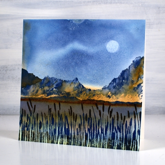
Before stamping the rushes I blended water along the base of the low mountain image to soften the edge into the lake. Once that was dry I stamped the rushes in faded jeans, gathered twigs and mowed lawn. I created the soft moon image by placing a large drop of water on the panel to sit and dilute the ink. I carefully absorbed the droplet with paper towel and repeated the step.
Although not the brightest and prettiest colour scheme I am loving the moodiness of the scene. I feel like this is the kind of vista I might come across one day if I’m lucky!
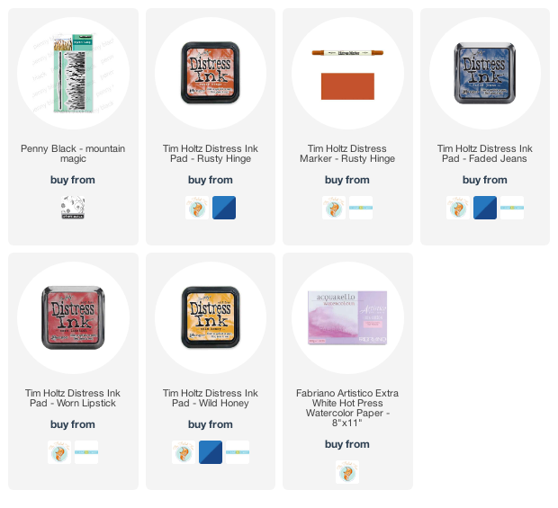
Supplies
(Compensated affiliate links used when possible)

Mountain Sunset
Posted: August 18, 2021 Filed under: Penny Black, picturesque, Stamped Landscapes | Tags: Catherine Pooler inks, Penny Black stamps, Ranger Distress inks 7 Comments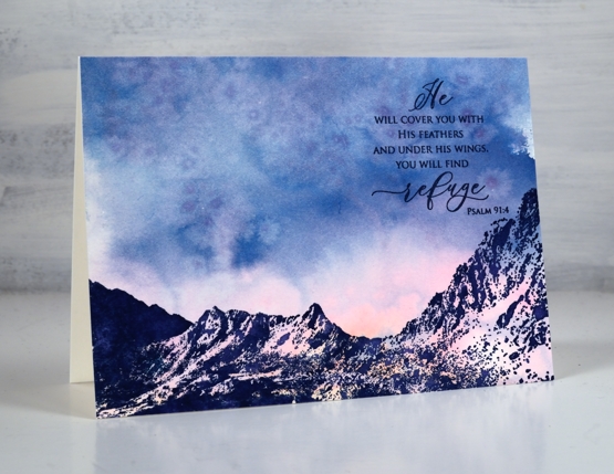
I’ve been enjoying this new mountain stamp from Penny Black, it’s aptly named ‘picturesque’. Although it works beautifully behind other stamps I wanted to show it alone first because when paired it with a sunset sky it really didn’t need more.
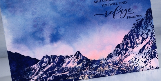
The wonder of mountains and sunsets reminds me of the mighty God who made and sustains this earth so I chose a sentiment that gives me the same encouragement.
To create this card I swiped a piece of watercolour paper through faded jeans, kitsch flamingo and scattered straw distress inks. While it dried I sprinkled salt on it to add some texture and pattern.
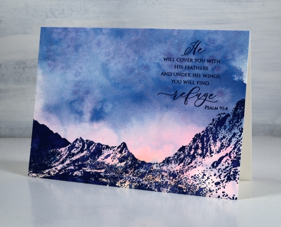
This is a larger card than my usual but the mountain stamp is also large so it spanned the 6¼” width. I stamped in Catherine Pooler juniper ink and decided not to blend over the stamping. The pinks of the watercolour looked like the sunset reflecting on snow so I kept the mountain crisp and added the sentiment from PB ‘inspirational sentiments’ in the same ink.
Tomorrow’s post will include this stamp paired with other scenic stamps for a moonlit farm view.
Supplies
(Compensated affiliate links used when possible)
Combining scenic stamps
Posted: August 16, 2021 Filed under: farmland, homeward, Penny Black, Stamped Landscapes | Tags: distress markers, Fabriano Watercolour Paper, Penny Black stamps, Ranger Distress inks 7 Comments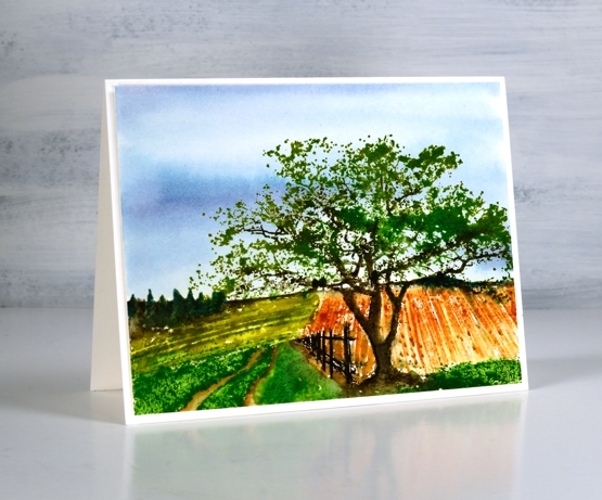
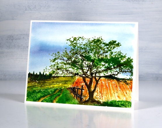
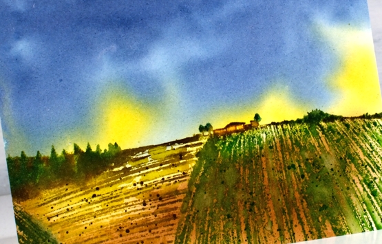
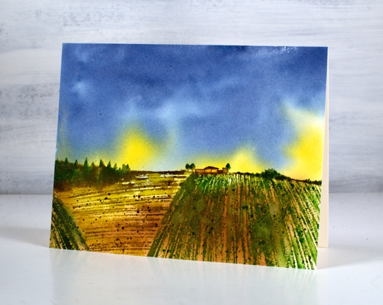
I’ve been playing with scenic stamps again, this time combining sections of two stamps to create a new scene. The Penny Black ‘farmland’ stamp forms the background scenery and the PB ‘homeward’ stamp makes up the foreground.
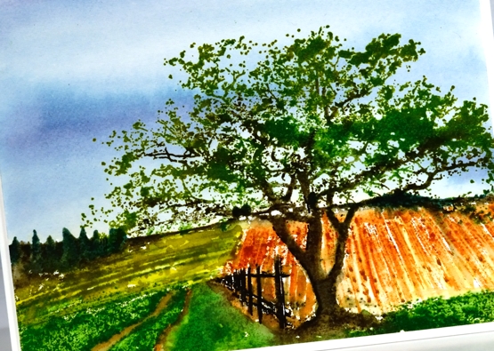
Out of habit (a successful one!) I used distress inks and markers to ink the stamps and add detail to the design. I kept the palette limited using two blues for the sky and several greens and browns for the rest of the scene. To see the process take a look at the video below.
I know some people find scenic stamps a bit daunting but the detail in the stamps themselves makes it possible to add a little or a lot of your own artistry. I hope you find the techniques shown in the video helpful.
You can see cards featuring the farmland stamp on its own here and to see the homeward stamp here.
I mentioned in the video that although I think the fields look authentic I have no idea what the crops might be. If you know of crops that would appear to be rust or olive coloured mention it below!
Supplies
(Compensated affiliate links used when possible)
Farmland Views
Posted: August 13, 2021 Filed under: farmland, Penny Black, Stamped Landscapes | Tags: Penny Black stamps, Ranger Distress inks 5 Comments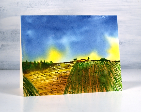
On Monday I posted a video featuring a new scenic stamp set from Penny Black. Today I’ve used the new ‘farmland’ stamp. I have two different colour schemes showing off the single stamp. In future posts I will combine it with other stamps for more detailed landscapes.
I created the background first using faded jeans, fossilized amber and vintage photo, colours I would use again in the stamping. (to see how I created the background check out Monday’s video)
Once the background was dry I put the stamp in a positioner so I could stamp one colour at a time. The farmers fields are vintage photo, crushed olive and mowed lawn. I used rustic wilderness for the trees on the horizon. A mix of stamp pads and markers made it possible to add detail to the house and trees. Spritzing and splattering over the fields gave them the texture which suggests crops.
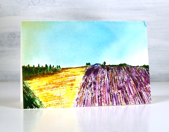
On this second card I used a reference photo of farm fields including lavender alongside another crop. The colours are perhaps a little bold but I love trying to recreate a photograph with stamps. The background is paler this time (scattered straw and salty ocean) and the fields a mix of seedless preserves, dusty concord, rusty hinge, fossilized amber, peeled paint, rustic wilderness and vintage photo.
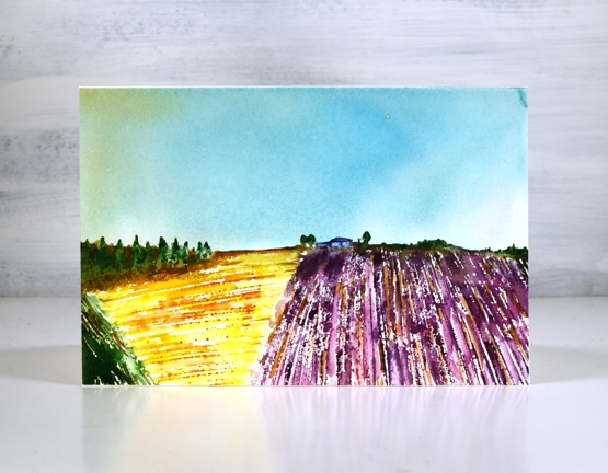
Once again I used markers to add final detail back into the trees and house. Can you picture the lavender fields of Provence? I have visited a lavender farm in Tasmania and you smell it before you see it!
Supplies
(Compensated affiliate links used when possible)
At Ease
Posted: August 11, 2021 Filed under: at ease, Penny Black | Tags: Penny Black stamps, Ranger Distress inks 21 Comments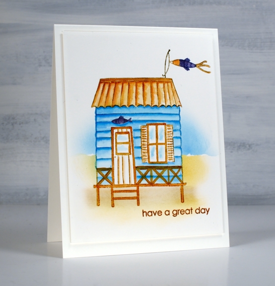
Wouldn’t you love to have a sweet beach hut like this one? To be honest I would love to be at the beach, hut or not! Instead I am enjoying a great summer with just the perfect mix of hot and warm days. The garden is growing and it is great to be outdoors. To celebrate the joys of summer I have teamed up with the Foiled Fox to host a Summer Giveaway.

If you like this beachy theme make sure you pop over to the Foiled Fox blog. I am blogging there today but you can also catch the cute starfish card Shauna posted recently.
I kept things clean and simple for this beach hut card, it wasn’t my first go with the PB ‘at ease’ set; I completed a couple of other panels using more colours and elements in the scene. I think this simple approach is my favourite.
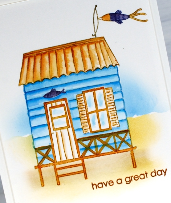
I stamped the hut in soft stone ink and did further stamping with distress inks. I used the salty ocean, rusty hinge and chipped sapphire distress inks to paint the hut, roof and railings as well as the fish decorations.
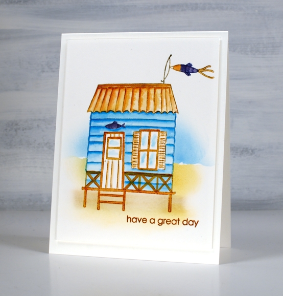
To add a background I placed some post-its over the hut so I could blend some ink for the sand and water. I used the torn edge of a post it to mask while blending. As I often do I popped up the panel on the same colour cardstock for a subtle ‘shadow’ frame. I added the sentiment from PB ‘enliven’ set because nothing says ‘great day’ to me like a beach themed card!
Make sure to leave a comment below telling me your favourite summer activity. I’ll put you in the draw to win a little spending spree at The Foiled Fox store!
Supplies
(Compensated affiliate links used when possible)
Honeycomb & Checkered
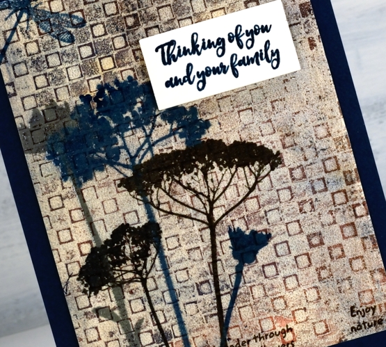
Posted: August 10, 2021 Filed under: checkered, Darkroom Door, Feathers, gel press, honeycomb, Nature Walk, Stencils | Tags: Darkroom Door stamps, Darkroom Door stencils, gel press, gel printing, Tsukineko Versafine inks 3 Comments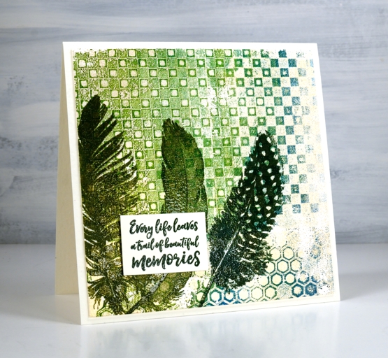
New stencils from Darkroom Door means new gel prints in my stack! I used greens, teal, beige and gold paints to print with the new honeycomb and checkerboard stencils. For the second card I used a mix of blue, beige, gold and coral paint for a rich print.
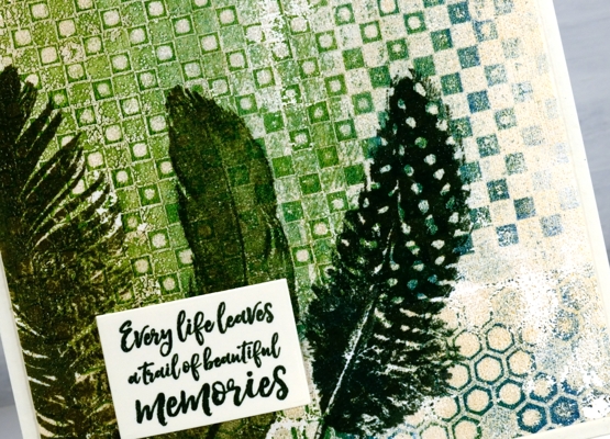
I used the stencil printing method demonstrated in this video and worked on printer paper with a 6″x6″ gel press.
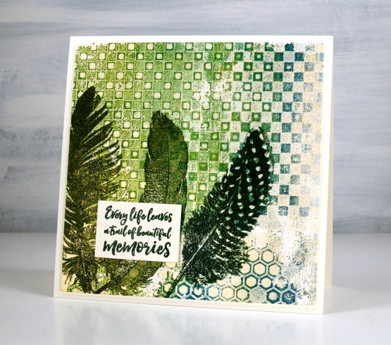
After completing a fresh stack of gel prints I chose these two because of the beautiful mix of colours and textures. I pulled out Darkroom Door feather and wildflower stamps and stamped them over the top of the prints. I decided to emboss using co-ordinating versafine inks to make the images stand up a little over the print.
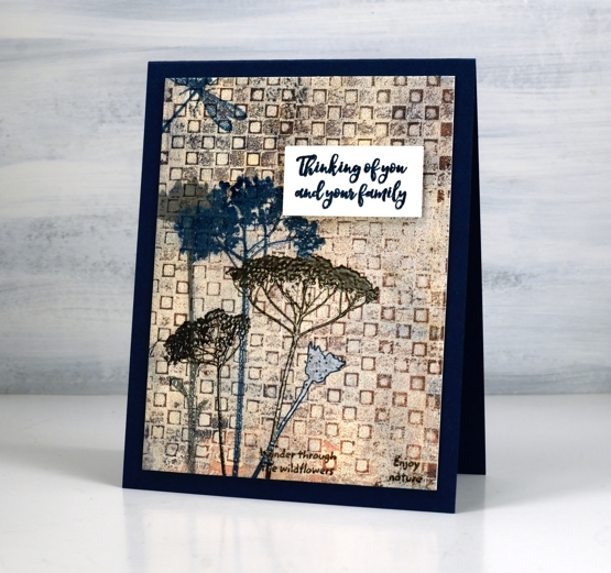
I chose sentiments from the DD sentiment strip stamp and embossed them to pop up over the stamped and printed panels.
Ever since I started gel printing with stencils I can’t get enough of the intricate detailed ones. These two new ones from Darkroom Door are very cool and create such great backgrounds!
Supplies
(Compensated affiliate links used when possible)
Sunset Over Wetlands Video
Posted: August 9, 2021 Filed under: mountain magic, Penny Black, Stamped Landscapes | Tags: Penny Black stamps, Ranger Distress inks 9 Comments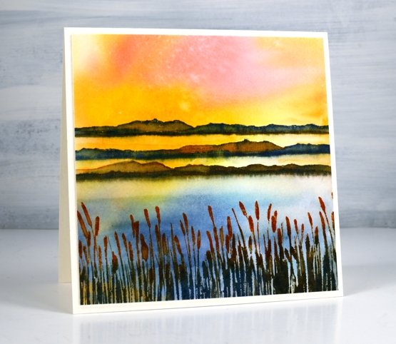
Scenic stamping can be so much fun and working with the new ‘mountain magic’ set from Penny Black is proving to be delightful. Even though the set mentions mountains, in this card I am using the wide hilly stamp to represent island strips in a wetlands environment when the sun is setting and hitting both water and land.
Once again I did the sunset sky first by swiping the watercolour paper through diluted ink. It is not possible to control the result with this method but it is possible to create stunning skies. Take a look at the video below to see the whole process.
I really enjoy working with scenic stamps, especially switching the time of day or time of year with colour choices and arrangement. I also like to look through my scenic and nature stamps in order to add more elements to the scene. I will be doing that with these two simple stamps from the ‘mountain magic’ set.
Hope today’s video inspires to you to swipe a pretty sky and stamp some scenery over the top!
Supplies
(Compensated affiliate links used when possible)
Lakeside Wander
Posted: August 6, 2021 Filed under: Stamped Landscapes, wander | Tags: Fabriano Watercolour Paper, Penny Black stamps, Ranger Distress inks 10 Comments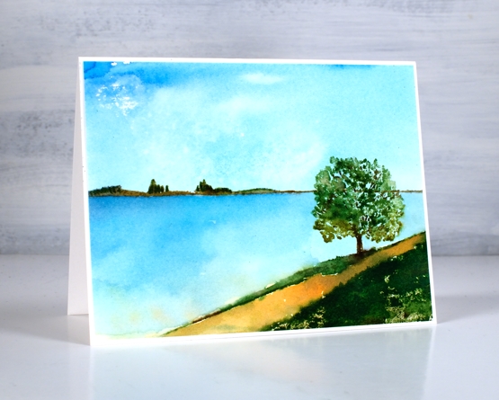
When I receive new scenic stamps from Penny Black I love creating a variety of scenes. I like to change mood and location first with colour and later with the addition of other scenic stamps. Both scenes in today’s post feature only one stamp, the new ‘wander’ cling stamp.
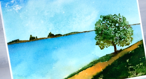
The stamp includes both the distant hills and the foreground with a tree. The space in between can be interpreted by the stamper to include whatever they wish. I have chosen to make it water in both my cards perhaps a river, a lake or ocean inlet.
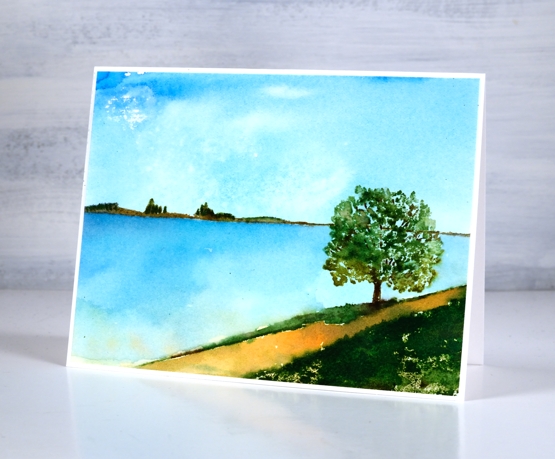
To make both scenes I created a smooshed ink sky first. For the sunny sky and water above I smooshed salty ocean, scattered straw and mowed lawn on my glass mat then swiped the watercolour panel through the diluted ink. For the moodier panel below I smooshed faded jeans, mowed lawn and tea dye to create my background.
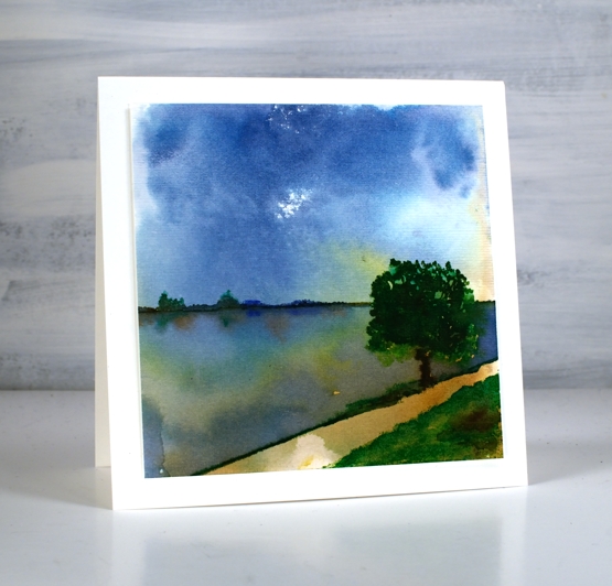
Once the sky dried I stamped the scenic stamp inking it with a mix of distress inkpads and markers. I add colours a bit at a time to build up dimension sometimes spritzing the stamp to move the inks and other times blending the stamped inks with a paint brush
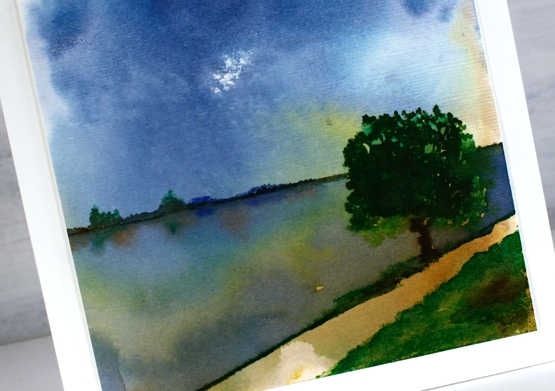
To add reflections to the second scene I painted over the water with hmmm, water so I could drop ink into the wet area below the land and trees.
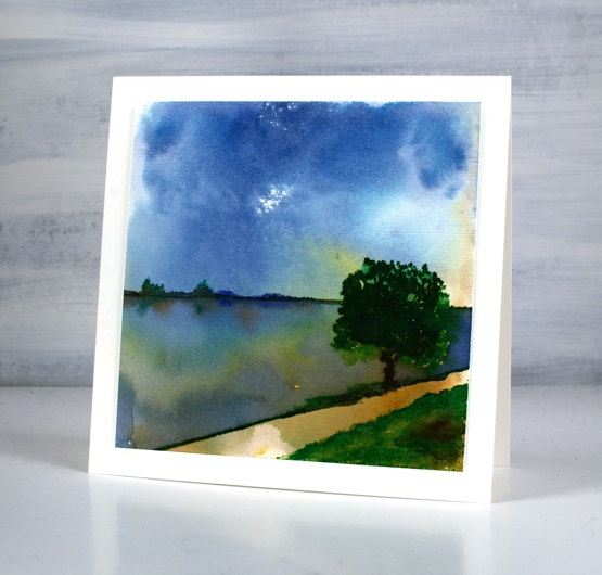
When I had finished the panel above I gave it some texture with the ‘subtle’ embossing folder so it looks like it has a canvas finish. The two cards definitely show different moods, the first being bright and sunny, the second darker but with drama in the water and sky. Which do you prefer?
Supplies
(Compensated affiliate links used when possible)