Winter Gem
Posted: August 22, 2022 Filed under: Dies, Penny Black, winter gem | Tags: Fabriano Watercolour Paper, Penny Black creative dies, Penny Black stamps, Ranger Distress inks 5 Comments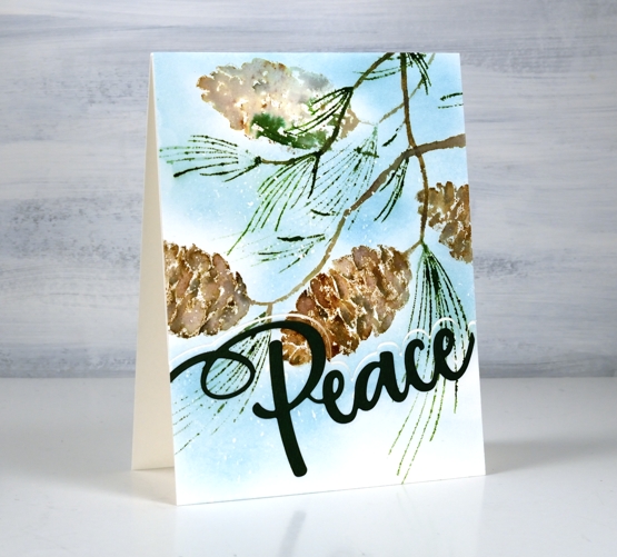
This lovely pinecone stamp is a new one from Penny Black called ‘winter gem’. The stamp has one pinecone plus groups of needles but I stamped it several times to fill my card front. The way I oriented the pine cones makes it look a little breezy with all the needles pointing to the left. I have a large and not very attractive pine tree in my front yard. It drops things all. year. round! There are always needles on the lawn, driveway and flower beds and most of the year there are pinecones too. It isn’t a tidy tree.
The one time the pine tree looks beautiful is after a fresh snowfall when all the snow is balancing on pinecones, needles and branches. For this panel I worked on hot pressed watercolour paper with masking fluid splattered over it before starting. I worked in a stamp positioner and inked the pinecone with three browns. I spritzed the stamp with water before stamping and spritzed again after before stamping a second generation image. I decided to stamp the pinecone a couple more times on the edges of the panel. I used a slightly wet paintbrush to blend the browns on the pinecones and touched up some of the pine needles also with a fine tip paintbrush.
Once the panel dried I blended speckled egg ink around the pinecones. Because there was masking fluid spots all over the panel little white dots of snow appeared after the masking fluid was removed.
Penny Black has come out with a few clever sentiment dies which pair a large word with a one sided outline. I cut the outline from the stamped panel but it looks fresh and snowy if you cut the outline from white cardstock and place it at the base of the your panel. My word is cut from dark green cardstock but looks black; it’s always the way with dark colours in my photos.
(Compensated affiliate links from Foiled Fox, Scrap n Stamp and Ecstasy Crafts)
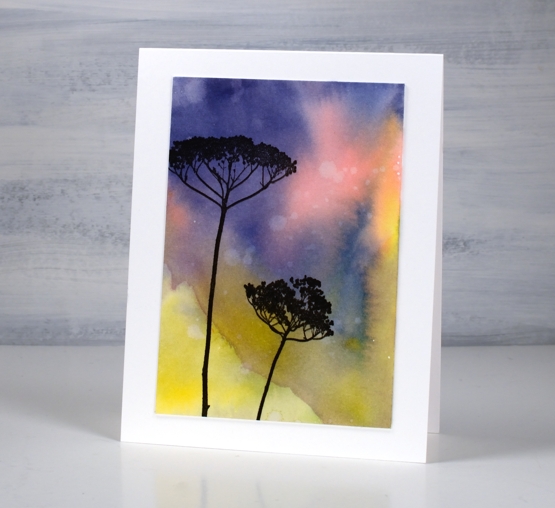
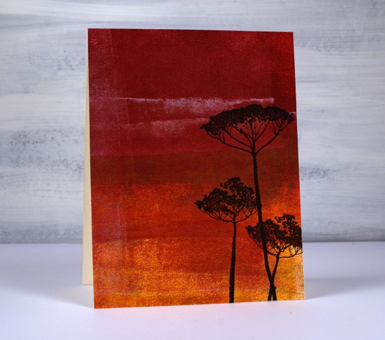
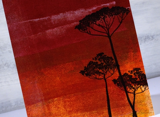
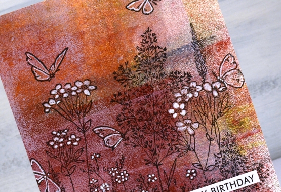
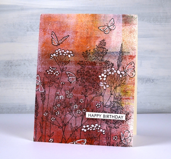
It’s all about the sky
Posted: August 18, 2022 Filed under: Darkroom Door, Wildflowers Vol 1 | Tags: Darkroom Door stamps, Fabriano Watercolour Paper, Ranger Distress inks 6 Comments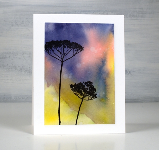
I recently returned to a favourite technique for a couple of card classes. We made a bunch of watercolour backgrounds ready to be turned into cards. This background is one of my favourites. I love the blends and the hint of a sun-kissed hill which just happened as I swiped my watercolour paper panel through smooshed ink.
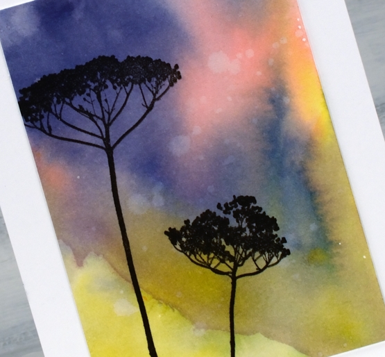
The pale splats are from splattering water onto a distress ink background then dabbing it up with paper towels. The silhouette flowers are once again from the beautiful darkroom door set, wildflowers vol 1. Often I would use a larger panel or even cover the whole card front. I created this background on a larger panel but trimmed it down to use the best part. That’s why I usually work on watercolour panels larger than I need. By the way we have seen some beautiful skies lately, hope you are catching some too.
(Compensated affiliate links from Foiled Fox, Scrap n Stamp and Ecstasy Crafts)
Holly Days
Posted: August 16, 2022 Filed under: Dies, holly-days, jumbo bauble, Penny Black, Spellbinders, stocking stuffers | Tags: Penny Black creative dies, Penny Black stamps 3 Comments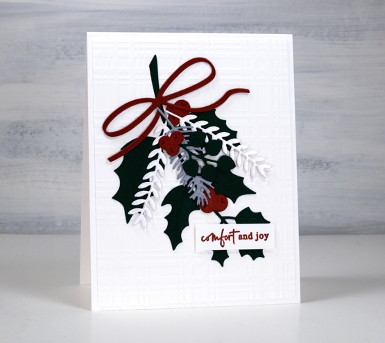
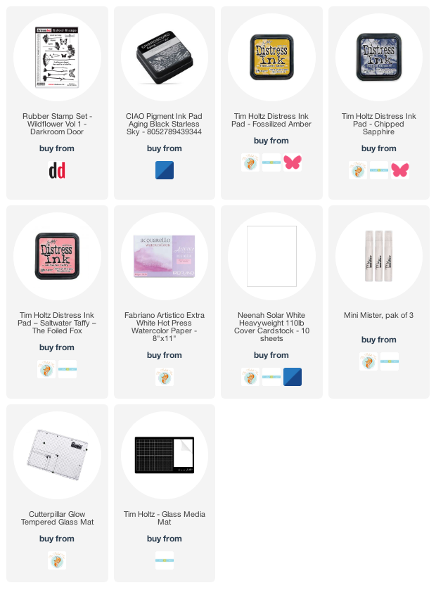
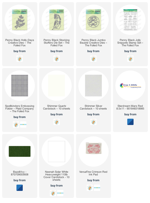
Today’s simple fresh card showcases some new dies from Penny Black. I chose solid colour cardstock, some shimmery, to create this little garland but I know I will use these dies again with gel prints or patterned papers.
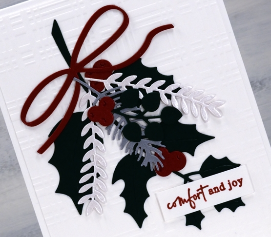
It is a little hard to tell in the photo but I have red shimmer, quartz shimmer and silver shimmer cardstock along with matte green for the leaves. The dies are from three new PB sets, holly-days, stocking stuffers and jumbo bauble. The card design is clean and simple but I added texture to the background with a spellbinders plaid embossing folder.
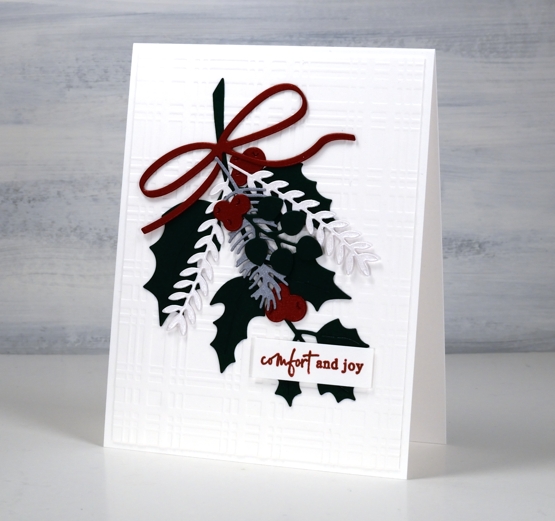
I finished off the card with one of the new little sentiments from the PB ‘jolly sentiments’ set. I think I have mentioned before how much I like little sentiments so a whole new set of them is exciting.
(Compensated affiliate links from Foiled Fox, Scrap n Stamp and Ecstasy Crafts)
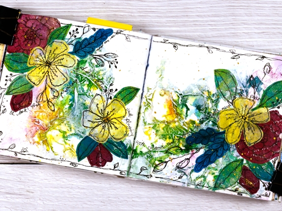
Echinacea Journal Page
Posted: August 11, 2022 Filed under: Art Journal, Finetec paints, gel press, Mixed Media | Tags: Art Journal, collage, Finetec artist mica watercolour paint, gel printing 10 Comments
I have echinacea or cone flowers growing happily in my garden and now happily in my almost finished 6″x 6″ art journal. A friend recently gave me a great big dictionary for cutting up so I ripped out the ‘book’ page and the ‘journal’ page and used them to cover the whole double page spread before I did anything else.

There were a few words I didn’t want covered up so when I was ripping then gluing I took care to keep them exposed. The word ‘boomerang’ appeared so I didn’t cover that one up even though it has nothing to do with this journal page. I am an Aussie after all. ‘Bookish, bookmark, bookshelf, bookworm, book-club and bookend are all visible, some of them highlighted. Somewhere in the gluing I lost the word ‘journal’ but ‘journey’ is still there.
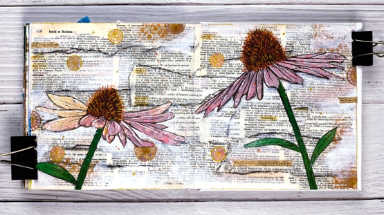
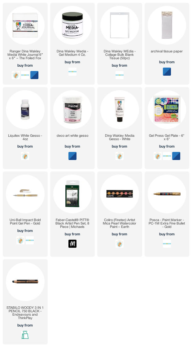
I used a black all pencil to darken the edges of the torn pieces and softened it with water. I also added white gesso over the top to mute the background a bit. I should have done those two steps in the opposite order so the gesso didn’t reactivate the pencil. I blended some tea dye or possibly antique linen ink around the edges and then wished I hadn’t, after all I don’t have to vintagefy everything!
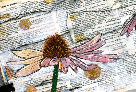
I cut the petals, cone, and green bits from different gel prints using a photo I’d printed out to guide me with the shape. After everything was glued down I used black, white and gold gel pens to add details and metallic paints on the cone details as well. I added white and gold splatter and a mix of washi tape and gel print circles dotted around the the place.
Hope you are surrounded by books and flowers…if you like them as much as I do!
Supplies
(Compensated affiliate links used when purchasing from Foiled Fox, Scrap n Stamp and Ecstasy Crafts)
Amaryllis Bundle
Posted: August 10, 2022 Filed under: amaryllis bundle, Penny Black | Tags: Fabriano Watercolour Paper, Penny Black stamps 3 Comments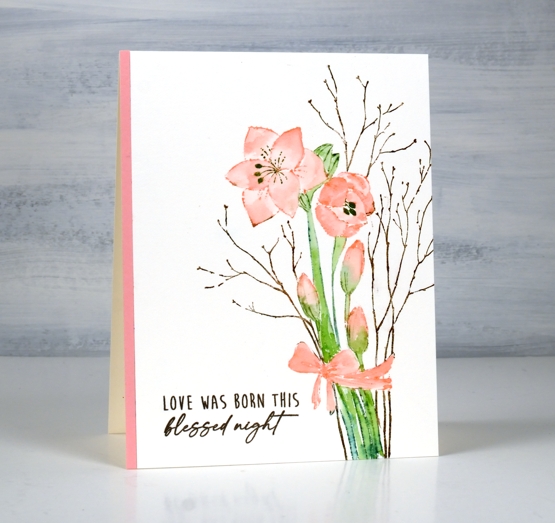
This sweet amaryllis bundle is another new stamp from Penny Black. I kept things simple using the same technique used on the pinecone poetry card.
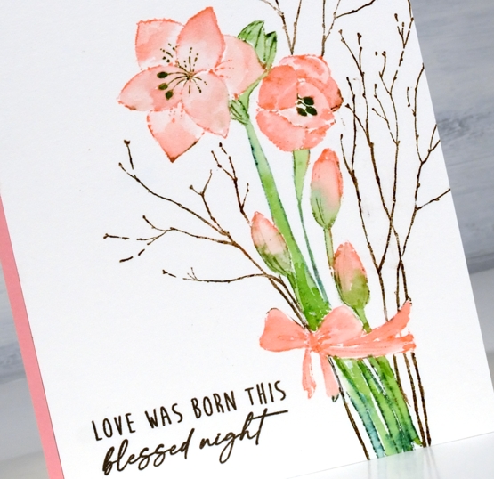
Keeping the stamp and watercolour panel in the stamp positioner I inked the stamp with a mix of distress inks and distress markers to colour the petals, stems and twigs. I worked one colour at a time so I could wipe ink off the stamp where I didn’t want it before stamping. The petals and bow are stamped and painted with saltwater taffy ink. The stems are a mix of mowed lawn and pine needles and the twigs are vintage photo and gathered twigs.
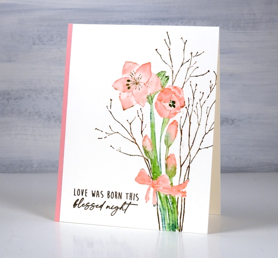
The panel was very clean and bright when I finished it so I decided to balance the amaryllis blooms with a strip of matching cardstock on the other side and stamp the sentiment to match the twigs.
Have you ever grown amaryllis? I have received them as Christmas presents twice and I could not believe how beautiful and big they were when fully open. One appeared to have shimmery petals. One also became too top heavy to hold itself up which was a sad discovery one morning.
Supplies
(Compensated affiliate links used when possible)
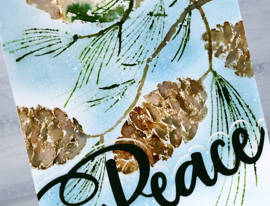
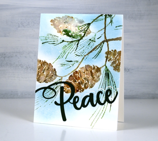
Pinecone Poetry
Posted: August 8, 2022 Filed under: Finetec paints, pinecone poetry | Tags: Finetec artist mica watercolour paint, Penny Black stamps 11 Comments
Yes it’s the height of summer round here so must be time for some Christmas stamping! I am a seasonal stamper as you know but when the first Christmas release comes from Penny Black I try them out straight away. It gets me started on my Christmas cards and shows you the new beauties that are available.

This large stamp is called ‘pinecone poetry’ and I have stamped and painted it with distress inks. The technique is one I have talked about many times and is made easier with the use of a stamp positioner. I worked on hot pressed watercolour paper inking the pine fronds and leaves with a mix of mowed lawn, pine needles and rustic wilderness distress inks. When it was time to paint the leaves I pulled ink from the stamping and picked up smooshed ink from my glass mat.
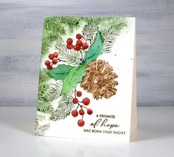
I used the same method for the pine cone inking with three different browns to vary the tones in the finished image. The berries are candied apple (I think) with a second addition of ink to give shadow to each berry. To complete the layout I stamped extra pine fronds and blended some green around the top left corner. I splattered gold paint over the design and added a sentiment in archival vintage photo ink.
Supplies
(Compensated affiliate links used when possible)
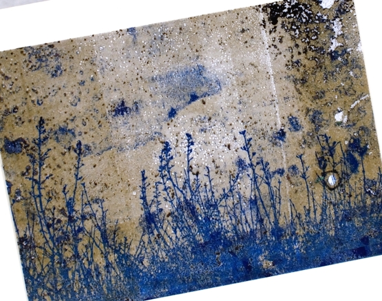
Gardens on gel prints
Posted: August 2, 2022 Filed under: Darkroom Door, fine flowers vol 2, gel press, mesh, Nature Walk, Wildflowers Vol 2 | Tags: Darkroom Door stamps, gel press, gel printing 7 Comments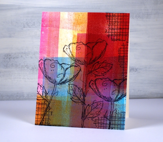
Another gel print post? Yes indeed, and no apologies. If you have tried gel printing you will know it is a little addictive. Today’s post features cards stamped with Darkroom Door flowers. Some are stamped on clean up sheets, others on gel prints. A clean up sheet is thick drawing paper I keep at the right of my gel plate for rolling excess ink off my brayer. As you can see in the panels above and below I can end up with some very colourful sheets.
I stamped flowers from the DD set’ ‘fine flowers vol 2” and the ‘mesh’ texture stamp in Ciao Bella Oceania ink. The ink is a pigment ink which stamps beautifully on gel prints and dries quickly so I don’t end up smudging it.
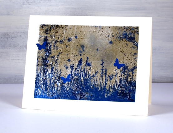
This deep red background is also a clean up panel. I am always excited to see landscapes or skies appear in an abstract print or clean up sheet. Those two strips of white added a hint of clouds to a very bold sunset! I stamped the silhouette flowers from the DD set, wildflowers vol 2.
The last two cards are made from gel printed panels not clean up sheets but are very distressed. The print I pulled and cut up to make a couple of garden cards include plenty of distressed texture from a printing session including a little bit of text.
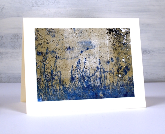
There was some blue in the print so I chose a co-ordinating ink to add the large grassy stamp from the DD ‘nature walk’ set. I’ve said it before it is a favourite set which I reach for again and again. I think I used versafine clair paradise ink.
I was crafting with a friend when I made these two cards and she had a tiny butterfly punch so the card below features a few co-ordinating butterflies. I haven’t seen many butterflies in my garden this year but there have been plenty of bees in the day and fireflies at night.
None of these cards have sentiments on them at this stage, I like to have blank cards on hand to use for any occasion. Thanks for dropping by today; I know it’s been quiet around here lately. I plan to be back soon with more projects and inspiration.
Supplies
(Compensated affiliate links used when possible)
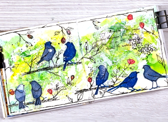
Art Journal variations on a theme
Posted: July 27, 2022 Filed under: Art Journal, Mixed Media, silhouette birds, Tim Holtz | Tags: Art Journal, Mixed Media 7 Comments
The three journals featured in today’s post are getting quite full. One contains only projects completed during my art journal adventure workshops and the other two have a mix of workshop pages and other experiments and explorations. I have enjoyed art journalling for years but in the last twelve months it has captured more of my interest. Possible techniques or layouts continue to pop into my head waiting for a chance to be tried in the newer 6″x 6″ Ranger journals or the 6″x 9″ Fabriano journals I started years ago.
Sometimes I design a page especially with the art journal adventure in mind. Other times I look through the journals and decide to feature a technique, theme or mixed media material. By the time I have tried the page once or twice then completed fresh ones during the workshops I have four or five pages made with the same theme or technique. I am not keen to make the same thing more than once so I am always thinking about different ways to approach each page.
The five spreads featured today started with the one below (featured in more detail in a previous blog post). The technique remained the same for at each workshop, but the shapes, colours and layout varied from one session to the next.
Of course not only are my pages different from each other but every page in the class is unique and I am always inspired by the colour choices, additional elements and different approaches each participant takes. Inspiration abounds. Can you tell I am enjoying myself?
Supplies
(Compensated affiliate links used when possible)
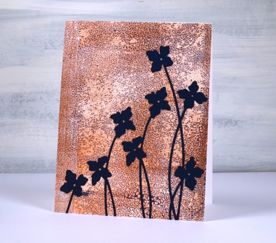
Dancing on gel prints
Posted: July 21, 2022 Filed under: butterfly dance, Dies, Paper Rose, Penny Black, shall we dance | Tags: gel press, gel printing, Penny Black creative dies, Penny Black stamps 8 Comments
I have a couple more cards incorporating gel prints today. This first one is made with a clean up sheet; maybe you can recognise the criss cross of brayer marks on the paper. When I stamped the PB ‘butterfly garden’ stamp over the background it was a bit too delicate to show up well. Highlighting petals and wings with a white gel pen worked to keep the design subtle but still noticeable.
I cut the gel print to fill the card front and added a sentiment from the Paper Rose Studio ‘so extra’ sentiment strips.
The gel print below has a delicate blue pattern over bronze made when the paint separates on the gel plate before you get a chance to take a print. I used a bronze print to pull the blue paint which had separated evenly over the whole plate. You can’t tell from the photo but the bronze has a metallic sheen to it.
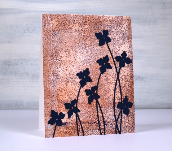
I cut flowers from navy cardstock using the Penny Black ‘shall we dance’ die to complete a card I can use for any occasion.
The Penny Black sale continues at The Foiled Fox so if you have a wish list, take a look.

Supplies
(Compensated affiliate links used when possible)
Die-cut gel print florals
Posted: July 20, 2022 Filed under: gel press, Penny Black, splendid, Taylored Expressions | Tags: gel press, Penny Black creative dies, Penny Black stamps, Taylored Expressions 5 Comments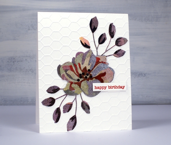
If you are thinking that’s an unusual choice of colours, patterns and textures, you’re right, but it actually makes me quite happy. This is the only layered flower die cut I have of the this type; I don’t generally do layered die cuts. It’s from Penny Black and it appealed to me because of the little buds rather than the complex flower. I know the idea of these dies is to layer in shades of the same colour going from light to dark in the layers. Instead I grabbed one of my gel printing clean up sheets which was covered in black, blue, green, pink, red and purple sections. The texture is from the brayer which I clean off on a thick sheet of paper when I’m gel printing.
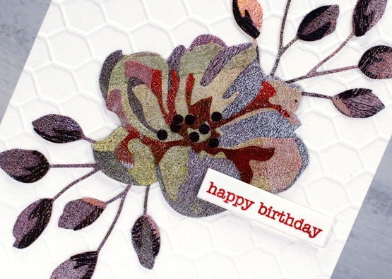
In keeping with the combination of colours and texture I decided to go for an unusual background also and attached the flower and buds to a card-base embossed with the a Taylored Expressions chicken wire pattern. I won’t be surprised if you find it a bit odd but I just can’t help reaching for gel prints and this odd scrappy combo makes me smile. By the way, those little black dots in the centre, I added them myself; they aren’t part of the original die.
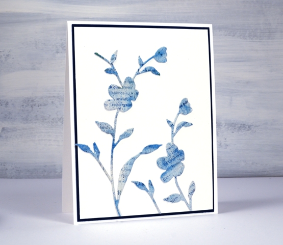
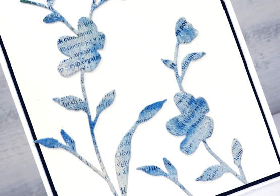
This second card has a bit more elegance. I used the PB ‘whisper’ die to cut flowers from a gel printed text transfer. The text is from a recipe page in a magazine so you might be able to pick out the word cinnamon if you look closely. The dark mat looks black but is actually dark blue to co-ordinate with the gel print. I’ve used the same die to cut both blooms but used only a portion on the right hand side.
Do you use layered dies? Do you blend the cardstock with inks or pick co-ordinating cardstock? Or perhaps you go for random colour combos like I did!
By the way, Foiled Fox is having a Penny Black sale, so pop over and have a browse.
Supplies
(Compensated affiliate links used when possible)