
Unfolding
Posted: April 22, 2019 Filed under: trees in bud, Unfolding | Tags: Penny Black stamps, Ranger Distress inks, Tsukineko Versafine inks 15 Comments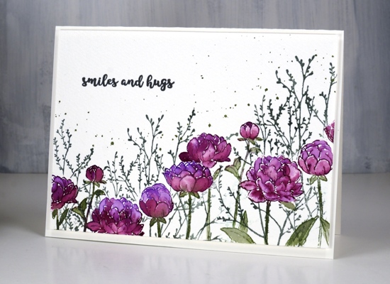
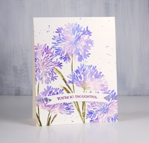
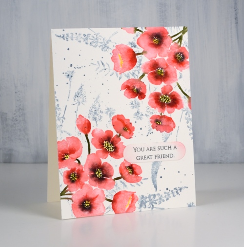
Like many card makers I have numerous boards on Pinterest filled with inspiration for future art and cards. I opened one such board yesterday looking for inspiration and decided to have all my flowers and foliage along the top of the card hanging down, then empty space below. I did all the painting with the flowers upside down but when I had finished it didn’t make sense to have the flowers upside down at all so here they are right side up.
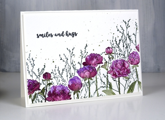
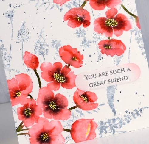
Working on cold pressed watercolour paper I stamped the PB ‘unfolding’ stamp twice which involved masking a flower head in the middle of the panel so I could overlap the flowers. I inked the flowers with wilted violet and seedless preserves distress inks and the stems in bundled sage then blended all the stamping with a little water and a small paintbrush. I wanted extra colour in the petals so I pressed all three stamp pads on my glass mat so I could pick up ink for painting.
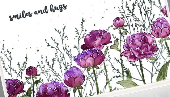
Once I had painted all the flowers I realised I would need a mask for each one so I could stamp background foliage. It didn’t take too much time to stamp and cut masks of the flower heads, I didn’t worry about masking the leaves. The foliage is PB ‘trees in bud’ stamped in iced spruce distress ink and the splatter is bundled sage. To finish the card I add a sentiment from the handy PB set, ‘banner sentiments’ in versafine clair morning mist and popped up the whole panel on foam over a hot pressed watercolour paper card base. Sometimes I want a frame around a panel but nothing as bold as a coloured mat would be so I pop the panel up creating what I call a ‘shadow frame’ simply because the small distance between panel and card base casts a subtle shadow.
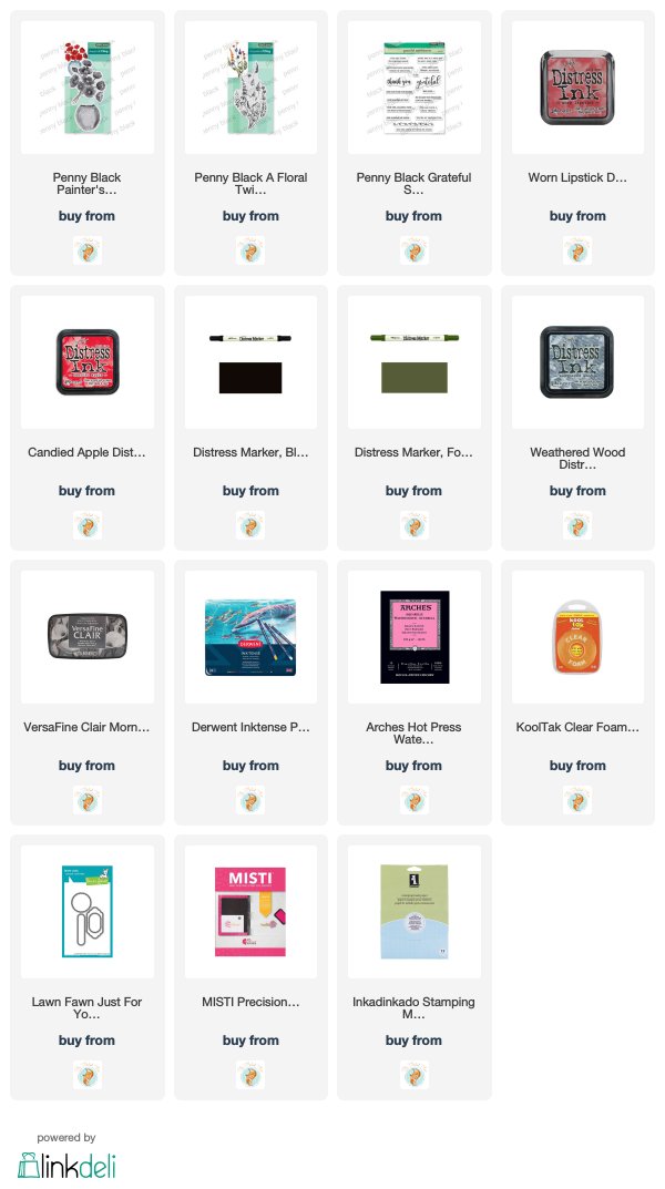
Supplies
https://linkdeli.com/widget.js?1552642647875
Dotty thanks
Posted: April 12, 2019 Filed under: big thanks, dots and hearts, dotted fill in | Tags: Concord & 9th, Ranger Distress inks, Tsukineko Versafine inks 5 Comments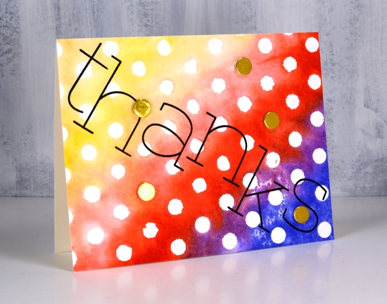
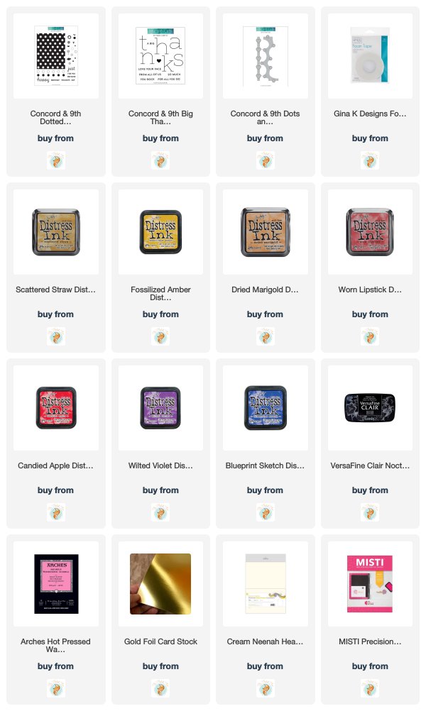
Polka dots are make happy patterns in my opinion. Add rainbow colours and it’s a double happy. I created this simple card with the Concord & 9th ‘dotted fill-in stamp set’. I inked the background stamp with a rainbow of distress inks, spritzed the stamp with water to blend the overlapping colours a little then stamped on watercolour paper.
I thought a bold black sentiment would stand out so I arranged the letters from the C&9 ‘big thanks’ set across the panel and stamped in versafine clair nocturne ink. The only embellishments are little gold circles die cut with the ‘dots and hearts’ die from gold foiled cardstock and popped up over a few of the polkadots.
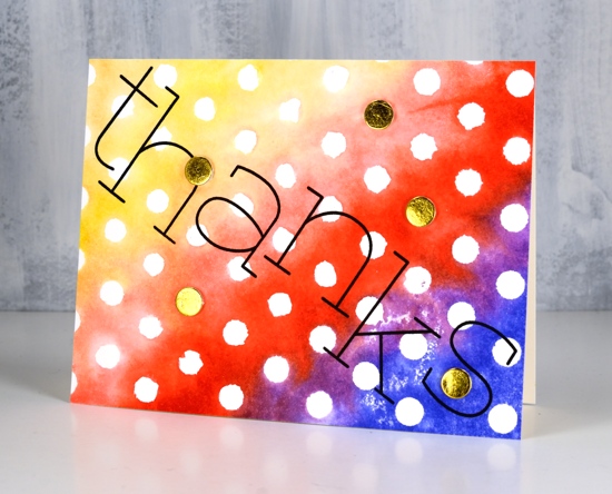
So simple. So dotty. So happy.
Supplies
Gelli butterflies and blossoms
Posted: April 10, 2019 Filed under: Alexandra Renke, cherry blossom, gelli plate, monarch, Script | Tags: gelli plate, Penny Black creative dies, Penny Black stamps, Tsukineko Versafine inks 3 Comments
Thank you for all your lovely comments about my recent art journal page. I’m glad you enjoyed it. I have a couple more pages in process in my journals which I look forward to showing you in the future. I would love to hear from other art journallers. What are some of your favourite mediums and techniques?
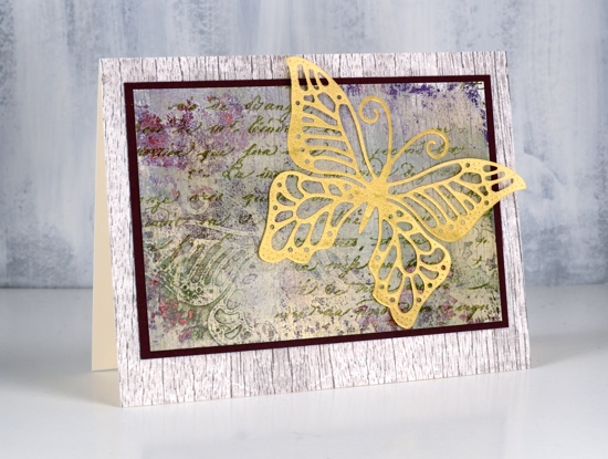
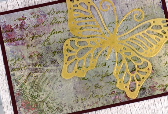
Today’s cards are made with my latest fave: the gelli plate! I am very much a beginner but learning as I go and watching the myriad of techniques shared on the Gelli Arts youtube channel. The panels in today’s cards were made by printing layer after layer while rearranging die cut paper butterflies and blossoms on top of each new layer of paint. The dies are Penny Black ‘monarch’ and cherry blossom’.
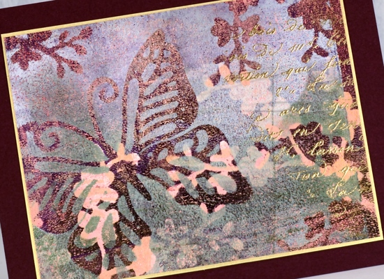
I wont’ try to describe my process because I don’t remember exactly what my order was or what paint colours I used. I know there was green, white, burgandy, gold and pink liquitex basic acrylics but there could have been more. Like many artistic techniques success with a layered gelli print can be knowing when to stop. Once I was happy with the one above I still had paint and pattern showing on the gelli plate so I added one more layer of paint then pulled a ghost print (I’m learning the lingo!) on patterned paper. The paper I chose was a woodgrain print from Alexandra Renke.
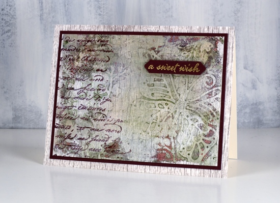
You can see the woodgrain print through the paint and pattern. I ended up matting both panels in burgandy cardstock then attaching them to a base panel of the same AR woodgrain paper.
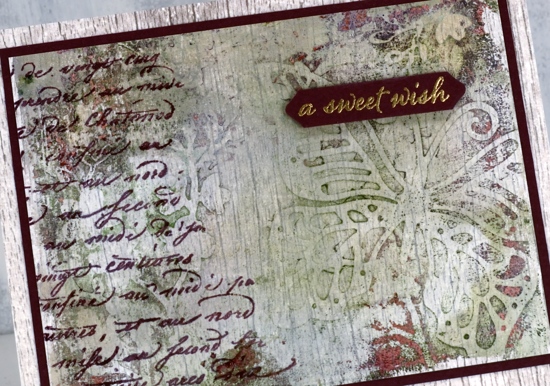
It’s always hard to capture shimmer on camera but all three panels have gold shimmer on them so I added some gold accents to each one. On the top panel I stamped the PB script stamp, embossed in gold powder and matted the panel with gold cardstock. On the card above I added a gold embossed sentiment from the PB set happy snippets and stamped the same script stamp in chianti versafine clair. On the card below I stamped the script stamp in shady lane versafine clair ink and added a gold vellum die cut butterfly, the same butterfly used as a mask in the gel printing process.
I love all the texture from the gelli printing process, the paint which builds up after several layers of printing adds so much interest
I did another butterfly and blossom print in a different colour scheme but I’ll share that another day. Thanks for dropping in.
.
Butterfly Garden
Posted: April 3, 2019 Filed under: butterfly garden, Penny Black, Tagged | Tags: Peerless Transparent Watercolors, Penny Black creative dies, Penny Black stamps, Ranger Distress inks, Tsukineko Versafine inks 3 Comments
Butterfly garden is a new transparent set from Penny Black with a nice mix of butterflies, leaves and flowers. I chose to watercolour the butterflies first then mask them before adding background foliage. I stamped the top butterfly in shabby shutters distress ink, the middle in broken china and the bottom one in dusty concord on hot pressed watercolour paper.
I used peerless watercolours to fill each butterfly with colour starting with a light green then blending to darker greens to fill the wings. I then added green first to the middle butterfly and blended into blue and a little bit of purple. The last one I blended from blue to purple. I stamped them again on masking paper, cut them out and covered the watercolouring before stamping leaves all over the panel in morning mist versafine clair ink. As I wanted to fill the panel with lots of stamping I used acrylic blocks so I could easily turn the stamps around to fit them in all the spaces. I drew little dots in grey marker to fill the background even more.
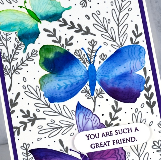
To finish the card I matted with purple cardstock, stamped a sentiment from the PB grateful sentiments set in monarch versafine clair, die cut it and popped it up with Gina K’s dimensional tape which adds just a little height without being too bulky.
Supplies
Blue & blue
Posted: February 25, 2019 Filed under: Penny Black, radiant, together | Tags: Penny Black creative dies, Penny Black stamps, Ranger Distress stains, Tsukineko Versafine inks 7 Comments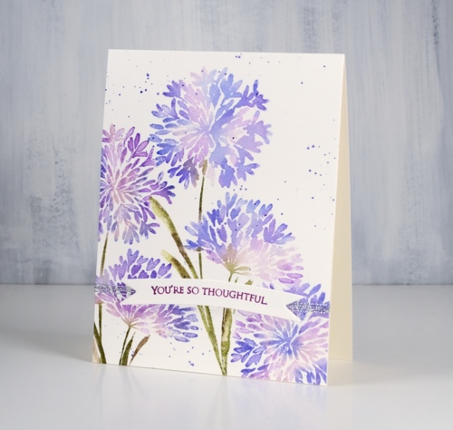
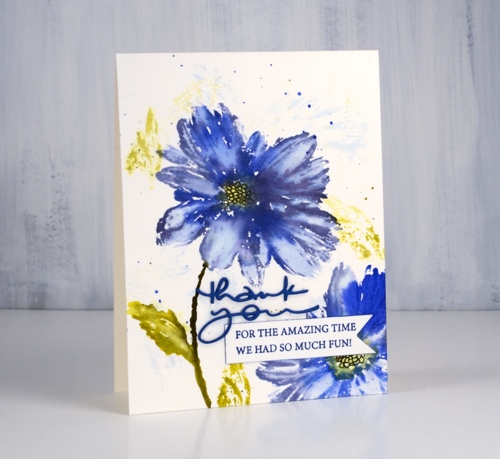
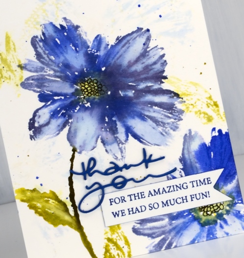
Blue flowers might just be my favourite, so of course I chose blue for some of the new flower stamps from Penny Black. My first card features the ‘Together‘ stamp which is lovely and reminds me of the agapanthus my parents often grew in their flower gardens.
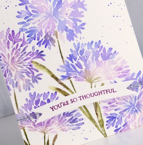
Both of today’s cards were made with distress stains either painted on or applied straight from the dauber.
I start by painting the lightest stain onto the stamp then stamping. I clean the stamp and add another colour and stamp again. To protect a detailed area like a flower centre I wipe the ink off the stamp in that spot so I can use ink or marker later. When the image has all been stamped I blend petals and leaves with a paint brush and water. For both blue floral cards I splattered some stain over the panel to complete the design then stamped a sentiment on a banner in a co-ordinating colored ink. Both sentiments are from the delightful new ‘grateful sentiments‘ set
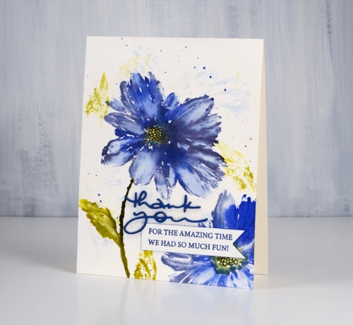
This large blue flower stamp is called ‘Radiant‘. For this card I started by wetting the watercolor panel so when I stamped on it with milled lavender and crushed olive distress inks I would get a diluted abstract print. I dried the panel before putting it in the stamp positioner to work on the bold print. For the bold stamping I used shaded lilac, blueprint sketch, dusty concord, crushed olive and scattered straw stains. Once the stain was dry I drew the centre of the flower with a black marker.
People often ask me if distress re-inkers can be used to create the same effects as the stains. I don’t own any re-inkers so I can’t tell you. I think it is probably time I got a few and did some comparisons. Stay tuned.
I am trialing a new supply linking system right now which looks and operates a little differently from what I was using. If you click on any of the supplies pictured below you will be taken to a complete list image where another click will take you to the Foiled Fox store. Buying through my affiliate links to the Foiled Fox store does not cost you any extra but earns me a commission. Please let me know if you have any thoughts or concerns with the new system. It is a trial and I am interested to know what you think.
Thanks for dropping by today.
Supplies
Floral corners
Posted: February 22, 2019 Filed under: a floral twist, painter's vase, Penny Black | Tags: Penny Black stamps, Ranger Distress inks, Tsukineko Versafine inks 10 Comments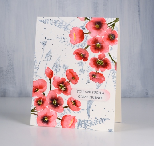
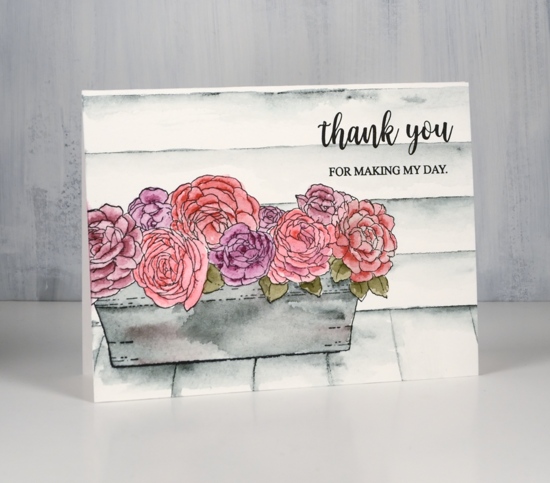
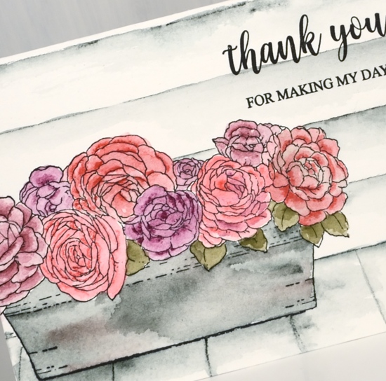
Today’s card features two new brushstroke stamps from Penny Black. The pink flowers in two corners of my panel are from a vase + flowers set called ‘painter’s vase’. I just used the flower stamp but there is a vase stamp I’ll use another day.
I used my stamp positioning tool (MISTI) and placed the flower stamp overlapping one corner of the hot pressed watercolour panel. I stamped the whole image in worn lipstick distress ink knowing the forest moss ink would be bold enough to cover the pink later. Without moving stamp or panel I inked centres and edges of the flowers with candied apple distress ink, stamped then blended the two pinks with water. I then added black soot ink to the flower centres, stamped and let the panel dry. I coloured in the flower centres with a sun yellow inktense pencil and shaded some of the flower centres and edges with poppy red. Then I flipped the panel 180° and repeated the whole process.
To add a background I had to mask the flowers so I stamped them on masking paper, cut them out and covered my completed corners while I stamped ‘a floral twist‘ stamp in weathered wood distress ink and added a few splatters too. All that was left was to add a sentiment; I decided on something small from ‘grateful sentiments’ on a little die cut label with the edges sponged in worn lipstick ink.
Thanks for dropping by today; it is great to be blogging with a bit of regularity again.
Supplies
Rose garden
Posted: February 21, 2019 Filed under: Inktense pencils, Penny Black, rose garden | Tags: Inktense, Penny Black stamps, Tsukineko Versafine inks 7 Comments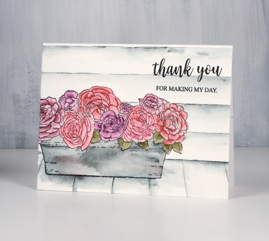
I am hanging out on the Foiled Fox blog today with some new Penny Black floral loveliness along with some new to me inktensity!
I have been trying out some inktense pencils lately. Friends have raved about them and Shauna from the Foiled Fox loves them and kindly sent me some to try. Inktense pencils and blocks are permanent once dry so it is possible to blend then add another layer without diluting the first layer. Some watercolours are not permanent so they blend with subsequent layers applied. I was happy to see how easy it is to ‘paint’ with these pencils.
Supplies
Home through the birches
Posted: January 2, 2019 Filed under: birches, Spread Cheer | Tags: Penny Black stamps, Ranger Distress stains, Tsukineko Versafine inks 11 Comments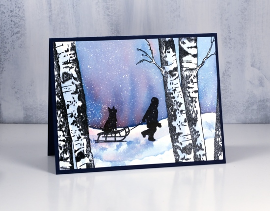
I really enjoy creating winter scenes and today’s card features stamps that lend themselves very well to scenic stamping. I used the PB ‘birches’ stamp and the boy from an older PB set, ‘spread cheer’. I began by embossing the large birch stamps on either side of a panel of hot pressed watercolour paper in versafine clair nocturne ink and clear powder. Next I splattered masking fluid over the panel to later look like snow.
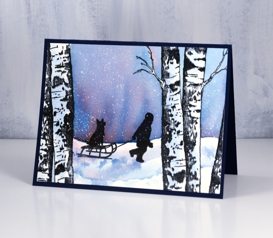
I painted water across the panel from left to right skipping the tree trunks, added distress stains, faded jeans and barn door, then blended the colours to create a winter sky. I painted some diluted blue stain on the tree trunks for a bit of shadow then let everything dry. I stamped the boy and his dog in nocturne inks several times to get a very solid black image over the embossing and stain that was already on the panel. After the black ink dried I painted some shadow with the same stains used for the sky.
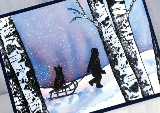
Once all the ink was dry I removed the masking fluid to reveal all the little dots of snow. I trimmed the panel to fit on a navy card base (although it looks black in the photos) and will add a white insert for writing my message inside.
Supplies
Stamps: birches, spread cheer (all PB)


Inks: nocturne versafine clair,

Stains: faded jeans, barn door


Paper: hot pressed watercolour paper, navy cardstock

Also: embossing powder, masking fluid, MISTI
![]()


Crisp or misty
Posted: December 12, 2018 Filed under: majestic mountains, pine cones | Tags: Darkroom Door stamps, Ranger Distress stains, Tsukineko Memento inks, Tsukineko Versafine inks 11 Comments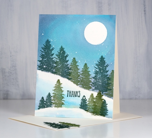
I pulled out the wonderful new trees from Darkroom Door’s ‘majestic mountains’ set to create today’s cards. I wanted to create two forest scenes, one on a crisp cold night, the other on a misty day. There are some similarities in the techniques and inks as well as differences which enabled me to create both looks. I began both times with cold pressed watercolour paper splattered with masking fluid. I like to have a few circles cut from frisket film on hand to mask a moon so I positioned one in the top right corner then tore a post-it note and positioned it diagonally across the panel. I stamped the two larger trees in versafine clair inks along the edge of the post-it mask so the trunks did not show and used one green for the largest tree and another green for the smaller.
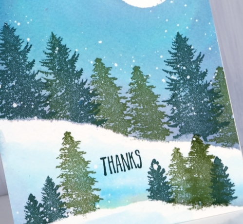
Next I removed the post-it mask and painted water along the lower edge of the stamping and upwards to fill the sky. Then while the paper was wet I added weathered wood, faded jeans and old paper distress stains to fill the sky. Once I had the sky blended I used the post-it mask again as an edge to stamp more trees including one of the smaller ones from the ‘majestic mountains’ set. Again after removing the post-it mask I painted water and blended some of the three stains into the water to create shadows behind the trees and snowbanks. To finish it off I dried the panel, removed the frisket film and masking fluid then added a sentiment from the DD ‘pine cones’ set.
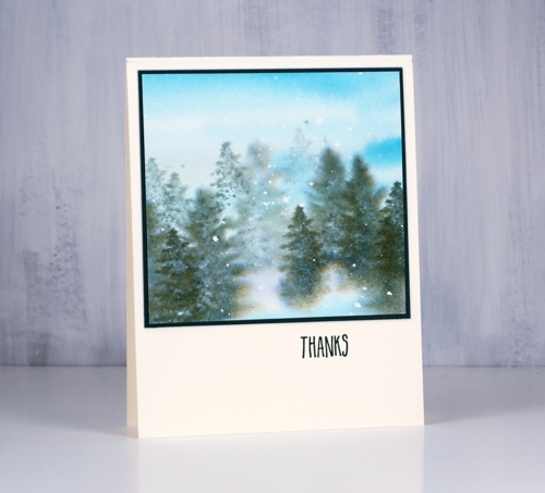
Although the colours and stamps are very similar I worked very much ‘wet into wet’ to create the second card. I painted water and diluted stain over most of the panel adding stripes of faded jeans, weathered wood and old paper. While it was wet I stamped the trees repeatedly with memento northern pine ink making first and second generation impressions to get dark foreground and lighter background images. Each time I inked the stamp I wiped ink off the trunk so it would not stamp, that way the trees all looked like they were in deep snow.
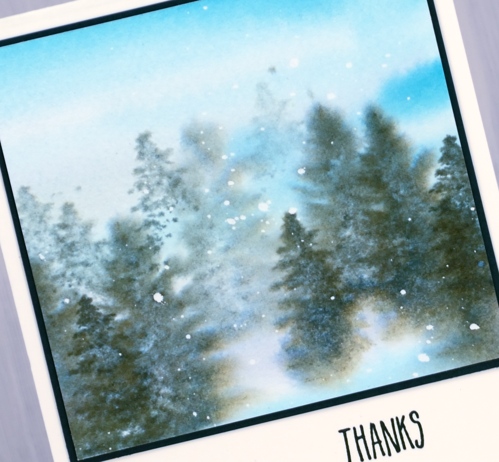
Believe it or not both panels started out the same size but a blot here and a mistake there meant this second one underwent some downsizing.
You might have noticed a stamped envelope in the first photo. I am going to try hard to stamp an envelope and my name on the back of the card as soon as I complete it. I have never been good at this but it makes a lot of sense to do it!
Supplies
Stamps:majestic mountains, pine cones (Darkroom Door)


Inks: northern pine memento, shady lane & rain forest versafine clair


Stains: faded jeans, weathered wood, old paper


Paper: cold pressed watercolour paper, neenah natural white, dark green


Also: masking fluid, glass mat

Pretty Paper Neighbourhood & a Wreath
Posted: November 16, 2018 Filed under: Alexandra Renke, neighbourhood border, starry night, whirl wreath | Tags: Alexandra Renke cardstock, Penny Black creative dies, Penny Black stamps, Ranger Distress inks, Tsukineko Versafine inks 6 Comments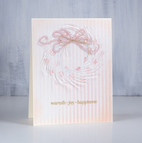
It’s all soft and subtle on the blog today. I have two projects featuring the beautiful Alexandra Renke cardstock the Foiled Fox recently started carrying in their store. The weight of the cardstock is somewhere between a good quality printer paper and a piece of cardstock. There is definitely enough weight to die cut nicely.
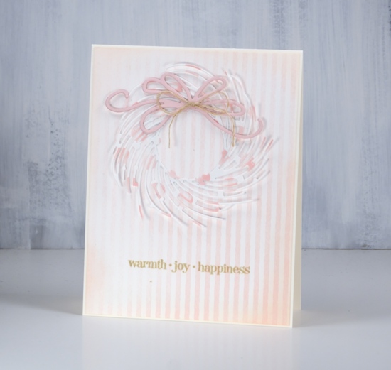
I chose the elegant ‘whirl wreath’ by Penny Black and cut one out of ‘pink dots’ cardstock. I attached it around the centre circle with adhesive but left the branches unattached ( so I will be careful putting it in a envelope) The background is ‘rose stripes’ which matches the pink dots perfectly. I cut the bow out of a piece of cardstock from my stash and layered a few together to give it some extra weight. I blended around the edge of the striped panel with tattered rose distress ink and attached everything to a cream cardbase.
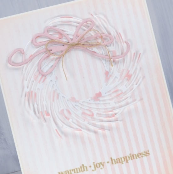
I chose to add a natural twine bow to the die cut bow then had to co-ordinate the sentiment with antique linen distress ink.
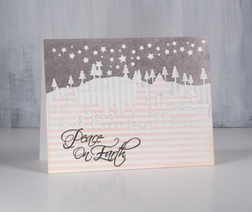
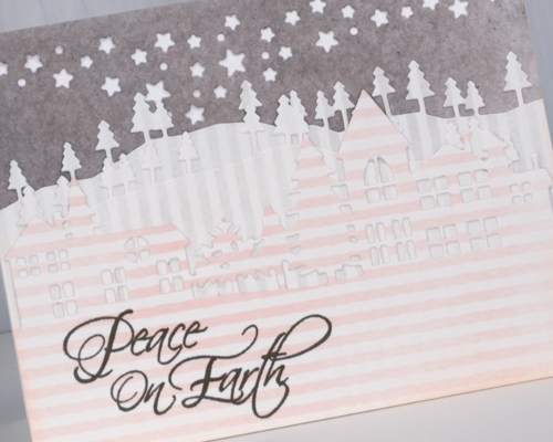
For my little neighbourhood card I use three patterns of Alexandra Renke cardstock, the rose stripes, gray stripes and medium mud watercolour. I know it is hard to see the details of the die cuts in my photo but in real life the pink striped neighbourhood is clear against two lines of gray striped trees in front of a gray mud starry sky.
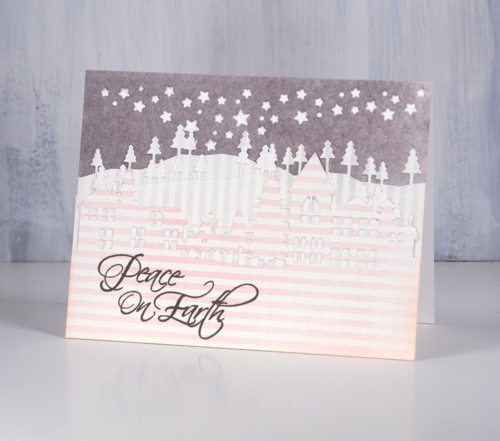
I have been wanting to try a white on white layered die cut scene and I probably still will but chose to try it with these pretty papers first. The neighbourhood is layered over two layers of trees cut with the ‘trees and hills’ dies which are layered over a gray piece cut with the starry sky night die attached directly to a white card base.
I featured some of the subtle colours and patterns from Alexandra Renke today but I do have some bold patterns and solids to share another day.
Have a great weekend.
Supplies
Stamps: Christmas sentiments, winter days (PB)


Dies: whirl wreath, neighbourhood border, starry night die, trees & hills die set (PB)


Cardstock: Alexandra Renke medium mud watercolor, gray stripes, rose stripes & Neenah solar white, cream, pink


Inks: tattered rose, antique linen distress ink, smokey gray versafine ink


Also: hemp twine


