
Unfolding
Posted: April 22, 2019 Filed under: trees in bud, Unfolding | Tags: Penny Black stamps, Ranger Distress inks, Tsukineko Versafine inks 15 Comments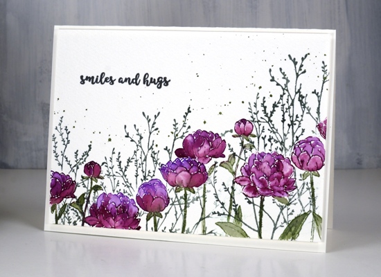
Like many card makers I have numerous boards on Pinterest filled with inspiration for future art and cards. I opened one such board yesterday looking for inspiration and decided to have all my flowers and foliage along the top of the card hanging down, then empty space below. I did all the painting with the flowers upside down but when I had finished it didn’t make sense to have the flowers upside down at all so here they are right side up.
Working on cold pressed watercolour paper I stamped the PB ‘unfolding’ stamp twice which involved masking a flower head in the middle of the panel so I could overlap the flowers. I inked the flowers with wilted violet and seedless preserves distress inks and the stems in bundled sage then blended all the stamping with a little water and a small paintbrush. I wanted extra colour in the petals so I pressed all three stamp pads on my glass mat so I could pick up ink for painting.
Once I had painted all the flowers I realised I would need a mask for each one so I could stamp background foliage. It didn’t take too much time to stamp and cut masks of the flower heads, I didn’t worry about masking the leaves. The foliage is PB ‘trees in bud’ stamped in iced spruce distress ink and the splatter is bundled sage. To finish the card I add a sentiment from the handy PB set, ‘banner sentiments’ in versafine clair morning mist and popped up the whole panel on foam over a hot pressed watercolour paper card base. Sometimes I want a frame around a panel but nothing as bold as a coloured mat would be so I pop the panel up creating what I call a ‘shadow frame’ simply because the small distance between panel and card base casts a subtle shadow.
Supplies
https://linkdeli.com/widget.js?1552642647875


I love the colours you have used Heather, they work beautifully together with the pretty flowers and foliage. A gorgeous card. x
Absolutely gorgeous and lovely card!
Very pretty. I like them right side up also. Can’t find what you used for the background flower though. Edna
Thanks, yes they would have looked odd hanging upside down. The background foliage is from Penny Black, a stamp called ‘trees in bud’
The white spaces on the petals adds so much and makes the petals more defined. Also the “shadow frame” technique is brilliant! It is just the right way to frame a card front that I have been working on!! Thanks bunches.
Beautifully done! I have the stamp but not sure I have the patience to cut a mask for each of the buds in order to do the background foliage. Love your card!
I feel the same about fussy cutting but it didn’t take me too long to cut the flowers, they are basically circles!
Gorgeous card Heather!!! Can’t imagine doing your painting upside down…the painting…not you – will have to give that a try – LOL! Sounds like FUN, especially when you turned it right side up and liked it so much!
Paper Hugs,
Jan
Very pretty. Love the colors. Was surprised you said cold pressed, as you usually use hot press? I am new to watercoloring, so I am curious how you choose which one to use?
Happy Easter,
Shirley
Hi Shirley, you’re right I usually choose hot pressed watercolour paper but if I am using a stamping tool like the misti I know I can get a complete image even on cold pressed paper because I have the luxury of stamping the image more than once if necessary. Sometimes I just pull out a piece of cold pressed for a change and if it doesn’t work I will try again with hot pressed. For this design I knew I would be painting in all the petals so either cold or hot would work.
Oh, my, heather, these flowers are so pretty in the purples! I love how the branches in the background give such warmth to your garden. Definitely worth all the fussy cutting for masks! Thanks for always sharing the details of how you did the card. You are such a good teacher and friend.
Oh so pretty. Love your colours too.
Perhaps doing it upside down was the right inspiration in some subtle way because the end result, “right side up,” is so lovely. Everything about it is perfect. Maybe it is an approach to try for all sorts of designs.
This is a charming card Heather. Beautiful in its simplicity. You were right about it not needing a coloured mat.
This card looks lovely with the foliage background. You are gifted, Heather 🙂