Iris Elegance
Posted: March 28, 2022 Filed under: Brusho, iris elegance, Penny Black | Tags: Brusho, Fabriano Watercolour Paper, Penny Black stamps, Ranger Distress inks 14 Comments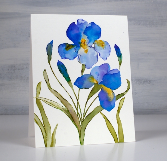
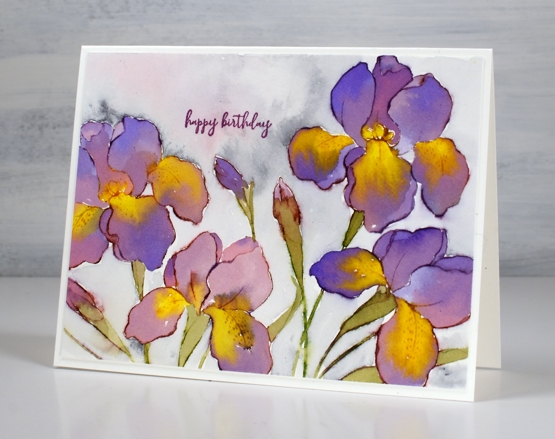
This is the second iris card I’ve painted but it probably won’t be the last. Iris Elegance from Penny Black is such a bold beautiful stamp.
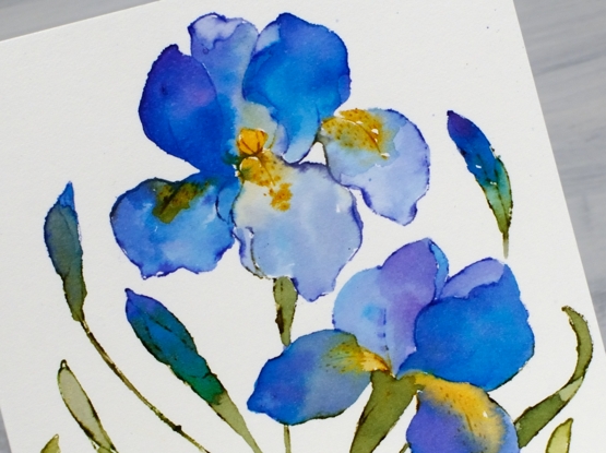
I worked on hot press watercolour paper in a stamp positioner to stamp the outline stamp in chipped sapphire, peeled paint and wild honey distress inks. I blended ink into the petals from the stamped outline but also used brusho paints to fill the petals with blends of colour. I had violet, ultramarine and moss green brusho mixed in a palette beside me so I could dip my brush and add paint to the petals.
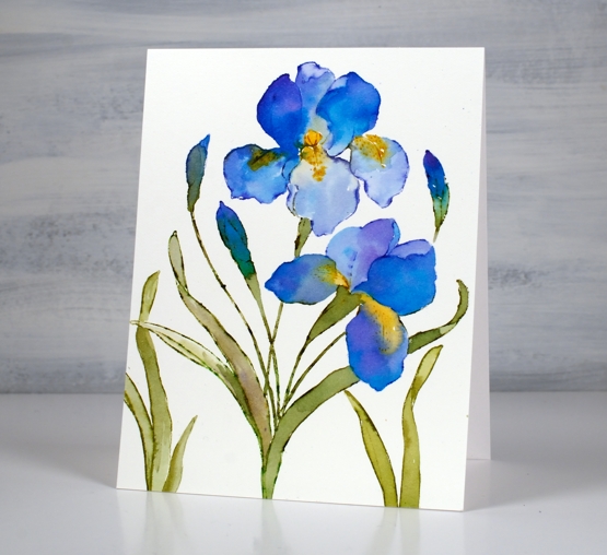
To fill out the design I stamped just leaves to the left and the right of the main image. Let me know if you have irises blooming already or suggest some petal colours to me. The yard is covered in snow again here so the irises best keep on sleeping for now!
Supplies
(Compensated affiliate links used when possible)
Irises
Posted: March 21, 2022 Filed under: Brusho, how sweet, iris elegance, Penny Black | Tags: Brusho, Fabriano Watercolour Paper, Penny Black stamps, Ranger Distress inks 8 Comments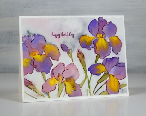
The new ‘iris elegance’ stamp from Penny Black is a delight to work with. The design is large so there is plenty of space in the petals for pretty watercolour blends. I inked the stamp with distress inks then blended the stamped ink with water to fill the flowers using some co-ordinating colours of brusho for extra depth and variation. I have been flipping back and forth between hot and cold pressed watercolour paper lately; this one is hot pressed.
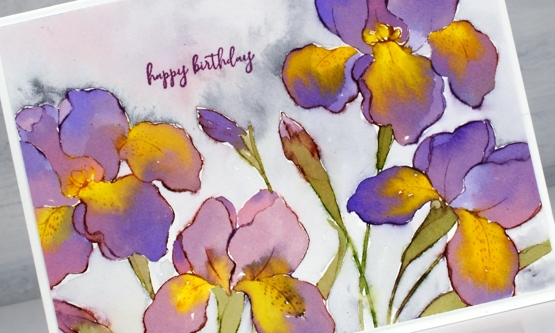
I have purple irises that come up in my garden each year but they don’t have the yellow centres I’ve featured on these ones. Yellow tends to be a pigment that pushes other pigments away which worked well on the petals. I painted the purples and then while the paint was still wet added yellow paint which spread and pushed the purple without making too much brown.
I don’t always add background but I did this time by painting water around the flowers then adding some Payne’s grey paint and a little diluted purple. Once again I chose the sweet little birthday stamp from the new ‘how sweet’ stamp set. Speaking of backgrounds, thank you so much to everyone who left me a message saying nothing more was needed on the recent poppy card. I am so encouraged by you, my kind and generous readers!
The warm weather and rain of the last few days has melted quite a lot of snow and now I see some green tips emerging. I have also spied a cardinal and a blue jay on the feeder. Spring is definitely in the air.
Supplies
(Compensated affiliate links used when possible)
Farm Fresh Lavender
Posted: March 15, 2022 Filed under: Background Stamps, Brick wall, Brusho, farm fresh, Penny Black | Tags: Brusho, Fabriano Watercolour Paper, Penny Black stamps, Ranger Distress inks 7 Comments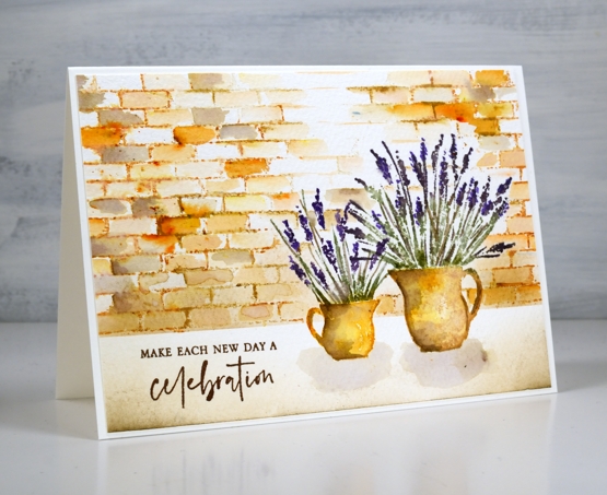
I am hoping I can fill a couple of jugs with lavender this summer. A couple of years back a friend split her lavender and gave me two plants which were coming along well last year and I hope will be even stronger and more full this year. When I have flowers in the garden I am always torn when deciding whether to cut them and bring some inside or just enjoy them outside where they will probably last longer.
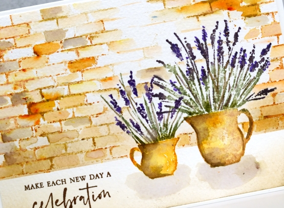
To create this little scene I used two stamps from the new Penny Black ‘farm fresh’ set and the ‘brick wall’ background stamp. I worked in a stamp positioner to create this panel. I stamped the jugs first with wild honey and tea dye distress inks. After blending the ink with water I added shadow with walnut stain ink. I used both bundled sage and rustic wilderness for the stems and a mix of milled lavender (of course) and dusty concord for the flowers.
Because I had done the jugs first I stamped and cut little masks from post-it notes to make it easier to stamp a brick wall behind them. I used tea dye to stamp the brick wall then started blending the tea dye ink to fill the bricks. I sprinkled a very small amount of sandstone brusho over the wall and started blending it in random bricks. This resulted in the warm orange bricks you see. I also added walnut stain ink to a few bricks for a darker look.
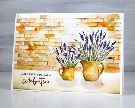
I blended antique linen and walnut ink in the foreground and painted pale shadows below the jugs. The card is finished with a sentiment from the new PB ‘love big’ stamp set.
Just in case you wondered at me thinking about cutting flowers from my garden, I’m just dreaming; it is definitely still covered in snow!
Supplies
(Compensated affiliate links used when possible)

New Penny Black Florals
Posted: March 8, 2022 Filed under: letter background, modesty, Penny Black, sweet sprouts | Tags: Fabriano Watercolour Paper, Penny Black stamps, Ranger Distress inks 8 Comments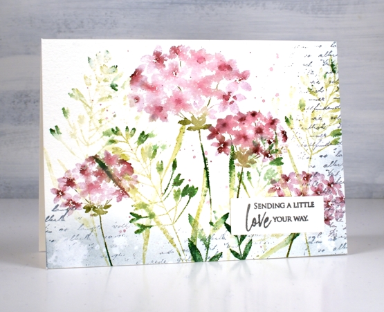
It snowed all day yesterday but spring arrived anyway in a package from Penny Black! I have a nice little stack of PB florals to share with you in the days to come and I should manage a video or two as well.
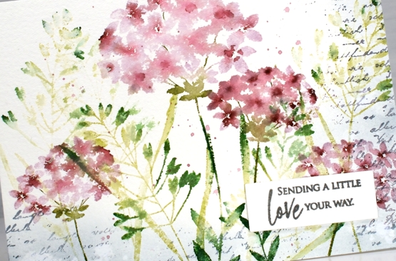
This first card features four stamps from the new Springtime release. Those of you who have been PB fans for years might notice a re-release among them. I stamped the large and small flowers from the ‘modesty’ set over foliage from the ‘sweet sprouts’ set; both sets include two large cling stamps. I used milled lavender and aged mahogany distress inks for the flowers and a mix of three distress greens for the leaves and stems. All the supplies are linked below.
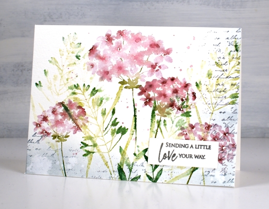
The washy blended look in the petals was achieved by spritzing the stamp before stamping along with some paint brush blending afterwards. I stamped a border of script in weathered wood with the ‘letter background stamp’ and blended the same ink around the edges. I splattered water for some watermarks and a mix of the milled lavender and aged mahogany around the flowers.
The card is 6¼”x 4½” on cold pressed watercolour paper finished with a sentiment from the new ‘love big’ set. I love the snowy cards as you are aware but I am definitely excited to be stamping florals again!
Supplies
(Compensated affiliate links used when possible)
Wintertide Blue
Posted: December 30, 2021 Filed under: Penny Black, wintertide | Tags: Fabriano Watercolour Paper, Penny Black stamps, Ranger Distress inks, sennelier watercolours 10 Comments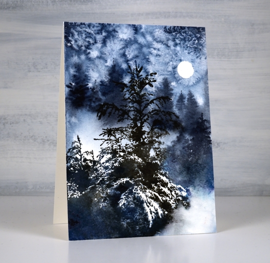
This beautiful ‘wintertide’ stamp from Penny Black is a scene in itself and the first time I stamped with it I didn’t add to it at all. This time I painted extra trees in the background for a bit more depth and atmosphere.
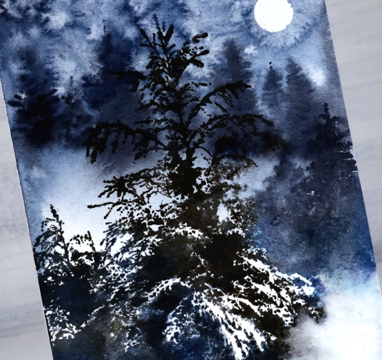
I began by punching a little circle mask from masking tape and placing it on the hot pressed watercolour panel. I wet the panel then painted a mix of dark blues and grey paint over some areas, leaving a few white patches. While the paint was wet I painted trees in the background which ended up with soft edges because I was working wet into wet. I sprinkled salt over the sky area and let the paint dry.
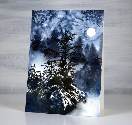
Once the paint dried I removed the salt and used a stamp positioner to stamp the ‘wintertide’ image in black soot and faded jeans ink. The little trees to the right of the feature tree were too small in comparison to the painted background trees so I painted taller trees over the top. I did a little blending of ink here and there but the stamp is so detailed with its branches and white space I tried not to fiddle with it too much. This will be the last post for 2021, I look forward to sharing projects, ideas and conversation with you here on the blog in 2022. Happy New Year!
Supplies
(Compensated affiliate links used when possible)
Vintage Candlelight
Posted: December 21, 2021 Filed under: candlelight, Footnotes, Karin brushmarkers, Penny Black | Tags: Fabriano Watercolour Paper, Karin brushmarkers, Penny Black stamps, Ranger Distress inks 5 Comments
It has been a while since I created a vintage style card but the pretty ‘candlelight’ stamp from Penny Black has worked well for this technique. I embossed the image on hot pressed watercolour paper in gold powder then used Karin brush markers to paint the candles and foliage before switching to distress inks for the background.
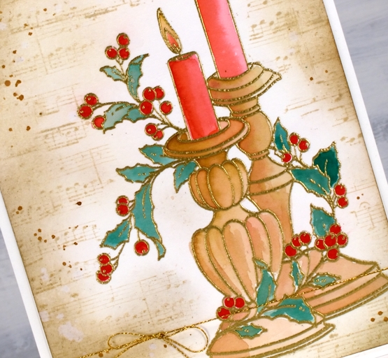
It probably wont surprise you that I used a limited palette for the colouring. I used a mix of red-209 and magenta red-170 to paint the candles, a mix of rosewood-272 and magenta red for the candle sticks, a mix of rosewood and lush green-228 for the leaves and straight red for the berries.
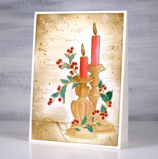
As usual I had not planned my background before I started but the colours on the candlesticks already looked vintage so I blended antique linen around the edges of the panel first then blended right up to the stamping. I stamped the music stamp from the PB set ‘footnotes’ in vintage photo then added more blending and splatter with the same ink. The stamp is tall so the card is A6 (4½” x 6¼”).
As the days are so short right now I am enjoying lighting candles and sometimes the fire. Hope things are cosy where you are.
Supplies
(Compensated affiliate links used when possible)

Quick inky sky
Posted: November 24, 2021 Filed under: gorgeous grove, Penny Black | Tags: Fabriano Watercolour Paper, Penny Black stamps, Ranger Distress inks 7 Comments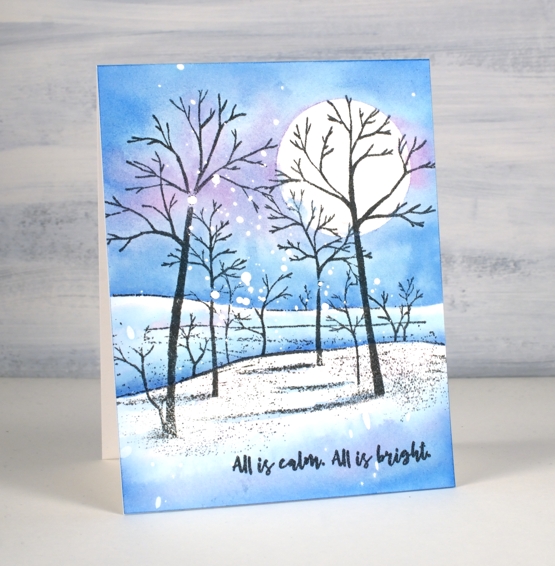
I’ve made many of these snowy scenes over the years but this was one of the quickest because the scene is all in one stamp. I already had a piece of hot pressed watercolour paper splattered with masking fluid, so that also cut out some time.
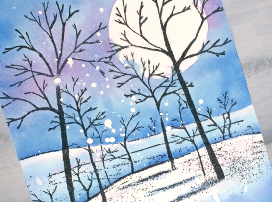
I stamped the PB ‘gorgeous grove’ stamp in versafine clair morning mist ink which I think I like better than black when the sky is not very dark. After stamping I added a frisket film circle mask which I did not seal perfectly but that’s ok; there’s a bit of cloud cover creeping over the moon.
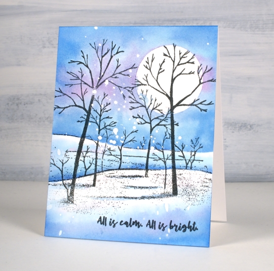
I didn’t want to spend too much time choosing colours so I just pulled out three of the newest distress inks. I’m still experimenting with the new colours so I started by painting salvaged patina around the moon then blending it with water to fill the top half of the panel above the horizon. Next I added prize ribbon ink just about everywhere and then some dabs of kitsch flamingo. I would not normally use these three colours together but it worked as distress blends often do. Once the sky was painted I dried the panel before using the same inks to paint shadows in the foreground and behind the snowy hill. The words are from PB ‘Christmas sentiments’ set stamped in morning mist to match the trees.
By the way I have a little sale going on over at my online classes site. If you use the code HTNOV you can get a 25% discount on the Floral Faves class, Winter Wonder class and the Colour Clues class.
Supplies
(Compensated affiliate links used when possible)
Let Heaven and Nature Sing
Posted: November 19, 2021 Filed under: CAS, nature sings, Penny Black | Tags: Faber-Castell Albrecht Durer Watercolour pencils, Fabriano Watercolour Paper, Penny Black stamps, Ranger Distress inks 9 Comments
This sweet bird is one of four in the Penny Black set ‘Nature Sings’. It is my plan to make a similar card with all four birds. I returned to a very clean and simple style for this one utilising some masking, blending and watercolour.
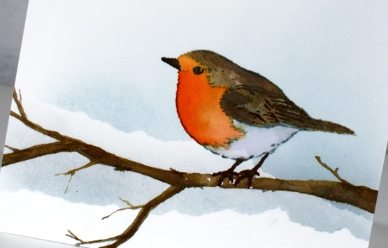
I worked on hot pressed watercolour paper because I knew I would watercolour the bird. Before stamping I tore a post-it note mask and lay it across the panel then blended speckled egg ink above it. I stamped the bird in soft stone papertrey ink then watercoloured with a few distress inks. The colours are listed below. The bird was floating in mid air so I drew a branch with a watercolour pencil then painted it with distress inks so he would have somewhere to perch. At this point I added a second area of masked blending to the background.

To finish off I stamped one of the sentiments from the same set in fallen leaves versafine clair ink. It just so happens that the CAS Christmas Card challenge this month is Christmas Critters so I am in!

Supplies
(Compensated affiliate links used when possible)
Carmine – No Line Watercolour Video
Posted: November 16, 2021 Filed under: carmine, Penny Black, sennelier watercolours, Tutorial | Tags: distress markers, Fabriano Watercolour Paper, Papertrey ink, Penny Black stamps, sennelier watercolours, Tsukineko Versafine inks, Tutorial, video 9 Comments
I hope you enjoy today’s no-line watercolour video. When I first saw this stamp I knew it would be perfect for the technique. There are a few little petals but most of the image is made up of open leaves and petals which are easy to see while painting. I used soft stone ink for the initial image on cold press watercolour paper and Sennelier watercolour paints for all the painting.
If you don’t always have a plan for the background you will see how I added one after all the painting was done. Take a look at the video below to see my process.
This is such a pretty stamp and might get inked up again soon to keep my stock of Christmas cards growing. I think it would look good embossed in white on a coloured background. Stay tuned!
Supplies
(Compensated affiliate links used when possible)
Festive Fragrance
Posted: November 10, 2021 Filed under: festive fragrance | Tags: Fabriano Watercolour Paper, Penny Black stamps, Ranger Distress inks 8 Comments
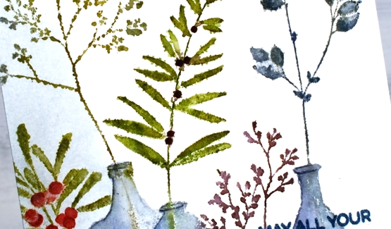
Isn’t this ‘festive fragrance‘ a pretty stamp? I know it is part of the PB Christmas release but it looks like an all-year-rounder to me. Just switching the colours around could make it quite springy or even autumnal. That’s the kind of stamp I like.
I chose to work with muted greens and blues plus a couple of berry colours. I inked with distress inks and markers plus a couple of Staedtler brush markers. I heard recently the sad news that distress markers are being discontinued so I am looking at my other markers to see which ones I might switch to when my distress markers can give no more. I think more than anything it is the colours of the distress markers that make me happy. Often when you buy a set of markers such as a 12 or 18 set many of the colours are bold rather than muted. There is a basic orange, red, yellow, light blue, dark blue, etc. You don’t find any stormy skies or picked raspberries!
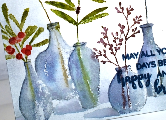
Anyway enough about that; I will keep you posted on my discoveries and choices. I used the mix of colours listed in the supplies below to ink all the foliage and used both faded jeans and weathered wood for the vases. The stamp was brand new when I inked it and I didn’t do any conditioning (such as wiping it or sanding it) so the ink beaded in a few places giving me a patchy look. I inked and stamped again for all but that tall bit of foliage. That one on the left I kept patchy as I liked the lacey look.
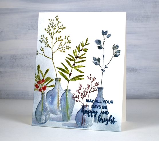
Once I had stamped and blended all the leaves and vases, I wanted to ground the collection somehow so I used a blending brush to add weathered wood ink to the base and side of the panel. I then painted shadows next to the vases with faded jeans ink. I finished the design off with a sentiment from the PB ‘happy & bright’ set knowing I would have to choose a bolder, darker ink so it would show up over the stamped vases. It is not as distinct as I would like but when the recipient looks at it up close it will be fine.
I hope you have had a chance to view the short video about my new class, ‘Wreaths – Stamped & Painted‘. Registration is open, a couple of lessons are already published and all the content will be accessible tomorrow. It is full of simple but pretty wreath designs, some very festive, others more rustic. I have included some technique lessons to show how I paint leaves and filler elements too so you can design with stamps plus your own unique touches. The giveaway is still open on my previous post where you have a chance to win a spot in the class. Make sure you pop back there and tell me how your Christmas card making is going. I see some of you have finished, some are barely started and some don’t go down that path. I think I am over half way with mine, largely because I created many wreath cards in preparation for the class!

One more bit of exciting news before I go. I am back on CRAFT ROULETTE this Friday as the guest crafter. Join me if you can on YouTube and drop a hello in the chat.
Supplies
(Compensated affiliate links used when possible)