Blushing blooms
Posted: September 16, 2019 Filed under: blushing, blushing cut out, Peerless watercolours, Penny Black | Tags: Peerless Transparent Watercolors, Penny Black creative dies, Penny Black stamps 10 Comments
I have coloured this lovely flower a few times lately but I realised I hadn’t posted it all on my blog. I did some no-line colouring with the stamp which took a while due to the number of petals, but still produced a nice result which I’ll share at the end of this post. This weekend I decided to emboss the flower instead and paint it with peerless watercolours. I must say this technique was faster and less fiddly than the no-line petal by petal approach. I embossed two of them and painted them side by side with the same three paint colours. Peerless paint blends beautifully on the paper, in this case hot pressed watercolour paper, and I was able to add royal crimson over the top of flesh tint and vice versa until I was happy with the coverage and blending. The leaves were painted in olive green. I think I’ve mentioned before how much I love the quality, depth and blending of peerless watercolours.
I used the co-ordinating die to cut out both flowers then arranged them on top of a ‘snowfall/speckles’ embossing folder background. I snipped a few of the leaves off and rearranged them to balance the composition. I also glued some pieces directly to the background and popped other pieces up on dimensional foam. The sentiment is from the grateful sentiments set and is embossed and popped up also. Because my orange/pinkish combo is opposite green on the colour wheel this card is a match for the current CAS watercolour challenge, a challenge I love but rarely get my act together to enter!
Here is a similar design I completed as part of my no-line watercolour class. I stamped in antique linen distress ink and used a selection of distress inks as ‘paint’. The sentiment is from a clever Taylored Expressions stamp and die combo.

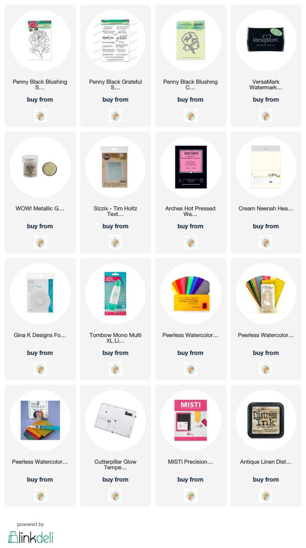
Supplies
Autumn wreaths
Posted: September 13, 2019 Filed under: A Pocket Full, all natural, golden delight, Penny Black | Tags: Penny Black creative dies, Penny Black stamps, Ranger Distress inks, Tsukineko Versafine inks 10 Comments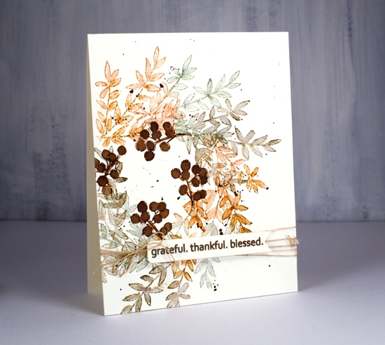
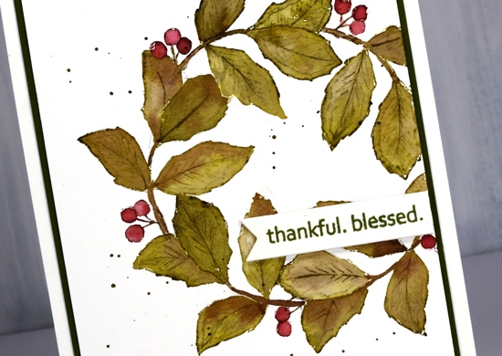
Much as I hate to admit it, things are beginning to feel distinctly autumnal. I don’t have any autumn wreaths to hang at home but if I did I think I would like one a bit like this, soft colours and delicate leaves.
I worked in my stamp positioner to create this panel on hot pressed watercolour paper but I think you could easily do it with the stamp on an acrylic block, it might even be faster. I started by tracing a circle on my panel with a pencil. Using the circle as I guide I positioned the branch stamp from Penny Black’s new ‘All Natural’ set so the base stems were on the circle. I inked with rusty hinge, stamped, moved the stamp around the circle a little, stamped in bundled sage, moved it again, stamped in frayed burlap and then repeated until I was all the way around the circle. I used a small watercolour brush to blend inside the leaves adding extra ink when necessary. I love the combination of colours; frayed burlap is new to my collection and I like the way it gets along with the other two inks. Once the blended ink was dry I stamped just a section of the berry stamp around the centre of the wreath in gathered twigs distress ink then blended it to fill the berries.
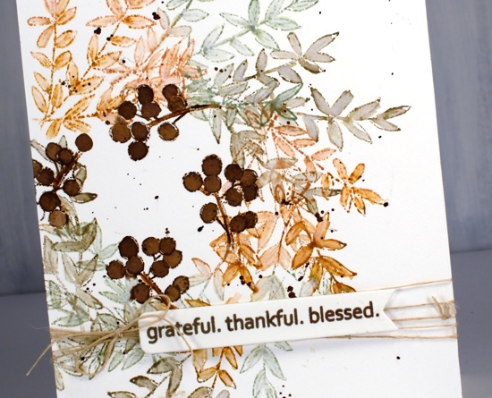
I used the same sentiment for both cards, it’s from another new and cute PB set called ‘golden delight’. I stamped both times on a little tag from the PB ‘a pocket full’ die set. To finish off the card I wrapped some twine around the panel, added a bow and popped the tag on top.
For the second card I grabbed another stamp from all natural and used the same process but needed a leaf mask cut from post-it note a couple of times where the leaves would have stamped over previous ones. This little stamp has both leaves and berries as well as a curved stem which just happened to conveniently match the curve of my traced circle. I used the same technique of blending the leaves and berries after stamping with forest moss and aged mahogany distress inks.
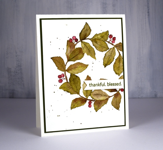
Both cards requested the splatter treatment and the second card wanted a olive green mat as well.
Hope the days are warm and sunny where you are.
Supplies
Gerberas
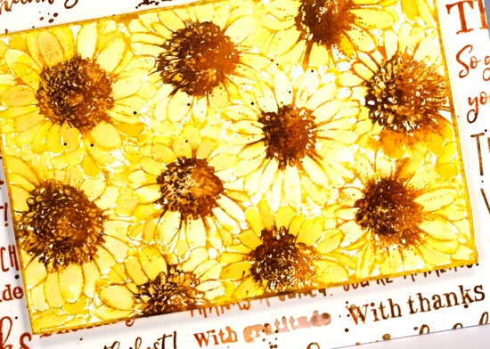
Posted: September 11, 2019 Filed under: Darkroom Door, gerberas, mesh | Tags: Darkroom Door stamps, Kuretake Zig clean color real brush markers, Ranger Distress inks 3 Comments
This pretty bunch of gerberas is one of the newest stamps from Darkroom Door. I would have shown it to you sooner but it arrived from Australia two days after I left to go to Australia! The inspiration for this colour scheme once again came from a simple web search. A photo popped up with pink, red, apricot and orange gerberas massed together. So that’s what I did.
I stamped in black ink and embossed in clear powder on hot pressed watercolour paper then used zig clean color real brush markers for colouring. I started each flower by colouring around the centre with the marker then blended out the colour with a brush and water. I was able to add more with the markers as needed. To give the flowers even more pizaazz I gave them all a layer of clear wink of stella. (the red and pink ones then got a coat of micro glaze because I kept touching them and getting pink and red stains on things that were not meant to be pink or red!) I wanted to mount the flowers on a background but didn’t want it to fight with the focal panel. The DD mesh stamp worked beautifully and reminds me of the decorative mesh that is sometimes wrapped around cut flowers.

I stamped a sentiment from the large DD ‘thank you’ set and threaded some sparkly black thread through the tag and round the panel. A friend gave me a stash of metallic threads recently and they are coming in handy for a little subtle sparkle.
For the second card I went with a more country style look. All the gerberas feature the same fossilized amber, vintage photo and rusty hinge colour scheme with the two brown inks used also to create a background. I stamped the whole gerbera stamp in fossilized amber distress ink first then inked the centres in rusty hinge. I blended each petal with water and did the same with the centres then inked one side of the flower centres in vintage photo to add some dimension.
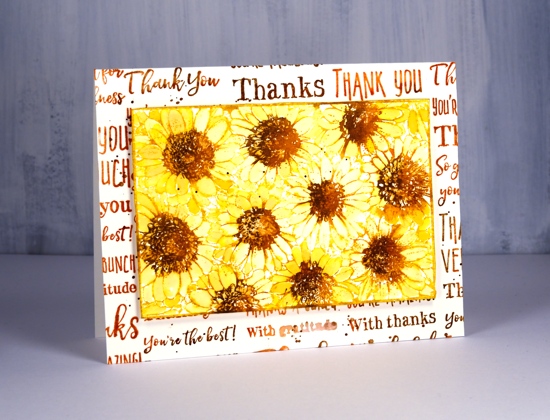
I tried a woodgrain background but it was too dark. By choosing to stamp the ‘thank you’ sentiment strip several times more of the cream background showed through. I inked the sentiment strip in vintage photo and rusty hinge distress inks and spritzed it lightly before each print. The result was blended and sometimes smudgy words. I gave both the flower panel and the background the splatter treatment then popped the gerberas up on a foam rectangle.
Gerberas are pretty classy flowers I think, they always seem to stand out in a bouquet.
Supplies
Waratahs
Posted: September 9, 2019 Filed under: Paper Rose, thanks a bunch | Tags: Paper Rose 15 Comments
Some of you will be familiar with the flower featured on this card. It’s the Australian waratah, state flower of New South Wales. When I was in NSW recently I visited ‘Alice in Paperland‘ in Port Macquarie and picked up this beauty. Due to my recent class I’m still on a no-line watercolour kick so that’s the method I chose for the stamp’s first inking. The set is called ‘Thanks a bunch’ and includes this large stamp, the sentiment I used and some little ones. I stamped in antique linen distress ink, kept the stamp and hot pressed watercolour panel in my stamp positioner then searched the interwebs for photos of waratahs. Even though I found plenty of bold red ones I chose a slightly more muted colour scheme and painted it with diluted aged mahogany ink. As usual I smooshed the aged mahogany ink pad on my glass mat so I could dilute the ink easily and pick it up with a paint brush. I worked petal by petal which took a while but I mixed up the process by switching to leaves while petals dried and also taking snack breaks.
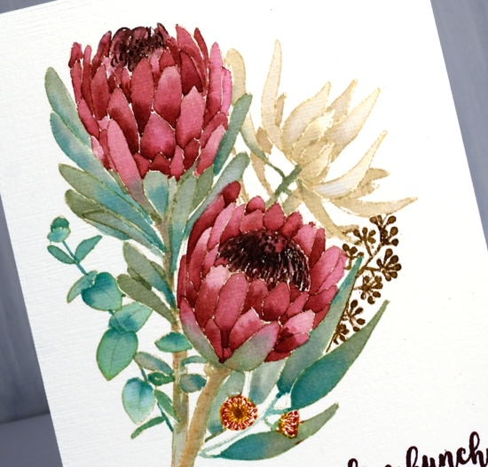
I wanted the bluey greens of eucalyptus leaves so I used shabby shutters ink mixed with evergreen bough for one branch of leaves then bundled sage plus evergreen bough for the others. The remaining flower I painted in antique linen. For the stems I used the same greens and added some tea dye ink for a brown tinge. I used markers to ink the tiny gum blossoms and gumnuts, gathered twigs, festive berries and wild honey. Because I kept the stamp and panel in the positioner I was able to ink the centre of the waratahs with an aged mahogany marker which helped retain the fine detail. I think I accidentally inked the centre with gathered twigs once also, oops!
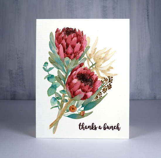
For the sentiment I used stazon claret because it matched the flowers so well. You might be able to see the texture on the finished panel; I achieved that look with the clever ‘subtle’ embossing folder by sizzix for Stampin’ Up.
This is the first card I’ve made with Paper Rose stamps but I do have a couple more of their stamps waiting in the wings.
Supplies

Filling in the florals
Posted: September 6, 2019 Filed under: big thanks, filled in florals, fine line florals, simple serif alphabet, simple serif alphabet dies | Tags: Concord & 9th, Ranger Distress inks 3 Comments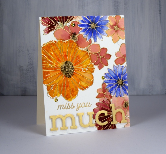
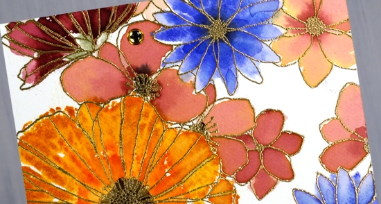
I’ve been playing with Concord & 9th’s co-ordinating stamp sets ‘filled in florals’ and ‘fine line florals’. For this first card I stamped the large ‘fine line floral’ stamp twice in versamark then embossed in gold powder. To fill in the flowers I switched to the ‘filled in florals’ stamps. I inked the large flower in wild honey ink then added abandoned coral ink around the centre. I spritzed the stamp then pressed it over the matching embossed flower. Because I had spritzed before stamping I got a nice blend of colours which loosely filled the outline. I repeated this step with the blue flowers (blueprint sketch) and burgandy flowers (aged mahogany) I diluted some aged mahogany to paint inside the remaining flowers.
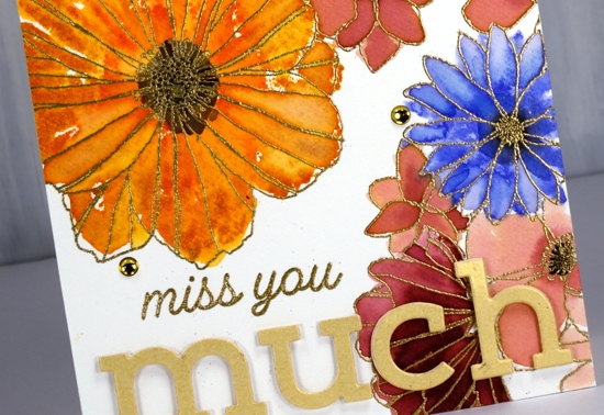
I stamped black soot ink in the centres and bundled sage for the little leafy bit below the petals. I stuck with the gold highlights when adding the sentiment, embossed ‘miss you’ in gold then popped the shimmer gold ‘simple serif’ die-cut letters with white foam. I thought it need just a little something more so added three gold half pearls. Usually I would add splatter but I guess I was feeling fancier!
The inspiration for the second card came as I was stamping off the ‘filled in floral’ stamps after I’d stamped the embossed areas. I grabbed another piece of watercolour paper then inked the flower stamps with the same colours used on the first card, spritzed the stamp then stamped one flower, spritzed again, a second flower, spritzed again and got a third paler flower. Once the panel was fairly full I switched to the leaf stamp, bundled sage and peeled paint ink and added some leaves. I used acrylic blocks for the stamping; there was no need for a stamp positioner with such a loose watery technique.

The watery technique did mean I lost much of the definition of the stamp so I drew some veins on the petals with a spiced marmalade marker once the ink dried. I used the simple serif stamps this time (they match the dies used on the other card) to stamp ‘thanks’ along with one of the sentiments from the C&9 ‘big thanks’ stamp set. This time I did want some black splatter but not all over the place so I chose the safe option of stamping black dots using two stamps from the fine line florals set then drew extra dots with a black marker. A black mat finished it off.
Are you a ‘stay inside the lines’ kind of painter or are you happy to be a bit loose and messy like I was with these cards?
Supplies
Wanderlust
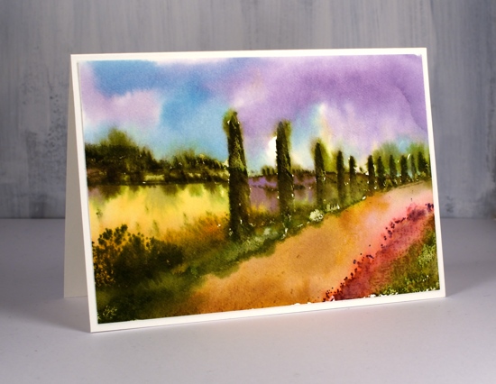
Posted: September 3, 2019 Filed under: Penny Black, Stamped Landscapes, wanderlust | Tags: distress oxide inks, Penny Black stamps, Ranger Distress inks, Ranger Distress stains 7 Comments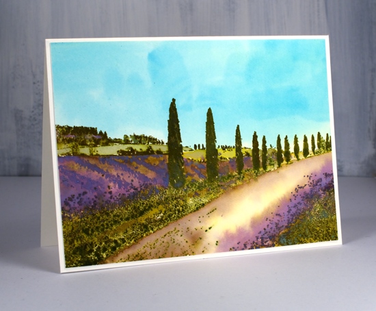
Wanderlust is the perfect name for this stamp; I would love to be walking down that lane in Provence! I have a friend with a house in Provence so I am curious to hear whether if I’ve managed to capture the look. To create this lavender themed panel I started by painting the watercolour paper in pale distress stains. I wet the whole panel then painted the bottom half in mustard seed stain. I was way too heavy handed and the result was bright yellow! I quickly whisked the panel to the sink and rinsed it off which resulted the pale yellow you see in the centre of the road. With the panel still wet I painted the sky area in broken china distress stain. I dried the panel and placed it in a stamp positioner to do all the stamping. There was a certain amount of back and forth with my stamping, blending, over-stamping etc but I will try and give you the gist of it. All the stamping is done with oxide inks on this panel so I would have more of an oil or acrylic painting look (something like this beauty by Maria Bertan). I stamped the trees and roadside grasses in peeled paint and forest moss distress oxide ink, wiping off the tips of the grasses on the right hand corner so I could ink with dusty concord oxide ink.
As I built up colour on the trees it was sometimes easiest to ink a large area with the oxide ink then wipe ink off the stamp where I didn’t want that colour. I also pressed the oxide ink pads down on my glass mat so I could pick up colour with a paint brush and apply it to the panel that way. As oxide inks are part dye ink and part pigment I was able to clear emboss over the stamping part way through the process to ‘lock’ in the colour on the foreground trees, grass and background trees. The ‘lavender field’ area is blank when stamped so I painted the rows of lavender with dusty concord and some spots of peeled paint oxide ink, the far fields in crushed olive and the road edges in diluted vintage photo. I loved the pops of purple so much I brought them into my second version also but not in the same way.
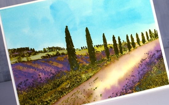
The second card is a looser watercolour look done with no oxides just the original distress inks and markers. I stamped the trees and grasses with forest moss, peeled paint and candied apple (roadside poppies). I was able to get some variety on the trees and grass by blending with a paint brush and re-stamping over the top.
The adjacent field is painted in wild honey distress ink then there is a dusty concord field further back. To get the blended effect I also spritzed my stamp not the panel so water was transferred from the stamp to the paper in certain areas not over the whole scene. While the inks were still damp I painted a tumbled glass and dusty concord sky around the tree tops and down to the hill edges. Some of the green ink bled into the sky but not too much. Finally I painted the road with vintage photo distress ink.
Have you been to Provence? Does it look a bit like this? Or, like me, do you want to go there now?
Supplies

Homeward
Posted: August 30, 2019 Filed under: homeward, Penny Black, Uncategorized | Tags: Penny Black stamps, Ranger Distress inks 6 Comments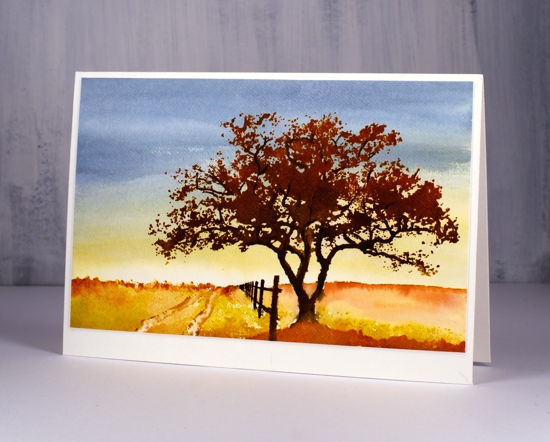
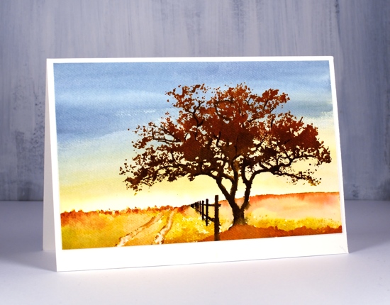
I have some more scenic stamping to share and without meaning to I have used an autumn colour scheme. Fall is going to come too soon as it is I didn’t mean to hurry it along!
When creating my previous scenic cards I stamped and painted the trees and scenery first, clear embossed them and added the ground, sea and sky last. For this scene I painted the sky first then stamped over it. I used weathered wood, stormy sky, and fossilized amber inks to fill the panel and create the look of sunset or sunrise in the background. I kept the colour very pale and diluted at the bottom of the panel as I knew stamping would cover the foreground anyway.
I dried the panel before putting it in a stamp positioner to create the scene. I inked the base of the stamp with fossilized amber and along the horizon with rusty hinge distress ink. The tree trunk, branches and the fence I inked with ground espresso and black soot markers. The foliage is a mix of vintage photo and rusty hinge ink. I used rusty hinge to paint a foreground rise also.
Believe it or not there I still have more stamped scenes to show you. I will probably toss a floral into the mix here and there too as I did this week. I’m not quite ready to be showing you Christmas cards yet but it won’t be long!
Supplies
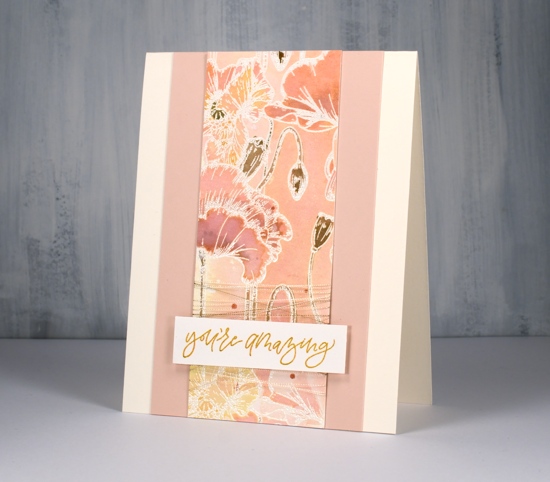
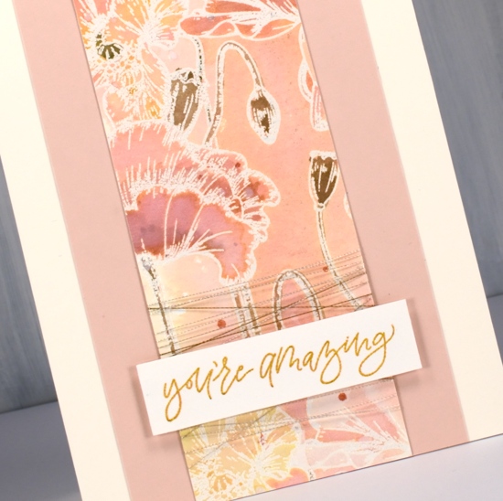
Poppy background watercoloured
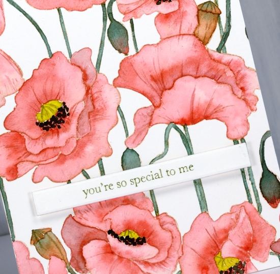
Posted: August 29, 2019 Filed under: Ink to Paper, My Favorite Things, poppy background | Tags: Faber-Castell Polychromos Colour Pencil, Ink to Paper, My Favorite Things, Ranger Distress inks, sennelier watercolours 10 Comments
I did not plan to post this stamp two days in a row but it was there on the desk within reach and you have to admit it is perfect for no line watercolour because the outlines are so clear. So, instead of working on my to do list I painted on this card.
I stamped on hot pressed watercolour paper with antique linen distress ink for a pale but easily seen outline image. I decided to use my sennelier watercolours because they are lovely to work with. I used a red, a yellow, and a green. To make brown I mixed the red and green, then to make the black I added more red and green. The green I used for the stems and buds was not straight from the pan I mixed in a little red first to make it more olive toned. Once again I was happy with the results from sticking to a limited palette. You can definitely try the same approach with whatever watercolours you have on hand. If your green is a little bright, as mine was, add in a bit of red.
I painted the petals one at a time with diluted red and while each was wet I added more red where I wanted depth or shadow. I paid attention this time to whether I was painting buds or pods. I painted the buds with green blended into red and painted the pods in browns. I added a little of the mixed green to my yellow before painting the poppy centres and used my red+green=almost-black to paint the little black dots around the poppy centres.
After all the painting was done I added a bit more shading and veins on petals with polychromos coloured pencils.
I decided to use another of the lovely little sentiments from my new Ink to Paper ‘tagged’ sentiments set. To achieve a matching olive green on the sentiment I stamped with versafine clair shady lane ink but I stamped on a scrap first so I could get a pale ‘second generation’ print.
I hope you see how versatile this stamp is; it worked beautifully with the loose distress stain watercolour and the more precise no-line watercolour. I have an idea for a third look too.
Supplies
Poppy Background split
Posted: August 28, 2019 Filed under: Ink to Paper, My Favorite Things, poppy background | Tags: Ink to Paper, My Favorite Things, Ranger Distress stains 10 Comments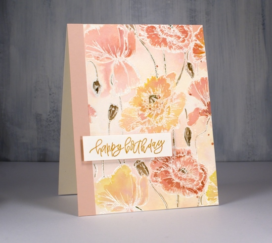
While I was a way this lovely MFT poppy background stamp arrived. (Thank you Foiled Fox) It has lovely detail which I will try to paint more realistically later but I thought I’d start with some emboss resist loose colour.
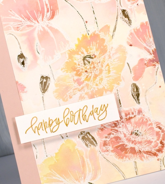
I embossed the large stamp on hot pressed watercolour paper with versamark and clear embossing powder. Next I sprayed some tattered rose, scattered straw and spun sugar distress stains on my glass mat then spritzed some homemade gold shimmer spray (interference gold pearl-ex mixed with water) to blend the three colours. I swiped my panel through the stains and discovered the spun sugar was not showing so I added more tattered rose and swiped again. Once it dried I had a panel with patches of blended colour, some yellow some pink, some blends of the two.
I painted all the poppies and buds by picking up undiluted stain from my glass mat with a paint brush. I did a few layers letting them dry in between coats so I could see how dark they were. I used frayed burlap to paint the stems, buds and pods and splattered a few dots of tattered rose over the finished panel.
Rather than make a big square card I cut the panel in two pieces and paired them with some blush coloured cardstock and cream card bases. The sentiments are from an ‘Ink to Paper’ set called ‘tagged’. It is a sweet little set featuring several different fonts and nine sentiments. To make my sentiments match my watercoloured panel I stamped them first in versafine clair golden meadow but it was too yellow so I stamped over the top with tattered rose until it was a little more peachy. I think these new stamps are peachy don’t you?
Supplies
Lake Wanaka
Posted: August 26, 2019 Filed under: Darkroom Door, Lake Wanaka, Nature Walk, Stamped Landscapes | Tags: Darkroom Door stamps, Ranger Distress inks 4 Comments
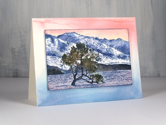
I have been creating with the new ‘Lake Wanaka‘ stamp from Darkroom Door. When I first saw this stamp I searched ‘Lake Wanaka tree’ and up came a range of inspiring images. Then I waited for the stamp to arrive so I could try to recreate some of the seasonal shots of this lake and tree in New Zealand.
For this first summer scene I worked with a hot pressed watercolour panel in my stamp positioner because I knew I was going to add inks step by step. I started by inking the lower (lake) portion of the stamp with stormy sky distress ink and the top portion of the stamp with tea dye distress ink. Next I worked with forest moss marker and ground espresso distress markers to add colour to the tree. This took a little while as the tree is made up of fine detail so I was only transferring a little ink at a time. Once the tree was defined I painted the lake with stormy sky and weathered wood ink. (smooshed onto my glass mat – I know you’ve probably got that step by now!) I switched to earth tones to paint the mountains and followed some of the definition of the stamp with rusty hinge, frayed burlap, vintage photo and tea dye inks. I painted a little stand of trees in the left corner with forest moss ink and added some reflections in the water. Once the mountains were dry I painted the sky with weathered wood, stormy sky and faded jeans ink.
For the sunset look below I used did less painting and worked with a base of one colour ink. I used faded jeans archival ink to stamp the whole image then painted more faded jeans distress ink into the shadows of the mountains, black soot ink over the foreground hills and faded jeans and spun sugar inks over the lake.
I used forest moss and ground espresso markers to ink the tree and stamp over the initial print and painted over the trunk also with ground espresso ink to make it bolder against the background. The sky is a mix of worn lipstick and spun sugar inks.
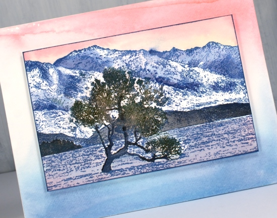
I decided to make a co-ordinating background panel by painting some worn lipstick, spun sugar and faded jeans distress stains onto my glass mat then swiping a piece of watercolour paper through it. I popped my stamped panel up on some dimensional tape.
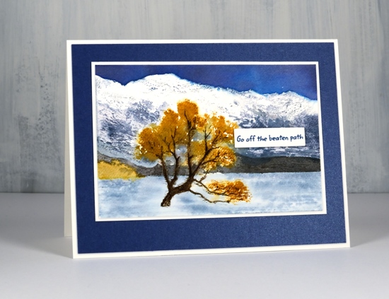
My autumn Lake Wanaka panel features the main tree and stand of trees in fossilized amber ink. I inked most of the stamp with a stormy sky marker but avoided the tree so I could use a fossilized amber marker to ink the foliage. I wanted to leave snow on the mountain tops so I did very little to that area but painted stormy sky and chipped sapphire shadows further down the mountains. Once again I painted the foothills in black soot ink. I used diluted stormy sky ink for the lake and chipped sapphire for a bold sky. When I was stamping the tree I spritzed the stamp to help the fossilized amber ink spread further.
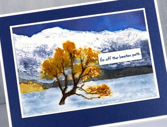
I finished the card off with white and navy mats and a little sentiment strip. I think you can probably guess why the sentiment is positioned right there. You’ve done the same I’m sure to cover a little bit that didn’t go the way you wanted it to!
Thank you for joining me today. I hope to be back before too long with more Lake Wanaka interpretations. Make sure you visit the Darkroom Door blog to see other creations featuring this stamp.