
Terraced Lane
Posted: April 28, 2016 Filed under: Stamped Landscapes, Terraced Lane, Watercolour | Tags: Penny Black stamps, Ranger Distress stains, Speedball elegant writer, Tombow dual brush pens 13 Comments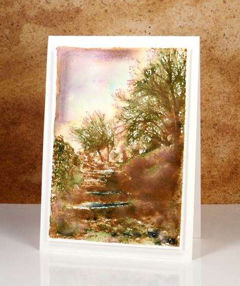
If you enjoy scenery stamps like I do there are a couple of beautiful designs in the new ‘A Little Bit of Sunshine’ release. This one, ‘Terraced Lane’ is a detailed stamp depicting both trees and steps. I will be trying this one in a range of colour schemes.
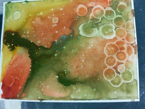
These two cards display two ways to approach such a detailed stamp. On the panel above I stamped first in vintage photo distress ink then added colour with a mowed lawn distress marker, the black elegant writer pen and a tiny bit of blue marker in the sky. I blended the green and black with water and a paintbrush to fill the scene with some colour then framed the top left corner free hand with vintage photo ink and some diluted black ink.
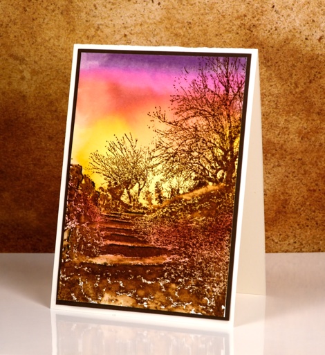
To create this sunset version I worked in the opposite order creating the background sunset with tombow dual brush pens first then once it was totally dry, I stamped the image in brown over the top. I finished the scene off by blending a few areas around the steps but left most of the stamping sharp.
Supplies:
Stamps: Terraced Lane (PB)
Inks: Mowed Lawn, Vintage Photo distress stains (Ranger) Elegant writer pen (Speedball) dark plum 679, rhodamine red 725, pink rose 703, light ochre 991 dual brush pens(Tombow)
Cardstock: Fabriano 100% cotton hot pressed watercolour paper, brown cardstock, Neenah natural white cardstock
2015 top ten
Posted: December 29, 2015 Filed under: Bister, Penny Black, Stamped Landscapes, Watercolour | Tags: Penny Black creative dies, Penny Black stamps 28 Comments
Of the 170 posts I have written this year, here are the ten that were viewed the most. I guess you could call this ‘the viewers’ choice’ post. If you click on the photos you can get to the original post with all the nitty gritty details.
Of course the most recent posts don’t really stand a chance under these terms but that is way ‘best of 2015’ lists go.
The card above is from a video tutorial, one of only two I made this year! I’m sorry; you deserved more.
The one above performed surprisingly well considering it is one of my ‘loose and messy’ ones; sometimes I wonder if other people don’t like them quite as much as I do.
Another ‘messy’ one which I was quite excited about because it was one of my early bister experiments. It was the only 2015 Christmas card to make the top 10.
I love this one, not sure if I managed to part with it. If I did that person should know they’re pretty special.
This one is a classic example of ‘using a sentiment to cover up a mess’!

The ‘stacked die’ technique made from the same panel featured in the card at the top of this post.
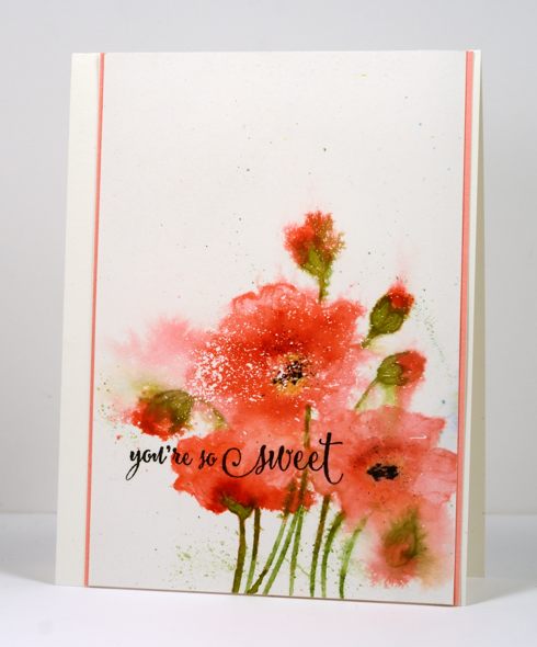
One of my carefully painted ‘not messy at all’ poppy cards.
Last but not least, my older daughter’s birthday card, another blue bister creation. There are 4 blue cards, 3 pink cards, 2 orange cards and 1 green card, which may mean my readers like blue and pink as much as I do!
Thank you for your feedback through viewing and commenting during 2015. You, my readers, mean a lot to me; it is a delight and a privilege to share my creating with such an appreciative audience. I will be back with my favourite creations from 2015.
Stamping the Seasons: Winter
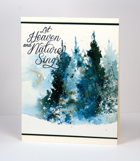
Posted: November 18, 2015 Filed under: Joy to All, Stamped Landscapes, Watercolour | Tags: Bister, Canson watercolour paper, Penny Black stamps, Tsukineko Memento inks, Tsukineko Versafine inks 13 Comments
Stamps that can be used all year round are winners in my opinion and I am always happy to see new tree stamps to use in my stamped landscapes. The ‘Joy to All‘ set contains a tree and some twiggy foliage stamps that I will be using winter, spring, summer and fall. This week and next you can see the Penny Black design team using new products to ‘stamp the seasons‘.
To create today’s wintry scene I splattered some masking fluid over the watercolour panel, let it dry then taped the panel to a firm surface to prevent warping. I used blue bister powder to paint the sky and snow banks then added the background trees in memento nautical blue ink while the sky was still damp. I stamped the tree from Joy to all in black ink then added shadows for all the trees in blue ink. To finish the scene I stamped the twig stamps from the same set in the foreground in black. Once all the ink was dry I removed the masking fluid then chose one of my favourite sentiments from the new release and a narrow black mat to frame the panel.
If you come back tomorrow you will see my spring scene using the same ‘Joy to All’ set.
Supplies:
Stamps: Joy to All, Season’s Gifts, Prancers (PB)
Inks: Memento Nautical Blue & Tuxedo Black, Versafine Onyx Black (ImagineCrafts/Tsukineko)
Cardstock: Canson 100% cotton hot pressed watercolour paper, Neenah epic black
Also: Winsor & Newton masking fluid, Bister powder
Brusho Northern lights
Posted: November 7, 2015 Filed under: Brusho, Prancers, Stamped Landscapes, Watercolour | Tags: Brusho, Penny Black stamps 10 Comments
I have another brusho card to share today with a different look. I blended all the colour on this panel rather than leave the speckled patterns of the previous cards. The brusho colours are intense so I didn’t use much to create this sky. I sprinkled some blue, green red and purple over a panel splattered with masking fluid, then blended with water as I would with other watercolour paints. I stamped the trees and sentiment in black then, once the ink was dry I removed the masking fluid to reveal a scattering of stars or perhaps snow.
Supplies:
Stamps: Seasons Wishes, Prancers (PB)
Mediums: Brusho powders, Versafine Onyx Black ink
Cardstock: Hotpressed Canson , Neenah Solar White, Epic Black
30 Day colouring challenge
Posted: October 2, 2015 Filed under: Fresh, Watercolour | Tags: Kuretake Zig clean color real brush markers, Penny Black stamps, Tsukineko Versafine inks 13 Comments
Kathy Racoosin of The Daily Marker is hosting a 30 Day Coloring Challenge during October. It is her third colouring challenge and her videos, blog posts and clever creations are very inspiring. I played along a few times during her last challenge and hope to participate even more this time. For all the details visit Kathy’s blog and check out her instagram also.

The colouring on my ‘fresh’ bouquet was done with Zig clean color real brush markers. I have 14 colours (so far), most of them quite bright so it was not difficult to get vivid petals by blending just the yellow, the pink and a little water. The background did involve fussy cutting a mask! Unlikely to happen often, I know. I stamped the background in versafine vintage sepia ink over the masked central image. Now that I think about it, several masks were needed so the background images did not stamp over the top of each other. This is why you don’t see this sort of thing very often on this blog. I do have a ‘too lazy to fussy cut and mask’ technique which often works well. I will share that some time soon.
Supplies:
Stamps: Fresh , Snippets (PB)
Inks: Versafine Vintage Sepia ink (Imagine Craft/Tsukineko)
Cardstock: Fabriano 100% cotton hot pressed watercolour paper, Neenah Natural White cardstock, Brown cardstock
Also: Zig clean color real brush markers, pink and orange thread
Farewell to summer: Rose
Posted: September 19, 2015 Filed under: Hand drawn, Watercolour | Tags: Fabriano Watercolour Paper, Ranger Distress stains 8 Comments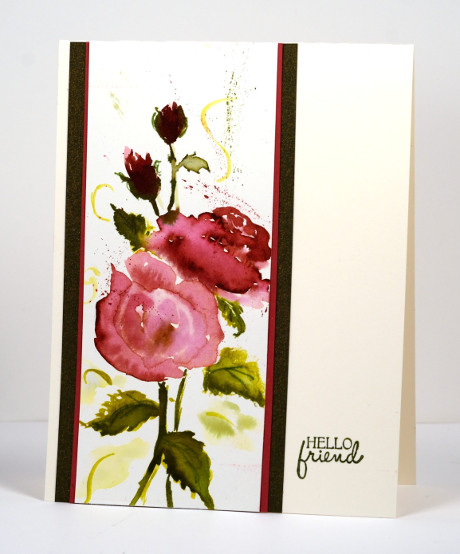
Another farewell to summer card, this time roses. We are enjoying the most beautiful weather at present so the farewell to summer is not too painful!
I painted this one myself with distress stains then added one little stamped sentiment. You cannot tell in the photo but the brown looking paper is actually black and gold glittery paper, not a shiny glitter a subtle glitter which works in well with the olive tones of the leaves. (If you like the look of handpainted roses check out Lydia’s recent roses with the artograph and brusho. It is a cool technique.) My plan for a while has been to be sketching and painting regularly but I am just not in the habit yet. I know a little every day is the way to improve. As my kids would say. “Just do it!”
Supplies:
Stamps: A Bunch (PB)
Inks: Aged mahogany, Victorian Velvet, Peeled Paint, Crushed Olive distress stains (Ranger), versafine Olympia green (Tsukineko)
Cardstock: Fabriano 100% cotton hot pressed watercolour paper, Neenah natural white
One stamp, two colours
Posted: July 21, 2015 Filed under: Bister, Queen Anne's Lace, Watercolour | Tags: Bister, Penny Black stamps, Ranger Distress stains 16 Comments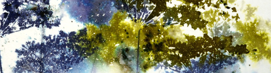
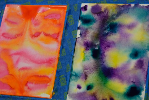
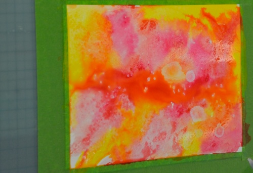
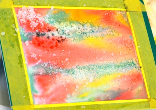
Continuing my experiments with bistre paint powders, I pulled out one of my favourite stamps and limited myself to a blue and green colour scheme. Below are all the results of my fiddling around with colours, water, repetitive stamping and order of operations. All the panels were splattered with masking fluid which really added interest on the most watery panels. Where the stains pooled and bled into each other the little masked dots break up the solid colour. Each was taped to a board with painter’s tape which created a masked border that I retained on all but one card.
On the panel below I sprinkled both blue and green bister on dry watercolour paper then spritzed lightly, tilted it this way and that, then walked away. This is becoming my new watercolour mantra, ” Walk away, just walk away!” As I have said before it helps to have chips on hand to distract yourself from wanting to fiddle more with the painting that needs to dry. In this case I did not have chips but I did have four different panels to work on so as each one was set aside to dry I started the next. Once dry I stamped the Queen Anne’s Lace in a dark green and a mix of two blues to co-ordinate with the bister patterns. I stamped twice without re-inking in between so the lower images are a bit paler. I like the lacy airiness of the flowers on this one but it’s not my favourite.
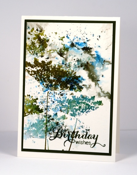
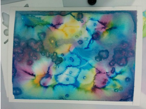
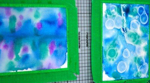
There was more water involved in the panel below and some painting and sponging too in order to frame the scene. I began by stamping in pale green on a slightly damp panel. You can see those first pale images in the background. I then switched to darker colours and dropped some bister into the stamping. To fill the white background I used a paintbrush to pull both stain and bister into the spaces. I tried to be careful not to lose the definition of the flowers. When it was totally dry (walk away, just walk away) I sponged a bit more colour in the corners. I like the shadowy images behind the stronger ones on this panel but it is not my favourite.
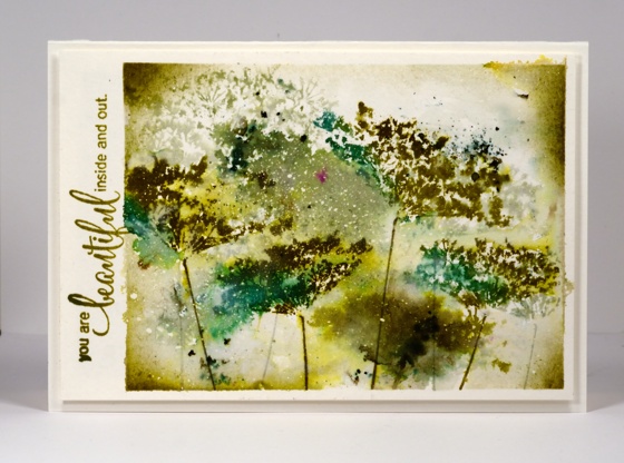
To be honest with you, below is the one that almost got tossed. I didn’t walk away and you can see all the murky green that resulted. I didn’.t want to give up however so I pulled out some scraps of dry wall tape I had used on another project and sprinkled bister powder over the tape, spritized water over the powders, let it dry a bit then sponged for more coverage. Not only does the grid add some interest, it leads the eye away from the murk. The other thing that saved this one is the mass of masking fluid flecks right in the centre adding light to the murk. You have probably guessed, not my favourite.
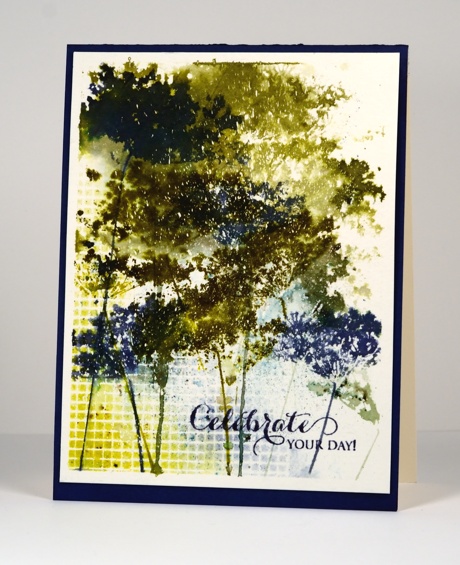
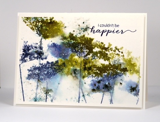
Which leaves us with this one. It has lots of blue, some nice bister bursts, both watery and defined stamping, some white flecks in appropriate places and I couldn’t be happier. Yes, it’s my favourite. Which one do you prefer?
Do you ever fiddle around with the same stamp and colours for several projects? It’s not quite making multiples but it is time efficient to use the supplies while they are all on the table.
Supplies:
Stamps: Queen Anne’s Lace, Happy Notes, Heartfelt, A Sweet Day (PB)
Inks: Bundled Sage, Forest Moss, Pine Needles, Crushed Olive, Chipped Sapphire, Evergreen Bough, Salty Ocean Distress Stains & Chipped Sapphire distress ink (Ranger) Spanish Moss, Majestic Blue & Olympia Green Versafine inks (Tsukineko)
Paint Powder: Blue and Green Bister
Cardstock: Canson cold pressed 100%cotton watercolour paper,
Also: Winsor & Newton masking fluid
Colour inspiration
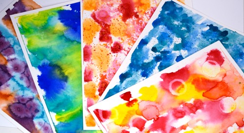
Posted: July 20, 2015 Filed under: Watercolour | Tags: Kuretake Gansai Tambi watercolour paints, Ranger Distress stains 6 CommentsLast month I taught a class involving watercolour panels and die cut shapes. All the samples I demonstrated and all the cards and panels created by class members were different. I really enjoyed watching everyone choose colours to work with. I snapped a few photos as the paints dried.


I still have some panels waiting to be transformed into something new.
Church on a hill
Posted: June 1, 2015 Filed under: Watercolour | Tags: Faber-Castell Albrecht Durer Watercolour pencils, Fabriano Watercolour Paper, Kuretake Gansai Tambi watercolour paints 20 Comments
This year marks twenty five years of ministry for the pastor of our church. He arrived in Ottawa shortly before we did in 2000 and our families have been friends ever since. His wife asked me if I would make a card for the occasion with a church on it. I looked through my stamps but the only church stamp was a snowy scene which was mainly trees with a snow laden church in the distance. As we are pretty happy to finally be free of snow I decided against using that stamp. I attempted a painting instead and found several church images as inspiration then combined elements from a few and set my church on a tree filled hillside. Rather than obscure some of the scene I printed the words on vellum and wrapped it round the painted panel. I used my gansai tambi watercolour paints for most of the painting then switched to watercolour pencils to add finishing touches.
Supplies
Cardstock: Fabriano 100% cotton hot pressed watercolour paper, Neenah Natural White 110lb cardstock, Neenah Epic Black cardstock, rust cardstock, vellum
Also: Kuretake Gansai Tambi watercolour paints, Faber-Castell Albrecht Durer watercolour pencils
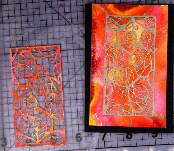
Butterflies Die Photo Tutorial
Posted: May 26, 2015 Filed under: Butterflies, Tutorial, Watercolour | Tags: Kuretake Gansai Tambi watercolour paints, Penny Black creative dies, Tutorial 9 Comments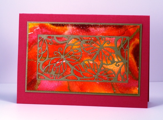
There are three new dies in the new Sunshine and Smiles. release all set in rectangular frames, which makes them a nice choice for the inlaid die technique. I used the Butterflies die to create the card above. Below is a photo tutorial with instructions below each photo describing my process.
Spritz or paint water onto a piece of cold pressed watercolour paper then add watercolour paint ( I used Kuretake Gansai Tambi on Fabriano cold pressed) in three or four colours. Let it blend, tilt the paper, move it around with a paintbrush if it is not going where you want it to. Let it dry.
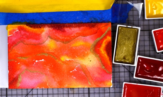
Add more paint to deepen the colours which will have dried paler than when you painted them. Add some metallic gold paint and some splatters. Let panel dry, then trim to desired size.
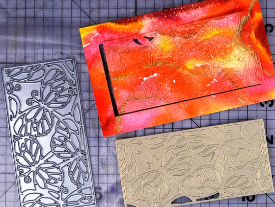
With the ‘Butterflies’ die cut a panel from your watercoloured piece and from a piece of metallic gold cardstock. Press both panels onto some ‘Cling film-Press & Seal’ to keep all the pieces together. I know it looks like I already lost some pieces but don’t worry they were there somewhere!

Attach a piece of double sided adhesive sheet (I used ‘stick it’) to a piece of cardstock larger than your die-cut panel.
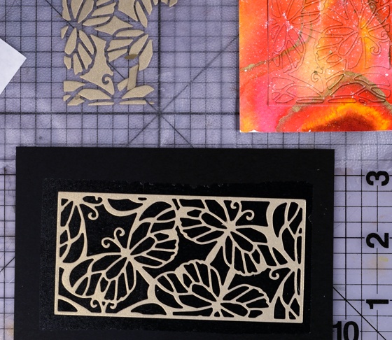
Remove the liner paper from the adhesive and press the gold ‘frame’ part of the butterflies die onto the adhesive covered cardstock.

Transfer the ‘inside’ pieces from the die-cut watercoloured panel into the gold frame pressing each one firmly onto the adhesive backing.
Attach the remaining border piece of watercoloured cardstock around the inlaid die-cut panel. Trim excess cardstock from the completed inlaid die cut panel. Mat with gold card then attach to co-ordinating card base.
Supplies
Creative Dies: Butterflies (PB)
Cardstock: Fabriano 100% cotton hot pressed watercolour paper, Pink and gold cardstock
Also: Kuretake Gansai Tambi watercolour paints, Stick it adhesive sheet


