
One stamp, two colours
Posted: July 21, 2015 Filed under: Bister, Queen Anne's Lace, Watercolour | Tags: Bister, Penny Black stamps, Ranger Distress stains 16 Comments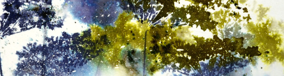
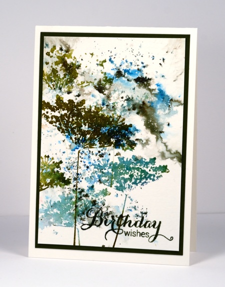
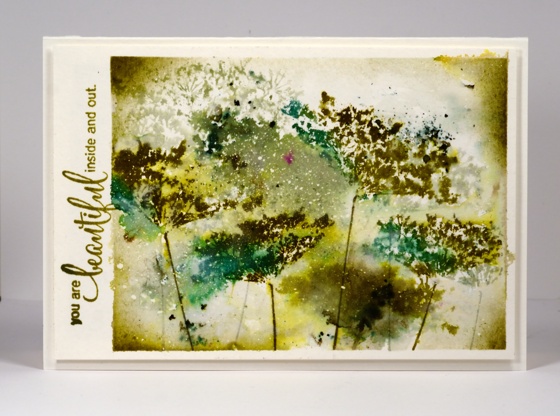
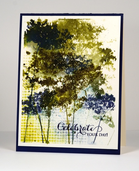
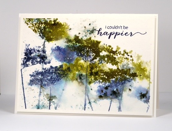
Continuing my experiments with bistre paint powders, I pulled out one of my favourite stamps and limited myself to a blue and green colour scheme. Below are all the results of my fiddling around with colours, water, repetitive stamping and order of operations. All the panels were splattered with masking fluid which really added interest on the most watery panels. Where the stains pooled and bled into each other the little masked dots break up the solid colour. Each was taped to a board with painter’s tape which created a masked border that I retained on all but one card.
On the panel below I sprinkled both blue and green bister on dry watercolour paper then spritzed lightly, tilted it this way and that, then walked away. This is becoming my new watercolour mantra, ” Walk away, just walk away!” As I have said before it helps to have chips on hand to distract yourself from wanting to fiddle more with the painting that needs to dry. In this case I did not have chips but I did have four different panels to work on so as each one was set aside to dry I started the next. Once dry I stamped the Queen Anne’s Lace in a dark green and a mix of two blues to co-ordinate with the bister patterns. I stamped twice without re-inking in between so the lower images are a bit paler. I like the lacy airiness of the flowers on this one but it’s not my favourite.
There was more water involved in the panel below and some painting and sponging too in order to frame the scene. I began by stamping in pale green on a slightly damp panel. You can see those first pale images in the background. I then switched to darker colours and dropped some bister into the stamping. To fill the white background I used a paintbrush to pull both stain and bister into the spaces. I tried to be careful not to lose the definition of the flowers. When it was totally dry (walk away, just walk away) I sponged a bit more colour in the corners. I like the shadowy images behind the stronger ones on this panel but it is not my favourite.
To be honest with you, below is the one that almost got tossed. I didn’t walk away and you can see all the murky green that resulted. I didn’.t want to give up however so I pulled out some scraps of dry wall tape I had used on another project and sprinkled bister powder over the tape, spritized water over the powders, let it dry a bit then sponged for more coverage. Not only does the grid add some interest, it leads the eye away from the murk. The other thing that saved this one is the mass of masking fluid flecks right in the centre adding light to the murk. You have probably guessed, not my favourite.
Which leaves us with this one. It has lots of blue, some nice bister bursts, both watery and defined stamping, some white flecks in appropriate places and I couldn’t be happier. Yes, it’s my favourite. Which one do you prefer?
Do you ever fiddle around with the same stamp and colours for several projects? It’s not quite making multiples but it is time efficient to use the supplies while they are all on the table.
Supplies:
Stamps: Queen Anne’s Lace, Happy Notes, Heartfelt, A Sweet Day (PB)
Inks: Bundled Sage, Forest Moss, Pine Needles, Crushed Olive, Chipped Sapphire, Evergreen Bough, Salty Ocean Distress Stains & Chipped Sapphire distress ink (Ranger) Spanish Moss, Majestic Blue & Olympia Green Versafine inks (Tsukineko)
Paint Powder: Blue and Green Bister
Cardstock: Canson cold pressed 100%cotton watercolour paper,
Also: Winsor & Newton masking fluid
CAS(E) this sketch #70
Posted: March 27, 2014 Filed under: Queen Anne's Lace | Tags: Faber-Castell Albrecht Durer Watercolour pencils, Fabriano Watercolour Paper, Penny Black stamps 11 Comments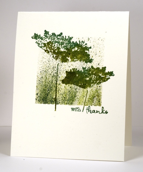
Playing along with CAS(E) this sketch is getting to be a habit but I am not just playing along this week; I am privileged to be the guest designer for sketch #70
Seems like this sketch was made just for me. You won’t have to look far through my blog before you spy one or two layouts along the same lines. I pulled out an old favourite from my stamp collection and paired it with my new favourite technique, flicking watercolour paint! I stamped the Queen Anne’s Lace first in a mix of Memento Cottage Ivy ink and Peeled Paint Distress stain. Next I positioned post-it notes as masks to create the central square and flicked colour from three different watercolour pencils with a water brush. Finally I removed the masks and added the sentiment.
Make sure you visit the CAS(E) this sketch challenge blog to see all the wonderful creations from the design team.
Supplies:
Stamps: Queen Anne’s Lace, Wishes (PB)
Inks: Memento Cottage Ivy (Tsukineko) & Peeled Paint Distress Stain (Ranger)
Pencils: Albrecht Durer watercolour pencils (Faber-Castell)
Cardstock: Fabriano Hot pressed 25%cotton watercolour paper
Scene by the sea
Posted: September 10, 2013 Filed under: Queen Anne's Lace, Stamped Landscapes | Tags: Penny Black stamps, Tsukineko Memento inks 12 Comments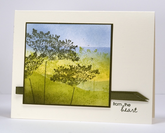
I have used my usual sponging and masking techniques to create this scene but by masking a straight line through the sky and sponging below it I was able to give the appearance of an ocean view.
I sponged blue on the top third of the panel, green on the lower third and yellow in the middle. I then cut a hill shaped mask and sponged green below the mask, re-positoned it and sponged a second paler hill behind. I stamped the Queen Anne’s Lace in two green tones then finally positioned the straight mask to create the ocean in the distance.
The current One Layer Wednesday in on Ardyth’s blog for a few more hours (sorry for the late notice) and the new one will be on Cheryl’s blog tomorrow.
Supplies:
Stamps: Queen Anne’s Lace, Every Happiness (PB)
Inks: Memento Summer Sky, Pistachio, Olive Grove, Dandelion (Tsukineko)
Cardstock: PB mix & match olive grove paper, Neenah Solar White and Cream
Also: olive grosgrain ribbon
Watermarked in blue
Posted: August 14, 2013 Filed under: CAS, Queen Anne's Lace, Watercolour 14 Comments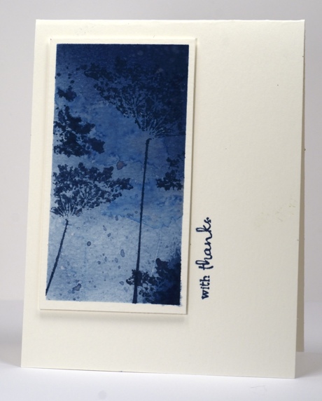
You may know blue is a favourite colour of mine as is Queen Anne’s Lace a favourite flower and watercolour a favourite technique. So when I saw this weeks Case this sketch I decided to use all three favourites to complete the challenge.
The panel and the card base are both watercolour paper (details below). I sponged the panel with nautical blue ink then painted the stamp with water and stamped it onto the sponging. The image created by “water stamping” is quite subtle and in the background. I then stamped in nautical blue, once the whole stamp as well as a few partial impressions. The final touches were some water droplets and some ink droplets.
Supplies:
Stamps: Queen Anne’s Lace, Wishes (PB)
Inks: Memento Nautical Blue (Tsukineko)
Cardstock: Fabriano Hot pressed 25%cotton watercolour paper
Black Damask
Posted: February 23, 2013 Filed under: Background Stamps, CAS, Damask Pattern, Queen Anne's Lace 18 Comments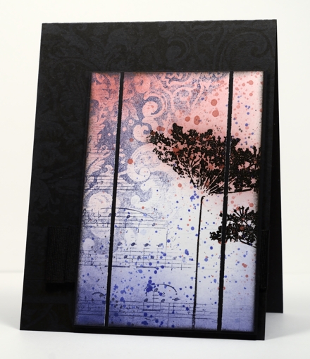
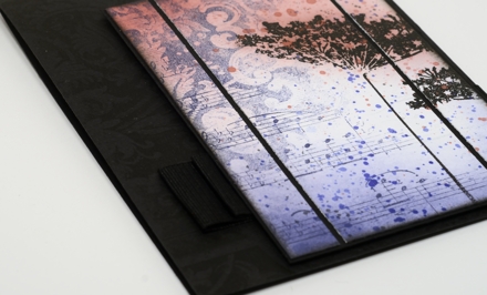
A few weeks back I used the damask background stamp to make a cup. I really hadn’t used the stamp much before that. After making the cup I noticed how elegant the detail in the stamp is and decided it was time to pull it out again. I also have some beautiful new ink colours from Tsukineko which I needed to play with.
I inked diagonally across the damask stamp with Versamagic Night Sky ink and stamped it on the panel. I then inked the music background, diagonally also, in order to fill the other half of the panel. It was only after I had stamped the music that I saw that I hadn’t worked out the whole upside-down and opposite side thing properly! I’m kind of glad I got it wrong though because I ended up liking the two backgrounds overlapping and it left me with a white space to stamp some flowers.
The flowers are stamped with versamark and embossed in black so they would resist the sponging and ink droplets added next. I sliced up the panel and matted in black and then looked for the right colour cardbase. White was too stark; black worked better but needed a little something on it. My intention was to emboss the damask background but once I had stamped it in Versafine Onyx black it showed up fine (possibly not in the photo). The wide grosgrain ribbon is pleated and stapled behind the popped up panel.
Supplies
Stamps: Damask Pattern, Queen Anne’s Lace, Music Background (PB)
Ink: Memento Rhubarb Stalk, Versafine Onyx Black & Versamagic Night Sky (Tsukineko)
Also: Black embossing powder
Collage Thank You cards
Posted: July 4, 2012 Filed under: A Flight of Thread, CAS, Collage cards, Penny Black, Queen Anne's Lace 18 Comments
Our daughter graduated from high school last week and when thinking back over the years I started recalling the many people who have positively impacted her life, contributed to her education and prayed for her through thick and thin. I thought I might get a few photos and slip them inside cards and send them, especially to our friends and family in Australia who love her dearly but rarely get to see her.

I enjoyed making my own collages although it does take a little time and does not always work the way I intend. In order to blend the images together without unattractive overlap it is sometimes necessary to ink only part of the stamp or as I did, ink it all then wipe off some ink with a cloth. It is hard to describe my process, especially as I am not sure that I remember what order I did things; perhaps it’s time for another tutorial?
Edited to add: I have posted a tutorial here on the blog and it is on my youtube channel
Supplies:
Stamps: A Flight of Thread, Queen Anne’s Lace, Letter Background, Flourish Thank You 4175F, Gratitude (PB)
Inks: Memento Rich Cocoa & Desert Sand, Summer Sky, Nautical Blue & Teal Zeal (Tsukineko)
Favourites
Posted: March 25, 2012 Filed under: CAS, Penny Black, Queen Anne's Lace, Tutorial 44 Comments
The designers at Penny Black are showcasing favourites from the new 2012 catalog at present but what I have posted today is an older Penny Black stamp, Queen Anne’s Lace which has become a new favourite of mine. I love the delicacy of Queen Anne’s Lace which this stamp captures beautifully. Picking a favourite stamp also worked for the Less is More challenge this week which asks us to choose and combine three previous challenges. I chose#15 One layer embossing, #22 Shades of Blue and #59 Masking.
Several people have left questions in the comments section lately about products and techniques; I have a draft in progress to answer those soon but a couple may be answered in the following tutorial. Brenda asked how I mask; the first three photos show how I make use of the lines on my mat to help me line up the edges of the card before positioning the post-it notes. The large post-it notes are worth the extra cost because they do the whole length of the card and the width of the sticky section is good.


After using the grid on the mat I put scrap paper underneath and start my design. For this card I stamped the image twice in versamark, then embossed in clear.

I use round craft sponges cut into quarters to sponge and for this card I used Memento Summer Sky and Danube Blue ink.

Building up colour by sponging takes a while. I start by dabbing the colour on and then blend with a swirly motion to make sure I have good coverage.

For this card I wanted a bit of white space so didn’t sponge the panel completely.

When I was happy with the sponging I stamped the image several times with Summer Sky ink.

I removed the masks and added one more image in Danube Blue and finished with a sentiment, from the transparent set, Gratitude.
Here’s the finished product using a favourite stamp, my favourite colour and a favourite technique.

Thanks for dropping by, I hope you get a chance to work with your favourites this week.


