
Five Butterflies
Posted: July 20, 2013 Filed under: CAS, Damask Pattern, Dies, Dots, Tagged | Tags: CAS, Penny Black creative dies, Penny Black stamps, Tsukineko Memento inks 11 Comments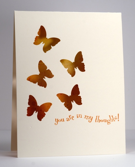
I tried for a while, recently, to make five butterflies work on a card and finally gave up and settled on three. With the help of the sketch from CAS(e) this Sketch #37 I managed to create a five butterfly card.
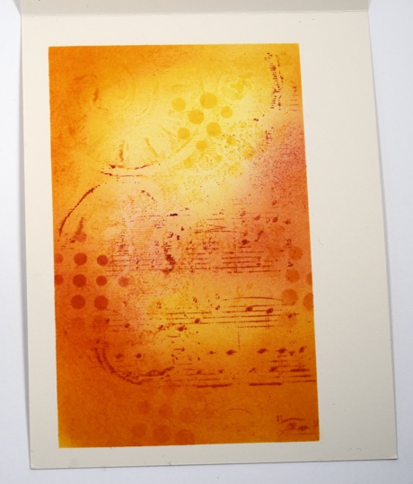
I have seen some wonderful cards lately where a die cut image reveals all the colour and pattern happening underneath so I decided to give it a try.
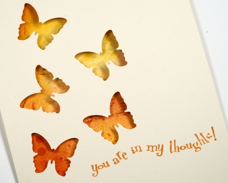
I cut my butterflies first using the butterfly die from the Tagged set , then masked an area inside the card to line up with what would be revealed through the butterflies. The collage pattern I created in the masked area is a combination of the damask pattern background and the music background along with sponging in warm yellow and orange tones. A dots mask die cut from a post-it note was sitting on the desk so I sponged a few dots through that too although I admit they weren’t entirely necessary!
The sentiment just seemed like the right one to choose with those butterflies weaving through the air like that.
Where will I write the greeting on this card I wonder?
Supplies:
Stamps: Damask Pattern, Music Background, In my Thoughts (PB)
Inks: Memento Tangelo, Love letter, Dandelion, Cantaloupe (Tsukineko)
Dies: Dots, Tagged
Hot Rod
Posted: May 17, 2013 Filed under: Background Stamps, CAS, Damask Pattern, Hot Rod 8 Comments
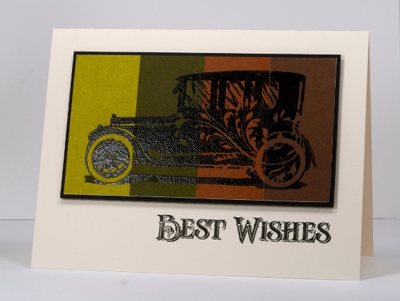
Today I am showing off this cool new stamp from Penny Black. I don’t often make cards with cars on them but the detail on this stamp and the flourish on the side of the hot rod won me over. As you can see I didn’t get too adventurous with the layout or even the ink colour. The image below is embossed on four colours of Penny Black mix & match cardstock and the one above is simply Versafine Onyx Black on white cardstock. To add a little colour to the one above I masked a panel and sponged three shades of blue and added a bit of the flourish from the damask pattern background stamp.
Supplies:
Stamps: Damask Pattern, Hot Rod (PB)
Inks: Memento Summer Sky, Bahama Blue, Danube Blue & Versafine Onyx Black (Tsukineko)
Cardstock: Penny Black Mix & Match Papers Olive Grove & Grand Canyon
Also: Black embossing powder

Being Complementary
Posted: May 5, 2013 Filed under: Background Stamps, CAS, Damask Pattern, Love Chapter, Penny Black 18 Comments
This Damask stamp from Penny Black is such a beautifully detailed stamp I like to show it off rather than relegate it to background status. When I started making this card I embossed a couple of panels, one in clear and one in black then played around with both. The white image left by the clear embossing powder definitely created the look I was after; I will have to fiddle with the black a little more before I’m happy with it.
As I said I started by embossing in clear then sponged Memento Pistachio from one corner toward the centre and Love letter from the opposite corner. I darkened the green portion further with Olive grove and added a little definition with a Bamboo Leaves marker. I then sliced the side off my panel so that it would be predominantly green rather than half and half, matted it in green and added a ribbon. I didn’t have the correct green so I used a paler green and coloured it with a marker.
When that card was finished I didn’t want the little strip I cut off to go to waste so I set out to make a very minimal design with just the thin panel and a sentiment. But then I remembered the “Love” stamp which has elaborate fonts that remind me of damask and a second design was created.
The complementary colour scheme is inspired by the Less is More Challenge this week.

Supplies:
Stamps: Damask Pattern, Love Chapter, Happy Birthday (PB)
Inks: Memento Pistachio, Olive Grove, Love Letter & Versamark (Tsukineko)
Cardstock: Penny Black Mix & Match Papers Olive Grove
Also: Clear embossing powder, ribbon
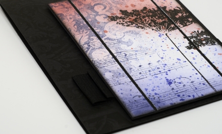
Black Damask
Posted: February 23, 2013 Filed under: Background Stamps, CAS, Damask Pattern, Queen Anne's Lace 18 Comments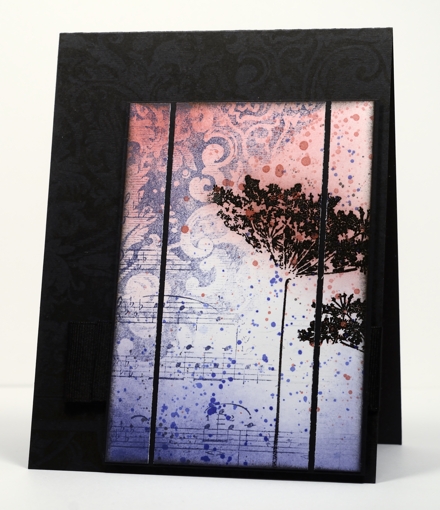
A few weeks back I used the damask background stamp to make a cup. I really hadn’t used the stamp much before that. After making the cup I noticed how elegant the detail in the stamp is and decided it was time to pull it out again. I also have some beautiful new ink colours from Tsukineko which I needed to play with.
I inked diagonally across the damask stamp with Versamagic Night Sky ink and stamped it on the panel. I then inked the music background, diagonally also, in order to fill the other half of the panel. It was only after I had stamped the music that I saw that I hadn’t worked out the whole upside-down and opposite side thing properly! I’m kind of glad I got it wrong though because I ended up liking the two backgrounds overlapping and it left me with a white space to stamp some flowers.
The flowers are stamped with versamark and embossed in black so they would resist the sponging and ink droplets added next. I sliced up the panel and matted in black and then looked for the right colour cardbase. White was too stark; black worked better but needed a little something on it. My intention was to emboss the damask background but once I had stamped it in Versafine Onyx black it showed up fine (possibly not in the photo). The wide grosgrain ribbon is pleated and stapled behind the popped up panel.
Supplies
Stamps: Damask Pattern, Queen Anne’s Lace, Music Background (PB)
Ink: Memento Rhubarb Stalk, Versafine Onyx Black & Versamagic Night Sky (Tsukineko)
Also: Black embossing powder


