
Greatest of these
Posted: September 9, 2015 Filed under: Love Chapter, Soft Wings | Tags: Penny Black stamps, Ranger Distress inks, Ranger Distress stains, Tsukineko Memento inks 7 Comments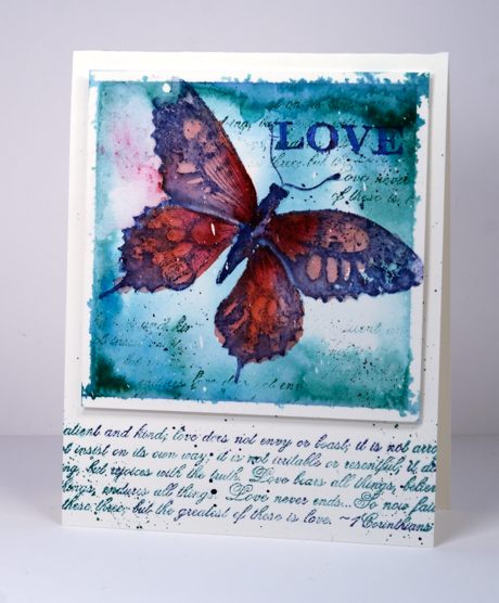
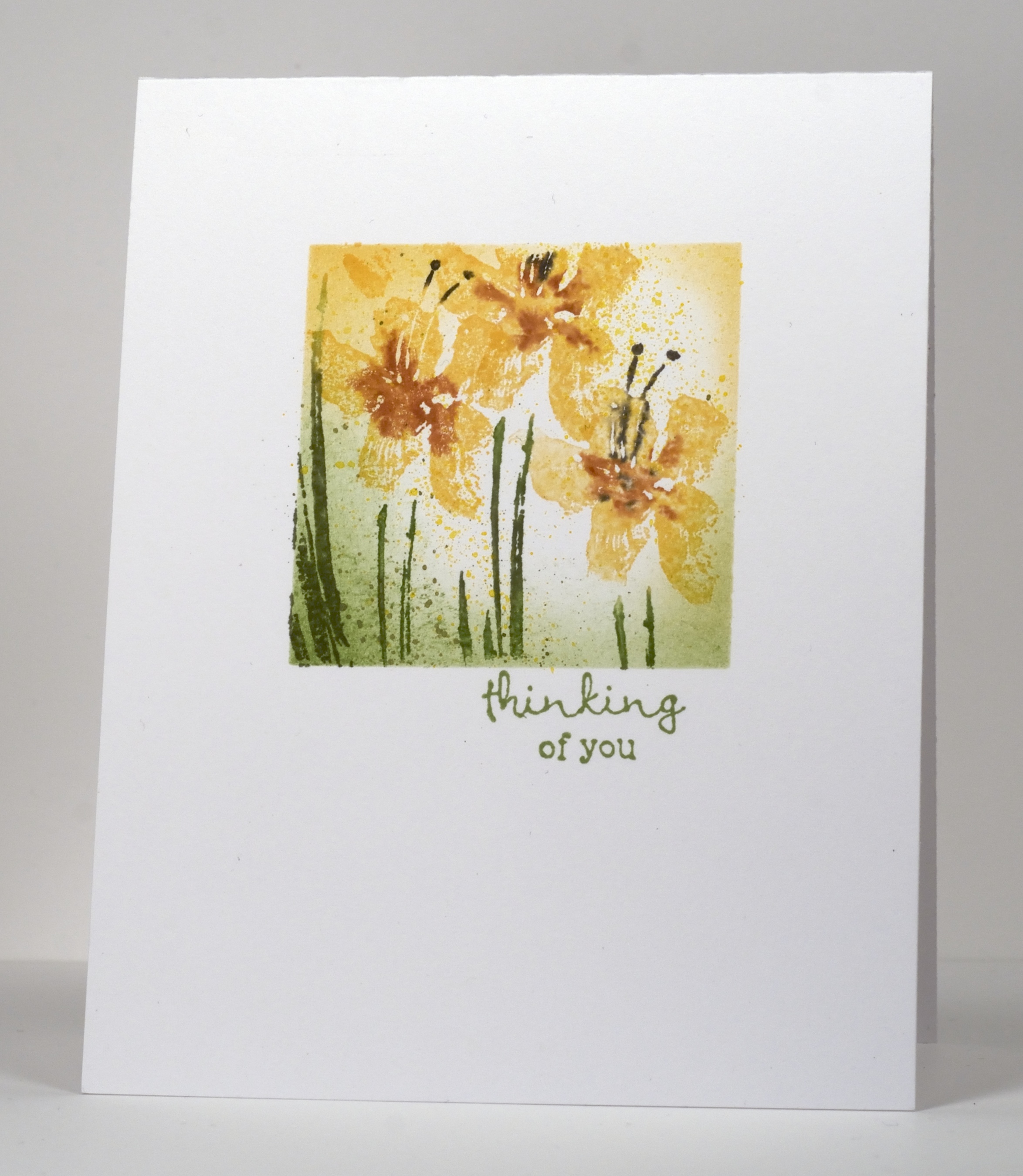
Today’s card is an example of wet into wet watercolour with some stamping added later for definition and texture. I wet the taped panel of watercolour paper then stamped a pale butterfly to give me an outline to paint over. I painted in pinks and purples and added background colour in teal. When it was dry I restamped in dark blue and did some partial stamping with the text stamp from the ‘love chapter’ transparent set.
I love watching the colour blend and blur when I stamp onto wet watercolour paper. If you haven’t tried it you should; it’s fun and you can always stamp over it if it is just too loose and flowy for you! I mentioned Periscope in my last post; if you’d like to know more about it I found this helpful tutorial.
By the way the latest One Layer Simplicity challenge is up and running with Ardyth. It’s all about numbers; check it out.
Supplies:
Stamps: Soft Wings, Love Chapter (PB)
Inks: Pine needles, Chipped Sapphire, Aged Mahogany, Worn Lipstick distress stains and inks (Ranger) Summer Sky memento ink (Tsukineko)
Cardstock: Fabriano 100% cotton hotpressed watercolour paper
Also: Winsor & Newton masking fluid
Love is..
Posted: May 10, 2015 Filed under: Love Chapter, To You | Tags: Fabriano Watercolour Paper, Penny Black stamps, Ranger Distress stains 12 Comments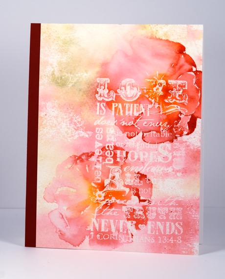
Although not designed as a Mother’s day card this one featuring the well known passage from 1 Corinthians 13 would be perfect to give my Mother as she has modeled the characteristics listed in this passage throughout her life. It could also work for a wedding or a special friend.
This panel was a very experimental one. I stamped the verse stamp from ‘Love Chapter’ in clear powder on cold pressed watercolour paper. I was aiming for an incomplete impression so I wiped off a bit of versamark before I stamped. I set aside the embossed panel while I worked on another panel using a single stamp but many distress stains. Each time I reinked the stamp I wiped the distress stain off on a baby wipe. The baby wipe ended up being quite saturated with pinks, yellows and greens but in quite a pretty, not muddy way. I lay the stained wipe over my embossed panel then soaked it with water so the colours transferred to the paper.
The large flower stamp is from the transparent set ‘To You’. I inked it with red, orange and pink stains, spritzed it with water then stamped over the embossing. Before it could dry I used a damp brush to draw the colours into the petals.
I hope you are having a happy Mother’s day. I am feeling well fed and well loved by my sweet family.
Supplies:
Stamps: Love Chapter, To You (PB)
Inks: Forest Moss, Ripe Persimmon, Spiced Marmalade, Worn Lipstick, Festive Berries Distress Stains(Ranger) & Versamark (Tsukineko)
Cardstock: Fabriano 100% Cotton cold pressed watercolour paper, Neenah Avon Brilliant white, Burgandy cardstock
Also: Clear embossing powder
Negative space rose
Posted: February 9, 2014 Filed under: Love Chapter, Rose | Tags: Fabriano Watercolour Paper, Penny Black creative dies, Penny Black stamps, Tsukineko Memento inks 17 Comments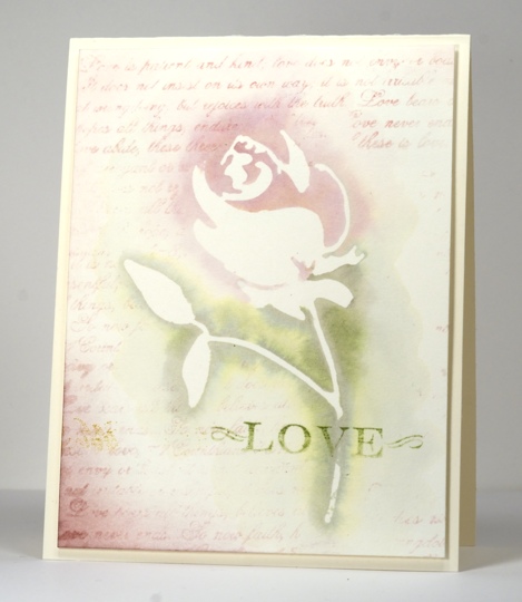
I found this rose panel under a pile of scraps a few days ago. I had created it back when I was making this card. When die cutting a negative rose mask out of masking paper to sponge through I naturally ended up with a rose out of masking paper too. I stuck that on the watercolour block and used some Memento pink and green inks that were open on my table. I painted diluted ink over the mask which did make the masking paper a little waterlogged but I let it dry completely before I peeled it off. I used the 1 Corinthians text stamp to add background interest and sponged a little Sweet Plum in the corner before adding a fading green sentiment.
Have a lovely week.
Supplies:
Stamps: Letter background, Love Chapter
Creative Dies: Rose
Inks: Memento Sweet Plum, Angel Pink, Bamboo Leaves (Tsukineko)
Cardstock: Fabriano 100% cotton hot pressed watercolour paper
Two Floral One-Layer cards
Posted: January 23, 2014 Filed under: Lofty, Love Chapter, Posies 17 Comments
I have been doing so much watercolour lately I thought I should check and see if I could still mask and sponge!
For both these cards I stamped and sponged through a post-it mask cut with a spellbinders square die. The hard part with a die cut mask is centering it on the card base. It took a few attempts. Lining the card base up on a gridded mat first helps a little. To create the pink scene I inked the stamp with an Angel pink ink pad then added the green and rhubarb ink to the stamp with markers. I inked the text stamp with rhubarb ink but wiped some off before stamping so some text would fade to nothing. I sponged the edges with both pink and rhubarb ink.
I also inked the stamp for the yellow and green scene with markers and spritzed it with water before stamping. I sponged the edges and added some splatter with a cool and easy technique I discovered by accident the other day. I held a watercolour pencil close to the panel and wiped a water brush back and forth across the coloured led sending splatter onto the card.
It’s the bleak mid-winter in Ottawa this week so I blew some frozen bubbles.
Supplies:
Stamps: Love Chapter, Posies, Lofty (Penny Black)
Inks: Rhubarb Stalk, Angel Pink, Cottage Ivy, Cantaloupe, Potter’s Clay Olive Green, Bamboo leaves, Espresso Truffle (Tsukineko)
Also: Faber-Castell watercolour pencils and a water brush
Penny Black plays along with Less is More
Posted: August 31, 2013 Filed under: CAS, Floral Applique, Love Chapter 14 Comments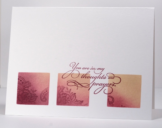
The Penny Black design team is playing along with the “Less is More” challenge this week which is to ‘use a stamp’ with the added suggestion of using watercolour too.
To use a stamp is not too much if a stretch for the Penny Black designers! I decided to limit my stamped area in keeping with the less is more guidelines. I punched squares out of a post it note to create a three square layout through which I sponged chalk inks. I stamped images from the floral appliqué set in chalk inks also. I had intentionally spaced my squares further apart on the right so I could place the sentiment in between the two squares.
As I was enjoying working with the chalk inks I used the same mask on a portrait oriented card switching the plum ink for a couple of blue inks. The colour scheme reminds me of the beach.

Supplies:
Stamps: Floral Applique, Sentimental, Love Chapter (PB)
Inks: Versamagic Perfect Plumeria & Wheat, Aegean Blue & Night Sky (Tsukineko)
Dies Days 1: Daisy Collage
Posted: July 8, 2013 Filed under: Background Stamps, CAS, Dies, Love Chapter 14 Comments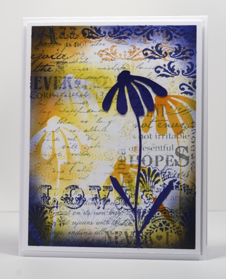
Penny Black released their new Creative Dies recently and are showcasing them everyday this week on the blog. I have been playing around with them so I have some “Dies Days” lined up for you this week too.
Today’s card features the Bashful Die in a collage panel. I began by masking a border then stamping a background of text in memento London fog ink. I used two stamps from Love Chapter along with the letter background stamp. I then used the bashful die to cut a mask out of a post-it note and sponged both the negative and the positive image with yellow and orange inks. I used a couple of stamps from the Lace Trim set along the top and bottom edge in memento Paris Dusk, added some sponging and a few feature words from the Love Chapter stamp. To finish I stamped the letter background on a dark blue die cut flower and attached that to the panel before popping it up on the card base.
Elizabeth, Jill & Peet have die cut inspiration on their blogs today
Supplies:
Stamps: Love Chapter, Letter Background, Lace Trims(PB)
Inks: Memento Dandelion, Cantaloupe, Tangelo, Paris Dusk, London Fog (Tsukineko)
Dies: Bashful
Being Complementary
Posted: May 5, 2013 Filed under: Background Stamps, CAS, Damask Pattern, Love Chapter, Penny Black 18 Comments
This Damask stamp from Penny Black is such a beautifully detailed stamp I like to show it off rather than relegate it to background status. When I started making this card I embossed a couple of panels, one in clear and one in black then played around with both. The white image left by the clear embossing powder definitely created the look I was after; I will have to fiddle with the black a little more before I’m happy with it.
As I said I started by embossing in clear then sponged Memento Pistachio from one corner toward the centre and Love letter from the opposite corner. I darkened the green portion further with Olive grove and added a little definition with a Bamboo Leaves marker. I then sliced the side off my panel so that it would be predominantly green rather than half and half, matted it in green and added a ribbon. I didn’t have the correct green so I used a paler green and coloured it with a marker.
When that card was finished I didn’t want the little strip I cut off to go to waste so I set out to make a very minimal design with just the thin panel and a sentiment. But then I remembered the “Love” stamp which has elaborate fonts that remind me of damask and a second design was created.
The complementary colour scheme is inspired by the Less is More Challenge this week.

Supplies:
Stamps: Damask Pattern, Love Chapter, Happy Birthday (PB)
Inks: Memento Pistachio, Olive Grove, Love Letter & Versamark (Tsukineko)
Cardstock: Penny Black Mix & Match Papers Olive Grove
Also: Clear embossing powder, ribbon
Shabby Chic tag cards
Posted: March 16, 2013 Filed under: Background Stamps, CAS, Cuttlebug, Love Chapter, Penny Black 10 Comments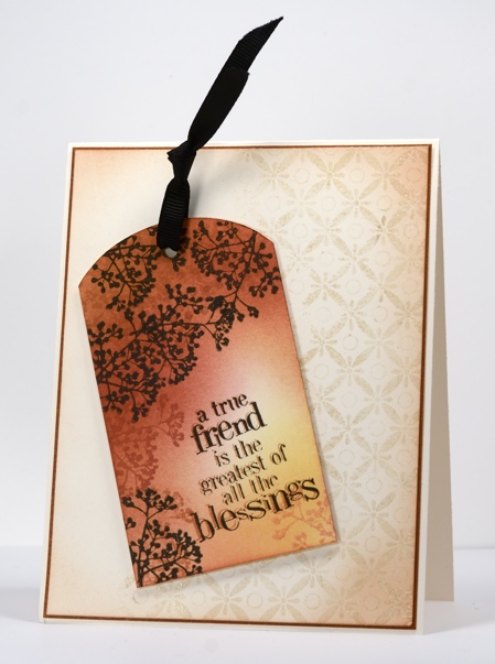
Today I have a couple of cards which developed as I stamped; I had a rough idea how I would do the tag above but nothing more than that. Once the first tag was finished I wanted to try the same technique with another text stamp. When both were finished I played around with layouts for quite a while before I settled on the ones you see here.
To create the tags I stamped the Dots in space background stamp then sponged three colours over most of the tag. Each tag has a branch motif which I stamped in brown tones first then black. The text stamps have an out of focus look intentionally; I stamped them first in Potter’s Clay then again in black but slightly offset from the first impression.
Both the tags were designed to feature but needed to be grounded on the card bases so I picked out a background stamp and an embossing folder. To ground the tag above I stamped part of the background stamp Indian Wheel in Wheat versamagic then embossed in clear powder before sponging the perimeter of the ivory panel in Memento Potter’s Clay. The tag below is grounded on the card base by an embossed panel created using a cuttlebug embossing folder which I sponged over lightly.
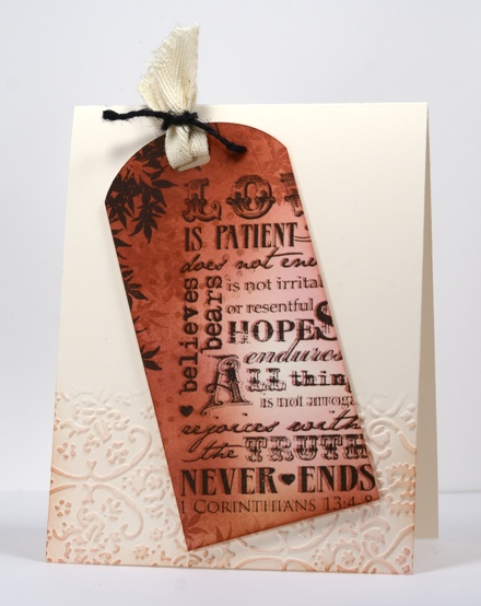
I do make tags from time to time but I rarely put a tag on a gift; I usually add a card in an envelope to a gift so these tags are more likely to get given this way than if they had remained as tags. What about you,do you make tags? Do you use them?
Supplies:
Stamps: Love Chapter, Friendship, Dots in Space, Indian Wheel, Tweet Tweet (PB)
Inks: Memento Potter’s Clay, Rhubarb Stalk, Dandelion, Angel Pink & Versafine Onyx Black & Versamagic Wheat (Tsukineko)
Cardstock: Mix & Match Grand Canyon
Also: Cuttlebug Folder Textile Texture, black ribbon, black twine
Love is…
Posted: February 14, 2013 Filed under: CAS, Love Chapter, Penny Black 17 Comments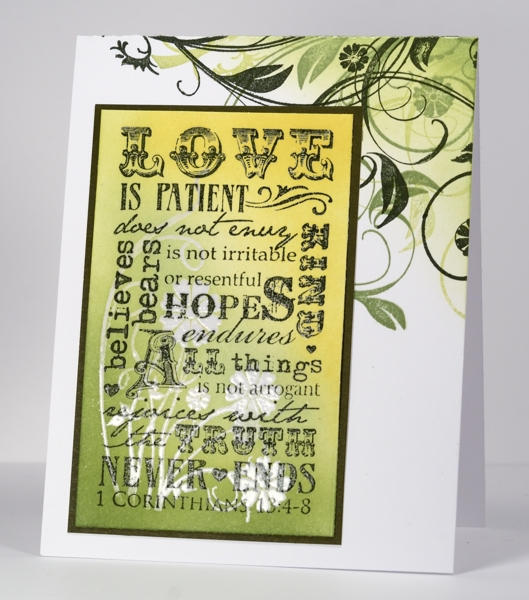
This card features stamps from two new Penny Black sets. The flourishy florals are from the slapstick cling set, Longing, and the 1 Corinthians text is from the transparent set, Love Chapter. I posted a little sneak peak this morning of a card made with the Longing stamps; you can see the whole card on the Penny Black blog.
I began the text panel for this card by stamping the floral stamp in Versamark and the text in Versafine Olympia Green then embossing both in clear e.p. I then sponged in greens and yellows and matted in Olive Grove Mix & Match paper. I overlapped the other floral stamp from the Longing set on the card base in three greens and sponged the corner.
Supplies:
Stamps: Love Chapter, Longing(PB)
Inks: Memento New Sprout, Pear Tart, Bamboo Leaves, Versafine Olympia Green, Versamark (Tsukineko)


