
Watercolour pencil cacti
Posted: August 30, 2018 Filed under: Happy together, Watercolour | Tags: Faber-Castell Albrecht Durer Watercolour pencils, Penny Black stamps, Ranger Distress inks 12 Comments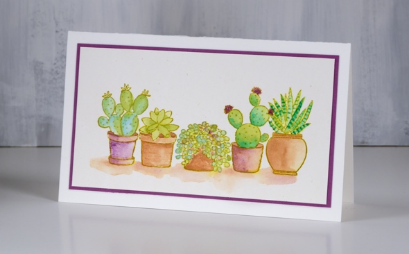
I’ve worked with this stamp before, last time with bister powder to colour it. It took longer with watercolour pencils but the process was quite relaxing. I used my tried and true Albrecht Dürer watercolour pencils from Faber Castell and limited my choices to light green, dark green, light blue, purple and brown.
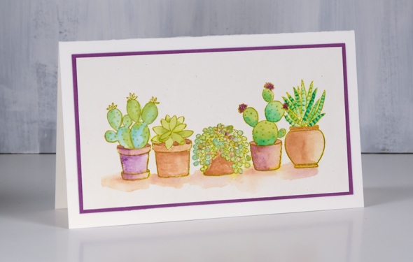
I stamped the image from the PB ‘happy together’ set in crushed olive distress ink then used a paint brush with my watercolour pencils to add colour. I painted shadows in a mix of brown and purple then matted with some purple cardstock.
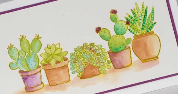
Now, help me out here, what is the right occasion for sending a cacti card??
Supplies
Stamps: happy together

Paper: hot pressed watercolour, neenah natural white, purple


Inks: crushed olive distress ink
,
Also: Albrecht Dürer watercolour pencils
Winter Solace
Posted: August 22, 2018 Filed under: Stamped Landscapes, Watercolour, winter solace | Tags: Penny Black stamps, Ranger Distress inks 4 Comments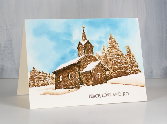
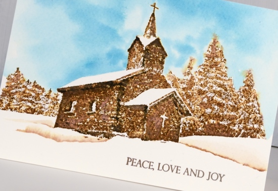
My vintage snowy scenes continue with this new Penny Black stamp ‘winter solace’. I kept it simple once again with vintage photo ink plus some black for shadows and some blue for the sky. The technique is similar to the one I shared in my recent video but because this is a more solid stamp it is necessary to blend the ink more carefully so as not to obscure the details in the stamp. I stamped in vintage photo distress ink on cold pressed watercolour paper.
Rather than use watercolour pencils to add extra colour, I pressed black soot, vintage photo and broken china onto my glass mat to use as needed.
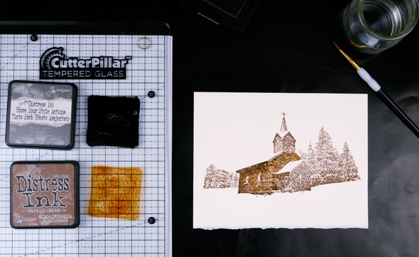
When blending the vintage photo ink I dabbed with a damp paintbrush instead of blending. I didn’t want the ink to cover the walls of the church uniformly, instead I left areas white and added black for shadows wherever I thought there would be some.
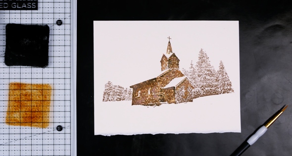
I added black under the eaves, under the windows and on the corners.
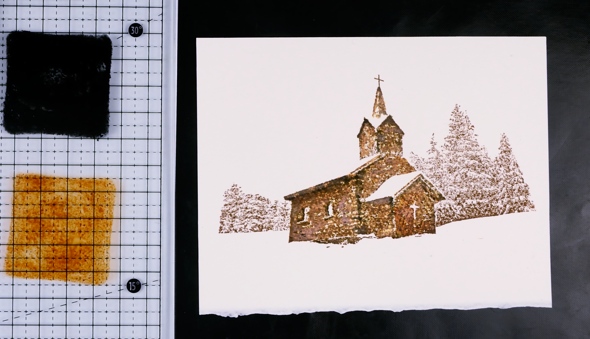
I used a pencil to lightly draw a roof line to give me a guide for painting blue sky. I painted right up to the pencil line and edges of building with water then added broken china ink to fill sky. I dabbed the blue ink around the edges of the trees with the point of the brush.
I blended water over the stamped sections of trees taking care to leave the white areas to look like snow.
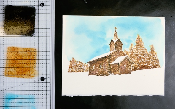
To add some snowbanks to the foreground I painted a few lines of vintage photo ink with a fine tip brush then blended them with water.
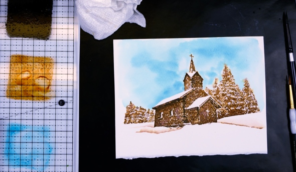
To complete the card I added a sentiment from the new ‘Christmas sentiments’ set.
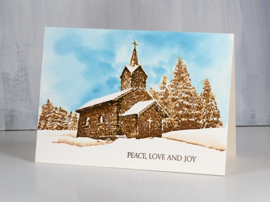
I’m looking forward to trying some other looks and colour schemes with this stamp.
Supplies
Stamps: winter solace, Christmas sentiments


Inks: vintage photo, black soot, broken china distress ink


Paper: cold pressed watercolour paper

Also: cutterpillar glass mat

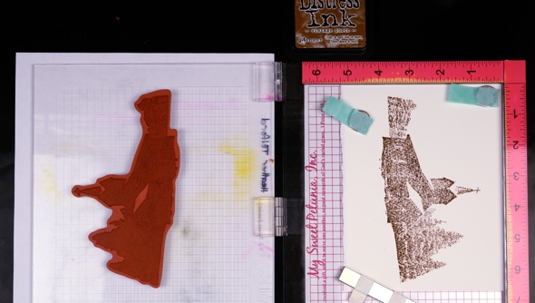
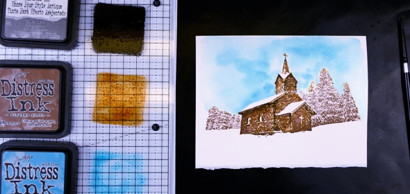
Tranquil Hamlet Video
Posted: August 20, 2018 Filed under: Stamped Landscapes, tranquil hamlet, Watercolour | Tags: Faber-Castell Albrecht Durer Watercolour pencils, Penny Black stamps, Ranger Distress inks 7 Comments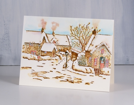
You’ve probably heard by now there is a new Penny Black release in town! Two actually, a big beautiful Christmas release and a fun fall release. The catalogues can be viewed here. I’ll be featuring vintage style snowy scenes all week here on the blog even though the sun is shining and the grass is green outside!
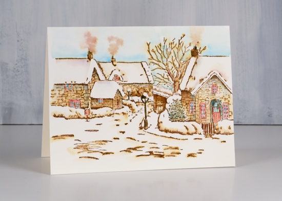
This lovely stamp called ‘Tranquil Hamlet’ is stamped in vintage photo ink and coloured with Faber Castell Albrecht Dürer watercolour pencils on hot pressed watercolour paper. Watch the video to see how
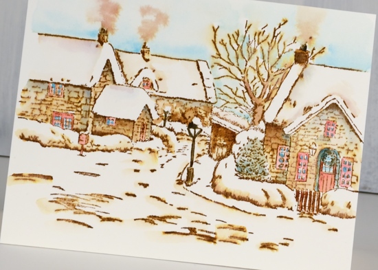
Thanks for dropping by; I’ll be back tomorrow with another snowy scene.
Supplies
Stamps: Tranquil Hamlet

Ink: vintage photo distress ink
Paper: hot pressed watercolour paper
Pencils: Faber Castell Albrecht Dürer Watercolour pencils (199, 159, 154, 151, 126)
Tools: stamping platform
.
A night of woodland beauty
Posted: August 29, 2016 Filed under: Prancers, Stamped Landscapes, Tutorial, Watercolour, Woodland Beauty | Tags: Dr Ph Martin Hydrus watercolor paints, Fabriano Watercolour Paper, Penny Black stamps, Tsukineko Versafine inks, Tutorial, video 18 Comments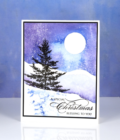
This week I am sharing my top three tree stamps from Penny Black’s new ‘Magic of the Season’ release. You know I love tree stamps so you wont be surprised that they were the first image I looked for when the new release arrived. The pretty spruce silhouette stamp immediately caught my eye and I knew it would be in my top three tree stamps. I have four stamped landscape cards to share this week and this little tree stamp features twice, today in a night time snowscape and tomorrow in a day time scene.
You will probably recognise another favourite tree stamp of mine in the background of this scene, it’s the little tree from the ‘Prancers’ set. I created a video to show you how I made this scene which features some watercolour effects along side some pigment ink stamping. I chose to pair pigment inks, which are waterproof, with watercolour painting so I could have pretty blends in the sky and snow but sharp tree images in the foreground and background.

Supplies
https://linkdeli.com/widget.js?1552642647875
Round the watercolour world
Posted: August 8, 2016 Filed under: Brusho, love to travel, mini community, Watercolour | Tags: Brusho, Fabriano Watercolour Paper, Penny Black creative dies 5 Comments
I have more watercolour die cuts to share. This card has a much higher fiddliness factor than the previous ones and has convinced me that I should never video myself making a shaker card! Rather than trying to describe my trial and error process for making this shaker card I will just list the layers I used from little die cuts right down to the card base. The mini community and ‘the world’ were cut from brusho panels.
watercoloured ‘mini community’ & ‘love to travel’ die cuts with stick-it adhesive on the back
black cardstock panel
acetate
foam with circle die cut from centre
watercolour panel to be ‘the world’
card base

I saved the little die-cut bus and cars to put inside the shaker area with the glitter, sequins and micro beads. It wasn’t until I started shaking it that I realised the bus and cars would end up in countless pile ups!

Supplies:
Stamps: Sprinkles and Smiles (PB)
Die: Mini community Love to Travel (PB)
Paints: Brusho (Colourcraft)
Cardstock: Fabriano 100% cotton hot pressed watercolour paper, Neenah solar white, Neenah epic black
Also: stick it adhesive sheet, glitter, sequins, micro beads
Watercolour Fuchsias
Posted: August 5, 2016 Filed under: Fuchsia, Watercolour | Tags: Penny Black creative dies, Penny Black stamps, Tsukineko Versafine inks 10 Comments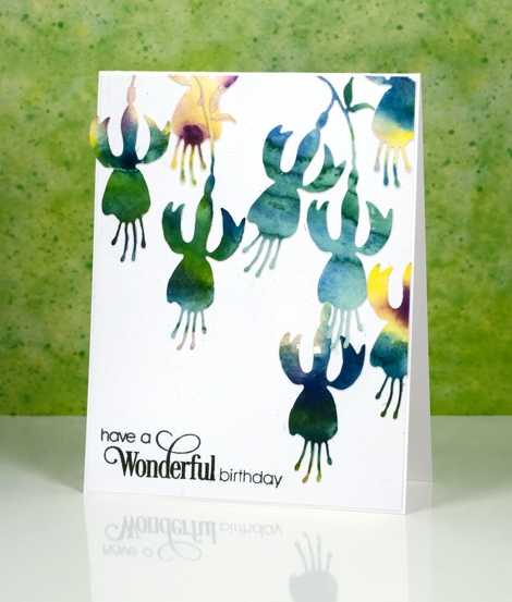
I’ve been cutting up watercolour panels again; it really is a great way to use up experiments or abandoned projects. Sometimes I have panels that were my ‘practice’ for something else or part of a class where I demonstrated a technique but then moved on. The colours in the panels are pretty but the pattern might be a bit random or unattractive. Using a die cut means I can cut from the sections where I really like what the colours are doing. These panels were painted with Gansai Tambi paints.
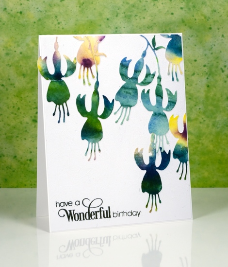
I put stick-it adhesive on the back then cut all these fuchsias from a couple of panels featuring the same blue green tones. I arranged them then attached them all to a white panel and then to a white card base. My photography didn’t pick up the texture on the white panel as it is quite subtle but it is a cute trick if you want to try it. The cutting base panel for my die-cutting machine is very well used all over so when a piece of cardstock is run through the machine the base transfers an intricate pattern of intersecting lines which creates subtly textured cardstock. I am going to include this card in the Casology ‘Watercolour’ challenge.

Supplies:
Stamps: Sprinkles and Smiles (PB)
Die:
Watercolour Dance
Posted: August 3, 2016 Filed under: Brusho, CAS, shall we dance, Watercolour | Tags: Brusho, Penny Black creative dies, Penny Black stamps 21 Comments
It’s really quite hot here at present and this card some how makes me feel a little cooler. It’s either the watery splatter or the cool blues and greens. I used up another abstract watercolour panel to make this card; there is quite a pile of painted or stamped panels sitting on my desk waiting to be turned into something. As you can probably guess this panel was mainly green but had a bit of purply pink on it. I am pretty sure it was done with brusho because there are little bits of other colours mixed in which is one of the nice features of brusho paint – the colours are not purely one pigment.
I used the new ‘shall we dance’ die from Penny Black to cut as many flowers as I could. I didn’t need them all to be complete die cuts as I wanted some tall and some short. Before I cut them I put ‘stick it’ adhesive on the back of the whole panel to make things easier later. Once I had all the flowers I could squeeze out of the panel I played around with positioning until I was happy. I did it all on a plain white panel assuming that I would keep the background blank and let the colours in the flowers pop. It would have been ok that way but I decided to use my watercolour pencils to try a little splatter in similar colours to the flowers. It may not be strictly white space any longer but it is pretty.
I am going to let this card play along with not one, but two challenges.
The CASology cue card is

and the CAS Mix Up challenge is

I read the fine print and discovered that if you didn’t have sprays then splatter is just fine so we’re in!
Supplies:
Stamps: Words of Kindness (PB)
Die: Shall we dance
Paints: Brusho powders (Colourcraft)
Inks: Cottage Ivy Memento ink (Tsukineko)
Cardstock: Fabriano 100% cotton hot pressed watercolour paper
Also: stick it adhesive sheet
Summer’s End
Posted: July 30, 2016 Filed under: Classes, Penny Black, Watercolour 4 Comments
No, I’m not heralding the end of summer, I’m showing a sneak peak of my next class. I teach monthly classes in Ottawa at a rented location and at Crop A While scrapbooking store. You can see the details for the classes I host on my Upcoming Classes page and find the dates and times for Crop A While on their events page.
I receive quite a few requests for online classes which I would love to provide at some stage. Be assured I will let you know here on the blog when I have some to offer you. While you wait I do have a few videos on my youtube channel.
Thank you for your interest and support; I have been so encouraged by the kind and generous comments left here on the blog and on my instagram page also. I am thrilled that you enjoy what you see here and love to hear when you try the techniques for yourself. I am always happy to answer questions if I can, so don’t hesitate to comment or use the contact me option to get in touch.
More butterflies
Posted: July 9, 2016 Filed under: butterfly charmer, Watercolour | Tags: Faber-Castell Albrecht Durer Watercolour pencils, Penny Black stamps, Ranger Distress inks, Tsukineko Versafine inks 17 Comments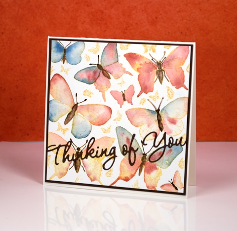
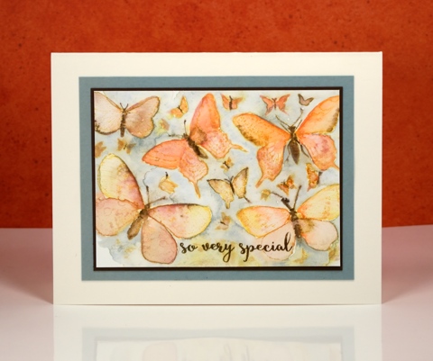
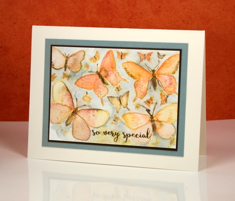
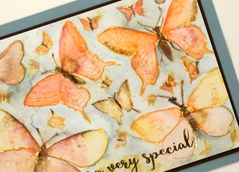
I didn’t intend for this week to be all about butterflies but that’s the way it turned out. To create this panel I coloured the little butterflies on the butterfly charmer stamp using what I am calling the colour drop method. I don’t think it is anything new but I needed a name for this little technique. I stamped the large stamp with wild honey distress ink then painted the butterflies with water one at a time. The water blended the wild honey ink to give each butterfly a warm yellow tone but it also gave me a pool to drop another colour into. I took colour from my water colour pencils and dropped it onto the wet wings and let it spread into the whole wet area. I moved from wing to wing so they could dry a little before adding a second colour to an adjacent area. I did video the process and have sped it up and posted it on my instagram
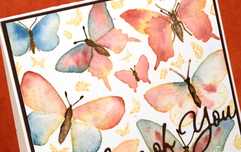
When the wings were all dry I drew over the butterfly bodies, legs and antennae with either a dark brown watercolour pencil or a distress marker then blended the brown with a very small paintbrush and a wee bit of water. The finished panels remind me of botanical books.
The first one I did using this method is below. I added colour to the little butterflies also and filled in the background.
I used Faber-Castell Albrecht Dürer watercolour pencils over rusty hinge distress ink for this one
You can see on the close up that you don’t lose all the definition of the stamped image when you paint over it; there are faint outlines of pattern underneath.
Thanks for dropping in; have a great weekend.
Supplies:
Stamps: Butterfly charmer, Happy Snippets (PB)
Dies: Wishes
Inks: wild honey distress ink, rusty hinge distress ink (Ranger) Versafine vintage sepia (Tsukineko)
Cardstock: Hot pressed Fabriano watercolour paper, brown cardstock, green cardstock
Also: Albrecht Durer watercolor pencils (Faber-Castell)
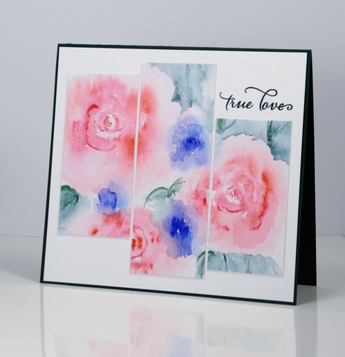
True Love
Posted: May 8, 2016 Filed under: CAS, Hand painted, Watercolour | Tags: Penny Black stamps, Sakura Koi watercolour paints 18 Comments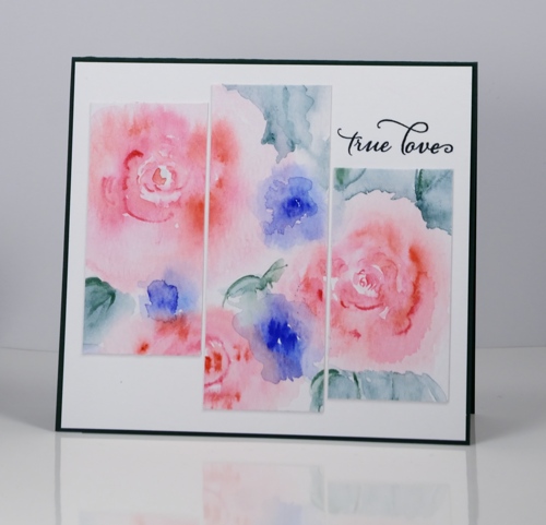
In keeping with my resolve to mix up my card layouts a wee bit I have a triptych inspired card to share. I painted the roses on a piece of watercolour paper, added leaves and blue flowers (not sure what they might be) then decided to find some inspiration on my ‘sketchy’ pinterest board. I sliced my panel into three strips of the same width then trimmed the ends so each would be a different length. The sentiment fitted quite nicely in one of the white spaces. I stamped the sentiment once in green then over the top in blue which gave me the bluey-green I was after to match my paint. I think the colours are soft enough to join in with the ‘pastels’ challenge on Less is More this week.
I hope you are having a lovely day.
Supplies:
Stamps: Happy Snippets, (PB)
Ink: Majestic Blue, Olympia Green Versafine inks (Tsukineko)
Paint: Sakura Koi watercolours
Paper: Heavy weight water media paper (Ken Oliver), Neenah SolarWhite 110lb cardstock, green cardstock


