True Love
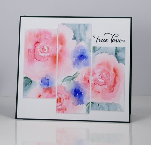
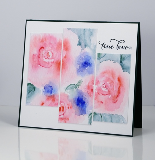
Posted: May 8, 2016 Filed under: CAS, Hand painted, Watercolour | Tags: Penny Black stamps, Sakura Koi watercolour paints 18 CommentsIn keeping with my resolve to mix up my card layouts a wee bit I have a triptych inspired card to share. I painted the roses on a piece of watercolour paper, added leaves and blue flowers (not sure what they might be) then decided to find some inspiration on my ‘sketchy’ pinterest board. I sliced my panel into three strips of the same width then trimmed the ends so each would be a different length. The sentiment fitted quite nicely in one of the white spaces. I stamped the sentiment once in green then over the top in blue which gave me the bluey-green I was after to match my paint. I think the colours are soft enough to join in with the ‘pastels’ challenge on Less is More this week.
I hope you are having a lovely day.
Supplies:
Stamps: Happy Snippets, (PB)
Ink: Majestic Blue, Olympia Green Versafine inks (Tsukineko)
Paint: Sakura Koi watercolours
Paper: Heavy weight water media paper (Ken Oliver), Neenah SolarWhite 110lb cardstock, green cardstock


Beautiful – so pretty and love the layout
Tlhis is so so pretty Heather and I love the pink with the purple and soft green in the background and you have made it that bit different by cutting into three uneven pieces which looks great! x
So very pretty! Really enjoying your cards!
So soft and pretty, Heather! Happy Mother’s Day!
Nicely done Heather….hope you are having a wonderful Mother’s Day!
Paper Hugs,
Jan
Your cards are always so pretty. Love the soft, painterly watercolor effects that you get. Lke your three level triptych look.
Dear Heather,
I receive your magnificent work in my inbox, but just wanted to pop over and say how much I love your new layout designs, they are real gems, love this one!
Well done.
Thanks so much for the inspiration,
Shaz in Oz.x
{Calligraphy Cards – Shaz in Oz}
Wow! Your watercolouring is fantastic…very inspiring. A beautiful and well designed card.
A fantastically feminine card Heather. The flower images are just wonderful.
Thanks so much for joining us
Sharon xx
“Less is More”
Really beautiful.
This is stunning. I love the soft watercolour and striking, unusual layout. Beautifully done and a great LIM entry!
Such an amazing creation, Heather! Thank you for all the inspiration!!
Lovely! Thanks so much for the inspiration!!
Such a clever layout. The soft colours really work with this stamp.
This is just beautiful, Heather! Love the soft colours and outlines, and your clever use of the watercolour panel. This design would work with so many of the watercolour or other media bits and pieces we play with.
What a gorgeous water coloured image. 🙂
Wow Heather, it’s great to see you at LIM again with this stunner. What amazing watercolour technique with such fab gentle colours!
Thanks so much
Chrissie
“Less is More”
I’m always blown away by your painting skills, Heather, and this is another stunner. Just love it.
Thanks for sharing with us.
Anita x
Less is More