
Layouts and sketches
Posted: May 6, 2016 Filed under: Alcohol Ink, CAS, Dies | Tags: CAS, Penny Black creative dies, Penny Black stamps, Ranger Alcohol Ink 7 Comments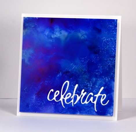
Recently I noticed how often my card designs involve a simple square or rectangle. Sometimes the panel is matted in black or a co-ordinating colour; other times it is popped up on the card base which creates a type of shadow mat. A matted panel with little embellishment is my most used layout. I’m not saying there is anything wrong with the matted panel approach; I often try to create a mini painting so framing it seems like an appropriate way to turn it into a card. However, there are many clever card makers who never default to the square or rectangular layout; each new card features angles, diagonal lines, curves, cutouts and all manner of creative designs. I’ve decided I need to mix things up a little in the sketch and layout area. Take the card above for example, the alcohol ink design reminded me of the ocean from beneath the surface with light above and bubbles all around. I really didn’t want to loose much of the blue pattern so I cut the sentiment out of the blue panel and popped it up. I like how it turned out but it was very much my usual style.
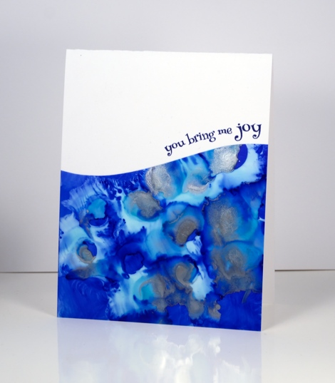
When I put this next card together I was working with a similar panel; the alcohol inks had done cool things creating a pattern I wanted to save if possible but not in yet another rectangular layout. By cutting a curve across the patterned yupo panel I was able to add some interest and bend a transparent sentiment stamp to hug the curve.

Once again I wanted to retain most of this warm toned alcohol ink design so I chose a cool new border die with curves that created a contrast with the angles of the stenciled pattern.
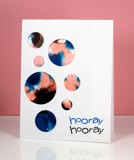
I have a board on pinterest where I am saving inspiration for new layouts. The card above was inspired by Paula Dobson’s bright happy card, pinned recently. Sketch challenges are another source of inspiration I hope to make use of more often. You may have noticed all the cards in this post were made from patterned panels, which of course, are easier to adapt to interesting layouts than pictures of real things! I may get adventurous and creative with my scenic or floral panels too, who knows?
Supplies:
Dies: Celebrations, Border Edges (PB)
Stamps: Happy Snippets, Sweet Wishes
Ink: Alcohol inks (Ranger) Versafine inks (Tsukineko)
Paper: Yupo paper, Neenah SolarWhite 110lb cardstock, Neenah Natural white cardstock


I am loving the different layouts for your fab alcohol pieces – they all look really cool and are very inspiring! xxx
Whenever I look at your cards, I think you are so blessed with talent, you really don’t need to try and do crazy creative things , because your technique just shine time after time! A simple frame just work so well for you! That being said… I love what you did here too! Beautiful ! You really inspire me! Thanks !!!
Your technique is beautiful and inspiring.
Such beautiful use of alcohol inks Heather and I love these idea for displaying and finishing a card in an really interesting way. x
These cards are beauties ! Real eyecatchers !
Thank you for sharing your talent !!
I love your cards featuring the alcohol inks! It’s really cool the effects you can get isn’t it? Have you tried using them on other surfaces like tinfoil? Paint or draw on the tinfoil (which I always wrap around some cardstock before hand) and using a blender medium or alcohol drip on what you’ve done. It reacts and dies some really cool things. The last card I made this way was a long time ago but you’ve made me want to pull out the tinfoil and play again! 🙂
I have tried the foil over card stock after running it through the big shot with a embossing folder. The effects were cool where the alcohol inks pooled and blended. I also tried some thin metal sheet which gave fun effects. So glad you are enjoying my efforts with the alcohol inks; I’m having so much fun!