
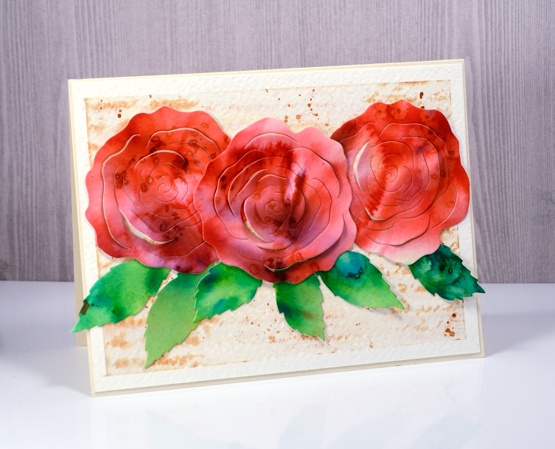
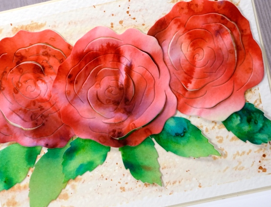
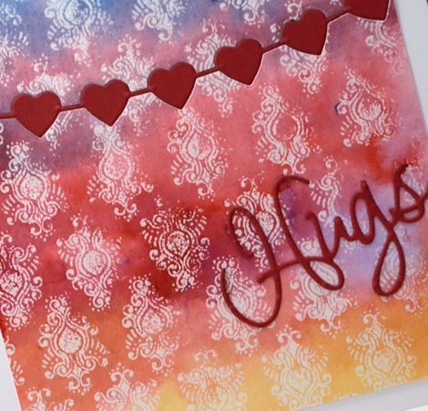
Dazzling postcard
Posted: March 20, 2020 Filed under: dazzle, Penny Black, Script, vintage postcard | Tags: Fabriano Watercolour Paper, Penny Black stamps, Ranger Distress inks 11 Comments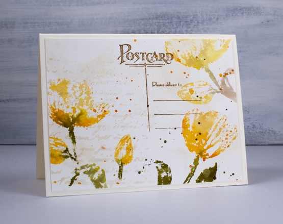
I am sharing these tulip cards over on the Foiled Fox blog today. You know I like it over there, I enjoy the inspiration on their blog, the range of products in their store and the interaction with the Foiled Fox staff and their readers. Make sure you pop over there.
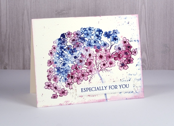
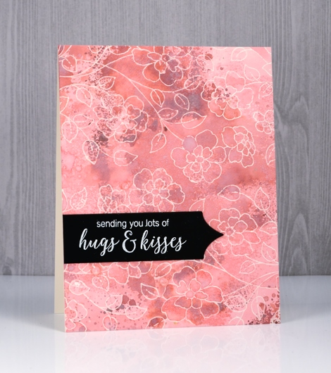
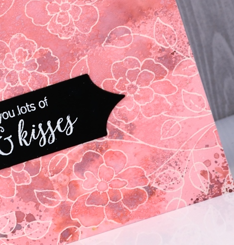
To create a vintage background I smooshed antique linen distress ink on a glass mat then spritzed water over the ink before swiping a hot pressed watercolour panel through the it. I dried the panel before repeating the step. Next I inked the ‘script’ background stamp in antique linen ink, spritzed it then stamped it on one side of the panel. I let everything dry before moving onto the tulips. The stamp is a new one from Penny Black called ‘dazzle’; it is large and features two tulips and two buds. Neither of today’s cards show you the whole stamp; I was after the look of patterned paper rather than a complete image. You will see the whole stamp on another card in the future.
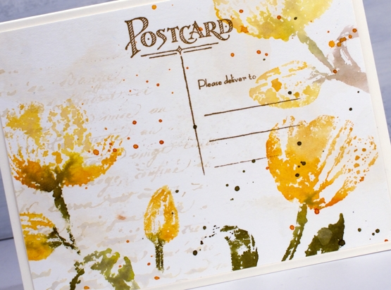
I inked the stamp with scattered straw, wild honey and forest moss distress ink, spritzed it lightly then stamped over the edges of the panels. I also wiped ink off the stamp before pressing it down so the tulips would appear to be floating not anchored to the base of the panel. On the second card I blended over the stamped tulips with water to create a transparent look but on the card above I left them looking ‘lacey’. After the ink dried I splattered both panels with wild honey and forest moss inks.
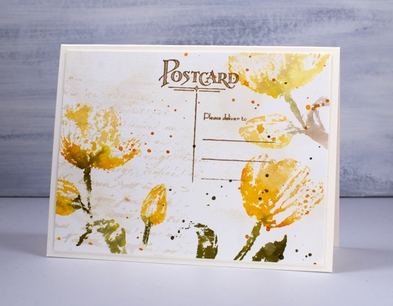
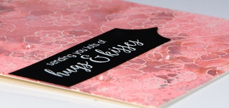
To finish the card above I stamped part of the new ‘vintage postcard’ stamp in vintage photo archival ink. On the card below I added some hemp twine and a popped up sentiment panel also stamped on ‘aged-looking’ paper.
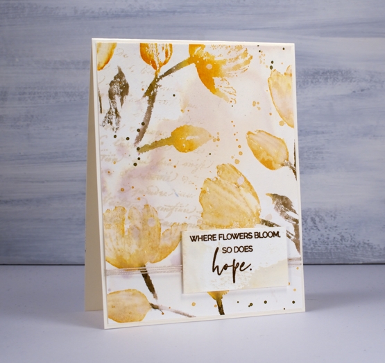
You have already seen this sentiment once this week; it does seem appropriate for the uncertain circumstances we are experiencing right now. I made both cards before the virus situation escalated in North America but I hope having these cards and those words end up on the blog this week is an encouragement to you.
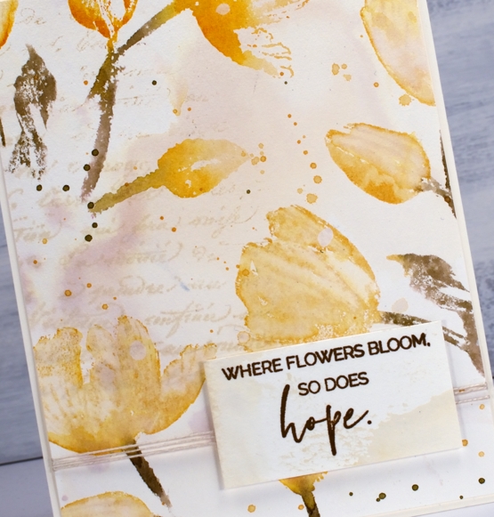
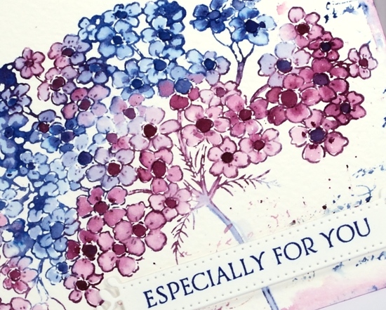
In the close up above you can see clearly the variation of colour achieved by picking up diluted antique linen ink on my watercolour panel; there seems to be a purply tone in there! I love this kind of background and it is so easy to do. Thank you for dropping by today. I appreciate you all and am encouraged to hear that these posts are providing you with some inspiration during a difficult time.
Supplies
Dreams of love
Posted: April 29, 2019 Filed under: dreams of love, Penny Black, Script, square and circles, Xmas sprigs | Tags: Penny Black creative dies, Penny Black stamps, Ranger Distress inks 12 Comments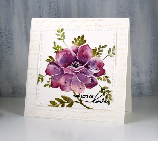
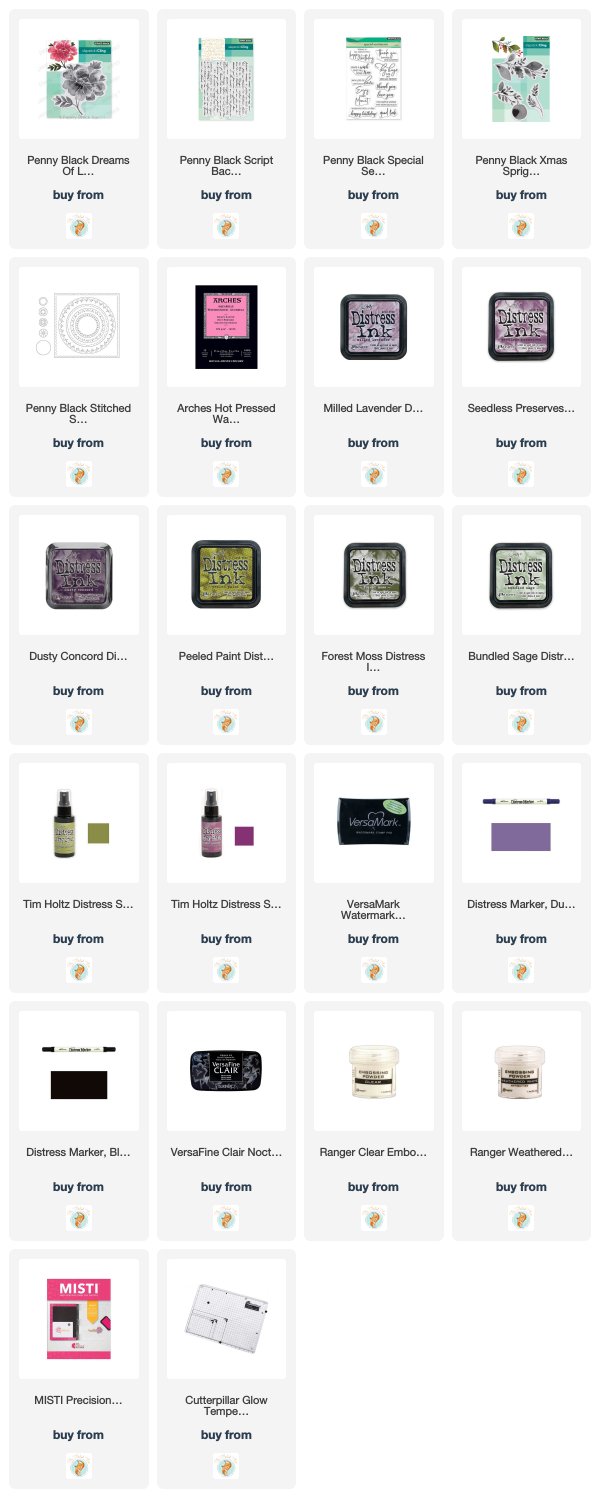
I think you can guess where this sweet floral came from. Penny Black has a new release, ‘Full Bloom’ and this is just one of the beauties I have to show you. As I often do with brushstroke stamps I pulled out distress inks for my first play with this stamp. I used three purple inks, milled lavender, seedless preserves and dusty concord to create variegated petals on this large flower. For the leaves I used a mix of peeled paint, forest moss and bundled sage. I would understand if you wondered whether I ever use any of the other greens, those three are definitely the first ones I reach for!
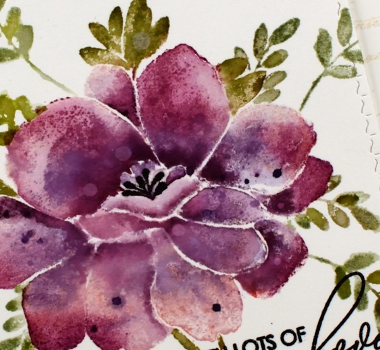
I used a stamp positioner and hot pressed watercolour paper and started by stamping the whole flower (but not the leaves) in milled lavender distress ink. On a stamp like this one it is sometimes hard to differentiate between petals and leaves when looking at the red rubber side of the stamp. I find it helpful to stamp it on scrap paper in a medium to dark ink as a reference. When doing partial inking as I did for this card, I ink all the petals then wipe off any ink that ended up on the leaves with a cloth or wet wipe. After stamping in milled lavender I inked the petals again, this time in seedless preserves ink and I did not cover all the petals. I gave the stamp a light spritz of water so the ink would blend when it layered over the previous stamping. Finally I inked it again in dusty concord keeping the ink concentrated around the centre of the flower not the edges. I then used a paintbrush and some water to blend the colours on each petal one at a time. To further define the petals I pressed the ink pads onto my glass mat so I could pick up ink with my paintbrush and add it to the edges or any areas where I wanted a strong shadow. I dried the panel before carefully inking the anthers with a black marker, unlike the rest of the image I wanted them sharp and defined rather than soft and blended. I also added distress stain drops and water drops while the panel was dry.
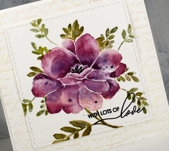
With the petals all finished I switched to the leaves and inked them with peeled paint and forest moss ink then blended them with water after stamping. I added a few more leaves of the same style using a stamp from the ‘Xmas sprig’ stamp set. To add them in I cut a rough post it note mask and positioned it over the petal edge before stamping the sprig in bundled sage and peeled paint inks.
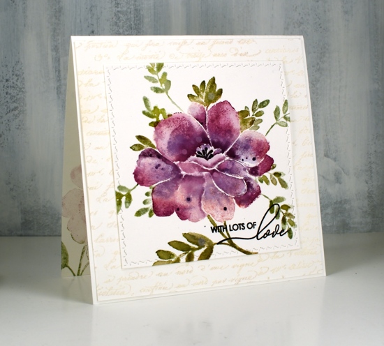
To finish the card I die-cut the panel using the square from the PB ‘stitched square & circles’ die set and clear embossed a sentiment from PB ‘special sentiments’ in black ink. I framed the floral panel with a script stamped panel which I embossed with Ranger weathered white embossing powder. I have not had success with this embossing powder until now, totally user error by the way, there is nothing wrong with the product! The embossing powder is called ‘weathered white’ for a reason, when you emboss with it the effect is not glossy and it is not even. It is, as the name suggests, weathered! For a large background area like this script panel it adds texture and subtle colour. The card is quite large and fits into a 6″ square envelope. I inked the stamp in milled lavender and bundled sage ink to stamp a pale image inside the card and used the same inks to stamp the ‘sprig’ on the envelope.
I’m looking forward to inking this stamp again with different colours schemes and maybe a looser watercolour look.
Supplies
Gelli butterflies and blossoms
Posted: April 10, 2019 Filed under: Alexandra Renke, cherry blossom, gelli plate, monarch, Script | Tags: gelli plate, Penny Black creative dies, Penny Black stamps, Tsukineko Versafine inks 3 Comments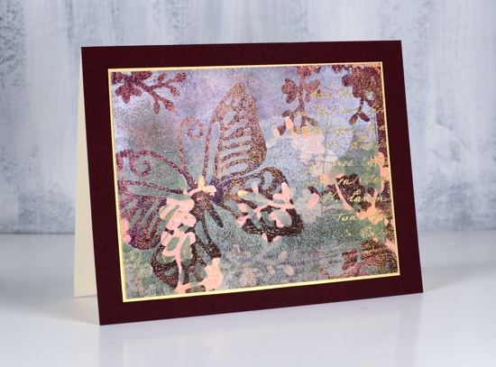
Thank you for all your lovely comments about my recent art journal page. I’m glad you enjoyed it. I have a couple more pages in process in my journals which I look forward to showing you in the future. I would love to hear from other art journallers. What are some of your favourite mediums and techniques?
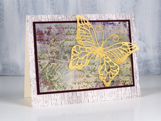
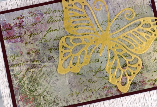
Today’s cards are made with my latest fave: the gelli plate! I am very much a beginner but learning as I go and watching the myriad of techniques shared on the Gelli Arts youtube channel. The panels in today’s cards were made by printing layer after layer while rearranging die cut paper butterflies and blossoms on top of each new layer of paint. The dies are Penny Black ‘monarch’ and cherry blossom’.
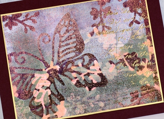
I wont’ try to describe my process because I don’t remember exactly what my order was or what paint colours I used. I know there was green, white, burgandy, gold and pink liquitex basic acrylics but there could have been more. Like many artistic techniques success with a layered gelli print can be knowing when to stop. Once I was happy with the one above I still had paint and pattern showing on the gelli plate so I added one more layer of paint then pulled a ghost print (I’m learning the lingo!) on patterned paper. The paper I chose was a woodgrain print from Alexandra Renke.
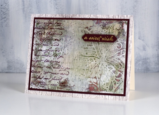
You can see the woodgrain print through the paint and pattern. I ended up matting both panels in burgandy cardstock then attaching them to a base panel of the same AR woodgrain paper.
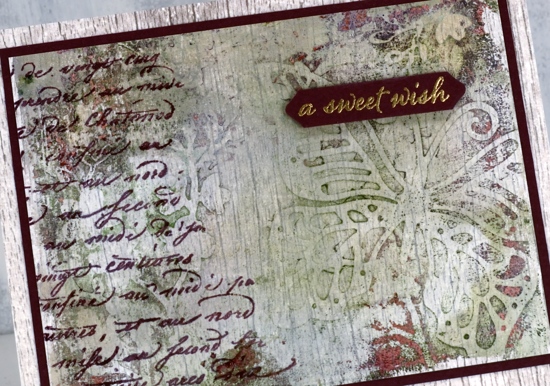
It’s always hard to capture shimmer on camera but all three panels have gold shimmer on them so I added some gold accents to each one. On the top panel I stamped the PB script stamp, embossed in gold powder and matted the panel with gold cardstock. On the card above I added a gold embossed sentiment from the PB set happy snippets and stamped the same script stamp in chianti versafine clair. On the card below I stamped the script stamp in shady lane versafine clair ink and added a gold vellum die cut butterfly, the same butterfly used as a mask in the gel printing process.
I love all the texture from the gelli printing process, the paint which builds up after several layers of printing adds so much interest
I did another butterfly and blossom print in a different colour scheme but I’ll share that another day. Thanks for dropping in.
.
Blooming journal page
Posted: April 8, 2019 Filed under: Art Journal, Hand lettered, Hypnotic, Penny Black, Script, timeless, winter branches | Tags: Penny Black stamps, Penny Black stencils, Ranger Distress inks, Ranger Distress stains 13 Comments
I’m been working in one of my Fabriano Venezia art journals again experimenting with vintage style. I started by painting absorbant ground over the double page spread then stamped the PB ‘script’ stamp in tea dye and antique linen distress inks. I spritzed the inked stamp before pressing it onto the page so I would get blurred prints.

Once that dried I spread modeling paste through the PB hypnotic stencil and had to go and do something else so I wouldn’t mess it up before it was dry. Even so I still stuck my finger on it while it was wet and smudged some.

Once the paste dried I spritzed the ‘see ya latte’ shimmerz spray over the pages then wiped it off the stencilled area so it would darken the background. I am not an experienced art journaller but I am using one to try things out. On this page I was trying to create a vintage look. I stamped the ‘timeless’ rose stamp from Penny Black three times in brown distress inks then blended the ink into the petals. My journal is not watercolour paper so ink and paint don’t move on the page as easily. I didn’t like the roses enough to keep them all, instead I covered some with flowers cut from leftover Italian papers. I glued them on with matte medium and painted diluted gesso over them to decrease the contrast then added a bit of distress vintage medium for the aged tea stain look.

I did a smaller collage of flowers on the opposite corner then stamped PB winter branches over the pages with vintage photo and ground espresso distress inks. I added some pretty scroll stamping with the PB set ‘flourish borders’ in white ink and some more of the ‘script’ stamp in brown ink. Tattered rose distress stain matched the paper flowers so I splattered a decent amount of that over everything too! I mentioned on my previous journal page post how I struggle with adding words to a page. I chose a quote from Ruth Chou Simon’s book ‘Gracelaced‘ which encourages and challenges me every time I open it. I wanted to write the words with my nib pen but when I tried, the ink spread into the page and looked like a blob so I wrote on calligraphy paper, tore the words into strips and glued them over the blob. Some of the letters are blurred because I didn’t let it dry long enough. I need a bit more patience when working in my art journals…
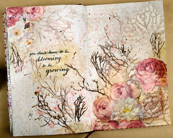
Not exactly what I set out to create but as I said, the art journal is for playing with mediums and ideas. Have a great day
Supplies
Exquisite
Posted: March 9, 2018 Filed under: birds and banners, exquisite, Script | Tags: Penny Black creative dies, Penny Black stamps, Ranger Distress stains 7 Comments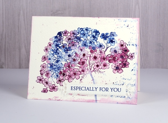
My final springy card for this week features this lovely big flower in two of my favourite distress stains, chipped sapphire and seedless preserves. I stamped this one on cold pressed watercolour paper so once again having the panel in a stamp positioner helped me get a good impression. I inked first with chipped sapphire over parts of the flower, stamped, wiped off the stamp and inked sections again but this time with seedless preserves. I ended up with some blue flowers, some pink and some a purple mix.
I blended the petals of all the flowers with a damp brush and let them all dry. I was going to leave all the centres white but it didn’t look right so I ended up painting them all darker with undiluted stain. To create a soft textured background I dropped a few drops of water around the flower then partially stamped the script stamp in the same ink stains. I dabbed out some ink with a paper towel and added some splatter as well. To frame the whole panel I ran the seedless preserves dauber around the edges then softened the colour with a damp brush.
To complete the card I stamped a sentiment on a fancy little die cut banner and popped it up over the stem of the flower.
Supplies
Stamps: exquisite, script, banner sentiment (Penny Black)


Die: birds & banners

Inks: chipped sapphire & seedless preserves distress stains, majestic blue versafine ink


Paper: cold & hot pressed watercolour paper


Polar bears
Posted: December 18, 2017 Filed under: mosaic pattern, polar bears | Tags: Kuretake Gansai Tambi watercolour paints, Penny Black creative dies, Penny Black stamps 12 Comments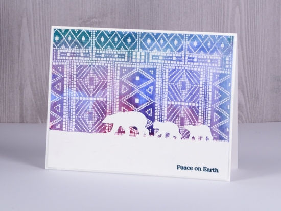
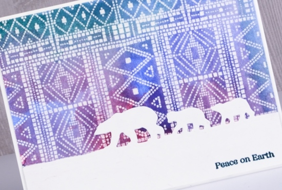
I stamped and embossed four panels of this Penny Black mosaic background recently for a project you’ll see in a few days but then I got another idea and painted over one. When I started painting it I totally forgot that I had not stamped it on watercolour paper but neenah solar white cardstock. I dabbed it dry fairly quickly and although it curled the surface of the paper, it did not end up looking pilled or damaged.
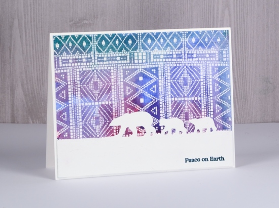
Even though the ‘sky’ is very patterned I still think it gives the impression of northern lights for this little family of bears to wander under. The polar bears die from Penny Black cuts only at the top so the bears appear to be walking across the snow.
Even though I initially did not plan to do watercolour with this panel I did and it meets the challenge at CAS watercolor this month. As always there is tons of beauty to be found if you check out the team samples and challenge entries.

Supplies
Stamp: mosaic pattern


Die: polar bears

Versamark ink & clear embossing powder

Paint

Distress Oxide Trials – one or two colours
Posted: May 5, 2017 Filed under: Blips, Felicity, Shades, Triple Banner | Tags: distress oxide inks, Penny Black creative dies, Penny Black stamps, WOW embossing powders 15 Comments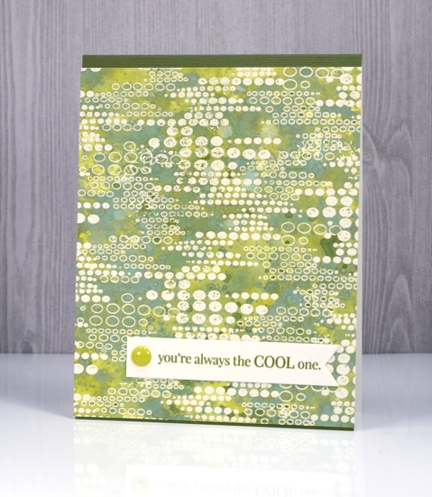
As I’ve been reading your comments about distress oxide inks I have noticed some of you are not sure you want them so have held off or only bought one or two to try. I decided to see what I could do with just one or two colours. I’ve been having so much fun with about half the colours I haven’t even opened them all yet and sadly spiced marmalade is currently hiding somewhere in my messy busy and productive workroom. All that to say, if you only have one or two colours, do some experimenting with them anyway; you might be surprised.
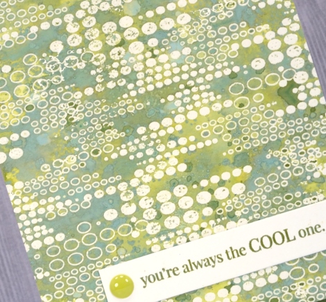
This green themed card is inked with only peeled paint distress oxide ink and yet there is a light and dark teal green, and dark and light olive tones as well. I was pretty impressed. I think the key to this effect is in the layering of colour. I pressed my ink pad on my craft mat, spritzed the ink then swiped my embossed panel through the ink. Colour only partially filled the panel; I dried it then repeated the process over and over. Each layer of ink reacts with the ink already on the paper and the un-inked areas on the paper. I also did some splattering of ink and water and some dabbing of water with a paper towel to lift a bit of colour. Because my panel was embossed I had to be careful not to reheat the embossing too much so I kept the heat tool moving. I love the effect around this ‘blips’ background stamp. A friend of mine used this stamp with great results recently by sprinkling brusho over the embossed image. Seeing her lovely card reminded me I had this stamp tucked away.
My second card uses only two distress oxide inks, worn lipstick and fired brick. I was hoping to do cards in just one colour but I wasn’t getting the same variety of colours from worn lipstick. My guess is that I spoiled my chances by covering the whole panel with my first layer of diluted ink rather than just part of the panel. I did manage to build up some different pinks over the top of the first layer but the differences were not as dramatic as shown on the green above. I will try again and use the same partial inking technique over and over and see what happens.
I did still manage to get some nice colour trapped inside the embossing creating light and dark petals and leaves. To provide just a bit more contrast I swiped it through some fired brick diluted ink a few times. When I press my ink on my craft mat then spritz it lightly it forms little beads of ink. Swiping through them spreads colour across the panel but pressing the paper down on top picks up little dots of ink, another cool effect I think.
I finished both cards with embossed sentiment banners and a few embellishments.
I have a growing list of suggestions from readers to try next week. Thanks for all your encouragement, tips and questions.
Supplies
Stamps: Felicity, Blips, Amazing!, Special Thoughts (PB)
Dies: Triple Banner, Shades
Paper: hot pressed watercolour paper, Neenah natural white and epic black cardstock
Inks: versamark (Tsukineko) Distress oxide peeled paint, worn lipstick, fired brick (Ranger)
Also: WOW clear embossing powder, Studio Katia sparkling crystals, Simple stories enamel dots
Pop out roses
Posted: April 11, 2017 Filed under: Pop out rose, Script | Tags: Brusho, Penny Black creative dies, Penny Black stamps, Ranger Distress inks 4 Comments
I’m a guest over at The Foiled Fox today sharing these die cut roses. This really was an easy card to make because the ‘pop out rose‘ die creates the lovely petals and brusho powders create the pretty colours. I used three different red brusho powders on watercolour paper and some leaf green brusho for the leaves. While the paper was still damp I sprinkled some salt over the panel to get subtle patterns.
The partial cuts in the roses make it possible to lift petals so I folded some up and kept others glued down when I attached the roses to the background panel. To make the background panel I stamped the ‘script’ stamp from Penny Black on cold pressed watercolour paper in tea dye distress ink then painted over the top with water. The result is a softly blurred background with splatters of ink to add to the aged look. Pop over to the Foiled Fox blog for more details and to see the products I have used on this card.
Thank you to the wonderful Foiled Fox team for having me back again; it’s always a pleasure.
Batik style background
Posted: December 29, 2016 Filed under: heart string, Peacock Feather | Tags: Brusho, Penny Black creative dies, Penny Black stamps, WOW embossing powders 4 Comments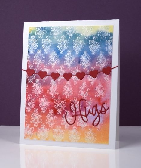
The emboss resist method creates pretty backgrounds especially when painted in a rainbow of colour. I used three primary colours overlapping them to end up with the yellow, orange, red, purple, blue and green. I stamped the peacock feather pattern in versamark and embossed in clear powder on watercolour paper and the slight texture of the watercolour paper combined with the very fine detail of the stamp meant that I did not get a perfect impression. Once I added the colour over the top I noticed that it looks very much like a batik fabric print.
I trimmed the panel then used the heart string die to cut the piece in two. With the same die I cut a string of red hearts then attached the panel to a card base inlaying the red hearts but attaching the die cut word on top of the panel.
Supplies
Stamps: Peacock Feather (PB)
Dies: heart string, love expression (PB)
Ink: versamark (Tsukineko)
Paint: yellow, prussian blue, crimson brusho (Colourcraft)
Paper: hotpressed 100% cotton watercolour paper, red cardstock, Neenah solar white cardstock
Also: WOW clear embossing powder
Stockings were hung
Posted: November 3, 2016 Filed under: Brick wall, Christmas stockings, Diamond pattern, Textures, Winter lantern | Tags: Penny Black creative dies, Penny Black stamps, Ranger Distress inks, Speedball elegant writer 8 Comments
…by the chimney with care. This is the last of my Winter Warmth series and the one that almost didn’t make the cut because I misjudged the size of the stocking! I created the whole background panel then pulled out the die to add the stocking only to find it was a tad larger than I’d remembered. My children assured me some stockings are so large they cover half the fireplace so I continued with the design.
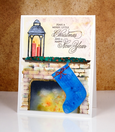
I created the background by stamping on cold pressed watercolour paper with distress inks. I first masked a space where the fireplace would be and a positioned a post-it across the panel where the mantel would end up. I stamped the brick wall stamp in brown and added darker tones with an elegant writer before blending with water. Above the mantel I stamped ‘diamond pattern and softened it with water. When I removed the post-it from the fireplace I used yellow, orange and black brusho to paint my ‘fire’. The lantern was done in two pieces just like I did on the ‘lakeside card‘ and yellow ink was added on the panel behind to make it glow.
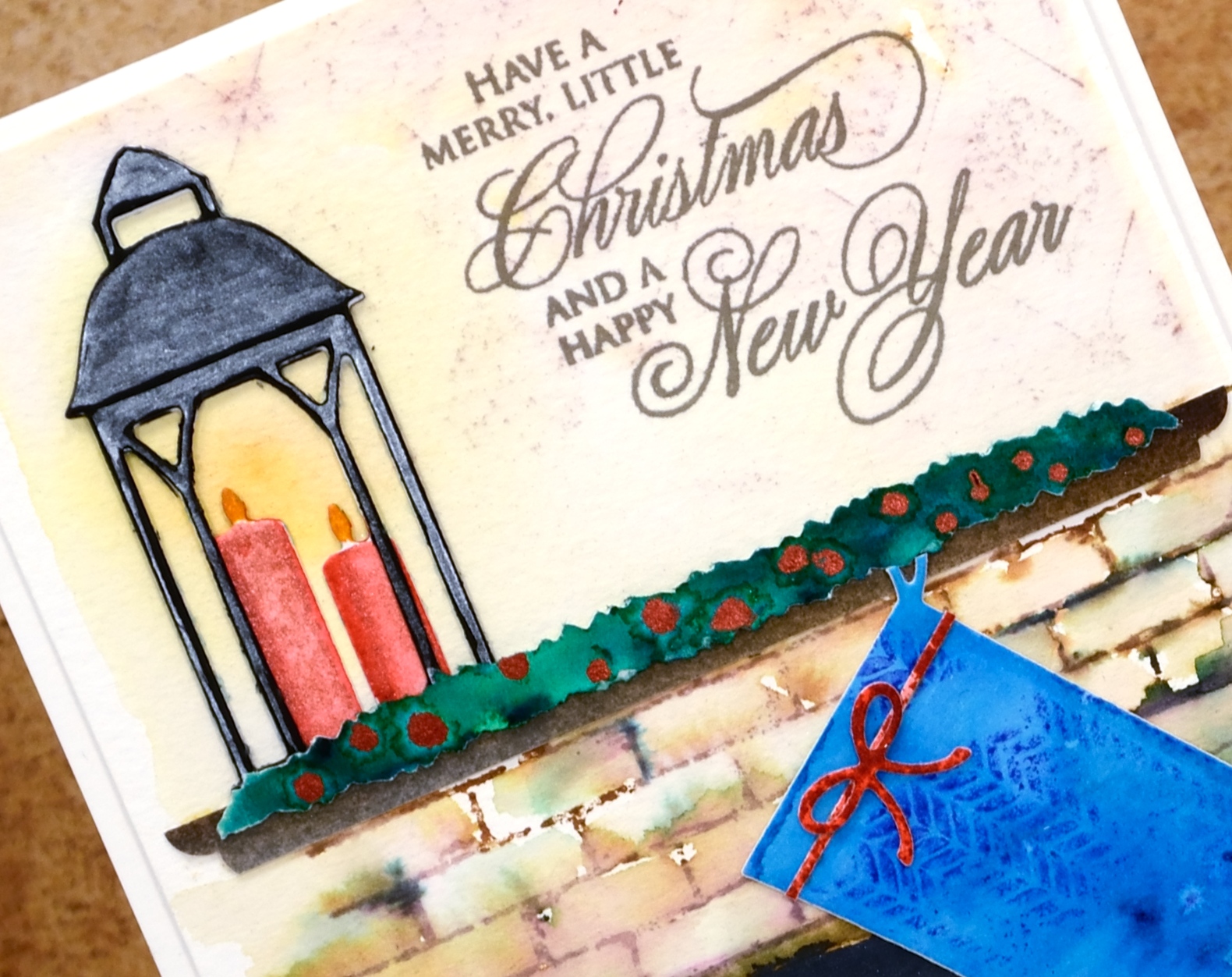
The swag over the mantel is a strip of watercolour paper painted with green brusho then dotted with siren smooches ink. I attached it over a strip of painted brown paper cut to look like a mantelpiece. The stocking was cut with one of the ‘Christmas Stocking’ dies then stamped with a texture stamp so it looked like fabric. This one had a higher fiddliness factor than most of my cards which increased my respect for those of you who create far more intricate die-cut cards on a regular basis.
Thanks for visiting this week as I shared my Winter Warmth cards. I’ll be back next week with some more snowscapes.
Supplies
Stamps: brick wall, textures, diamond pattern, season’s gifts (PB)
Dies: winter lantern, Christmas stockings, little ornaments (PB)
Ink: vintage photo, fired brick, blueprint sketch, scattered straw, spiced marmalade distress inks (Ranger)
Paper: hot pressed watercolour paper, cold pressed watercolour paper, black cardstock
Paint: scarlet, ost blue, yellow, gamboge, black, dark brown, emerald green brusho powder, Finetec Artist Mica watercolour paint
Also: elegant writer pen, siren smooches ink


