
Vintage poinsettia
Posted: September 22, 2016 Filed under: gift card pocket, Scarlet Majesty | Tags: Faber-Castell Albrecht Durer Watercolour pencils, Penny Black creative dies, Penny Black stamps, Ranger Distress inks, Tsukineko Versafine inks 8 Comments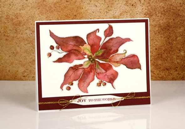
Today’s card is a contrast to the sparkly bright poinsettias earlier in the week. I returned to a style I have featured on the blog several times this year, a vintage appearance. To achieve the aged look I stamp first in vintage photo distress ink then blend the stamped ink with watercolour pencils. I worked one petal at a time and used a wet paintbrush to pick up colour from the pencils. I chose a couple of reds, and a light green for the petals and a dark brown for the berries. Once the whole image was painted I coloured around the edge with a grey pencil to help ‘lift’ it off the page a little.
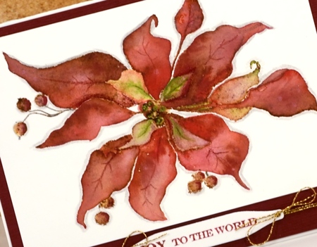
I matted the panel with textured burgandy cardstock and added a sentiment on one of the handy tags from the gift card pocket die (a set that gives you way more than just a gift card pocket; its full of tabs, tags, flowers, scalloped shapes…).
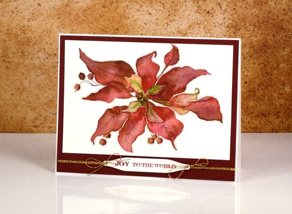
As I finished editing this post it occurred to me that the vintage look on my poinsettia does give it a bit of a ‘dried up ‘cos I didn’t get watered look’. Now, how would I know that look I wonder?
Supplies:
Stamps: Scarlet Majesty, Holiday Snippets (PB)
Dies: Gift Card Pocket
Inks: Versafine Crimson Red ink (Tsukineko) vintage photo distress ink(Ranger)
Cardstock: Fabriano 100% cotton hot pressed watercolour paper, Burgandy textured cardstock
Also: Faber-Castell Albrecht Durer watercolour pencils, Gold cord
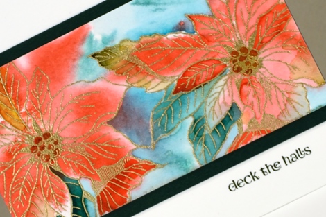
Golden Poinsettias
Posted: September 20, 2016 Filed under: Red Star, Winter Joy | Tags: Penny Black stamps, Ranger Distress stains, WOW embossing powders 15 Comments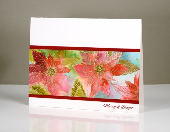
As the title of this post suggests I embossed the poinsettia stamp from the ‘Winter Joy’ transparent set in gold. I also added gold wink of stella to the centres of some of the poinsettias. The colour painted in and around the poinsettias is distress stain. I kept the look loose and fluid by painting wet into wet.
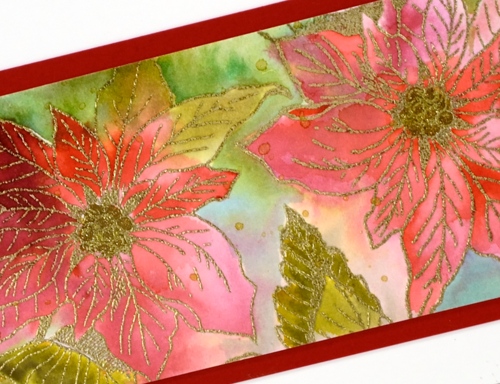
On the card below I began by inking the ‘red star’ stamp in red and green stain then stamping it onto the wet panel. Some of the colour ended up in the poinsettias, some outside. I used a paintbrush to paint the same stains into the petals to make the colour more intense.
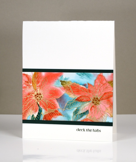
I’m not sure that the camera picked up the gold and shiny factor as much as it could have; it’s pretty in real life.
Supplies:
Stamps: Winter Joy, Holiday Snippets, Red Star, (PB)
Inks: Versamark, Versafine Olympia Green & Satin Red (Tsukineko) pined needles, crushed olive, festive berries, barn door distress stainsRanger)
Cardstock: Fabriano 100% cotton hot pressed watercolour paper, green cardstock, red cardstock
Also: WOW metallic gold rich embossing powder, gold wink of stella brush marker
Butterflies in blue
Posted: September 14, 2016 Filed under: Butterfly trio | Tags: Finetec artist mica watercolour paint, Penny Black stamps, Ranger Distress inks 8 Comments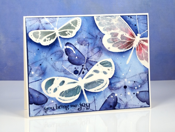
I am a guest once more of the lovely crew over at the Foiled Fox Blog. Check out their blog for details on this butterfly card and while you’re there take a look at the pretty cards from the Foiled Fox girls.
Berry Thankful
Posted: September 12, 2016 Filed under: Berry kissed | Tags: Penny Black stamps, Ranger Distress stains 11 Comments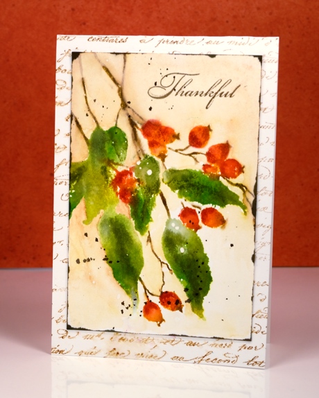
These berries are from the new Magic of the Season release but the season does not necessarily have to be winter. I have given a autumn feel to my card today to link in with the Canadian Thanksgiving season in October. I paired the ‘berry kissed’ stamp with the ‘script’ background stamp and stuck with green, orange and brown colour choices.
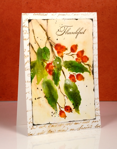
I began with a piece of hot pressed watercolour paper splattered with masking fluid. (The white dots on the leaves are a result of the masking fluid) I inked the stamp with crushed olive, mowed lawn and barn door distress stains then stamped it with the misti. I let that layer dry then inked the stamp again this time with markers so I could be more selective about where I put the colours. After stamping I blended the dark and lights with a wet paintbrush creating some shadow and dimension on the image. I painted around the image using a watercolour pencil as my ‘paint’. Once the panel was dry I splattered some dark brown stain and and swiped the edges with stain also.
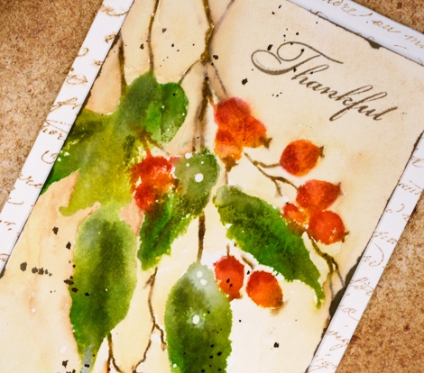
I stamped the script stamp onto the card base in vintage photo ink and blended some areas with water.
Supplies:
Stamps: Berry kissed, Grateful, Script(PB)
Inks: Versafine Vintage Sepia ink (Tsukineko) mowed lawn, crushed olive, barn door, gathered twigs distress stains, vintage photo, spiced marmalade, barn door, peeled paint distress markers (Ranger)
Cardstock: Fabriano 100% cotton hot pressed watercolour paper
Also: masking fluid
It’s how you look at it
Posted: September 8, 2016 Filed under: Berry Bevy | Tags: color burst, Penny Black stamps, Ranger Distress stains 16 Comments
I have three similar cards to share today with only slight differences in technique and layout. My initial plan was to have the branch on each card pointing in a different direction but I ended up with two upward facing. I would have peeled it off and turned it around but lately, in the interests of not having my cards fall apart when handled, I have started attaching watercolour paper with sookwang tape on one side and regular adhesive on the other sides. Once you press that sookwang tape down you cannot pull it back up again. The card looked fine as it was so I left it that way. You can see in the card above I have the branches going side ways and below I have them reaching upwards.

On all three cards the branches are embossed. I used the misti to stamp first in versamark ink then moved the panel down a millimetre and stamped again but in versafine onyx black. I embossed in clear powder which covered the black branch and the versamark just above the branch. It’s a technique I have been using for years to get a little layer of snow on trees and branches but the misti does make it a whole lot easier. On some of the panels it looks like a layer of snow, on others it looks like the light of the moon.

The blues and purples on the middle card were painted in distress stain. On the other two cards I used Colorburst powders.

There are a few other subtle differences. I splattered masking fluid before embossing on the top panel, after embossing on the middle panel and not at all on bottom panel. Embossing powder sticks to masking fluid so it really is better to sprinkle it after embossing but it still ended up working the other way. The moon was masked with a frisket film circle.
Next time you are stamping something twiggy or branchy, even flowery, try turning it 90° and see what you think.
Supplies
Stamps: Prancers, Berry Bevy (PB)
Ink: Versafine onyx black ink, versamark (Tsukineko) chipped sapphire, salty ocean, seedless preserves distress stain(Ranger)
Paper: hot pressed watercolour paper, Neenah solar white paper
Paint: Indigo, Merlot, Crimson Colorburst powder
Also: Daler Rowney masking fluid, Grafix frisket film, WOW clear embossing powder
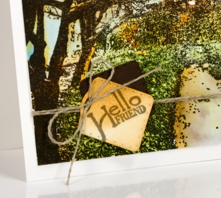
Down the Lane
Posted: September 2, 2016 Filed under: Down the lane | Tags: Penny Black stamps, Ranger Distress inks, Ranger Distress stains, Tsukineko Versafine inks 14 Comments
Thank you for all the lovely feedback you gave me about the tree cards. I hope the images and information inspire you to create some scenes of your own. Today’s card has the scene created already; all I did was decide on a colour scheme.
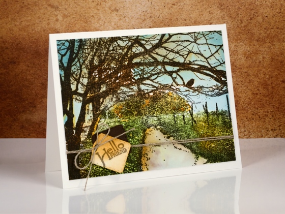
I chose some early fall colours, a bit like we will see very soon around here. The plants by the path are still green but the trees are getting a warm yellow tinge to them. To keep the definition of the detailed image I stamped first in versafine vintage sepia ink, then over the top with distress vintage photo ink. The versafine is a pigment ink so doesn’t bleed when I add water. The distress ink is very reactive with water so I was able to pull some brown tones into the surrounding area with a wet paint brush. I painted some blue, green and yellow over the sky, plants and trees using distress stains.
Supplies
Stamps: Down the Lane, April Showers (PB)
Die: Gift card pocket (PB)
Ink: Versafine vintage sepia ink, (Tsukineko) mustard seed, tumbled glass, broken china, mowed lawn distress stain & vintage photo distress ink(Ranger)
Paper: hot pressed watercolour paper
Also: linen thread
Birch and Brusho
Posted: September 1, 2016 Filed under: Grateful, Nature's Gifts, Nature's Silhouettes, Woodland Beauty | Tags: Brusho, Penny Black stamps, Tsukineko Memento inks 15 Comments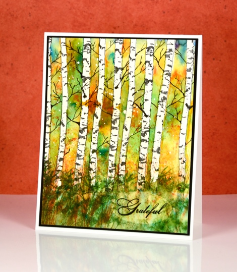
The tree stamp I have to share with you today is not technically a ‘tree’, it’s really a pair of trunks but it is oh, so versatile when creating trees for landscape scenes. I stamped it multiple times on this panel but you could just as easily stamp a single tree, a bent tree, or even some logs lying on the ground.
Before stamping I splattered a piece of watercolour paper with masking fluid, cut a hill shaped mask out of a post-it note and positioned it at the bottom of the panel. I stamped birch trees across the panel in versafine onyx black ink which is waterproof. To mask the trunks I painted masking fluid over all the trunks and let it dry. The next steps I did over a long period of time, not because I had to but because I wanted to let it dry naturally each time I added colour. With the trees and the ground masked I sprinkled a little leaf green and yellow brusho over the panel, spritzed it and let it dry. Later I came back and did it again but added some gamboge to the mix. I did this several times, always letting it dry in between. This allowed me to create patches of colour rather than the one big blend of green, orange and yellow I would have created if I had done it in one go.
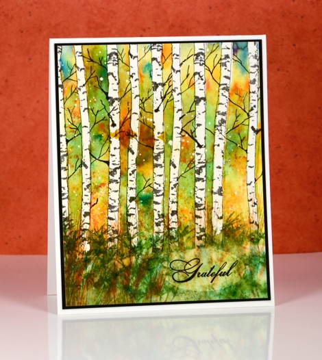
After all the panel dried I removed the masking fluid from the trees and added some brusho to the ground area. While it was still wet from spritzing I added a couple of grassy stamps with memento inks. The grasses blended into the damp paper. I waited until it was almost dry then stamped the same grasses again resulting in a bit more definition. To finish the scene I used some pigma micron pens to add thin twiggy branches between the trunks. Finally I removed the splattered masking fluid.
I wanted to add the sentiment without adding another layer but the colour of the grassy area was too dark. To lighten it I punched an oval out of frisket film then positioned the aperture piece over the watercolour panel so I could remove paint with a damp brush and a paper towel. The result was a lighter oval patch where I could stamp the one word sentiment in black.
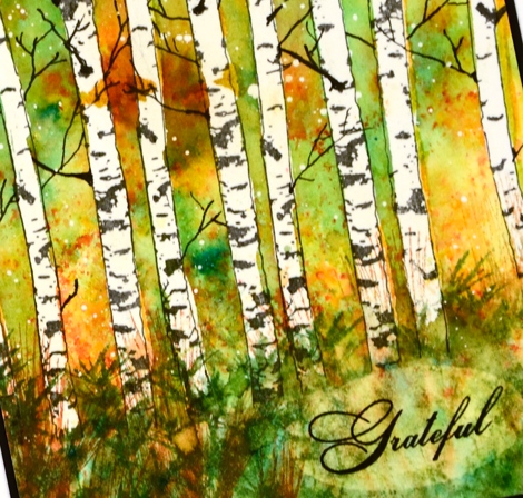
The two birch trunks in the Nature’s Silhouette set are going to be so handy for adding birch trees to cards for any season. I’ve already tried it on a winter scene which I will share another day.
Supplies:
Stamps: Woodland Beauty, Nature’s Silhouettes, Grateful, Nature’s gifts (PB)
Paints: Leaf green, yellow & gamboge Brusho powders (Colourcraft)
Inks: Potter’s Clay, Cottage Ivy Memento ink (Tsukineko)
Cardstock: Moulin du Roy 100% cotton hot pressed watercolour paper
Also: masking fluid
Moonlit Rendezvous
Posted: August 31, 2016 Filed under: Rendezvous | Tags: Canson watercolour paper, Penny Black stamps, Ranger Distress stains, Tsukineko Versafine inks 7 Comments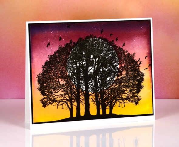
Isn’t this an amazing tree stamp? As I have said before you can never have too many tree stamps and happily the stamp designers at Penny Black seem to agree.
I chose to let this stamp be the star of the card and just made a pretty sky for the background. This was not a tricky card to make but I had to think about the order of operations. First I die-cut a circle from frisket film and firmly attached it to a piece of hot pressed watercolour paper. Frisket film is a clear plastic film with adhesive on one side and is used for masking areas on art work that you want to remain unpainted. After the circle mask was in place I splattered a little masking fluid around the top part of the panel. I wasn’t really wanting it to look like snow on this card, more like stars.

To paint the sunset/moonrise I worked from light to dark always overlapping and blending each colour with the last. I began with mustard seed distress stain, then worn lipstick, festive berries, seedless preserves and finally a little bit of chipped sapphire right at the top.

Once the painting was dry I removed the circle mask and masking fluid before stamping the tree. I used my MISTI to stamp because the stamp has very fine detail and the watercolour paper, even though it is hot pressed still has some texture. With the MISTI I was able to stamp and overstamp until I had a solid black tree. I trimmed the panel so the land at the base of the tree touched the edge of the panel and appeared to join up with my black mat. With the tree centred like it is I decided not to add a sentiment. I can’t wait to create other scenes with these beautiful trees.
Supplies
Stamps: Rendezvous (PB)
Ink: Versafine onyx black ink, (Tsukineko) mustard seed, worn lipstick, festive berries, seedless preserves, chipped sapphire distress stain (Ranger)
Paper: hot pressed Canson Moulin du Roy watercolour paper, Neenah Epic black cardstock
Also: Grafix extra tack frisket film, Daler Rowney masking fluid
A day of woodland beauty
Posted: August 30, 2016 Filed under: Nature's Silhouettes, Stamped Landscapes, Woodland Beauty | Tags: Fabriano Watercolour Paper, Penny Black stamps, Ranger Distress stains, Tsukineko Memento inks 10 Comments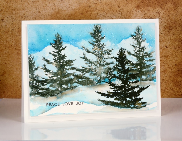
As this tree is one of my favourite stamps from the new Christmas release I decided to create a day scene and a night scene as part of my ‘Top Three’ feature on the Penny Black blog this week. For the night scene I painted the sky before stamping the tree, on this panel I did the opposite.
I began as I often do by splattering some masking fluid on a piece of hot pressed watercolour paper. I did some partial stamping with the tree stamp so I could make the base of each tree look like it was stuck in a snow bank. To do partial stamping or ‘faux masking’ I ink the stamp then remove some of the ink with a wet wipe, in this case I removed the base of the tree so no trunk showed and the bottom edge was a little different each time I stamped it. I chose memento northern pine ink again because the colour separates when I spritz a little water over it (which I did each time before stamping).
I let the trees dry then painted the sky in three blue stains blending and removing colour to make it look like there were clouds. I used a small round watercolour brush and painted right up to and sometimes over the edge of the branches so there would be some blending of colour as well as some white spaces which end up looking a bit like snow.
Once all the sky was dry I stamped a single tree in the foreground and made it darker by re-stamping in the same colour. I painted a snow bank either side of the foreground tree with stain then added some shadows at the base of the trees using diluted northern pine ink as my paint. To finish I removed the masking fluid, added a sentiment in brown then popped it up on a cream card base.
If you didn’t catch my night time scene with this stamp, you can find it here along with a video tutorial.
Supplies
Stamps: Woodland beauty, Nature’s Silhouettes (PB)
Ink: memento northern pine (Tsukineko) tumbled glass, broken china, salty ocean distress stain(Ranger)
Paper: hot pressed Fabriano watercolour paper
Also: Daler Rowney masking fluid
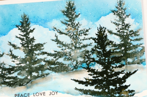
A night of woodland beauty
Posted: August 29, 2016 Filed under: Prancers, Stamped Landscapes, Tutorial, Watercolour, Woodland Beauty | Tags: Dr Ph Martin Hydrus watercolor paints, Fabriano Watercolour Paper, Penny Black stamps, Tsukineko Versafine inks, Tutorial, video 18 Comments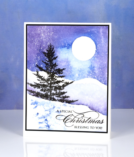
This week I am sharing my top three tree stamps from Penny Black’s new ‘Magic of the Season’ release. You know I love tree stamps so you wont be surprised that they were the first image I looked for when the new release arrived. The pretty spruce silhouette stamp immediately caught my eye and I knew it would be in my top three tree stamps. I have four stamped landscape cards to share this week and this little tree stamp features twice, today in a night time snowscape and tomorrow in a day time scene.
You will probably recognise another favourite tree stamp of mine in the background of this scene, it’s the little tree from the ‘Prancers’ set. I created a video to show you how I made this scene which features some watercolour effects along side some pigment ink stamping. I chose to pair pigment inks, which are waterproof, with watercolour painting so I could have pretty blends in the sky and snow but sharp tree images in the foreground and background.

Supplies
https://linkdeli.com/widget.js?1552642647875


