
Down the Lane
Posted: September 2, 2016 Filed under: Down the lane | Tags: Penny Black stamps, Ranger Distress inks, Ranger Distress stains, Tsukineko Versafine inks 14 Comments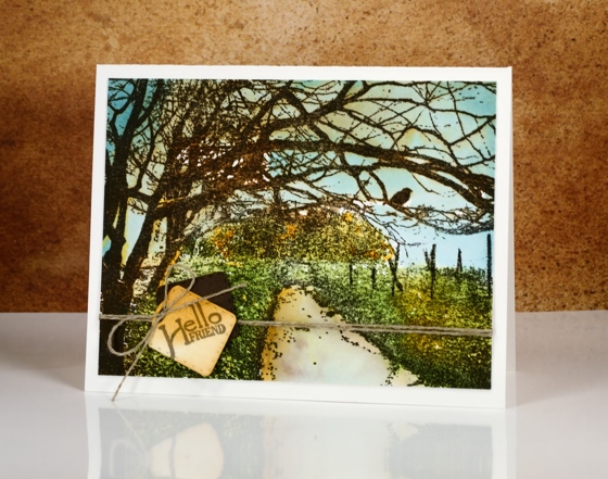
Thank you for all the lovely feedback you gave me about the tree cards. I hope the images and information inspire you to create some scenes of your own. Today’s card has the scene created already; all I did was decide on a colour scheme.
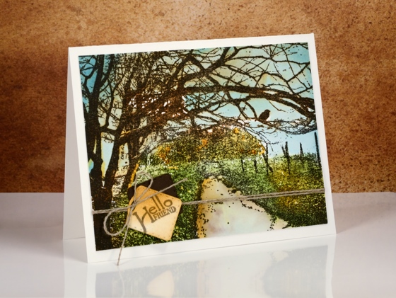
I chose some early fall colours, a bit like we will see very soon around here. The plants by the path are still green but the trees are getting a warm yellow tinge to them. To keep the definition of the detailed image I stamped first in versafine vintage sepia ink, then over the top with distress vintage photo ink. The versafine is a pigment ink so doesn’t bleed when I add water. The distress ink is very reactive with water so I was able to pull some brown tones into the surrounding area with a wet paint brush. I painted some blue, green and yellow over the sky, plants and trees using distress stains.
Supplies
Stamps: Down the Lane, April Showers (PB)
Die: Gift card pocket (PB)
Ink: Versafine vintage sepia ink, (Tsukineko) mustard seed, tumbled glass, broken china, mowed lawn distress stain & vintage photo distress ink(Ranger)
Paper: hot pressed watercolour paper
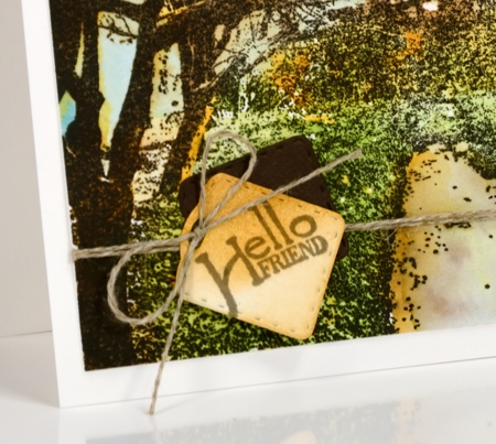
Also: linen thread


Wow! This looks so out of my league! I would love to see a video tutorial on this card. Beautiful!!
You’re a gifted artist, and I really enjoy your emails and web site. They have taught me several things, and I haven’t used inks and the other things you specialize in yet. I truly thought this card was a photo, even after I read the first paragraph! I searched the PB web site and found it really hard to find the particular stamps I wanted to see, particularly trees. I like them, too. I guess I’m supposed to check the stores first, but there isn’t much beyond Michaels and Hobby Lobby. Just a note of appreciation.
Hi Katherine,
I always place links to the stamps I use at the bottom of my blog posts. If you click on the stamp name it takes you to the Penny Black store. Thank you for your kind words about my art.
How beautiful! I agree with the comment above. I have learned so much. Thank you for sharing your talent!
Scapestamps are great,and Down the Lane is a good one. Your coloring is fantastic. Thanks.
Your painting is remarkable on this! I always study your work hoping someday to be able to do something like this! I love the sunlight bouncing off the tree trunks! The colors are amazing and this looks exactly like fall is about to arrive. This makes me want to run to buy that stamp!
Hi Nancy,
You are always so generous in your praise. This stamp really does half the work for you and if you have the MISTI or similar, it does the other half!
A beautiful interpretation using this stamp Heather and the colours have got that bit of warmth to them which will be happening all too soon now as the Autumn shades will soon be in evidence. x
Thank you Pat for your kind words; you are such an encouragement to me. I am in no hurry for summer to end; it has been an amazing summer here and I want it to last and last!
You continue to amaze me with your sheer creative genius…to stamp for detail with versafine and using the MISTI, overstamp with distress inks to give the vintage look is “inconthievable!” (oops, a little Princess Bride leaking out there!) 🙂 I never would have thought of it. I can’t wait to try it! Heather, I am having a bit of trouble getting my (newly acquired) Elegant Writer to bleed and soften on my paper…I am using Strathmore watercolor paper and a water pen. Even when I scrub the markings it still leaves a strong black line….??? Any suggestions come to mind?
Hi Clelie,
sorry for the delay in replying, things have been busy here moving my daughter off to school in another city (sniff, sniff). I do have a couple of suggestions about the elegant writer. One is to draw directly on the stamp with your elegant writer; it does stain the stamp but it also positions the ink right where there would be a line anyway. The other suggestion is to paint some water on your paper and add the elegant writer to a wet area. I hesitate to suggest different paper because I don’t know if that is the problem. I don’t use Strathmore so I can’t comment on how it works with the EW. Thanks for comment; I always enjoy a little Princess Bride – is there really a better movie in existence?
I just love your cards, you are so talented. You have gotten the colours spot on for this time of the year and apart from the tree not having any leaves on it I could be looking out of my window.
Love Alli Xx
So beautiful
Amazing card!!!