Painted Sunfire
Posted: April 4, 2018 Filed under: cherry blossom, Foiling, Peerless watercolours, stitched square & circles, Sun fire | Tags: Peerless Transparent Watercolors, Penny Black creative dies 11 Comments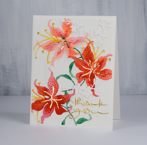
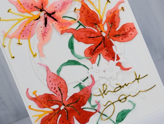
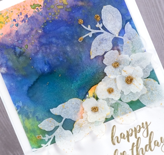
When creating die cut cards I sometimes paint the watercolour paper first, as I did for the brusho card posted a couple of days ago. Other times I do the die cutting and paint each element separately. For today’s card I cut three lilies ( a Penny Black die named ‘sunfire’) from hot pressed watercolour paper then painted them with peerless watercolours.
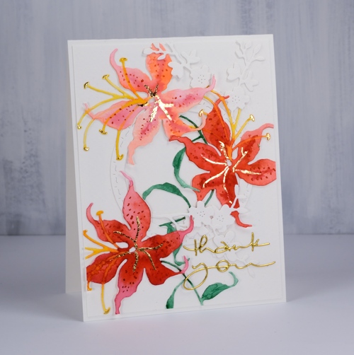
I chose a pink, a red and an orange paint and used at least two of them on each flower which gave me variety in the blooms but a cohesive look overall. I let the petals dry before using the red paint to add dots and the yellow paint for the stamen. I used a blue-ish green on the stems and leaves. Once all the paint was dry I used a glue pen to add a vein down the centre of the petals and also dabbed the ends of each stamen. I let the glue sit and dry partially then pressed gold foil over it .
To create a floral arrangement I cut a circle and some cherry blossom from unpainted watercolour paper and glued down all the elements. It took me a while to work out a layout that looked balanced. The die cut lilies are quite large so I trimmed bits off in order to fit them all on the card front. I finished it off with a gold foil die cut sentiment.
Supplies
Dies: sunfire, cherry blossom, many thanks, stitched square & circles


Paper: cold pressed watercolour paper, gold foil cardstock


Paint: Peerless watercolour paints

Also: quickie glue pen, gold foil


Bodacious brusho
Posted: April 2, 2018 Filed under: bodacious, Brusho, CAS | Tags: Brusho, Penny Black creative dies, Penny Black stamps 8 Comments
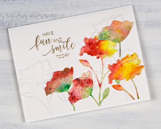
This week I have a couple of painted die cut cards to share. To create this one I first sprinkled leaf green, sunburst yellow and rose red brusho over a piece of hot pressed watercolour paper and spritzed with water to activate the paint. The colours did blend together a little but I was able to keep some distinct red, yellow and green areas. Once dry I used the ‘bodacious’ die from Penny Black to cut several flowers. I also cut white flowers with the same die. When creating my layout I glued down a few white diecut flowers first then coloured ones over the top. I trimmed stems and buds so I could arrange the flowers at different heights and facing different directions.
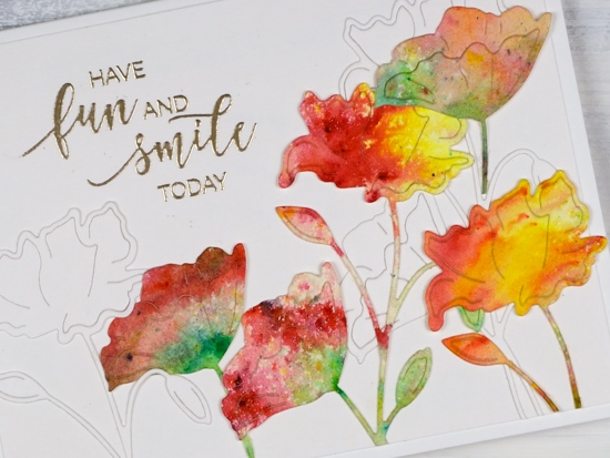
I embossed a sentiment from the ‘smile today’ set in platinum, trimmed the white background panel and attached it to a white card base.
Supplies
Stamps: smile today!

Die: bodacious

Paper: hot pressed watercolour, neenah solar white, white linen texture paper


Paint: leaf green, sunburst yellow, rose red brusho

Also: platinum embossing powder

Floral Arrangement
Posted: March 15, 2018 Filed under: floral arrangement | Tags: distress oxide inks, liquid metals, Penny Black creative dies, Penny Black stamps 11 Comments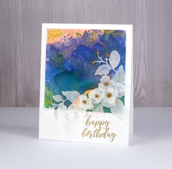
I have a burst of colour and some sprinklings of sparkle to share today. I am enjoying the entries in the ‘Sparkle With Us‘ challenge but I would love to see more. There are still five days left to add your sparkly project to the gallery, just click over to see all the details.
I used some new and some older distress oxide inks to create my colourful background. My paper is hot pressed watercolour and my technique was pressing the oxide pad on a craft mat, spritzing with water then swiping my paper through the ink. I did this numerous times but always dried the panel between swipes, that way I was able to build up layers and pockets of colour. After I had added my last layer of oxide ink I put some diluted liquid metal (metallic sky) on my craft mat and swiped the panel through that; the result was some blue shimmer over the blue painted area.
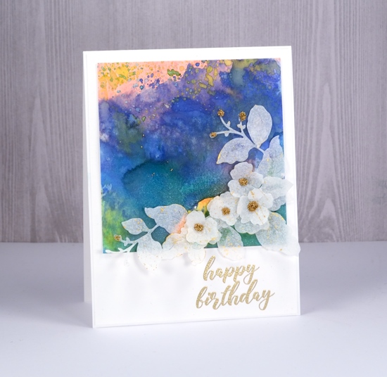
To create my spray of flowers I used the Penny Black ‘floral arrangement’ die to cut three flower sprays from ‘parchment’ patterned vellum, one of the designs in the grafix assorted vellum pad. I snipped the die cut flowers to create a layered arrangement of small flowers and leaves. The die does cut a larger flower, but I didn’t use it on this card. I put all my die cuts in a box and splattered gold paint from the gansai tambi starry colors set over them. After they dried I attached the leaves and flowers on my panel and I added a drop of glue to some of the flowers and sprinkled gold micro beads onto the glue. I co-ordinated the sentiment with the beads by embossing it in gold. All the supplies are listed below.
Do you think I might be able to label this one mixed media?
Supplies
Stamp: smile today

Die: floral arrangement

Inks: tattered rose, candied apple, blueprint sketch, fossilized amber distress oxide, versamark


Paper: hot pressed watercolour paper, parchment patterned vellum, neenah solar white

Paint: gansai tambi starry colors, metallic sky liquid metal


Also: On point glue, gold micro beads, gold embossing powder


Exquisite
Posted: March 9, 2018 Filed under: birds and banners, exquisite, Script | Tags: Penny Black creative dies, Penny Black stamps, Ranger Distress stains 7 Comments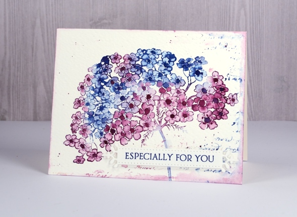
My final springy card for this week features this lovely big flower in two of my favourite distress stains, chipped sapphire and seedless preserves. I stamped this one on cold pressed watercolour paper so once again having the panel in a stamp positioner helped me get a good impression. I inked first with chipped sapphire over parts of the flower, stamped, wiped off the stamp and inked sections again but this time with seedless preserves. I ended up with some blue flowers, some pink and some a purple mix.
I blended the petals of all the flowers with a damp brush and let them all dry. I was going to leave all the centres white but it didn’t look right so I ended up painting them all darker with undiluted stain. To create a soft textured background I dropped a few drops of water around the flower then partially stamped the script stamp in the same ink stains. I dabbed out some ink with a paper towel and added some splatter as well. To frame the whole panel I ran the seedless preserves dauber around the edges then softened the colour with a damp brush.
To complete the card I stamped a sentiment on a fancy little die cut banner and popped it up over the stem of the flower.
Supplies
Stamps: exquisite, script, banner sentiment (Penny Black)


Die: birds & banners

Inks: chipped sapphire & seedless preserves distress stains, majestic blue versafine ink


Paper: cold & hot pressed watercolour paper

Parade of flowers
Posted: March 7, 2018 Filed under: Parade of flowers | Tags: Dr Ph Martin Hydrus watercolor paints, Penny Black creative dies, Penny Black stamps, Ranger Distress inks, Tsukineko Versafine inks 5 Comments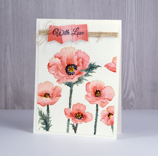
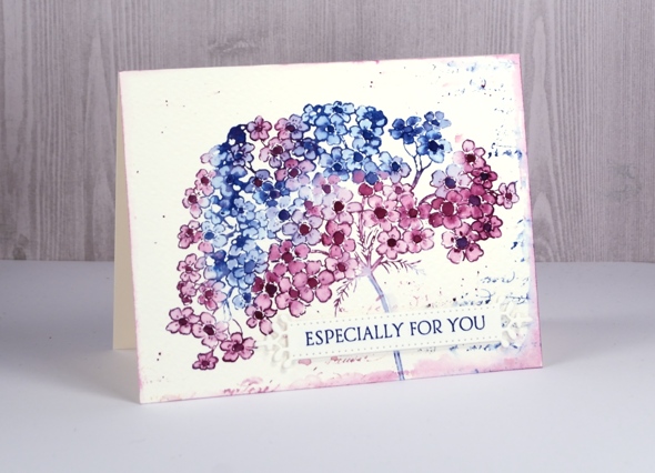
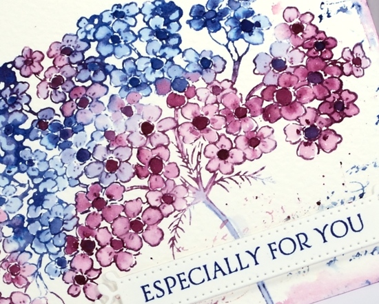
The flowers continue to bloom across my blog this week and it’s making me pretty keen for spring to arrive. Today’s poppies are as realistic and detailed as you are likely to see from me! A little different from my distress stain loose and watery florals. I used a stamp positioner to stamp ‘parade of flowers’ in antique linen distress ink on cold pressed watercolour paper; because of the texture of the cold pressed paper I stamped a few times to guarantee a complete image.
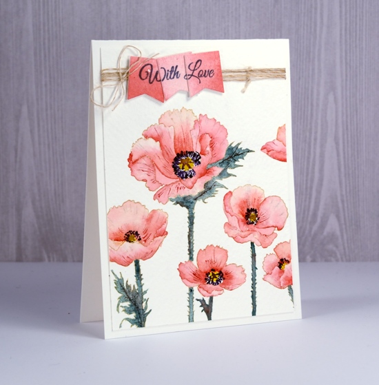
All the painting was done with Dr Ph Martins Hydrus watercolours. When undiluted the colours are very vibrant so I put only a drop of each colour in a palette then added water. To keep the colour scheme muted and cohesive I limited my paint choices. The petals are painted with ‘deep red rose’ and the leaves and stems a mix of phthalo green, deep red rose and Venetian brown. The centres of the flowers are gamboge, with dark details added in ultramarine and Venetian brown.
I worked on one petal at a time painting first with water then dropping in some deep red rose paint. I blended the colour to the edges then added more paint if necessary to create shadow or deeper colour near centre of flower. While each petal dried I worked on a non-adjacent one. When all the petals were dry I added some more red here and there to create a bit more depth and when that dried I used a very fine tipped brush to paint veins on some of the petals. I wanted to stamp the sentiment on a matching panel so I painted diluted deep red rose paint on a scrap of hot pressed watercolor paper the die cut three tags using die from ‘gift card pocket’ set. With the stamp postioner I was able to stamp ‘With Love’ sentiment from ‘special wishes’ set on tags one at a time so when together they would over lap each other.
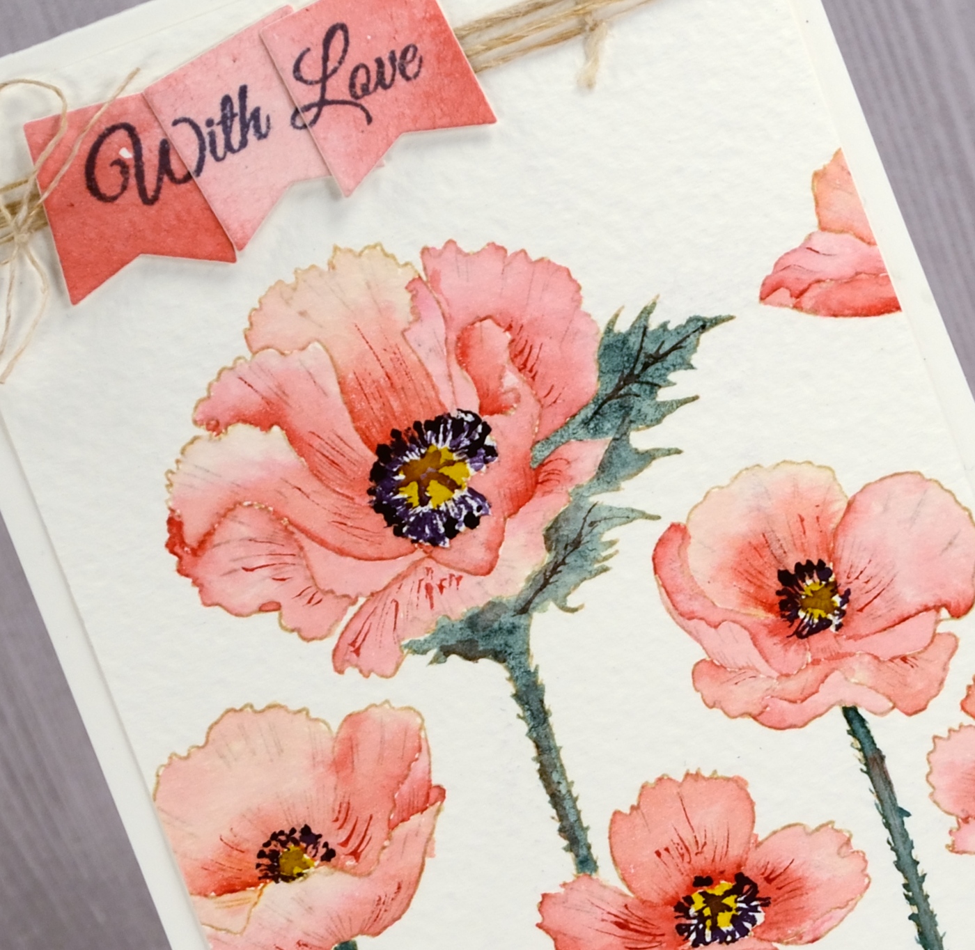
I wrapped twine around top of painted panel, attached the three sentiment tags over the top and attached the panel to a natural coloured card base.
Don’t forget to pop over to the ‘Sparkle with Us’ challenge hosted by The Foiled Fox and me. There is already some sparkly inspiration linked up but we’d love to see more.
Supplies
Stamps: parade of flowers, special wishes


Die: gift card pocket

Paper: rough 100% cotton watercolour paper, hot pressed watercolour paper

Ink: antique linen distress ink, imperial purple versafine ink

Paints: deep red rose, gamboge, pthalo green, Venetian brown, ultramarine Dr Ph Martins Hydrus watercolors (soon to be available at The Foiled Fox)
Also: antique hemp twine
Sparkle With Us challenge
Posted: March 1, 2018 Filed under: Challenges, Gilding Flakes, Swirling Wings, The Foiled Fox, Triple Banner | Tags: Gilding, Penny Black creative dies, WOW embossing powders 4 Comments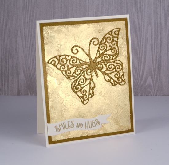
It’s time to put on your sparkly shoes, my friends, or at least your sparkly embellishments! I have teamed up with The Foiled Fox for a sparkly challenge that starts now.

I might have got a little bit carried away in choosing sparkly elements for my card. There is not much that doesn’t sparkle on this one. You can follow my lead and pull out all the sparkle or you can choose to feature just a little sparkle. Either approach will qualify you to enter the ‘Sparkle With Us’ challenge.
I used some lovely shimmer cardstock from The Foiled Fox and a whole bunch of gilding flakes. I know they can end up all over the place but I love the textured look of gilding flakes. Because there is some creasing and overlapping there is a lot of variation in the gold of the flakes. I also used gold embossing powder for my gold on gold on gold sparkly card. There are some step by step photos on the Foiled Fox blog so make sure you click on over.
I am excited to share some more sparkly inspiration over the next few weeks and hope to see your creations in the challenge gallery: you can get there by clicking the frog below.


Sparkly Supplies
Stamps: Penny Black banner sentiments set
Dies: swirling wings, triple banner die set


Cardstock: shimmer antique gold, neenah natural white,
![]()

Also: stick it adhesive, gold gilding flakes, gold embossing powder


Pencil tulips
Posted: February 23, 2018 Filed under: tulip bouquet | Tags: Faber-Castell Polychromos Colour Pencil, Minc, Penny Black creative dies, Penny Black stamps, Prismacolor pencils 7 Comments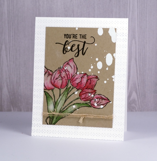
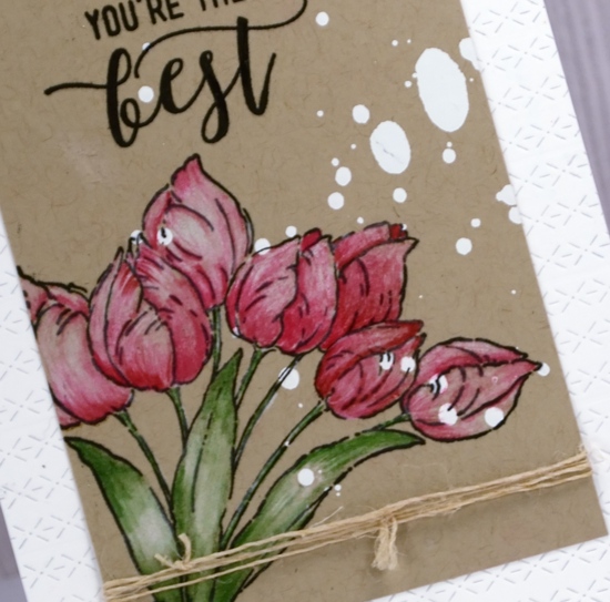
I had fun with a few new techniques and products when creating this card. Those white spots on the kraft cardstock are not paint splats even though they look a bit like I spilt something on my panel. I sprayed some minc reactive mist onto a kraft panel then ran it through the minc with white foil. I realise I could have used white gesso or paint but the thing I like about the foiling in this instance is that it has no texture or bulk so stamping over it was easy.
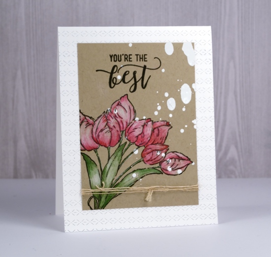
I stamped the Penny Black ‘tulip bouquet’ stamp in the corner and part of a sentiment from the PB ‘choose happy’ set both in versafine onyx black ink then started colouring. Since I began teaching my pencil colouring technique class I have had pencils within reach most of the time. I grabbed a couple of prismacolor pinks, a green and a polychromos white to colour the tulips and leaves. The antique hemp twine seems to be popping up on quite a few cards too; it’s not too thick to knot or tie in a bow and it blends in with most colour schemes and especially kraft cardstock. To add a little interest to my white card base I gave it an all-over texture treatment by running it through the die-cutting machine several times with the new ‘rows of stitches’ die from Penny Black.
I really enjoyed reading the responses to my last card – the one with the clever black brusho design. Some of you have already experienced the joy of black brusho and others are now wanting to try it. I’d love to see your creations if you do try it; please leave me a comment or use the contact me option.
Supplies
PB Stamps: tulip bouquet, choose happy


PB Die: rows of stitches

Ink: versafine onyx black ink

Paper: kraft

Pencils: prismacolor 925, 930, 911, polychromos 101


Also: minc reactive mist, white foil, minc


How clever is black brusho?
Posted: February 21, 2018 Filed under: cheesecloth | Tags: Brusho, My Favorite Things, Penny Black creative dies 23 Comments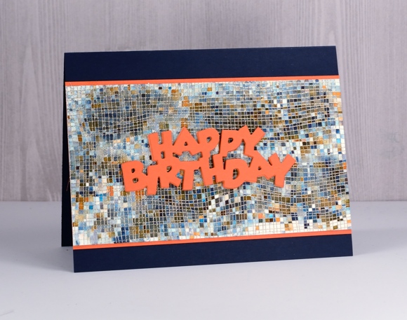
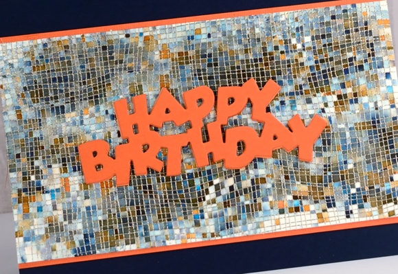
I am sharing this card over on The Foiled Fox blog today. It’s a simple one but I think, a clever one. And by clever I’m not talking about my artistic skills; I’m talking about the wonder of black brusho. If you have some brusho paint and you’ve been avoiding the black container then you are missing out! You can see in the close up below black is made up of a bunch of different colours and this cheesecloth stamp from My Favorite Things keeps those colours divided like tiles.
You can find my step by step process on The Foiled Fox blog and my supply list below. Thanks for dropping by; now go and play with your black brusho!
Edited to add: sadly this stamp is no longer available but you can find an equally fabulous mesh stamp here.
Supplies
Stamp: Cheese cloth background (MFT)

Die: Birthday (PB)

Ink: versamark

Paint: black brusho

Paper: hot pressed watercolour paper, navy cardstock, orange cardstock
Also:

Roses all over
Posted: January 30, 2018 Filed under: Bister, My Favorite Things, Roses all over, Shades | Tags: Bister, My Favorite Things, Penny Black creative dies 15 Comments
I pulled out my bister powders the other day; they were kind of pushed to the back of the watercolour shelf. They turned out to be a perfect match for this ‘roses all over’ stamp from My Favorite Things. Bister (and brusho and colorburst) does wonderful things when sprinkled over embossing because the powder gets trapped inside the ‘walls’ of embossing and keeps colours and shades separate. If you are not familiar with bister, you can read about it here. The colours are earthier than brusho and colorburst which is nice for a change.
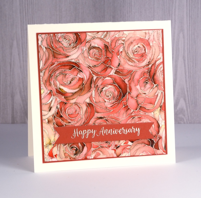
Believe it or not this panel is painted with just red bister; all that lovely variety is from one colour. I embossed the watercolour panel with platinum embossing powder then sprinkled the red bister over it and spritzed with water. I watched to see if sections were filling with colour before spritzing or sprinkling a second time. Once there was enough powder I used a paint brush in just a few places to blend or spread the colour. I did not have to do much with the brush because MAGIC.

I found a cardstock that co-ordinated to mat the panel and create a banner for the sentiment. The banner die is from the PB ‘shades’ set and the sentiment embossed in platinum is from the PB ‘banner sentiments’ set.
Thanks for dropping by.
Supplies
Stamps: roses all over (MFT), banner sentiments(PB)

Die: shades (PB)

Ink: versamark
Paint: bister powder red
Cardstock: hot pressed watercolour, neenah natural white, red cardstock

Also: platinum embossing powder
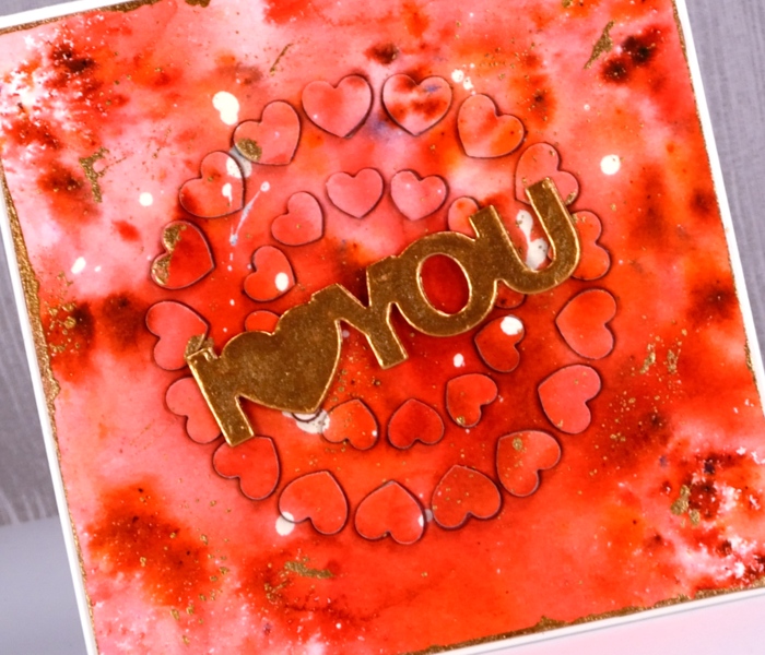
Circle of hearts
Posted: January 25, 2018 Filed under: hearts in circle | Tags: Brusho, Finetec artist mica watercolour paint, Penny Black creative dies 4 Comments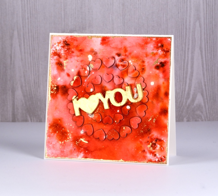
For today’s rather bold card I started, as I often do with a masking fluid splattered panel. I continued, as I often do by sprinkling brusho powder over the panel then spritzing with water to activate it. I do tend to be a ‘chap of one idea’ at times don’t I? (Can you place that quote from one of my favourite book series?) This time the brusho was rose red and terracotta. Once dry, I splattered gold finetec paint over the panel and let it dry. I removed the masking fluid, trimmed the panel to a square then painted the edges with gold paint.
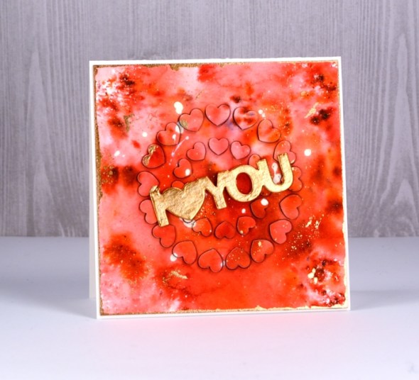
That was the easy part; after that the fiddliness factor rose considerably. I attached adhesive sheet to the back of the panel and die cut ‘hearts in circle’ from the centre of the panel and from a red adhesive backed foam sheet. I carefully saved the little hearts in formation on a piece of ‘press n seal’. I peeled the backing off the watercolour panel and attached it to the card front. Next I pressed the die cut adhesive backed foam hearts into each space in the die cut panel. Finally I peeled the backing off the die cut watercolour hearts and attached them on top of foam hearts. This was a little like completing a jigsaw puzzle.
Supplies