
Pencil tulips
Posted: February 23, 2018 Filed under: tulip bouquet | Tags: Faber-Castell Polychromos Colour Pencil, Minc, Penny Black creative dies, Penny Black stamps, Prismacolor pencils 7 Comments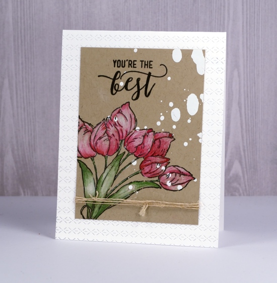
I had fun with a few new techniques and products when creating this card. Those white spots on the kraft cardstock are not paint splats even though they look a bit like I spilt something on my panel. I sprayed some minc reactive mist onto a kraft panel then ran it through the minc with white foil. I realise I could have used white gesso or paint but the thing I like about the foiling in this instance is that it has no texture or bulk so stamping over it was easy.
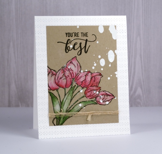
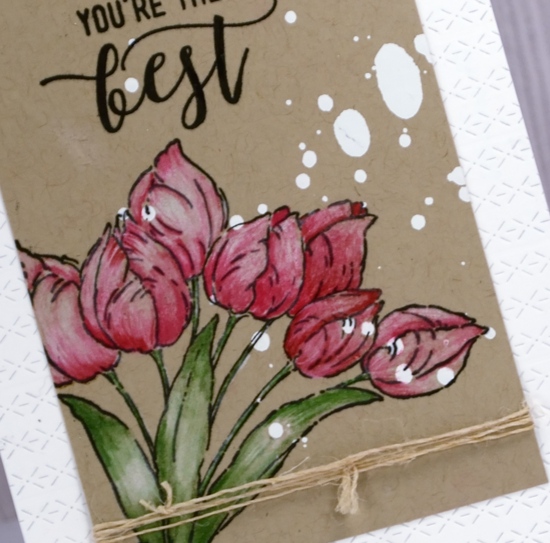
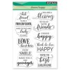
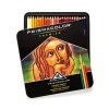
I stamped the Penny Black ‘tulip bouquet’ stamp in the corner and part of a sentiment from the PB ‘choose happy’ set both in versafine onyx black ink then started colouring. Since I began teaching my pencil colouring technique class I have had pencils within reach most of the time. I grabbed a couple of prismacolor pinks, a green and a polychromos white to colour the tulips and leaves. The antique hemp twine seems to be popping up on quite a few cards too; it’s not too thick to knot or tie in a bow and it blends in with most colour schemes and especially kraft cardstock. To add a little interest to my white card base I gave it an all-over texture treatment by running it through the die-cutting machine several times with the new ‘rows of stitches’ die from Penny Black.
I really enjoyed reading the responses to my last card – the one with the clever black brusho design. Some of you have already experienced the joy of black brusho and others are now wanting to try it. I’d love to see your creations if you do try it; please leave me a comment or use the contact me option.
Supplies
PB Stamps: tulip bouquet, choose happy
PB Die: rows of stitches
Ink: versafine onyx black ink
Paper: kraft
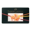
Pencils: prismacolor 925, 930, 911, polychromos 101
Also: minc reactive mist, white foil, minc
How clever is black brusho?
Posted: February 21, 2018 Filed under: cheesecloth | Tags: Brusho, My Favorite Things, Penny Black creative dies 23 Comments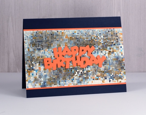
I am sharing this card over on The Foiled Fox blog today. It’s a simple one but I think, a clever one. And by clever I’m not talking about my artistic skills; I’m talking about the wonder of black brusho. If you have some brusho paint and you’ve been avoiding the black container then you are missing out! You can see in the close up below black is made up of a bunch of different colours and this cheesecloth stamp from My Favorite Things keeps those colours divided like tiles.
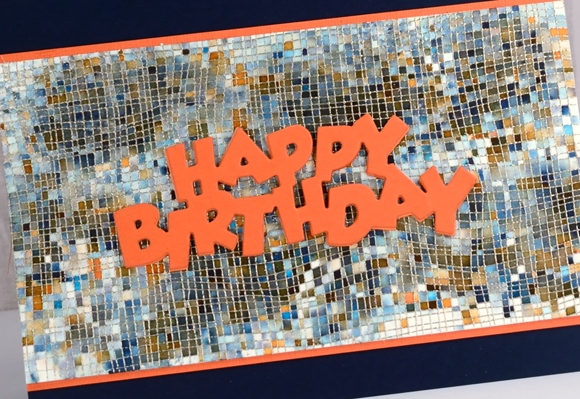
You can find my step by step process on The Foiled Fox blog and my supply list below. Thanks for dropping by; now go and play with your black brusho!
Edited to add: sadly this stamp is no longer available but you can find an equally fabulous mesh stamp here.
Supplies
Stamp: Cheese cloth background (MFT)
Die: Birthday (PB)

Ink: versamark
Paint: black brusho
Paper: hot pressed watercolour paper, navy cardstock, orange cardstock
Also:
Roses all over
Posted: January 30, 2018 Filed under: Bister, My Favorite Things, Roses all over, Shades | Tags: Bister, My Favorite Things, Penny Black creative dies 15 Comments
I pulled out my bister powders the other day; they were kind of pushed to the back of the watercolour shelf. They turned out to be a perfect match for this ‘roses all over’ stamp from My Favorite Things. Bister (and brusho and colorburst) does wonderful things when sprinkled over embossing because the powder gets trapped inside the ‘walls’ of embossing and keeps colours and shades separate. If you are not familiar with bister, you can read about it here. The colours are earthier than brusho and colorburst which is nice for a change.

Believe it or not this panel is painted with just red bister; all that lovely variety is from one colour. I embossed the watercolour panel with platinum embossing powder then sprinkled the red bister over it and spritzed with water. I watched to see if sections were filling with colour before spritzing or sprinkling a second time. Once there was enough powder I used a paint brush in just a few places to blend or spread the colour. I did not have to do much with the brush because MAGIC.

I found a cardstock that co-ordinated to mat the panel and create a banner for the sentiment. The banner die is from the PB ‘shades’ set and the sentiment embossed in platinum is from the PB ‘banner sentiments’ set.
Thanks for dropping by.
Supplies
Stamps: roses all over (MFT), banner sentiments(PB)


Die: shades (PB)

Ink: versamark
Paint: bister powder red
Cardstock: hot pressed watercolour, neenah natural white, red cardstock
Also: platinum embossing powder
Circle of hearts
Posted: January 25, 2018 Filed under: hearts in circle | Tags: Brusho, Finetec artist mica watercolour paint, Penny Black creative dies 4 Comments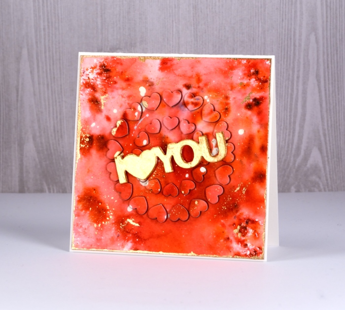
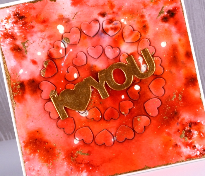
For today’s rather bold card I started, as I often do with a masking fluid splattered panel. I continued, as I often do by sprinkling brusho powder over the panel then spritzing with water to activate it. I do tend to be a ‘chap of one idea’ at times don’t I? (Can you place that quote from one of my favourite book series?) This time the brusho was rose red and terracotta. Once dry, I splattered gold finetec paint over the panel and let it dry. I removed the masking fluid, trimmed the panel to a square then painted the edges with gold paint.
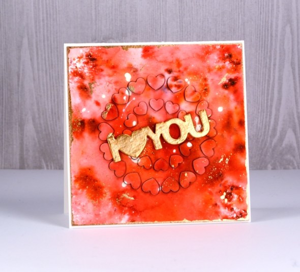
That was the easy part; after that the fiddliness factor rose considerably. I attached adhesive sheet to the back of the panel and die cut ‘hearts in circle’ from the centre of the panel and from a red adhesive backed foam sheet. I carefully saved the little hearts in formation on a piece of ‘press n seal’. I peeled the backing off the watercolour panel and attached it to the card front. Next I pressed the die cut adhesive backed foam hearts into each space in the die cut panel. Finally I peeled the backing off the die cut watercolour hearts and attached them on top of foam hearts. This was a little like completing a jigsaw puzzle.
Supplies



In my heart
Posted: January 24, 2018 Filed under: Tree heart, Triple Banner | Tags: Kuretake Gansai Tambi watercolour paints, Penny Black creative dies, Penny Black stamps, WOW embossing powders 4 Comments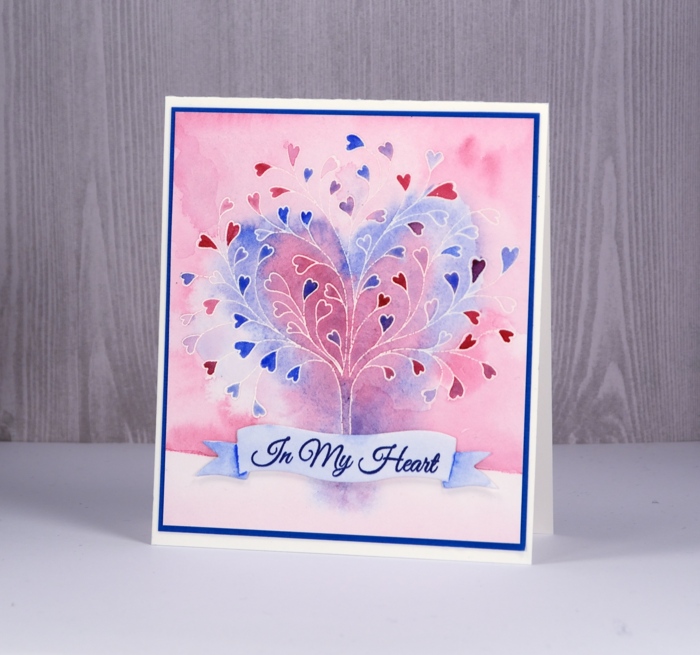
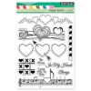
This stamp is called ‘tree-heart’ but I always think of it as a family tree. After all what better to have on a family tree but a whole bunch of hearts? I stamped the tree in versamark and embossed with clear powder on hot pressed watercolor paper. Next I painted water over the top section of panel and added pink and blue watercolour paints. Keeping it loose I painted a heart shape over tree with both pink and blue. I filled in the heart leaves with more intense pink and blue paint then painted diluted pink over base area.
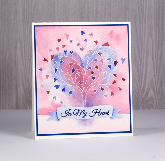
I grabbed a scrap of watercolour paper, painted diluted blue over it and stamped a sentiment from ‘happy hearts’ in versafine majestic blue ink. I die cut a banner to contain the sentiment and painted shadows on the ends of banner with blue paint.
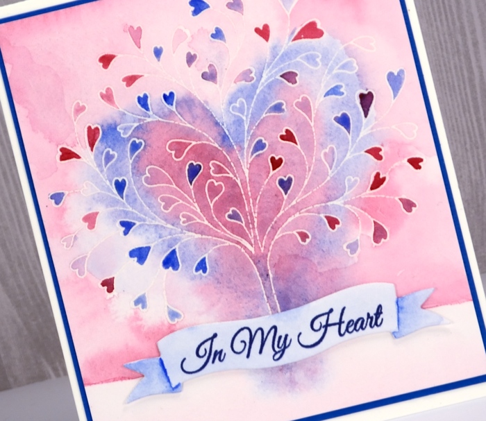
To finish I attached the banner to the tree panel with very low profile adhesive dots and matted the panel in blue cardstock before attaching to a white cardbase.
Supplies

Brusho Rose
Posted: January 23, 2018 Filed under: Rose | Tags: Brusho, Fabriano Watercolour Paper, Penny Black creative dies 12 Comments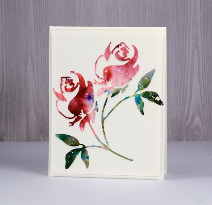
Ah, brusho, how I love thee! My cards on the Penny Black blog and here on my blog this week are all ‘love themed’ so it shouldn’t matter that it’s a paint that I’m in love with, should it? Brusho paint powders do such magical things I never tire of putting them to use.
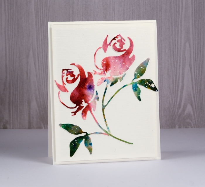
To create this simple card I started with a piece of hot pressed watercolour paper already splattered with masking fluid. I sprinkled rose red brusho on one end of the panel and a mix of leaf green and olive green brusho over the other end. I spritzed with water to activate the paint and added more water and moved the paint around to create a varied coverage. Once it was completely dry I die cut a couple of roses using the Penny Black ‘rose’ die. I kept one die-cut complete and trimmed the rose and leaves off the other to arrange separately on a panel of linen textured cardstock.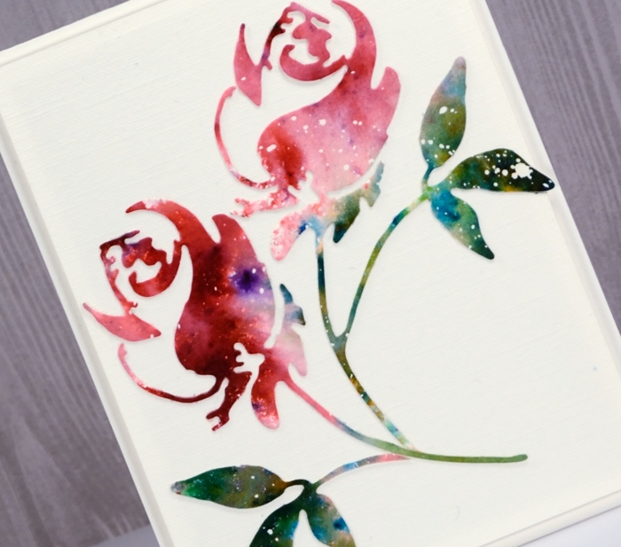
I popped up the panel on a natural white card base and left it sentiment free to keep my options open.
Supplies

Winter wardrobe
Posted: December 22, 2017 Filed under: Skis 'n' sled, winter wardrobe | Tags: Kuretake Gansai Tambi watercolour paints, Penny Black creative dies, Penny Black stamps, Tsukineko Versafine inks 1 Comment
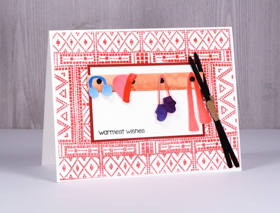
I had some fun and a certain amount of frustration putting today’s cards together. The fiddliness factor was high, well for me anyway. All three cards feature the winter wardrobe and sled ‘n’ skies die sets from Penny Black. I’ve backed them with the mosaic pattern stamp on the first two cards and created an outside window backdrop for the final card.
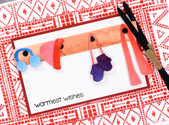
On the cards above and below I stamped the mosaic background stamp then embossed in clear powder. Above I used versafine crimson red ink; below I used versamark. To create all the clothing, skis and sleds I painted scraps of watercolour paper with gansai tambi paints. I had a bunch of coloured scraps that I lay the various dies on to cut as many elements as I could. I also cut a few from black card stock. When I had all my little bits and pieces cut out I arranged them on a white sheet of paper and started making combinations and vignettes. For a few crazy moments I thought about videoing the process of putting these cute little collections together then realized that it would make me want to poke tweezers in my eyes and possibly have the same effect on you, my faithful readers.
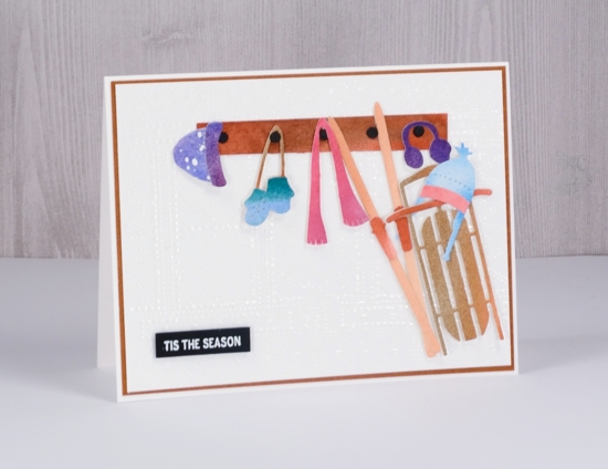
Despite the fiddliness factor it was fun to combine my different coloured hats, mitts, scarves, muffs and trims to co-ordinate and contrast with the sleds and skis.
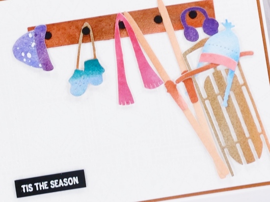
To create my outdoor scene I used a piece of brown wood textured cardstock then tore some white card to create two layers of snow where I tucked in the sled, skis and hats (or beanies and toques depending where you come from!) I painted pale blue on a white piece of watercolour paper for the window panel and die cut a light brown square with four more squares cut from it for the window frame.
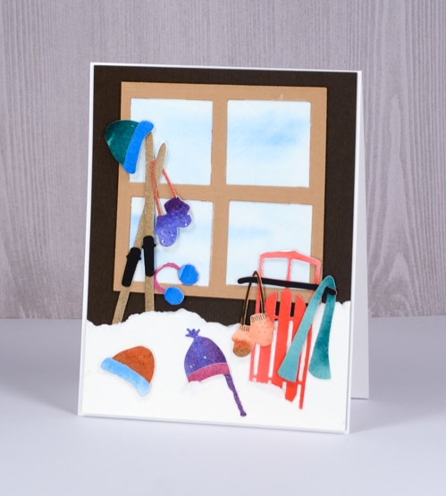
All three panels are on white card bases and two feature sentiments from the PB holiday snippets stamp set.
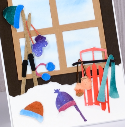
I hope you are having a warm and wonderful day.
Supplies
Stamps: holiday snippets
Dies: winter wardrobe, sled n skis, square dies
Ink: versafine crimson red, versamark
Paper: neenah solar white, neenah epic black, hot pressed watercolour
Paint
Adhesives: multi matte medium, kool tak foam
Polar bears
Posted: December 18, 2017 Filed under: mosaic pattern, polar bears | Tags: Kuretake Gansai Tambi watercolour paints, Penny Black creative dies, Penny Black stamps 12 Comments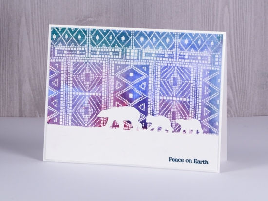
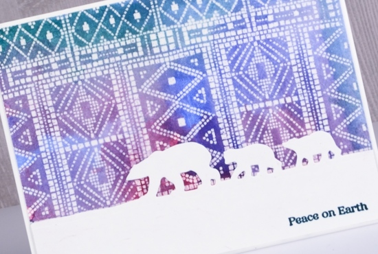
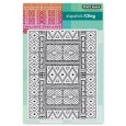
I stamped and embossed four panels of this Penny Black mosaic background recently for a project you’ll see in a few days but then I got another idea and painted over one. When I started painting it I totally forgot that I had not stamped it on watercolour paper but neenah solar white cardstock. I dabbed it dry fairly quickly and although it curled the surface of the paper, it did not end up looking pilled or damaged.
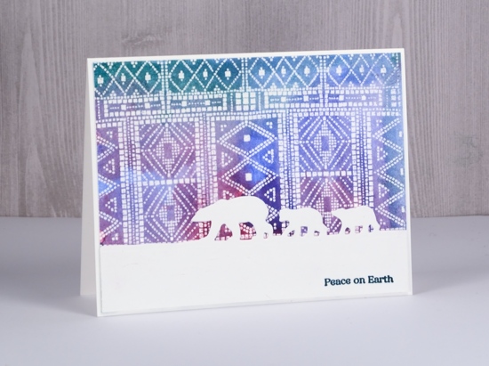
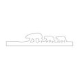
Even though the ‘sky’ is very patterned I still think it gives the impression of northern lights for this little family of bears to wander under. The polar bears die from Penny Black cuts only at the top so the bears appear to be walking across the snow.
Even though I initially did not plan to do watercolour with this panel I did and it meets the challenge at CAS watercolor this month. As always there is tons of beauty to be found if you check out the team samples and challenge entries.
Supplies
Stamp: mosaic pattern
Die: polar bears
Versamark ink & clear embossing powder
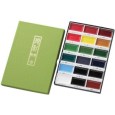
Paint
Snowy Village
Posted: December 6, 2017 Filed under: snow covered, snowy village | Tags: Peerless Transparent Watercolors, Penny Black creative dies, Penny Black stamps 2 Comments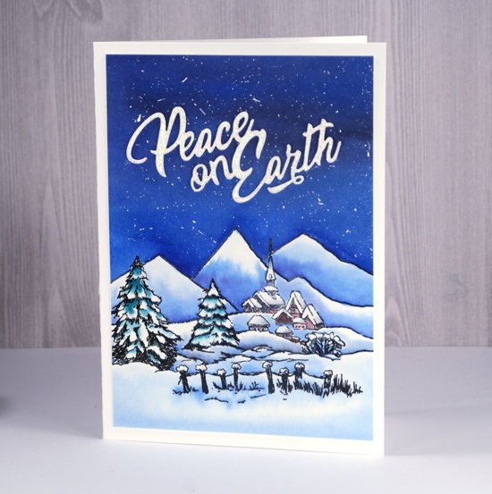
The second of my winter landscapes this week combines two outline stamps, the little village in the background is from the ‘snowy village set’ and the trees and fence stamp is from the ‘snow covered’ set. I stamped both stamps in versafine onyx black ink onto hot pressed watercolour paper. To make sure the two stamps created a cohesive scene I extended some of the snow bank lines with a black embossing pen both to the right of the village and to the left behind the trees then added some mountains in the background. I embossed all the stamping and pen work with clear embossing powder.
To add colour to scene I used the ‘wet into wet’ technique, painting water first into sky area filling all the space above the mountain tops. I worked with peerless watercolours to next add blue paint, then purple and grey to the wet area gradually filling the sky with colour. One by one I painted water into each hill shape then added blue and purple paint from the bottom blending to pale at the top of each hill. I did the same on all the snow banks.
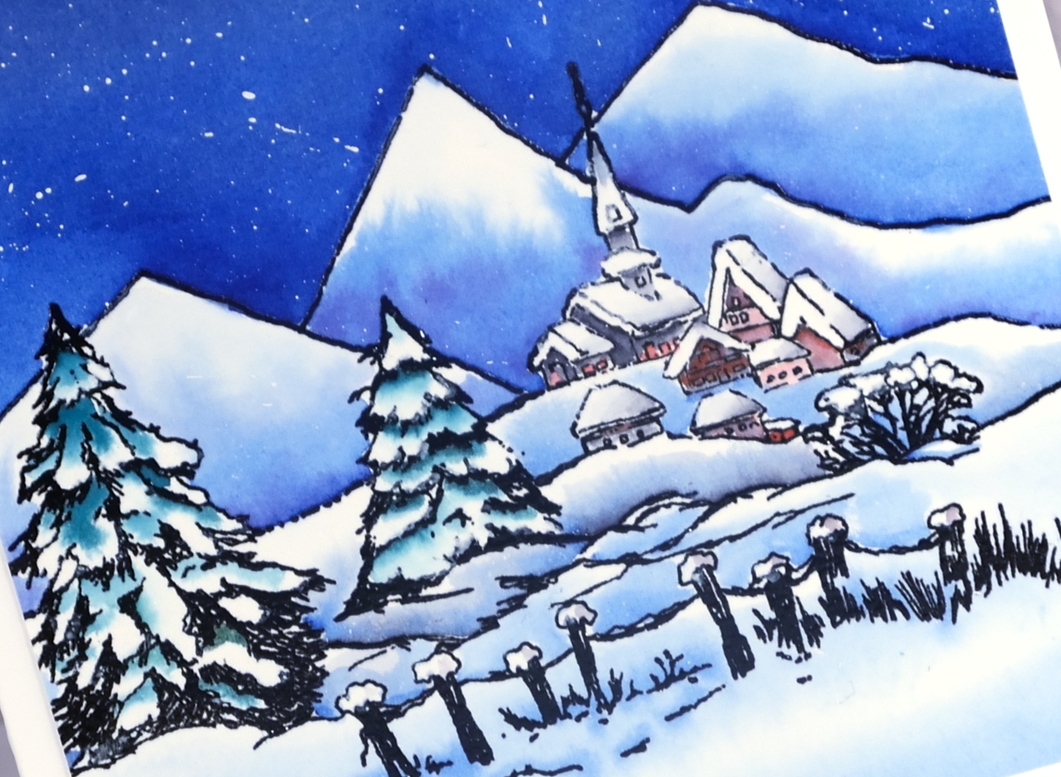
To colour the trees I also painted water over them and added small amounts of green paint while preserving some areas as white. I used grey and red paint to fill the buildings taking care to keeping the snowy roofs white or with minimal grey shading. I splattered white gesso over the sky using a small brush and a toothpick then attached the panel to a white card base.
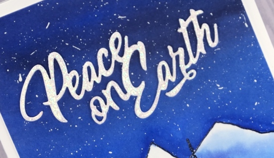
As the sky filled almost half the panel I decided to create a large sparkly sentiment. I cut the ‘peace’ die from white cardstock three times and embossed one with clear sparkle embossing powder. I added glue to the back of each die cut and stacked them on top of each other. I have found the easiest way to get them to line up is to squeeze the layers together from above with a pair of tweezers. It is a quite large card so I did a side fold rather than my usual top fold.
Supplies
Stamps: snowy village, snow covered
Die: peace

Inks: versafine onyx black, black embossing marker
Paint: Peerless transparent watercolors, white gesso
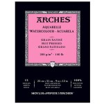
Paper: neenah solar white cardstock, arches hot pressed watercolour paper
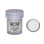
Also: WOW clear sparkle embossing powder, clear gloss embossing powder
More layered poinsettias
Posted: November 29, 2017 Filed under: Brusho, layered poinsettia | Tags: Brusho, Penny Black creative dies, Penny Black stamps, WOW embossing powders 10 Comments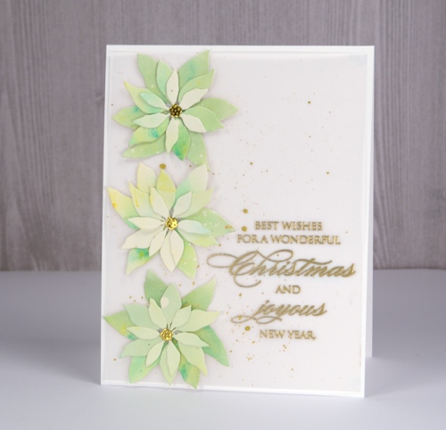
I liked that first layered poinsettia card so much I made another, this time with some pale green brusho to get the ‘white poinsettia’ look. I think I could go even lighter with my paint so there may be another poinsettia card to come. I started with watercolour paper splattered with masking fluid so I would have little white dots over the petals at the end.
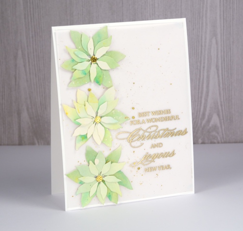
I painted lime green brusho on the watercolour panel but it ended up separated into distinct areas of blue and yellow so I add a tiny bit of olive green brusho to get everything looking greener. When I die-cut the petals I tried to keep the smaller ones a little lighter and the larger ones darker.
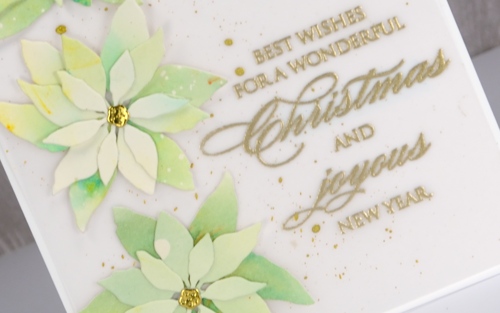
Even though I was aiming for clean and simple when I lay the petals on a white card base, it was a little too stark. A layer of vellum softened the base and I splattered gold paint over it then added an embossed sentiment. Solving the vellum adhesive problem was easy under the die cuts and sentiment but the corners needed something too so I added just the tiniest amount from my tombow tape runner to hold them down to the card base.
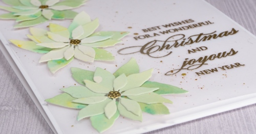
Stay tuned because I think there are another couple of colour schemes yet to be tried with this pretty little die set!
Supplies
Dies: layered poinsettia
Stamps: joy & happiness

Versamark ink, WOW gold metallic rich embossing powder

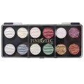
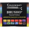
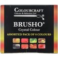
Paints: finetec mica pearl 12, brusho 12, brusho 8, masking fluid

Neenah solar white cardstock, hot pressed watercolour paper, vellum












