Lovely
Posted: March 13, 2023 Filed under: lovely, Penny Black | Tags: Fabriano Watercolour Paper, Penny Black stamps, Ranger Distress inks 7 Comments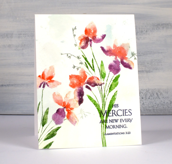
I have another lovely new stamp from Penny Black and it is aptly named ‘Lovely’! It is a brushstroke stamp, meaning that it is semi solid and made from a painted image to look like you painted it. I find that dye inks and water based markers are great for this type of stamp.
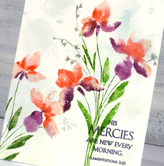
I worked on hot press watercolour paper which had some masking fluid splattered over it. I sometimes use masking fluid even when I am not creating a snowy scene because I like the slightly aged or ‘rainy’ look it gives my stamping and painting. I wanted to do the background before I stamped so I smooshed some speckled egg and mowed lawn distress inks on my glass mat, spritzed water to dilute it then swiped my watercolour panel through it. The result is very soft but enough to add subtle interest to the background.
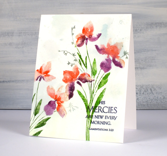
I inked the flowers with a mix of tattered rose, abandoned coral and seedless preserves distress inks, spritzed the stamp with water then stamped. I used a paintbrush to blend the ink to fill the petals. You can see me use this technique in a video here. I inked the stems with mowed lawn and the tiny flowers with iced spruce. I do use a mix of large and small ink pads when I ink the stamp along with distress markers. I know distress markers are discontinued but I will keep using mine until the bitter end. I managed to reink a marker the other day following a video a friend told me about. The video maker used a distress stain but I had a re-inker in the required colour so I used the re-inker. I didn’t see any improvement until the next day after the ink had time to soak through the tube and into the brush tip.
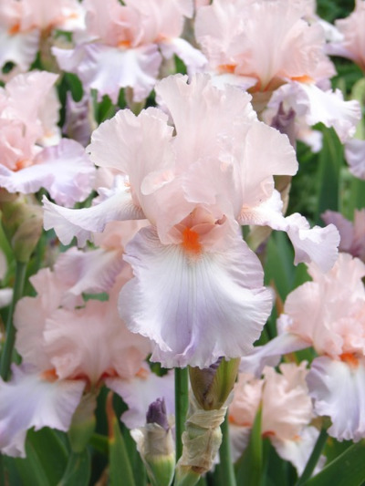
Because I love the matchy-matchy I pulled out a Ciao Bella ink to stamp the sentiment from the new PB set ‘blessings’. My colour inspiration was from a photo Jan sent me last year. My colours are not as subtle as the ones in the photo but I still like the unusual mix of coral and purple. Thanks for the inspiration, Jan, I went to my file of your pics as soon as I started working with this stamp!
(Compensated affiliate links from Foiled Fox, Scrap n Stamp & Ecstasy Crafts)
Prized
Posted: March 10, 2023 Filed under: Penny Black, prized | Tags: Fabriano Watercolour Paper, Penny Black stamps, Ranger Distress inks 17 Comments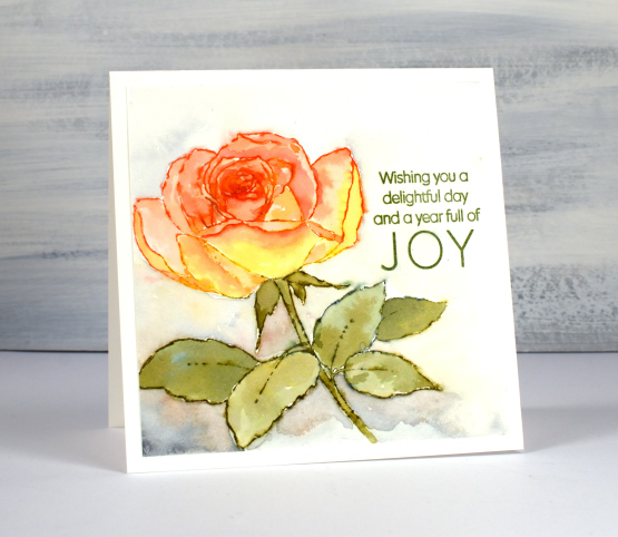
Penny Black has new stamps! And of course I am especially interested in new flowers and tree stamps. This rose, aptly named ‘prized’ is just one of the new stamps I will be sharing on the blog in the next few weeks.
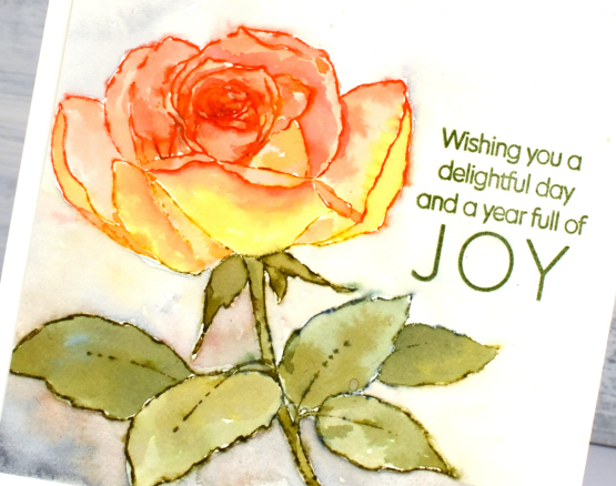
My mother loved roses and she and my father grew them in every garden they made. My dad has several lovely ones out the front and the back of his retirement unit. I think he has one with peachy/yellow colouring a bit like this one.
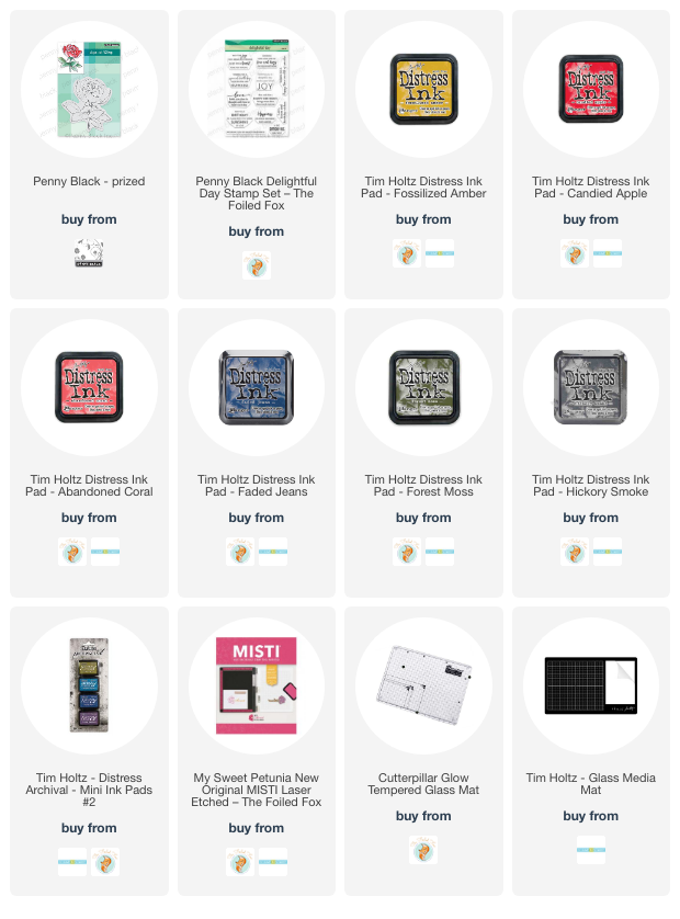
To colour the ‘prized’ rose I worked on hot pressed watercolour paper and kept it in a stamp positioner. I inked the petals with both fossilized amber and abandoned coral distress inks. I spritzed the inked stamp before stamping which made the ink wetter and easier to blend into each petal shape. When using this technique I always smoosh the ink pad on my glass mat so I can pick up ink there as well.
While the petals dried I inked the leaves and stem with forest moss and a small amount of faded jeans distress inks then followed the same technique as above to paint the leaves. I went back to the petals and did a second round of stamping and blending adding candied apple ink to the centre of the rose to deepen the colour.
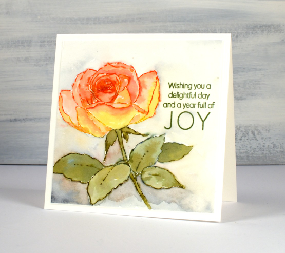
After I had completed the flower I used mix of diluted inks to paint around the rose. I added hickory smoke to the other four inks as I blended around the edges of the flower and feathered out to pale yellow or grey at the edges of the watercolour panel.
I chose the title sentiment from the PB set ‘delightful day’ and stamped it in peeled paint archival ink.
Hope you are having a delightful day!
(Compensated affiliate links from Foiled Fox, Scrap n Stamp)
Handmade Art Journal
Posted: March 9, 2023 Filed under: gel press, Handmade book | Tags: Fabriano Watercolour Paper, gel press, gel printing, Handmade book 15 Comments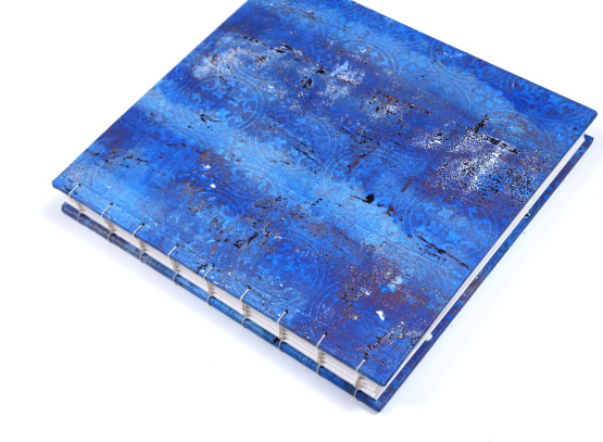
A couple of weeks ago I posted photos and description of the handmade book with Coptic binding which I made as a participant in the November 5-Day challenge from the Handmade Book Club. I really like the construction and binding of this particular book so I made another one, this time with cold pressed watercolour pages and a gel printed cover.
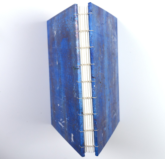
The pages in this book are seven inches square so the covers are a little larger. When I went through my very large stash of gel prints I didn’t have two pieces large enough and matchy-matchy enough for my liking. Hard to believe I know, because my gel print collection now inhabits two large boxes. Knowing that I needed at least 9″ x 9″ prints I made a couple on rice paper especially for this journal. The pretty circle/tile pattern in the print is from a piece of embossed cardstock I have been holding onto for a very long time ‘just in case I needed it!’
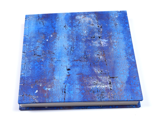
I make my covers from the thick cardstock backs of watercolour paper pads. You can buy bookboard, but my stash of thick cardstock pieces is large and easily sturdy enough. I printed the cover patterns on rice paper which folds beautifully over the thick cardboard.
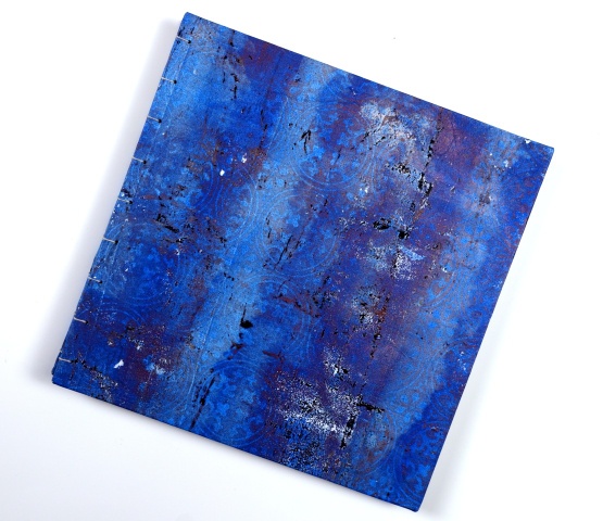
As you might have noticed from recent art journal posts, I’ve been creating in a 6″ x 6″ journal for my classes and at home. This one is just that little big bigger so I’m excited to get started in it.
Stay tuned to see what I put in this journal. I think it is safe to say some of the prints from those two big boxes will end up in here! Hope your day includes a book, in some shape or form.
Seedlings
Posted: March 2, 2023 Filed under: Echidna Studios, seedlings, sennelier watercolours, Simply Graphic | Tags: digital stamps, Echidna Studios, Fabriano Watercolour Paper, sennelier watercolours, Simply Graphic 8 Comments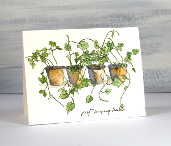
If you are a plan ahead – plant ahead person then you might have some seedlings growing somewhere in your house or green house. These are the only seedlings I have at this point but I must say they are looking quite healthy.
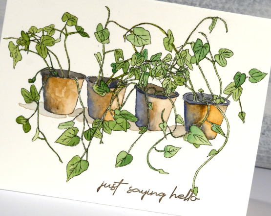
This is a digital stamp designed by my daughter and available in her etsy store Echidna Studios. I printed it so that it just fitted on an A2 card front but I think it might be nice to print it larger and feature only one or two pots on a card front with the shoots and leaves coming off the edge of the panel.
I printed on hot pressed watercolour paper and used my Sennelier pan paints for all the colouring. I used a mix of greens for the greenery and a mix of blue and brown for the pots. I really like blue and brown combos these days, something that I wouldn’t have imagined a few years back.
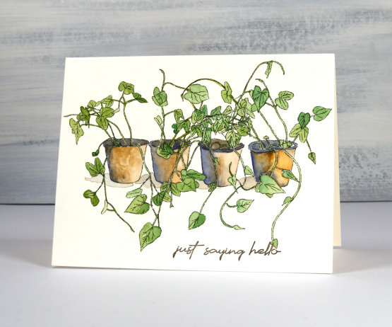
The sentiment is from Simply Graphic’s ‘English Sentiments’ set; I like the handwritten look and the size of the words. I know I could be handwriting a few sentiments myself here and there but I always add the sentiment last and by that time I don’t want to mess up a otherwise completed card with a crooked or uneven sentiment. That being said I think I should try a few handwritten sentiments on upcoming cards…
(Compensated affiliate links from Foiled Fox, Scrap n Stamp)
Snowflake Cards
Posted: February 23, 2023 Filed under: crystalline, Dies, Echidna Studios, grafix, Penny Black, snowflake digital stamp set | Tags: Echidna Studios, Fabriano Watercolour Paper, grafix, Penny Black creative dies 9 Comments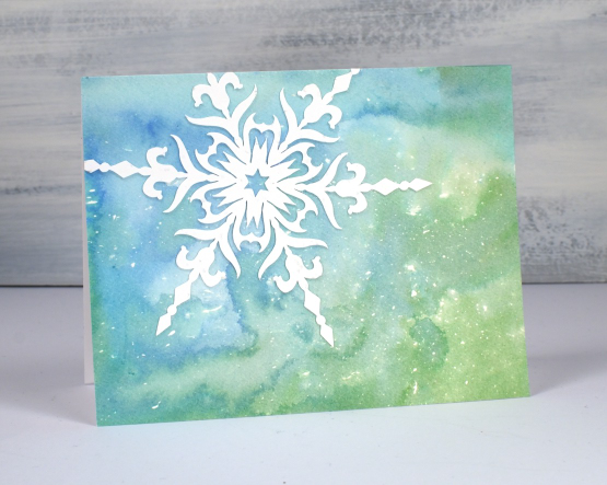
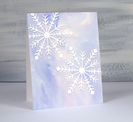
Apparently we are getting 10-20cm of snow tonight. So these cards are appropriate for late February! I teamed up with Grafix to complete these projects. I love using liquid frisket to create a scattering or a storm of snowflakes or stars across a watercolour background.
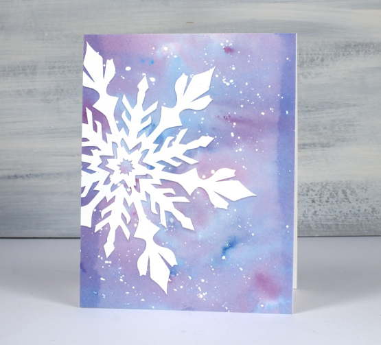
I splattered the liquid frisket on hot pressed watercolour, let the droplets dry then used dye inks to colour the panels. You can see the process in the video below.
I cut intricate snowflakes from lightweight white linen cardstock to add to the watercolour panels. All but the die-cut snowflakes on the final card are designs from Echidna Studios. I used snowflakes from the Snowflake Digital Stamp set. I have used them as stamps on previous cards but this time I cut them on a cricut.
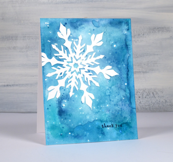
Because the snowflakes are quite intricate gluing them on with artist tac was very straightforward. I also use artist tac when I am attaching individual letters to create a word or sentiment.
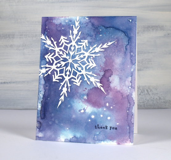
I used a few of the cards as thankyous and left a few blank.
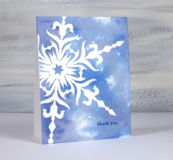
I used smooshed distress inks to create the watercolour backgrounds but you could use watercolour paints or powders to make soft blended backgrounds.
(Compensated affiliate links from Foiled Fox, Scrap n Stamp)

Salt & Dandelions
Posted: February 21, 2023 Filed under: Dandee, Penny Black | Tags: Fabriano Watercolour Paper, Kuretake Gansai Tambi watercolour paints, Penny Black stamps 6 Comments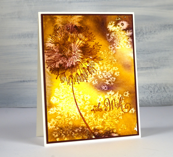
Just in case you are wondering this isn’t a recipe, well not an edible one! I know you can eat several parts of a dandelion plant but I don’t know about the little seeds that blow everywhere to plant new dandelions. This card has been hiding out in a drawer with a few others cards that give the impression of light and shade.
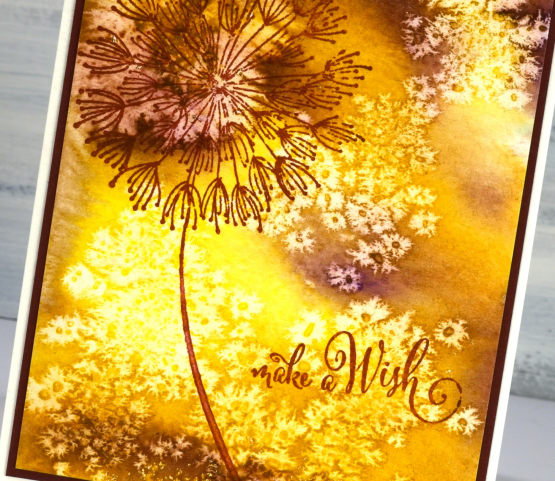
I didn’t create the multicoloured background for the dandelion stamp; I just created it while experimenting with watercolour paints and salt crystals. You have probably done the same sort of thing yourself. If not, try sprinkling salt crystals of different sizes on wet watercolour paint or die ink. As it dries it creates fabulous patterns. The ones on this panel looked so much like dandelion seeds I had to find the right stamp and sentiment to finish the card. You can find a video demonstrating the salt sprinkling technique here. After the paint and panel has dried you can gently brush off the salt to reveal the patterns.
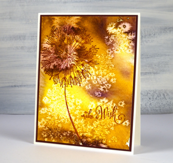
I used gansai tambi watercolour paints and a large PB stamp called ‘Dandee’. If I had wanted a background that looked like dandelion fluff blowing about I’m sure I couldn’t have created it. That’s why I play and experiment then see what I should make with the panels.
(Compensated affiliate links from Foiled Fox, Scrap n Stamp)
Streaming
Posted: January 26, 2023 Filed under: Penny Black, Stamped Landscapes, streaming | Tags: Fabriano Watercolour Paper, Penny Black stamps, Ranger Distress inks, Staedtler watercolour brush pens 8 Comments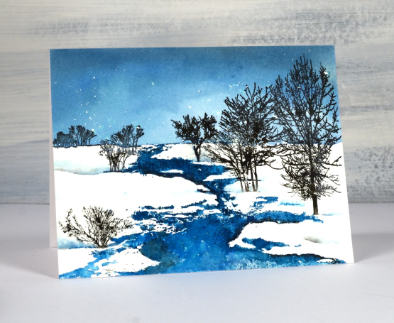
As I write this a snow storm continues outside so there will be scenes like this one to enjoy in days to come. The whole scene is one of Penny Black’s beautiful scenic stamps; this one is called ‘streaming’. I worked on hot pressed watercolour paper in a stamp positioner and had splattered masking fluid over the panel before I began.
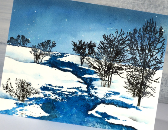
I used a few different inks so I could blend in some areas and get sharp images in others. The first thing I stamped was the top of the stamp including the horizon in uncharted mariner distress ink. Once I could see the horizon I painted more of the same ink to fill the sky adding a little black soot to the blending at the top to darken the sky. I let the panel dry before stamping the stream also in uncharted mariner ink. I took my time blending the stream because I wanted a bit of variety in the depth of colour. You can probably see a few areas that look quite dark where I added black ink to create the look of shadow at the water’s edge.
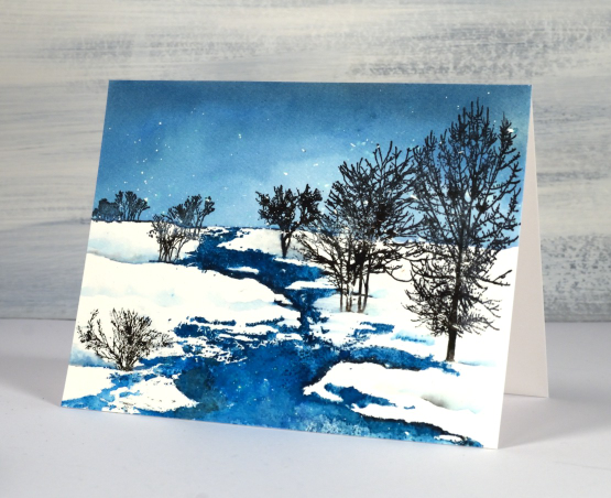
I inked the trees in black archival ink and black starless sky ink (from Ciao Bella) I also used black and blue markers here and there to add ink to fiddly places. I painted some of my own shadowy snow drifts to fill out the scene.
(Compensated affiliate links from Foiled Fox, Ecstasy Crafts & Scrap n Stamp)
Mini Tree
Posted: December 21, 2022 Filed under: decorated holiday mini tree, Echidna Studios, Finetec paints, sennelier watercolours | Tags: digital stamps, Echidna Studios, Fabriano Watercolour Paper, Finetec artist mica watercolour paint, sennelier watercolours 2 Comments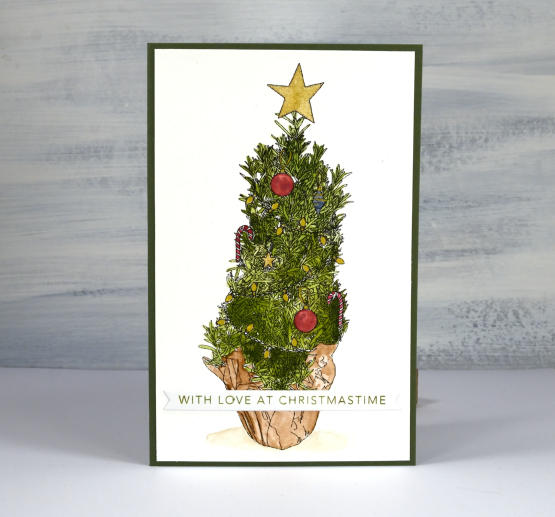
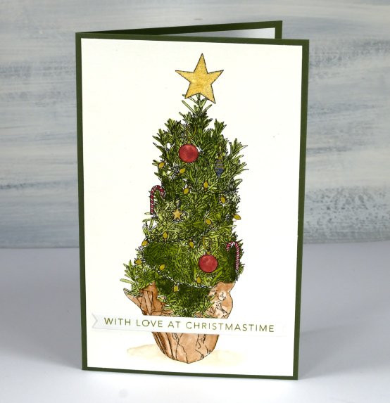
Another festive (digital) beauty from my daughter’s etsy store, Echidna Studios. Do you recognise the inspiration for this little tree? You probably see them in the grocery store; it’s a little pot of rosemary, shaped like a tree. The design is available already decorated or in a set with separate tree and decorations. It is only a few days before Christmas so of course I am featuring the already decorated one!
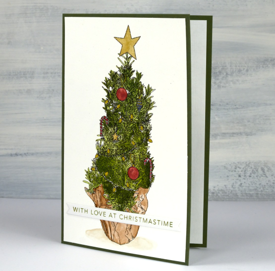
I printed the tree on hot pressed watercolour paper and painted the paper wrapping and tree with Sennelier watercolour paints. Several people asked me about printing on watercolour paper. Up until recently I had no success; I would manually feed it into the printer but the ink would smudge off. A friend told me about the preferences settings when clicking to print and now I choose ‘manual feed’ and ‘heavyweight paper’ and no more smudging!
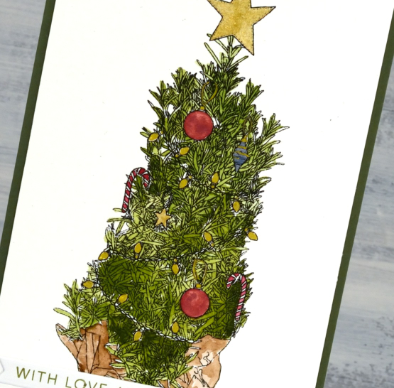
I switched to Finetec pearlescent paints and a gold gel pen to do the decorations so they have a little shimmer and shine to them. I reached into my little box of pre-stamped, pre-cut sentiments and pulled out one to suit the colours and the recipient. It’s a tall skinny tree (a bit like our family) so the card isn’t my usual size. It’s a 6¼” x 4″ olive green card base.
My life size tree is also decorated in red and gold this year. I always pick a slightly different colour scheme so this year all the red baubles came out, the tartan ribbon and the individual decorations in red, gold or wood. Do you change your colours from year to year?
(Compensated affiliate links from Foiled Fox & Scrap n Stamp)
Sunlit Rivulet
Posted: December 20, 2022 Filed under: Penny Black, rivulet | Tags: Fabriano Watercolour Paper, Penny Black stamps, Ranger Distress inks 12 Comments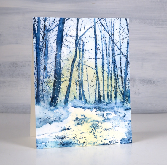
This is the second card made with the beautiful Penny Black ‘rivulet’ stamp. This time I wanted to create a pale sunrise and reflection so I painted some diluted scattered straw ink on the panel before stamping. The panel was already splattered with masking fluid in tiny dots to represent falling snow.
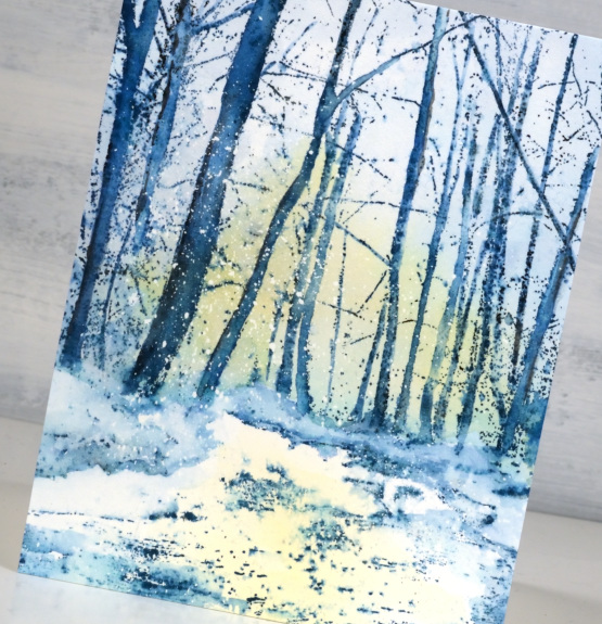
After the yellow ink dried I stamped the image in uncharted mariner distress ink and added a few shadows to the edge of the tree trunks with black soot ink. I blended the ink on the trees and around the snowy ground with a paintbrush but I didn’t want the blue and yellow inks to mix too much as I didn’t want any green hurricane sky!
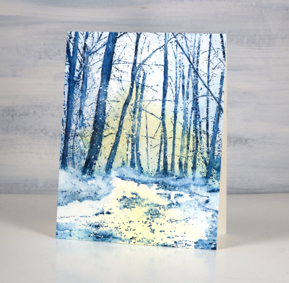
Once the whole panel was dry I used blending brushes to apply a little more scattered straw ink to the sky and foreground as well as some blue to the sky.
(Compensated affiliate links from Foiled Fox & Scrap n Stamp)

Winter tree
Posted: December 19, 2022 Filed under: Echidna Studios, winter tree & bench | Tags: digital stamps, Echidna Studios, Fabriano Watercolour Paper, sennelier watercolours 15 Comments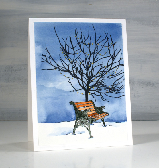
This sweet scene is based on a real tree and a real bench. It’s another design by my daughter and available as a digital stamp in her etsy store, Echidna Studios. I printed it twice on hot pressed watercolour paper. One image almost fills a 4¼” x 5½” card and the other is smaller leaving room to be framed by the snowfall embossed panel.

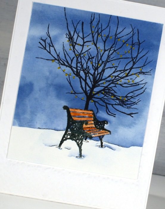
One of the nice things about digital stamps is the way they can be printed any size you want. I used Sennelier watercolour paints to paint the blue sky across the panel working my way around the bench but painting over the top of the tree. Once the sky was dry I painted the bench with brown and grey paint then the tree with black. Some of the branches are quite thin especially on the smaller version so I used a fine tip Pitt pen to colour them.
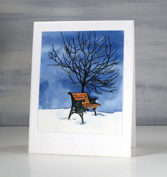
When the painting was all dry I coloured over the lights with a gold gel pen. Now that I have tried the image a couple of times I want to go more slowly and see if I can get those lights to glow a bit more. It is a calm pretty image but if I was trying to reflect the last few days of weather here in Ottawa both tree and bench would be covered in snow!
(Compensated affiliate links from Foiled Fox, Scrap n Stamp)