
Flower embrace
Posted: April 29, 2017 Filed under: Flower embrace | Tags: Faber-Castell Albrecht Durer Watercolour pencils, Kuretake Zig clean color real brush markers, Penny Black stamps, WOW embossing powders 13 Comments
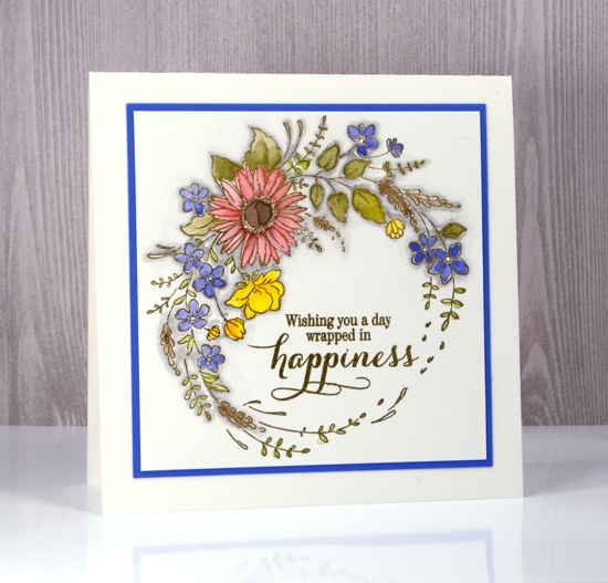
I embossed this pretty new stamp from Penny Black so I could do some pencil colouring while I was away in Toronto a few weeks ago. The photo below is a little washed out on the gold embossing but I included it so you could see how the shiny gold contrasts with the pencil colouring. I used watercolour pencils as tiny palettes which is my usual method. I hold the pencil in one hand and a water brush in the other to pick up colour from the pencil lead.
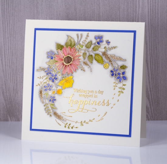
My watercolour pencils are Faber Castell’s Albrecht Dürer. I’ve had a set of 36 since art school and recently I bought a bunch of colours I didn’t have. The floral wreath is embossed in gold powder after stamping in versamark.

The only other detail I added was a shadow of grey around all the embossing. I used a zig cleancolour brush marker then blended it with some water. Enjoy your day.
Supplies
Stamps: flower embrace, sprinkles and smiles (PB)
Pencils: Faber Castell Albrecht Dürer watercolour pencils 172, 168, 176, 108, 126, 225, 144
Ink: versamark
Also: WOW gold metallic rich fine embossing powder, gray zig cleancolor brush pen
Bible journalling
Posted: March 24, 2017 Filed under: Bible journaling, Fragrant Flowers | Tags: Bible journaling, Faber-Castell Albrecht Durer Watercolour pencils, Penny Black stamps, Tsukineko Versafine inks 9 Comments
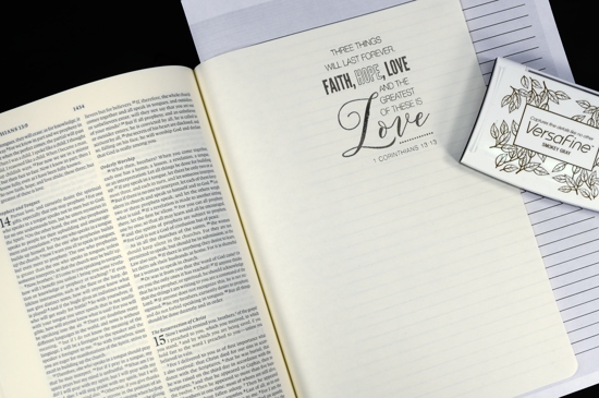
I have recently started some bible journalling. When I first saw the trend I decided I wouldn’t venture down that path but a couple of things changed my mind. The pastor of our church challenged us to read through the New Testament this year, a challenge I am enjoying and even managing to keep up with! I started jotting things down in a notebook as I read. Also I began taking notes during the sermons more carefully; there is usually an outline on the back of the weekly bulletin provided for notes. The problem was, even after I took the notes I brought them home and they piled up and eventually I tossed them out. Rather than continue that practice I decided to buy an interleaved bible which has a blank page after every printed page, and transfer my notes into that. I have been doing it for a month or so and it makes a difference for me to read the bible passage, hear the sermon, take notes, then come home and read through it all again as I add notes to my journalling bible. Most of the pages I’ve written on do not include colour illustration but I enjoy having the option of lettering, writing, drawing or stamping on the blank pages. The page I am sharing today has plenty of blank space left for notes on the passage highlighted in the stamped verse.
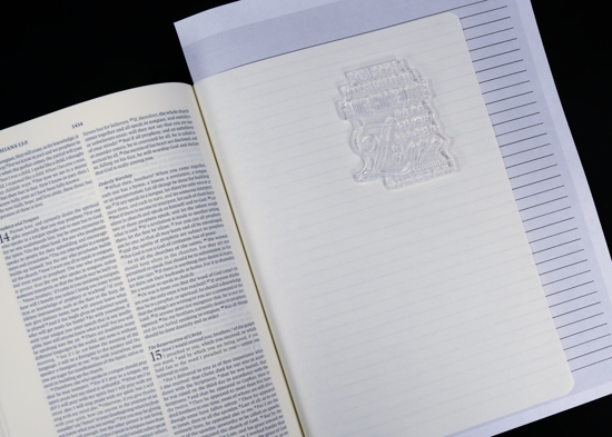
Now onto my process. I printed out a lined page to both guide my stamping and protect the page underneath.
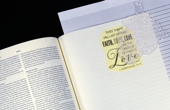
I stamped the 1 Corinthians verse from the set, ‘Faith’, in versafine smokey gray on the blank bible page and and on a post-it note to use as a mask.
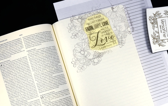
With the mask in place I stamped the floral bouquet from the ‘Fragrant Flowers’ set, also in smokey grey but a second generation impression. I did this three times to surround the verse.
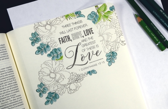
I decided to use my Albrecht Dürer watercolour pencils to colour my page but kept them dry. (you can click on the photo to view larger version) There are two types of leaves on the floral stamp so I chose two pairs of green pencils, yellow greens (apple green 170, moss green 168) and blue greens (Hookers Green 159, Juniper Green 165) I coloured with the lighter hue first then added shadow and definition with the darker.
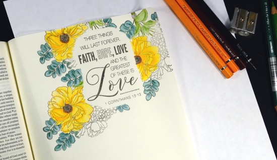
For the yellow flowers I chose two oranges and coloured all the petals with canary yellow (108) then added shading with cadmium orange (111). In the centre of the flowers I switched to browns (Venetian red 190, sepia 175)
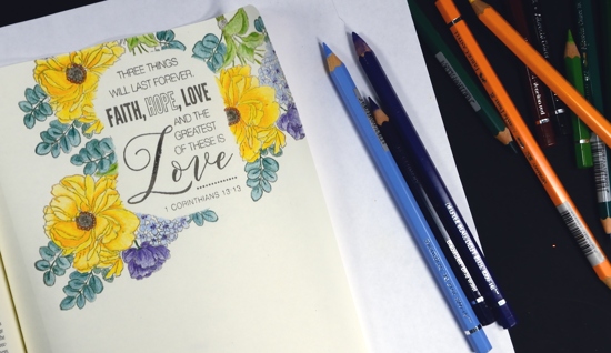
Purple and yellow are complementary colours so I chose blues and purples for the remaining flowers knowing it would give some visual impact to the page. (blue violet 137,Delft blue 141, sky blue 146)
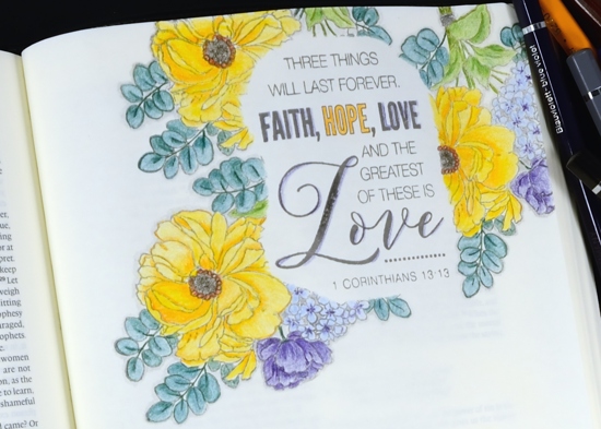
Once all my colouring was done I shaded around the edges of all the leaves and flowers with cold grey IV 233 and added some colour around a few of the letters in the verse.
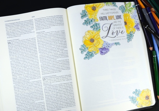
I balanced out the page with a section of the stamp coloured in the lower corner and will add journalling to the page some time in the future.
Supplies
Stamps: Faith, Fragrant Flowers (PB)
Inks: versafine smokey gray (tsukineko)
Pencils: Albrecht Dürer watercolour pencils (Faber-Castell)
Bible: ESV journaling bible interleaved (Crossways)
A new poppy to enjoy
Posted: February 16, 2017 Filed under: Dynamic | Tags: Faber-Castell Albrecht Durer Watercolour pencils, Penny Black creative dies, Penny Black stamps, WOW embossing powders 16 Comments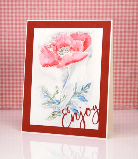
If you are familiar with Penny Black stamps you will know there are a lot of poppies to choose from. The one on my card above is a lovely new outline stamp called ‘dynamic’. I chose to heat emboss it in clear powder then colour with watercolour pencils. I used only five colours, varying the intensity of the red by adding more in the shadowed areas.(I also added a little sparkle to the petals with wink of stella) I used two greens for the stem and leaves, a black in the centre and a grey around the image.
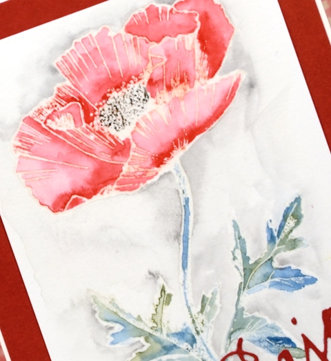
Once my colour was complete I let it dry then ironed the embossing out of the paper. To do this you place the panel face down on some printer paper and iron with no steam over the panel until the embossing has melted into the paper underneath. It still looks embossed but it is no longer raised or shiny. I ended up giving the panel a wide red frame and a die cut sentiment from the same cardstock as the frame. Don’t forget to check out all the new loveliness in the new Bliss release.
Supplies
Stamps: Dynamic (PB)
Dies: You enjoy(PB)
Ink: versamark (Tsukineko)
Pencils: 174, 199, 233, 225, 155 Albrecht Dürer watercolour pencils (Faber Castell)
Paper: hotpressed 100% cotton watercolour paper
Also: WOW clear embossing powder, wink of stella clear marker
The Yellow House
Posted: December 28, 2016 Filed under: Brusho, Victorian home | Tags: Brusho, Faber-Castell Albrecht Durer Watercolour pencils, Penny Black stamps, Tsukineko Versafine inks 3 Comments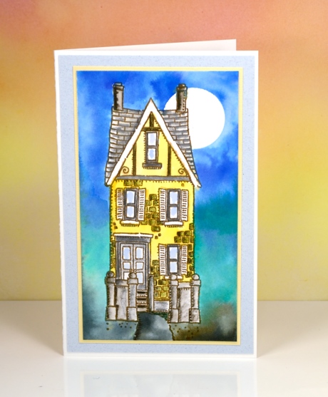
I painted the yellow house a while ago using brusho watercolour powders for both the background and the house. In the background I let the brusho do what it does so well, blend from colour to colour. The house I was more finicky about. I stamped the house in vintage sepia versafine ink, a pigment ink that would not bleed when I started adding watercolour paints over it. I used a small paintbrush and brusho in a palette to paint the house in yellow and grey. After it dried I used watercolour pencils to add shading to columns, steps, roof tiles and bricks. I let that dry before adding a circle mask in the top right corner to create the moon in the blended blue sky. By dampening the paper before adding colour I was able to blend softly from blue to green to grey.
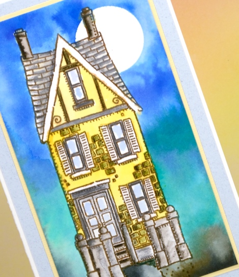
I matted in yellow and grey just like I might if framing a painting . The stamp is long and thin so the card is too. When I was making this panel a friend of mine was making one too. She didn’t end up with such a tall thin card because she added a car beside the house which looked very cute!
Supplies:
Stamps: Victorian Home (PB)
Ink: vintage sepia versafine ink (Tsukineko)
Paper: 100% cotton hot pressed watercolour paper, co-ordinating cardstock for mats
Paint: brusho ultramarine, lemon, emerald green, black (Colourcraft)
Pencils: sepia, pine green, cold greyIV Albrecht Durer watercolour pencils (Faber Castell)
Poinsettia gift set
Posted: December 2, 2016 Filed under: Winter Joy | Tags: Artline Stix brush markers, Faber-Castell Albrecht Durer Watercolour pencils, Fabriano Watercolour Paper, Peerless Transparent Watercolors, Penny Black stamps, Tombow fudenosuke brush pen 20 Comments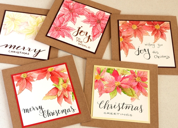
Although I had posts popping up on the blog while I was away for a month all the projects had been created and photographed before I left for Australia. I did take some art materials with me and spent a little bit of time creating this gift set for my sister-in-law. I was able to catch up with her a couple of times, once for dinner and a concert where she lives and again for my last day in Australia, a girls day out in Sydney. We had a great time together and I was happy to have finished this little set as a thank you gift.

I only took two stamp sets with me, one stayed uninked but the poinsettia from ‘winter joy’ was perfect for this set of cards. I stamped it on some label paper and cut it out so I would have a mask to enable me to layer the images and stamped all but one design in vintage photo ink. The one pale card was stamped in antique linen so I could create ‘white’ poinsettias.

I did my colouring with a mix of watercolour pencils and peerless watercolours on hot pressed watercolour paper. Because I hadn’t taken any sentiment sets with me I hand lettered all the sentiments, some more neatly than others! I picked up some kraft coloured square cards and envelopes from Eckersleys art store and raided my parents’ stash of coloured cardstock to create some mats. Even though I was working with minimal supplies I still managed to spread myself over half the dining room table at mum and dad’s house!
Supplies
Stamps: winter joy (PB)
Inks: vintage photo, antique linen distress ink (Ranger)
Paints: Peerless watercolours, Faber Castell Albrecht Durer watercolour pencils
Markers: Tombow fudenosuke brush pen, Artline Stix brush pens
Cardstock: fabriano hot pressed watercolour paper, Kaisercraft card & envelope pack
Vintage poinsettia
Posted: September 22, 2016 Filed under: gift card pocket, Scarlet Majesty | Tags: Faber-Castell Albrecht Durer Watercolour pencils, Penny Black creative dies, Penny Black stamps, Ranger Distress inks, Tsukineko Versafine inks 8 Comments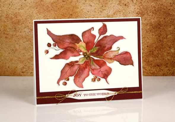
Today’s card is a contrast to the sparkly bright poinsettias earlier in the week. I returned to a style I have featured on the blog several times this year, a vintage appearance. To achieve the aged look I stamp first in vintage photo distress ink then blend the stamped ink with watercolour pencils. I worked one petal at a time and used a wet paintbrush to pick up colour from the pencils. I chose a couple of reds, and a light green for the petals and a dark brown for the berries. Once the whole image was painted I coloured around the edge with a grey pencil to help ‘lift’ it off the page a little.
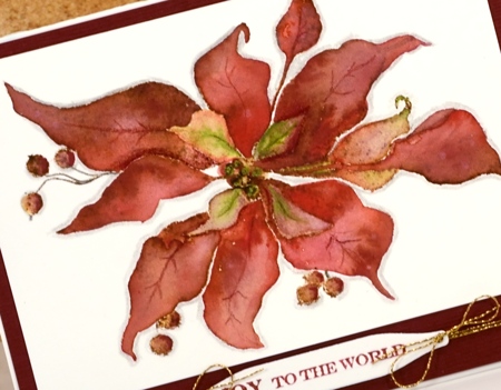
I matted the panel with textured burgandy cardstock and added a sentiment on one of the handy tags from the gift card pocket die (a set that gives you way more than just a gift card pocket; its full of tabs, tags, flowers, scalloped shapes…).
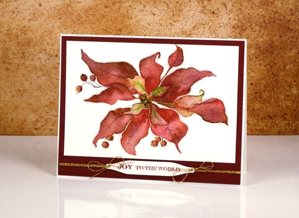
As I finished editing this post it occurred to me that the vintage look on my poinsettia does give it a bit of a ‘dried up ‘cos I didn’t get watered look’. Now, how would I know that look I wonder?
Supplies:
Stamps: Scarlet Majesty, Holiday Snippets (PB)
Dies: Gift Card Pocket
Inks: Versafine Crimson Red ink (Tsukineko) vintage photo distress ink(Ranger)
Cardstock: Fabriano 100% cotton hot pressed watercolour paper, Burgandy textured cardstock
Also: Faber-Castell Albrecht Durer watercolour pencils, Gold cord
More butterflies
Posted: July 9, 2016 Filed under: butterfly charmer, Watercolour | Tags: Faber-Castell Albrecht Durer Watercolour pencils, Penny Black stamps, Ranger Distress inks, Tsukineko Versafine inks 17 Comments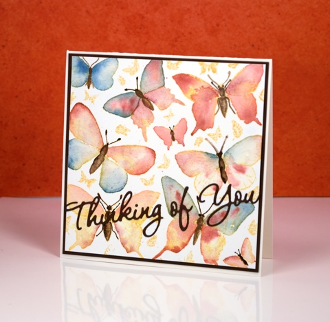
I didn’t intend for this week to be all about butterflies but that’s the way it turned out. To create this panel I coloured the little butterflies on the butterfly charmer stamp using what I am calling the colour drop method. I don’t think it is anything new but I needed a name for this little technique. I stamped the large stamp with wild honey distress ink then painted the butterflies with water one at a time. The water blended the wild honey ink to give each butterfly a warm yellow tone but it also gave me a pool to drop another colour into. I took colour from my water colour pencils and dropped it onto the wet wings and let it spread into the whole wet area. I moved from wing to wing so they could dry a little before adding a second colour to an adjacent area. I did video the process and have sped it up and posted it on my instagram
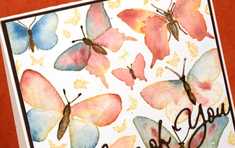
When the wings were all dry I drew over the butterfly bodies, legs and antennae with either a dark brown watercolour pencil or a distress marker then blended the brown with a very small paintbrush and a wee bit of water. The finished panels remind me of botanical books.
The first one I did using this method is below. I added colour to the little butterflies also and filled in the background.
I used Faber-Castell Albrecht Dürer watercolour pencils over rusty hinge distress ink for this one
You can see on the close up that you don’t lose all the definition of the stamped image when you paint over it; there are faint outlines of pattern underneath.
Thanks for dropping in; have a great weekend.
Supplies:
Stamps: Butterfly charmer, Happy Snippets (PB)
Dies: Wishes
Inks: wild honey distress ink, rusty hinge distress ink (Ranger) Versafine vintage sepia (Tsukineko)
Cardstock: Hot pressed Fabriano watercolour paper, brown cardstock, green cardstock
Also: Albrecht Durer watercolor pencils (Faber-Castell)
Limberlost Journal page & video
Posted: July 6, 2016 Filed under: Art Journal, Butterfly trio, Muse, Script, Tutorial, Verdure | Tags: Art Journal, color burst, Dr Ph Martin Hydrus watercolor paints, Faber-Castell Albrecht Durer Watercolour pencils, Penny Black stamps, Tsukineko Versafine inks, Tutorial, video 21 Comments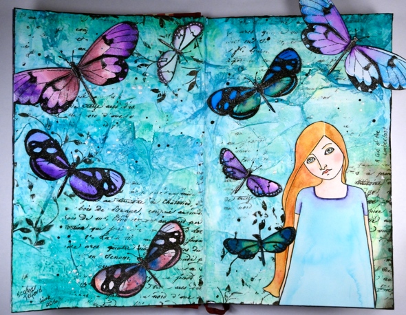
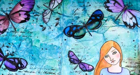
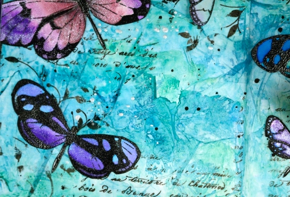
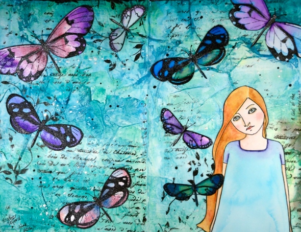
It is over a year ago since I completed a page in my art journal so it was a good thing when I was asked to create an art journal video for the Penny Black blog. The latest release from PB, Artistic Endeavors includes some beautiful stamps designed with journaling in mind. The page I created last year was a Narnia page so I decided to stick with the literary theme and make another book inspired page. My inspiration this time is ‘A Girl of the Limberlost’ by Gene Stratton-Porter. I read the book quite a few years ago but really enjoyed it and could see the butterfly and figure stamp working well on such a page.
The main character, Elnora, catches moths to sell to collectors in order to support herself through high school. She lives on the edge of the Limberlost, a forested and swampy region where she finds the moths she later sells. I know these stamps depict butterflies but I chose to exercise some artistic license.
Because I wanted to watercolour both the butterflies and the girl I stamped them on watercolour paper, painted them, then cut them out so I could attach them to the page.
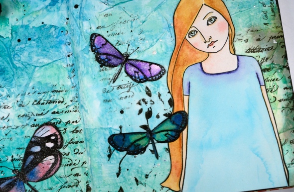
To add texture to the background I glued torn strips of tissue paper all over it then did partial stamping with a script stamp and a leafy stamp.
Journal pages take me a long time so despite the fact that I sped up just about all the footage, it is still on the lengthy side. I hope you enjoy it and, maybe like me, get inspired to pull out a neglected art journal. Or perhaps you’ll go and check the book out of the library…
Edited to add: In the video I mentioned learning a lot from Vicky Papaioannou; her videos are here:https://www.youtube.com/user/vickypgr
Supplies:
Stamps: Muse, Script, Verdure, Butterfly trio (PB)
Art Journal: Fabriano 24cm x 15.5cm
Art supplies: Faber-Castell gel medium , Tsukineko Versafine Onyx Black ink , clear embossing powder, Ken Oliver Colorburst powders (merlot, violet, ultramarine blue), Ken Oliver liquid metals (platinum, verdi gris, ultramarine blue), Faber-Castell Stampers big brush pen, lead pencil, Pigma 0.3 micron pen, Faber-Castell Albrecht Durer watercolour pencils (medium flesh, brown ochre, juniper green, ochre, burnt ochre, venetian red, delft blue, warm grey 3), tissue paper, Dr Ph Martin Hydrus liquid watercolours (Hansa yellow light, phthalo blue, phthalo green, carbon black) Art glitter designer dries clear adhesive, Ranger distress micro glaze.
OLS29 Christmas in July
Posted: July 1, 2016 Filed under: CAS, One-Layer Simplicity challenge, Spread Cheer | Tags: Faber-Castell Albrecht Durer Watercolour pencils, Penny Black stamps, Speedball elegant writer, Tsukineko Memento inks, Tsukineko Versafine inks 18 Comments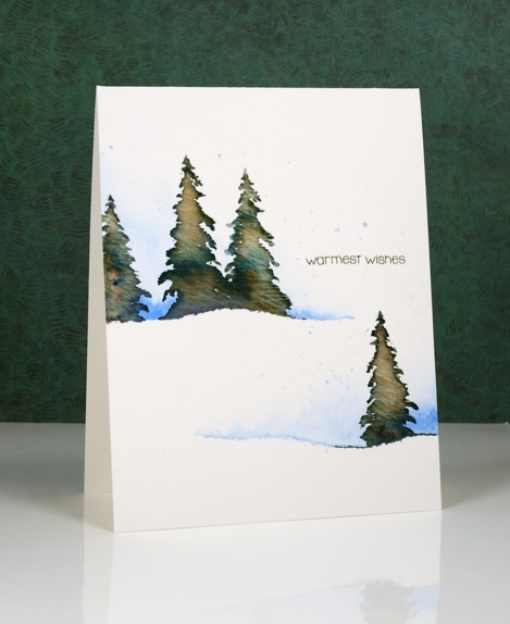
I am hosting the One Layer Simplicity Challenge this month and the theme is ‘Christmas in July’. I know some of you make Christmas cards all year but I usually start around now and keep going until December! If you haven’t even thought about Christmas cards then perhaps this challenge will be a motivator. Perhaps you want to enjoy the summer sun and not think about December at all – that is totally fine too!
To make this one layer card I tore a piece of painter’s tape lengthwise into two strips and positioned them on my watercolour paper card base. I painted some blue along the torn tape edge and faded it to white. Keeping the tape in place I stamped a few trees in Memento Northern Pine ink and added a few dabs of black elegant writer pen. After stamping I painted over the tree to blend the ink. Northern Pine separates into brown and green when diluted which gives the foliage some variety in colour.
I’ve been reading a book called ‘The Non-Designer’s Design Book’ which has made me think about layout in terms of alignment, repetition, contrast and proximity. The book is concerned mainly with text documents like business cards, menus, ads, etc but the principles are relevant to art layout too. I found myself trying to apply what I’ve learnt when working out where my sentiment would go.
Supplies:
Stamps: Spread Cheer(PB)
Inks: Northern Pine Memento ink, Versafine Olympia green (Imagine Craft/Tsukineko)
Pencils & Pens: blue watercolour pencil (Faber Castell), elegant writer pen (Speedball)
Cardstock: Canson Moulin du Roy 100% cotton hot pressed watercolour paper
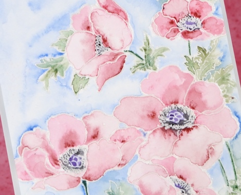
Pastel Poppy Gems
Posted: June 16, 2016 Filed under: Poppy Gems | Tags: Faber-Castell Albrecht Durer Watercolour pencils, Fabriano Watercolour Paper, Penny Black stamps 10 Comments
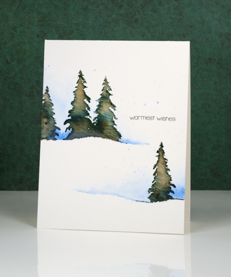
This week my colouring has grown softer each day. I changed mediums for this card and pulled out my tried and true watercolour pencils. I have added to my set lately but the originals are still the set I bought in university for my art subjects. I remember my parents thinking they were quite an expensive purchase then but I would say we got our money’s worth!
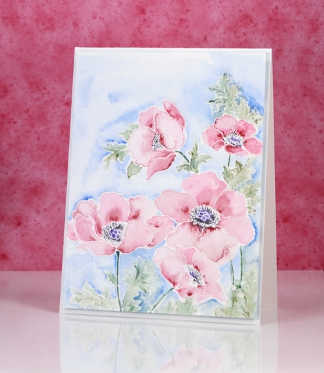
I embossed the poppy gems stamp in clear powder then painted each petal one at a time. I applied two pinks from the pencils and blended from dark to light, keeping some watermarks and blending others out. On yesterday’s card I kept the blending very smooth but sometimes I like to have a few watermarks here and there.
Colouring three times in a row is great practice for Kathy Racoosin’s upcoming 30 day colouring challenge. The next one starts on July 5th and lasts until August 3. I will share more details closer to the time but it is a great challenge, no pressure to colour every single day, plenty of wonderful inspiration from Kathy and some prizes along the way.
Supplies:
Stamps: Poppy gems(PB)
Inks: Versamark (Tsukineko)
Pencils: Pine green 267, Chromium green opaque 174, Dark red 225, Madder 142, True blue 148 (Faber Castell Albrecht Durer watercolour pencils)
Cardstock: Fabriano 100% cotton hot pressed watercolour paper


