
Dancing Daisies
Posted: June 1, 2017 Filed under: dancing daisies | Tags: Fabriano Watercolour Paper, Finetec artist mica watercolour paint, Penny Black stamps, Ranger Distress stains 10 Comments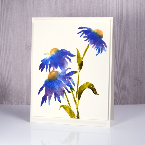
It’s been a bit quiet here on the blog lately. I’m spending my time on the less exciting tasks of stamping matching envelopes, stamping my new name stamp on the back of cards and packaging up said cards for the upcoming craft market on June 17. I have made a new resolution to stamp a matching envelope at the same time as I make the card. It is a bit time consuming pulling out the stamps and inks to try and match what I made weeks or months ago. I know I don’t have to have matching envelopes but they are pretty.
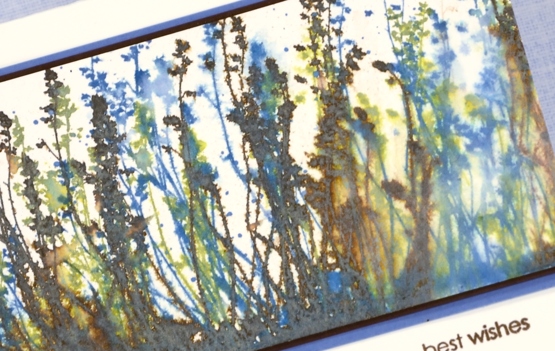
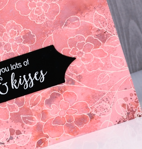
Stamps from Penny Black’s new ‘Poetic’ release arrived in my mail box last week so I have been itching to create with them. This new cling stamp, Dancing Daisies, should possibly be yellow, or pink, or orange if you are looking for realism but I really wanted it in blue. I wanted a particular blue what’s more and as I didn’t have an ink that colour I stamped with three different distress stains to get the blue you see in the centre of the daisy above, right next to the yellow. I inked part of the petals with salty ocean distress stain first and stamped that, then switched to dusty concord and finally added blueprint sketch. I cleaned the stamp between applications so I didn’t contaminate the dauber on the distress stains. I used dried marigold and scattered straw on the flower centres and forest moss and crushed olive stains on the stems and leaves.
![]()
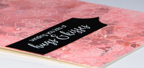
My second attempt is a little different as I used some of the same colour stsains but also pulled out my pearlescent finetec paints and painted some directly on the stamp and the panel, blue on the petals, green on the leaves and gold on the flower centres. It is hard to see in the photo but there is definitely some shimmer happening.
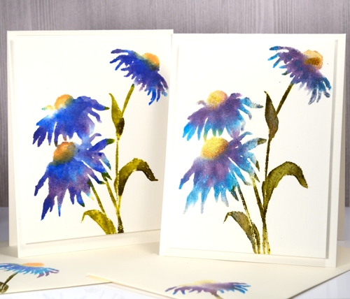
Both panels were stamped on hot pressed watercolour paper with the help of the MISTI so I could add the colours one at a time.
Supplies:
Stamps: dancing daisies
Inks: salty ocean, dusty concord, blueprint sketch, crushed olive, forest moss, dried marigold, scattered straw distress stains (Ranger)
Paint: finetec pearlescent paints
Paper: hot pressed watercolour paper
Silver Dragonflies
Posted: May 26, 2017 Filed under: Flutters, Gilding Flakes | Tags: color burst, Fabriano Watercolour Paper, Gilding, Penny Black creative dies 9 Comments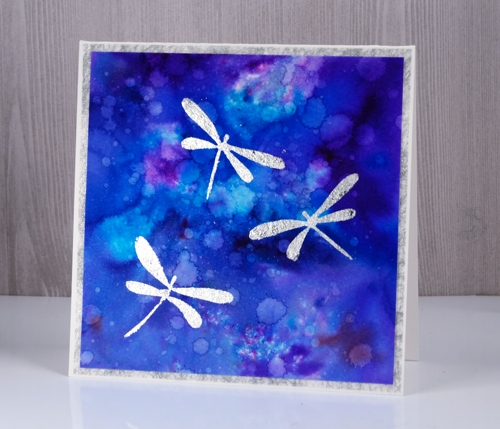
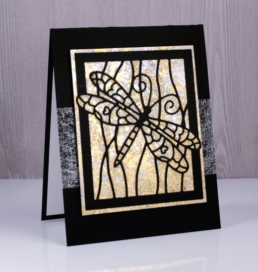
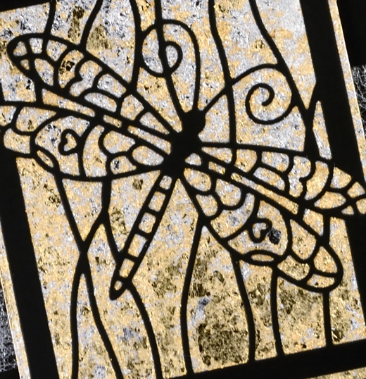
My second gilded card also features dragonflies, this time little silver ones. In my previous post I shared a card gilded in both gold and silver flakes; this time I just used silver because I think silver and blue look so very pretty together. I used stick it adhesive once again to attach the gilding to the watercolour panel and colorburst powders to create the background panel.
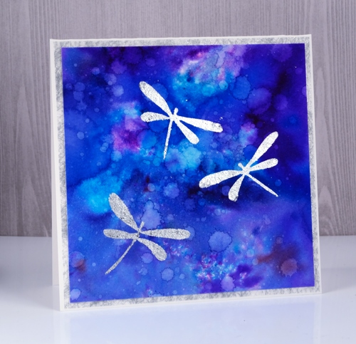
I sprinkled three colours of colorburst powder on watercolour paper then sprinkled with water. Once the colours were blending nicely I used a brush to spread the colour to the edges of the panel. I dried it with a heat tool then added droplets of water a few at a time and dabbed some of them up with a paper towel. I dried the panel in between each batch of water droplets so I could get a mass of water marks. I die-cut three dragonflies from stick it adhesive then applied them to the watercolour panel, removed the backing paper and rubbed silver gilding flakes on top. I burnished with a plastic scrubby pad to remove the excess flakes. It’s finished with a frame of silver spiderweb fabric that comes from France and happens to match the gilding flakes perfectly.
Supplies:
Dies: Flutters
Cardstock: Neenah solar white cardstock, hot pressed watercolour paper
Also: stick it adhesive sheets
Shimmery Stuff: silver spiderweb fabric, Nuvo silver bullion gilding flakes
Gilded Dragonfly
Posted: May 23, 2017 Filed under: Dragonfly Frame, Gilding Flakes | Tags: Gilding, Penny Black creative dies 11 Comments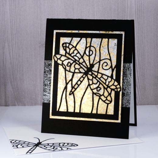
The lovely folk at The Foiled Fox have been spoiling me again, this time with gilding flakes. I tend not to add sparkly elements to all my cards but I do like the option of a little or sometimes a lot when a card asks for bling. I had no idea just how much I would like playing Midas with the Nuvo gilding flakes. They arrived on Friday, I experimented with them on Saturday and turned my panels into cards yesterday. If I didn’t have classes to plan and groceries to buy I would probably play with them more today.
My initial experiments have resulted in six cards which I will share over the next little while. I played with a few techniques for adhering the gilding flakes and today’s is possibly the most effective so far. A word of warning, the gilding flakes are lighter than feathers and they do go everywhere! Jennifer McGuire suggested a swiffer cloth for clean up so I might just need to get one of those! To create the gilded background I cut a piece of ‘stick-it’ adhesive sheet larger than my dragonfly frame die and stuck it to a piece of white cardstock then removed the backing paper. Next I cut the dragonfly frame from black cardstock and positioned it on top of the adhesive rectangle on the white cardstock. I gently laid both silver and gold gilding flakes onto the adhesive panel and pressed lightly. The gilding adheres effortlessly to the ‘stick’it’, filling the entire area not covered by the black die cut. I burnished the flakes gently with a scrubby which breaks off excess pieces and makes sure all the adhesive is covered. The scrubby tends to turn the shiny silver and gold to brushed silver and gold so if you want maximum shine then burnish with your fingers or something smoother than a scrubby.
I trimmed the panel keeping a gilded border round the die cut frame. I wanted something extra behind the panel but not too much so I wrapped a strip of silver spiderweb fabric around my black card base then attached the gilded panel over the top. I finished the card with a white paper panel inside to write on and an envelope decorated with the die cut dragonfly. I am training myself to complete a card/envelope combo each time rather than have to catch up with envelopes at a later date. I have a booth in a craft market next month so most cards I make at present will be heading to Craft-Fest 2017 on June 17 here in Ottawa. More about the market in the days to come.
Supplies
Die: dragonfly frame (PB)
Cardstock: solar white, epic black (Neenah) textured white paper
Also: stick it adhesive (Ken Oliver), silver bullion gilding flakes, radiant gold bullion gilding flakes (Nuvo), silver spiderweb fabric from France
Homestead views
Posted: May 17, 2017 Filed under: Alcohol Ink, Homestead | Tags: Darkroom Door stamps, Ranger Alcohol Ink 7 Comments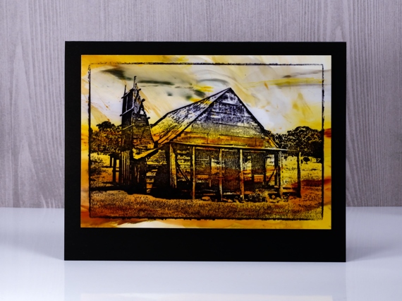
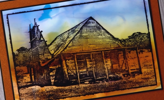
I am really enjoying working with alcohol inks on photo paper right now. I just taught a class where we worked on photo paper and the effects are quite different to those I get on watercolour paper. I am using glossy photo paper from Costco and for stamping on these cards, archival inks. I have since switched to StazOn inks because they dry more quickly and slip less on the glossy surface.
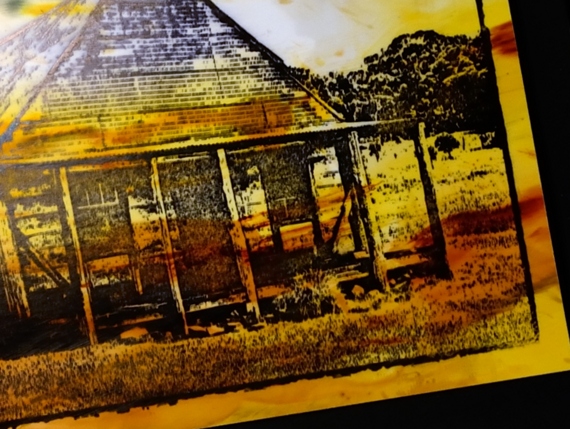
These two cards feature a Darkroom Door stamp of the quintessential Australian homestead from days gone by. I chose colours that remind me of the often dry summer landscape and black bases to match the ink.
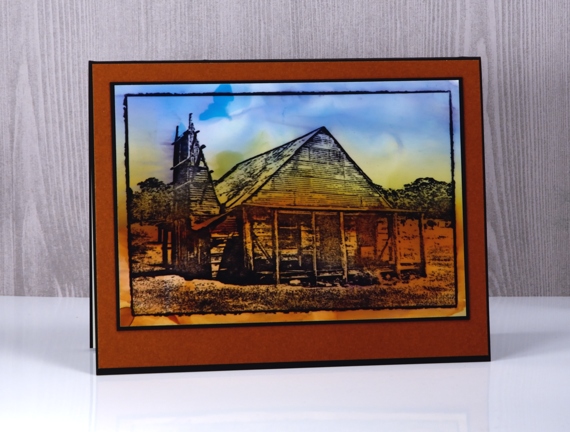
I used the swipe method to apply alcohol ink to the photo paper, dropping colours onto an impermeable craft mat, diluting them with rubbing alcohol then swiping my panel through the ink several times to cover the area.
Supplies
Stamps: Homestead (Darkroom Door)
Inks: Jet black archival ink & sunshine yellow, willow, ginger, stonewashed, slate grey alcohol inks (Ranger)
Papers: glossy photo paper (Kirkland from Costco), Neenah epic black cardstock, brown cardstock
Tools: craft mat
Brusho Balloons
Posted: May 15, 2017 Filed under: CAS, stencil cut, Uplifting | Tags: Brusho, Penny Black creative dies, Penny Black stamps 8 Comments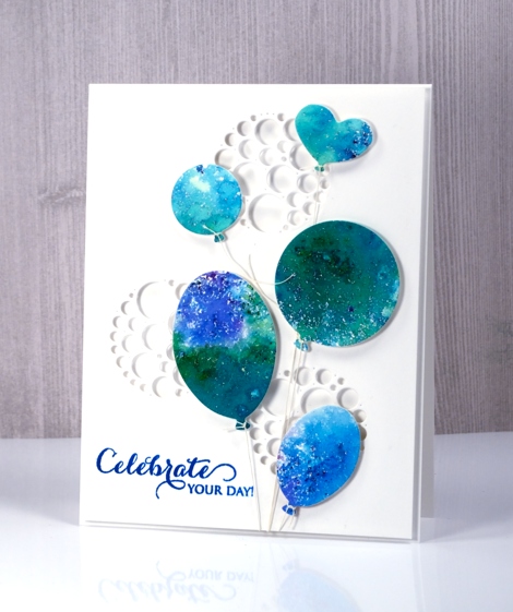
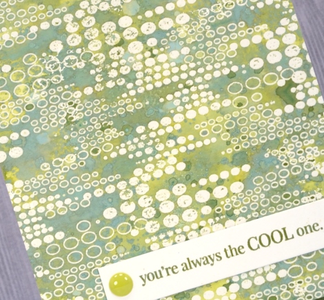
I have another card that utilises brusho experiments. If you have delved into the magic of brusho you probably have a pile of pretty brusho panels you don’t know quite what to do with. Experimenting with brusho is a bit addictive so it is rather easy to keep trying colour combinations with no project goal in mind. I decided to put a scrap of green, blue and purple brusho ‘mosaic’ to use as balloons. By brusho mosaic I mean the effect I get when I spritz over the sprinkled brusho only enough to activate it but not send it flowing all over the paper.
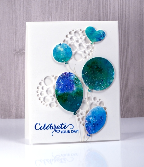
I used the ‘uplifting’ dies from Penny Black to cut out five balloons then added adhesive backed foam to each one. I cut circles of circles out of a panel of neenah solar white cardstock to create a background panel then cut circles from a piece of foam to position behind the panel so shadows would show inside the circles. The circles of circles are part of a new PB die set ‘stencil cut’.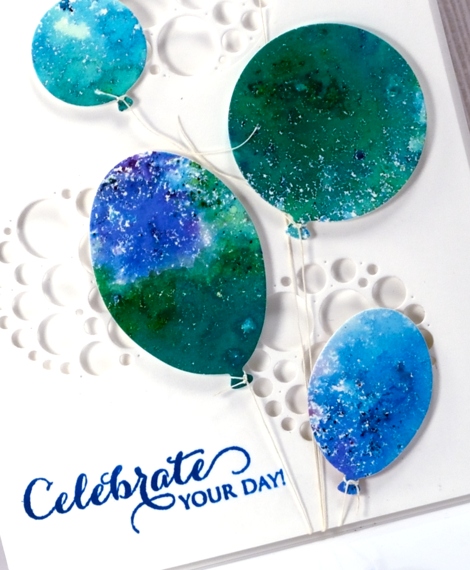
I tied a linen thread to each balloon and tucked the other ends under the background panel. The thread tying took me close to my fiddliness factor limit but I persevered and assembled the layers and added a sentiment. This happy card would work for any celebration so I am adding it to the Casology challenge this week ‘Commencement’.
Supplies
Stamps: A sweet day (PB)
Dies: uplifting, stencil cut (PB)
Paint: brusho crystals (Colourcraft)
Also: linen thread, fun foam
Burst of Bister
Posted: May 12, 2017 Filed under: Bister, CAS | Tags: Bister, Penny Black stamps, Tsukineko Versafine inks 8 Comments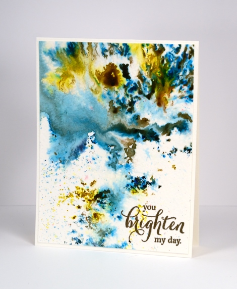
It’s been all about the colorburst and brusho powders with me lately so I thought it was past time to share the other watercolour powder in my life, bister. The concept is the same with bister; you add water and colour bursts out. The colours in the bister range are more earthy than the other brands and the crystals are, on the whole, coarser. The effects are just as magical as you can see on this panel.
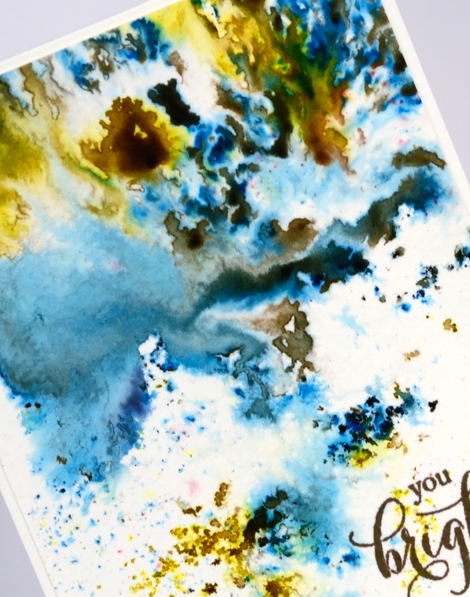
I think this panel is from my initial experimenting with watercolour powders. I really liked how the colours moved on the cold pressed watercolour paper but for a long time I didn’t have a plan for the abstract panel. Eventually I realised it didn’t need a plan; it was a stand alone! I added a sentiment and popped up the panel on foam to give it a ‘shadow frame’ and that is the card. This panel shows the versatility of watercolour powders quite well. By varying the amount of water added you can get small intensely coloured shapes which I think look a bit like mosaics, you can get soft washes and some patterning in between the two extremes.
Supplies
Stamps: special thoughts (Penny Black)
Paint: Bister paint powders
Ink: Versafine vintage sepia (Tsukineko)
Paper: cold pressed watercolour paper
Tulip festival time
Posted: May 10, 2017 Filed under: Tulips | Tags: Darkroom Door stamps, Ranger Distress stains 10 Comments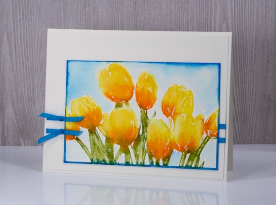
The tulip festival starts here in Ottawa in two days. Of course there are tulips already blooming but the very chilly turn our weather took last week might have kept a few from blooming earlier. I have only a few tulips in my garden so I was seriously annoyed to see a squirrel pull a bud off a stalk this morning. I quickly ran outside and yelled but he just scampered further from me and proceeded to eat the whole thing!
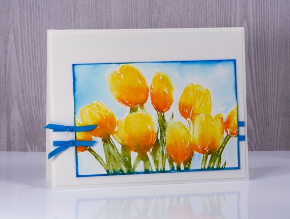
I used distress stains to ink the Tulips stamp from Darkroom Door for this card. I have heard that Ranger is discontinuing the dauber version of the distress stains which makes me sad. I love inking stamps with the dauber to create soft watery looks. I have most of the daubers in the distress stain range but I plan to complete my set before they become unavailable. The spray stain bottles will still be available so I will use them to refill my daubers. I used my MISTI so I could stamp the stains one at a time starting with mustard seed on the petals. Next I added spiced marmalade to the base of the petals, stamped and followed with peeled paint on the stems. I blended all the stain into the petals for fill the outline stamping then let it dry before add a blue frame. I used salty ocean stain on the frame part of the stamp then blended it with water around the tulips after stamping.
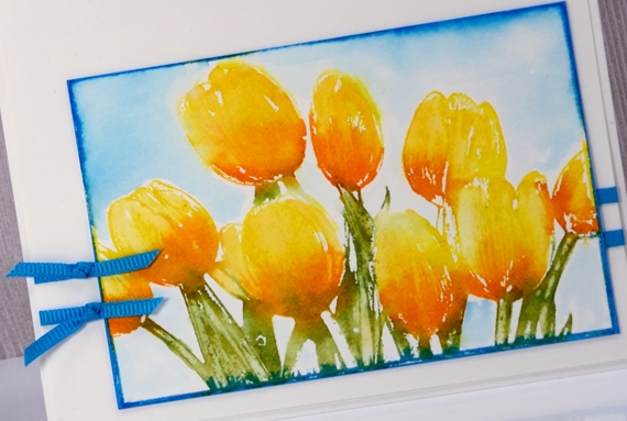
I found I had a nice match in ribbon so wrapped some around a white panel and added two knotted pieces. I popped the tulip panel on the white and attach all to a white card base.
Hope the flowers are blooming where you are.
Supplies
Stamps: Tulips (Darkroom Door)
Inks: mustard seed, spiced marmalade, peeled paint, salty ocean distress stains (Ranger)
Paper: hot pressed watercolour paper, Neenah solar white cardstock
Also: turquoise grosgrain ribbon
The distress oxide trials – Overstamping
Posted: May 8, 2017 Filed under: Feathery | Tags: distress oxide inks, Penny Black stamps, Tsukineko Versafine inks 7 Comments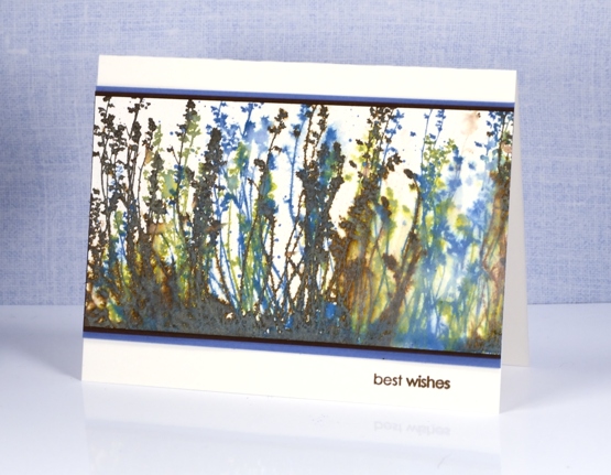
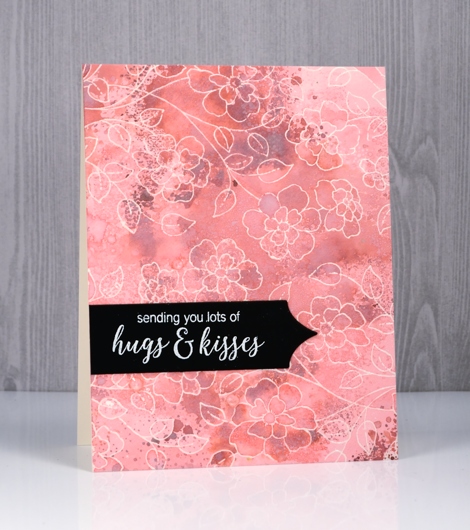
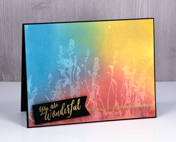
Today’s misty muted scene is brought to you by ‘The Distress Oxide Trials’. This one was one of my early experiments involving stamping over stamping. The effect might be a bit messy for some but I like the way lighter colours over darker colours give something of a skeletal look. I used the ‘feathery’ stamp and inked it with peeled paint first, spritzed then stamped, did the same with vintage photo, and finished with broken china.
You can see the blue over the brown shows up as a x-ray type image. On the right hand side there was an area without much brown so I decided to soften it even more with water to create the look of light coming through.
To finish the card I matted with both brown and blue cardstock then added a sentiment in brown.
Supplies:
Stamps: Feathery, snippets (Penny Black)
Inks: vintage photo, peeled paint, broken china distress oxide inks (Ranger) versafine vintage sepia (Tsukineko)
Paper: hot pressed watercolour paper, blue cardstock, brown cardstock
Distress Oxide Trials – one or two colours
Posted: May 5, 2017 Filed under: Blips, Felicity, Shades, Triple Banner | Tags: distress oxide inks, Penny Black creative dies, Penny Black stamps, WOW embossing powders 15 Comments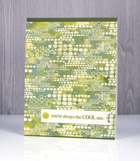
As I’ve been reading your comments about distress oxide inks I have noticed some of you are not sure you want them so have held off or only bought one or two to try. I decided to see what I could do with just one or two colours. I’ve been having so much fun with about half the colours I haven’t even opened them all yet and sadly spiced marmalade is currently hiding somewhere in my messy busy and productive workroom. All that to say, if you only have one or two colours, do some experimenting with them anyway; you might be surprised.
This green themed card is inked with only peeled paint distress oxide ink and yet there is a light and dark teal green, and dark and light olive tones as well. I was pretty impressed. I think the key to this effect is in the layering of colour. I pressed my ink pad on my craft mat, spritzed the ink then swiped my embossed panel through the ink. Colour only partially filled the panel; I dried it then repeated the process over and over. Each layer of ink reacts with the ink already on the paper and the un-inked areas on the paper. I also did some splattering of ink and water and some dabbing of water with a paper towel to lift a bit of colour. Because my panel was embossed I had to be careful not to reheat the embossing too much so I kept the heat tool moving. I love the effect around this ‘blips’ background stamp. A friend of mine used this stamp with great results recently by sprinkling brusho over the embossed image. Seeing her lovely card reminded me I had this stamp tucked away.
My second card uses only two distress oxide inks, worn lipstick and fired brick. I was hoping to do cards in just one colour but I wasn’t getting the same variety of colours from worn lipstick. My guess is that I spoiled my chances by covering the whole panel with my first layer of diluted ink rather than just part of the panel. I did manage to build up some different pinks over the top of the first layer but the differences were not as dramatic as shown on the green above. I will try again and use the same partial inking technique over and over and see what happens.
I did still manage to get some nice colour trapped inside the embossing creating light and dark petals and leaves. To provide just a bit more contrast I swiped it through some fired brick diluted ink a few times. When I press my ink on my craft mat then spritz it lightly it forms little beads of ink. Swiping through them spreads colour across the panel but pressing the paper down on top picks up little dots of ink, another cool effect I think.
I finished both cards with embossed sentiment banners and a few embellishments.
I have a growing list of suggestions from readers to try next week. Thanks for all your encouragement, tips and questions.
Supplies
Stamps: Felicity, Blips, Amazing!, Special Thoughts (PB)
Dies: Triple Banner, Shades
Paper: hot pressed watercolour paper, Neenah natural white and epic black cardstock
Inks: versamark (Tsukineko) Distress oxide peeled paint, worn lipstick, fired brick (Ranger)
Also: WOW clear embossing powder, Studio Katia sparkling crystals, Simple stories enamel dots
Distress oxide trials – Desaturation
Posted: May 3, 2017 Filed under: Effulgent, Feathery, full of glee, Tagged | Tags: distress oxide inks, Penny Black creative dies, Penny Black stamps 15 Comments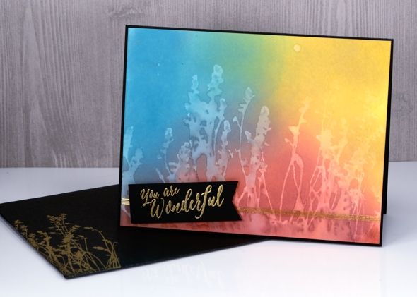
Can you tell I like the way ‘distress oxide trials’ sounds like an significant chemical experiment? That’s why I called today’s post ‘desaturation’ rather than just ‘stamping with water! The effect does come, however, from stamping with water. I think it is my favourite technique so far. I began by blending the inks onto hot pressed watercolour paper. They do blend nicely on neenah classic crest paper but they blend even better on watercolour paper. By blending I mean sponging ink onto the paper, also called inking by some crafters.
For the these three cards I sponged three colours onto the paper and overlapped them to get nice soft blended colours. The sponging doesn’t take long, it doesn’t leave marks shaped like the edge of your applicator and it creates intense colour.
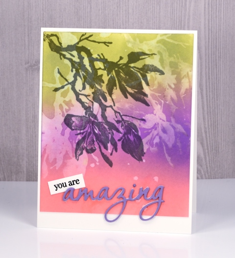
After sponging my colours over the whole panel I put the panel into my MISTI, positioned my stamp then spritzed it with water. All the stamps used for these cards are red rubber; (slapstick cling from Penny Black, names listed below) I haven’t tried with clear stamps yet. The stamp just has to hold onto the water for the technique to work.
After stamping a water print onto the blended colour, I lifted the stamp and dabbed a paper towel over the print. It left a pale image on the coloured panel.
It’s not a really sharp image but it is definitely recognisable and I love the look.
The trials are not over but if you are looking for a technique to start with try some sponging; the finish is so rich and creamy. Then if you are feeling scientific try some desaturation as well. If you have thought of a technique you’d like me to try please leave me a comment below.
Supplies
Stamps: full of glee, feathery, Effulgent, stitched flowers, happy snippets (PB)
Die: tagged, omg (PB)
Inks: worn lipstick, broken china, fossilized amber, wilted violet, peeled paint distress oxide inks (Ranger) versamark, versafine onyx black & smokey gray (Tsukineko)
Papers: hot pressed watercolour paper, neenah solar white, neenah epic black, violet cardstock
Also: gold & white embossing powder, white ribbon, gold thread


