Back on Craft Roulette
Posted: November 17, 2021 Filed under: birds and banners, Dies, Penny Black, petals & branches | Tags: Penny Black creative dies, Penny Black stamps, Ranger Distress inks 5 Comments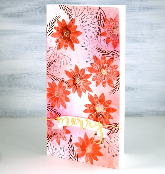
I was once again a guest crafter on Craft Roulette last Friday night and it was loads of fun. Mary Gunn, the host keeps the action going with crafting, chatting, and sharing over eighty card samples made by viewers. To see Mary and I chat and create pop over to the Craft Roulette youtube channel. (To just watch the card making part you can skip to 55:11)
Craft Roulette is a crafting game show where a wheel is spun four times to choose four parameters which must be used on the project being created live during the show. Last Friday the parameters were:
Card type: ‘Lil Chubby’ ( like a slimline but wider)
Colour choice: Warm colours
Element: ‘It’s a sign’
Random: Crumpled paper
The finished card is 4″x 8″ with a blended background that I patterned with a wet crumpled tissue. The colours are warm and that banner die looks like a ‘sign’ to me so I squeaked it in.
It was lovely to see some familiar names in the chat, encouraging me and asking questions. Thank you Karen for staying up late in Wales to watch. I didn’t see all the chat because, well, I had to do some crafting but I was able to read some of it. My dad watched from Australia and was chatting along.
There is definitely an added pressure when crafting live but it is all great fun and the community is such a friendly supportive one. If you have never watched Craft Roulette, I highly recommend!
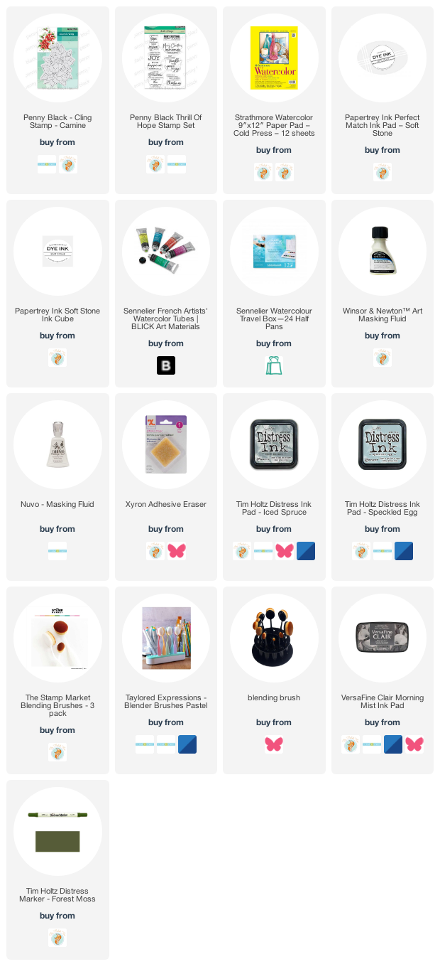
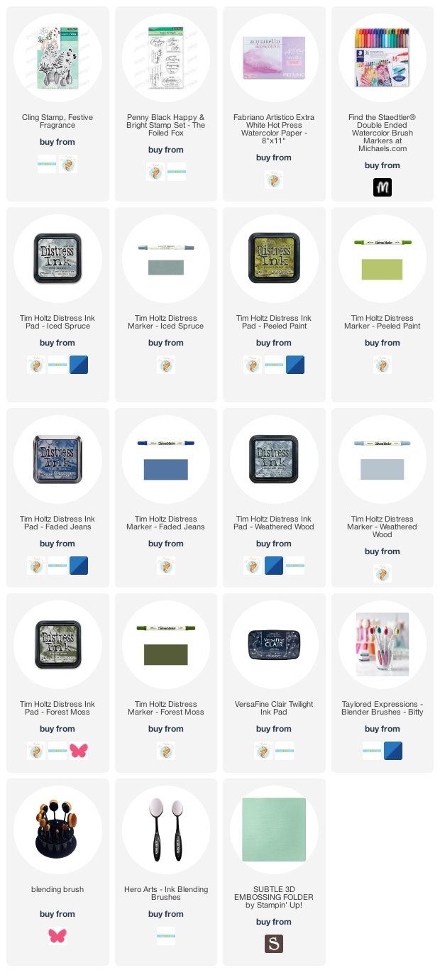
Supplies
(Compensated affiliate links used when possible)
Carmine – No Line Watercolour Video
Posted: November 16, 2021 Filed under: carmine, Penny Black, sennelier watercolours, Tutorial | Tags: distress markers, Fabriano Watercolour Paper, Papertrey ink, Penny Black stamps, sennelier watercolours, Tsukineko Versafine inks, Tutorial, video 9 Comments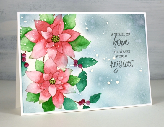
I hope you enjoy today’s no-line watercolour video. When I first saw this stamp I knew it would be perfect for the technique. There are a few little petals but most of the image is made up of open leaves and petals which are easy to see while painting. I used soft stone ink for the initial image on cold press watercolour paper and Sennelier watercolour paints for all the painting.
If you don’t always have a plan for the background you will see how I added one after all the painting was done. Take a look at the video below to see my process.
This is such a pretty stamp and might get inked up again soon to keep my stock of Christmas cards growing. I think it would look good embossed in white on a coloured background. Stay tuned!
Supplies
(Compensated affiliate links used when possible)
A Winner & some Chat
Posted: November 15, 2021 Filed under: Classes, Darkroom Door, Hand drawn, Hand painted, online class, Penny Black | Tags: Classes, online class 3 Comments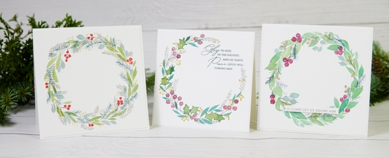
Thank you to everyone who left a comment on the Wreaths – Stamped & Painted online class launch post a week ago. It was lovely to hear from you. Thank you to all of you who have already registered in the class; I am delighted to have you making wreath cards with me. I used a random number generator to pick a winner from the comments left on last Monday’s post and the winner of a class registration is …
Jo Anna Grimsley
who wrote that she had completed her Christmas cards. YAY! and had never been done this early! Well done Jo Anna, you can now treat yourself with an online class. I will be in touch by email.
On Christmas Cards
I was interested to read that many of you had started Christmas cards, some of you don’t make holiday cards but prefer to send cards throughout the year. Several people make photo cards which I think is a great idea; I love to receive a family photo or scenic photo taken some time during the year. A few of you, like me decided to make Christmas cards throughout the year; I didn’t do that well actually so I have had to ramp up the process lately. Some of you keep it simple with a mass produced design but a few of you departed from that plan this year and have been making quite elaborate cards. Thank you so much for all your comments. I made my list yesterday and counted that I need 80+ cards. I spent the afternoon writing in all the ones that go to Australia; they need to be in the mail first.
On Markers
When I mentioned distress markers being discontinued several people commented on their disappointment with the way distress markers dried out faster than other markers. I have found that to be so with the bullet tip of the distress markers but haven’t noticed it so much with the brush tip which is what I usually use. Although I have Tombow markers I tend to forget them. I used several in the wreaths class and found them to be good as new so they are not drying out while they wait for me to choose them! For a while now I have been using the Staedtler watercolour brushmarkers and they also feature in the new class. I am enjoying them and there is a nice range of colours in the set of 36. I found them at Michaels, and with a coupon the price was not bad. I am going to do some side by side comparisons with markers and will let you know what I find.
On Handmade Books
When I posted about my first handmade book (well, first since making big storybooks with 1st graders) the other day a few of you mentioned the need for yet more supplies. I don’t own any book making supplies but I had a long spike tool from an eyelet hardware set, I think a Stampin’ Up purchase from years ago; I also have a crop-o-dile which can punch holes of a certain size. I had the stiff board backs from paper pads stashed away along with plenty of patterned papers. I had embroidery thread and linen twine which, once I bought the beeswax, worked to sew my book signatures together. I had a metal ruler and utility knife and the bone folder from my scorboard. So you see you might have most of what you need. All I bought was the beeswax and the course which was $10. I’m not receiving any affiliate income from the maker of the course; I just loved it, that’s all!
On Artsy Podcasts
I listen to a lot of podcasts on a range of topics. Over the last year I have added several art podcasts to my line up. I have been a fan of Julie Fei Fan Balzer’s Adventures in Arting podcast for years. She hosts it with her mother and they chat with each other and often have a guest to interview. It covers a whole range of art pursuits and art related topics. If card making is your artistic outlet or you are an Altenew fan you might enjoy Jennifer Rzasa’s podcast Craft Your Life. She also interviews guests and the latest was the wonderful Jennifer McGuire.
Another art themed podcast I thoroughly enjoy is Laura Horn’s Art podcast. She and her photographer husband talk all things art related and include interviews from time to time as well. Every single time I listen I am inspired or motivated. It is worth listening just to enjoy their accents. I have also been encouraged and learnt a lot from Art Juice with Louise Fletcher and Alice Sheridan. They include interviews, chats about the artistic process as well as the business side of things. (again the accents are a bonus). One more recommendation is Izzy & Gina in Stitches. Izzy Moore and Gina Ferrari are machine embroidery artists but their art is not limited to fibre, like me they have a range of artistic pursuits. Their conversations always encourage, inform and amuse. Do you have any art related pocasts you can recommend?
Thank you for your continued interest and support; I will be back with a card video next time. Take care.
A Handmade Book
Posted: November 12, 2021 Filed under: Handmade book | Tags: Handmade book 10 Comments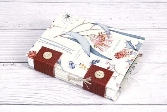
I have been wanting to try book making for a while but it has been yet another appealing idea that has had to wait. While I was waiting to try book making I signed up on Ali Manning‘s waiting list. Ali is a skilled book maker who runs the Handmade Book Club, a club where members learn, share and make. Before Ali opens the club for registration she hosts a 5 day challenge where you pay $10 and make a book by following her video instruction and daily zoom sessions.
Last time she offered the challenge I had too much happening. This time it fell on the same week I was launching my new class. I decided to sign up anyway even if I had to wait and make my book later. It has been a busy week and I soon fell behind with the book making steps. Yesterday after I hit publish on the last of the lessons in my new online class I had time to catch up. I’m writing this paragraph as I wait for glue to dry before I finish the last steps on my book.
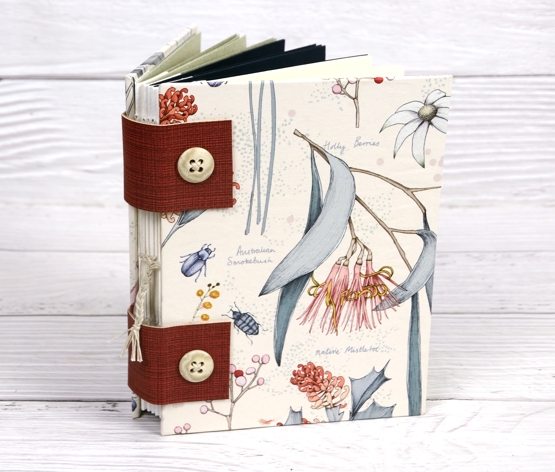
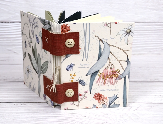
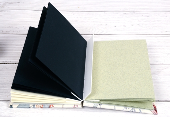
As you can imagine I have quite a lot of paper at my disposal. When making this book it wasn’t a question of do I have the right supplies, it was ‘which of these lovely supplies do I use?’ I was hoping to make the whole book without having to buy anything new. I did need beeswax but that is the only thing I couldn’t find around here.
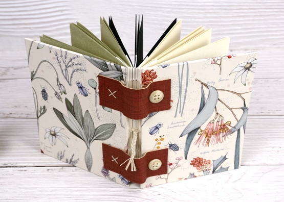
I don’t have book making supplies but I have tools, papers and random items that worked. One thing I have been saving for years is the sturdy cardboard backs of paper pads. I’ve culled the collection once or twice wondering why on earth I had so many. Now I know. Those thick card board pieces are covers for future hand made books.
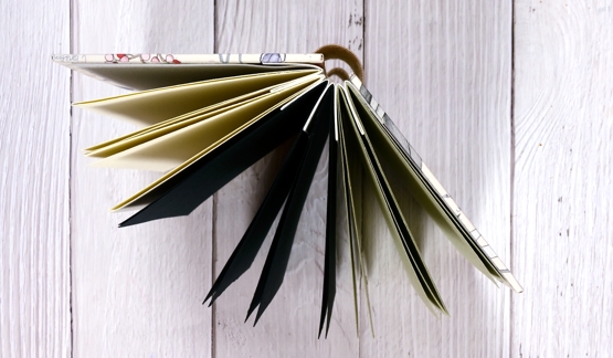
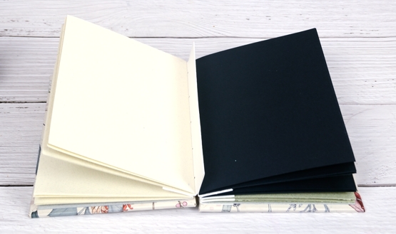
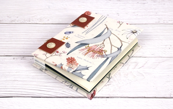
I covered the front and back of my book with beautiful paper from The Paper Place in Toronto. I bought the paper years ago with no plan in mind. It has Australian native plants illustrated and labelled. I used coloured watercolour paper made in Montreal for the neutral, green and blue pages. I bought a pad of it a few years back and have used it a few times for cards.
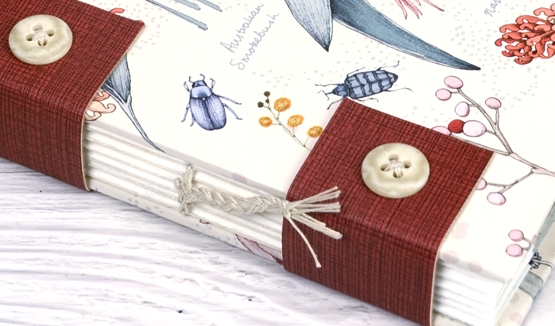
The vinyl straps are from my daughter’s stash; she makes bags, and the buttons are from my collection.
I won’t try and explain the steps involved in making it, that is Ali’s job and she did it brilliantly. The explanations and demos are excellent and she gave an extra hour a day to answer questions on zoom.
Another thing I enjoyed about this project is the scope for customization or personal touches. There are different ways to attach the hinges, to finish off the spine and of course size, colour and paper choices make everyone’s book unique.
Can you tell I enjoyed this project? It was just the change of focus I needed to keep my creative juices flowing.
Do you have a creative project wish list? Mine is long but exciting to contemplate. ( ‘I hear you calling me gel plate; I haven’t forgotton you!’) Let me know in the comments what you would like to try one day.
And remember you still have a chance to win a spot in my new online class. I will announce a winner on Monday. The lessons are all published and available now; I would love you to join me in creating Wreaths – Stamped & Painted
Festive Fragrance
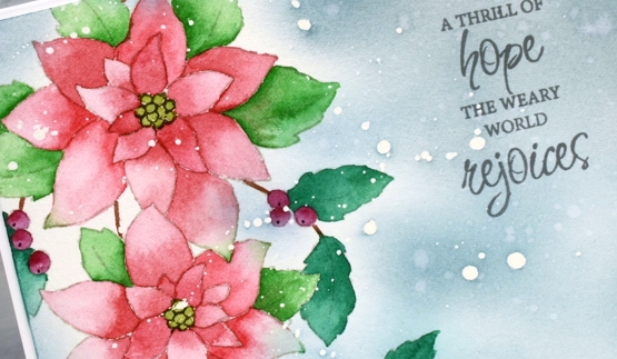
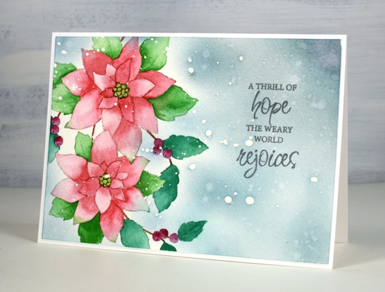
Posted: November 10, 2021 Filed under: festive fragrance | Tags: Fabriano Watercolour Paper, Penny Black stamps, Ranger Distress inks 8 Comments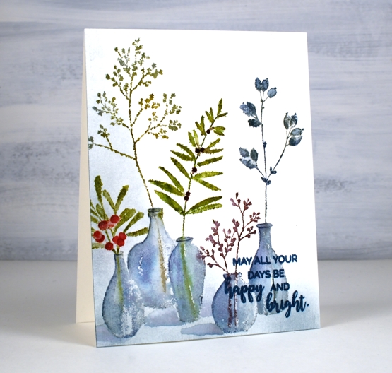
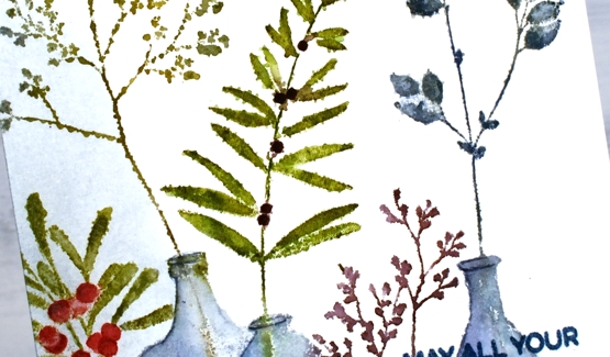
Isn’t this ‘festive fragrance‘ a pretty stamp? I know it is part of the PB Christmas release but it looks like an all-year-rounder to me. Just switching the colours around could make it quite springy or even autumnal. That’s the kind of stamp I like.
I chose to work with muted greens and blues plus a couple of berry colours. I inked with distress inks and markers plus a couple of Staedtler brush markers. I heard recently the sad news that distress markers are being discontinued so I am looking at my other markers to see which ones I might switch to when my distress markers can give no more. I think more than anything it is the colours of the distress markers that make me happy. Often when you buy a set of markers such as a 12 or 18 set many of the colours are bold rather than muted. There is a basic orange, red, yellow, light blue, dark blue, etc. You don’t find any stormy skies or picked raspberries!
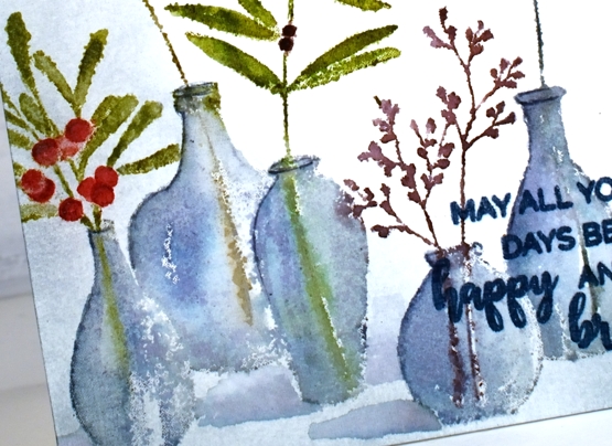
Anyway enough about that; I will keep you posted on my discoveries and choices. I used the mix of colours listed in the supplies below to ink all the foliage and used both faded jeans and weathered wood for the vases. The stamp was brand new when I inked it and I didn’t do any conditioning (such as wiping it or sanding it) so the ink beaded in a few places giving me a patchy look. I inked and stamped again for all but that tall bit of foliage. That one on the left I kept patchy as I liked the lacey look.
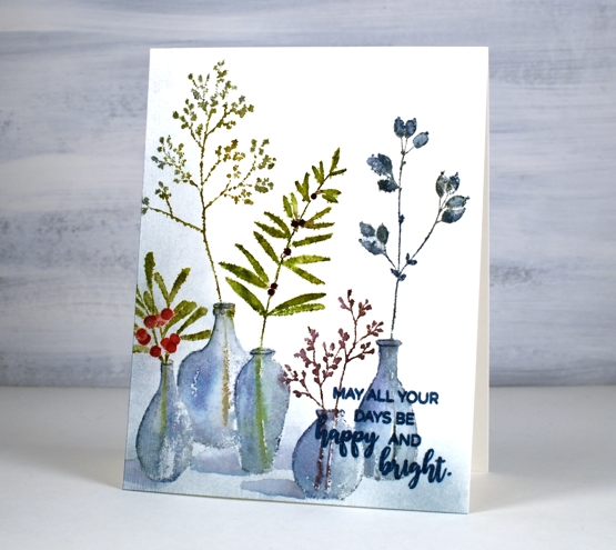
Once I had stamped and blended all the leaves and vases, I wanted to ground the collection somehow so I used a blending brush to add weathered wood ink to the base and side of the panel. I then painted shadows next to the vases with faded jeans ink. I finished the design off with a sentiment from the PB ‘happy & bright’ set knowing I would have to choose a bolder, darker ink so it would show up over the stamped vases. It is not as distinct as I would like but when the recipient looks at it up close it will be fine.
I hope you have had a chance to view the short video about my new class, ‘Wreaths – Stamped & Painted‘. Registration is open, a couple of lessons are already published and all the content will be accessible tomorrow. It is full of simple but pretty wreath designs, some very festive, others more rustic. I have included some technique lessons to show how I paint leaves and filler elements too so you can design with stamps plus your own unique touches. The giveaway is still open on my previous post where you have a chance to win a spot in the class. Make sure you pop back there and tell me how your Christmas card making is going. I see some of you have finished, some are barely started and some don’t go down that path. I think I am over half way with mine, largely because I created many wreath cards in preparation for the class!

One more bit of exciting news before I go. I am back on CRAFT ROULETTE this Friday as the guest crafter. Join me if you can on YouTube and drop a hello in the chat.
Supplies
(Compensated affiliate links used when possible)
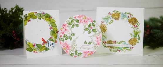
Wreaths – Stamped & Painted Online Class
Posted: November 8, 2021 Filed under: Classes, online class | Tags: Classes, Darkroom Door stamps, Ink to Paper, online class, Penny Black stamps 37 Comments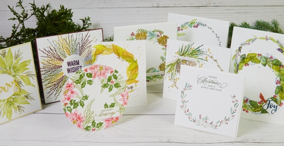
After hinting and promising for weeks I am thrilled to launch my new online class ‘Wreaths – Stamped & Painted‘. In this class I use a range of techniques, styles and materials to create original card sized wreath designs. The lessons are focused on stamping, painting and drawing elements for wreaths and combining them in many different ways. The class includes instruction for ten different projects but there are way more examples of wreath cards I made with the same techniques. There are quite a few Christmas or holiday style wreaths included in the class along with some autumn toned ones. The techniques will work for any season or occasion so you can customize to your heart’s content!
Once again the filming was done by my talented son, Ben, and we have included a wonderful mix of close ups and overhead footage. There are written notes, project photos, extra inspiration photos and downloadable instructions to support the video content. All the lessons are self paced so you can take your time to go through the class and re-watch as many times as you like. You can leave comments and ask questions as you go through the lessons and add photos of your projects along the way.
A GIVEAWAY
As in previous classes I am going to do some giveaways. I will give away a class registration to a blog reader, please leave a comment below to tell me if you have started making Christmas cards yet. I will also host a craft store gift card giveaway for those who sign up for the class.
Registration is open and all content is available. For more information or to register click here: WREATHS – STAMPED & PAINTED
To see my other online classes click here: ONLINE CLASSES with HEATHER TELFORD
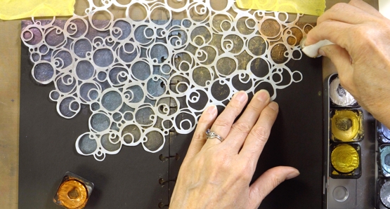
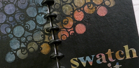
Grafix Mixed Media Journal Cover – video
Posted: November 5, 2021 Filed under: grafix, mixed media journal | Tags: grafix, Mixed Media 4 Comments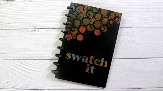
A couple of weeks back I shared my process for creating a mixed media swatch book. I used the new mixed media journal from Grafix and swatched alcohol inks as well as metallic and paint markers. You can see the blog post and video here.
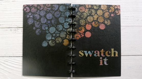
After creating several swatch pages I got to work on the cover. The mixed media journal comes with craft plastic and dura-lar film pages along with two chipboard covers. I used texture paste, a stencil and pearlescent paints to create a bold and shimmery cover. You can see my process in the video below.
I was pretty happy with the shimmery circles that appeared on top of the texture and will be putting this technique to work again on some journal pages I’m sure.
I also tried something I have rarely done and that is sealing my artwork with a fixative. I took the covers outside and sprayed them with a Blair fixative. It gave them a lovely satin finish but did not smell good. I decided to leave it outside in the fresh air for a while. I had put the swatch pages back in so the whole book was sitting outside in the sunshine. Within a short time it started raining and I didn’t notice straight away. When I rushed outside to save my swatch book I was happy to see the fixative had protected the cover and the plastic pages were also unharmed. Yay! And the chemical smell was gone.
Supplies
(Compensated affiliate links used when possible)
Merriest
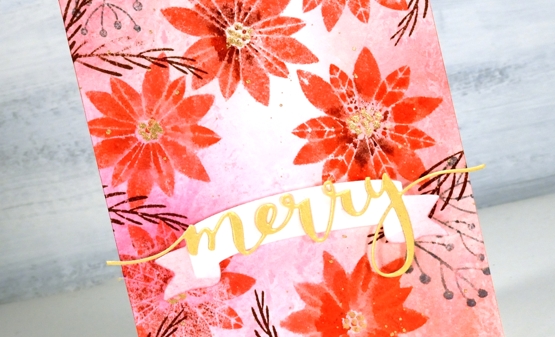
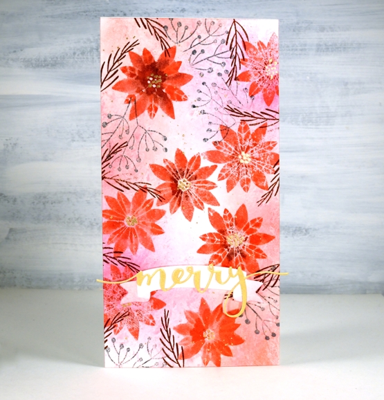
Posted: November 4, 2021 Filed under: Catherine Pooler inks, Karin brushmarkers, merriest, Penny Black, Tutorial, winter branches | Tags: Catherine Pooler inks, Fabriano Watercolour Paper, Karin brushmarkers, Penny Black stamps, Tsukineko Versafine inks 7 Comments
The new ‘Making Spirits Bright’ release from Penny Black is full of beautiful festive foliage. As you know I love working with florals and foliage especially on rubber cling stamps so these new stamps are definitely my thing!
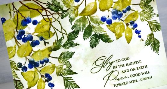
I used Catherine Pooler inks for this design and the colours worked beautifully. I sometimes forget my CP inks, then when I put them to use I remember now juicy and vibrant they are. Take a look at my process below; I have used some of my favourite techniques on this one. (by the way I think I call the release ‘keeping spirits bright’ and the branch stamp fragile beauty instead of ‘winter branches’. Oops)
I know I have been hinting and promising the new class release for the last week. So thanks for your patience; it’s coming, it’s really coming!
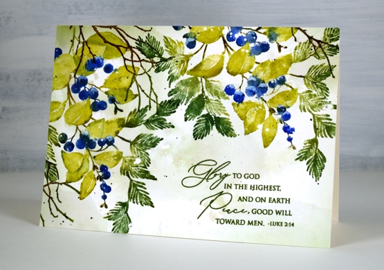
I know it’s subtle but one of my favourite things about this card is the muted background, just some pale greens and brown tones with tiny white dots from the masking fluid.
Thanks for dropping by today. I’ll see you again tomorrow.
Supplies
(Compensated affiliate links used when possible)
2021 BuJo – November theme
Posted: November 2, 2021 Filed under: all natural, beautified, Bullet Journal, Coloured pencil, Dingbat notebooks, Hand lettered, Penny Black | Tags: Bullet Journal, Dingbats notebook, Faber-Castell Polychromos Colour Pencil, Papertrey ink, Penny Black stamps 1 Comment
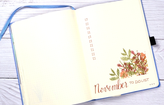
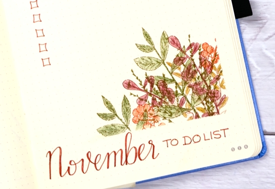
And just like that it’s November! I’ve been stamping and painting wreaths for the last few months while creating my new online course so it seemed natural to add one to my bullet journal.

I used stamps from the Penny Black ‘all natural’ and ‘beautified’ sets to create a wreath with dye inks and coloured pencils.
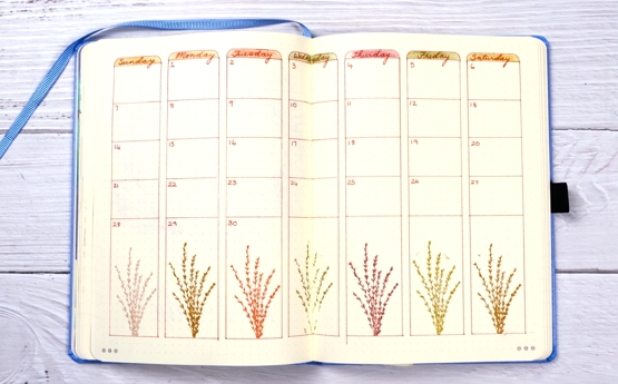
For the calendar page I stamped the same grass stamp in a different colour for each week day and added coordinating labels at the top of each column.
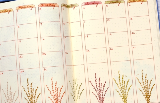
The same stamps from the wreath popped up again on the to do list page springing out of a masked corner and once again coloured with polychromos pencils.
No snow yet in Ottawa I’m happy to say. Still quite a few leaves to fall and collect. I have planted some bulbs and done a bit of garden clean up but I am hoping the weather stays nice long enough for me to finish the job!
Supplies
(Compensated affiliate links used when possible)
Floral Birthday
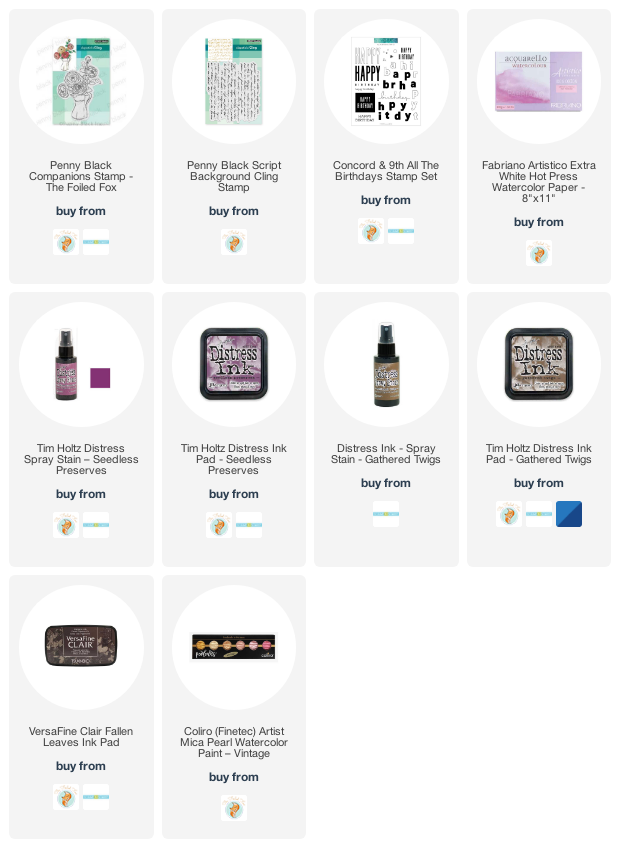
Posted: October 29, 2021 Filed under: all the birthdays, companions, Concord & 9th, Penny Black | Tags: Fabriano Watercolour Paper, Penny Black stamps, Ranger Distress stains 10 Comments
In my last post I shared a Christmas card featuring loose watercolour; the style of this card is even looser and was done with a few of the distress stain daubers I still have in my stash. Although I used techniques I’d devised years ago, this card was inspired by a card I saw on Pinterest recently. I followed the link and read through the whole post on the Tattered Nest Designs blog and combined some of her techniques with mine to create this very vintage floral birthday card.
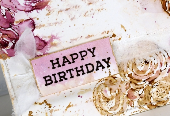
I worked on hot pressed watercolour paper with gathered twigs and seedless preserves distress stains. I still have those two colours in the daubers but you could use ink pads or spray stains on a glass mat or craft mat to get similar results. Check out the Tattered Nest post to read how she did it with spray stains. I inked the PB ‘companions’ stamp with both distress stains and stamped on the corners of my watercolour paper panel. I dried the stain with a heat tool then started blending loosely with water and a paintbrush. If the ink was too intense I would use more water or dab it with a paper towel, if too pale I would add more stain with the paintbrush.
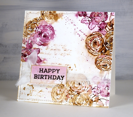
Once the flowers were loosely blended I inked the PB script background stamp with the same inks, spritzed it and stamped off on scrap paper. I spritzed it again with water before stamping a diluted print on the panel. You can see I also added splatter and created a sentiment on a small piece coloured with the same inks.
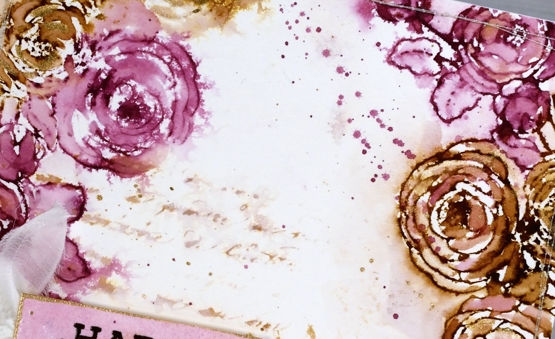
To finish the card I added splatter and some extra painting with rose gold pearlescent paint. You can see the gold border around the little tag in the close up above. Inspired by the Tattered Nest projects I sewed around the edge of the panel and then tore a strip of fabric to make a frayed ribbon sash.
Progress continues on my new online class; I’ve been gazing at the computer screen for days. I’m excited to share it with you very soon!
Supplies
(Compensated affiliate links used when possible)