
Layouts and sketches
Posted: May 6, 2016 Filed under: Alcohol Ink, CAS, Dies | Tags: CAS, Penny Black creative dies, Penny Black stamps, Ranger Alcohol Ink 7 Comments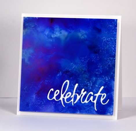
Recently I noticed how often my card designs involve a simple square or rectangle. Sometimes the panel is matted in black or a co-ordinating colour; other times it is popped up on the card base which creates a type of shadow mat. A matted panel with little embellishment is my most used layout. I’m not saying there is anything wrong with the matted panel approach; I often try to create a mini painting so framing it seems like an appropriate way to turn it into a card. However, there are many clever card makers who never default to the square or rectangular layout; each new card features angles, diagonal lines, curves, cutouts and all manner of creative designs. I’ve decided I need to mix things up a little in the sketch and layout area. Take the card above for example, the alcohol ink design reminded me of the ocean from beneath the surface with light above and bubbles all around. I really didn’t want to loose much of the blue pattern so I cut the sentiment out of the blue panel and popped it up. I like how it turned out but it was very much my usual style.
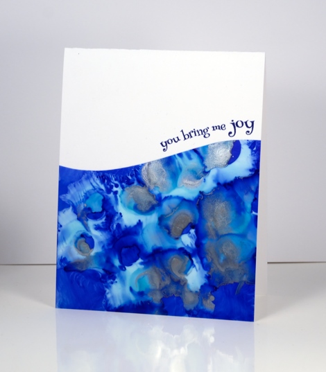
When I put this next card together I was working with a similar panel; the alcohol inks had done cool things creating a pattern I wanted to save if possible but not in yet another rectangular layout. By cutting a curve across the patterned yupo panel I was able to add some interest and bend a transparent sentiment stamp to hug the curve.

Once again I wanted to retain most of this warm toned alcohol ink design so I chose a cool new border die with curves that created a contrast with the angles of the stenciled pattern.
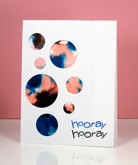
I have a board on pinterest where I am saving inspiration for new layouts. The card above was inspired by Paula Dobson’s bright happy card, pinned recently. Sketch challenges are another source of inspiration I hope to make use of more often. You may have noticed all the cards in this post were made from patterned panels, which of course, are easier to adapt to interesting layouts than pictures of real things! I may get adventurous and creative with my scenic or floral panels too, who knows?
Supplies:
Dies: Celebrations, Border Edges (PB)
Stamps: Happy Snippets, Sweet Wishes
Ink: Alcohol inks (Ranger) Versafine inks (Tsukineko)
Paper: Yupo paper, Neenah SolarWhite 110lb cardstock, Neenah Natural white cardstock
More vintage watercolour
Posted: May 5, 2016 Filed under: butterfly charmer, flourish & butterflies | Tags: Faber-Castell Albrecht Durer Watercolour pencils, Penny Black creative dies, Penny Black stamps, Ranger Distress inks 19 Comments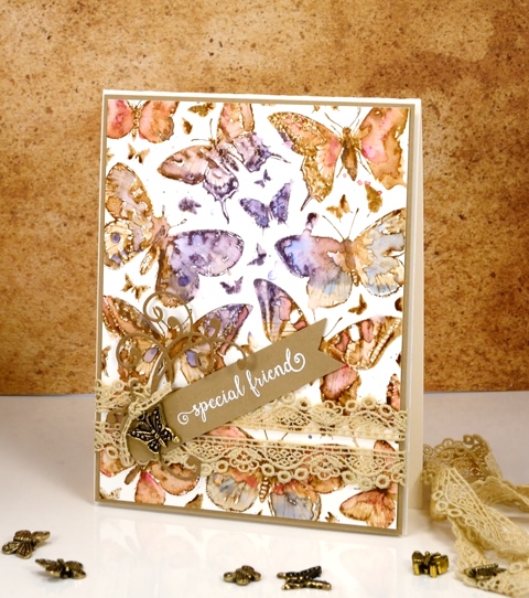
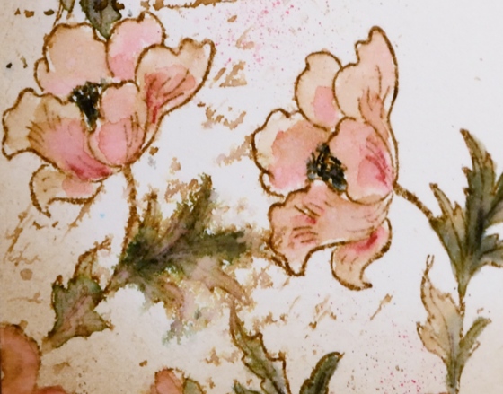
Thank you for your encouraging response to yesterday’s technique video. Please let me know if you give it a try. I have another card done in the same style today so if you missed the instructions yesterday, check out the tutorial here. The painting on this one was more straightforward as there was no masking. The butterflies are all on one large stamp, ‘Butterfly Charmer‘, and their botanical look makes them perfect for the vintage treatment.
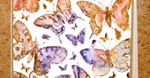
As with yesterday’s card I stamped in vintage photo distress ink; this provides the sepia tone which I want to carry through the whole image as well as the water solubility necessary to blend the ink with the added colour from the watercolour pencils. I chose a blue, a purple and a pink pencil and switched from one to another as I coloured each butterfly.
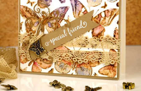
The assembly was more time consuming with this card partly because it had fiddly little lace and charm elements. The main reason putting this card together took a while though was because I didn’t know what I wanted. I glued down some lilac ribbon and added a bow to the butterfly charm only to decide I didn’t like it. Thankfully the ribbon pulled off without ruining the watercolour panel. I did want the lace and the charm so I paired them with an embossed sentiment on a tag plus a little flourish die cut . The whole shebang is matted with the same pale brown as the tag and popped up on a natural coloured card base. I know for some of you this constitutes a fairly simple layout but for me this is high on the fussy-fiddly scale!
Supplies:
Stamps: Butterfly charmer, Happy Snippets (PB)
Dies: flourish & butterflies, a pocketful
Inks: Vintage Photo distress ink (Ranger) Versamark (Tsukineko)
Cardstock: Hot pressed Fabriano watercolour paper, brown cardstock
Also: Albrecht Durer watercolor pencils (Faber-Castell), lace, butterfly charm
Vintage Watercolour tutorial
Posted: May 4, 2016 Filed under: Fly High, Playful, Tutorial | Tags: Faber-Castell Albrecht Durer Watercolour pencils, Penny Black stamps, Ranger Distress inks, Speedball elegant writer, Tutorial, video 31 Comments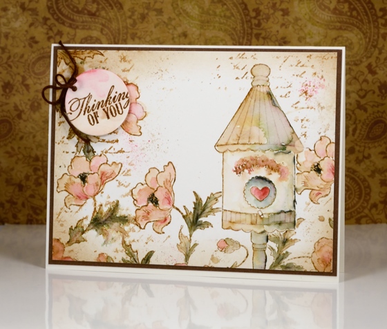
I have a tutorial for you today (gasp) which I made for SplitcoastStampers. In it I show my technique for creating a vintage style watercolour. By vintage style I am referring to muted sepia tones in this case with some blurred script and watermarks to give it an even more aged look.
I chose a birdhouse from the Fly High set and paired it with the Playful stamp using masks to stamp all my elements before I started watercolouring.
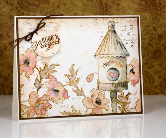
The two examples above are fairly similar; I changed the sentiment and naturally the watercolouring is not exactly the same. If you visit Splitcoaststampers you can see the stepped out photo tutorial or you can watch my video tutorial below.
This video came together quite smoothly (with the help of my son and my husband) so here’s to more!
Thank you for being so kind in your comments. You really are such an encouragement to me. I hope you try some vintage style stamping; all you need is some brown ink and a few watercolour pencils. The fun of the elegant writer pen is entirely optional.
Supplies:
Stamps: Playful, Fly High, Soar (PB)
Inks: Vintage Photo distress ink (Ranger)
Cardstock: Hot pressed Fabriano watercolour paper, brown cardstock
Also: elegant writer (Speedball) Albrecht Durer watercolor pencils 142, 180 (Faber-Castell)
You’re Sweet
Posted: May 3, 2016 Filed under: Alcohol Ink, CAS, Dies | Tags: CAS, Penny Black creative dies, Ranger Alcohol Ink 5 Comments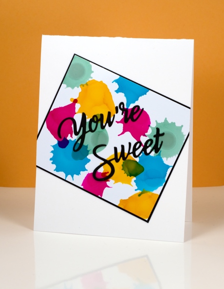
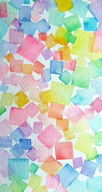
Earlier today I was admiring yet another fabulous card by Ardyth Percy-Robb, who is not only clever and creative, but also a faithful challenge participant. The card that caught my eye was for the May Pinterest Inspired Challenge featuring the image below:
Even though I love watercolour and the image above is full of lovely soft blends and bleeds I chose to use my recent arty crush, alcohol inks. I dropped sunshine yellow, pool, raspberry and juniper one colour at a time so I could squirt air at each drop before it dried. You can see how some inks create a new colour when they intersect but others cover or push the other colour. I matted in black and attached my panel to the card base askew before adding a die cut sentiment.
Supplies:
Die: You’re Sweet (PB)
Alcohol Ink: sunshine yellow, pool, raspberry, juniper (Ranger)
Paper: Kirkland photo paper, Neenah SolarWhite 110lb cardstock, Neenah epic black cardstock
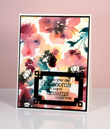
Poppy Pattern Party
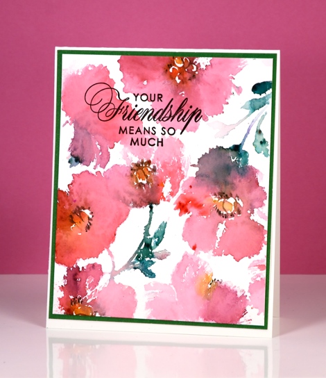
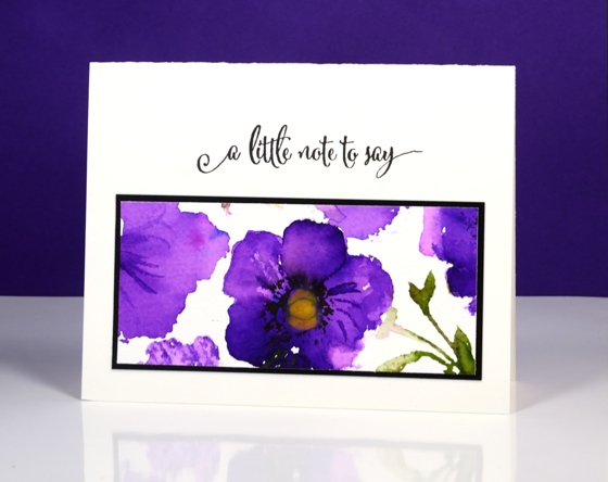
Posted: May 3, 2016 Filed under: Color Burst, Poppy Pattern | Tags: color burst, Penny Black creative dies, Penny Black stamps, Ranger Distress stains 15 Comments
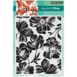
It’s the poppy pattern stamp’s turn to be featured today. I have a variety of colour schemes but only two mediums. The most subdued version is the one above done with forest moss, worn lipstick and scattered straw distress stains plus a black marker to add definition to the poppy centres once the stains had dried a little. I used a MISTI to add colours one at a time.
The remaining cards were all done with colour burst powders dropped onto water stamping. You lose a lot of definition with this technique but you achieve some gorgeous bold colours and in some cases some magical blending. Above I used phthalo green, lemon yellow and merlot (I think). Below it was probably alizarin crimson.
The bright purple panel below was the one section I saved from the large stamped image. I stamped it with water but when I went to sprinkle violet colorburst powder I got a little more than I bargained for. I let it dry, then chose one section to touch up, trim and turn into a card.
Supplies:
Stamps: Poppy Pattern, Special Wishes, Friendship, Sentiment Collection (PB)
Dies: Deco Frame (PB)
Mediums: Versafine onyx black (Tsukineko) distress stains (Ranger) Colorburst powders (Ken Oliver)
Cardstock: Fabriano 100% cotton hot & cold pressed watercolour paper, Neenah Epic Black cardstock
Shaded Canopy
Posted: May 2, 2016 Filed under: Shade Canopy, Stamped Landscapes | Tags: Fabriano Watercolour Paper, Penny Black stamps, Ranger Distress stains 3 Comments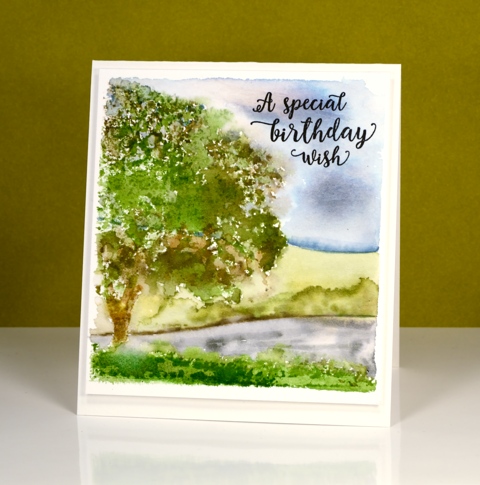
‘Shaded Canopy’ is another lovely (and versatile) stamp from the new ‘A Little Bit of Sunshine’ release. My scene today could be spring or summer depending on where you live. When I first moved to Canada I could not believe how bright green the summers were. Where I lived in Australia I was used to pale muted colours in summer because everything became very dry.
I used distress stains and inks for stamping and for painting the background leaving a space around the scene to frame it then popping up the panel on the same colour card base.
I am teaching a class this month in Ottawa where we will use this stamp to create four cards, one for each season.
Supplies:
Stamps: Shade Canopy, Words of Kindess(PB)
Inks: Forest Moss, Peeled Paint, Weathered Wood, Tumbled Glass, Mowed Lawn, Vintage Photo distress stains (Ranger)Versafine Onyx black (Tsukineko)
Cardstock: Fabriano 100% cotton hot pressed watercolour paper
One Layer Simplicity: Fruit Smoothie
Posted: May 1, 2016 Filed under: Elegance in Motion | Tags: Penny Black stamps, Ranger Distress inks 16 Comments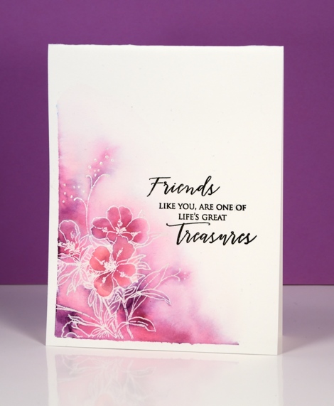
It is my turn to host the One Layer Simplicity challenge this month and I want you to make a fruit smoothie. Fruit smoothie inspired card that is, you can make an actual smoothie too, that is entirely up to you. There are two ways to go about this challenge, you can pull out your fruit stamps or your inks with fruity names. You know which inks they are: the Memento pear tart, the cantaloupe and the tangelo, the Distress picked raspberry and seedless preserves, the SU blackberry bliss and cherry cobbler or any one of the many inks named after fruit!
I chose inks with fruity names for my emboss resist card above. I taped two edges of watercolour paper with painter’s tape then stamped and embossed the new ‘elegance in motion’ stamp with clear powder. I then coloured with picked raspberry and seedless preserves distress markers and blended the ink with water. Once it was dry I removed the tape and ironed it. (one layer watercolour cards sometimes need to be ironed)
I have a sad and sorry fruit smoothie tale to share. I enjoy smoothies but rarely make them because my children do and often offer me some. One day I had all the right ingredients so I filled the jug and started blending with the stick blender. For some reason I turned away to do something else; the jug with stick blender in it did not tip over immediately, it stayed steady just to taunt me I guess, then it fell off the counter onto the floor. The berry coloured smoothie went far and wide. It was further up the walls than my height, it was on the kitchen windows and curtains, a cupboard door was open so it was all over the inside and contents of the cupboard and on the underneath of the drawer above that open cupboard. How on earth? I spent 1½ hours cleaning it up!
Don’t let my carelessness put you off entering our challenge; I’m sure you won’t make half the mess I did!
Supplies:
Stamps: Elegance in Motion, Treasured Sentiments (PB)
Inks: Picked raspberry, Seedless preserves (Ranger) Versamark (Tsukineko)
Cardstock: Hot pressed Fabriano watercolour paper
Also: clear embossing powder
Land and sea
Posted: April 30, 2016 Filed under: Alcohol Ink, Twirls | Tags: Penny Black stamps, Ranger Alcohol Ink, Yupo Paper 11 Comments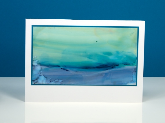
One of the techniques we been trying in my current alcohol inks class is the ‘landscape’ technique. I don’t think I could give you clear instruction on how I did these two scenes because it is still a lot of trial and error for me. The scene above involved some swiping the inks once they were on the yupo paper to get the horizontal sweeps of colour.
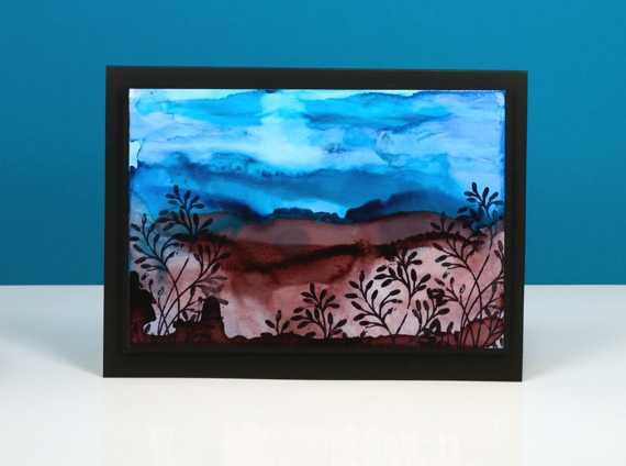
This one above features more lines of ink. When you lay down some ink then add some more beside it the second lot of ink pushes away first often creating a dark thick edge. These can end up looking like hills. Adding blending fluid into the ink you already have on your yupo washes it out somewhat creating paler areas. I am addicted to creating with alcohol inks right now so I will analyse my techniques a little more so my instructions might be clearer (and yes, I will try and make a video).
Believe it or not there is a video coming next week. I also noted the requests for videos on the roses and terraced lane cards. I’ll keep those in mind because I do appreciate my readers and their endless patience in waiting for video tutorials!
Supplies:
Stamps: Twirls (PB)
Alcohol Ink: stream, pool, stonewashed, currant, alcohol blending solution (Ranger) Jet Black archival ink
Paper: yupo paper, Neenah SolarWhite 110lb cardstock, Neenah Epic black 100lb cardstock
Terraced Lane
Posted: April 28, 2016 Filed under: Stamped Landscapes, Terraced Lane, Watercolour | Tags: Penny Black stamps, Ranger Distress stains, Speedball elegant writer, Tombow dual brush pens 13 Comments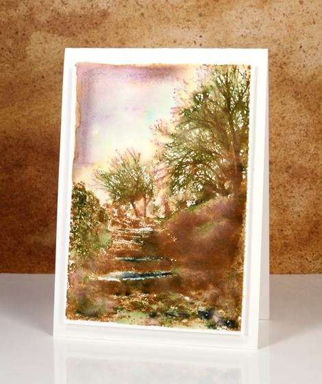
If you enjoy scenery stamps like I do there are a couple of beautiful designs in the new ‘A Little Bit of Sunshine’ release. This one, ‘Terraced Lane’ is a detailed stamp depicting both trees and steps. I will be trying this one in a range of colour schemes.
These two cards display two ways to approach such a detailed stamp. On the panel above I stamped first in vintage photo distress ink then added colour with a mowed lawn distress marker, the black elegant writer pen and a tiny bit of blue marker in the sky. I blended the green and black with water and a paintbrush to fill the scene with some colour then framed the top left corner free hand with vintage photo ink and some diluted black ink.
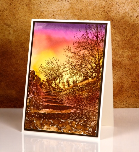
To create this sunset version I worked in the opposite order creating the background sunset with tombow dual brush pens first then once it was totally dry, I stamped the image in brown over the top. I finished the scene off by blending a few areas around the steps but left most of the stamping sharp.
Supplies:
Stamps: Terraced Lane (PB)
Inks: Mowed Lawn, Vintage Photo distress stains (Ranger) Elegant writer pen (Speedball) dark plum 679, rhodamine red 725, pink rose 703, light ochre 991 dual brush pens(Tombow)
Cardstock: Fabriano 100% cotton hot pressed watercolour paper, brown cardstock, Neenah natural white cardstock
Out to Sea
Posted: April 27, 2016 Filed under: Alcohol Ink, CAS, Out to sea | Tags: CAS, Penny Black creative dies, Ranger Alcohol Ink 15 Comments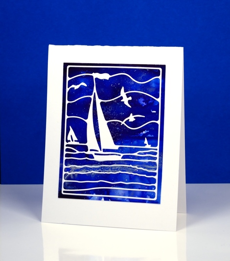
Is this not a stunning new die? I thought it was perfect to lay over my bright blue alcohol ink panel. Blue panels are the most challenging for me to photograph accurately. In real life there is more purple and the light blues are lighter. The speckled bits that conveniently look a bit like ocean spray or foam are silver accents. I created the panel by dropping some blue alcohol inks on yupo paper and blending. I added some silver alcohol ink and moved it around with extra blue ink and blending solution; the metallic inks don’t move much until another ink is added to them.
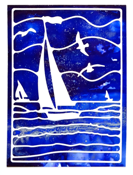
This die is also going to be beautiful over a watercoloured panel. If I am feeling patient and steady I might do the inlaid die technique but it really doesn’t need it; the overlay approach works just fine.
Supplies:
Die: Out to Sea(PB)
Alcohol Ink: denim, indigo, silver, alcohol blending solution (Ranger)
Paper: yupo paper, Neenah SolarWhite 110lb cardstock


