
Out to Sea
Posted: April 27, 2016 Filed under: Alcohol Ink, CAS, Out to sea | Tags: CAS, Penny Black creative dies, Ranger Alcohol Ink 15 Comments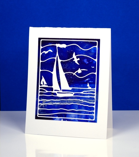
Is this not a stunning new die? I thought it was perfect to lay over my bright blue alcohol ink panel. Blue panels are the most challenging for me to photograph accurately. In real life there is more purple and the light blues are lighter. The speckled bits that conveniently look a bit like ocean spray or foam are silver accents. I created the panel by dropping some blue alcohol inks on yupo paper and blending. I added some silver alcohol ink and moved it around with extra blue ink and blending solution; the metallic inks don’t move much until another ink is added to them.
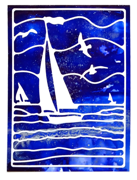
This die is also going to be beautiful over a watercoloured panel. If I am feeling patient and steady I might do the inlaid die technique but it really doesn’t need it; the overlay approach works just fine.
Supplies:
Die: Out to Sea(PB)
Alcohol Ink: denim, indigo, silver, alcohol blending solution (Ranger)
Paper: yupo paper, Neenah SolarWhite 110lb cardstock


I saw that new die from Penny Black. You made a beautiful card with it!!!
Oh, that blue is gorgeous with that white die cut! I’m really smiling because I bought that die and it just arrived in the mail an hour ago!
Hi, I’ve ordered this die. Cut 2 out last Friday but they didn’t punch all the way out and I didn’t notice it until today when I was assembling the cards. Guess I will have to wait now until mine arrive! When I was assembling my cards today I came across some gold paper and I thought that if alcohol inks work on silver why not gold so will try that tomorrow at CAW. Bev
Sent from my iPad
>
This card is beautiful Heather. Ohhhhhh…another die to buy!!
Wow, this is so pretty! Love your background and that is a nice die!
Gorgeous! Reminds me of the Bruce Cockburn song, All the Diamonds…
it is indeed a stunning die…and you definitely did it justice Heather!!!! Thanks for sharing!!!
Paper Hugs,
Jan
Stellar!
That die would be rather perfect for all the sailors in my husb’s family! Beautiful use of it here with the alcohol inks.
Gorgeous card!
This die is so striking on that beautiful background!
Having worked with both watercolour and alcohol inks, which would you say provides the most vibrant results? Do the alcohol inks blend well, or do they dry to quickly? Thank you.. all your cards are absolutely stunning (I don’t say that often – I’m picky.. lol). 😀
Sylvie-Marie
Hi Sylvie,
The colours of the alcohol inks are probably the most vibrant over all but you can create some strong bold colour with watercolour if you don’t dilute it too much. The alcohol inks do not blend as well as watercolours and the way they react with each other varies from colour to colour. Both are a lot of fun though!
This is a fabulous scenic die and I love the combination of your vibrant blues with the white of the die cut Heather. x
WONDERFUL card! Love your blue bkgrd and the die, cut simply in white. So solemn, peaceful, serene. 🙂