
Sun and sea
Posted: May 24, 2016 Filed under: Brusho, Out to sea, Serenity | Tags: Brusho, Fabriano Watercolour Paper, Penny Black creative dies, Penny Black stamps 4 Comments
Over on the Penny Black blog this week ‘Father’s Day’ cards are the feature. My card could definitely be used for Father’s Day (if I remember to post it!) but it could be just as easily used for any friend or family member. The colour scheme and the lack of floral images does make it a good choice for a masculine card.
Four different painted panels were cut up then layered to create my sunny seascape. The background blue panel is one piece of cold pressed watercolour paper; I taped masking tape across the horizon about 2/3 of the way up then painted some masking fluid in lines to suggest waves and light on the sea. Once the masking fluid was dry I painted the sea with cobalt blue and turquoise brusho. Once that dried I repositioned the tape to mask the edge of the sea so I could paint the sky with turquoise brusho.
All the remaining pieces were painted on hot pressed watercolour paper. For the tree and grass I used three greens (listed below) and dark brown brusho. I used a large piece of watercolour paper adding brown just in the area where I would die cut the tree. After die cutting the tree I used a craft knife to cut a hill from the rest of the green area. To keep the tree sitting flat on the background I used the bottom of the tree die to cut into the green hill then inserted the tree in the space when assembling the scene.
I used the ‘Out to Sea’ die to cut a yacht from a yellow brusho panel then painted red over the hull of the boat. The only other piece to cut was the sun which came out of a piece I painted with yellow and a sprinkle of red.
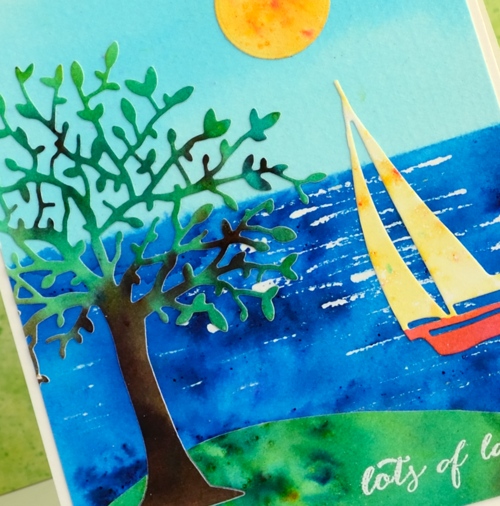
To make assembly a bit easier I applied ‘stick it’ adhesive to the tree panel before cutting it out. I embossed the little sentiment in white before putting it all together. My husband just walked past and was surprised that this was one of my cards; it is a bit of a departure from my usual.
Supplies
Stamps: Happy Snippets
Dies: Out to sea, Serenity
Paints: leaf green, sea green, emerald green, cobalt blue, turquoise, yellow, ost. red, dark brown brusho
Ink: Versamark ink
Paper: hot & cold pressed Fabriano watercolour paper
Also: white embossing powder, masking fluid
Out to Sea
Posted: April 27, 2016 Filed under: Alcohol Ink, CAS, Out to sea | Tags: CAS, Penny Black creative dies, Ranger Alcohol Ink 15 Comments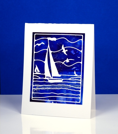
Is this not a stunning new die? I thought it was perfect to lay over my bright blue alcohol ink panel. Blue panels are the most challenging for me to photograph accurately. In real life there is more purple and the light blues are lighter. The speckled bits that conveniently look a bit like ocean spray or foam are silver accents. I created the panel by dropping some blue alcohol inks on yupo paper and blending. I added some silver alcohol ink and moved it around with extra blue ink and blending solution; the metallic inks don’t move much until another ink is added to them.
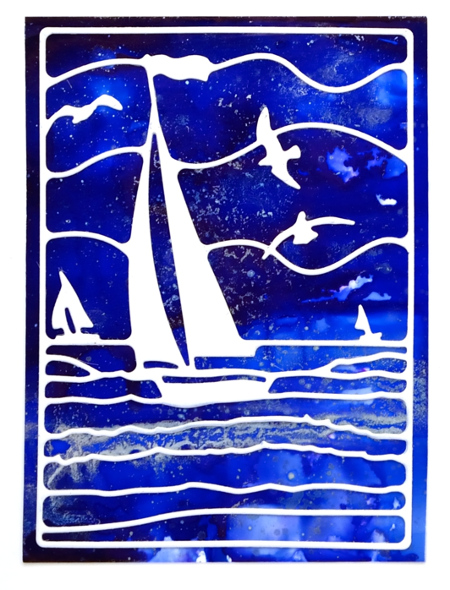
This die is also going to be beautiful over a watercoloured panel. If I am feeling patient and steady I might do the inlaid die technique but it really doesn’t need it; the overlay approach works just fine.
Supplies:
Die: Out to Sea(PB)
Alcohol Ink: denim, indigo, silver, alcohol blending solution (Ranger)
Paper: yupo paper, Neenah SolarWhite 110lb cardstock


