
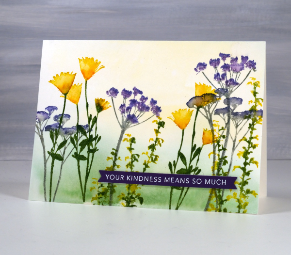
Birds & Feathers
Posted: June 5, 2024 Filed under: Collage cards, Darkroom Door, Feathers, gel press, on a wire, Penny Black | Tags: Darkroom Door stamps, gel printing, Penny Black creative dies 2 Comments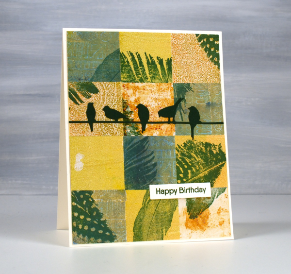
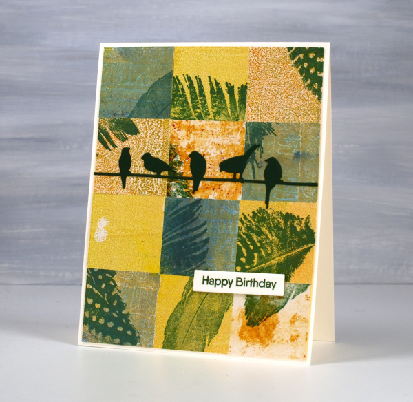
Same concept, different colour palette. I’ve been sharing my collaged gel print cards over recent weeks featuring a lot of blue prints. You know I love blue but it isn’t the only colour I print with. Although I have gel-printed with feathers, the ones featured here were all stamped. You can add interest to your prints with stamping or stenciling or other techniques; you don’t have to leave them just the way they pulled off the plate.
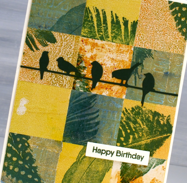
For this bird themed card I chose yellow, orange and greenish prints then stamped feathers on them before cutting them into squares. To make the squares I sometimes use a square punch, but often tear the panels with a metal edge ruler so I get some white of the paper on the edge. The feather stamps are from Darkroom Door ‘Feathers’ set. The birds die is called ‘on a wire’ and it’s from Penny Black.
Speckled Leaf Trails
Posted: May 30, 2024 Filed under: Alcohol Ink, gel press, Lavinia, leaf trails stencil, Taylored Expressions | Tags: Alcohol Ink, gel press, gel printing, Lavinia, Taylored Expressions 2 Comments
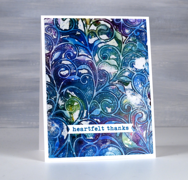
If this design looks familiar it’s because I posted a couple of similar cards a few weeks back. They featured the same pretty Lavinia stencil, ‘leaf trails’.
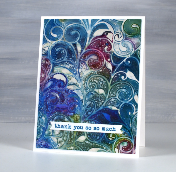
The difference between the cards is partly the colours but more significantly today’s cards feature splatter! You know how I feel about splatter. I always say if a project doesn’t seem quite finished, add some splatter.
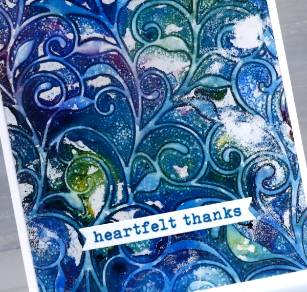
The panels on these cards were made with alcohol inks on a gel plate. I dropped three or four alcohol inks on the plate along with some isopropyl alcohol to help the inks move and blend. I dropped the leaf trails stencil on top and let the inks dry. Once the ink on the plate was dry I splatted some isopropyl alcohol over the design, waited a minute and lifted the stencil. I used white acrylic paint to pull the print on heavy cardboard then added Taylored Expressions sentiments to complete the cards. This post includes an affiliate link from Foiled Fox. If you buy through these links I receive a small commission at no extra cost to you. And remember, if in doubt, add some splatter!
Zig Zag Print cards
Posted: May 28, 2024 Filed under: gel press, Heather lowercase die set, Penny Black, Pink Fresh studio, Stencils, Tim Holtz, wild flowers #1, Zigs & zags 3 Comments
Recently I posted several ’tiled’ collage cards on the blog and mentioned there would be more to come. Today’s cards once again feature gel printed panels arranged and decorated in two ways.

I used three different gel prints to ’tile’ the card above, a plain blue print, a print created with a zig-zag stencil and a print made with the an impression from an embossing folder. To tie together the dark blue, light blue and yellow + blue prints I added a navy wildflower (Tim Holtz) and navy ink splatter.

To create the square birthday card below I used ’tiles’ from the same print but rearranged them on the card front so they didn’t fit together like a jigsaw.

The brassy-gold paint used on the gel print prompted me to die-cut letters, stars and the word birthday from a similar colour cardstock to create a sentiment. This post includes affiliate links from Foiled Fox. If you buy through these links I receive a small commission at no extra cost to you.

Florals on Black
Posted: May 21, 2024 Filed under: Concord & 9th, fine line florals, meadow blossoms, online class, Penny Black, radiant | Tags: Concord & 9th, Finetec artist mica watercolour paint, online class, Penny Black stamps 6 Comments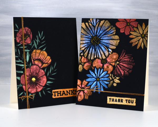
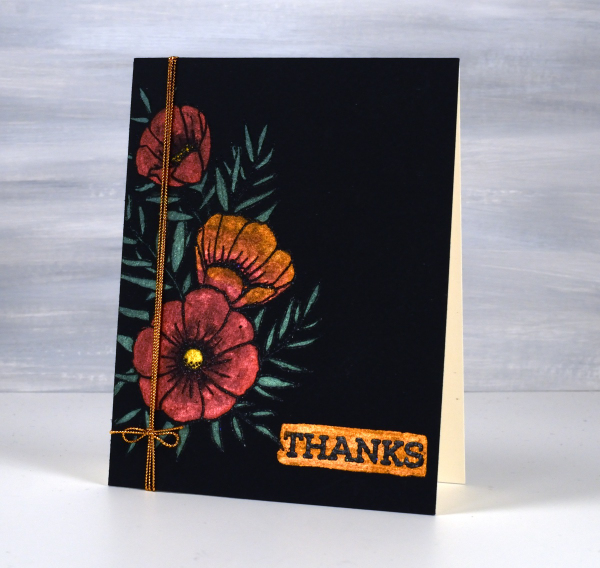
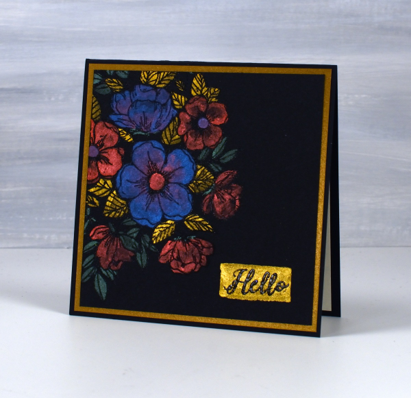
I haven’t used this eye catching technique in a while but I really should try it more often. These two cards were made as part of my Floral Faves online class, a lesson about using metallic watercolours on black watercolour paper. Maybe black watercolour paper has been around for a long time but when I first found it several years ago I was very keen to try it.
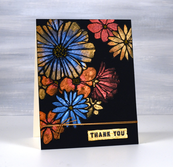
As you can imagine the paints need to be somewhat opaque to show up on black. I use Coliro and Finetec metallic watercolours (two names but all made by Finetec). I have also been given some Beam metallic watercolours which I will try out soon. I used Stonehenge Black watercolour paper for these cards and it worked well. It is very soft so I am careful if using tape on the edges as it lifts the surface off. I just work on a piece slightly larger than I need so I can trim it down to size after painting. I recently bought some of the Van Gogh brand so I will report back once I have tried it.
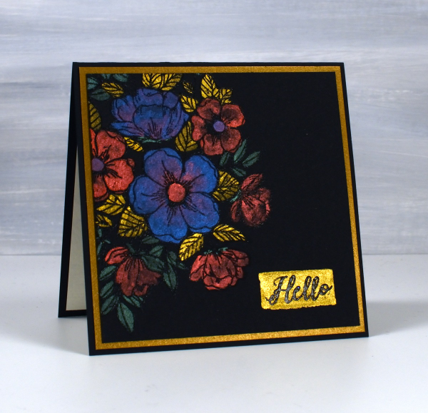
All these designs were made with embossed outlines making it easier to stay inside the lines. One feature of these cards that I quite like and need to remember to incorporate is the little painted strip where I embossed a sentiment over the top. It’s a trick that doesn’t have to be used only on a black background; I could paint a strip on any colour then emboss on top of it. For the cards featured today I used Penny Black ‘radiant’ set and Concord & 9th ‘fine line florals’ and ‘meadow blossoms’
If you have metallic watercolours let me know in the comments your favourite ways to use them.
Pink & Blue Squares
Posted: May 18, 2024 Filed under: Collage cards, Dies, gel press, gift card pocket, Penny Black, Tim Holtz, wild flowers #1 | Tags: collage, gel printing, Penny Black creative dies, Tim Holtz 3 Comments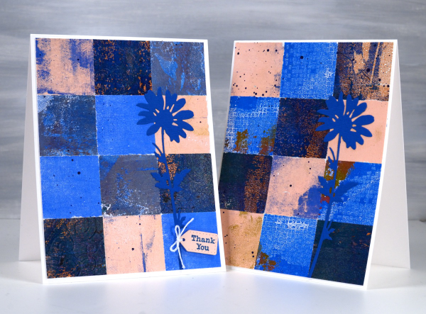
As mentioned in previous posts my stash of gel prints is considerable. I am always on the look out for ways to use them. Large prints are great for covers on handmade books; I use many smaller prints for card fronts and collage.
These two collage cards are made from four or five different gel prints. I punched the squares with a 1 3/8″ punch then fiddled around with the layout until I was happy with it. Because I love things to match all the prints had some blue in them and there is some repetition of pink as well.
The prints were part of my stash and were not made specifically for these cards so some have patterns and others were probably second or third pulls to clean off a plate. Once I had them arranged to my satisfaction I die-cut Tim Holtz wildflowers and added a tiny Penny Black tag. You’ll see more of this style in the next few weeks as I made them in several different colour combinations. Those of you who know me might have noticed the dark blue splatter on the both cards; I always think a bit of splatter ties thing s together.
Wildflower Spring
Posted: May 8, 2024 Filed under: Darkroom Door, Nature Walk, online class, Taylored Expressions, Wildflowers Vol 1, Wildflowers Vol 2 | Tags: Darkroom Door stamps, online class 6 Comments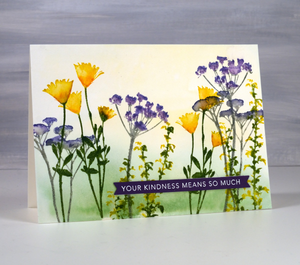
These spring flowers are all silhouette stamps from Darkroom Door, some from the Nature Walk set and a few from Wildflowers vol 1 & 2. Even though the stamps are solid with no detail it is possible to use ink pads and markers to give them more depth.

This card is a sample from my Floral Faves online class. In the class I feature no-line watercolour with outline stamps, techniques with brushstroke stamps and ways to use silhouette stamps as featured on this card. I often use my silhouette stamps with a black or dark ink over a sunset sky but I do like to give them colour sometimes with a pale watercolour wash in the background.
I hope you are seeing spring colour in your garden or perhaps fall colour if you are in the southern hemisphere.
Blue & Green Leaf Trails
Posted: May 7, 2024 Filed under: Alcohol Ink, gel press, Lavinia, leaf trails stencil, Taylored Expressions | Tags: Alcohol Ink, gel press, gel printing, Lavinia, Taylored Expressions 5 Comments
There are many ways to use stencils on the gel plate, one being with alcohol inks rather than acrylic paint. When I use alcohol inks I do pull the print with acrylic paint but most of the colour you see is from the initial layer of alcohol inks.
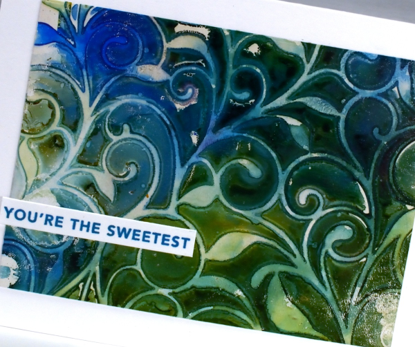
You can lay the stencil down then add alcohol inks or do it the other way round, dropping the stencil onto the wet alcohol ink. Some gel-printers add a layer of hand sanitiser first but that isn’t what I did to make these prints. I’m not 100% sure but I believe I lay the stencil down on top of a layer of alcohol ink for these prints. I use some isopropyl alcohol to help the inks move further and facilitate some blends between colours. I also use an air blower to push the ink around and speed up the drying process.
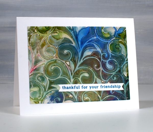
The pretty twirly patterns are from the Lavinia ‘leaf trails’ stencil. Lavinia has lovely organic stencils which often feature in my gel prints. I can’t remember the exact alcohol inks I used but the technique works with all sorts of colour combos so pick your faves. No surprise to see blue in my mix. I have mentioned before that I often gel print on printer paper but these panels I pulled with thick cardstock so when it came to making cards I just cut some rectangles from the print and added them to white card bases along with sentiments from Taylored Expressions.

Ocean Collage in Art Journal
Posted: May 2, 2024 Filed under: Art Journal, gel press, Handmade book | Tags: Art Journal, collage, gel printing 3 Comments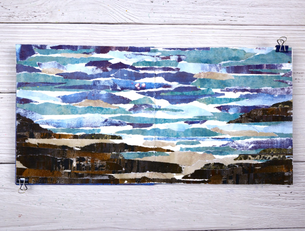
I guess the title gives it away but I hope you can see the ocean, the rocks and the shore in this art journal spread. As with many recent blog posts I used gel prints to create this scene in my 7”x7“ journal.

I created this double page scene after seeing a torn paper landscape a friend had created. I tore strips of paper from several blue prints and brown prints. As I laid them out I realized that the order in which I glued them would affect the end result. I had intentionally ripped the paper to have white edges that looked like the surf.
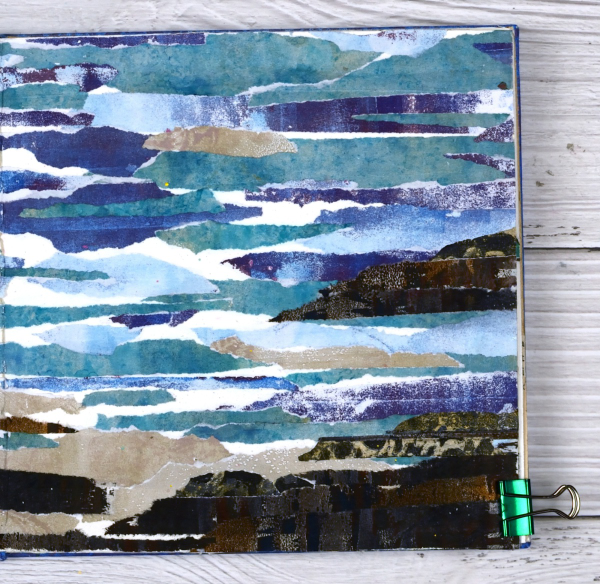
Rather than try and plan the whole design I just started gluing and some how it worked. It is a technique I will try again to see if I can settle on some general instructions.
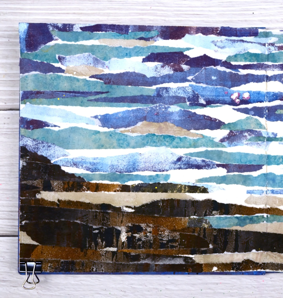
You can see there are some patches of white here and there where I didn’t cover the journal page at all. I felt those patches acted as white caps and surf or sand.

As I sit and write this I can see the ocean out the window and a couple of hours ago I was walking on a beach which looks a bit like these pages. Although the inspiration for this page came out of my memory it seemed like a good day to share an ocean view.
Leaves and Flowers-Cut & Printed
Posted: April 29, 2024 Filed under: gel press, Tim Holtz, vault wildflowers | Tags: gel press, gel printing, Tim Holtz 9 Comments
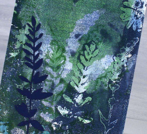
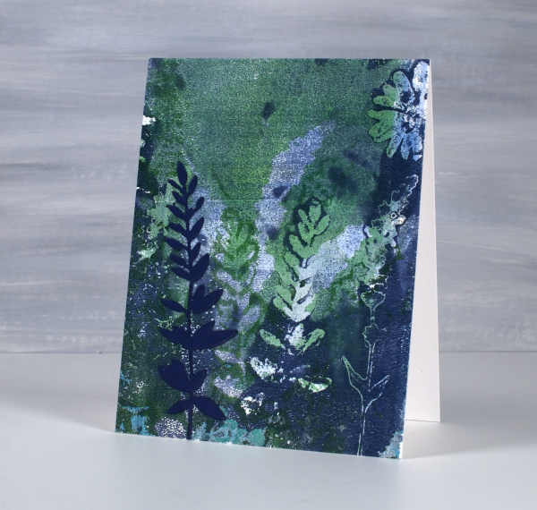
When fresh flowers for gel printing are not readily available, there are always the die-cut ones. In making today’s cards I gel printed patterns using die-cut flowers and leaves and a mix of blue, green and white paints.

Both the flowers on the card above and the stem of leaves on the card below are from Tim Holtz ‘vault wildflowers’ die set. The prints are grungy because I built up some layers of outlines on the plate before adding an image transfer text layer to the final print.
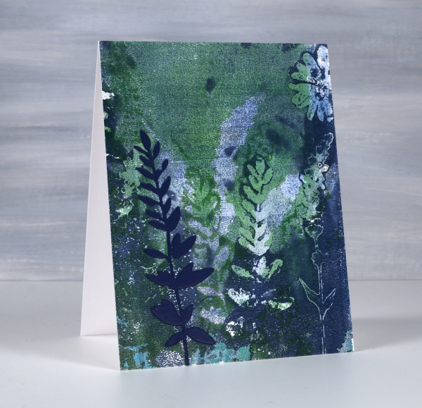
To finish the cards I added a cardstock flower or stem of leaves to match the partial prints in the background.
I did both prints on paper not cardstock then attached them to card bases with double sided adhesive. When I am spending a day or half day gel printing I will often do many prints on paper and a handful on cardstock or thicker paper. I never know which ones are going to be the favourites but I do know the session will be full of ‘just a couple more prints’ moments.

You can see when comparing these two cards the impact of adding some white paint to the mix. I used the same blue and green acrylic paints for both panels but the one above was toned down with white brayered onto the gel plate with the green and blue. So while you to print fresh flowers, die-cut yourself some from paper or duralar and see what you can come up with.
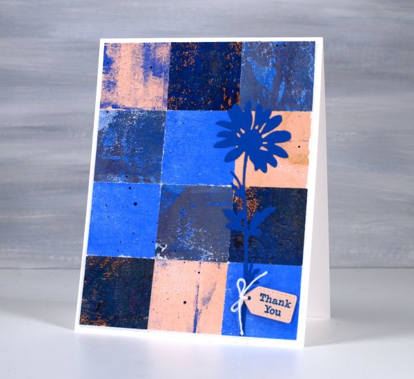
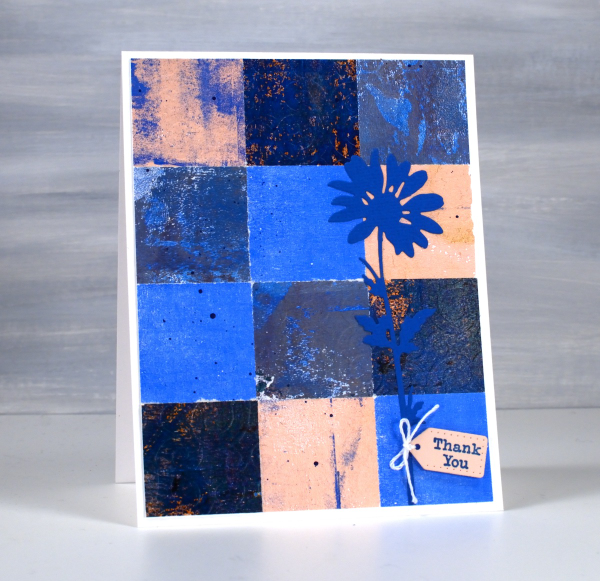
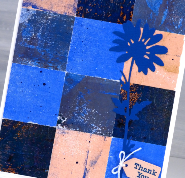
Tiles
Posted: April 26, 2024 Filed under: Collage cards, gel press, Tim Holtz, vault wildflowers | Tags: gel press, gel printing, Penny Black stamps, Tim Holtz 5 Comments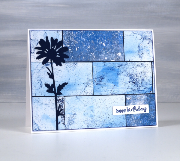
Do you have more gel prints than you know what to do with? Are some of them not very interesting or only partial prints? I definitely answer yes to both those questions. I keep finding though, that the grungy prints make really nice backgrounds for journal pages and cards.

I have many of my gel prints sorted by colour so I pulled several 6 x 6 prints from the blue folder and used them on a few different cards. I also had green, yellow and gold toned prints on hand to make some multicoloured cards; I’ll share them another day. To create this card I cut the blue gel prints with a rectangle die then arranged them like tiles over a navy background before trimming end to fit.
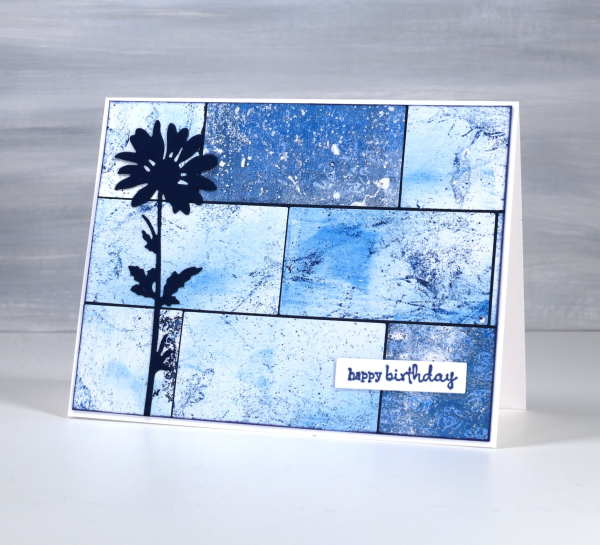
I added a die-cut flower from the Tim Holtz vault wildflowers set and a little Penny Black sentiment. If you like blue then maybe this multi-print collage will please you as much as it did me! This post includes affiliate links from Foiled Fox. If you buy through these links I receive a small commission at no extra cost to you.


