Floral Birthday
Posted: October 29, 2021 Filed under: all the birthdays, companions, Concord & 9th, Penny Black | Tags: Fabriano Watercolour Paper, Penny Black stamps, Ranger Distress stains 10 Comments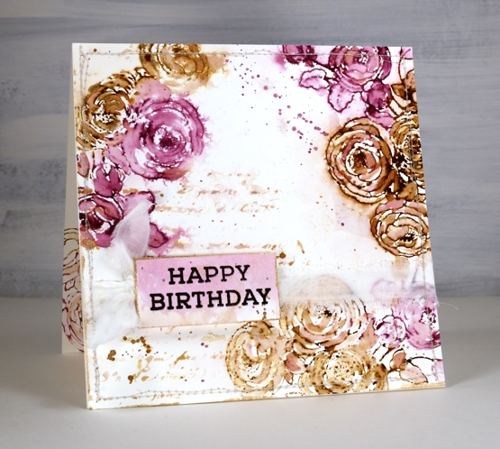
In my last post I shared a Christmas card featuring loose watercolour; the style of this card is even looser and was done with a few of the distress stain daubers I still have in my stash. Although I used techniques I’d devised years ago, this card was inspired by a card I saw on Pinterest recently. I followed the link and read through the whole post on the Tattered Nest Designs blog and combined some of her techniques with mine to create this very vintage floral birthday card.
I worked on hot pressed watercolour paper with gathered twigs and seedless preserves distress stains. I still have those two colours in the daubers but you could use ink pads or spray stains on a glass mat or craft mat to get similar results. Check out the Tattered Nest post to read how she did it with spray stains. I inked the PB ‘companions’ stamp with both distress stains and stamped on the corners of my watercolour paper panel. I dried the stain with a heat tool then started blending loosely with water and a paintbrush. If the ink was too intense I would use more water or dab it with a paper towel, if too pale I would add more stain with the paintbrush.
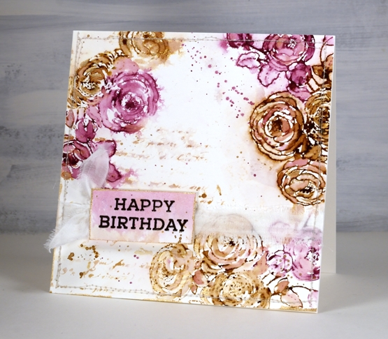
Once the flowers were loosely blended I inked the PB script background stamp with the same inks, spritzed it and stamped off on scrap paper. I spritzed it again with water before stamping a diluted print on the panel. You can see I also added splatter and created a sentiment on a small piece coloured with the same inks.
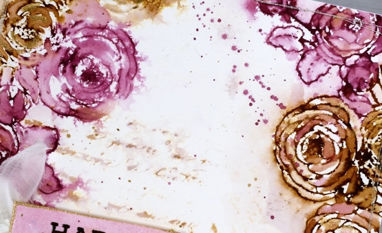
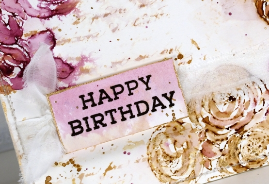
To finish the card I added splatter and some extra painting with rose gold pearlescent paint. You can see the gold border around the little tag in the close up above. Inspired by the Tattered Nest projects I sewed around the edge of the panel and then tore a strip of fabric to make a frayed ribbon sash.
Progress continues on my new online class; I’ve been gazing at the computer screen for days. I’m excited to share it with you very soon!
Supplies
(Compensated affiliate links used when possible)

Christmas Blush
Posted: October 27, 2021 Filed under: Christmas blush, Penny Black | Tags: Penny Black stamps, Ranger Distress inks, Tsukineko Versafine inks 7 Comments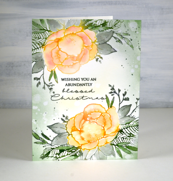
This pretty rose surrounded by leaves and needles is called ‘Christmas Blush’ and is another beauty from the Penny Black ‘Keeping Spirits Bright’ release. Even though it is part of a Christmas release I think I will use it year round. It’s quite a large stamp so I have made a 6¼” x 4½” card.
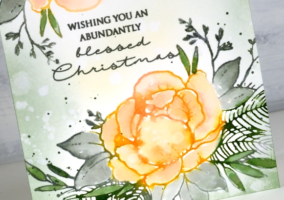
I used a technique similar to a favourite from a few years ago when I would ink my rubber stamps with distress stains. The distress stains first came in daubers which made it possible to ink a stamp with a very juicy amount of ink. To replicate that I inked with a stamp pad then spritzed generously before stamping.
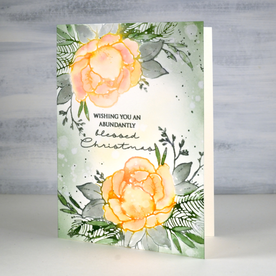
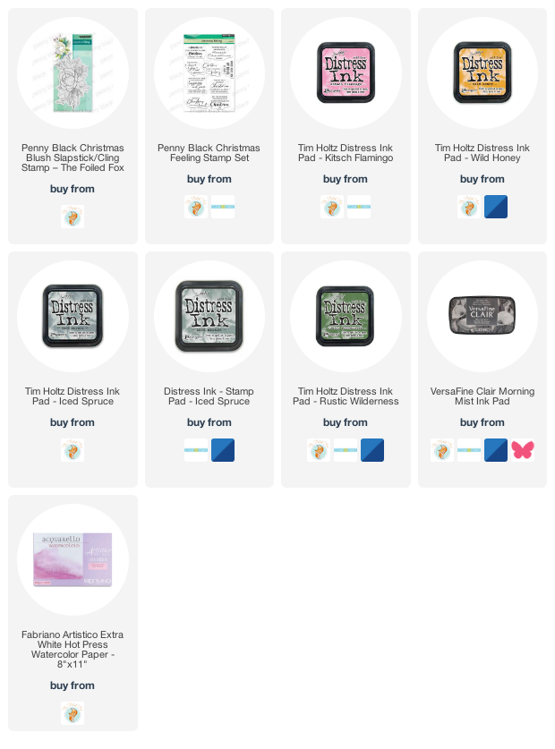
I inked the rose first in wild honey and kitsch flamingo, cleaned off the surrounding area then inked the foliage with rustic wilderness and iced spruce. Next I spritzed the stamp with water and stamped in the stamp positioner. There was enough ink still on the stamp to spritz it again and stamp it on the other end of the watercolour paper panel. While the ink was still wet on the paper I blended with a wet paintbrush, adding extra ink where necessary. I often watercolour outline stamps this way, the difference this time being how wet the ink was hitting the paper. I was looking for excess ink so the painting would be loose rather than precise.
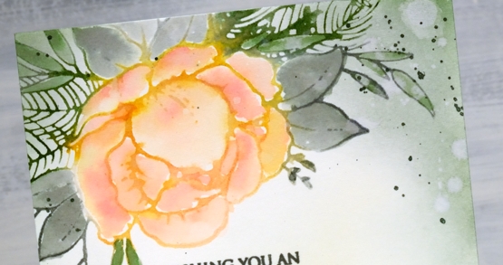
After blending ink inside all the leaves and petals I dried the image and used blending brushes to add both green inks around the edges of the card and a little wild honey in the centre. I splattered water over the panel several times before dabbing it off with a paper towel to leave watermarks in both the blended and stamped areas. I added some green splatter and a sentiment from the PB ‘Christmas feeling’ set stamped in morning mist versafine clair ink.
I like this loose watercolour look and also the fact that it didn’t take anywhere near the time a more precise no-line watercolouring approach would take. I’m sure I will take more time over this stamp another day with another colour scheme; it’s too pretty not to.
Supplies
(Compensated affiliate links used when possible)
Beautify – Video
Posted: October 25, 2021 Filed under: beautify, Penny Black, Tutorial | Tags: Penny Black stamps, Ranger Distress inks, video 4 Comments
Today I have a second Christmas card featuring new rubber cling stamps from the Penny Black ‘Keeping Spirits Bright’ release. This one, ‘Beautify‘ is a garland shape but instead of stamping it across the card from side to side I have used it to create festive foliage hanging down. I love being able to use my stamps in multiple ways, sometimes the changes are through colour but other times I use part of a stamp or repeat impressions with a stamp.
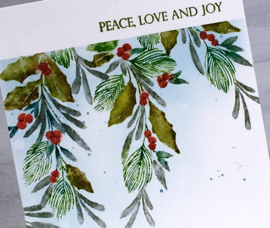
I filmed my process while creating this card so you can see the step-by-step in the video below. As the foliage is all quite small I used distress markers for the inking then blended some leaves after stamping. I upgraded the berries from distress ink to pearlescent paint to give them more prominence and a little shine.
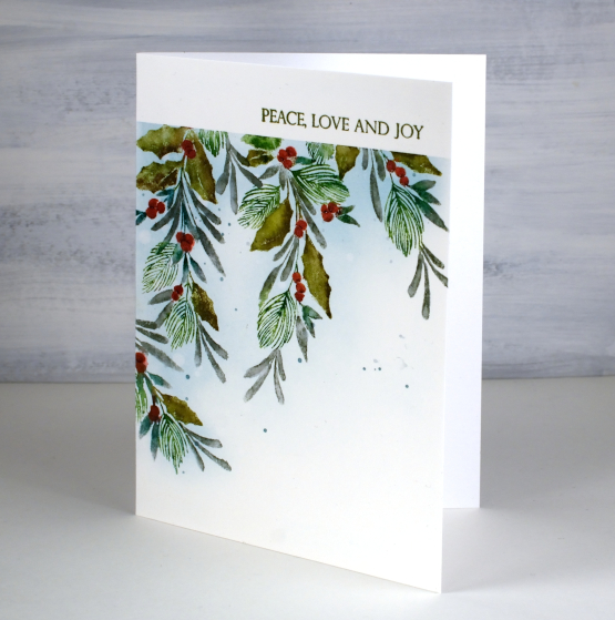
I’m sure you will see this stamp again perhaps positioned in a more traditional garland orientation. Looking at this stamp makes me want to make my own fresh garlands but I’m not sure that’s going to happen. Have you made a fresh garland or wreath? Did it have a high fiddliness factor? I even borrowed a book from the library with the how-to.
Although I have not made any fresh wreaths yet I have been designing, stamping and painting wreaths for my new online card class. It is nearly ready to share so stay tuned for all the details.
Supplies
(Compensated affiliate links used when possible)

Alight
Posted: October 22, 2021 Filed under: alight | Tags: Penny Black stamps, Ranger Distress inks 8 Comments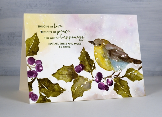
I’d like to introduce ‘Alight’ a lovely stamp from the new Penny Black release. I have teamed up with the Foiled Fox to share this pretty little bird so you can find me over there today too. Make sure you click over to see more of the new release in their shop and plenty of inspiration on their blog.
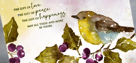
The new ‘Making Spirits Bright’ release includes some lovely wintry images, several easily large enough to fill a card front. This card is just under 6½” x 4¾”, larger than my usual size. I worked on hot pressed watercolour paper with masking fluid splattered on it and painted the background first. By ‘painted’ I mean smooshed the ink on my glass mat, diluted it with a few spritzes of water and swiped the panel through the liquid. I was after some pale swooshy colours in the background and used inks that were going to feature in the stamped design.
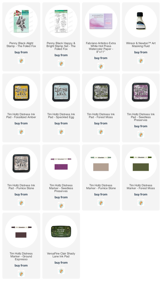
I worked in the stamp positioner the whole time so I could add ink bit by bit. I completed the bird first inking the edges in fossilized amber, pumice stone and speckled egg. I inked and stamped a couple of times then added some water to blend and cover each section. I didn’t want each colour to blend too much with the one beside it so I didn’t drown either the stamp or the page with water.
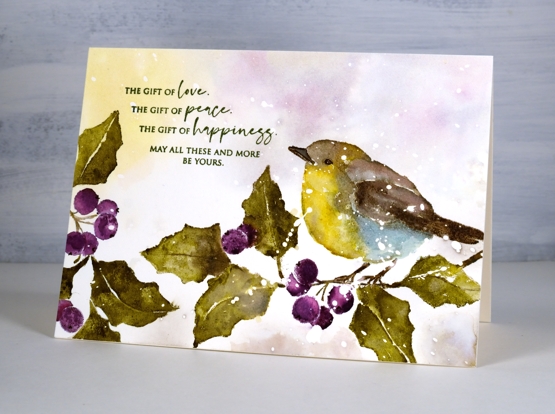
I made sure the bird was dry before adding the beak, eye and legs so they would stay distinct and not blend into the rest of the bird. For the leaves and berries I just picked one green and one purple, unusual for me; I often blend two greens for leaves. To add light and shadow I blended over the forest moss and seedless preserves stamping with a bit of water keeping some areas dark and other diluted.
The sentiment is from the new PB ‘happy & bright’ set stamped in shady lane versafine clair ink. How are you going with your Christmas card making. At the beginning of this year I resolved to make at least one Christmas card each month. We are in the tenth month and I have managed to make six (including this one!) I do have a new online class coming soon though which is full of Christmas card designs so I will have more than six on hand! I also have an in-person class at the beginning of November, so samples from that one will also boost my supply.
Thanks for dropping by today.
Supplies
(Compensated affiliate links used when possible)
Woodsy Autumn
Posted: October 20, 2021 Filed under: Brusho, woodsy | Tags: Brusho, Penny Black stamps 8 Comments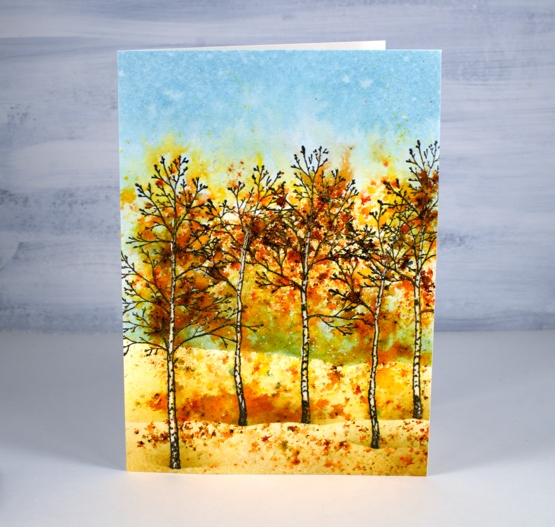
This new set, ‘Woodsy’ from Penny Black will be fabulous for winter scenes but before I put it to work in the snow I decided to create an autumn vista with the three trees.
Hoping to create the colour mass I see when the trees are at their best I pulled out a few brusho powders. I didn’t come close to the beauty outside right now but the brusho powders did not disappoint. If you have used brusho you will know they are unpredictable. I had a scene in mind and hoped the brusho would play its part.
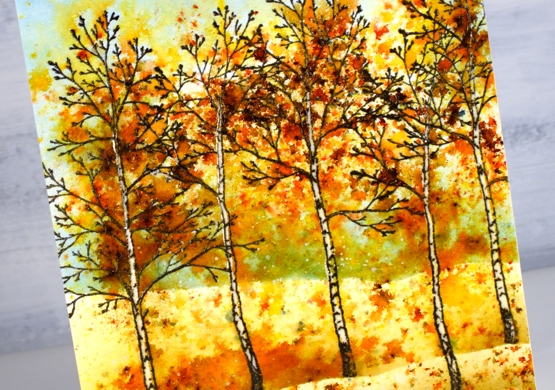
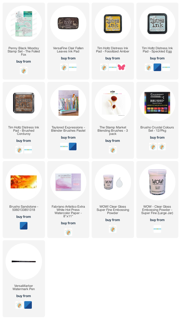
First I stamped the three trees in ‘fallen leaves’ versafine clair ink and embossed in clear powder on hot pressed watercolour paper. To preserve the white tree trunks I used a clear embossing marker to cover the length of each trunk and embossed in clear powder again. With distress inks and blending brushes I blended speckled egg ink in the sky area and fossilized amber and brushed corduroy on the ground. I used simple post-it note masks to suggest hills and horizon.
Before sprinkling brusho over the panel I lay a paper mask over the sky at the top of the panel and ground at the bottom of the panel. I sprinkled sandstone brusho over the middle area then spritzed from 10″ inches above. I watched and waited as the colours began to appear and spread then added a little more brusho and water. I dried it with a heat tool before repeating the process. You have to be patient with brusho; if you add too much water too soon you will not have spots and dots of colour. Sandstone brusho is made up of several colours so I saw yellow, red, orange and brown appear, even a few blue dots too.
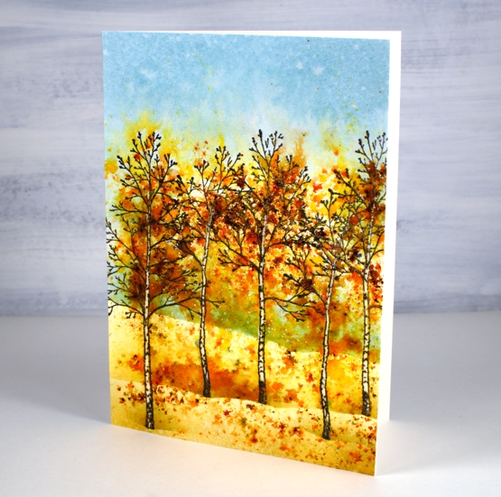
Once I had some nice patterns appearing I added a bit of yellow brusho and a tiny sprinkle of terracotta then left the panel alone while I ate lunch. After drying the panel thoroughly I blended more ink with the same post-it masks I had used at the beginning.
When I stopped I couldn’t decide if the scene was artsy or just messy. I set it aside and tried a few other approaches for a brusho autumn scene but kept coming back to this one, the messy, artsy, woodsy one!
Supplies
(Compensated affiliate links used when possible)
Autumn in the mountains
Posted: October 7, 2021 Filed under: arbors, Penny Black, picturesque, Stamped Landscapes | Tags: Penny Black stamps, Ranger Distress inks 5 Comments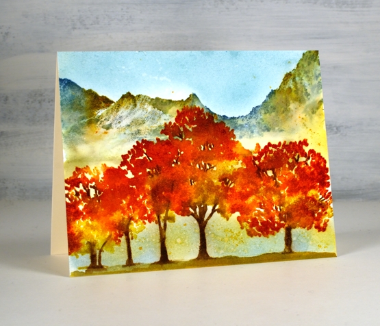
Outdoors is pretty ‘speccy’ right now. We don’t have too much of the deep red yet but I have seen it here and there. I have got into the habit of going for a walk or run soon after breakfast so I’ve seen the increase in autumn colours over the last few weeks. Yesterday there was fog when I set out so everything was a bit more muted but by the time I headed home the sun was burning off the fog and the golden tones were shining.
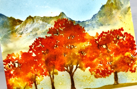
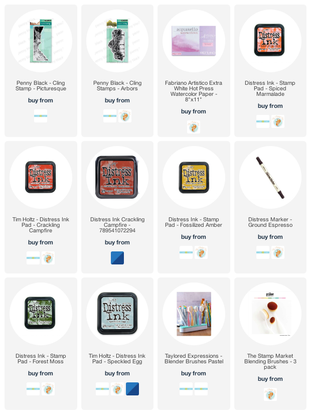
The first step in creating this scene was to stamp the top half of the mountain stamp (PB picturesque) in faded jeans and speckled egg distress inks on hot pressed watercolour paper. I painted below the mountains with water softening the colours at the bottom so there was no distinct line where the mountains ended. I then painted over the top of the mountains with water and dropped some spiced marmalade, forest moss and ground espresso ink into the wet area to add colour.
I dried the panel before starting on the trees using the PB arbors stamp. I stamped with ground espresso, fossilized amber, spiced marmalade and crackling campfire, not all at once, a couple of colours at a time to build up the coverage. I spritzed the stamp before stamping but didn’t spritz the paper.
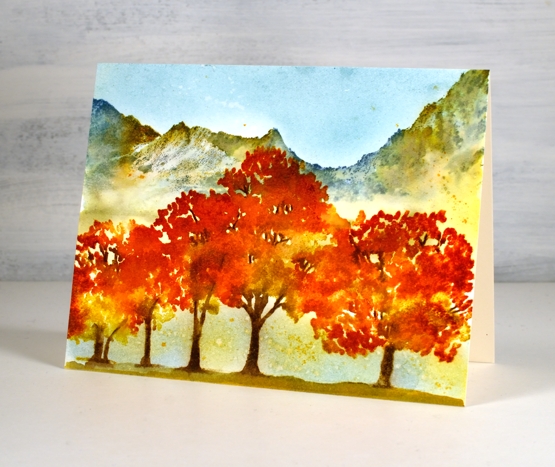
When I was satisfied with the trees I painted ground underneath them and dried the panel again before blending speckled egg ink in the sky and below the branches. To finish I splattered both water and fossilized amber ink to break up the expanses of blue.
Supplies
(Compensated affiliate links used when possible)
Blended Autumn Bouquet
Posted: September 30, 2021 Filed under: autumn bouquet, Penny Black, Uncategorized | Tags: Penny Black stamps, Ranger Distress inks, Tsukineko Versafine inks, WOW embossing powders 7 Comments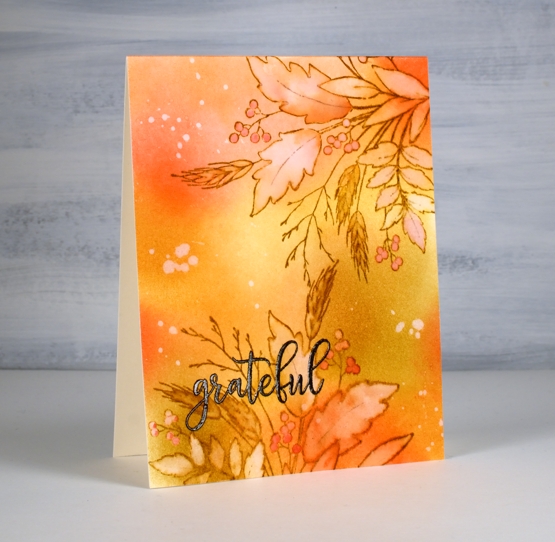
Today’s card is a second look with the Penny Black ‘autumn bouquet’ stamp. I blended distress inks over a panel of hot pressed watercolour paper before doing any stamping. The colours are listed below.
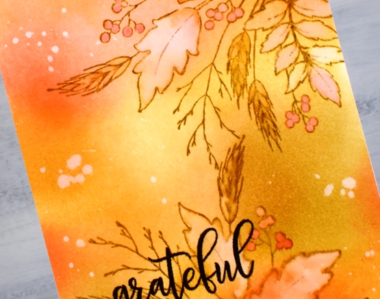
After blending I stamped the autumn bouquet stamp twice on the panel with brushed corduroy distress ink then painted inside all the leaves, berries and wheat stalks with water. As I painted I also dabbed away water leaving the insides of the images lighter than the outside. I picked up some smooshed ink and dropped it back into the round berries and the wheat berries.
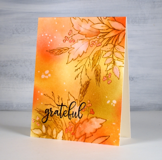
I splattered some water over the panel, let it sit then dabbed it away with paper towel leaving a random pattern of watermarks here and there. The embossed sentiment is from the PB ‘million thanks’ set stamped in fallen leaves versafine clair ink.
Thank you for dropping by. I am indeed grateful for all your support and kindness.
Supplies
(Compensated affiliate links used when possible)

Windswept
Posted: September 22, 2021 Filed under: Gilding Flakes, Penny Black, windswept | Tags: Penny Black stamps, Ranger Distress inks, Ranger Distress stains 8 Comments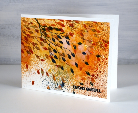
Today is officially the first day of autumn in the northern hemisphere and the leaves are flying here on the blog. I am featuring another new stamp from Penny Black, aptly named windswept. It is a simple rubber cling stamp depicting a branch and loose leaves. On my card the leaves are flying across the whole front and back of the card.
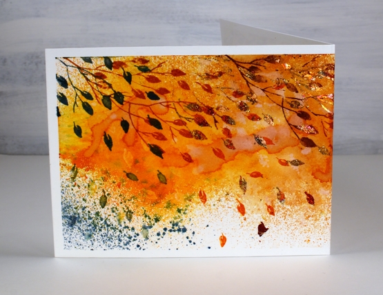
I taped the hot pressed watercolour panel to my glass mat as I planned to spray the panel with both water and ink. I sprayed quickly and lightly with spiced marmalade, scattered straw, rusty hinge, wild honey, vintage photo and stormy sky distress sprays. I sprayed some water over the top to blend some of the inks then dried with a heat tool creating some watermarks as I did so.
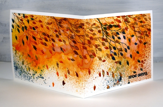
Once the panel was dry I stamped the branch across the panel starting on the left hand side (which ended up being the back of the card) then overlapping as I moved across to the right. I used distress inks in the same colours as the sprays to ink the branch a couple of colours at a time.
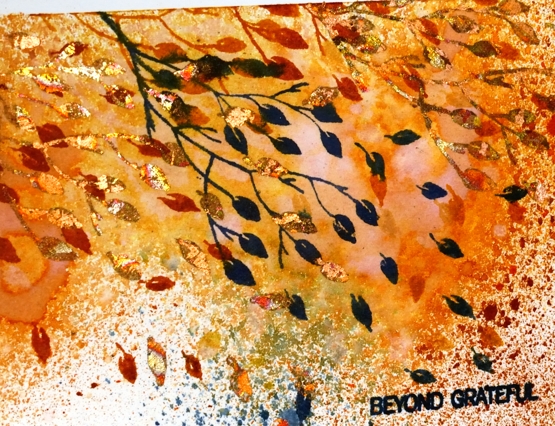
Once the panel was completely dry I decided to add some more leaves but with gilding flakes. It is a while since I used gilding flakes so I did a quick youtube search and tried two different methods. I preferred the second method which was to stamp with the Tsukineko essential glue pad then press the flakes onto the image. Gilding flakes travel far and wide if you are not careful so I had the vacuum cleaner at my side. I used the Cosmic Shimmer ‘red blaze‘ gilding flakes which are a beautiful mix of red, golds, bronze and brown metallic flakes, perfect for autumn. I finished off the card with a sentiment from the PB ‘ever thanks’ set.
Supplies
(Compensated affiliate links used when possible)

Gilded Wheat
Posted: September 20, 2021 Filed under: gilded wheat, Penny Black, Stampin Up, subtle | Tags: Faber-Castell Albrecht Durer Watercolour pencils, Penny Black stamps, Ranger Distress inks, Stampin Up 14 Comments
This beautiful wheat stalk, ‘gilded wheat’ is new from Penny Black. You know that feeling when you think maybe a project is complete but you’re not sure so you keep going? I had that feeling after I had finished stamping, painting and highlighting the wheat stalks. I just wasn’t sure whether to add a background or not.
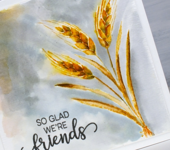
I stamped the wheat in scattered straw and wild honey distress inks then blended with a paint brush. To add shadow to the sides of the leaves and the base of the wheat berries I used iced spruce ink. After painting I switched to watercolour pencils and added more shadow with a similar grey-green spruce colour.
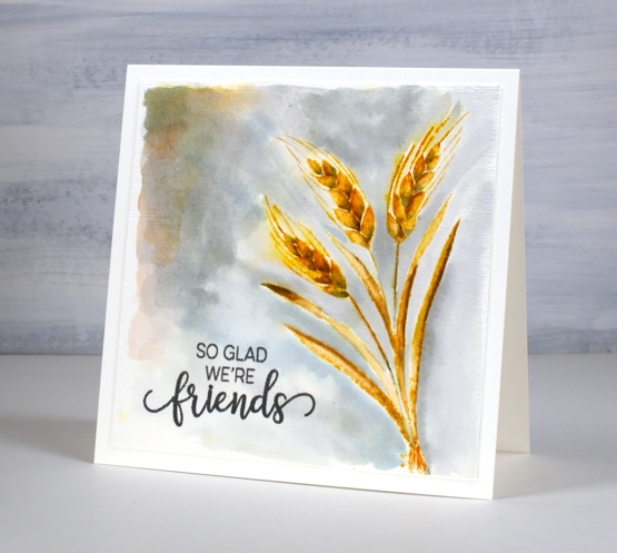
I could have stopped there and not added the background painting which is kind of patchy but I liked the contrast of the gold colours and the grey so I kept going. Before putting the card together I stamped a sentiment from the PB ‘choose happy’ set and ran the panel through the die cutting machine in the SU ‘subtle’ embossing folder. Sometimes people ask me how I settle on my colour combos; this one was inspired by the small leaves at the top of the previous card. Who knew grey and gold would be so happy together?
Supplies
(Compensated affiliate links used when possible)

Autumn Bouquet
Posted: September 17, 2021 Filed under: autumn bouquet, fragile branches, fresh ferns, Penny Black | Tags: Fabriano Watercolour Paper, Penny Black stamps, Ranger Distress inks 12 Comments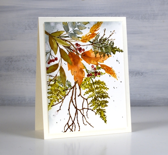
Are the leaves changing where you are? I noticed this morning a few patches of colour on the predominately green trees. The mornings are quite fresh too and the sunsets are amazing. Today’s card features a new Penny Black stamp ‘autumn bouquet’ teamed up with a couple of favourite filler stamps, ‘fresh fern’ and ‘fragile beauty’.
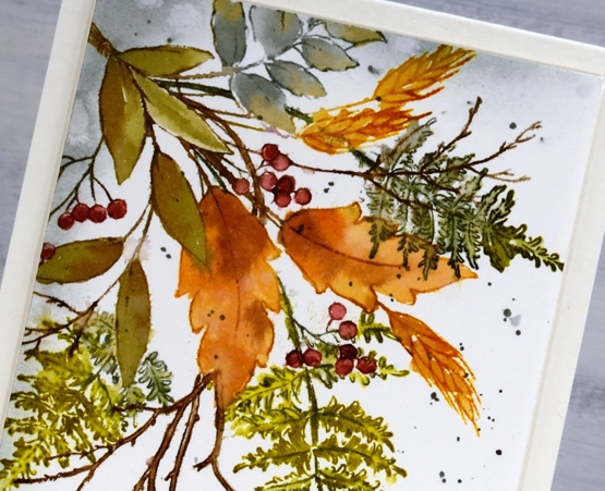
I kept the autumn bouquet stamp in the positioner so I could stamp each element one at a time. There are three types of leaves plus the wheat and the berries. All were done with a combination of inks. Often I ink the image using markers then smoosh the corresponding ink pad on my glass mat to give me ink for painting inside the stamped image.
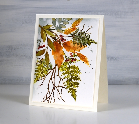
I used partial stamping to add the fern fronds and twigs. I usually ink the bit furtherest from the existing stamping then fill more in each time I stamp so as to avoid stamping over the top of other elements. This is because I am often too lazy to mask the stamping I’ve already done.
After painting and blending inside all the stamped images I used blending brushes to add iced spruce to two edges and splattered some over the panel. I trimmed and popped up the panel on a white luxe card base.
Have a wonderful weekend, thanks for dropping by.
Supplies
(Compensated affiliate links used when possible)