
A mixed media card!
Posted: January 13, 2016 Filed under: Camelia | Tags: gelli plate, Penny Black creative dies, Penny Black stamps 6 Comments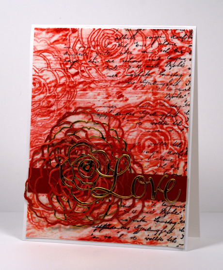
It seems that mixed media doesn’t appear on this blog very often but if I make a bit more progress in my art journals that might change. The card above features the first and only use of my gelli plate. I have seen lots of wonderful creating done with gelli plates but mine is currently stranded on Mount Techniques-To-Try along with other cool stuff!
I began by laying rose die cuts on my gelli plate then brayering red printing ink over plate and roses. I removed the roses before making a print of the pattern on deli paper. Out of several prints this one showed the most detail. I was going to throw away the very messy rose die cuts but a friend who was busy creating at the same time convinced me to hold onto them. Once they were dry they made delicate details which co-ordinated with the paper. I added some text to the paper, a solid strip to ground the embellishments and some gold die cuts for the focal element.
Have you gelli-printed? I intend to get back to my plate and would love to hear your favourite way to use one.
Supplies:
Stamps: Letter Background (PB)
Dies: Camelia die, Love & Joy die (PB)
Inks: Red Printing ink (Speedball), Black archival ink (Ranger)
Cardstock: Mixed media paper, deli paper, gold foil cardstock
Brusho Hearts
Posted: January 5, 2016 Filed under: All my hearts, Brusho, Love & Hugs, Love is growing, Triple love | Tags: Brusho, Penny Black creative dies, Penny Black stamps 13 Comments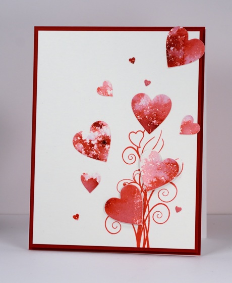
‘Tis the season for creating Valentine cards but the fresh snow outside my window is calling me to keep creating snowy scenes! New stamps and dies however, were calling from inside my craft room so red, pink and hearts it is. The new release from Penny Black is full of love, hearts and sweet wishes and is available in the online store now.
I created a red and pink panel with brusho then die cut a bunch of different sized hearts using three different dies. Aren’t those tiny ones cute? I popped up two of the hearts on fun foam and attached the others directly onto the stamped panel.
What are you creating in the new year?
Supplies:
Stamps: Love & Hugs (PB)
Dies: Triple love, Love is growing, All my hearts (PB)
Mediums: Brusho powders, Versafine Satin red ink
Cardstock: Hotpressed Fabriano watercolour paper, Neenah chili red
Also: white fun foam
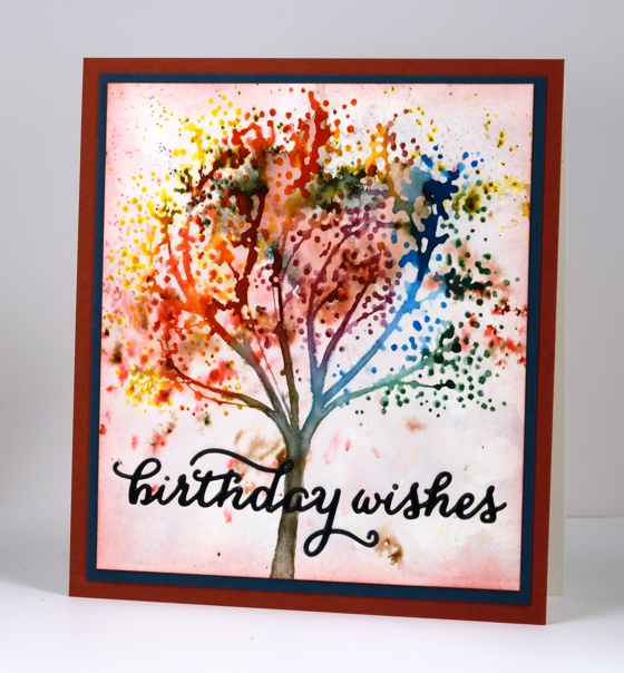
My Favourites from 2015
Posted: December 30, 2015 Filed under: Bister, Brusho, Hand drawn, Hand lettered, Penny Black, Stamped Landscapes | Tags: Penny Black creative dies, Penny Black stamps 17 CommentsThank you for your response to the viewer’s top ten from 2015 and thank you for the encouragement to keep sharing here. I love reading your comments and visiting your blogs and I am hoping to respond to your comments more in the coming year because I enjoy the conversations that develop from time to time. Sometimes they are about techniques and products but often they are about memories, traditions and experiences. It is great getting to know you better.
I whittled my favourites down to 10 but there were a few more I wanted to include. The pink one I shared yesterday was a favourite but it already made one list! The cards included below are in the order I originally posted them and a click on the photo will take you to the original post.
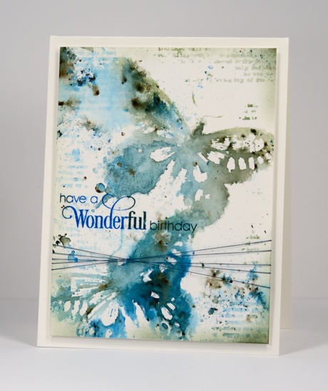
This one is a favourite for what is happening in the background as well as the foreground.
I used a die cut mask for this one and managed to make the leaves look like eucalyptus which of course reminded me of Australia.

I worked on this one in portrait orientation then once I was finished realised it looked better landscape.

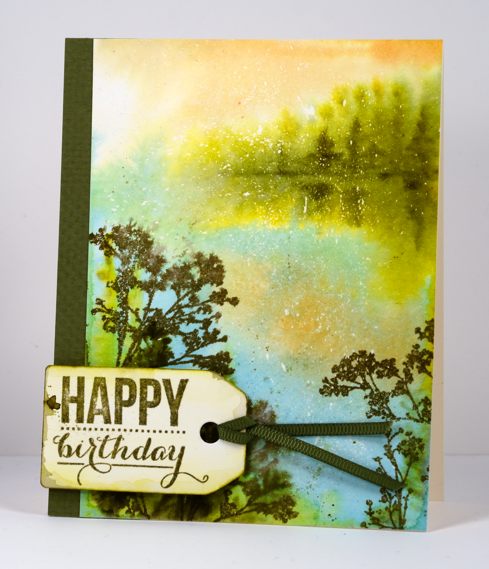
I love Queen Anne’s Lace so it is not surprising to find some in my top 10.

This is just one of those watercolours that worked above and beyond my hopes and I will never manage to do the same again! My mother has grown roses this colour so that made it extra special.

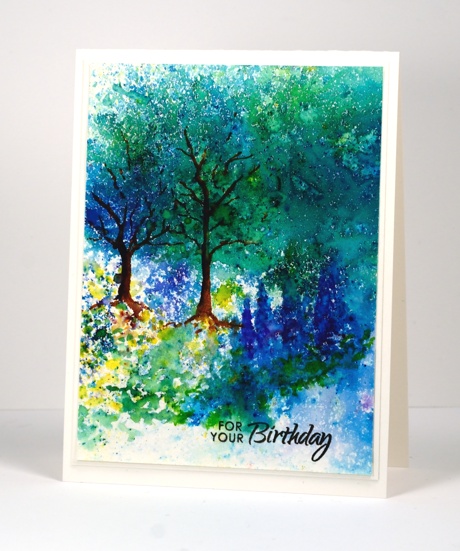
A simple design and some bister made me happy. (and of course you can never have too many tree stamps!)
After I had created quite a few bister cards I borrowed some brusho and the love affair with watercolour powders continued. “Finding” a garden in a random pattern of brusho was so very satisfying.

One of my goals this year was to paint more from scratch. I felt like I had not done much but when I looked through this year’s posts I saw some that were entirely my own design, like the one above, as well as some where I combined some stamping with some hand painting as in the one below.
My recent series ‘Stamping the stories’ struck a chord with many of you and I enjoyed the conversations it generated about favourite stories.
I only just posted this one but it is definitely a favourite. I will be doing more with this vintage colour scheme and hand lettering in 2016 so stay tuned.
Thanks for indulging me as I shared some of my favourites. They certainly represent some of the techniques and products I have enjoyed this year as well as some of the subjects I love to include in my projects.
2015 top ten
Posted: December 29, 2015 Filed under: Bister, Penny Black, Stamped Landscapes, Watercolour | Tags: Penny Black creative dies, Penny Black stamps 28 Comments
Of the 170 posts I have written this year, here are the ten that were viewed the most. I guess you could call this ‘the viewers’ choice’ post. If you click on the photos you can get to the original post with all the nitty gritty details.
Of course the most recent posts don’t really stand a chance under these terms but that is way ‘best of 2015’ lists go.
The card above is from a video tutorial, one of only two I made this year! I’m sorry; you deserved more.
The one above performed surprisingly well considering it is one of my ‘loose and messy’ ones; sometimes I wonder if other people don’t like them quite as much as I do.
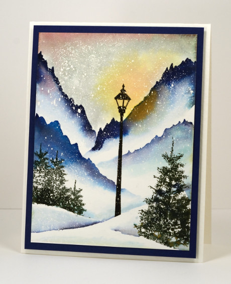
Another ‘messy’ one which I was quite excited about because it was one of my early bister experiments. It was the only 2015 Christmas card to make the top 10.
I love this one, not sure if I managed to part with it. If I did that person should know they’re pretty special.
This one is a classic example of ‘using a sentiment to cover up a mess’!

The ‘stacked die’ technique made from the same panel featured in the card at the top of this post.
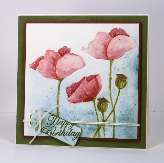
One of my carefully painted ‘not messy at all’ poppy cards.
Last but not least, my older daughter’s birthday card, another blue bister creation. There are 4 blue cards, 3 pink cards, 2 orange cards and 1 green card, which may mean my readers like blue and pink as much as I do!
Thank you for your feedback through viewing and commenting during 2015. You, my readers, mean a lot to me; it is a delight and a privilege to share my creating with such an appreciative audience. I will be back with my favourite creations from 2015.
Blue Christmas
Posted: December 22, 2015 Filed under: Regalia | Tags: Penny Black creative dies, Penny Black stamps, Ranger Distress stains, Tsukineko Memento inks 7 Comments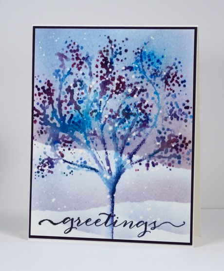
I don’t know under what circumstances one would have a blue tree like this! I just grabbed all the blue and purple markers and with the help of the MISTI stamped and restamped then spritzed and sprinkled blue brusho until I had whimsical blue tree.
In creating this post I remembered I had stamped this tree before but never shared it. This one was also done with the MISTI so all those colours didn’t get muddy on the stamp.
I hope you are having a lovely day. Must get on with the baking…
Supplies
Stamps: Regalia, Believe (PB)
Dies: Splendid Wishes (PB)
Inks: All the blue and purple memento markers (Tsukineko)
Paints: Brusho
Cardstock: Canson hot pressed watercolour paper, purple cardstock
Also: masking fluid
Very Merry
Posted: December 21, 2015 Filed under: Peace & Harmony, Stamped Landscapes | Tags: Brusho, Fabriano Watercolour Paper, Penny Black creative dies, Penny Black stamps 9 Comments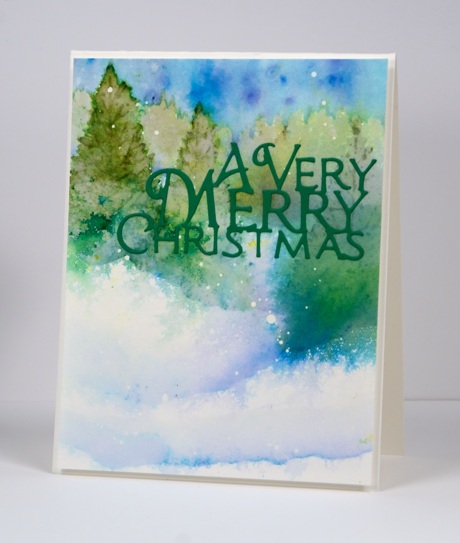
As we approach Christmas Day I will share the last of the cards I created to give away this year. I don’t plan to go into detail about techniques this week but will link to cards created in a similar way so you can read those instructions if you are interested. I will list below the supplies used I used to create each card. The technique for today’s feathered and blended tree scene is explained here.
We hosted a cello recital at our home yesterday for a friend so that gave me a deadline to have our tree decorated and the window hung with lights and greenery. My daughter and I did some baking but there is more to come. I always make gingerbread so that is one of the next tasks on my list. I like making it but you can probably guess that it’s the decorating I enjoy most. For years we made gingerbread houses or structures but I think it will just be cookies this year. (you can see what my children and their friends have built in past years on my other blog)
Santa is dropping off a guest from Australia on his way through Ottawa very early Christmas morning so there is still some cleaning and organizing to get her room ready.
Supplies:
Stamps: Peace & Harmony (PB)
Dies: A Very Merry (PB)
Paint: Brusho
Inks: memento Olive Grove, Cottage Ivy (Tsukineko)
Cardstock: Fabriano 100% cotton hot pressed watercolour paper, green cardstock
Also: masking fluid
Pink Berries
Posted: December 11, 2015 Filed under: Berry Bevy | Tags: Penny Black creative dies, Penny Black stamps, Ranger Distress stains, Tsukineko Memento inks 4 Comments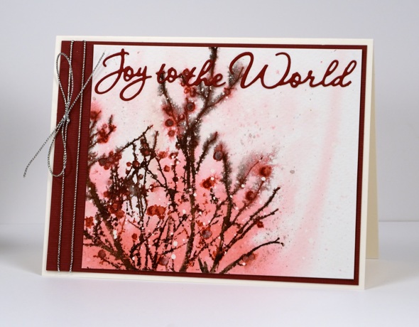
I usually end up with at least a couple of pink Christmas cards along with all the blue and green ones I make. What is your favourite colour combo for Christmas cards?
I began this card by splattering some drops of masking fluid on cold pressed watercolour paper. I am using more cold pressed these days to add a little texture to designs. Once the masking fluid was dry I wet the panel and stamped the ‘berry bevy’ stamp onto the panel in spun sugar and worn lipstick distress stains. The stain spread out to give me the background colour. I inked the stamp with both brown and burgandy for the branches and berries and spritzed to make the ink bleed in a few places. I used a paintbrush and some micro pearl powder mixed with burgandy ink to fill in the berries so some of them have a little shimmer. To finish off the card I found a matching piece of cardstock, cut a mat and a sentiment and added silver cord as the final touch.
Thanks for dropping by today.
Supplies:
Stamps: Berry Bevy (PB)
Dies: World of wishes (PB)
Inks: Worn Lipstick, Spun Sugar distress stains (Ranger) Espresso Truffle, Rhubarb Stalk Memento markers (Tsukineko)
Cardstock: Fabriano 100% cotton hot pressed watercolour paper, Burgandy textured cardstock
Also: silver cord, masking fluid, micro pearl powder
Stamping the stories: Peter Pan
Posted: December 2, 2015 Filed under: Pirates | Tags: Fabriano Watercolour Paper, Kuretake Gansai Tambi watercolour paints, Penny Black creative dies, Penny Black stamps, Tsukineko Versafine inks 11 Comments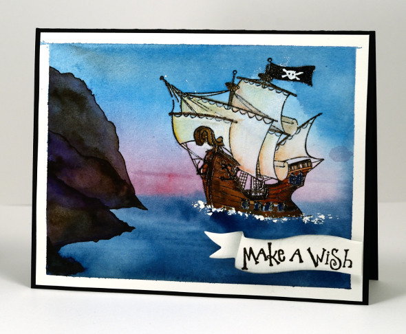
I am continuing the journey through imaginative books and stopping in Neverland today. When I was creating cards for the challenge I had to make sure there was a scene or setting from the book I could stamp or paint with some success. In thinking about Peter Pan, a story I enjoyed as a child and read to my children, I remembered this pirate ship stamp and pulled it out for the first time. I also pulled out one of my copies of Peter Pan for inspiration, the one illustrated by the incredibly talented Michael Hague.
To create this scene I painted some masking fluid where the waves would be then embossed the ship in black. I used watercolour paints to paint the sea, sky and cliffs then concentrated on the ship using paints then watercolour pencils for some finer details at the end. The sentiment is stamped on a die cut banner then trimmed and popped up over the panel.
After creating all my ‘story book’ cards I realised the books I chose were all made into movies. Perhaps that is a sign of a good story? I know I loved the books first and sometimes enjoyed the movies later on. It was the whimsical parts of Peter Pan that appealed to me, Wendy sewing on Peter’s shadow, the dog being their Nanna (although I did not get that as a child!?) and a ticking crocodile!
Supplies:
Stamps: Pirates, Sweet Wishes (PB)
Inks: Versafine Onyx Black (ImagineCrafts/Tsukineko)
Cardstock: Fabriano 100% cotton hot pressed watercolour paper, Neenah Epic Black cardstock
Dies: Triple Banner (PB)
Also: Gansai Tambi paints, masking fluid
Stamping the stories: Lord of the Rings
Posted: December 1, 2015 Filed under: Butterfly Party, Fantasy, Leaflets, Splendor, Stamped Landscapes | Tags: Kuretake Gansai Tambi watercolour paints, Penny Black creative dies, Penny Black stamps, Tsukineko Memento inks 17 Comments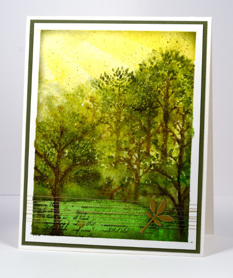
I don’t understand it but none of my children seem to have inherited my love for ‘The Lord of the Rings’ trilogy and ‘The Hobbit’. I think they all read the latter but I am not sure that any of them finished all three LOTR. I have read them several times and thoroughly enjoyed them so when challenged with a fantasy and imagination theme the delightful forest of Lothlórien came to mind. I pulled out some tree stamps, some green inks and gold thread to create a representation of the magical forest realm of the elves in middle earth.
I used some sponging for the golden light of the sky, painting and stamping for the trees and grass and a little gold die cut popped up on gold thread as an embellishment. I stamped some of the trees wet into wet to create some misty atmosphere but added some more defined stamping once the paper dried. I think the little bit of script helps give the middle earth look. The speckled look is from a fine splatter of masking fluid applied before I started and removed once all the paint and ink were dry.
Have you read any JRR Tolkien? Are you a fan? What about the movies? Years ago my husband and I were watching ‘The Fellowship of the Ring”; we did not know one of our girls was still awake in next room. All she could hear was music then battle sounds, then talk, then battle sounds over and over. She finally asked us to turn it down; it was too scary to listen to. Poor thing. The movies are a whole lot of walk, talk, walk, fight, fight, fight, walk, talk, walk, fight, fight…
Supplies:
Stamps: Splendor, Fantasy, Butterfly Party (PB)
Inks: Rich Cocoa, Bamboo Leaves, Espresso Truffle, Pear Tart, Olive Grove(ImagineCrafts/Tsukineko)
Cardstock: Fabriano 100% cotton hot pressed watercolour paper, green cardstock, Neenah natural white
Dies: Leaflets (PB)
Also: Gansai Tambi paints, gold embroidery thread, masking fluid
Imagine
Posted: November 30, 2015 Filed under: Soft Wings | Tags: Fabriano Watercolour Paper, Kuretake Gansai Tambi watercolour paints, Penny Black creative dies, Penny Black stamps 8 Comments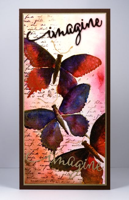
Many of you are familiar with the fabulous online stamping community ‘Splitcoaststampers‘. I have been a member for years and have appreciated the wealth of resources provided and the warm interaction and encouragement of the members. I was honoured to be invited at the beginning of this year to be a member of the Splitcoast design team, The Dirty Dozen. While a ‘Dirty Girl’ I was tasked with creating six projects each month inspired by a monthly theme. Back in April these projects were for fan club members only. It is one of the ways Splitcoast says thank you to fan club members for their financial support. Splitcoast membership is free but by paying a yearly subscription to the fan club you enjoy more resources and privileges while contributing to the running costs.
I was thrilled to be asked to join the ‘Dirty Dozen’ but I was a little apprehensive about thinking up a bunch of projects each month on a set theme. Themed challenges have a way of freezing up my creative juices! But a challenge is meant to be just that, a challenge and the results can be surprising. I met each challenge and was so happy to be taken outside my comfort zone. Each month I was blown away by the projects created by the rest of the team.
I enjoyed all the months but my favourite ended up being the ‘Imagine that’ challenge. I have turned the projects from that month into a story book week here on my blog. I’ll be back tomorrow with the first story book inspired card.
Supplies:
Stamps: Soft Wings, Letter background (PB)
Dies: Envision (PB)
Inks: Versamark, Rich Cocoa (Tsukineko)
Cardstock: Fabriano 100% cotton hotpressed watercolour paper, gold cardstock, brown cardstock
Also:Water colour with Gansai Tambi paints, gold embossing powder


