
More vintage watercolour
Posted: May 5, 2016 Filed under: butterfly charmer, flourish & butterflies | Tags: Faber-Castell Albrecht Durer Watercolour pencils, Penny Black creative dies, Penny Black stamps, Ranger Distress inks 19 Comments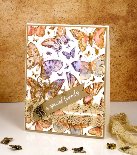
Thank you for your encouraging response to yesterday’s technique video. Please let me know if you give it a try. I have another card done in the same style today so if you missed the instructions yesterday, check out the tutorial here. The painting on this one was more straightforward as there was no masking. The butterflies are all on one large stamp, ‘Butterfly Charmer‘, and their botanical look makes them perfect for the vintage treatment.
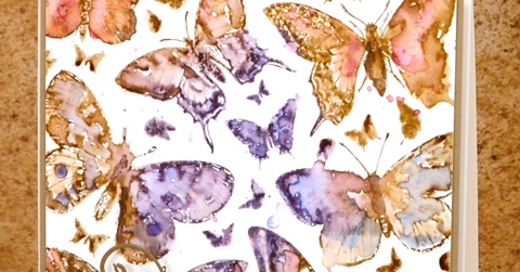
As with yesterday’s card I stamped in vintage photo distress ink; this provides the sepia tone which I want to carry through the whole image as well as the water solubility necessary to blend the ink with the added colour from the watercolour pencils. I chose a blue, a purple and a pink pencil and switched from one to another as I coloured each butterfly.
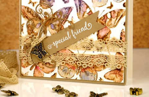
The assembly was more time consuming with this card partly because it had fiddly little lace and charm elements. The main reason putting this card together took a while though was because I didn’t know what I wanted. I glued down some lilac ribbon and added a bow to the butterfly charm only to decide I didn’t like it. Thankfully the ribbon pulled off without ruining the watercolour panel. I did want the lace and the charm so I paired them with an embossed sentiment on a tag plus a little flourish die cut . The whole shebang is matted with the same pale brown as the tag and popped up on a natural coloured card base. I know for some of you this constitutes a fairly simple layout but for me this is high on the fussy-fiddly scale!
Supplies:
Stamps: Butterfly charmer, Happy Snippets (PB)
Dies: flourish & butterflies, a pocketful
Inks: Vintage Photo distress ink (Ranger) Versamark (Tsukineko)
Cardstock: Hot pressed Fabriano watercolour paper, brown cardstock
Also: Albrecht Durer watercolor pencils (Faber-Castell), lace, butterfly charm
You’re Sweet
Posted: May 3, 2016 Filed under: Alcohol Ink, CAS, Dies | Tags: CAS, Penny Black creative dies, Ranger Alcohol Ink 5 Comments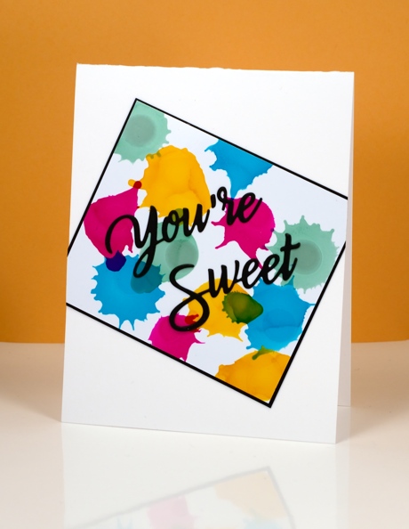
Earlier today I was admiring yet another fabulous card by Ardyth Percy-Robb, who is not only clever and creative, but also a faithful challenge participant. The card that caught my eye was for the May Pinterest Inspired Challenge featuring the image below:
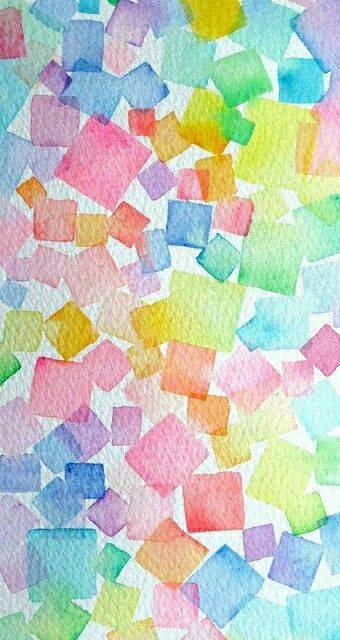
Even though I love watercolour and the image above is full of lovely soft blends and bleeds I chose to use my recent arty crush, alcohol inks. I dropped sunshine yellow, pool, raspberry and juniper one colour at a time so I could squirt air at each drop before it dried. You can see how some inks create a new colour when they intersect but others cover or push the other colour. I matted in black and attached my panel to the card base askew before adding a die cut sentiment.
Supplies:
Die: You’re Sweet (PB)
Alcohol Ink: sunshine yellow, pool, raspberry, juniper (Ranger)
Paper: Kirkland photo paper, Neenah SolarWhite 110lb cardstock, Neenah epic black cardstock
Poppy Pattern Party
Posted: May 3, 2016 Filed under: Color Burst, Poppy Pattern | Tags: color burst, Penny Black creative dies, Penny Black stamps, Ranger Distress stains 15 Comments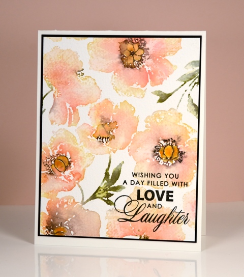
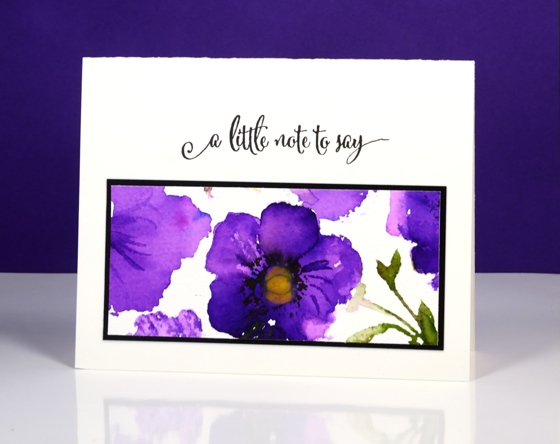
It’s the poppy pattern stamp’s turn to be featured today. I have a variety of colour schemes but only two mediums. The most subdued version is the one above done with forest moss, worn lipstick and scattered straw distress stains plus a black marker to add definition to the poppy centres once the stains had dried a little. I used a MISTI to add colours one at a time.
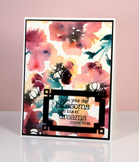
The remaining cards were all done with colour burst powders dropped onto water stamping. You lose a lot of definition with this technique but you achieve some gorgeous bold colours and in some cases some magical blending. Above I used phthalo green, lemon yellow and merlot (I think). Below it was probably alizarin crimson.
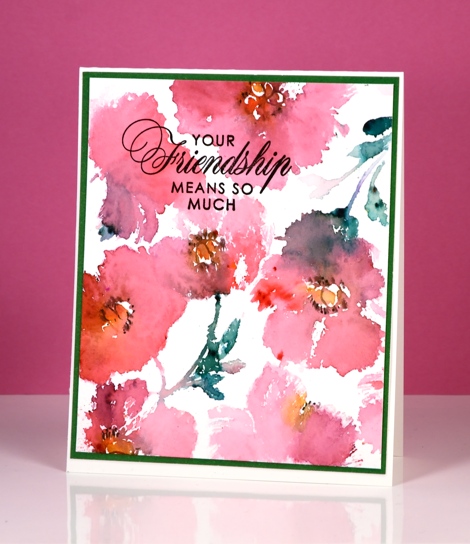
The bright purple panel below was the one section I saved from the large stamped image. I stamped it with water but when I went to sprinkle violet colorburst powder I got a little more than I bargained for. I let it dry, then chose one section to touch up, trim and turn into a card.
Supplies:
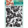
Stamps: Poppy Pattern, Special Wishes, Friendship, Sentiment Collection (PB)
Dies: Deco Frame (PB)
Mediums: Versafine onyx black (Tsukineko) distress stains (Ranger) Colorburst powders (Ken Oliver)
Cardstock: Fabriano 100% cotton hot & cold pressed watercolour paper, Neenah Epic Black cardstock
Out to Sea
Posted: April 27, 2016 Filed under: Alcohol Ink, CAS, Out to sea | Tags: CAS, Penny Black creative dies, Ranger Alcohol Ink 15 Comments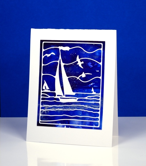
Is this not a stunning new die? I thought it was perfect to lay over my bright blue alcohol ink panel. Blue panels are the most challenging for me to photograph accurately. In real life there is more purple and the light blues are lighter. The speckled bits that conveniently look a bit like ocean spray or foam are silver accents. I created the panel by dropping some blue alcohol inks on yupo paper and blending. I added some silver alcohol ink and moved it around with extra blue ink and blending solution; the metallic inks don’t move much until another ink is added to them.
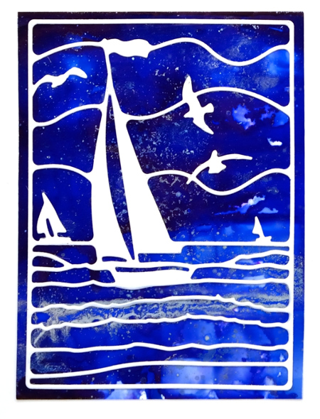
This die is also going to be beautiful over a watercoloured panel. If I am feeling patient and steady I might do the inlaid die technique but it really doesn’t need it; the overlay approach works just fine.
Supplies:
Die: Out to Sea(PB)
Alcohol Ink: denim, indigo, silver, alcohol blending solution (Ranger)
Paper: yupo paper, Neenah SolarWhite 110lb cardstock
Timely bookmarks
Posted: April 12, 2016 Filed under: Bejeweled, The Unfolding | Tags: Penny Black creative dies, Penny Black stamps, Ranger Distress stains 13 Comments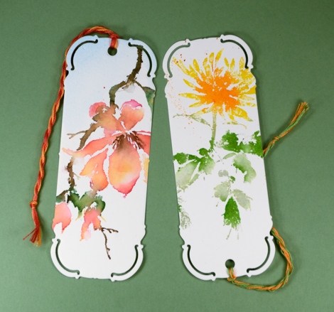
This week the design team at Penny Black are sharing some book mark designs cut using the elegant ‘bookmark’ die. I guess it’s no surprise that I decided to cut my bookmarks out of watercoloured panels, the orange and green one shows a portion of the ‘Bejeweled’ image.
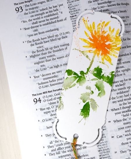
The pink and orange one below features ‘The Unfolding’ which just might be my favourite stamp from the last release. I used distress stains for both images, inking with the lighter stains first, then the darker ones over the top. I sometimes add a spritz of water if the stains were not so juicy it helps the colours blend softly into each other. Once I have stamped the image I do further blending on the paper with a paintbrush. And of course there is the small matter of splatter added at the end if desired.
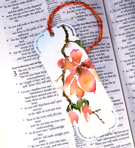
The die punches the little hole for the cord so I twisted some matching colours of embroidery floss and threaded them through. A book mark project is quiet timely actually as I have stepped up my reading over the past few months. I have a few books on the go right now and am enjoying some audio books also.
Have you read or listened to any good books lately? Do you read more than one at a time? Do you reread favourites? I just finished reading ‘The Invention of Wings’ by Sue Monk Kidd and ‘A Homemade Life’ by Molly Wizenburg. I’m also rereading the Mitford series by Jan Karon.
Supplies:
Stamps: The Unfolding, Bejeweled (PB)
Dies: Bookmark (PB)
Inks: Mowed Lawn, Bundled Sage, Vintage photo, Mustard seed, Spiced Marmalade, Worn Lipstick, Dried Marigold distress Stains (Ranger)
Paint: Phthalo blue Dr Ph. Martin Hydrus
Cardstock: Fabriano 100% cotton hot pressed watercolour paper
Also: Embroidery thread
CAS Mix up Challenge
Posted: March 18, 2016 Filed under: CAS, Color Burst, Dies, Love Art | Tags: CAS, color burst, Penny Black creative dies, Penny Black stamps 11 Comments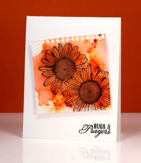
There is a new challenge on the block and it is definitely worth a look. It has been dreamed up by the very talented, Bonnie Klass and Loll Thompson and it’s called the CAS Mix up Challenge.
In their words:
Is CAS your style?? Do you love the look of clean and simple designs with lots of open space?? And have you seen all those fabulous mixed media techniques and products popping up all over and want to give them a try?? Then this is the challenge for you!
- stamping – no problem
- watercolour – absolutely
- my choice – a die cut
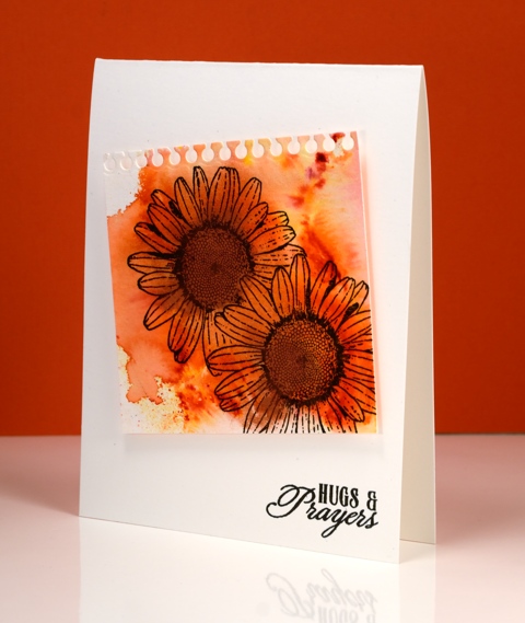
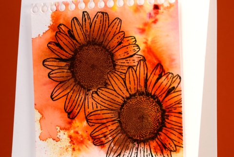
I splashed some water on my watercolour paper then added some Tangerine colourburst powder and some Copper liquid metal. I let the colour move and blend and tilted it to almost fill the paper then let it dry. I had to do a little fussy cutting to mask one daisy before I stamped the other but I seemed to have survived the ordeal. I used the notebook die from the ‘pocket full’ set to cut the top of the panel then popped it up on the card base before adding a sentiment. I tried to do the artistic-messy-thread-stuck-behind-the-panel trick but did not succeed. Maybe it was just as well because the challenge specified three elements not four!
Pop over to the challenge and check out the entries; it is a feast of inspiration.
Supplies:
Stamps: Love Art, Soar (PB)
Die: A Pocket full (PB)
Mediums: Colorburst powders, Liquid Metal (Ken Oliver) Versafine Onyx Black ink (Tsukineko)
Cardstock: Cold pressed Fabriano watercolour paper
Well Done
Posted: March 10, 2016 Filed under: Alcohol Ink | Tags: Penny Black creative dies, Ranger Alcohol Ink 9 Comments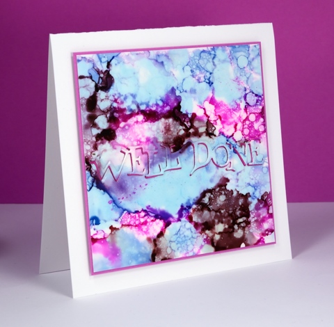
I am flitting back and forth between poppies and alcohol inks at present; I hope you don’t mind. Jane Clempson is continuing to create inspiring alcohol ink projects over on her blog so I have a list of techniques yet to try.
This one started out the same way many of my panels have with me dropping three colours randomly over the whole surface of the yupo paper. Once the colours settled and stopped jostling each other I started dropping blending solution here, there and everywhere. It made some pretty patterns but nothing I hadn’t tried before so I switched to splattering blending fluid over the panel with an old paintbrush. The droplets were smaller and more numerous and achieved the bubbly look you see here.
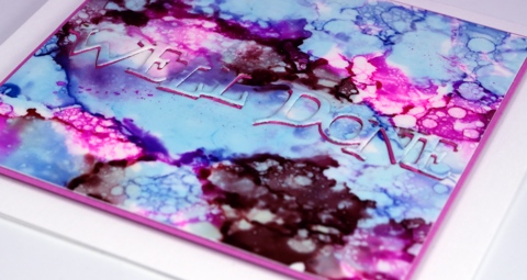
I was inspired to position my sentiment front and centre after seeing this card by Jane. I die cut the sentiment from both the patterned panel and a piece of pink fun foam (both with stick-it adhesive on the back) so I could position the fun foam in the space left by the die cut and then the inked die cut back on top of the fun foam. Looks simple described in print but in reality it drove me crazy working those fiddly little words into the fiddly little spaces with a fiddly little pair of tweezers! Cute effect though, don’t you think?
Supplies:
Dies: Well Done (PB)
Alcohol Ink: Stonewashed, Raspberry, Raisin & alcohol blending solution (Ranger)
Paper: Yupo, Neenah Solar White 110lb cardstock, Pink cardstock
Also: stick it adhesive, fun foam
You Rock
Posted: March 8, 2016 Filed under: Alcohol Ink | Tags: Penny Black creative dies, Ranger Alcohol Ink 7 Comments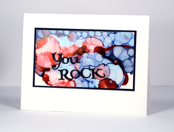
Oh these alcohol inks are so much fun! During an experimental session the other day I discovered I could blend over the top of a panel I did not like with blending solution which would not remove all the colour but would make it a soft blended background on which I could start a new design. The possibilities are seemingly endless.
This panel was done in two steps. I began by dropping two blues and a red on the yupo paper to create large circles. When the big circles had stopped mingling I used a Q-tip and some blending solution to add little circles over the top of it all. The finished effect reminds me of bokeh.
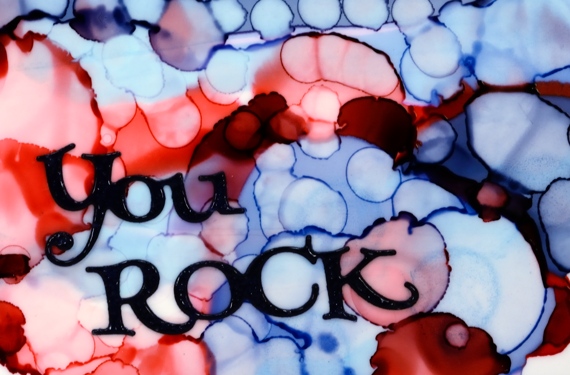
Although they might look black, the die cut sentiment and the mat are actually navy blue and the sentiment is embossed in clear powder to give it a glossy finish. I wouldn’t say I have settled on a favourite but I am liking these blues.
Supplies:
Dies: Well Done (PB)
Alcohol Ink: Denim, Stonewashed, Poppyfield, alcohol blending solution (Ranger)
Paper: Yupo, Neenah Solar White 110lb cardstock, Neenah patriot blue 100lb cardstock
Poppy Gems 2
Posted: March 4, 2016 Filed under: gift card pocket, Poppy Gems | Tags: Dr Ph Martin Hydrus watercolor paints, Faber-Castell Albrecht Durer Watercolour pencils, Penny Black creative dies, Penny Black stamps 20 Comments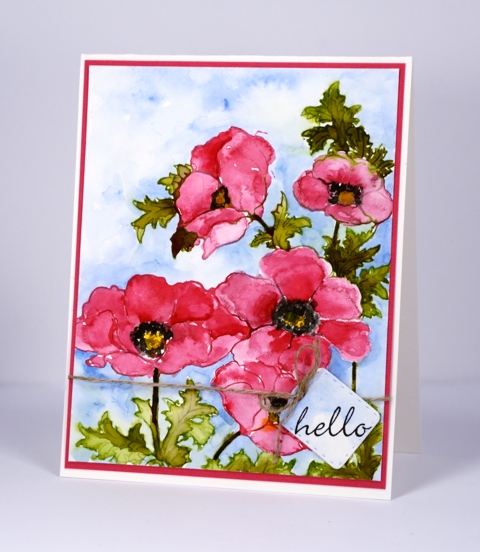
The Poppy Gems return today but in a more traditional colour scheme than last week’s card. I stamped with liquid watercolour paint on this panel, a technique not unlike what I often do with the distress stains. I used a paintbrush to apply the paint to the stamp then, after stamping, used water to blend the colour into the petals and leaves. In the centres and shadows on the flowers I layered colour to increase the intensity. The paints are Dr Ph Martin Hydrus watercolours which dry permanent. This feature was helpful when I decided to add a background weeks after completing the flowers. There was no chance I would make the pinks and greens bleed into the sky when I added blue with a watercolour pencil and waterbrush.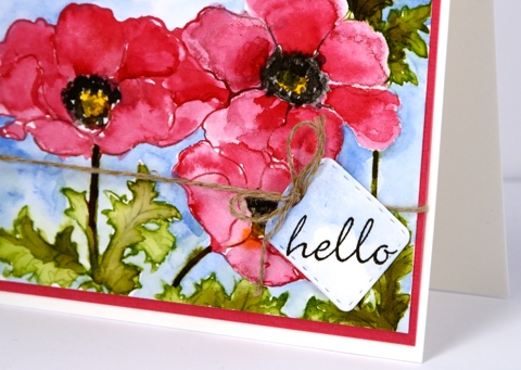
The little tag is a cut with the new die from Penny Black, ‘gift card pocket’ which comes with so much more than just the pocket die.
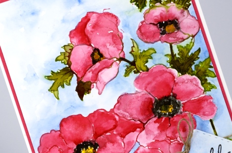
Thank you for dropping by today; I will be back soon with more alcohol ink adventure as well as another couple of cards made with the ‘Poppy Gems’ stamp. I hope you have a great weekend.
Supplies:
Stamps: Poppy gems, Perfect Pairing (PB)
Dies: gift card pocket (PB)
Inks: Versafine Onyx Black (Ranger)
Pencil: Albrecht Durer watercolour pencil sky blue 147(Faber-Castell)
Paints: Dr Ph Martin Hydrus Liquid Watercolours – Set 1
Cardstock: Fabriano 100% cotton hot pressed watercolour paper, pink cardstock
Also: linen thread
Poppy gems 1
Posted: February 27, 2016 Filed under: Flourish and butterflies, gift card pocket, Poppy Gems | Tags: Penny Black creative dies, Penny Black stamps, Ranger Distress stains, Speedball elegant writer 28 Comments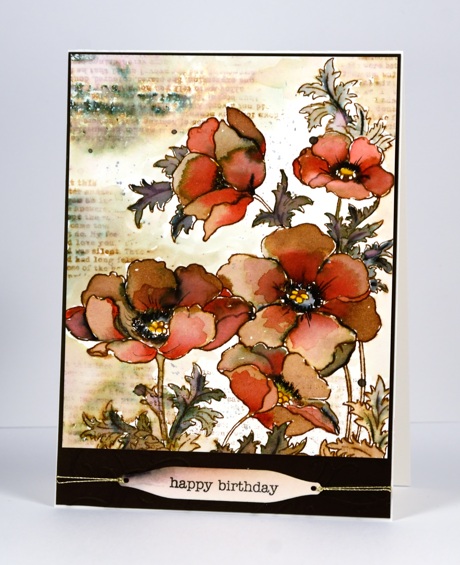
Over the next week or so you are likely to see the new ‘Poppy gems’ stamp a few times. I have already stamped it in four different colour schemes and varied the mediums and styles. This one is by far the ‘busiest’ and is quite the contrast to the clean and simple stamping I have been sharing lately.
I created this earth toned panel initially with just brown and black but after doing most of the blending with water I decided to add a bit of red to the petals over the brown. I stamped with distress stain and pulled it into the petals and leaves with a paint brush. I added black with the elegant writer pen which bleeds pink and green tones when wet. I decided to add the text details after the flowers were finished keeping it loose and watery with the addition of water to both the stamp and panel. I stamped the text upside down the first time so I had to make it blurred so my error would not be less noticeable!
I die cut a few flourishes with the new ‘flourish and butterflies’ die and attached them to the base for a tone on tone detail; you can just make it out in the photo below. The sentiment is stamped on a tag from the new ‘ gift card pocket’ die.
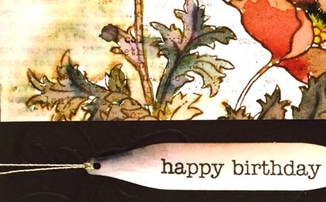
Thanks for dropping by; I hope you are enjoying a relaxing weekend.
Supplies:
Stamps: Poppy gems, footnotes, snippets (PB)
Dies: flourish & butterflies, gift card pocket
Inks: festive berries, mustard seed, vintage photo distress stains & ink (Ranger) black elegant writer pen (Speedball)
Cardstock: Fabriano 100% cotton hot pressed watercolour paper, brown cardstock












