
Watercolour Dance
Posted: August 3, 2016 Filed under: Brusho, CAS, shall we dance, Watercolour | Tags: Brusho, Penny Black creative dies, Penny Black stamps 21 Comments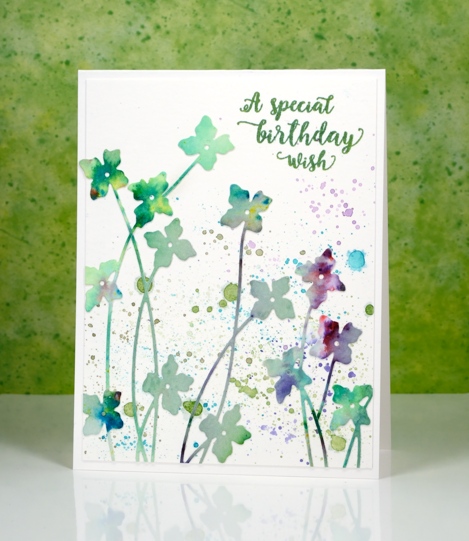
It’s really quite hot here at present and this card some how makes me feel a little cooler. It’s either the watery splatter or the cool blues and greens. I used up another abstract watercolour panel to make this card; there is quite a pile of painted or stamped panels sitting on my desk waiting to be turned into something. As you can probably guess this panel was mainly green but had a bit of purply pink on it. I am pretty sure it was done with brusho because there are little bits of other colours mixed in which is one of the nice features of brusho paint – the colours are not purely one pigment.
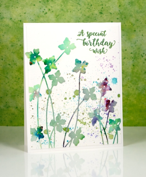
I used the new ‘shall we dance’ die from Penny Black to cut as many flowers as I could. I didn’t need them all to be complete die cuts as I wanted some tall and some short. Before I cut them I put ‘stick it’ adhesive on the back of the whole panel to make things easier later. Once I had all the flowers I could squeeze out of the panel I played around with positioning until I was happy. I did it all on a plain white panel assuming that I would keep the background blank and let the colours in the flowers pop. It would have been ok that way but I decided to use my watercolour pencils to try a little splatter in similar colours to the flowers. It may not be strictly white space any longer but it is pretty.
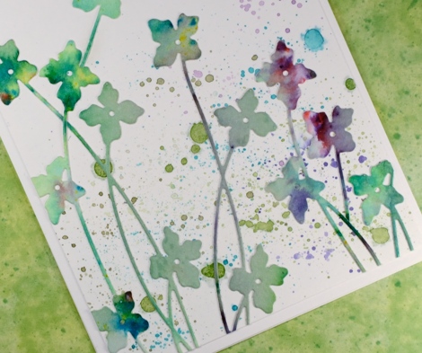
I am going to let this card play along with not one, but two challenges.
The CASology cue card is
and the CAS Mix Up challenge is
I read the fine print and discovered that if you didn’t have sprays then splatter is just fine so we’re in!
Supplies:
Stamps: Words of Kindness (PB)
Die: Shall we dance
Paints: Brusho powders (Colourcraft)
Inks: Cottage Ivy Memento ink (Tsukineko)
Cardstock: Fabriano 100% cotton hot pressed watercolour paper
Also: stick it adhesive sheet
Strange things are happening
Posted: August 1, 2016 Filed under: Field of Dreams, Zigs & zags | Tags: Kuretake Gansai Tambi watercolour paints, Penny Black creative dies, Penny Black stencils 9 Comments
Strange indeed to see me enter a challenge, follow a sketch, use a chevron pattern and texture paste! I would not be surprised if you thought someone else had taken over my blog. There are two signs, however that this is my card, those watercoloured poppies might look familiar and the placement of that little sentiment is pretty standard for me also.
How did this happen? Well, I have been meaning to try adding texture to cards for a while so I picked up some molding paste and applied it through a couple of stencils. In this experiment I mixed liquid metal into the paste before spreading it through the ‘Zigs and Zags’ stencil from Penny Black. It didn’t end up with a metallic look but it took on the green of the ‘verdi gris’ liquid metal. It has been a while since I did a challenge other than One Layer Simplicity (new one is up today) so I checked a couple of my favourites and found the sketch on “Case this Sketch“.

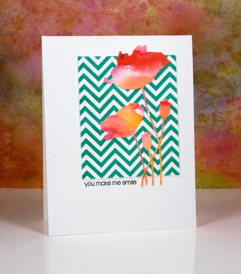
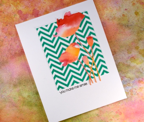
The die-cut poppies were sitting on my desk along with some other left over watercolour painted panels. (I will share projects featuring the other panels later this week.) This card really is an exercise in contrasts, the soft blends of the paint against the sharp corners of the zigzag, the pops of red over the stripes of green and the tiny black letters in the midst of a large expanse of white space.
As Joan Bardee would say:
MOOD WHEN DONE: Surprised but satisfied!
Supplies:
Stamps: Snippets (PB)
Dies: Field of Dreams (PB)
Stencil: Zigs & Zags (PB)
Inks: Versafine onyx black (Tsukineko)
Mediums: Molding paste (Golden) Verdi gris liquid metal (Ken Oliver) Watercolour paint (Kuretake Gansai Tambi)
Cardstock: Hot pressed Fabriano watercolour paper, Neenah solar white cardstock
Stamping with alcohol inks
Posted: June 4, 2016 Filed under: Alcohol Ink, Autumn Jewels, Pinwheel | Tags: Penny Black creative dies, Penny Black stamps, Ranger Alcohol Ink 11 Comments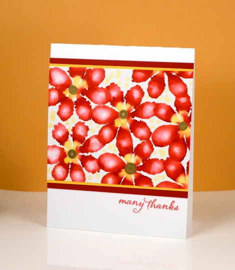
A few months ago I tried all sorts of fun techniques with alcohol inks and I am keen to get them back off the shelf to try some more. Today’s cards are all examples of stamping with alcohol inks, using die-cut felt as the ‘stamp’.

I did all the stamping on glossy photo paper which allows the inks to move and blend a little but nowhere near as much as the on yupo paper. Yupo paper is a synthetic paper which is totally waterproof so the ink does not soak into it at all but spreads across it as it dries. The photo paper does absorb ink even as the glossy surface lets it spread and blend a little.
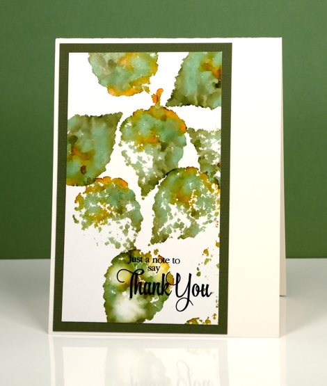
By varying the amount of ink you drop on the felt die-cut you can get a lacy effect or a full print. By adding a little blending solution to the felt you can dilute the colour and get a blurry effect within the shape. The possibilities are extensive with this technique.
Supplies:
Stamp: Words of Kindness, Sentiment Collection, Happy Snippets (PB)
Die: Autumn Jewels , Pinwheel (PB)
Ink: Alcohol inks (Ranger)
Cardstock: Glossy photo paper, coloured cardstock, Neenah solar white & natural white
Stencilled
Posted: May 31, 2016 Filed under: Alcohol Ink, Hypnotic | Tags: Penny Black creative dies, Penny Black stencils, Ranger Alcohol Ink 16 Comments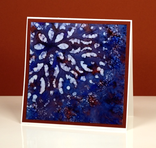
If you haven’t tried stencils with your alcohol inks you might be surprised at the lovely effects you can get. Let me warn you though, they might not do what you want them to, but they will probably do something cool. There is a bit of trial and error involved when working out how much blending solution or rubbing alcohol to apply through the stencil. Too much and it spreads under the stencil and you lose the pattern definition. Too little and you will not remove enough colour to get a pattern. It is worth playing with applicators too. Applying solution with a q-tip will take much longer but you will have more control.
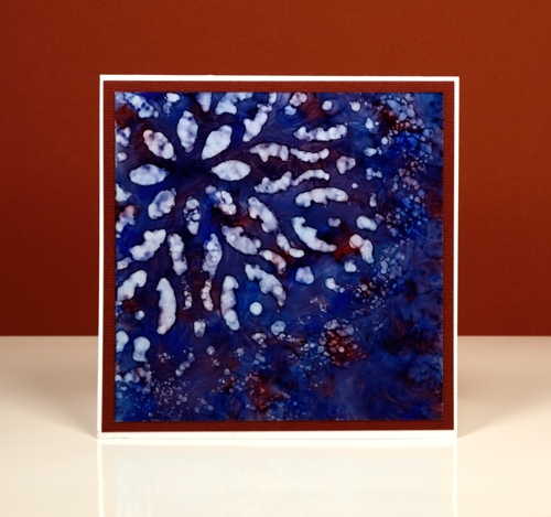
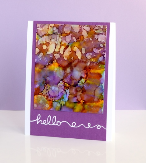
I started with a deep blue pattern on yupo paper with little patches of burgandy ink. When it was dry I positioned the ‘hypnotic’ stencil over one corner then removed colour with blending solution on a felt applicator. I kept an eye on the felt as I pounced it through the stencil because it was picking up blue ink. If it got too blue it wasn’t removing ink anymore. I like the batik look with some lines of blue in the white spaces
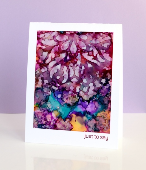
On these two purple toned panels I used the same technique but was not as careful to keep the stencil still on the one below. The pattern from the stencil is just a mix of abstract shapes. The blue panel at the top of this post is all about the stencilled pattern but these two messy purple ones are just here because I love the colours. Before I die cut the word ‘hello’ out of the purple cardstock I positioned a strip of ‘stick it’ adhesive on the back where the word would be. That made it easy to attach the panel to the card base and pop in the little loops and circles that were cut out. I saved the purple ‘hello’ cut out of the card below and stuck it inside the card above.
Supplies:
Stencil: Hypnotic (PB)
Stamp: Happy Snippets (PB)
Die: Doodles (PB)
Ink: Alcohol inks (Ranger)
Cardstock: Yupo, mauve cardstock, Neenah solar white
Sun and sea
Posted: May 24, 2016 Filed under: Brusho, Out to sea, Serenity | Tags: Brusho, Fabriano Watercolour Paper, Penny Black creative dies, Penny Black stamps 4 Comments
Over on the Penny Black blog this week ‘Father’s Day’ cards are the feature. My card could definitely be used for Father’s Day (if I remember to post it!) but it could be just as easily used for any friend or family member. The colour scheme and the lack of floral images does make it a good choice for a masculine card.
Four different painted panels were cut up then layered to create my sunny seascape. The background blue panel is one piece of cold pressed watercolour paper; I taped masking tape across the horizon about 2/3 of the way up then painted some masking fluid in lines to suggest waves and light on the sea. Once the masking fluid was dry I painted the sea with cobalt blue and turquoise brusho. Once that dried I repositioned the tape to mask the edge of the sea so I could paint the sky with turquoise brusho.
All the remaining pieces were painted on hot pressed watercolour paper. For the tree and grass I used three greens (listed below) and dark brown brusho. I used a large piece of watercolour paper adding brown just in the area where I would die cut the tree. After die cutting the tree I used a craft knife to cut a hill from the rest of the green area. To keep the tree sitting flat on the background I used the bottom of the tree die to cut into the green hill then inserted the tree in the space when assembling the scene.
I used the ‘Out to Sea’ die to cut a yacht from a yellow brusho panel then painted red over the hull of the boat. The only other piece to cut was the sun which came out of a piece I painted with yellow and a sprinkle of red.
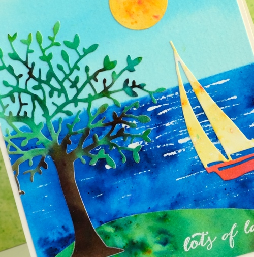
To make assembly a bit easier I applied ‘stick it’ adhesive to the tree panel before cutting it out. I embossed the little sentiment in white before putting it all together. My husband just walked past and was surprised that this was one of my cards; it is a bit of a departure from my usual.
Supplies
Stamps: Happy Snippets
Dies: Out to sea, Serenity
Paints: leaf green, sea green, emerald green, cobalt blue, turquoise, yellow, ost. red, dark brown brusho
Ink: Versamark ink
Paper: hot & cold pressed Fabriano watercolour paper
Also: white embossing powder, masking fluid
Lilac Roses – a tutorial
Posted: May 19, 2016 Filed under: Scented Beauty, Tutorial | Tags: Penny Black creative dies, Penny Black stamps, Ranger Distress inks, Ranger Distress stains, Tombow dual brush pens, Tutorial, video 20 Comments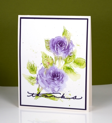
The new scented beauty rose stamp from PB is such a pretty stamp. I have tried a variety of mediums and styles with it so far and will share a few different cards at the end of this post. First let’s talk about this card. Can you believe this is my second video this month? I’m hoping to continue this pattern, but I know I’ve said that before.
I am fairly new to tombow dual brush pens; I bought a few for lettering but recently I added to my collection and started using them for stamping as well. They blend nicely with each other and with water on watercolour paper. For this card I only used two colours but managed to vary the intensity of colour by diluting with water. As is often my habit I didn’t think about the sentiment until the end and felt that a stamped sentiment messed up the balance of the design too much. Instead I settled on one of the thinnest die-cut sentiments I have which stretched across the base of the card keeping things balanced left to right but maybe a little bottom heavy!
I used tombow dual brush pens in the video but you could use stamp pads or distress markers for similar results.
Supplies:
Stamps: Scented Beauty (PB)
Dies: Many Thanks
Inks: Light Olive-126, Dark Plum-679 Dual Brush pens (Tombow)
Cardstock: Fabriano 100% cotton hot pressed watercolour paper, olive green cardstock
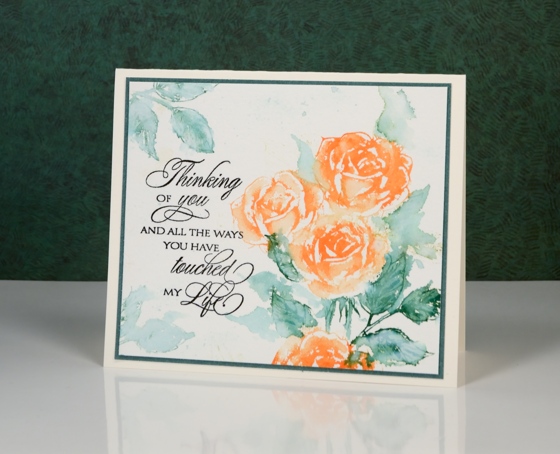
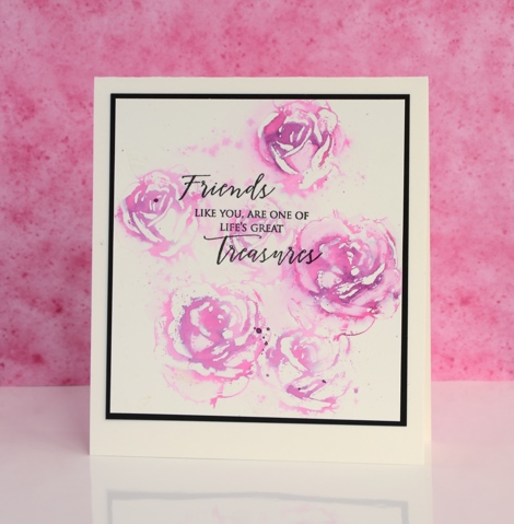
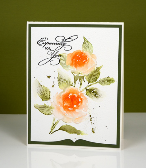
Below are a few more cards featuring ‘Scented Beauty’. The technique is similar to that shown in the video but with different mediums. I varied the amount of water added and did not always ink the whole stamp.
Supplies:
Stamps: Scented Beauty, Treasured Sentiments (PB)
Inks: Dried Marigold, Pine Needles distress stain (Ranger)
Cardstock: Fabriano 100% cotton cold pressed watercolour paper,green cardstock
Supplies:
Stamps: Scented Beauty, Treasured Sentiments (PB)
Inks: Picked raspberry distress marker (Ranger) Versafine onyx black (Tsukineko)
Cardstock: Fabriano 100% cotton cold pressed watercolour paper, black cardstock
Supplies:
Stamps: Scented Beauty, Treasured Sentiments (PB)
Inks: Mowed Lawn, Ripe Persimmon, Spiced Marmalade, Forest Moss, Spun Sugar, Weathered wood distress stains (Ranger)
Cardstock: Fabriano 100% cotton cold pressed watercolour paper, purple cardstock
Folk Flower
Posted: May 17, 2016 Filed under: Alcohol Ink, CAS, folk flower | Tags: Penny Black creative dies, Penny Black stamps, Ranger Alcohol Ink 7 Comments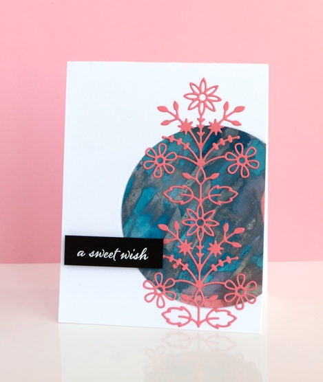
Having so many alcohol ink experiments on hand is helping with my resolve to try new layouts and sketches. The colours and patterns that appear almost magically when working with alcohol inks need little or no adornment. This panel was mainly aqua with some splotches of coral pink here and there until I added silver and scraped it across the panel with the coffee stirrer. I ended up with the rock formation style patterns which were kind of cool but the silver had taken over.
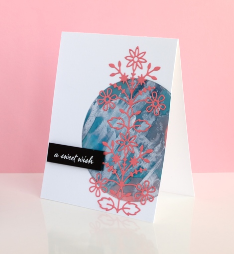
I played around with several ideas for using the panel including tossing it but finally settled on a layout inspired by this card on JJ Bolton’s blog. I chose the coral coloured cardstock for the die cut to bring out the few patches on the panel. The assembly of this layout did not go smoothly for me, (there is more than one reason I stick to the portrait gallery layout!) I cut a piece of light weight cardstock to stick behind the circle to keep everything together. When I ran my finger over the edge of the circle to press it firmly onto the backing, the silver ink smudged onto my clean white card base. I managed to transfer silver ink via my die cutting plates also. The metallic alcohol inks sit on the surface and therefore need some sort of fixative; (I have watched a tutorial about this just haven’t looked into whether I have the right fixative) Rather than make the same mistake three times I decided to polish the patterned circle with a paper towel as someone had done successfully in class to see how much silver would come off. I removed quite a bit which revealed more aqua and left the panel less smudgy. The rest of the assembly was more straight forward; I used ‘stick it’ adhesive on the back of the folk flower die cut and embossed the sentiment on black cardstock for contrast.
When I visited JJ Bolton’s blog to look at her card layout I read about the clever wax crayon technique she used on her card…something to try another day.
Supplies:
Stamps: Happy Snippets (PB)
Dies: Folk Flower (PB)
Ink: Alcohol inks, Versafine ink (Ranger)
Paper: glossy photo paper, Neenah Epic Black 100lb cardstock, Neenah solar white cardstock, coral cardstock
Also: stick it adhesive, white embossing powder
Blue bird houses
Posted: May 16, 2016 Filed under: Good neighbours | Tags: Penny Black creative dies, Penny Black stamps, Ranger Distress stains, Tsukineko Versafine inks 13 Comments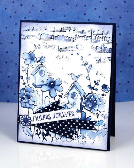
It’s all about blue on my card today. I used chipped sapphire distress ink for all but the sentiment and managed to get different blues by diluting some areas more than others. I inked the stamp with distress stain which made the print very juicy and perfect for the watercolour effect. I used a wet paintbrush to pull the colour in from the stamped outline. I also stamped the music in chipped sapphire ink and splattered a few drops of water to soften the notes and staff. To frame the panel I sponged around the edges. I stamped the sentiment in versafine majestic blue because versafine does sentiments so very nicely. I had some polka dot ribbon on hand so cut the sentiment strip and ribbon ends to match and layered them with a die cut flower on top.
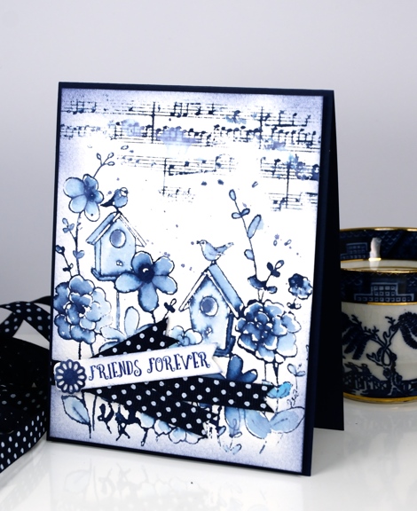
The colour scheme reminded me of the willow pattern china bowl my mother often used for fruit salad (probably still does) I wasn’t sure whether I owned any willow pattern but I checked my tea cups and saucers and found one which I popped in the background of the second photo.
Supplies:
Stamps: Good Neighbors, Happy Snippets, Footnotes (PB)
Dies: Layered Flower (PB)
Inks: Chipped Sapphire distress stain and ink (Ranger) Majestic Blue Versafine ink
Cardstock: Fabriano 100% cotton cold pressed watercolour paper, Neenah patriot blue cardstock
Also: Polka dot ribbon
Alcohol ink backgrounds
Posted: May 14, 2016 Filed under: Alcohol Ink, In the Garden, Love Art, Serenity | Tags: Penny Black creative dies, Penny Black stamps, Ranger Alcohol Ink 2 Comments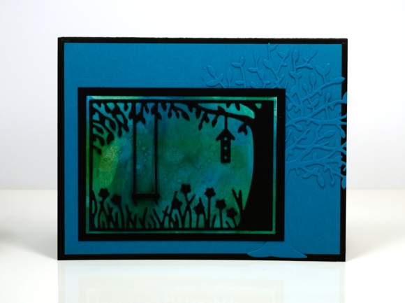
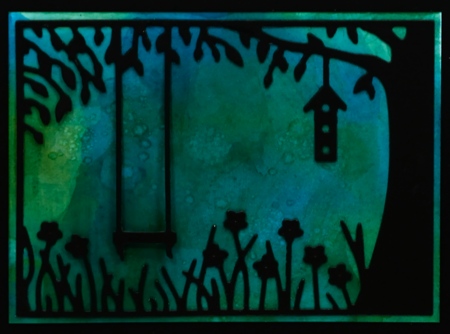
Yesterday I shared some alcohol ink abstract panels; today I have more abstract panels but these ones have become backgrounds for dies or stamps. The one above looked so forest-like I had to pair it with trees. It is a fairly dark mix of colour so I think it must be dusk or dawn. The ‘in the garden’ die was perfect for turning the blue-green panel into a scene and the new ‘serenity’ tree die just added to the woodland feel.
Supplies:
Dies: Serenity, In the Garden (PB)
Ink: Alcohol inks (Ranger)
Paper: glossy photo paper, Neenah Epic Black 100lb cardstock, blue cardstock
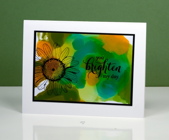
The colours in this panel again determined what I would add. Orange, yellow and green patterns seem an appropriate background for a daisy. I used archival ink which gave a crisp fast drying print. There was another card made from this background but I made the mistake of laying a stamp on top of the panel for positioning before inking the stamp. The natural stickiness of the stamp on the glossy paper lifted the surface off the paper removing the alcohol ink (not in a cool resist type way!). It didn’t happen on the daisy card because I just inked, stamped and hoped for the best.
Supplies:
Stamps: Love Art, Special Thoughts (PB)
Ink: Alcohol inks, Jet black archival ink (Ranger)
Paper: glossy photo paper, Neenah Epic Black 100lb cardstock, Neenah solar white cardstock
Layouts and sketches
Posted: May 6, 2016 Filed under: Alcohol Ink, CAS, Dies | Tags: CAS, Penny Black creative dies, Penny Black stamps, Ranger Alcohol Ink 7 Comments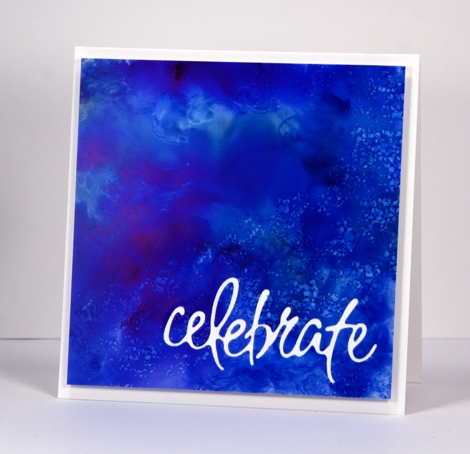
Recently I noticed how often my card designs involve a simple square or rectangle. Sometimes the panel is matted in black or a co-ordinating colour; other times it is popped up on the card base which creates a type of shadow mat. A matted panel with little embellishment is my most used layout. I’m not saying there is anything wrong with the matted panel approach; I often try to create a mini painting so framing it seems like an appropriate way to turn it into a card. However, there are many clever card makers who never default to the square or rectangular layout; each new card features angles, diagonal lines, curves, cutouts and all manner of creative designs. I’ve decided I need to mix things up a little in the sketch and layout area. Take the card above for example, the alcohol ink design reminded me of the ocean from beneath the surface with light above and bubbles all around. I really didn’t want to loose much of the blue pattern so I cut the sentiment out of the blue panel and popped it up. I like how it turned out but it was very much my usual style.
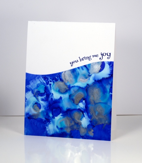
When I put this next card together I was working with a similar panel; the alcohol inks had done cool things creating a pattern I wanted to save if possible but not in yet another rectangular layout. By cutting a curve across the patterned yupo panel I was able to add some interest and bend a transparent sentiment stamp to hug the curve.

Once again I wanted to retain most of this warm toned alcohol ink design so I chose a cool new border die with curves that created a contrast with the angles of the stenciled pattern.
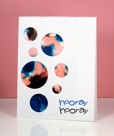
I have a board on pinterest where I am saving inspiration for new layouts. The card above was inspired by Paula Dobson’s bright happy card, pinned recently. Sketch challenges are another source of inspiration I hope to make use of more often. You may have noticed all the cards in this post were made from patterned panels, which of course, are easier to adapt to interesting layouts than pictures of real things! I may get adventurous and creative with my scenic or floral panels too, who knows?
Supplies:
Dies: Celebrations, Border Edges (PB)
Stamps: Happy Snippets, Sweet Wishes
Ink: Alcohol inks (Ranger) Versafine inks (Tsukineko)
Paper: Yupo paper, Neenah SolarWhite 110lb cardstock, Neenah Natural white cardstock












