
Folk Flower
Posted: May 17, 2016 Filed under: Alcohol Ink, CAS, folk flower | Tags: Penny Black creative dies, Penny Black stamps, Ranger Alcohol Ink 7 Comments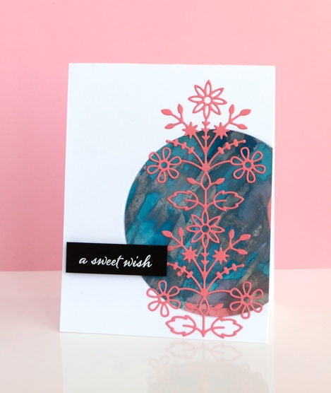
Having so many alcohol ink experiments on hand is helping with my resolve to try new layouts and sketches. The colours and patterns that appear almost magically when working with alcohol inks need little or no adornment. This panel was mainly aqua with some splotches of coral pink here and there until I added silver and scraped it across the panel with the coffee stirrer. I ended up with the rock formation style patterns which were kind of cool but the silver had taken over.
I played around with several ideas for using the panel including tossing it but finally settled on a layout inspired by this card on JJ Bolton’s blog. I chose the coral coloured cardstock for the die cut to bring out the few patches on the panel. The assembly of this layout did not go smoothly for me, (there is more than one reason I stick to the portrait gallery layout!) I cut a piece of light weight cardstock to stick behind the circle to keep everything together. When I ran my finger over the edge of the circle to press it firmly onto the backing, the silver ink smudged onto my clean white card base. I managed to transfer silver ink via my die cutting plates also. The metallic alcohol inks sit on the surface and therefore need some sort of fixative; (I have watched a tutorial about this just haven’t looked into whether I have the right fixative) Rather than make the same mistake three times I decided to polish the patterned circle with a paper towel as someone had done successfully in class to see how much silver would come off. I removed quite a bit which revealed more aqua and left the panel less smudgy. The rest of the assembly was more straight forward; I used ‘stick it’ adhesive on the back of the folk flower die cut and embossed the sentiment on black cardstock for contrast.
When I visited JJ Bolton’s blog to look at her card layout I read about the clever wax crayon technique she used on her card…something to try another day.
Supplies:
Stamps: Happy Snippets (PB)
Dies: Folk Flower (PB)
Ink: Alcohol inks, Versafine ink (Ranger)
Paper: glossy photo paper, Neenah Epic Black 100lb cardstock, Neenah solar white cardstock, coral cardstock
Also: stick it adhesive, white embossing powder


The only technique I’ve used my alcohol inks for is the polished stone technique, which I really like. I love using the metallic mixatives in that technique and I’ve never had a problem with them not drying. Thanks for the warning about adding them later on top of the alcohol inks. Don’t think I’ll be trying that since I’m a messy Molly! LOL!! I like how you used the alcohol ink panel on this card. Like you, I need to branch out and try different layouts on my cards more often. I seem to do that when I allow myself time to play around with the card design. But, more often than not, I’m in a hurry to complete a card and find myself returning back to my comfort zone.
I need to look up the polished stone technique, now that I have the inks on hand. Yes the comfort zone is where I often find myself when putting my cards together but I am having fun with the many layouts featured on other people’s blogs.
The intricate coral die cut looks perfect over the alcohol ink circle. Good for you for persevering when the silver was trying to convince you to give up. 😉
You are giving me so many ideas to try! This card is very pretty. Thanks for sharing your “learnings” !
It’s so good you didn’t give up and found a way to make it work cause the end result is fabulous! The delicate die cut looks gorgeous on the alcohol ink background! xxx
What a unique & beautiful card, Heather!
This looks really pretty with the die cut over the top Heather and a fabulous design! x