
Pink Berries
Posted: December 11, 2015 Filed under: Berry Bevy | Tags: Penny Black creative dies, Penny Black stamps, Ranger Distress stains, Tsukineko Memento inks 4 Comments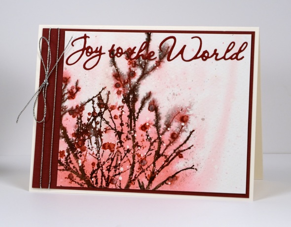
I usually end up with at least a couple of pink Christmas cards along with all the blue and green ones I make. What is your favourite colour combo for Christmas cards?
I began this card by splattering some drops of masking fluid on cold pressed watercolour paper. I am using more cold pressed these days to add a little texture to designs. Once the masking fluid was dry I wet the panel and stamped the ‘berry bevy’ stamp onto the panel in spun sugar and worn lipstick distress stains. The stain spread out to give me the background colour. I inked the stamp with both brown and burgandy for the branches and berries and spritzed to make the ink bleed in a few places. I used a paintbrush and some micro pearl powder mixed with burgandy ink to fill in the berries so some of them have a little shimmer. To finish off the card I found a matching piece of cardstock, cut a mat and a sentiment and added silver cord as the final touch.
Thanks for dropping by today.
Supplies:
Stamps: Berry Bevy (PB)
Dies: World of wishes (PB)
Inks: Worn Lipstick, Spun Sugar distress stains (Ranger) Espresso Truffle, Rhubarb Stalk Memento markers (Tsukineko)
Cardstock: Fabriano 100% cotton hot pressed watercolour paper, Burgandy textured cardstock
Also: silver cord, masking fluid, micro pearl powder
Stamping the stories: Peter Pan
Posted: December 2, 2015 Filed under: Pirates | Tags: Fabriano Watercolour Paper, Kuretake Gansai Tambi watercolour paints, Penny Black creative dies, Penny Black stamps, Tsukineko Versafine inks 11 Comments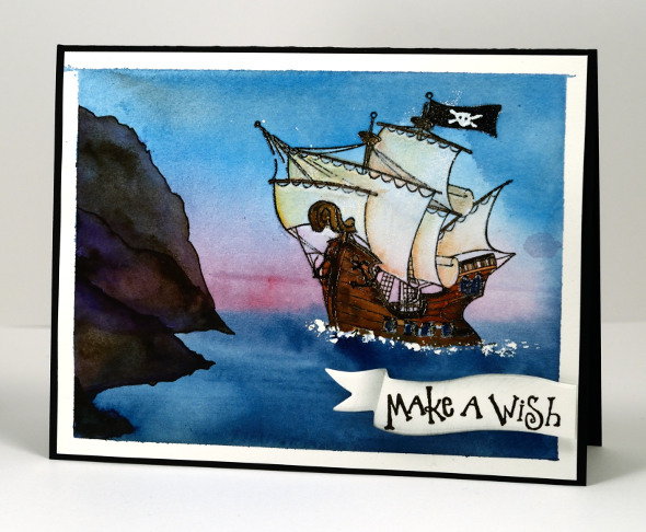
I am continuing the journey through imaginative books and stopping in Neverland today. When I was creating cards for the challenge I had to make sure there was a scene or setting from the book I could stamp or paint with some success. In thinking about Peter Pan, a story I enjoyed as a child and read to my children, I remembered this pirate ship stamp and pulled it out for the first time. I also pulled out one of my copies of Peter Pan for inspiration, the one illustrated by the incredibly talented Michael Hague.
To create this scene I painted some masking fluid where the waves would be then embossed the ship in black. I used watercolour paints to paint the sea, sky and cliffs then concentrated on the ship using paints then watercolour pencils for some finer details at the end. The sentiment is stamped on a die cut banner then trimmed and popped up over the panel.
After creating all my ‘story book’ cards I realised the books I chose were all made into movies. Perhaps that is a sign of a good story? I know I loved the books first and sometimes enjoyed the movies later on. It was the whimsical parts of Peter Pan that appealed to me, Wendy sewing on Peter’s shadow, the dog being their Nanna (although I did not get that as a child!?) and a ticking crocodile!
Supplies:
Stamps: Pirates, Sweet Wishes (PB)
Inks: Versafine Onyx Black (ImagineCrafts/Tsukineko)
Cardstock: Fabriano 100% cotton hot pressed watercolour paper, Neenah Epic Black cardstock
Dies: Triple Banner (PB)
Also: Gansai Tambi paints, masking fluid
Stamping the stories: Lord of the Rings
Posted: December 1, 2015 Filed under: Butterfly Party, Fantasy, Leaflets, Splendor, Stamped Landscapes | Tags: Kuretake Gansai Tambi watercolour paints, Penny Black creative dies, Penny Black stamps, Tsukineko Memento inks 17 Comments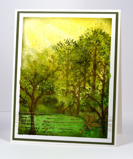
I don’t understand it but none of my children seem to have inherited my love for ‘The Lord of the Rings’ trilogy and ‘The Hobbit’. I think they all read the latter but I am not sure that any of them finished all three LOTR. I have read them several times and thoroughly enjoyed them so when challenged with a fantasy and imagination theme the delightful forest of Lothlórien came to mind. I pulled out some tree stamps, some green inks and gold thread to create a representation of the magical forest realm of the elves in middle earth.
I used some sponging for the golden light of the sky, painting and stamping for the trees and grass and a little gold die cut popped up on gold thread as an embellishment. I stamped some of the trees wet into wet to create some misty atmosphere but added some more defined stamping once the paper dried. I think the little bit of script helps give the middle earth look. The speckled look is from a fine splatter of masking fluid applied before I started and removed once all the paint and ink were dry.
Have you read any JRR Tolkien? Are you a fan? What about the movies? Years ago my husband and I were watching ‘The Fellowship of the Ring”; we did not know one of our girls was still awake in next room. All she could hear was music then battle sounds, then talk, then battle sounds over and over. She finally asked us to turn it down; it was too scary to listen to. Poor thing. The movies are a whole lot of walk, talk, walk, fight, fight, fight, walk, talk, walk, fight, fight…
Supplies:
Stamps: Splendor, Fantasy, Butterfly Party (PB)
Inks: Rich Cocoa, Bamboo Leaves, Espresso Truffle, Pear Tart, Olive Grove(ImagineCrafts/Tsukineko)
Cardstock: Fabriano 100% cotton hot pressed watercolour paper, green cardstock, Neenah natural white
Dies: Leaflets (PB)
Also: Gansai Tambi paints, gold embroidery thread, masking fluid
Imagine
Posted: November 30, 2015 Filed under: Soft Wings | Tags: Fabriano Watercolour Paper, Kuretake Gansai Tambi watercolour paints, Penny Black creative dies, Penny Black stamps 8 Comments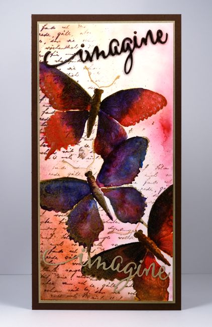
Many of you are familiar with the fabulous online stamping community ‘Splitcoaststampers‘. I have been a member for years and have appreciated the wealth of resources provided and the warm interaction and encouragement of the members. I was honoured to be invited at the beginning of this year to be a member of the Splitcoast design team, The Dirty Dozen. While a ‘Dirty Girl’ I was tasked with creating six projects each month inspired by a monthly theme. Back in April these projects were for fan club members only. It is one of the ways Splitcoast says thank you to fan club members for their financial support. Splitcoast membership is free but by paying a yearly subscription to the fan club you enjoy more resources and privileges while contributing to the running costs.
I was thrilled to be asked to join the ‘Dirty Dozen’ but I was a little apprehensive about thinking up a bunch of projects each month on a set theme. Themed challenges have a way of freezing up my creative juices! But a challenge is meant to be just that, a challenge and the results can be surprising. I met each challenge and was so happy to be taken outside my comfort zone. Each month I was blown away by the projects created by the rest of the team.
I enjoyed all the months but my favourite ended up being the ‘Imagine that’ challenge. I have turned the projects from that month into a story book week here on my blog. I’ll be back tomorrow with the first story book inspired card.
Supplies:
Stamps: Soft Wings, Letter background (PB)
Dies: Envision (PB)
Inks: Versamark, Rich Cocoa (Tsukineko)
Cardstock: Fabriano 100% cotton hotpressed watercolour paper, gold cardstock, brown cardstock
Also:Water colour with Gansai Tambi paints, gold embossing powder
Stamping the Seasons: Spring
Posted: November 19, 2015 Filed under: Flower tags, Joy to All, Stamped Landscapes | Tags: Brusho, Canson watercolour paper, Penny Black creative dies, Penny Black stamps 9 Comments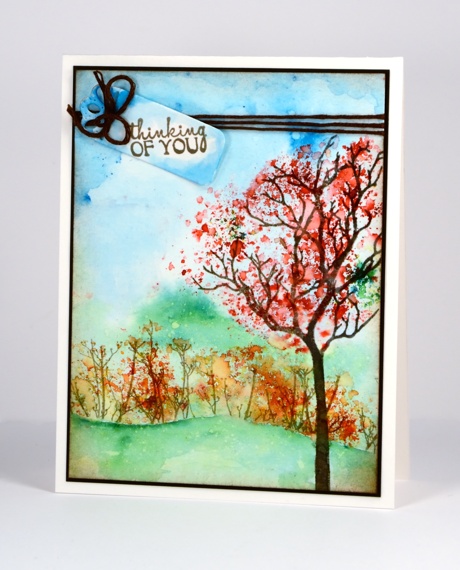
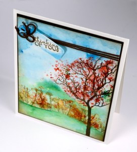
I am back as with a spring card today using the same stamp set as yesterday, Joy to All. Some of my process was the same as for my winter scene but I definitely changed my colour palette. The muted tones of bister powder worked well for yesterday’s chilly scene but the spring scene required the brighter brusho tones.
I began by taping the watercolour panel down then painted water over the whole area. I sprinkled blue and green powder over the wet panel and moved it around with a paint brush until I had a soft background with clouds and trees suggested. Next I stamped the tree in a pigment ink and masked the area around the branches so I could sprinkle red powder over the branches without getting it on the rest of the scene. I spritzed over the powder and watched the grains transform into blossom.
I cut a hill shaped mask which I positioned across the bottom of the panel then stamped the twig stamp to create some flowering bushes with orange brusho. I removed the mask and darkened the edge of the hill with a paint brush and some green brusho mixed with water. I spritzed a fine mist of water over the panel which resulted in some little spots of lighter colour here and there.
To complete the card I added a brown mat and some brown thread to tie a tag stamped and painted to match the sky.
Supplies:
Stamps: Joy to All, A bunch (PB)
Dies: Flower tags
Inks: Versafine vintage sepia (ImagineCrafts/Tsukineko)
Cardstock: Canson 100% cotton hot pressed watercolour paper, dark brown cardstock
Also: Brusho watercolour powder , brown embroidery thread
Bister landscape
Posted: November 2, 2015 Filed under: Bister, In the winter | Tags: Bister, Penny Black creative dies 11 Comments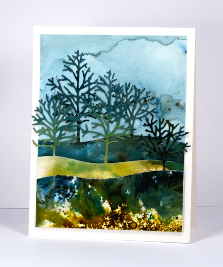
If your creating goes anything like mine you probably end up with multiple experiments scattered across your work space. After playing with bister, the green, blue and yellow powders in particular, I ended up with three extra panels, some dark, some light. The patterns and colours just called out to be made into a landscape using the new triple tree die from Penny Black. The die is called ‘in the winter’ but I know it is going to be handy all year round. I die cut the same hillside of trees from each panel then snipped off the trees I didn’t need so I could have the distant trees peeping out between the mid ground trees. I painted a new panel for the sky using just blue bister which I diluted so the trees would stand out against it.
Now that I have used up those stray scraps of bistered beauty; it’s time to play with some brusho. Stay tuned.
Supplies:
Dies: In the winter (PB)
Inks: Bister
Cardstock: Hot & Cold Pressed Canson
Stencilled Trees
Posted: October 29, 2015 Filed under: Nature's Beauty, Tiny Tree | Tags: Penny Black creative dies, Tsukineko Memento inks 6 Comments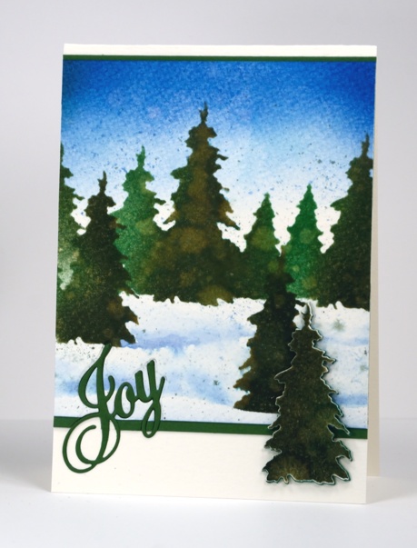
You know I have said before, ‘You can never have too many tree stamps!’ Well if you find yourself running short you can always make a few tree stencils to help you through that difficult time. I was happy to see some new tree dies in the latest release from Penny Black and decided to make my own stencil by die-cutting a row of trees using two different sized tree dies.
I used a piece of Plaid stencil plastic and cut a row of trees with the die from ‘Nature’s Beauty’ set and a smaller tree from the ‘Tiny Tree‘ set. I sponged a gradated sky with two blue inks then sponged two greens through the stencil. I was going to spritz the images quite generously to make the colours bleed together but I decided to stop after a couple of spritzes because the watermarks and texture from the paper already looked interesting. I diecut a single tree from the stencil plastic also so I could sponge isolated trees then painted the shadows of the snow drifts around them. The foreground tree was sponged and spritzed the same way then die cut and popped up on some die cut fun foam for added dimension.
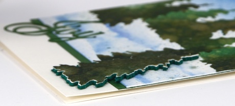
I decided to inlay the word Joy which was not a brilliant idea because I had already attached the thick watercolour paper to the green cardstock mat and die cutting an intricate word ended up being rather tricky.
Supplies:
Dies: Nature’s Beauty, Tiny Tree, Greetings (PB)
Inks: Memento Northern Pine, Cottage Ivy, Summer Sky, Danube Blue (Imagine Craft/Tsukineko)
Cardstock: Cold Pressed Canson, Green cardstock
Also: fun foam, Plaid stencil blank
Snowy Stamping
Posted: October 26, 2015 Filed under: Snow time, Winter moments | Tags: Penny Black creative dies, Penny Black stamps, Tsukineko Memento inks 8 Comments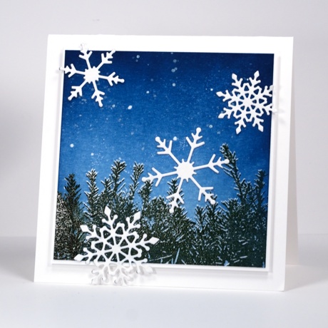
Last week Penny Black released ‘Winter Romance’, a sweet new collection of snowy stamps and dies. I have featured both a new stamp and a fresh die sets on today’s card. I chose to use a technique I haven’t done in a while to make a crisp wintry scene. If you look closely you can see a dusting of snow on top of the hedge. To create this look you need a stamp positioning tool. I used the MISTI (of course) but when I first dreamed up this technique I used a stamp-a-ma-jig.
I stamped the hedge first in versamark on white cardstock then, with the help of the MISTI I stamped the hedge again ever-so-slightly lower in green ink. Next I embossed the hedge with clear powder. I brayered the sky with two blue inks, first the lighter ‘Summer Sky’ then the darker ‘Nautical Blue’. The embossed hedge resisted the ink revealing the fine snowy edge. I splattered white wink of stella over the sky to look like snow or stars then added the four snowflakes cut with the new ‘snow time’ set.
Supplies:
Stamps: Winter moments (PB)
Dies: Snow Time (PB)
Inks: Versamark, Memento Northern Pine, Summer Sky, Nautical Blue (Imagine Craft/Tsukineko)
Markers: White Wink of Stella (Kuretake)
Cardstock: Neenah Solar White 110lb
Also: clear embossing powder
Upcoming Classes
Posted: October 25, 2015 Filed under: Classes | Tags: Classes, Penny Black creative dies, Penny Black stamps, Tsukineko Memento inks 10 CommentsI am teaching at three locations in November so I thought I would let you know just in case you happen to be in the right place to join me.
Studio BBG in Montreal
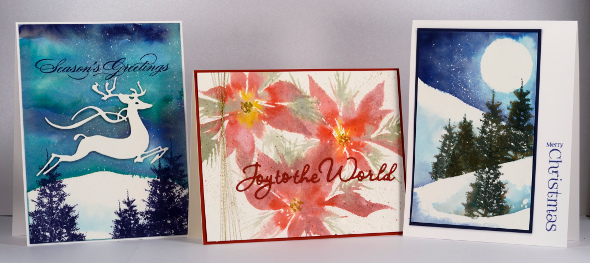
On Saturday, November 7th at 10:00am I will be teaching Winter Watercolours (contact store for details)
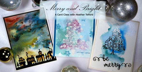
On Saturday, November 7th at 2:00pm I will be teaching Merry & Bright (contact store for details)
Crop A While in Orleans
On Thursday, November 12th at 6:00pm and Friday, November 13th at 12:30pm I will be teaching Woodland Watercolours (contact store for details)

Riverside Drive in Ottawa
On Saturday, November 14th at 1:00pm and Monday, November 16th at 1:00pm I will be teaching Woodland Watercolours (click here for details)
Warm toned leaves
Posted: October 16, 2015 Filed under: Bister, Lush & Lavish | Tags: Bister, Fabriano Watercolour Paper, Penny Black creative dies, Penny Black stamps, Ranger Distress stains 4 Comments
Here are the warm toned leaves I promised in contrast to the cool toned ones I posted a few days ago. Ottawa is enjoying fabulous colours this year; the yellows appeared first but now the orange and reds have joined in and they really are amazing.
Today’s loose and somewhat messy card reminds me of a leaf pile; we have had some pretty impressive ones over the years. Once again I created my panel in a couple of layers, starting with some orange toned leaves stamped onto wet watercolour paper. The leaf images bled in all directions creating the blurry shapes you see in the background. When they were dry I stamped with reds and browns and used a brush to fill in the leaves. I also sprinkled brown bister which ended up separating into black and brown with a few red and blue spots as well. When it was all dry I splattered some gold dots over the panel with a wink of luna pen. To complete the card I cut the ‘thank you’ sentiment out of both the panel and a piece of red cardstock so I could do an inlay to match the mat.
Are you raking leaves or have you yet to start like us?
Supplies
Stamps: Lush & Lavish (Penny Black)
Dies: Stylish Gratitude (Penny Black)
Inks: Rusty Hinge, Mustard Seed, Spiced Marmalade, Barn Door distress stains (Ranger)
Cardstock:Fabriano hot pressed 100% cotton hot pressed watercolour paper
Also: Gold wink of luna pen, brown bister powder












