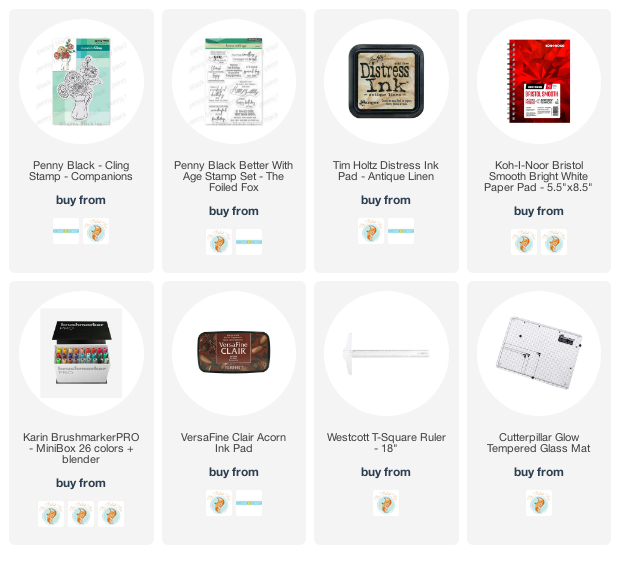
Holly Leaves – framed
Posted: December 12, 2023 Filed under: Echidna Studios, holly leaves, Karin brushmarkers | Tags: Echidna Studios, Fabriano Watercolour Paper, Karin brushmarkers, Penny Black stamps, sennelier watercolours 1 Comment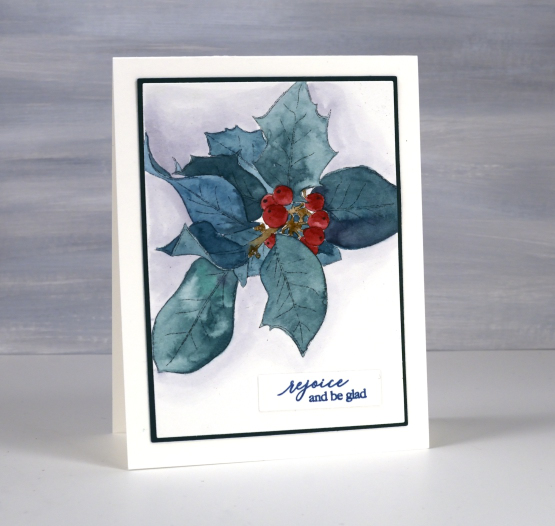
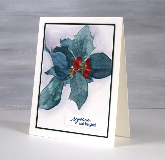
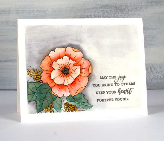
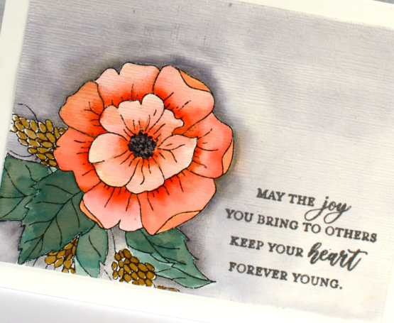
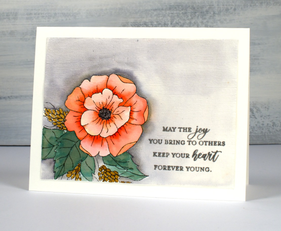
This is my second pair of cards featuring the new ‘holly leaves‘ digital stamp set from Echidna Studios. In an earlier post I shared the foiled cards which were overfoiled by accident but came out looking very shimmery and still accepted watercolour. For today’s cards I printed the holly images larger and didn’t foil them. I once again used Fabriano hot pressed watercolour paper and Sennelier watercolours to paint the two images.
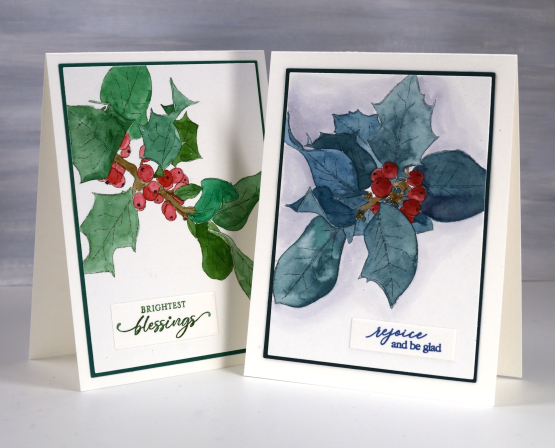
If you remember the foiled post you might notice I made the same colour choices, an unrealistic blue-green and a more realistic green-green! A little hint if you are painting berries, it is always nice to have a darker and a lighter side to suggest dimension but even without that a little black or white dot can make them immediately more realistic.
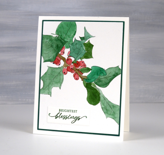
I chose to mat these panels and found a suitable blue green but ended up blending mowed lawn distress ink over a piece of light green cardstock to create a matching green for the card above. Blending ink to create matching mats is something Ardyth does all them time. She is full of clever strategies. I chose to add a shadowy background around the blue-green leaves using a grey Karin marker and water to dilute and spread the ink. The sentiments are from PB ‘jolly snippets‘ and ‘light of Christmas‘ sets.
Today’s post features affiliate links to The Foiled Fox. If you buy through these links I receive a small commission at no extra cost to you.
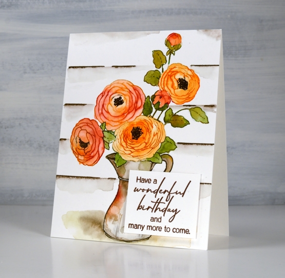
Purple Potted Pretties
Posted: August 15, 2023 Filed under: Karin brushmarkers, Penny Black, potted pretties | Tags: Karin brushmarkers, Penny Black stamps 13 Comments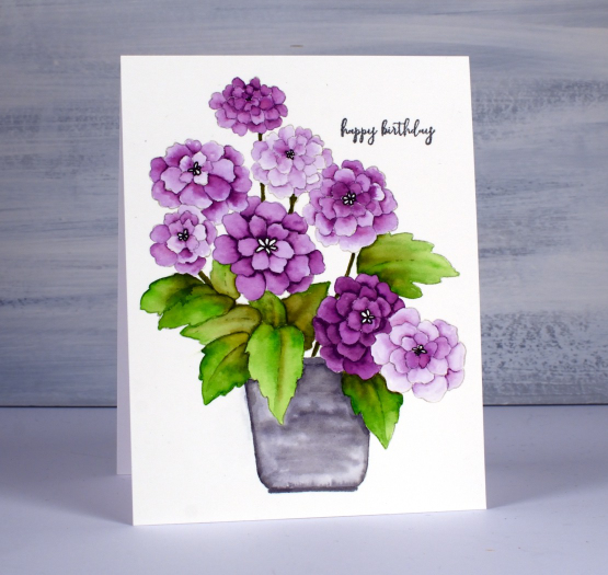
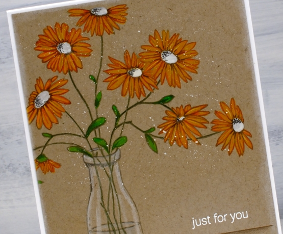
The first time I coloured this sweet stamp, potted pretties I used pencils on kraft cardstock but I knew it had to also be watercoloured. I was very happy to be able to get such a range of depth on the petals with just one watercolour marker.
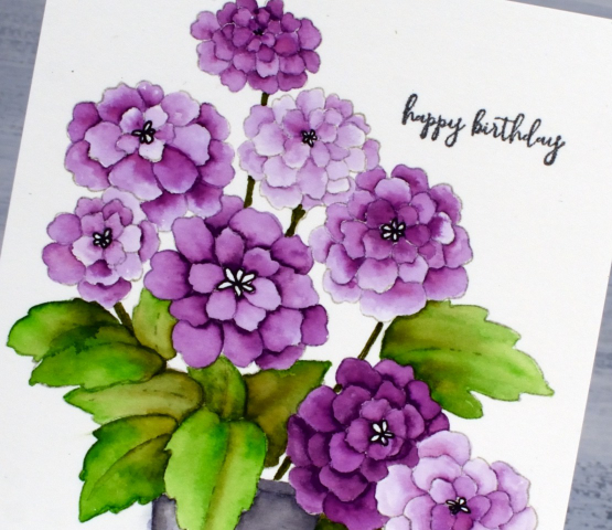
I worked on hot pressed watercolour paper and used four different markers from the Karin Brushmarker set of 26. For the petals I used one of the purples and had water and a brush handy to blend the ink. I put a few dots of ink from the purple marker at the narrow point of each petal then blended the ink to fill the petal. For a dark petal I laid down more ink initially, for the paler petals I sometimes used only the diluted ink left in the paintbrush.
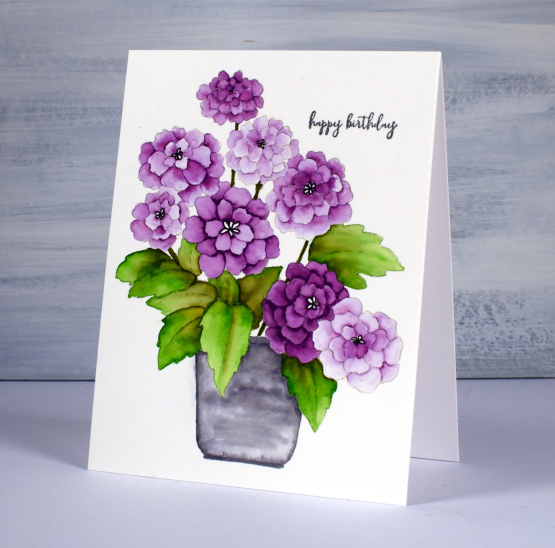
You can probably see the leaves are a mix of a bright green and an olive green and I coloured the pot with blended grey ink. I added a sentiment in black from the PB ‘how sweet’ set and used a black gel pen to define the centres of the flowers.
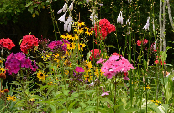
Here are a few of the flowers I’ve been enjoying in my own garden. They get hit by rain then they bounce back up again. Mostly…
Bud & Bloom
Posted: March 16, 2023 Filed under: bud & bloom, Echidna Studios, Karin brushmarkers | Tags: Echidna Studios, Fabriano Watercolour Paper, Karin brushmarkers, Penny Black stamps 8 Comments
More flowers on the blog as we get more snow on the ground! The trio of flowers on the card above and the single bloom on the card further down the page are both digital stamps from the ‘bud and bloom‘ set available from Echidna Studios. I printed them on hot pressed watercolour paper then used Karin brushmarkers to add colour.
I haven’t used my Karin markers in a while but there are still as juicy as ever so a little ink goes a long way. I have seen the Karin markers used direct to paper, then blended with water and also scribbled onto a glass mat or palette then picked up with a brush. In the past I have tended to apply directly to my watercolour paper or directly on a stamp. This time I scribbled the markers onto my glass mat and blended colours before painting the flowers. I think this gave me more control over the blends. I worked with a yellow, a couple of oranges and a red to come up with the three mixes you see in the card above.
To add a green background to the card above I blended northern pine memento ink (the magic green ink) around the flowers then splattered water droplets over it and dabbed them up with a paper towel.
On the second card with the single bloom I added orange to the soft peach marker, once again picking up ink from a glass mat rather than applying it directly to the paper. While the ink was still wet on the paper I did touch the tip of the orange marker to the areas where I wanted deeper colour and shadow then immediately blended it out towards the ends of the petals. I added a little extra shading on both panels with coloured pencils, a trick I learnt from Kathy Racoosin a colouring wizard!
I used a warm grey marker from my set of 26 colours to add a background with a few spots of very diluted orange here and there. There are three greys in the set, a warm, a cool and a neutral grey. I tried each one on a scrap of watercolour paper before settling on the warm grey. I painted water onto the background then applied the grey ink onto the wet cardstock. I also added texture to this panel with the ‘subtle’ embossing folder which creates a canvas look.
The sentiments on both cards are from the new Penny Black set, ‘delightful day’. I’ve mentioned before one of the bonuses of a digital stamp is that you can print it out whatever size you like. I’ve already printed the trio of flowers image larger on watercolour paper so the flowers will fill the whole panel. I hope to have that one finished to share with you soon.
Hope you have a delightful day whether you are surrounded by snow or flowers!
(Compensated affiliate links from Foiled Fox, Scrap n Stamp & Ecstasy Crafts)

Pencil Daisies
Posted: May 3, 2022 Filed under: Coloured pencil, daisy dream, Karin brushmarkers, springtide | Tags: Faber-Castell Polychromos Colour Pencil, Gouache paints, Karin brushmarkers, Penny Black stamps 8 Comments
When I stamped the PB ‘brilliant’ stamp for my recent pencil poppy card I also stamped several other outline stamps on kraft cardstock for pencil colouring. This stamp is called ‘daisy dream’ and is coloured with Karin pigment decobrush markers, white gouache and Faber-Castell coloured pencils.
In my recent pencil poppies post I referred you to the talented Debby Hughes for a video tutorial about colouring with gouache and coloured pencils. I used some of the same tips for this card but ended up using the Karin pigment brushmarkers as well. I coloured the petals on the flowers above with the gold marker. The effect was very similar to painting gouache first but easier because the marker brush tip did such a good job on those narrow petals. I painted the centres with white and the leaves with the Karin ‘leaf green’ marker before using coloured pencils to add details and shading to the flowers and stems. The glass vase is coloured with a white and two grey pencils.
I added some shading below and behind the vase, a white embossed sentiment and some white gouache splatter before attaching the panel to a white card base.
I now have three daffodils blooming in my garden so there should be at least 47 more coming! I did plant 50 daffodil bulbs a year and a half ago and they are supposed to multiply aren’t they?
Supplies
(Compensated affiliate links used when possible)
Fresh Bouquet
Posted: April 27, 2022 Filed under: fresh bouquet, how sweet, Karin brushmarkers, Penny Black | Tags: Avery Elle, Karin brushmarkers, Penny Black stamps 4 Comments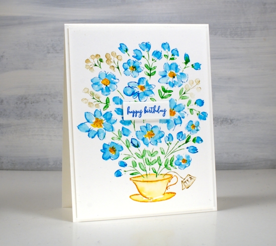
My Karin markers have been a bit neglected lately so I brought them out to work with the cute cup of flowers stamp from the PB ‘fresh bouquet’ set. I worked in a stamp positioner on hot pressed watercolour paper. First I inked the flower centres with the gold marker, next the blue petals with cyan, leaves with grass and berries with rosewood.
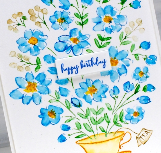
I used a paintbrush and water to pull ink from the stamping to fill the petals and leaves working loosely but taking care not to blend much from one ink to the next. Blue and yellow make green as you know and I didn’t want the petals or centres turning green.
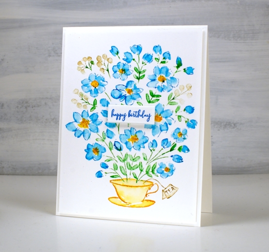
Adding a sentiment was a bit tricky. The cup of flowers stamp comes with a large and lovely sentiment but it would have covered too many flowers. I need birthday cards at present so I stamped the little ‘happy birthday’ from the PB ‘how sweet’ set in paradise versafine clair ink and then wondered where to place it. It is rare that I will place a sentiment right in the middle of a card but it just seemed to work this time.
I have some beautiful tea cups, some from my mother, my nanna and my grandma. I rarely use them because I like a large mug of tea. Perhaps I could occasionally put a few flowers in one, once I have more than two tiny flowers in my garden.
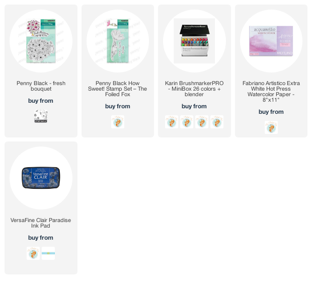
Supplies
(Compensated affiliate links used when possible)
Vintage Candlelight
Posted: December 21, 2021 Filed under: candlelight, Footnotes, Karin brushmarkers, Penny Black | Tags: Fabriano Watercolour Paper, Karin brushmarkers, Penny Black stamps, Ranger Distress inks 5 Comments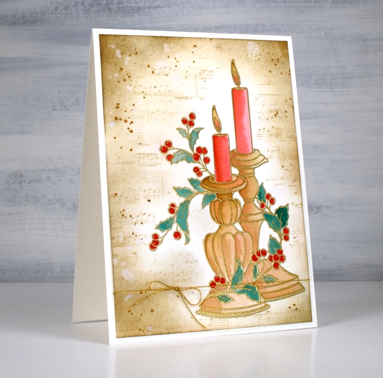
It has been a while since I created a vintage style card but the pretty ‘candlelight’ stamp from Penny Black has worked well for this technique. I embossed the image on hot pressed watercolour paper in gold powder then used Karin brush markers to paint the candles and foliage before switching to distress inks for the background.
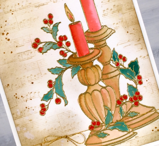
It probably wont surprise you that I used a limited palette for the colouring. I used a mix of red-209 and magenta red-170 to paint the candles, a mix of rosewood-272 and magenta red for the candle sticks, a mix of rosewood and lush green-228 for the leaves and straight red for the berries.
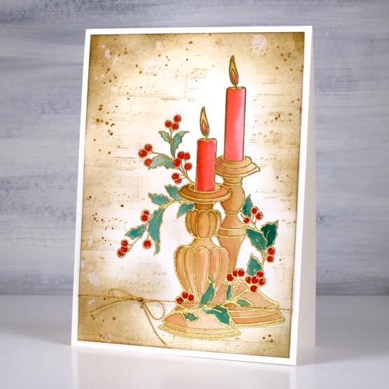
As usual I had not planned my background before I started but the colours on the candlesticks already looked vintage so I blended antique linen around the edges of the panel first then blended right up to the stamping. I stamped the music stamp from the PB set ‘footnotes’ in vintage photo then added more blending and splatter with the same ink. The stamp is tall so the card is A6 (4½” x 6¼”).
As the days are so short right now I am enjoying lighting candles and sometimes the fire. Hope things are cosy where you are.
Supplies
(Compensated affiliate links used when possible)

Merriest
Posted: November 4, 2021 Filed under: Catherine Pooler inks, Karin brushmarkers, merriest, Penny Black, Tutorial, winter branches | Tags: Catherine Pooler inks, Fabriano Watercolour Paper, Karin brushmarkers, Penny Black stamps, Tsukineko Versafine inks 7 Comments
The new ‘Making Spirits Bright’ release from Penny Black is full of beautiful festive foliage. As you know I love working with florals and foliage especially on rubber cling stamps so these new stamps are definitely my thing!
I used Catherine Pooler inks for this design and the colours worked beautifully. I sometimes forget my CP inks, then when I put them to use I remember now juicy and vibrant they are. Take a look at my process below; I have used some of my favourite techniques on this one. (by the way I think I call the release ‘keeping spirits bright’ and the branch stamp fragile beauty instead of ‘winter branches’. Oops)
I know I have been hinting and promising the new class release for the last week. So thanks for your patience; it’s coming, it’s really coming!
I know it’s subtle but one of my favourite things about this card is the muted background, just some pale greens and brown tones with tiny white dots from the masking fluid.
Thanks for dropping by today. I’ll see you again tomorrow.
Supplies
(Compensated affiliate links used when possible)
Scooter
Posted: July 28, 2021 Filed under: Dies, gift card pocket, Karin brushmarkers, Penny Black, puptastic | Tags: Karin brushmarkers, Penny Black creative dies, Penny Black stamps 4 Comments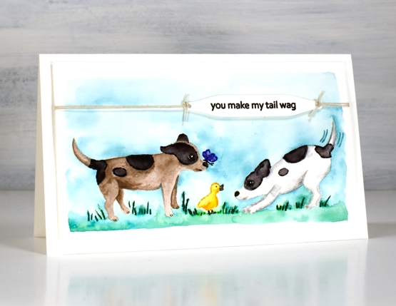
If you have visited the Penny Black blog lately you will have met Scooter; that’s her on the right. The Scooter release features a pup and her friends. The real life Scooter was part of the Penny Black family and now there is a range of stamps featuring her real and imagined activities. Penny Black is donating a portion of the proceeds from Scooter stamp set sales to Muttville a senior dog rescue program.
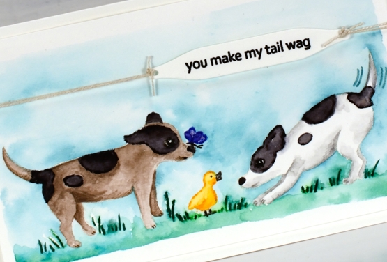
Unaccustomed to painting cute critters like Scooter it took me a while to get in the groove. For this little scene featuring stamps from the Puptastic set I stamped the outline images in papertrey soft stone ink then watercoloured with Karin brushmarkers. The sky and grass is also diluted ink from the Karin markers.
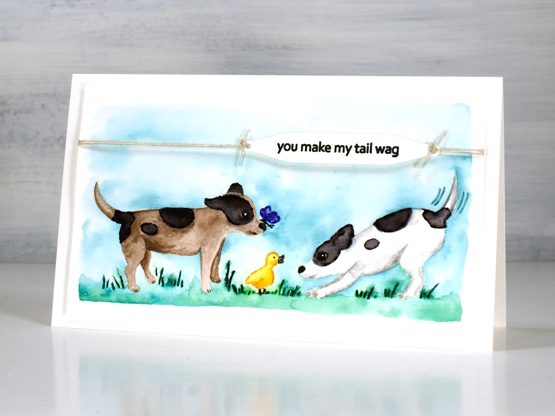
To complete the card I stamped the sentiment from the same set on a label cut with a tag from the PB ‘gift card pocket’ die set, tied it with twine and popped it up on dimensional tape.
Thank you for all your kind words about my garden pics. It really has become a relaxing pastime for me. I think because it is finally under control I can enjoy working on a patch for a short time or strolling around trimming off deadheads. It is no longer just about weeding!
Supplies
(Compensated affiliate links used when possible)
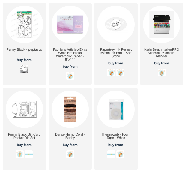
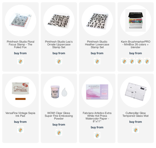
Floral Focus
Posted: June 28, 2021 Filed under: floral focus, Heather lowercase stamp set, Karin brushmarkers, Lea ornate uppercase stamp set, Pink Fresh studio | Tags: Karin brushmarkers, Pink Fresh studio 7 Comments
Hello! I am excited to be sharing this post here and on the Foiled Fox blog today. All this floral beauty is on one stamp from Pink Fresh Studio and it’s called ‘floral focus’. Since it arrived on my work table I’ve tried it with pencil colouring, emboss resist and this Karin brushmarker watercolour technique. I love how bright and summery it looks with these colours.
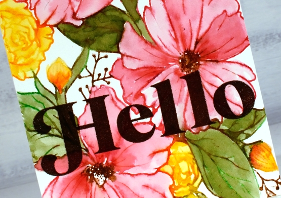
Floral Focus is a large rubber background stamp and rubber stamps are my favourite to work with. I know transparent stamps are great for placement but rubber stamps seem to hold onto their ink better. I will always have both in my collection but I get a little bit excited when I ink the rubber stamps. I used a stamp positioner for this panel and inked the large pink flowers first with magenta red and henna markers. If I get ink on adjacent areas I just wipe it off before stamping. Once stamped I blended the pink ink to fill the petals and restamped the centres in brown to make them a bit bolder. Next I inked the small flowers and buds with the gold brushmarker, then blended with water. For the leaves and stems I inked with both henna and grass markers to get a muted green rather than a bright green. Finallly I did the twiggy bits with the henna marker.
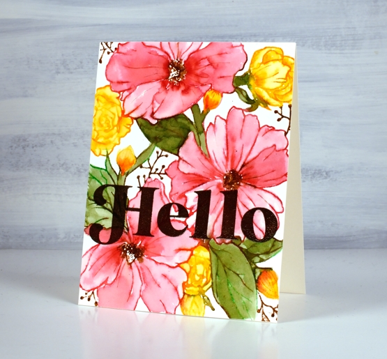
The large letters are from two Pink Fresh studio alphabet sets, the ‘H’ is from Lea’s Ornate uppercase set and the rest of the word from the Heather lowercase set. I stamped several times in versafine vintage sepia then embossed in clear powder for a glossy finish.
Thanks for dropping by today, make sure you visit the Foiled Fox blog for more information and inspiration!
Supplies
(Compensated affiliate links used when possible)
Companions & a winner
Posted: May 24, 2021 Filed under: Classes, companions, Karin brushmarkers, online class, Penny Black | Tags: Karin brushmarkers, online class, Penny Black stamps 5 Comments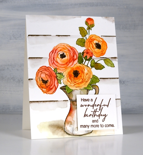
I have a video and a prize winner to share today but first thank you for participating in the giveaway. I really enjoyed reading what your favourite flower stamps are and I’m planning to go back and read through again and feature some of them in upcoming posts. Several of you named stamps that have been on the blog recently, some of which feature in the new online class FLORAL FAVES. Others mentioned older classics which I hadn’t thought about in a while. Dancing Daisies came up several times so I pulled it out and made a sample for the class. But without further ado let me announce the winner of a registration in my new FLORAL FAVES class!
Denise Bryant
Gorgeous card! I love the design and colors! The effect of the layering to frame the design is so pretty!
My favorite flower stamp is Penny Black’s ‘Together’. It reminds me of the agapanthus plants my grandmother grew in her yard.
Congratulations, Denise, I will be in touch by email.
Another stamp mentioned among the favourites was PB companions which features in today’s card.
After watercolouring on bristol cardstock I can recommend it. I wouldn’t choose it over hot pressed watercolour paper but it worked well and is more of a bright white, if you like that for your stamping.
Flowers continue to my focus right now as I proof read for the 15th time and put the finishing touches on the lessons in the FLORAL FAVES class ready for Wednesday (when the lessons will be available). I also planted more flowers in the garden over the weekend. I transplanted the morning glories I grew from seed; they look rather spindly but they started out that way last year and ended up a big success.
Supplies
(Compensated affiliate links used when possible)