
Cosy Cottage
Posted: August 4, 2015 Filed under: Christmas Cottage | Tags: Fabriano Watercolour Paper, Penny Black stamps, Ranger Distress inks 11 Comments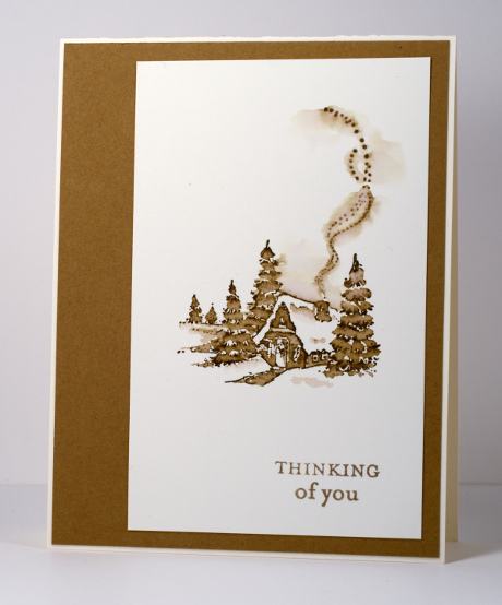
From January to June this year I was honoured to be a member of the Dirty Dozen at Splitcoaststampers. My term on the team is over now but I will forever be a Dirty Dozen Alumni which brings its own opportunities and privileges. Right now there are all sorts of challenges going on especially for fan club members. Alumni have dreamed up wonderful projects and multiple challenges are being released each day.
While I was a member of the Dirty Dozen I created projects with a different theme each month. This is one of the first cards I shared; the theme was “All Cooped Up”. I made it during the bleak midwinter, a far cry from our current hot midsummer! I stamped with one ink then pulled colour from the stamped image with a small paintbrush to fill in the trees, cottage and path. I kept it clean and simple when finishing the card by matching the ink colour exactly with a cardstock mat.
Supplies:
Stamps: Christmas Cottage, Enjoy Life (PB)
Inks: Vintage Photo Distress Stains (Ranger)
Cardstock: Fabriano 100% cotton hot pressed watercolour paper, Neenah Natural White 110lb card stock, Tan cardstock
Color burst poppies
Posted: July 30, 2015 Filed under: Color Burst, poppy pair | Tags: color burst, Fabriano Watercolour Paper, Penny Black creative dies, Penny Black stamps 7 Comments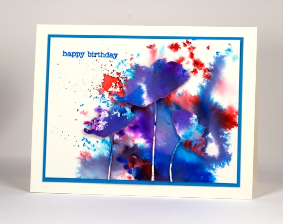
This watercolour powder experiment displays on one card some of the different effects you can get with color burst powders. Depending on how much water you add you can get fine dots of colour or very watery blends of colour. I sprinkled the powder on a piece of watercolour paper and spritzed lightly at one end but more generously at the other. The fine dots must have got hardly any water, the little irregular shapes a bit more water then the purple and blue areas were fairly saturated. All the purples and shades of blue came from only pink and blue powders.
I die cut poppies from the watercoloured panel and some from foam as well then attached them all together with stick it adhesive.
Supplies:
Stamps: Snippets (Penny Black)
Creative dies: Poppy Pair (Penny Black)
Inks: Color burst watercolour powders(Ken Oliver), Salty ocean distress (Ranger)
Cardstock: Fabriano cold pressed watercolour paper
Also: Stick it adhesive sheet (Ken Oliver)
Brusho in the garden
Posted: July 28, 2015 Filed under: Brusho | Tags: Brusho, Fabriano Watercolour Paper, Penny Black creative dies 6 Comments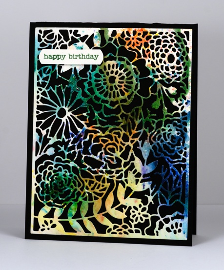
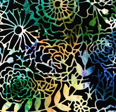
I tried out yet another watercolour powder recently when I got together with some arty crafty friends. Brusho seems to be similar to Color Burst and has a lovely range of bright colours. The panel featured on the card above was cut from one of my first experiments. I sprinkled green, blue, orange and yellow brusho powders on watercolour paper then spritzed and tilted the paper to let the colours blend a little. I did walk away (to eat chips) and let it dry alone. You can see some sections of the paper remained without colour.
The multicoloured panel seemed a good match for the intricate garden die I had not used before now. I tried backing it with green and white but the contrast of the black card base was the most effective.
Supplies:
Stamps: Snippets (Penny Black)
Inks: Brusho watercolour powders
Cardstock: Fabriano cold pressed watercolour paper
Creative die: In the garden (Penny Black)
Poppy Painting
Posted: July 18, 2015 Filed under: Poppy Time | Tags: Bister, color burst, Fabriano Watercolour Paper, Kuretake Zig clean color real brush markers 14 Comments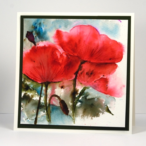
More bister, this time in combination with color burst powder and zig clean color real brush pens. This panel of poppies was almost tossed because at one point it looked a mess. I stamped two poppies using a pink zig pen to ink the stamp. I filled the outline in using both the pen and some pink colour burst powder. I also painted the stems in green but it all looked a bit dull and I wasn’t sure how to add interest. I decided to lose some of the definition by spritzing the whole thing with water. The poppies bled in all directions and it really wasn’t an improvement at all! I set it aside and worked on something else while it dried. When I came back to it I decided to add another partial poppy as well as the bud and seed head. I painted loose leaf shapes and added green and blue bister powder around the bottom and top of the panel. To sharpen the poppy images a little I painted darker colours below the edges and added the veins back in.
Those poppies keep finding their way onto my cards; I don’t know how it happens…
Supplies:
Stamps: Poppy Time (Penny Black)
Inks: Color Burst & Bister watercolour powders
Cardstock: Fabriano cold pressed watercolour paper
Also: Zig clean color real brush markers
Christmas Bister
Posted: June 29, 2015 Filed under: Before the Snow, Bister, CAS, Stamped Landscapes | Tags: Bister, Fabriano Watercolour Paper, Penny Black stamps 22 Comments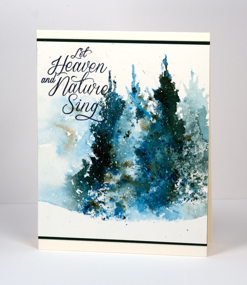
I know it is odd for me to throw a Christmas card up on the blog in June but I had to pair the green and blue bister powders with the beautiful ‘Before the Snow’ tree stamp. After watching the way the bister powders reacted in water I wanted to see if I could stamp an image with water then drop some powder onto the watery image. It took a bit of fiddling around, several re-stampings and a paintbrush for some extra shaping but my experiment did work and I will keep playing with the technique.
I had splattered my watercolour panel with masking fluid in advance so I would have flecks of snow. The powders created pretty blues and greens that I was not able to match with one ink pad so I stamped my sentiment twice first in green then in blue and ended up with a suitable match.
Don’t worry I’m not switching to winter stamping; I’ll be back with bright summery images soon!
Supplies:
Stamps: Before the Snow, Season’s Wishes (PB)
Inks: Versafine Majestic Blue & Spanish Moss (Tsukineko) Blue and Green bister powders
Cardstock: Fabriano 100% cotton hot pressed watercolour paper & Green card
Also: Winsor & Newton Masking Fluid
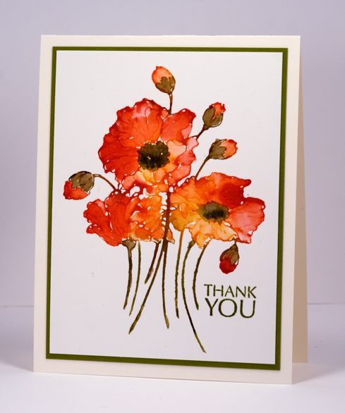
Thank you flowers
Posted: June 17, 2015 Filed under: CAS, Poppy Pattern | Tags: CAS, Fabriano Watercolour Paper, Penny Black stamps, Ranger Distress stains 8 Comments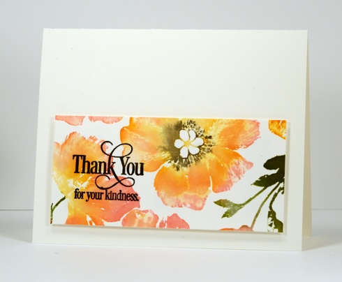
June is my last month as a member of the Dirty Dozen at Splitcoaststampers. I joined the team in January for my six month term. I have really enjoyed being part of the group and have been stretched by the monthly themes. Some of the themes saw me creating cards I would never have chosen to make otherwise which was a great exercise for me. It was also wonderful to see all the projects created by the rest of the ‘Dirty Girls‘. For the June theme I created a friendship card using the ‘poppy pattern’ background stamp. I turned a left over scrap into the card above.
As you might have gathered I love to ink my stamps with distress stains because the print I get is usually fluid and easy to blend. To stamp the panel above I used the misti and inked the stamp one stain at a time which enable the stains to blend on the paper as each colour was added. I have been enjoying pairing pinks with oranges lately, something I would never do if choosing what to wear, but a combination which I love on paper. I used a pink, a yellow and an orange stain on the flowers, one green for the leaves then added black to the flower centres once the yellow was almost dry. I don’t use my misti all the time but it is so very helpful with large background stamps which I rarely manage to stamp well the first time.
Supplies:
Stamps: Poppy Pattern, Heartfelt (PB)
Inks: Mustard Seed, Worn Lipstick, Spiced Marmalade, Peeled Paint distress stains & black soot distress marker (Ranger) Versafine Onyx Black (ImagineCrafts/Tsukineko)
Cardstock: Fabriano 100% cotton hot pressed watercolour paper
Church on a hill
Posted: June 1, 2015 Filed under: Watercolour | Tags: Faber-Castell Albrecht Durer Watercolour pencils, Fabriano Watercolour Paper, Kuretake Gansai Tambi watercolour paints 20 Comments
This year marks twenty five years of ministry for the pastor of our church. He arrived in Ottawa shortly before we did in 2000 and our families have been friends ever since. His wife asked me if I would make a card for the occasion with a church on it. I looked through my stamps but the only church stamp was a snowy scene which was mainly trees with a snow laden church in the distance. As we are pretty happy to finally be free of snow I decided against using that stamp. I attempted a painting instead and found several church images as inspiration then combined elements from a few and set my church on a tree filled hillside. Rather than obscure some of the scene I printed the words on vellum and wrapped it round the painted panel. I used my gansai tambi watercolour paints for most of the painting then switched to watercolour pencils to add finishing touches.
Supplies
Cardstock: Fabriano 100% cotton hot pressed watercolour paper, Neenah Natural White 110lb cardstock, Neenah Epic Black cardstock, rust cardstock, vellum
Also: Kuretake Gansai Tambi watercolour paints, Faber-Castell Albrecht Durer watercolour pencils
With love, my friend
Posted: May 22, 2015 Filed under: Delicate Florals, Watercolour | Tags: Fabriano Watercolour Paper, Kuretake Gansai Tambi watercolour paints, Penny Black stamps, Ranger Distress stains, Tsukineko Memento inks 17 Comments
I made this for a close friend of mine who unexpectedly ended up in hospital this week. I am pleased to say she should be home by now. I began by painting a background with blue and red watercolour paints which I left to dry completely. During the whole painting and and stamping process I had the panel turned vertically but when it came to make the card I preferred it in landscape orientation. I inked the brambles stamp in mustard seed distress stain, spritzed it then stamped. The flower heads of the ‘delicate florals’ stamp, I inked in barn door distress stain and the stems in memento espresso truffle marker, spritzed and stamped. The flower heads were quite watery so I let them dry and stamped again over the top to add some details. I ended up keeping the frame made by the tape placed around the panel and popping it up on a card base made from watercolour paper. I have mentioned before how the whole matchy-matchy thing is very important to me so sometimes the card base has to be exactly the same not just close which is what it would be if I used a different card stock.
Supplies:
Stamps: Delicate Florals, Gratitude, Bramble (PB)
Inks: Mustard Seed, Barn Door distress stains, Black Soot distress marker(Ranger) Expresso Truffle memento marker, Versafine Majestic Blue & Vintage Sepia (Imagine Craft/Tsukineko)
Cardstock: Fabriano 100% cotton hot pressed watercolour paper
Watercolour with Distress Stain Video Tutorial
Posted: May 20, 2015 Filed under: Fresh, Tutorial | Tags: Fabriano Watercolour Paper, Penny Black stamps, Ranger Distress stains, Tutorial, video 29 Comments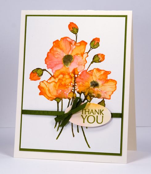
I created a tutorial for Splitcoaststampers showing how I use distress stains to do watercolouring with outline stamps. There is both a photo tutorial and video on the Splitcoast website and I have included the video below. I used the same technique to create two cards, the one above is the star of the video, the one below is featured in the photo tutorial.
Supplies:
Stamps: Fresh , Flower Sparks (PB)
Inks: Peeled Paint, Barn Door, Spiced Marmalade, Scattered Straw, distress stains & Forest Moss, Black soot distress markers(Ranger), Versafine Spanish Moss ink (Imagine Craft/Tsukineko)
Cardstock: Fabriano 100% cotton hot pressed watercolour paper, Neenah Natural White cardstock
This is a favourite technique of mine; I used it for the following cards.


Roses and wishes
Posted: May 12, 2015 Filed under: Efflorescence, Stitched Edges, Wishes | Tags: Fabriano Watercolour Paper, Penny Black creative dies, Penny Black stamps, Ranger Distress stains 5 Comments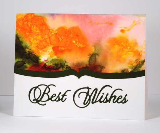
Today’s card is the one which produced the pretty coloured baby wipe that made the previous card possible. The watery rose panel above was initially much larger and there were red roses down below the orange ones. I used the wipe which ended up covered with orange, pink and green stain to clean off the rose stamp after each impression. I can’t really give you a play-by-play for this panel because I just kept on stamping, spritzing, painting and blotting until I ended up what you see above. There is a fine line between a soft blurred floral design and and a mess of washed out colour which some of you might think I have definitely stepped over (hehe) but I like the way the roses bleed into the background and the leaves bleed into the roses.
I cropped the red roses out because they were not so pretty then added a shaped border cut with one of the ‘stitched edge’ dies. I put ‘stick it’ adhesive on the back of the green cardstock before I cut the ‘best wishes’ sentiment which makes it very easy to attach to the card base.
Supplies:
Stamps: Efflorescence (PB)
Creative Dies: Stitched Edges, Wishes (PB)
Inks: Ripe Persimmon, Worn Lipstick, Forest Moss, Festive Berries, Spiced Marmalade distress stains (Ranger)
Cardstock: Fabriano 100% cotton hot pressed watercolour paper, Green paper, Neenah Avon Brilliant White 110lb cardstock


