
Poinsettia gift set
Posted: December 2, 2016 Filed under: Winter Joy | Tags: Artline Stix brush markers, Faber-Castell Albrecht Durer Watercolour pencils, Fabriano Watercolour Paper, Peerless Transparent Watercolors, Penny Black stamps, Tombow fudenosuke brush pen 20 Comments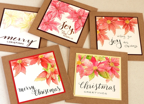
Although I had posts popping up on the blog while I was away for a month all the projects had been created and photographed before I left for Australia. I did take some art materials with me and spent a little bit of time creating this gift set for my sister-in-law. I was able to catch up with her a couple of times, once for dinner and a concert where she lives and again for my last day in Australia, a girls day out in Sydney. We had a great time together and I was happy to have finished this little set as a thank you gift.
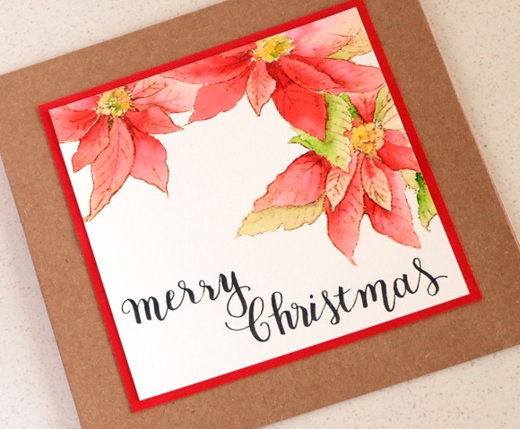
I only took two stamp sets with me, one stayed uninked but the poinsettia from ‘winter joy’ was perfect for this set of cards. I stamped it on some label paper and cut it out so I would have a mask to enable me to layer the images and stamped all but one design in vintage photo ink. The one pale card was stamped in antique linen so I could create ‘white’ poinsettias.
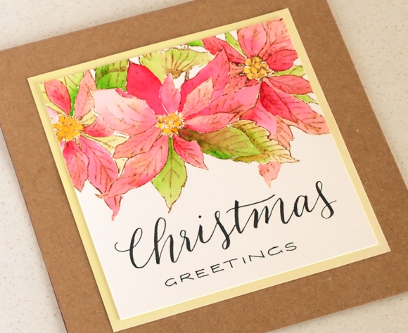
I did my colouring with a mix of watercolour pencils and peerless watercolours on hot pressed watercolour paper. Because I hadn’t taken any sentiment sets with me I hand lettered all the sentiments, some more neatly than others! I picked up some kraft coloured square cards and envelopes from Eckersleys art store and raided my parents’ stash of coloured cardstock to create some mats. Even though I was working with minimal supplies I still managed to spread myself over half the dining room table at mum and dad’s house!
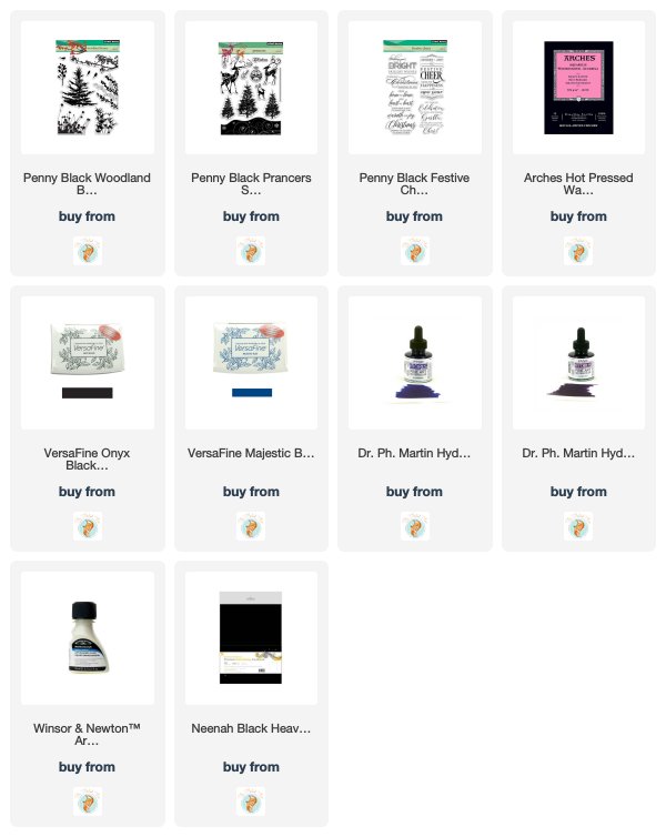
Supplies
Stamps: winter joy (PB)
Inks: vintage photo, antique linen distress ink (Ranger)
Paints: Peerless watercolours, Faber Castell Albrecht Durer watercolour pencils
Markers: Tombow fudenosuke brush pen, Artline Stix brush pens
Cardstock: fabriano hot pressed watercolour paper, Kaisercraft card & envelope pack
Winter celebration
Posted: November 22, 2016 Filed under: Stamped Landscapes, Woodland Beauty | Tags: Fabriano Watercolour Paper, Penny Black stamps, Ranger Distress inks, Tsukineko Versafine inks 10 Comments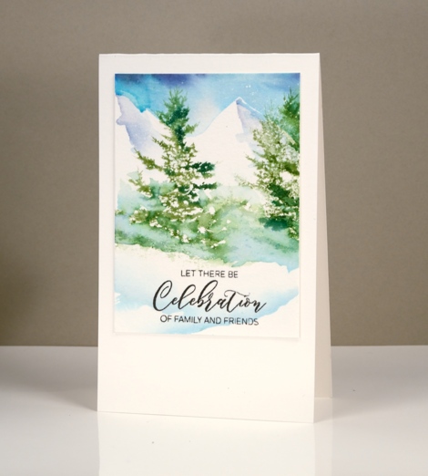
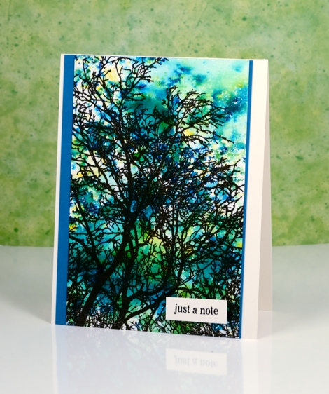
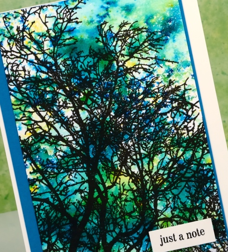
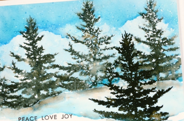
The tree from the ‘woodland beauty’ set has definitely become a favourite of mine. (It features in my next Christmas card class this weekend and one spot just opened up) I started by painting a blue and purple sky over some masking fluid specks. I used the same blues to paint shadows over the mountains.
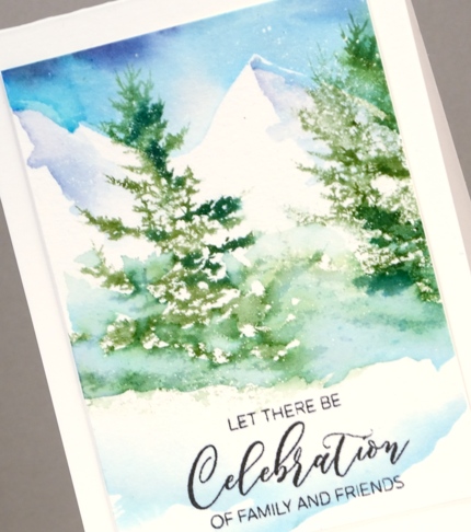
To create this little winter scene I stamped the tree in a mix of two greens and added water to blend the greens and add the shadow to the snow. To make the snowbank below the trees I partially inked the trees so the trunks weren’t stamped then painted some blue ink around the branches and as a sharp edge below the branches.
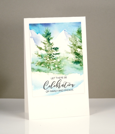
I painted some more pale blue snow banks then used part of a sentiment stamp to finish the panel. I’ve been back in Canada for over a week now and the snow has indeed come to Ottawa!
Supplies
Stamps: woodland beauty, festive cheer
Inks: versafine onyx black (Tsukineko), forest moss, pine needles distress markers (Ranger)
Paper: hot pressed watercolour papers (Fabriano), green cardstock
Paint: brusho watercolour crystal paint
Also: masking fluid
Baby, it’s cold outside
Posted: November 2, 2016 Filed under: Frosty day, What's in your cup | Tags: Fabriano Watercolour Paper, Penny Black creative dies, Penny Black stamps, Ranger Distress inks, WOW embossing powders 7 Comments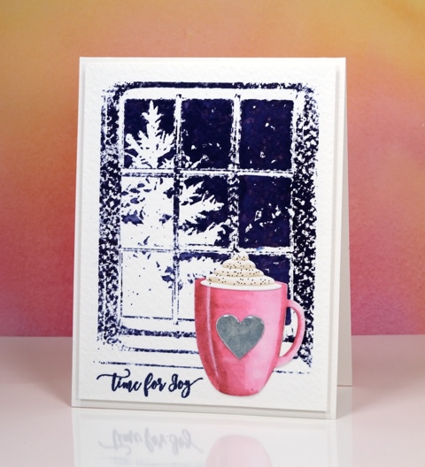
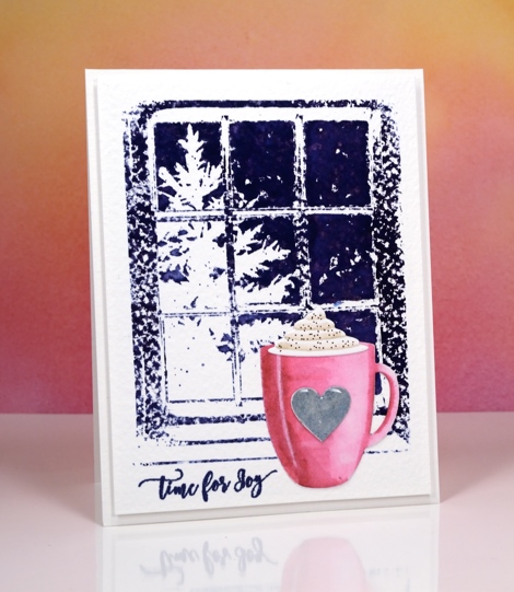
I’m continuing my ‘Winter Warmth’ feature with a cup of hot chocolate and a steaming cup of tea. I had fun creating a couple more scenes with simple watercolour backgrounds and die cut focal images in the foreground. On today’s cards the background is rough watercolour paper so the ‘frosty day’ stamped images were speckled all over until I used a wet paintbrush to blend the ink over the sky area.
I die-cut the cup using the ‘what’s in your cup?’ die set. This set comes with the cup, cream, steam, teabag plus more detail pieces. I cut the pieces out of hot pressed watercolour paper, coloured them with distress markers and blended the colour with water.
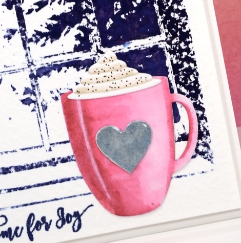
I added a silver heart, cream and cinnamon to the pink cup then attached them all to the background panel. Because the die set comes with all the cute little extras I decided to make a second card this time with a cup of tea.
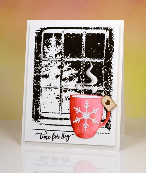
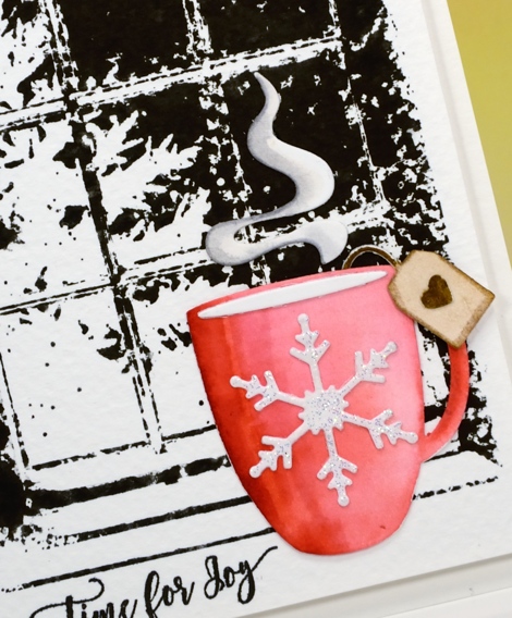
I stamped the background in black soot distress ink for this card and once again blended the sky area but left the rest textured.
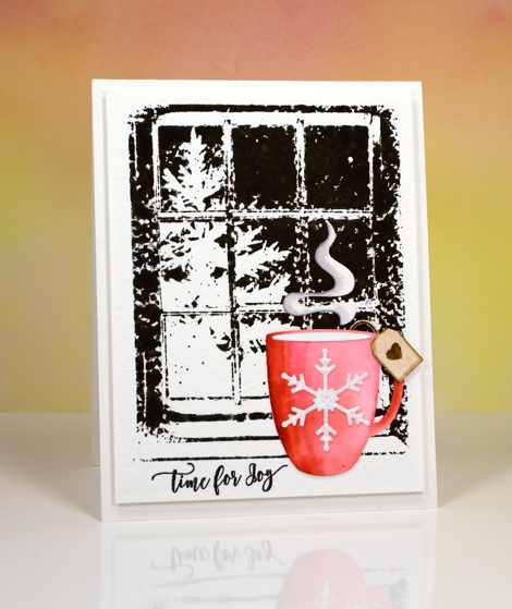
I coloured the cup with red distress inks then added a sparkly embossed snowflake, a teabag tag and some rising steam.
I have one more ‘winter warmth’ card to share tomorrow.
Supplies
Stamps: frosty day, festive snippets
Dies: what’s in your cup?
Ink: Chipped sapphire, black soot, festive berries, old paper, gathered twigs, picked raspberry, vintage photo, hickory smoke distress inks/markers (Ranger) Versamark, versafine majestic blue, imperial purple & onyx black (Tsukineko)
Paper: hot pressed watercolour paper, rough watercolour paper
Paint: Finetec Artist Mica watercolour paint
Also: Clear gloss embossing powder, Clear sparkle embossing powder
Forest grove
Posted: October 7, 2016 Filed under: gift card pocket, Serenity, Snowy Grove, Stamped Landscapes | Tags: Fabriano Watercolour Paper, Penny Black creative dies, Penny Black stamps, Ranger Distress inks, Ranger Distress stains 7 Comments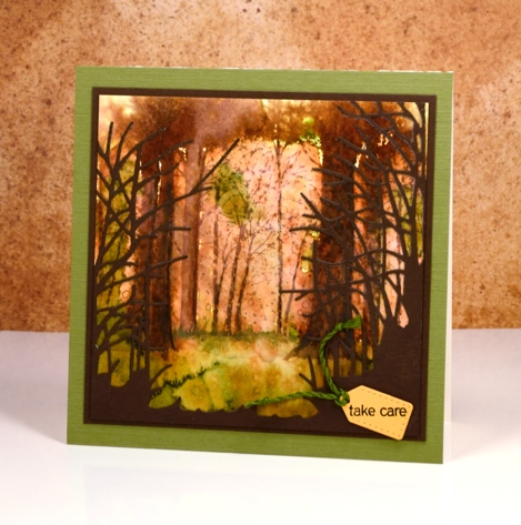
As you might know I use hot pressed watercolour paper 90% of the time because it is smooth and takes stamping so well, giving me a complete images. Occasionally, however, I like to pull out some cold pressed or even more occasionally some rough watercolour paper because the texture gives a whole different look. The labels hot, cold and rough, when attached to watercolour papers refer to the way the paper is pressed. Hot is flattened with heat and pressure making it the smoothest of all three. Cold is flattened with pressure but not heat and rough is flattened with less pressure than cold, making it the most textured of the three types.
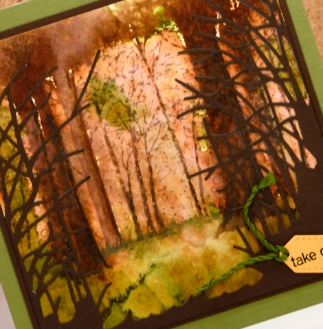
I stamped the ‘snowy grove’ stamp on cold pressed paper in vintage photo ink. I then used the image as a starting point for painting some of the trees more distinctly. In some cases I joined a few trunks together with extra ink to create wider trees. I painted some foliage plus the forest floor with crushed olive and peeled paint distress stains and spritzed with water to blend and blur both the ground and the canopy. I cut the ‘serenity’ die from brown cardstock to add some framing and give the impression of looking into a grove of trees. The tiny tag is cut with the ‘gift card pocket’ die.
The trees around here still have plenty of green on them but we are beginning to see gorgeous colour too. Have a great weekend and Happy Thanksgiving Canadians!
Supplies:
Stamps: Snowy Grove, Snippets (PB)
Dies: Serenity, gift card pocket
Inks: vintage photo, crushed olive, peeled paint distress inks & stains(Ranger)
Cardstock: Cold pressed watercolour paper, brown cardstock, green textured cardstock
Skyward
Posted: October 3, 2016 Filed under: Brusho, Skyward | Tags: Brusho, Fabriano Watercolour Paper, Penny Black stamps 8 Comments
You know how much I like tree stamps, so you can imagine how delighted I was to see this delicate branch silhouette appropriately called ‘Skyward’. I created a thank you card I’ll be linking to Susan Raihala’s Gratitude Campaign
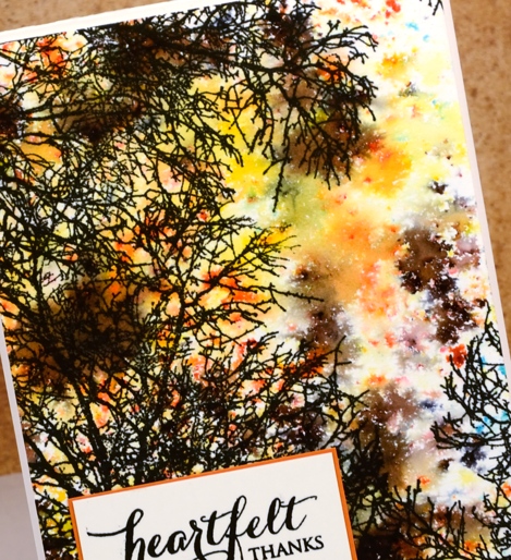
I chose to keep my design simple by adding colour with brusho. I sprinkled gamboge, lemon and dark brown brusho on a piece of watercolour paper, spritzed with water then dried it immediately with a heat tool. By limiting the amount of water and drying it quickly I was able to halt the blending of the colours. The resulting bursts of colour do a good impression of fall foliage, I think. I wanted the branches to almost fill the sky so I stamped twice overlapping some of the branches.
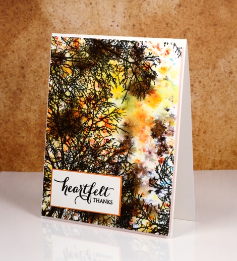
For the second card I used the same technique but went for a summer look. It is not clear whether my colour is sky or foliage so I am happy for it to be both.
You would think I had used blue brusho but I sprinkled leaf green, sea green and lemon. I love the way brusho is never one single colour but a mix of different coloured powders; it’s different every time.
Supplies
Stamps: Skyward, Snippets, Heartfelt (PB)
Ink: Versafine onyx black ink (Tsukineko)
Paper: hot pressed watercolour paper, orange cardstock, teal cardstock
Paint: gamboge, lemon, dark brown, sea green, leaf green brusho powder
Northern winter sky
Posted: September 30, 2016 Filed under: Brusho, Nature's Gifts, Stamped Landscapes, Woodland Beauty | Tags: Brusho, Fabriano Watercolour Paper, Penny Black stamps 17 Comments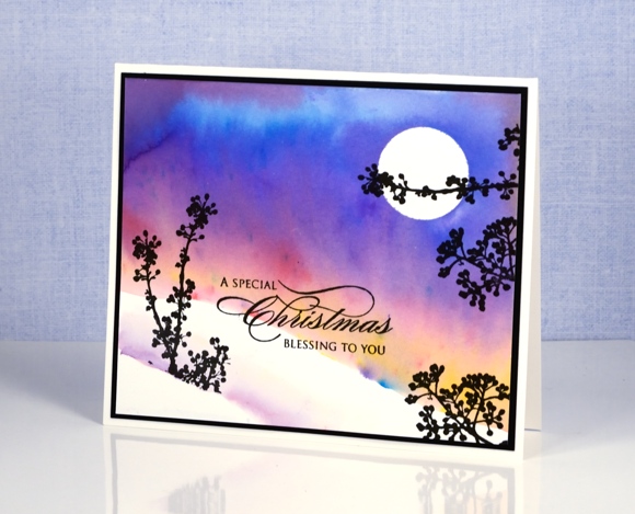
Some times watercolour paint does the work for you. I added a few stamped branches to turn this pretty sky into a scene but really, the blended colours were almost enough by themselves.
I did have a basic plan but the blending was magic that happened when I walked away. I positioned a frisket film mask in the top right then sprinkled four colours of brusho on the panel of watercolour paper. Using a wet brush I blended the colours creating a hard edge at the bottom and adding water to the upper part of the panel. Once I had wet the whole upper area I tilted the panel so the colour blended from yellow to pink to purple and blue. At this point I had to go and teach a mini class so I was gone for an hour.

When I returned my panel was dry and all blended in the pretty pattern you see above – magic! I added the berry branches here and there, an extra shadow for a snow bank and a sentiment.
Supplies
Stamps: Woodland Beauty, Nature’s Gifts, Festive Cheer (PB)
Ink: Versafine onyx black ink (Tsukineko)
Paper: hot pressed watercolour paper, Neenah epic black paper
Paint: Violet, ultramarine, crimson, yellow brusho powder
A day of woodland beauty
Posted: August 30, 2016 Filed under: Nature's Silhouettes, Stamped Landscapes, Woodland Beauty | Tags: Fabriano Watercolour Paper, Penny Black stamps, Ranger Distress stains, Tsukineko Memento inks 10 Comments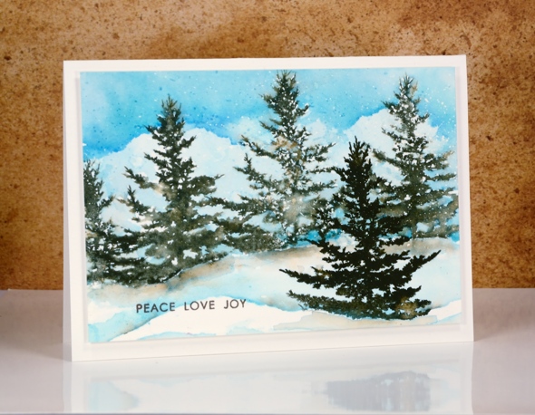
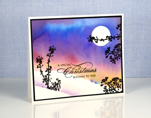
As this tree is one of my favourite stamps from the new Christmas release I decided to create a day scene and a night scene as part of my ‘Top Three’ feature on the Penny Black blog this week. For the night scene I painted the sky before stamping the tree, on this panel I did the opposite.
I began as I often do by splattering some masking fluid on a piece of hot pressed watercolour paper. I did some partial stamping with the tree stamp so I could make the base of each tree look like it was stuck in a snow bank. To do partial stamping or ‘faux masking’ I ink the stamp then remove some of the ink with a wet wipe, in this case I removed the base of the tree so no trunk showed and the bottom edge was a little different each time I stamped it. I chose memento northern pine ink again because the colour separates when I spritz a little water over it (which I did each time before stamping).
I let the trees dry then painted the sky in three blue stains blending and removing colour to make it look like there were clouds. I used a small round watercolour brush and painted right up to and sometimes over the edge of the branches so there would be some blending of colour as well as some white spaces which end up looking a bit like snow.
Once all the sky was dry I stamped a single tree in the foreground and made it darker by re-stamping in the same colour. I painted a snow bank either side of the foreground tree with stain then added some shadows at the base of the trees using diluted northern pine ink as my paint. To finish I removed the masking fluid, added a sentiment in brown then popped it up on a cream card base.
If you didn’t catch my night time scene with this stamp, you can find it here along with a video tutorial.
Supplies
Stamps: Woodland beauty, Nature’s Silhouettes (PB)
Ink: memento northern pine (Tsukineko) tumbled glass, broken china, salty ocean distress stain(Ranger)
Paper: hot pressed Fabriano watercolour paper
Also: Daler Rowney masking fluid
A night of woodland beauty
Posted: August 29, 2016 Filed under: Prancers, Stamped Landscapes, Tutorial, Watercolour, Woodland Beauty | Tags: Dr Ph Martin Hydrus watercolor paints, Fabriano Watercolour Paper, Penny Black stamps, Tsukineko Versafine inks, Tutorial, video 18 Comments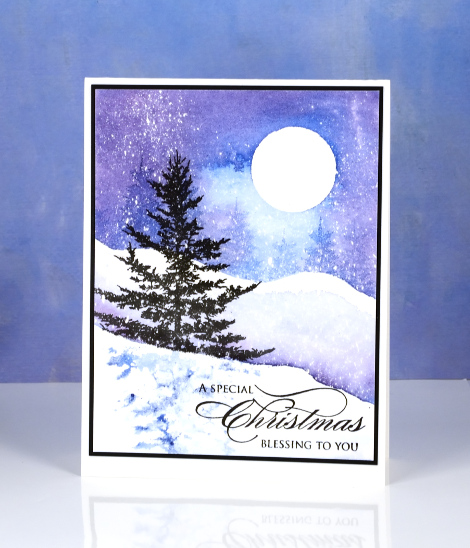
This week I am sharing my top three tree stamps from Penny Black’s new ‘Magic of the Season’ release. You know I love tree stamps so you wont be surprised that they were the first image I looked for when the new release arrived. The pretty spruce silhouette stamp immediately caught my eye and I knew it would be in my top three tree stamps. I have four stamped landscape cards to share this week and this little tree stamp features twice, today in a night time snowscape and tomorrow in a day time scene.
You will probably recognise another favourite tree stamp of mine in the background of this scene, it’s the little tree from the ‘Prancers’ set. I created a video to show you how I made this scene which features some watercolour effects along side some pigment ink stamping. I chose to pair pigment inks, which are waterproof, with watercolour painting so I could have pretty blends in the sky and snow but sharp tree images in the foreground and background.

Supplies
https://linkdeli.com/widget.js?1552642647875
Round the watercolour world
Posted: August 8, 2016 Filed under: Brusho, love to travel, mini community, Watercolour | Tags: Brusho, Fabriano Watercolour Paper, Penny Black creative dies 5 Comments
I have more watercolour die cuts to share. This card has a much higher fiddliness factor than the previous ones and has convinced me that I should never video myself making a shaker card! Rather than trying to describe my trial and error process for making this shaker card I will just list the layers I used from little die cuts right down to the card base. The mini community and ‘the world’ were cut from brusho panels.
watercoloured ‘mini community’ & ‘love to travel’ die cuts with stick-it adhesive on the back
black cardstock panel
acetate
foam with circle die cut from centre
watercolour panel to be ‘the world’
card base

I saved the little die-cut bus and cars to put inside the shaker area with the glitter, sequins and micro beads. It wasn’t until I started shaking it that I realised the bus and cars would end up in countless pile ups!

Supplies:
Stamps: Sprinkles and Smiles (PB)
Die: Mini community Love to Travel (PB)
Paints: Brusho (Colourcraft)
Cardstock: Fabriano 100% cotton hot pressed watercolour paper, Neenah solar white, Neenah epic black
Also: stick it adhesive sheet, glitter, sequins, micro beads
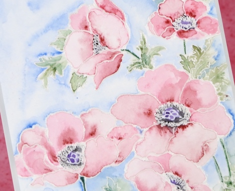
Pastel Poppy Gems
Posted: June 16, 2016 Filed under: Poppy Gems | Tags: Faber-Castell Albrecht Durer Watercolour pencils, Fabriano Watercolour Paper, Penny Black stamps 10 Comments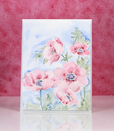
This week my colouring has grown softer each day. I changed mediums for this card and pulled out my tried and true watercolour pencils. I have added to my set lately but the originals are still the set I bought in university for my art subjects. I remember my parents thinking they were quite an expensive purchase then but I would say we got our money’s worth!
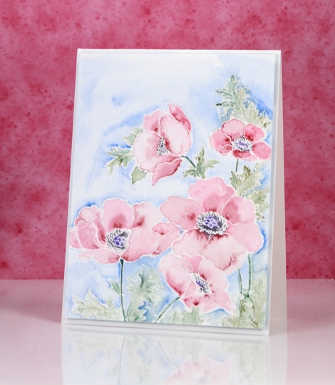
I embossed the poppy gems stamp in clear powder then painted each petal one at a time. I applied two pinks from the pencils and blended from dark to light, keeping some watermarks and blending others out. On yesterday’s card I kept the blending very smooth but sometimes I like to have a few watermarks here and there.
Colouring three times in a row is great practice for Kathy Racoosin’s upcoming 30 day colouring challenge. The next one starts on July 5th and lasts until August 3. I will share more details closer to the time but it is a great challenge, no pressure to colour every single day, plenty of wonderful inspiration from Kathy and some prizes along the way.
Supplies:
Stamps: Poppy gems(PB)
Inks: Versamark (Tsukineko)
Pencils: Pine green 267, Chromium green opaque 174, Dark red 225, Madder 142, True blue 148 (Faber Castell Albrecht Durer watercolour pencils)
Cardstock: Fabriano 100% cotton hot pressed watercolour paper


