Dressed in snow
Posted: August 10, 2017 Filed under: Uncategorized | Tags: Fabriano Watercolour Paper, Penny Black stamps, Tsukineko Memento inks 14 Comments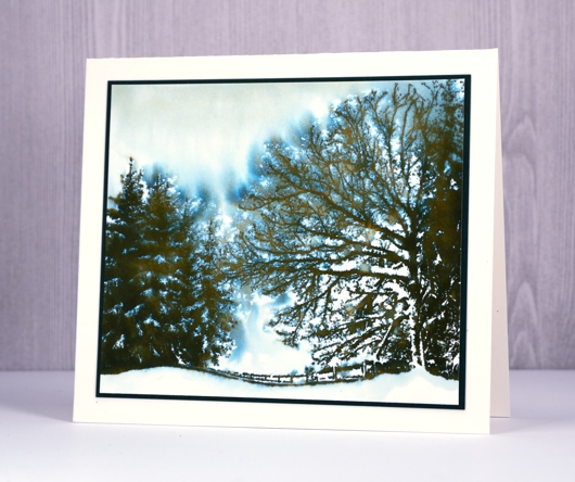
Yes, it’s a snow scene, which means there are new Christmas stamps in the house! Penny Black is showing off their new collection ‘Be Merry’ over the next few weeks and giving away gift certificates to celebrate the new products. This lovely scene is a single stamp and I have inked it in a simple colour to show how easy it is to create a pretty snow scene.
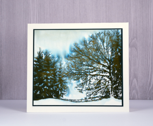
I’ve mentioned before how much I like memento ‘northern pine’ ink for wintry tree scenes; when you add water to it, it separates into a teal blue and a brown. One colour becomes three and gives you green foliage, brown bark and the look of blue snow or sky. I stamped the large image on hot pressed watercolour paper with the help of a stamp positioner then spritzed carefully over the trees on the left and far right.

I wanted to preserve some white areas so I spritzed from quite a distance and covered the some areas with my hand as I did it so that I wouldn’t lose the look of snow on the lower branches. To finish off the scene I matted with dark green cardstock and attach to a white card base. I know I’ll be working with this stamp again!
Supplies
Stamp: Dressed in Snow (PB)
Ink: Memento Northern Pine (Tsukineko)
Paper: Hot pressed watercolour paper (Fabriano)
Beautiful tree
Posted: July 31, 2017 Filed under: Shade Canopy | Tags: distress oxide inks, Fabriano Watercolour Paper, Penny Black stamps 6 Comments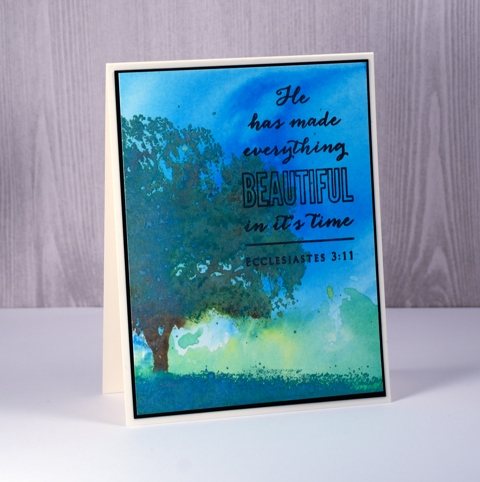
The newest distress oxide inks are in the house (thank you Foiled Fox) so I decided to do some stamping with them along with a basic background. So far in my experiments with distress oxides and my recent class I have used distress oxides to create dramatic and rich backgrounds. In using them for stamping I had to think about what characteristics of the ink I wanted to take advantage of.
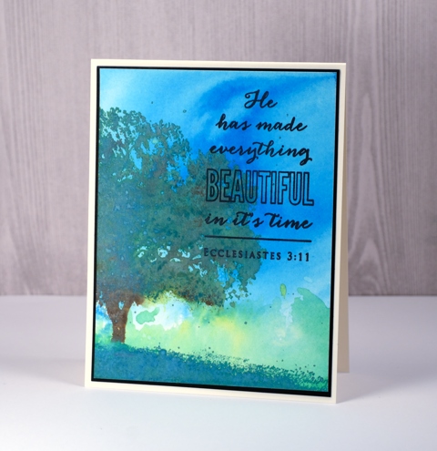
I began by making a background. I pressed the salty ocean ink on my impermeable craft mat, added water then swiped my watercolour panel through it. I dried that completely then did a similar thing with lucky clover and twisted citron inks. Next I pulled out the MISTI so I could stamp the tree colour by colour. I inked the foliage in lucky clover, stamped, peeled paint, stamped, spritzed to let it blend then inked the trunk and a few areas within the foliage with vintage photo and stamped that. To get a nice blend I kept stamping patches of colour here and there with the help of the misti. What I didn’t end up liking was how pale and ‘oxidised’ the foliage became. It got the chalky look where I wanted more bold colour. The fix for this I felt, would be to add undiluted ink over the top so I dried everything and stamped more lucky clover and peeled paint over the top of the blended colour. There is still plenty of chalky oxidised colour but also some darker areas.
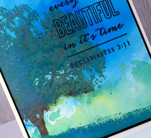
Only the grass remained to be stamped so I picked ‘lucky clover’ on account of its name and stamped that across the bottom of the panel. I kept the stamp in place but moved my paper to extend the grass from one side to the other. The overall effect is more like a tree painted in acrylic over a watercolour sky. Rather than switch to my usual versafine for the sentiment I kept it all in the DiOx family and used black soot then framed the panel in black and attached it to my cream card base.
Supplies:
Stamps: Shade Canopy, Faith (PB)
Inks: salty ocean, lucky clover, peeled paint, twisted citron, vintage photo, black soot distress oxide inks (Ranger)
Cardstock: Fabriano 100% cotton hot pressed watercolour paper
Bliss birds
Posted: July 22, 2017 Filed under: happy bliss, Tagged | Tags: distress oxide inks, Fabriano Watercolour Paper, Hand lettering, Penny Black creative dies, Penny Black stamps 7 Comments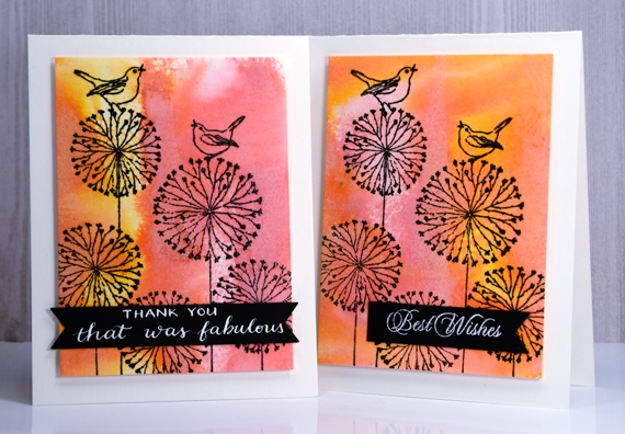
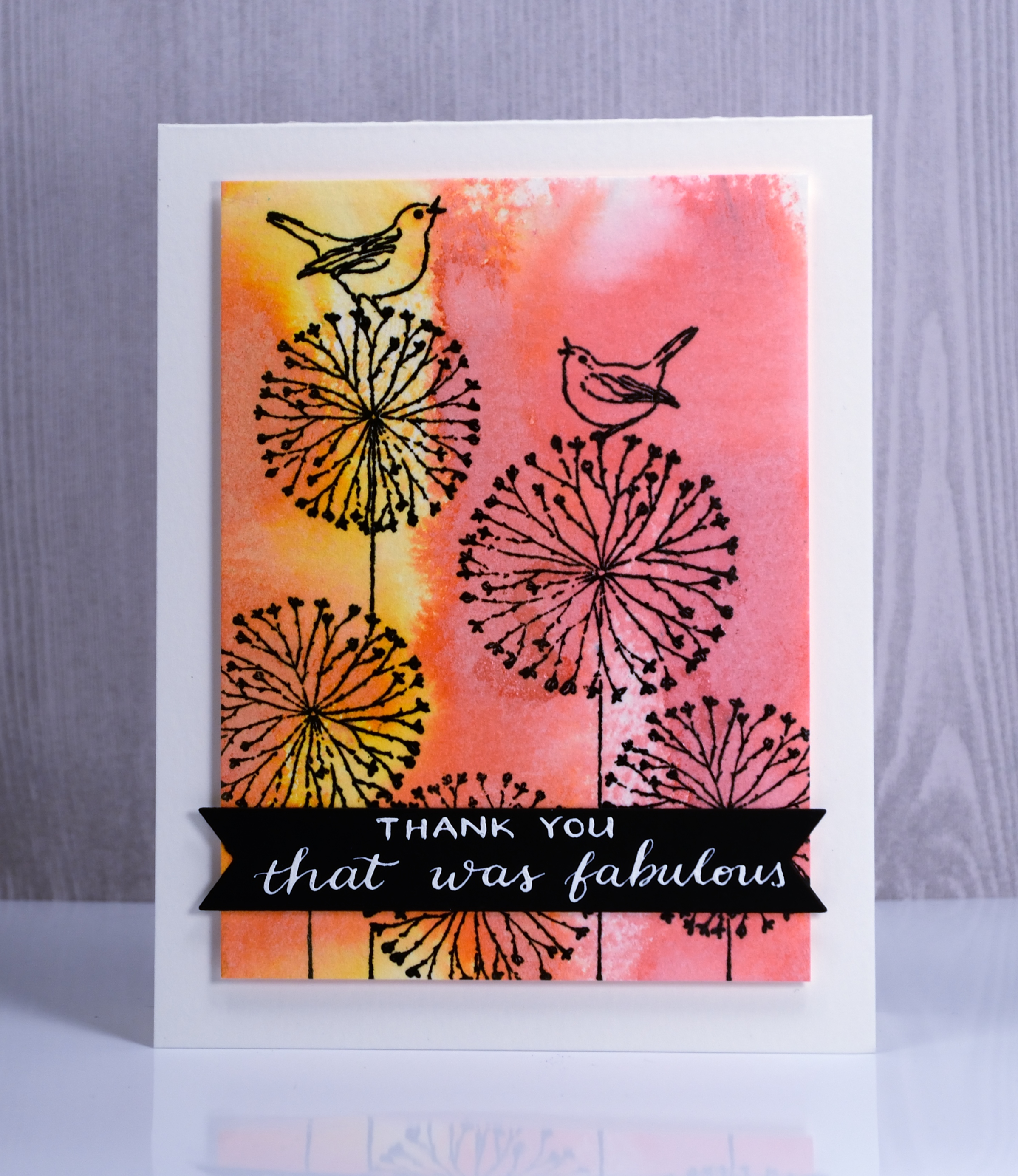
I have a couple of distress oxide backgrounds to share today, topped with a whimsical line stamp from Penny Black. To create the backgrounds I applied spiced marmalade and worn lipstick diox inks to watercolour paper then spritzed them enough to make the colours blend but not so much as to flood the colour off the page.
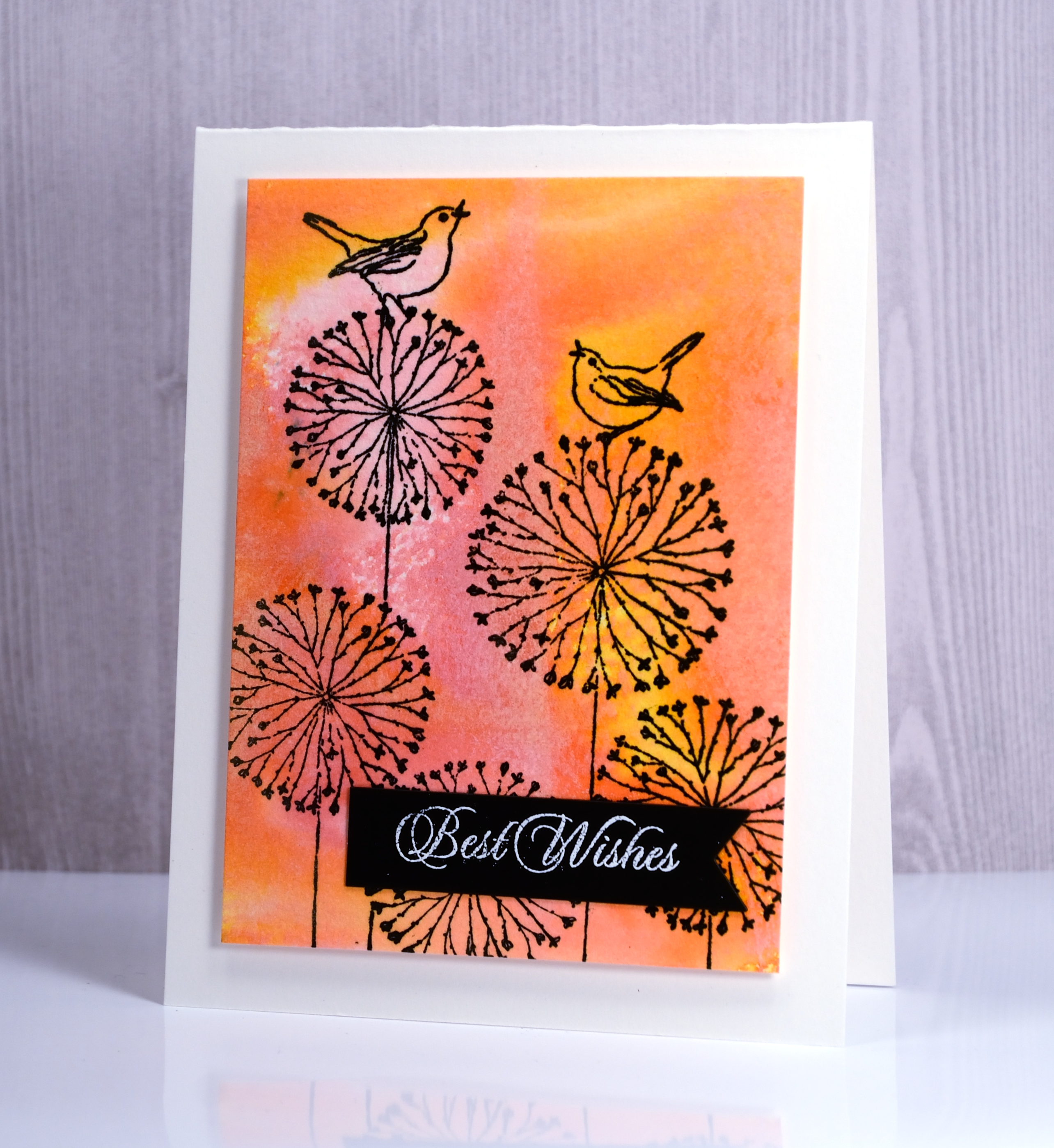
I stamped the ‘happy bliss’ stamp in versafine onyx black ink over the coloured background and popped up the panels on white card bases. I die cut the little black banners and added a stamped sentiment on one and a handlettered phrase on the other.
Hope you are having a fabulous day.
Supplies
Stamps: Happy Bliss (PB)
Dies: Tagged, Shades (PB)
Pens: Exclusive Calligraphy nib holder (Foiled Fox)
Ink: Spiced marmalade & worn lipstick distress oxide inks (Ranger) Versafine onyx black ink (Tsukineko)
Papers: hot pressed watercolour paper, Neenah epic black and solar white cardstock
Ink: DrPh Martins bleedproof white for calligraphy
Lanterns
Posted: July 3, 2017 Filed under: Flower lanterns | Tags: CAS, Fabriano Watercolour Paper, Penny Black stamps, Ranger Distress inks 8 Comments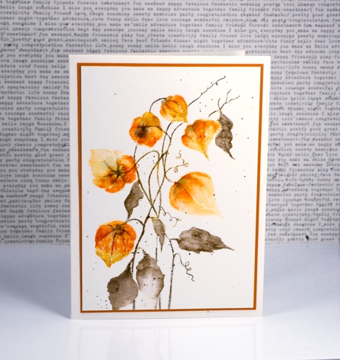
Flower lanterns is a new brushstroke stamp from Penny Black. I happen to have some dried flower lanterns in my craft room so I was able to keep my colours fairly accurate on this one. I love how delicate they look and enjoy the fact that most of my dried ones have kept their shape and colour for a few years now.
I painted these with the help of a stamp positioner to enable me to build up colour one step at a time. I started by stamping the flower heads in wild honey distress ink applied with a marker. This gave me a pale print of all the lanterns as a base for stamping and painting more colour. I continued to use distress markers to add spiced marmalade and rusty hinge ink. I stamped sections then blended with a damp brush slowly but surely adding colour until the lanterns took form. I switched to forest moss distress marker for the stems and leaves and also drew some veins onto the lanterns.
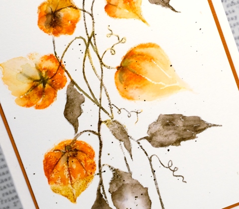
I finished with some splatter of forest moss ink over the panel and a rust coloured mat to frame it.
Supplies
Stamp: flower lantern
Inks: wild honey, spiced marmalade, rusty hinge, forest moss distress markers
Paper: hot pressed watercolour paper, rust cardstock
Happy Canada Day
Posted: July 1, 2017 Filed under: Felicity | Tags: Brusho, Fabriano Watercolour Paper, Penny Black creative dies, Penny Black stamps, WOW embossing powders 8 Comments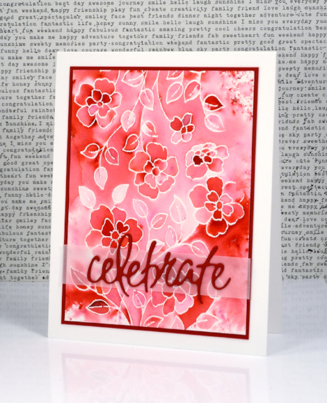
Supplies
Stamps: Felicity (PB)
Dies: Dies: celebrations (PB)
Paper: hot pressed watercolour paper, Neenah solar white and red pepper cardstock, vellum
Inks: versamark (Tsukineko)
Also: white embossing powder, clear wink of stella
Playful Emboss Resist
Posted: June 22, 2017 Filed under: Playful | Tags: Brusho, Fabriano Watercolour Paper, Kuretake Gansai Tambi watercolour paints, liquid metals, Penny Black creative dies, Penny Black stamps 12 Comments
I’m still playing with the emboss resist technique, hoping to inspire you to get involved in the Simply Irresistible challenge the Foiled Fox and I have happening right now.
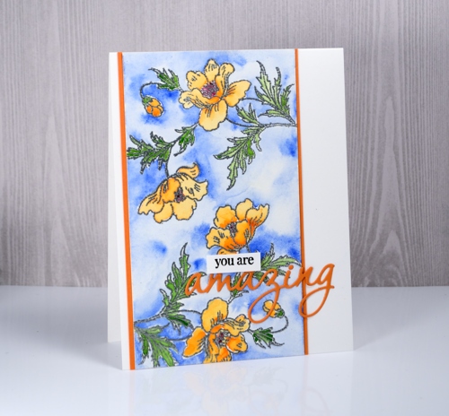
The three cards I’m sharing today were made from panels left over after teaching a class a few months ago. I used gansai tambi paints on the top card and the middle card. On the top card I added gold shimmer to both the flowers and the petals with some Ken Oliver liquid metal.
On the card below I used brusho paints, a red and a green, sprinkled over the embossed panel then activated carefully with water. In places the green and red blended creating some brown/orange tones.

I hope there are a few ideas here that might inspire you to do some emboss resist card making then link it up on The Foiled Fox blog.

Supplies
Stamps: playful, snippets
Dies: omg
Inks: versamark, versafine onyx black
Embossing powder: clear, white and silver WOW embossing powders
Paint: gansai tambi watercolours, brusho crystals, gold liquid metal (Ken Oliver)
Dancing Daisies
Posted: June 1, 2017 Filed under: dancing daisies | Tags: Fabriano Watercolour Paper, Finetec artist mica watercolour paint, Penny Black stamps, Ranger Distress stains 10 Comments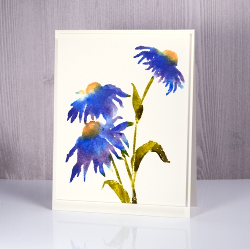
It’s been a bit quiet here on the blog lately. I’m spending my time on the less exciting tasks of stamping matching envelopes, stamping my new name stamp on the back of cards and packaging up said cards for the upcoming craft market on June 17. I have made a new resolution to stamp a matching envelope at the same time as I make the card. It is a bit time consuming pulling out the stamps and inks to try and match what I made weeks or months ago. I know I don’t have to have matching envelopes but they are pretty.
Stamps from Penny Black’s new ‘Poetic’ release arrived in my mail box last week so I have been itching to create with them. This new cling stamp, Dancing Daisies, should possibly be yellow, or pink, or orange if you are looking for realism but I really wanted it in blue. I wanted a particular blue what’s more and as I didn’t have an ink that colour I stamped with three different distress stains to get the blue you see in the centre of the daisy above, right next to the yellow. I inked part of the petals with salty ocean distress stain first and stamped that, then switched to dusty concord and finally added blueprint sketch. I cleaned the stamp between applications so I didn’t contaminate the dauber on the distress stains. I used dried marigold and scattered straw on the flower centres and forest moss and crushed olive stains on the stems and leaves.
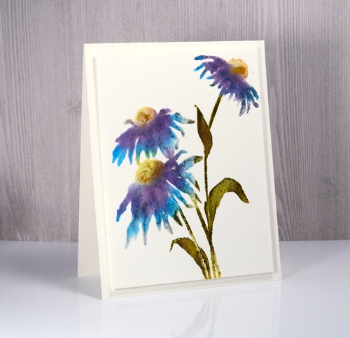
My second attempt is a little different as I used some of the same colour stsains but also pulled out my pearlescent finetec paints and painted some directly on the stamp and the panel, blue on the petals, green on the leaves and gold on the flower centres. It is hard to see in the photo but there is definitely some shimmer happening.
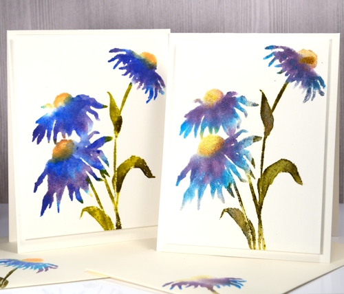
Both panels were stamped on hot pressed watercolour paper with the help of the MISTI so I could add the colours one at a time.
Supplies:
Stamps: dancing daisies
Inks: salty ocean, dusty concord, blueprint sketch, crushed olive, forest moss, dried marigold, scattered straw distress stains (Ranger)
Paint: finetec pearlescent paints
Paper: hot pressed watercolour paper
Silver Dragonflies
Posted: May 26, 2017 Filed under: Flutters, Gilding Flakes | Tags: color burst, Fabriano Watercolour Paper, Gilding, Penny Black creative dies 9 Comments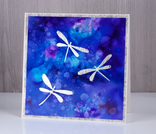
My second gilded card also features dragonflies, this time little silver ones. In my previous post I shared a card gilded in both gold and silver flakes; this time I just used silver because I think silver and blue look so very pretty together. I used stick it adhesive once again to attach the gilding to the watercolour panel and colorburst powders to create the background panel.
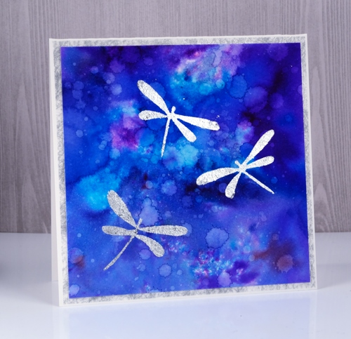
I sprinkled three colours of colorburst powder on watercolour paper then sprinkled with water. Once the colours were blending nicely I used a brush to spread the colour to the edges of the panel. I dried it with a heat tool then added droplets of water a few at a time and dabbed some of them up with a paper towel. I dried the panel in between each batch of water droplets so I could get a mass of water marks. I die-cut three dragonflies from stick it adhesive then applied them to the watercolour panel, removed the backing paper and rubbed silver gilding flakes on top. I burnished with a plastic scrubby pad to remove the excess flakes. It’s finished with a frame of silver spiderweb fabric that comes from France and happens to match the gilding flakes perfectly.
Supplies:
Dies: Flutters
Cardstock: Neenah solar white cardstock, hot pressed watercolour paper
Also: stick it adhesive sheets
Shimmery Stuff: silver spiderweb fabric, Nuvo silver bullion gilding flakes
Dawn & Dusk
Posted: April 4, 2017 Filed under: cattail clique | Tags: Fabriano Watercolour Paper, Penny Black creative dies, Penny Black stamps, Ranger Distress stains 10 Comments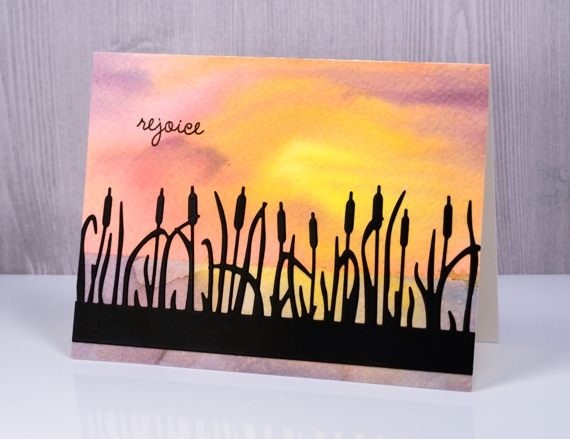
The star of today’s cards is the pretty cattails clique die from Penny Black. I cut it as a silhouette out of black cardstock for my dawn card and painted it for my dusk card later on in this post.
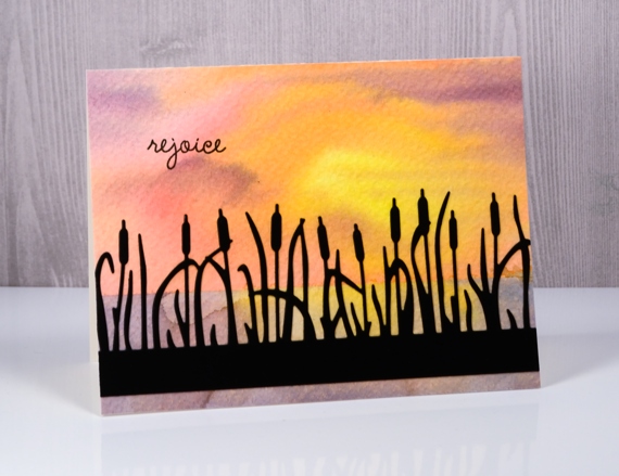
To create my dawn background I taped down some rough watercolour paper. More often than not I use hot pressed(smooth) watercolour paper but I decided this time to let the texture of rough paper add to my project. I taped across the panel about two thirds of the way down so I could paint the sky first. I used the wet into wet technique and painted first mustard seed, then worn lipstick, spiced marmalade and dusty concord distress stains onto the panel. In some places I blended the colours into each other but left one area lighter and more yellow to represent the sun. When that was dry I removed the tape and positioned it over the top section to reveal the lower section. I painted again with the same colours but blended it more to represent the reflection of the sky in the water.
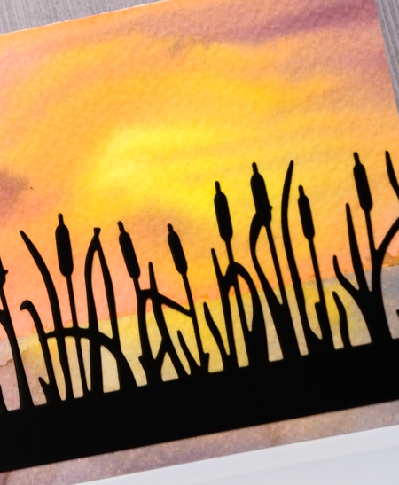
I applied a double sided adhesive to black cardstock then die cut the ‘cattails clique’ out of it and attached it to the watercolour panel and added a sentiment in black ink.
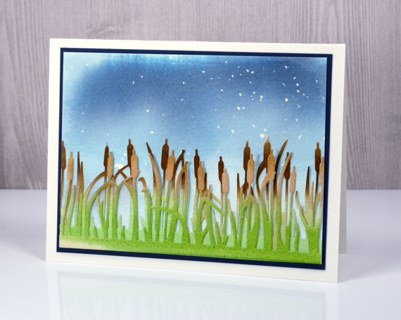
For my dusk card I used cold pressed watercolour paper but this time started by splattering masking fluid over it. I then painted stormy sky and faded jeans distress stain over the panel diluting it with water towards the bottom. On separate pieces of cold pressed watercolour paper I painted gathered twigs distress stain across the top of each panel and mowed lawn distress stain over the bottom of the panel. Once they were dry I cut two more ‘cattails’ pieces to layer over my sky panel.
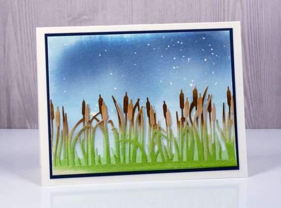
Before assembling the card I rubbed all the masking fluid off the blue painted panel to reveal ‘stars’ in the evening sky. I layered and offset my cattail die cuts, attached them at the bottom of the panel and matted the scene in dark blue cardstock.
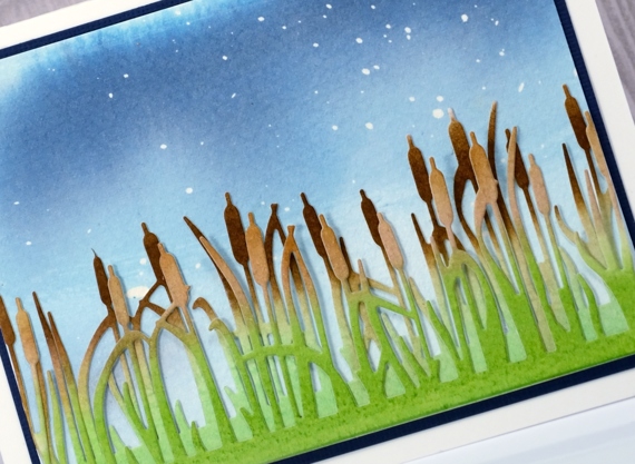
I love creating scenes with stamps and dies so the cattails die makes me happy.
Supplies
Stamps: Spiritual snippets (PB)
Dies: Cattail Clique (PB)
Inks: mustard seed, worn lipstick, spiced marmalade, dusty concord, stormy sky, faded jeans, mowed lawn, gathered twigs distress stains, versafine onyx black ink
Paper: rough & cold pressed watercolour paper, black cardstock, blue cardstock
Also: masking fluid, double sided adhesive sheets
Matelasse cards & a winner
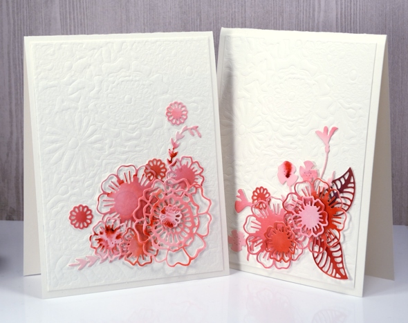
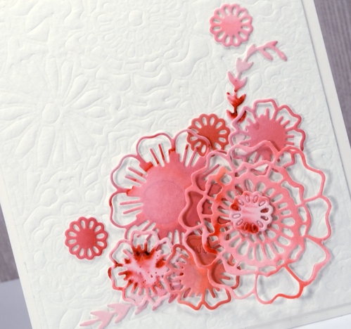
Posted: March 27, 2017 Filed under: Brusho, CAS, layered flower, Leaflets, the garden | Tags: Brusho, Fabriano Watercolour Paper, Penny Black creative dies 8 Comments