Hand painted floral wreath
Posted: May 11, 2020 Filed under: Hand painted | Tags: Fabriano Watercolour Paper, sennelier watercolours 31 Comments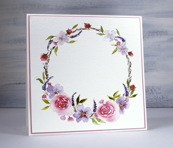
It is a constant resolve of mine to do more painting. I love painting with stamped images but I want to improve my painting without stamps too. I spent some free time recently painting this little wreath for a friend’s birthday. I worked on Fabriano cold pressed watercolour paper (100% cotton 140lb) and used Sennelier watercolour paints. As usual I kept my palette of colours limited concentrating on the same red, blue, purple, grey and mustard paints to get different hues and tones. I began by tracing a circle with a light brown watercolour pencil knowing that I would cover most of it up and it would dilute and disappear as I painted over it.
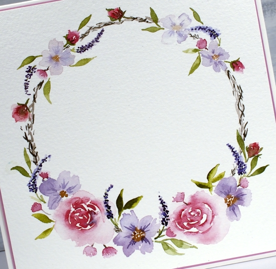
I started by painting the large flowers then moved on to the smaller ones and leaves. I kept adding little leaves or buds thinking the circle was unbalanced but eventually had to tell myself to stop. The decision about whether to stamp, hand letter or die cut some words is still unresolved. What to do you think?
Meadow blossoms
Posted: April 27, 2020 Filed under: Concord & 9th, Inktense pencils, meadow blossoms, Peerless watercolours, Penny Black | Tags: Concord & 9th, Fabriano Watercolour Paper, Inktense, Peerless Transparent Watercolors, Penny Black creative dies, Penny Black stamps 6 Comments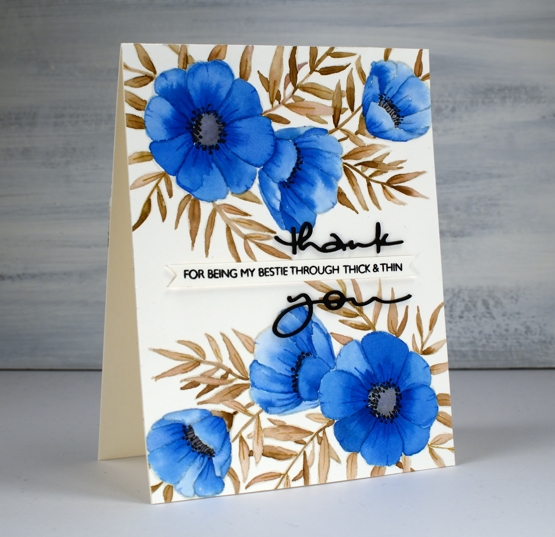
I attended a class not too long ago taught by my clever friend, Liane, where we used paint chips to make cards. Some paint chips have colours from the same family displayed but others have colour combinations that are suggestions when painting and decorating a room. I used one such card to choose the colours for this blue floral card. The paint chip featured colours called nautica, blizzard and tahini. I found similar colours on my peerless watercolour palette and did some no-line watercolour.
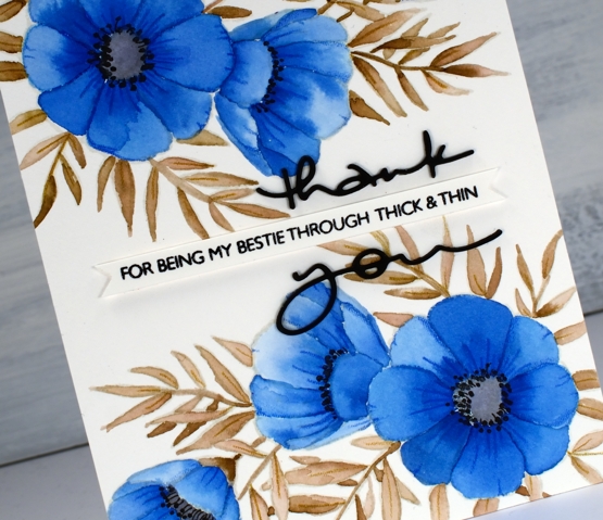
I started by stamping C&9 ‘meadow blossoms’ floral stamp in Gina K ‘whisper’ ink. The ink is a pale beige/grey dye ink which disappeared nicely as I painted with peerless watercolour paint over the top. I worked on non adjacent petals so the paint and water would not bleed from one area to the next. On the largest flowers I painted a dab of ‘Alice blue’ paint then blended it with water to fill the petal.
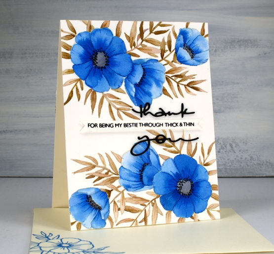
On the smaller flowers I switched the order and painted each petal with water first then dabbed in some blue paint. The second method resulted in slightly paler flowers. I painted all the leaves and stems in ‘warm sepia’ and the flower centres in ‘pearl grey’. Once all the paint was dry I used two inktense pencils to add veins and shading to the leaves and petals. I painted black dots in the flower centres then drew tiny stems to the dots with a very fine tip black pen. The black thank you die cut is from the PB ‘many thanks’ die set cut from black cardstock and stacked for extra dimension. I think it works well either side of the cute phrase from the PB ‘million thanks’ set which is stamped in nocturne black on a strip cut with the Taylored Expressions ‘simple strips’ die.
If you are stuck for a colour combo try some paint chip inspiration; I don’t think I would have thought up the blue, brown, grey combo without the inspiration on the chip. And call your bestie!
Supplies
Stamping with Arteza Real Brush pens
Posted: April 17, 2020 Filed under: Arteza, nature's glory, Penny Black, Tutorial, Watercolour, watercolour real brush pens | Tags: Arteza, Fabriano Watercolour Paper, Penny Black stamps, Tutorial, video 10 Comments
Hi there, this pretty stamp, ‘nature’s glory’ is making its second appearance on the blog and I’ve paired it up with Arteza real brush pens. I did all the inking with the brush pens and made a video to give you an idea of the process. One of the tricky steps when creating watercolour cards with stamps is when, where and how much water to add, hopefully the video will give you an idea.
You probably noticed in the video the way the brush pen bristles were able to easily get into small sections of the stamp so I could ink the flowers, berries and leaves. I spritzed the stamp before pressing onto the hot pressed watercolour paper so the inks would blend on the stamp rather than me blending them on the paper. I love the softness of the blends including the areas that get more water and the ones that look a little dry because they got less water.
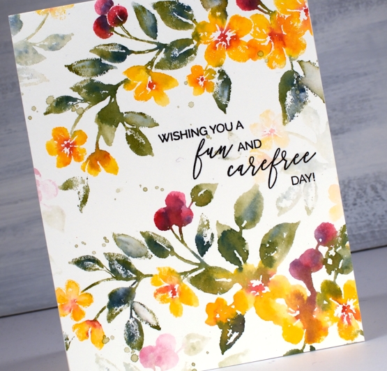
The soft background leaves and flowers were all stamped with ink left on the stamp after doing the bold images. The ink is certainly intense enough that an extra spritz of water is all you need in order to stamp the pale images that appear to be further back between the branches. Dabbing these pale images with a paper towel after stamping makes them even paler and removes any liquid sitting on the surface.

I even had enough ink on the stamp to get a pale print on my envelope then finished with splatter as you know I like to do.
The card below was done with the same stamping technique but I created the soft coloured background at the beginning of my process. I scribbled the blue, yellow and green pens on my glass mat first, spritzed with water then swiped the hot pressed watercolour panel through the ink picking up sections of diluted colour which I dried before transferring the panel to my stamp positioner to do all the flowers. If you are wondering about the sentiment, it is for one of my friends who was told this by a student! When she relayed the experience to me I knew it had to become a card. I did a bit of partial stamping with MFT ‘birdie brown greeting stamps’ then cut the letters b, a, b, y from dark green cardstock (I know it looks black ) with MFT ‘little lowercase dies’.
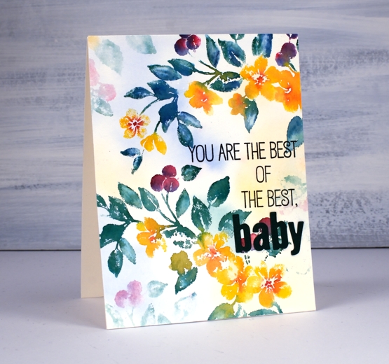
If you are a teacher connecting with your students on line, encouraging them and trying to come up with methods that work in the current situation please know I think you are the best of the best…baby!
Supplies
Three colour brusho video
Posted: April 9, 2020 Filed under: Brusho, flutterby, Penny Black, Tagged, Tutorial, Watercolour | Tags: Brusho, Faber-Castell Polychromos Colour Pencil, Fabriano Watercolour Paper, Penny Black creative dies, Penny Black stamps, Tutorial, video 7 Comments
A while back I posted three cards all painted with the same three brusho paint colours and my Welsh friend, Karen requested a video. Well this is it, a different stamp and three different colours (Brusho sunburst lemon, prussian blue, rose red) but the same technique. Here is the one that prompted the video request.

As with the card above I embossed the outline stamp, ‘flutterby’ in gold powder then swiped up a brusho background by sprinkling brusho on my glass mat then spritzing water over it to activate the powders and turn them into liquid watercolour paint. From there I moved onto painting petals and leaves with individual colours and secondary colours. Take a look at the video and you will see what I mean.
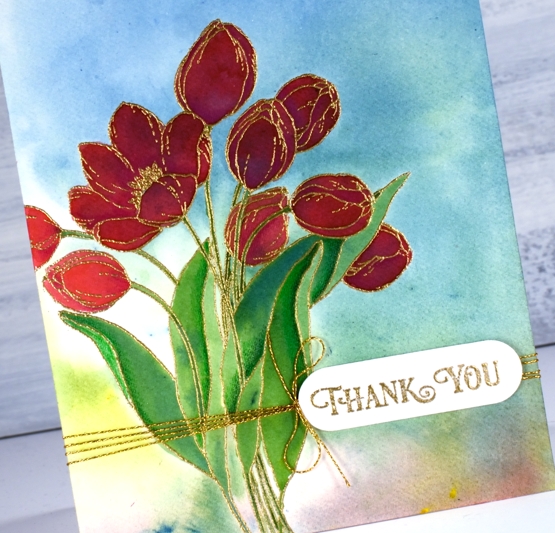
After all the painting was done I added some extra shading in shadow areas with Faber-Castell polychromos pencils and some gold thread detail. The sentiment is from PB ‘banner sentiments’ gold embossed and die cut with a die from the PB ‘tagged’ set.
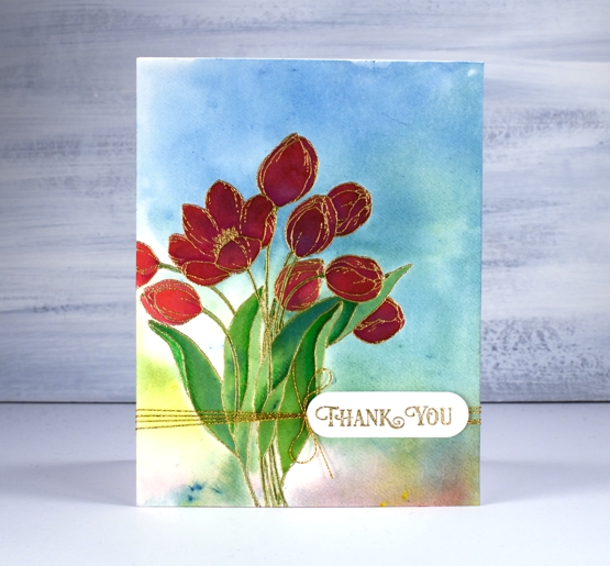
One of the things I like about this technique is the way the background works with the painted images even though the are painted right over the top of a multicoloured panel. The colours work because they are the same colours and because the background is not too bold. You can see in the tulip on the left what the true colour of the rose red brusho is, but the ones that are painted over the blue background still look red, just a deeper red perhaps in shadow not full sun.
Happy Easter my friends. Stay home, stay healthy, stay hopeful and maybe try a new art or craft technique!
Supplies
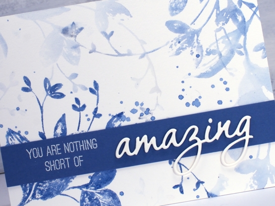
You are nothing short of amazing
Posted: April 8, 2020 Filed under: exhilaration, Penny Black, Script | Tags: brutus monroe embossing powder, Fabriano Watercolour Paper, Papertrey ink, Penny Black creative dies, Penny Black stamps, Ranger Distress inks 12 Comments
I got together with some friends a while back for a crafting afternoon, seems like an age ago now! While there I stamped the two panels you see here. For a while they were forgotten as I was working on other projects then I fiddled around to create two quite different cards. The basic technique is the same for both panels and involves stamping and restamping without reinking in between impressions. The card above began as a vintage looking panel stamped in antique linen ink. I smooshed some antique linen distress ink on my glass mat, spritzed with water then swiped my panel through it to pick up inky stains. I dabbed some areas with paper towel which makes them dry a more yellowy colour. I partially inked the Penny Black script background stamp in antique linen and stamped on one side.
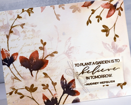
Once the background was dry I used the PB stamp, ‘exhilaration’ to stamp some coloured flowers. I inked the flowers with a Papertrey Americana ink cube and chipped sapphire distress ink then the stems with a gathered twigs distress marker. I wiped ink off the stamp in some areas so the image would be patchy on purpose, spritzed then stamped on the panel. I did both the left hand side and right top corner then, without cleaning the stamp spritzed it again and stamped paler images which immediately appear to be in the background. I stamped a sentiment on an ‘antiqued’ scrap in versafine vintage sepia ink, added a twine bow and popped it up on some foam tape.
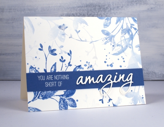
Now that I have described my process for the first card you can probably see that I used the same technique for the blue card but only used one colour, Papertrey ink ‘blueberry sky’. I didn’t start by making a vintage style background, I just jumped right on in with the first stamping. I spritzed the stamp and did another print, then another and one more very pale one and that was it! I added some splatters but nothing more to this pretty blue panel. It was very quick and probably took longer to find a matching cardstock. Once I found a co-ordinating blue I stamped part of a sentiment from the PB ‘sentiment’ set and embossed in alabaster powder. I finished the sentiment by stacking three die cut ‘amazings’ from the PB OMG die set.
I love this technique for adding depth and dimension to flat stamped panels. I have a video coming next week demonstrating a similar process so stay tuned!
Thanks for visiting here today, I hope you are safe and well where you are and thanks again if you are on the front lines taking care of health, food and safety needs. You are nothing short of amazing!
Supplies
Lovely Lilacs video
Posted: April 3, 2020 Filed under: lovely lilacs, Penny Black, Tutorial, Watercolour | Tags: Fabriano Watercolour Paper, Penny Black stamps, Ranger Distress inks, Tutorial, video 25 Comments
I am so happy to have a video for you today especially as so many of us are staying home to stay healthy. I hope this simple technique and pretty card featuring Penny Black’s ‘lovely lilacs’ set will inspire you in your creating. Check out the video below and then read further for the different colour combinations I came up with. They all require a light and a dark colour in the same ‘family’ for the flowers and a green for the stems. That’s it; so simple and so pretty!
The inks are listed in the video and linked below but just for reference while you are reading, on the card above I used milled lavender distress ink, seedless preserves & peeled paint distress markers and shady lane versafine clair ink for the sentiment. All the cards are stamped on Fabriano hot pressed watercolour paper. The sentiments are from two different PB sets, ‘carefree wishes’ and ‘magical friendship’.
As I have been home a lot more than usual I have been spending quite a bit of time making videos. I’ve said before they take me a long time and that is still true but I am feeling more confident with the editing software since I’ve spent days sitting in front of it! Other than the mammoth grocery runs ( I did one today that I am hoping will feed the four of us for two weeks) and some outdoor exercise, I haven’t been out and about at all. I am sure it is the same for many of you.
The card above is the first one I did with this technique and it was stamped with shaded lilac distress ink, blueprint sketch & forest moss distress markers. I think this might be my favourite colour combo.
This red and pink one ended up with splatter and was stamped with worn lipstick distress ink and aged mahogany & forest moss distress markers.
I’m not sure that lilacs come in all these colours but when has that ever stopped me. The colour pairs are spun sugar + worn lipstick, tumbled glass + salty ocean and milled lavender + dusty concord.
I hope you find this technique appealing; please let me know if you try it and if you come up with new colour combinations.
Supplies
Dazzling postcard
Posted: March 20, 2020 Filed under: dazzle, Penny Black, Script, vintage postcard | Tags: Fabriano Watercolour Paper, Penny Black stamps, Ranger Distress inks 11 Comments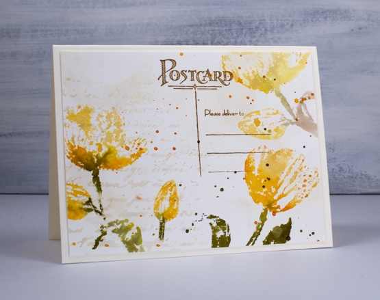
I am sharing these tulip cards over on the Foiled Fox blog today. You know I like it over there, I enjoy the inspiration on their blog, the range of products in their store and the interaction with the Foiled Fox staff and their readers. Make sure you pop over there.
To create a vintage background I smooshed antique linen distress ink on a glass mat then spritzed water over the ink before swiping a hot pressed watercolour panel through the it. I dried the panel before repeating the step. Next I inked the ‘script’ background stamp in antique linen ink, spritzed it then stamped it on one side of the panel. I let everything dry before moving onto the tulips. The stamp is a new one from Penny Black called ‘dazzle’; it is large and features two tulips and two buds. Neither of today’s cards show you the whole stamp; I was after the look of patterned paper rather than a complete image. You will see the whole stamp on another card in the future.
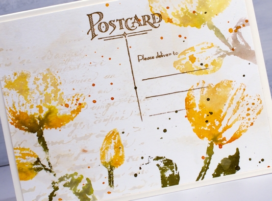
I inked the stamp with scattered straw, wild honey and forest moss distress ink, spritzed it lightly then stamped over the edges of the panels. I also wiped ink off the stamp before pressing it down so the tulips would appear to be floating not anchored to the base of the panel. On the second card I blended over the stamped tulips with water to create a transparent look but on the card above I left them looking ‘lacey’. After the ink dried I splattered both panels with wild honey and forest moss inks.
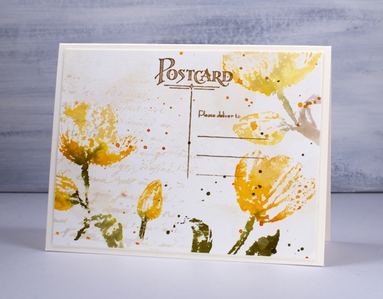
To finish the card above I stamped part of the new ‘vintage postcard’ stamp in vintage photo archival ink. On the card below I added some hemp twine and a popped up sentiment panel also stamped on ‘aged-looking’ paper.
You have already seen this sentiment once this week; it does seem appropriate for the uncertain circumstances we are experiencing right now. I made both cards before the virus situation escalated in North America but I hope having these cards and those words end up on the blog this week is an encouragement to you.
In the close up above you can see clearly the variation of colour achieved by picking up diluted antique linen ink on my watercolour panel; there seems to be a purply tone in there! I love this kind of background and it is so easy to do. Thank you for dropping by today. I appreciate you all and am encouraged to hear that these posts are providing you with some inspiration during a difficult time.
Supplies
Herb garden
Posted: March 18, 2020 Filed under: herb garden, Penny Black | Tags: Fabriano Watercolour Paper, Penny Black stamps, Ranger Distress inks 7 Comments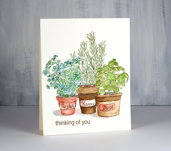
Here is another new stamp from Penny Black and definitely one of my faves from the new release ‘Secret Garden’. I’m not much of a gardener, certainly not in the class of my mother and father but I do plant herbs every spring and use them in my cooking during summer and fall. Before the snow came at the beginning of winter my daughter decided to transplant a few into pots and bring them inside. They really didn’t enjoy the transfer but they struggled on. I don’t think they have enjoyed the neglect either we as fail to water them for weeks at a time. Despite our patchy efforts they seem to be hanging in there. I assume I should prune them hard soon then look after them a bit better leading up to their return to the outside world.
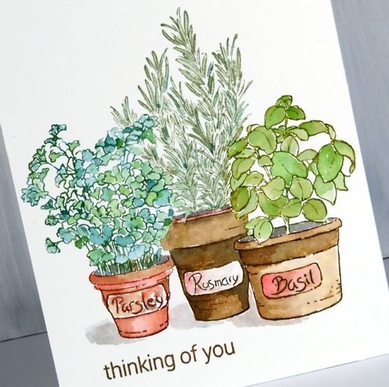
I did not have the same issues keeping these three pots looking healthy. I used distress inks pads and markers to do some watercolouring. I knew I wanted the herbs to all be different greens but I didn’t want them to clash with each other so I picked four green inks and used a different pair on each herb for continuity. The parsley was pine needles and mowed lawn, rosemary was iced spruce and peeled paint and basil was mowed lawn and peeled paint. When inking the stamp I dabbed both inks on the leaves, stamped then used a paintbrush to blend the inks with water to fill the leaves.
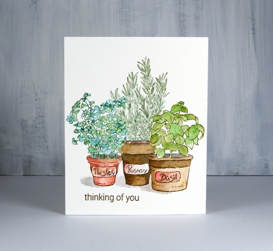
All the pots were done with barn door, hickory smoke and vintage photo ink. I inked the stamp with the three distress inks but also picked them up from a glass mat so I could paint each pot adding shadows and depth. I also painted shadows below each pot with hickory smoke ink and a little vintage photo. I thought about adding some background but I just love those little pots sitting there looking healthy all by themselves to I left them alone just adding ‘thinking of you’ from the mini set ‘wildflowers’.
I just took another look at our sad stringy herbs; advice is welcome!
Supplies
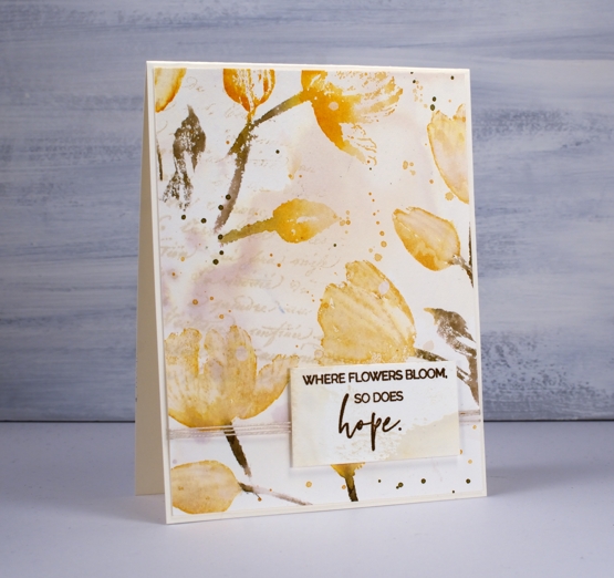
Where flowers bloom
Posted: March 16, 2020 Filed under: exhilaration, Penny Black, Uncategorized | Tags: Fabriano Watercolour Paper, Penny Black stamps, Ranger Distress inks 6 Comments
The appearance of sunny skies and warmer temperatures over the weekend have been a pleasant change; maybe spring has sprung. Life seems to have changed a little since I was posting on Friday! Events have been cancelled, churches, schools, libraries and recreation centres have closed for the next three weeks at least and store shelves have some significant gaps. Here in Ottawa the number of people infected with the virus is still low but growing each day.
This simple card is stamped with a new brushstroke stamp from Penny Black called ‘Exhilaration’. It is a spray of flowers which curves in a ‘s’ shape. I stamped it once from the top left corner then just a partial image crossing the bottom left corner.
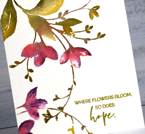
You probably won’t be surprised by any of the process today as I used the same technique I often for brushstroke stamps. I did the stamping on hot pressed watercolour paper in the stamp positioner using distress markers to ink the stamp. I was pleasantly surprised how well the colours worked and how nice the blends were after minimal inking and spritzing.
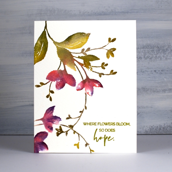
The colours I used were festive berries and dusty concord on the flowers and peeled paint, crushed olive and forest moss on the leaves and stems. I did spritz the stamps a little before stamping so the inks would blend. Using three greens worked well giving the simple leaf shapes more interest. The criss-crossing of stems gave me an indent which worked perfectly for a sentiment. I stamped the sentiment from the ‘blooming sentiments’ set in Spanish moss versafine ink.
Take care, I’ll be back with more in a few days.
Supplies
Petal Poetry
Posted: March 9, 2020 Filed under: Penny Black, petal poetry | Tags: Fabriano Watercolour Paper, Penny Black stamps, Ranger Distress inks, Tsukineko Versafine inks 12 Comments
Introducing ‘petal poetry’ from Penny Black, another floral beauty from the new release ‘Secret Garden’. This one is a brushstroke stamp which means the image is taken from a painted image. I like to stamp each brushstroke stamp I receive in a single colour, just a medium tone, nothing too light or dark, to see all the detail before I start creating with it. Having a monotone print of the image beside me when I work is very helpful. I always use a stamp positioner for this type of image so I can work on a bit at a time and I don’t feel any pressure to ink every bit in the right colour first go.
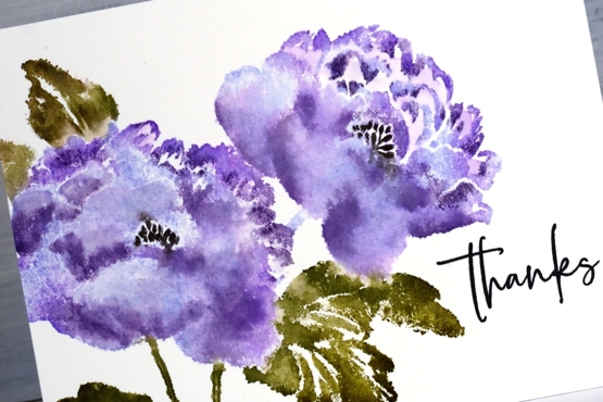
To create this panel I started by inking the flowers with shaded lilac distress ink and the leaves with peeled paint distress ink, then stamped without any spritzing. With the pale image of the peonies on my hot pressed watercolour panel I inked the edges of the petals in wilted violet distress ink and added forest moss ink to the leaves with a marker then stamped again. From this point on I added ink to the stamp with distress markers to define the petals, I had shaded lilac and dusty concord markers to help show edges and shadows. I did some spritzing of ink on the stamp but also blended the colour on the panel with a paintbrush. To see the sort of process I used check out a couple of my videos with similar stamps (blossom branch and spontaneous joy)
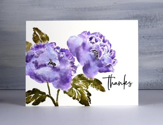
I kept on adding dabs of colour and blending with water until I was happy with the result. With this one I know I stopped myself from spritzing too much so the petals would still have some definition. And I didn’t even splatter! Such restraint! Once it was dry I added the centre of the flowers with a black soot distress marker and stamped a sentiment from ‘million thanks’ in versafine clair nocturne ink.
I hope you are enjoying the new floral stamps from Penny Black; there are indeed other images in the new release and I will eventually tear myself away from the florals to share some with you.
Supplies