
2015 top ten
Posted: December 29, 2015 Filed under: Bister, Penny Black, Stamped Landscapes, Watercolour | Tags: Penny Black creative dies, Penny Black stamps 28 Comments
Of the 170 posts I have written this year, here are the ten that were viewed the most. I guess you could call this ‘the viewers’ choice’ post. If you click on the photos you can get to the original post with all the nitty gritty details.
Of course the most recent posts don’t really stand a chance under these terms but that is way ‘best of 2015’ lists go.
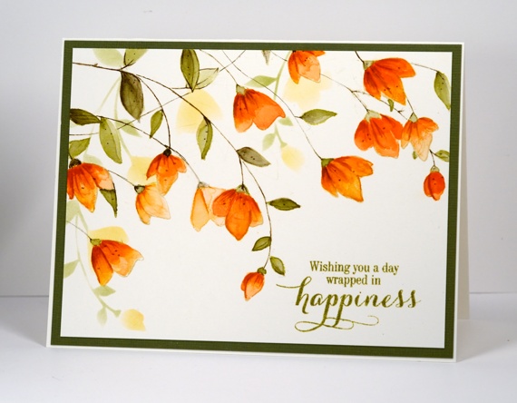
The card above is from a video tutorial, one of only two I made this year! I’m sorry; you deserved more.
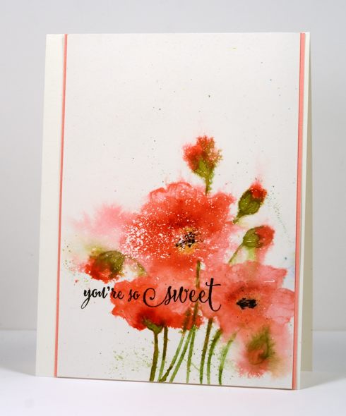
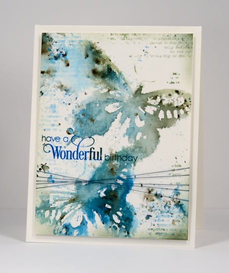
The one above performed surprisingly well considering it is one of my ‘loose and messy’ ones; sometimes I wonder if other people don’t like them quite as much as I do.
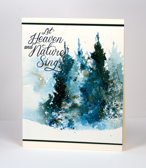
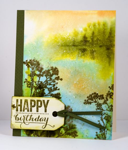
Another ‘messy’ one which I was quite excited about because it was one of my early bister experiments. It was the only 2015 Christmas card to make the top 10.
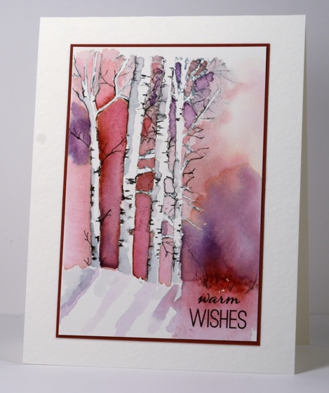
I love this one, not sure if I managed to part with it. If I did that person should know they’re pretty special.
This one is a classic example of ‘using a sentiment to cover up a mess’!

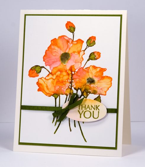
The ‘stacked die’ technique made from the same panel featured in the card at the top of this post.
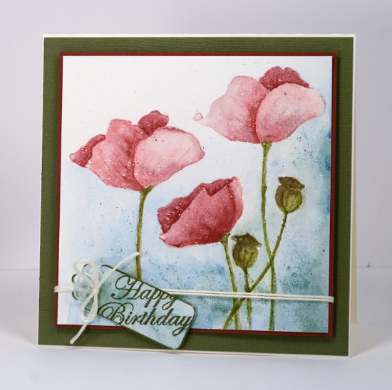
One of my carefully painted ‘not messy at all’ poppy cards.
Last but not least, my older daughter’s birthday card, another blue bister creation. There are 4 blue cards, 3 pink cards, 2 orange cards and 1 green card, which may mean my readers like blue and pink as much as I do!
Thank you for your feedback through viewing and commenting during 2015. You, my readers, mean a lot to me; it is a delight and a privilege to share my creating with such an appreciative audience. I will be back with my favourite creations from 2015.
Very Merry
Posted: December 21, 2015 Filed under: Peace & Harmony, Stamped Landscapes | Tags: Brusho, Fabriano Watercolour Paper, Penny Black creative dies, Penny Black stamps 9 Comments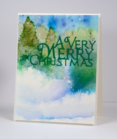
As we approach Christmas Day I will share the last of the cards I created to give away this year. I don’t plan to go into detail about techniques this week but will link to cards created in a similar way so you can read those instructions if you are interested. I will list below the supplies used I used to create each card. The technique for today’s feathered and blended tree scene is explained here.
We hosted a cello recital at our home yesterday for a friend so that gave me a deadline to have our tree decorated and the window hung with lights and greenery. My daughter and I did some baking but there is more to come. I always make gingerbread so that is one of the next tasks on my list. I like making it but you can probably guess that it’s the decorating I enjoy most. For years we made gingerbread houses or structures but I think it will just be cookies this year. (you can see what my children and their friends have built in past years on my other blog)
Santa is dropping off a guest from Australia on his way through Ottawa very early Christmas morning so there is still some cleaning and organizing to get her room ready.
Supplies:
Stamps: Peace & Harmony (PB)
Dies: A Very Merry (PB)
Paint: Brusho
Inks: memento Olive Grove, Cottage Ivy (Tsukineko)
Cardstock: Fabriano 100% cotton hot pressed watercolour paper, green cardstock
Also: masking fluid
Snowy Birches
Posted: December 17, 2015 Filed under: Stamped Landscapes, Winter Song | Tags: Brusho, Fabriano Watercolour Paper, Hand lettering, Kuretake Gansai Tambi watercolour paints, Penny Black stamps 13 Comments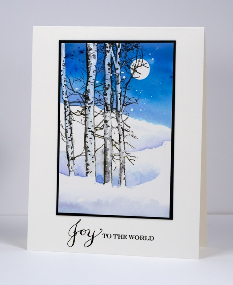
Do you recognise these trees? They are part of a larger stamp, ‘Winter Song’ and even though the whole stamp is beautiful I often just want to use that stand of trees on one side. I began by painting a sky over a moon mask using brusho blues. Once it was dry I decided to add these trees and the snow banks. Because the sky was already painted I had to paint the trees in white paint to block out the blue on the trunks. I used the Gansai Tambi white paint and kept it quite thick and opaque. Once I had white trunks to work with I painted some grey shadows on the trunks and added some black spots and twigs with a marker. I used the ‘to the world’ from Holiday Snippets and then hand lettered some joy.
I have lights and greenery around the window now and one ornament on the tree! Little by little…
Supplies:
Stamps: Winter Song, Holiday Snippets (PB)
Paints: Brusho, Gansai Tambi
Inks: Tuxedo Black (Imagine Craft/Tsukineko) Micron fine tip black marker
Cardstock: Fabriano 100% cotton hot pressed watercolour paper, Strathmore cold pressed watercolour paper, burgandy cardstock
Snowscape 2 ways
Posted: December 15, 2015 Filed under: Periscope, Spread Cheer, Stamped Landscapes | Tags: Brusho, Fabriano Watercolour Paper, Penny Black stamps, Periscope, Tsukineko Memento inks, Tsukineko Versafine inks 14 Comments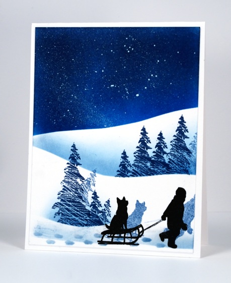
Even though we have absolutely no snow outside I felt inspired to create some snowscape cards today. I used two methods, the first sponging over a mask and the second painting the snow bank edge with watercolour paint and softening with it on one side with water.
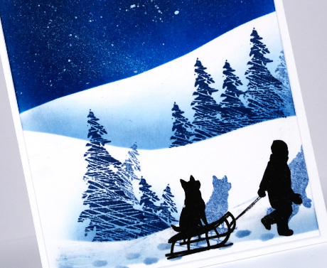
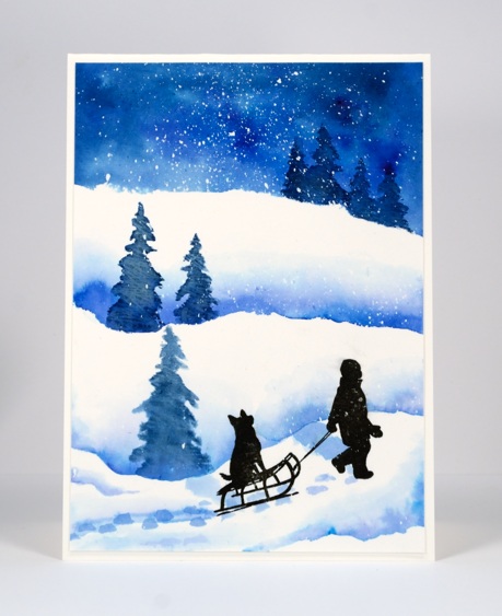
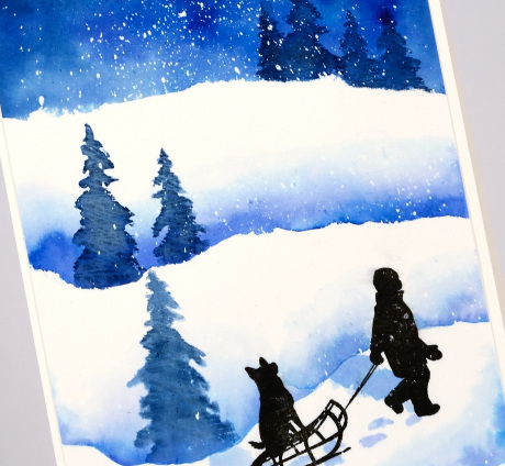
The first card was sponged with Memento Bahama Blue and Nautical blue over masks cut from post-it notes. I added trees then stamped the boy and his dog in the foreground. I had not planned the card when I started so there was no masking fluid splattered on the sky for snow or stars. Instead I added it at the end by flicking it off the brush of a white wink of luna pen. The moon was not in my sky but I decided it must have been off to the left so stamped shadows behind the boy and the trees then sponged some little footprints too.
The painted scene was done on watercolour paper that had been splattered with masking fluid so snow appeared when I rubbed off the mask at the end. I painted the sky first with two different brusho blues then each of the snow banks. Once the painting was dry I stamped the trees and painted over them immediately to blend the ink into a more solid image. I stamped the boy in pigment ink then painted some shadows. I filmed the part where I created the sky and snow banks for each panel on periscope so it is available to watch here. I turned each panel into a scene later off camera.
Thanks for dropping in today.
Supplies:
Stamps: Spread Cheer (PB)
Inks: Memento Nautical Blue & Bahama Blue, Versafine Onyx Black (ImagineCraft/Tsukineko)
Paint: Brusho powders
Cardstock: Neenah solar white cardstock, Hotpressed Fabriano watercolour paper
Reach for the stars
Posted: December 8, 2015 Filed under: Prancers, Stamped Landscapes | Tags: Fabriano Watercolour Paper, Kuretake Gansai Tambi watercolour paints, Penny Black stamps 11 Comments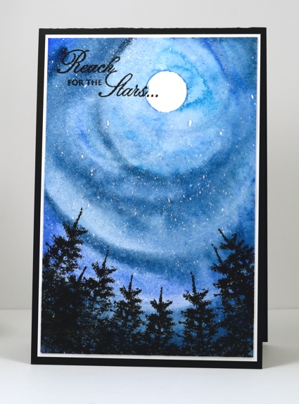
Today’s card reminds me of photos I have seen taken with a fish eye lense so the world all leans into the photograph. I could have added the colours of northern lights as I sometimes would but I stuck to the more common blues of a night sky. It was a fairly simple card to make. I positioned a circle mask then splattered masking fluid on a piece of watercolour paper, once the masking dried I painted blue gansai tambi paint in circles around the moon to fill the panel. To finish the card I stamped black trees and a sentiment, matted and added the panel to a black card base.
We have had some beautiful sunset skies lately; I haven’t taken many photos but I have tried to imprint them on my mind to recreate with paint and ink at a later time. It is weird to be into December and not have snow or even the need to wear gloves yet. No-one in our house is complaining about the lack of shoveling but my son is wanting to start on the outdoor rink and my husband is keen to ski. What does it look like where you are? White Christmas or green?
Supplies:
Stamps: Prancers, Eloquence (PB)
Inks: Black Soot ink (Ranger) Versafine Onyx Black (ImagineCraft/Tsukineko)
Cardstock: Fabriano 100% cotton hot pressed watercolour paper, Neenah Classic Crest Solar White, Neenah Epic Black cardstock
Also: Winsor & Newton masking fluid, Kuretake Gansai Tambi watercolour paints
Stamping the stories: The Lion, the Witch and the Wardrobe
Posted: December 5, 2015 Filed under: Prancers, Stamped Landscapes, Uptown | Tags: Fabriano Watercolour Paper, Penny Black stamps, Ranger Distress stains 25 Comments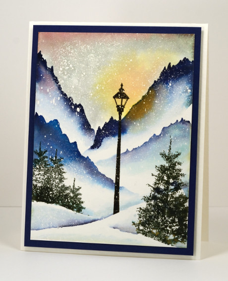
This scene is from a book, a whole series in fact, that is well loved by our family. I read the books to the children; they read them once they were able. We listened to the radio theatre series from Focus on the Family and when the movies came out we watched them. We knew the books so well that we were quite nitpicky about the movies but we enjoyed them despite the deviations from the original. If there is someone who does not recognize this little vignette, the series is the Chronicles of Narnia by C.S. Lewis. For those who recognised it straight away, which is your favourite Narnia story? My son’s favourite is ‘The Horse and his Boy, my older daughter’s ‘The Lion, the Witch and the Wardrobe, my younger daughter’s, ‘The Magician’s Nephew’ and for me ‘The Dawn Treader’ but ‘Last Battle’ is a close second. You see there is something for everyone. If you haven’t read them, get on it!
When the story begins it is ‘always winter but never Christmas’ in the magical land of Narnia. The white witch has made it so. Lucy meets Mr Tumnus the faun under the lamp post you see in the scene above. I painted it with distress stains over a generous splatter of masking fluid and used the ‘oh so useful’ trees from the ‘Prancers’ set in the foreground. I followed this card up with an art journal page because it was so much fun to paint.
This is the last of my stamping the stories cards; it has been fun to share them. Thank you so much for visiting and joining in the conversations.
Stamping the stories cards: Mary Poppins, Wind in the Willows, Peter Pan, Lord of the Rings
Supplies:
Stamps: Prancers, On the town (PB)
Inks: Chipped Sapphire, Mahogany, Scattered Straw, Salty Ocean, Iced Spruce distress stains (Ranger), Northern Pine, Versafine Onyx Black (ImagineCrafts/Tsukineko)
Cardstock: Fabriano 100% cotton hot pressed watercolour paper, Neenah patriot blue
Also: Winsor & Newton masking fluid
Stamping the stories: Wind in the Willows
Posted: December 3, 2015 Filed under: Sprigs, Stamped Landscapes | Tags: Fabriano Watercolour Paper, Penny Black stamps, Ranger Distress stains, Tsukineko Versafine inks 12 Comments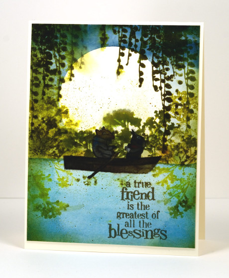
I was surprised how much I enjoyed this book. I don’t think I read it as a child; it was later when training to be a primary school teacher, reading all the classics and designing lessons and such. I am not that keen on animal books but this one is a delight; Ratty and Mole are such appealing characters. I read it to my children from a beautifully illustrated edition (Michael Hague once again) given to me by my Nanna on my 21st birthday. Some of the double page illustrations are incredible watercolours which surprise you with their intricate details.
I initially had the boat moored by the river bank with no Ratty and Mole in it but my daughter said I had to put them in. I did not have any suitable stamps so I had to paint them myself. Unlike the talented Sandy Allnock I do not find animals easy to paint or colour, let alone draw! I found an E. H. Sheppard illustration to assist me and did my best. I’m glad the moon is behind them; they are legitimately dark and shadowed. I realise the boat is backwards; I was so caught up in adding Ratty and Mole I put the oars in the wrong hands, ahem, paws!
Anyway, back to the beginning, I started by painting the river then positioned a large circle mask cut from frisket film before painting the sky. I removed the mask and stamped the foliage and spritzed it so it would bleed a little into the surrounding area. I let everything dry before I painted the boat and its inhabitants. I think the sentiment was just the right one for Ratty and Mole.
What are your favourite fantasy books? Do you even enjoy fantasy? Books about other worlds and magic lands have always intrigued me. I know Wind in the Willows isn’t another world or a magical tale but the animals do talk and go messing about in boats so you do have to use your imagination a little bit.
Supplies:
Stamps: Sprigs, Friendship (PB)
Inks: Forest Moss, Crushed Olive, Peeled Paint distress (Ranger), Versafine Spanish Moss (ImagineCrafts/Tsukineko)
Cardstock: Fabriano 100% cotton hot pressed watercolour paper, Neenah Classic Crest Natural White 110lb smooth
Also: Gansai Tambi paints, Grafix extra tack frisket film
Stamping the stories: Lord of the Rings
Posted: December 1, 2015 Filed under: Butterfly Party, Fantasy, Leaflets, Splendor, Stamped Landscapes | Tags: Kuretake Gansai Tambi watercolour paints, Penny Black creative dies, Penny Black stamps, Tsukineko Memento inks 17 Comments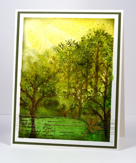
I don’t understand it but none of my children seem to have inherited my love for ‘The Lord of the Rings’ trilogy and ‘The Hobbit’. I think they all read the latter but I am not sure that any of them finished all three LOTR. I have read them several times and thoroughly enjoyed them so when challenged with a fantasy and imagination theme the delightful forest of Lothlórien came to mind. I pulled out some tree stamps, some green inks and gold thread to create a representation of the magical forest realm of the elves in middle earth.
I used some sponging for the golden light of the sky, painting and stamping for the trees and grass and a little gold die cut popped up on gold thread as an embellishment. I stamped some of the trees wet into wet to create some misty atmosphere but added some more defined stamping once the paper dried. I think the little bit of script helps give the middle earth look. The speckled look is from a fine splatter of masking fluid applied before I started and removed once all the paint and ink were dry.
Have you read any JRR Tolkien? Are you a fan? What about the movies? Years ago my husband and I were watching ‘The Fellowship of the Ring”; we did not know one of our girls was still awake in next room. All she could hear was music then battle sounds, then talk, then battle sounds over and over. She finally asked us to turn it down; it was too scary to listen to. Poor thing. The movies are a whole lot of walk, talk, walk, fight, fight, fight, walk, talk, walk, fight, fight…
Supplies:
Stamps: Splendor, Fantasy, Butterfly Party (PB)
Inks: Rich Cocoa, Bamboo Leaves, Espresso Truffle, Pear Tart, Olive Grove(ImagineCrafts/Tsukineko)
Cardstock: Fabriano 100% cotton hot pressed watercolour paper, green cardstock, Neenah natural white
Dies: Leaflets (PB)
Also: Gansai Tambi paints, gold embroidery thread, masking fluid
Stamping the Seasons: Fall
Posted: November 26, 2015 Filed under: Joy to All, Stamped Landscapes | Tags: Bister, Canson watercolour paper, Penny Black stamps 5 Comments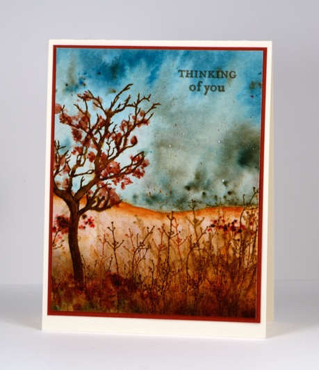
Here is the final instalment in my Stamping the Seasons collection. Although I have added a few extra stamps here and there each design features the tree and twig stamps from the ‘Joy to All’ set.
The earthy tones of my bister powders were perfect for an autumn scene so I began by painting a green and blue sky then painted the brown and red landscape below. While the brown area was stil wet I stamped the twig stamp in three colours of brown over and over filling the foreground with both blurred images and later sharper ones. I positioned the tree on the left this time and bent the trunk a little on the acrylic block. To create leaves I sprinkled bister over the branches and under the tree then added water to activate it.
I didn’t set out to make these four cards so similar in layout and but it has been a interesting challenge to change the colour scheme each time to convey the feeling of each season. I did a similar thing a few years back using the Berry Branch stamp from Penny Black. (Spring & Summer, Fall & Winter, Winter tutorial)
Winter, Spring, Summer and Fall

Supplies:
Stamps: Joy to All, Enjoy Life (PB)
Inks: Rusty Hinge, Barn Door, Gathered Twigs, Vintage Photo distress inks(Ranger)
Cardstock: Canson 100% cotton hot pressed watercolour paper, Burgandy cardstock, Neenah Natural white cardstock
Also: Bister powder
Stamping the Seasons: Summer
Posted: November 24, 2015 Filed under: Brusho, Joy to All, On the Town, Stamped Landscapes | Tags: Brusho, Penny Black stamps 3 Comments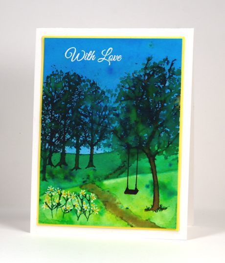
It’s a little ironic to be posting the summer tree on the day I woke up to the first snowfall this season! Let’s just consider this scene a happy memory or if you are in the southern hemisphere a glimpse of what may already have arrived. I worked with Brushos again to create this scene; I might return to the bister for the fall one. I began by taping down my watercolour panel and painting the sky in mix of several blues. While that dried I painted the paler green strip then finally the darker green hill. I let it all dry before stamping several trees on the left hand side and the tree from ‘Joy to all’ on the right hand side. I sprinkled green brusho over the empty branches and spritzed to add water. Between spritzing and painting with a brush I filled out the trees with a couple of green tones. The odd little flowers at the front I drew onto the stems which I stamped with the twig stamp. Finally I painted a path and added a white sentiment.
I haven’t done the autumn scene yet but watercolour powders seem to be the perfect medium for blend of colours I see in fall so I’m looking forward to that one. The rest of the Penny Black design team are sharing their ‘stamping the seasons’ projects on the blog this week and next.
Supplies:
Stamps: Joy to All, On the town, Special Wishes (PB)
Inks: Versamark, Memento Rich Cocoa, Cottage Ivy (ImagineCrafts/Tsukineko)
Cardstock: Canson 100% cotton hot pressed watercolour paper, yellow cardstock, Neenah solar white
Also: Brusho watercolour powder , white gel pen, white embossing powder


