
Stamping the stories: Wind in the Willows
Posted: December 3, 2015 Filed under: Sprigs, Stamped Landscapes | Tags: Fabriano Watercolour Paper, Penny Black stamps, Ranger Distress stains, Tsukineko Versafine inks 12 Comments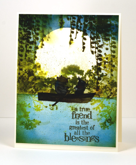
I was surprised how much I enjoyed this book. I don’t think I read it as a child; it was later when training to be a primary school teacher, reading all the classics and designing lessons and such. I am not that keen on animal books but this one is a delight; Ratty and Mole are such appealing characters. I read it to my children from a beautifully illustrated edition (Michael Hague once again) given to me by my Nanna on my 21st birthday. Some of the double page illustrations are incredible watercolours which surprise you with their intricate details.
I initially had the boat moored by the river bank with no Ratty and Mole in it but my daughter said I had to put them in. I did not have any suitable stamps so I had to paint them myself. Unlike the talented Sandy Allnock I do not find animals easy to paint or colour, let alone draw! I found an E. H. Sheppard illustration to assist me and did my best. I’m glad the moon is behind them; they are legitimately dark and shadowed. I realise the boat is backwards; I was so caught up in adding Ratty and Mole I put the oars in the wrong hands, ahem, paws!
Anyway, back to the beginning, I started by painting the river then positioned a large circle mask cut from frisket film before painting the sky. I removed the mask and stamped the foliage and spritzed it so it would bleed a little into the surrounding area. I let everything dry before I painted the boat and its inhabitants. I think the sentiment was just the right one for Ratty and Mole.
What are your favourite fantasy books? Do you even enjoy fantasy? Books about other worlds and magic lands have always intrigued me. I know Wind in the Willows isn’t another world or a magical tale but the animals do talk and go messing about in boats so you do have to use your imagination a little bit.
Supplies:
Stamps: Sprigs, Friendship (PB)
Inks: Forest Moss, Crushed Olive, Peeled Paint distress (Ranger), Versafine Spanish Moss (ImagineCrafts/Tsukineko)
Cardstock: Fabriano 100% cotton hot pressed watercolour paper, Neenah Classic Crest Natural White 110lb smooth
Also: Gansai Tambi paints, Grafix extra tack frisket film
Pink Poppies
Posted: March 9, 2015 Filed under: Blooming tags, Sprigs | Tags: Faber-Castell Albrecht Durer Watercolour pencils, Penny Black creative dies, Penny Black stamps 18 Comments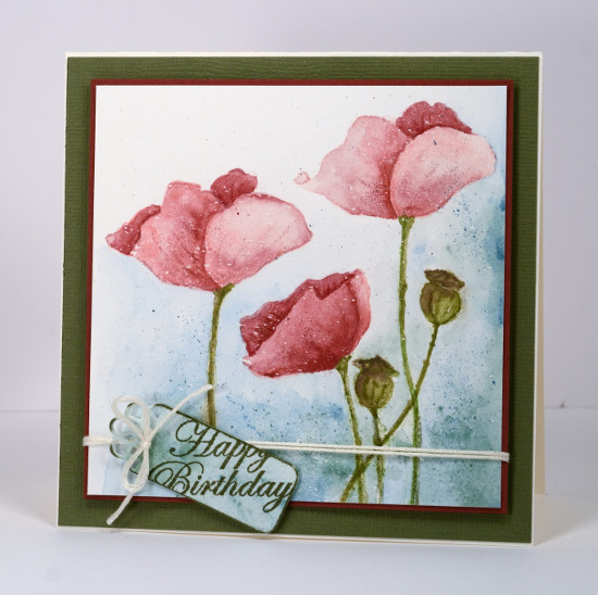
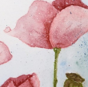
Last week I posted several loosely watercoloured cards. The poppies on today’s card were painted with more precision and there was no spritzing to make the colours blend and bleed. I worked on a watercolour block which I had splattered with a fine mist of masking fluid. The end result with such a fine mist could represent snow but I think it could pass for rain too. I have had snow fall on my daffodils and tulips but the poppies are pretty safe! Once the masking fluid was dry I inked the poppy image from ‘blooming garden‘ with memento angel pink and new sprout markers. The colours are fairly pale so I had an outline to work with but not so dark that it would be noticeable after I had added all the colour. For this one I used my watercolour pencils as paints. I do this by picking up colour from the lead of the pencil with a waterbrush then painting with it. For the poppies I used colour from three pink pencils (listed below), for the stems and seed heads two greens and a brown then a blue and a green for the background.
I didn’t want both of the tall poppies to look exactly the same so I altered the petals a bit on the left hand one. When I checked a photo of seed pods to choose my colours I saw many were quite round so I fattened mine up a little. When the poppies and seed heads had dried I drew some veins and ridges with the watercolour pencils.
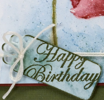
To create the little tag I painted a scrap of watercolour paper with the same colours I had used on the background of the main panel, die cut a ‘flower tag’, then stamped the sentiment from the ‘sprigs’ set across it. To complete the card I matted the panel with a narrow red mat, tied the tag on with embroidery floss, popped the panel up on a wider green mat and attached it to a cream card base.
As you know I love doing the loose watery images but I also find it quite satisfying to work slowly to paint a more formal image.
Kathy Racoosin is doing a 30 day coloring challenge at present which inspired me to do pull out my pencils.
Supplies:
Stamps: Blooming Garden, Sprigs (PB)
Creative Dies: flower tags (PB)
Inks: Memento Angel Pink, New Sprout, Olive Grove markers (Tsukineko)
Cardstock: Fabriano 100% cotton hot pressed watercolour paper, Neenah Classic Crest Natural White 110lb smooth, pink and green cardstock
Also: Albrecht Durer watercolour pencils medium flesh 131, dark red 225, indian red 192, night green 155, pine green 267, olive green 173, moss green 168, apple green 170(Faber-Castell), Cream embroidery floss
Summer birthday
Posted: February 17, 2015 Filed under: Sprigs, Stamped Landscapes, Watercolour | Tags: Penny Black creative dies, Penny Black stamps, Ranger Distress inks 23 Comments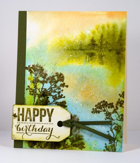
My husband and I both have February birthdays which meant hot summer days for the first 35 years of our lives. Now we celebrate in the bleak mid-winter!
For his birthday card this year I have gone with the warm tones of summer for inspiration. I managed better with this card than the anniversary card; I wrote in it and gave it to him before posting it here on the blog. To create this scene I started by flicking masking fluid onto my small watercolour block. Even though this isn’t a wintery scene some little flecks of white add interest and dimension to the scene. After the masking fluid dried I wet the whole panel and painted the trees and reflections in the distance, the sky and the water with brushes. In the foreground I stamped several stamps from the ‘sprigs’ set onto the wet paper and let them bleed into the surrounding area. When the paper dried a bit I stamped a couple more sprigs which stayed more distinct. I die cut a tag and splashed some of the same colour over it before adding a sentiment and ribbon.
Supplies:
Stamps: Sprigs , Sprinkles & Smiles (PB)
Creative Dies: Tagged (PB)
Inks: Dried marigold, forest moss, frayed burlap, crushed olive distress inks (Ranger) Versafine Spanish Moss (Imagine Crafts/Tsukineko)
Cardstock: Fabriano hot pressed watercolour paper, Olive green cardstock & ribbon
Watercoloured Sprigs
Posted: February 11, 2015 Filed under: Deco Frame, No Card Left Behind, Sprigs, Watercolour | Tags: Penny Black creative dies, Penny Black stamps, Tsukineko Memento inks 8 Comments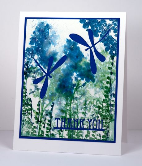
I had a card idea in my head yesterday and I did several trials and variations with the stamps from the transparent set ‘Sprigs’ but my original idea did not end up working. I set the experiments aside and designed a totally different card. Today when I looked at yesterday’s experiment I came up with the card you see above. The problem with the panel before I die cut dragonflies and a sentiment out was that is did not really have a focal point. The colours were pretty and some of the watercolour effects were pretty (others were messy) but it all looked too similar. By cutting the dragonflies to reveal the blue cardstock behind, the focus is taken away from the watercolour panel and transferred to the bold images and letters. I could have just as easily popped dragonflies on top but I like the cut-away look. The features I liked in the original panel are no longer trying to be the stars, they work better as back up. Next time you cast aside a stamped panel because it’s not working the way you thought consider whether it just needs to be in the background and let another element take centre stage.
To create the panel I inked up three of the ‘sprigs’ stamps with a mix of blues and greens. I inked each stamp with one colour using a large stamp pad then added another colour with a marker. I spritzed each stamp, stamped them on watercolour paper then, when I had stamped all the images, spritzed the paper.
I can’t always turn my experiments into finished cards, often the watercolour panels just get turned over so I can use the other side. Sometimes I wonder if the recipients of my cards ever see the backs of some of my panels, hopefully the adhesive holds and the rejected side stays hidden!
Supplies:
Stamps: Sprigs (PB)
Creative Dies: Deco Frame, Flutters (PB)
Inks: Nautical Blue, Teal Zeal, Cottage Ivy, Bamboo Leaves Memento ink (Imagine Craft/Tsukineko)
Cardstock: Fabriano hot pressed watercolour paper, Blue cardstock


