
Poppies with love
Posted: September 14, 2015 Filed under: Efflorescence, Flourish, No Card Left Behind | Tags: Fabriano Watercolour Paper, Penny Black creative dies, Penny Black stamps, Ranger Distress stains, Tsukineko Memento inks 16 Comments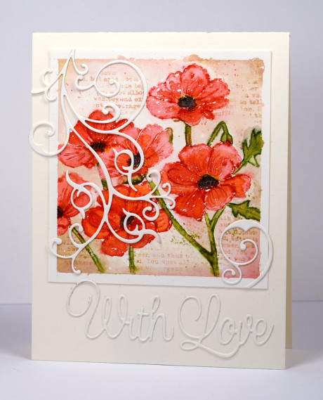
I have another card featuring one of my favourite techniques, ‘watercolouring with distress stains‘. I worked on a panel of watercolour paper taped to a board and splattered with masking fluid. The stamp is an outline stamp which I inked with festive berries and ripe persimmon stain on the petals and peeled paint on the stems. I painted colour into the petals straight away so the outlines would blend with the colour in the whole petal. I drew a bud and a few leaves with a marker to fill the space more evenly. Once the flowers were almost dry I painted the background with desert sand ink and added some text also. I added black to the flower centres with a marker and blended with water to soften the edges a little.
When I removed the tape and the masking fluid I wasn’t entirely happy with the finished panel. Instead of trying to alter any part of the watercolouring I decided to add another element, the die cut flourish over the top. I tied the flourish in with a swirly sentiment and attached all the elements to a natural card base.
Supplies:
Stamps: Efflorescence, Footnotes (PB)
Creative Dies: Flourish, For You (PB)
Inks: Festive Berries, Ripe Persimmon, Peeled Paint Distress stains, Desert sand ink, Tuxedo Black, Northern Pine memento markers (Tsukineko)
Paper: Fabriano 100% cotton hot pressed watercolour paper, Neenah natural white cardstock
Also: Winsor & Newton masking fluid
Watercoloured Sprigs
Posted: February 11, 2015 Filed under: Deco Frame, No Card Left Behind, Sprigs, Watercolour | Tags: Penny Black creative dies, Penny Black stamps, Tsukineko Memento inks 8 Comments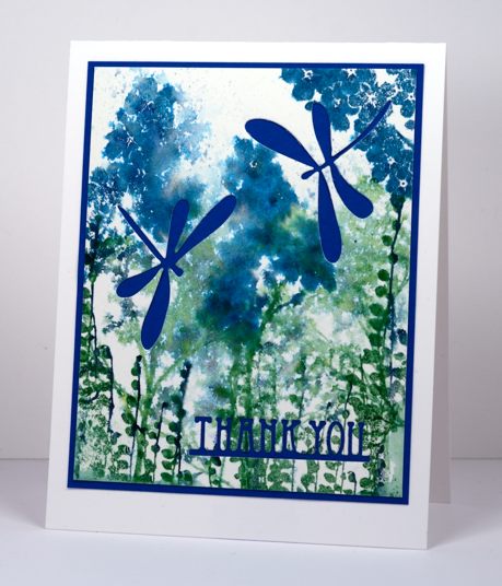
I had a card idea in my head yesterday and I did several trials and variations with the stamps from the transparent set ‘Sprigs’ but my original idea did not end up working. I set the experiments aside and designed a totally different card. Today when I looked at yesterday’s experiment I came up with the card you see above. The problem with the panel before I die cut dragonflies and a sentiment out was that is did not really have a focal point. The colours were pretty and some of the watercolour effects were pretty (others were messy) but it all looked too similar. By cutting the dragonflies to reveal the blue cardstock behind, the focus is taken away from the watercolour panel and transferred to the bold images and letters. I could have just as easily popped dragonflies on top but I like the cut-away look. The features I liked in the original panel are no longer trying to be the stars, they work better as back up. Next time you cast aside a stamped panel because it’s not working the way you thought consider whether it just needs to be in the background and let another element take centre stage.
To create the panel I inked up three of the ‘sprigs’ stamps with a mix of blues and greens. I inked each stamp with one colour using a large stamp pad then added another colour with a marker. I spritzed each stamp, stamped them on watercolour paper then, when I had stamped all the images, spritzed the paper.
I can’t always turn my experiments into finished cards, often the watercolour panels just get turned over so I can use the other side. Sometimes I wonder if the recipients of my cards ever see the backs of some of my panels, hopefully the adhesive holds and the rejected side stays hidden!
Supplies:
Stamps: Sprigs (PB)
Creative Dies: Deco Frame, Flutters (PB)
Inks: Nautical Blue, Teal Zeal, Cottage Ivy, Bamboo Leaves Memento ink (Imagine Craft/Tsukineko)
Cardstock: Fabriano hot pressed watercolour paper, Blue cardstock
A little bird
Posted: December 9, 2014 Filed under: CAS, No Card Left Behind, Winter Song | Tags: Fabriano Watercolour Paper, Penny Black stamps, Ranger Distress stains, Tsukineko Memento inks 11 Comments
Do you recognise this little scene? It is a portion of the large “Winter Song” scenic stamp. I was experimenting with ways to the colour the stamp back when I made this card. I wasn’t happy with the whole panel but cropping it gave me a smaller scene I could work with. Coming up with a layout that worked I’m sure took me as long as the original painting. I tried portrait but really wanted landscape orientation. A partial red mat didn’t overwhelm the panel and the words provide balance and carry the red highlights across the card. It wasn’t until I was searching for a sentiment that I realized that these three word stamps positioned in the right order have built in framing. It only took me about ten practices off the card base to get the positioning right!. I embossed them in clear powder so they have a pretty shine.
I guess I should mention how I coloured the panel. It was weeks ago so I am guessing a bit. I stamped the whole scene in memento summer sky first; you can see it at the base of the panel looking a bit like a shadow. The summer sky ink served as a guide so I could paint the scene with distress stains. I selectively inked the stamp to restamp after the painting, adding brown to the lower branches and black for the birch trees.
Thanks for dropping by.
Supplies:
Stamps: Winter Song , Joy Filled (PB)
Inks: Memento Summer Sky, London Fog, Rich Cocoa, Versafine & Satin Red (Tsukineko) Barn Door, Broken China, Peeled Paint
Cardstock: Fabriano 100% cotton hot pressed watercolour paper, Neenah Avon Brilliant White 110lb, Neenah Chili Red 100lb
Moonlit Forest
Posted: October 20, 2014 Filed under: Nature's Friend, No Card Left Behind, Stamped Landscapes | Tags: Fabriano Watercolour Paper, Penny Black stamps, Ranger Distress stains 16 Comments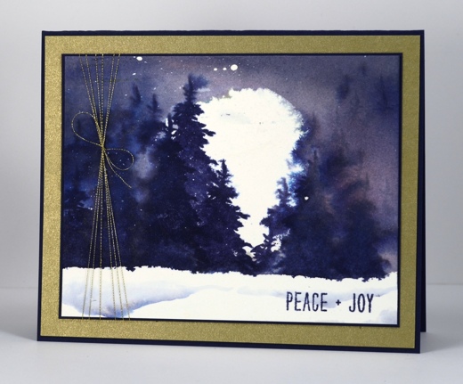
As you can see I am still creating super moons! This time the moon is lighting up a snowy pass through the forest. I have only skied by moonlight once. It was beautiful, cold, but beautiful. This scene reminds me of that moonlit ski because there seems to be a pass between the trees. When I went the moon was nowhere near as big as the one above but it gave us enough light that we could see the trails without headlamps most of the time.
The moon for this panel was masked with frisket film but I have discovered that, for watercolouring, low tack film does not do the trick like extra tack frisket film. I have tried both now and extra tack seals better without damaging the paper. The brand I have tried is Grafix; I am sure there are other brands available but I was able to order both low tack and extra tack from DeSerres. I positioned the large moon mask on watercolour paper that already had some masking fluid flicked over it. I also placed a frisket mask across the bottom of the panel to cover the snowy foreground. I painted Victorian Velvet and Chipped Sapphire distress stains over the whole sky area and spritzed pearl-ex spray (interference gold) over the panel to blend the colours. When I peeled off the moon mask I discovered some of the stain had seeped under the mask (low tack frisket film) so the moon was no longer a circle. I decided to keep going regardless of my wonky moon and stamp the trees to reveal only part of the moon. The tree is from the “Nature’s Friend” set and is a solid silhouette. As you can see the trees are sharper over the moon area, which was dry, and more blended and watery where the paper was damp from the stain and spray. I inked just the top of the tree with a paint brush to stamp the shadowy tops of trees in the distance.
In the foreground I painted a couple of lines of stain then blended with water to make the colour fade out. I wish you could see the shimmery sheen from the pearl-ex spray over the whole sky and tree area. It is really rather pretty and has a gold tint which is why I chose a gold mat and thread to finish the card. The simple sentiment is from the same set as the tree.
Supplies:
Stamps: Nature’s Friend (PB)
Inks: Victorian Velvet, Chipped Sapphire distress stains & Chipped Sapphire distress ink (Ranger)
Cardstock: Navy Cardstock, Gold cardstock, Fabriano 100% cotton hot pressed watercolour paper
Also: Grafix frisket film, Winsor & Newton masking fluid, scanfil metallic gold thread, Interference gold Pearl-ex powder mixed with water to make a spray.
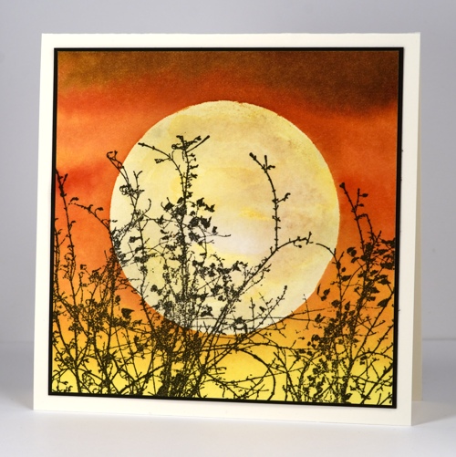
Harvest Moon
Posted: October 16, 2014 Filed under: Etched Branches, Nature's Gifts, No Card Left Behind, Stamped Landscapes, Watercolour | Tags: Fabriano Watercolour Paper, Penny Black stamps, Ranger Distress stains 17 Comments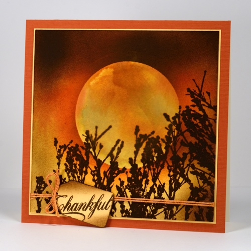
The lovely foliage stamps in the new Penny Black release are perfect for creating stamped landscapes. There are some new transparent sets as well as a couple of slapstick cling stamps that I will use winter, spring, summer and fall. Both these cards are very simple in design using only one foliage stamp to suggest the landscape.
The card above was a “no card left behind” project as it didn’t go quite as planned. I decided to paint a watercolour moon inside a negative mask cut from frisket film. The aperture was wider than the moon you see above. After I had painted the moon in golden orange distress stains I dried it completely (or so I thought). I swapped the negative mask covering the moon for the circle mask which left the rest of the sky to be painted in darker tones. When I started painting the darker distress stains onto the paper the colours seeped in under the mask. They didn’t spread over the whole moon just around the edges. When I removed the mask it did not look like a realistic moon any more. To save my scene I cut a smaller moon mask, stuck that over the watermarked moon then sponged a darker sky around it to cover the seepage. I finished the scene by stamping the branches from “Nature’s Gifts” several times across the bottom and tying on a little tag.
Having learnt from experience I placed the mask on dry unpainted watercolour paper for the panel below. I painted the sky with distress stains and there was no seepage. (I will do more experimenting with the frisket film and let you know what I discover) When I removed the mask the moon was too white and flat so I painted and sponged some pale yellow and brown ink around it until it looked more realistic. I stamped the gorgeous etched branches across the base in black to complete my scene.
Both cards are around 5 inches square so I have been having fun with a friend’s envelope maker making custom envelopes out of pretty designer paper in my stash from long ago.
These cards make me think of one of my favourite songs, Helpless, by Neil Young. It’s the line, Yellow moon on the rise that keeps popping into my head. I have liked that song for many years. Little did I know as a teenager back in Australia I would one day live in Ontario (also mentioned in the song) and see Neil Young in concert twice. Do you ever get inspired by songs or performers? I know Ardyth has a thing for David Bowie but I’m definitely more of a Neil Young girl!
Supplies
Stamps: Natures Gifts, Etched Branches, Special Wishes (PB)
Inks: Ripe Persimmon, Spiced Marmalade, Mustard seed, Vintage Photo, Antique Linen distress stains & Wild Honey, Spiced Marmalade, Vintage Photo, Black Soot distress inks(Ranger)
Cardstock: Neenah Natural White 110lb, Fabriano 100% cotton hot pressed watercolour paper, rust cardstock
No card left behind
Posted: August 29, 2014 Filed under: CAS, No Card Left Behind, Oh Christmas Tree | Tags: CAS, Faber-Castell Albrecht Durer Watercolour pencils, Penny Black stamps, Ranger Distress stains 15 Comments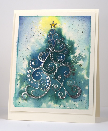
I recently started using the phrase ‘no card left behind’ at my classes. I know sometimes a card needs to left behind; sometimes a fresh start is best. I’m not talking about those instances; I’m talking about the times when the card is basically working. The colours are pretty, the layout is balanced, the stamping is solid but then something goes wrong. It could be a crooked sentiment or maybe a smudge of ink, perhaps an incomplete imprint from the stamp. In these situations I have adopted the policy of “No Card Left Behind” and I like to make sure it happens in my classes. I like the participants to go home happy with the their cards. I know they might try it again and tweak things or they might decide the design is not for them and never try it again. Either way I like them to go home with the promised cards.
To this end I have a few emergency solutions up my sleeve. I’m sure you have them too. Some of my class participants joke about the butterfly fix: “I can always stamp a butterfly over that” It can work in some situations but not really on a snow scene! I have shared some of my fixes before and have decided to continue in the spirit of “No Card Left Behind” and share some more from time to time. I will try and remember to photograph the problem before I come up with the fix but sometimes I just forge ahead and its too late for ‘before and after photo shoots’.
I have two cards to share today; the second one is the NCLB. I started both with the tree image embossed on watercolour paper with silver powder. I added distress stains to the paper and blended them immediately with water and a paintbrush. For the card above I kept the colour contained in the tree area just letting it bleed out a little by spreading the stain and water with a brush. On the other panel I blended the colour all over the panel so the whole rectangular area was covered in shades of green. I then sprinkled salt on the wet paper and let it dry. The result was a pretty textured background but overall the design was lacking something. I set it aside and finished the above panel with some silver, blue, green and yellow splatter. I added a bit of definition around some of the swirls and the border with watercolour pencils.
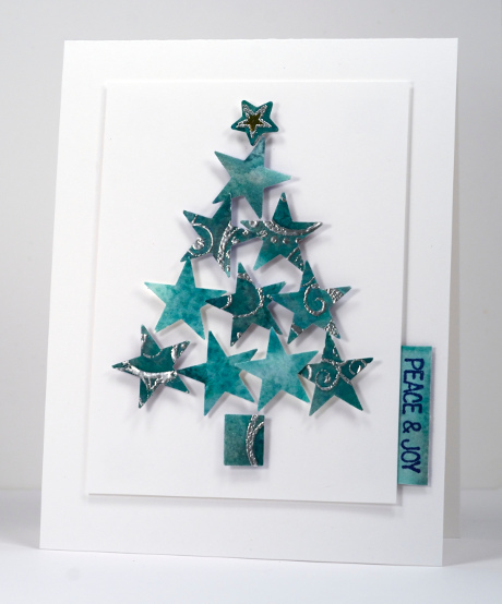
Now how about the NCLB card? You can see I ended up punching out stars and arranging them as a tree but it took a bit of fiddling around before I settled on that design. I first punched squares from the watercoloured panel to see if I could come up with a three or four square CAS layout but that wasn’t coming together so I punched as many stars as possible out of the squares and remaining scraps and arranged them in a tree shape. I had a little star punch that framed the star at the top of the tree and cut a little trunk from a scrap. All the shapes are popped up with 3D foam squares from Scrapbook Adhesives on a white panel which is popped up with the thin 3D foam squares. I had a few narrow scraps left so I stamped a simple sentiment and attached it as a tab to the panel. Punches are a good option for saving a card that will no longer work as a whole panel. I often punch squares from a stamped design but circles or fancier shapes like flowers and stars are great to arrange into a new design.
Thanks for wading through this rather long description; have I inspired you to give the occasional mess up a second chance? Do you have strategies for saving your hard work after an annoying slip or smudge?
Supplies:
Stamps: Oh Christmas Tree , Winter Magic (PB)
Punches: large and small star
Inks: Versamark, Versafine Majestic Blue (Imagine Craft/Tsukineko), Distress stains Pine Needles, Evergreen Bough (Ranger)
Pencils: Albrecht Durer watercolour pencils Indianthrene Blue 247, Viridian 161, Lemon 107 (Faber Castell)
Cardstock: Fabriano 100% cotton hot pressed watercolour paper, Neenah Natural white 110lb cardstock, Neenah Solar white 110lb cardstock
Also: Silver Embossing Powder, Silver Wink of Stella Pen, Salt, 3D foam squares, thin 3D foam squares (Scrapbook Adhesives)


