
Silver Dragonflies
Posted: May 26, 2017 Filed under: Flutters, Gilding Flakes | Tags: color burst, Fabriano Watercolour Paper, Gilding, Penny Black creative dies 9 Comments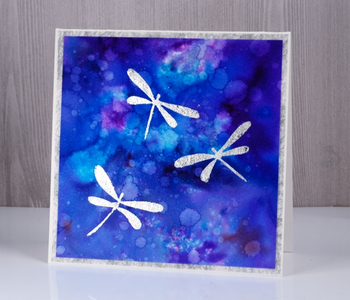
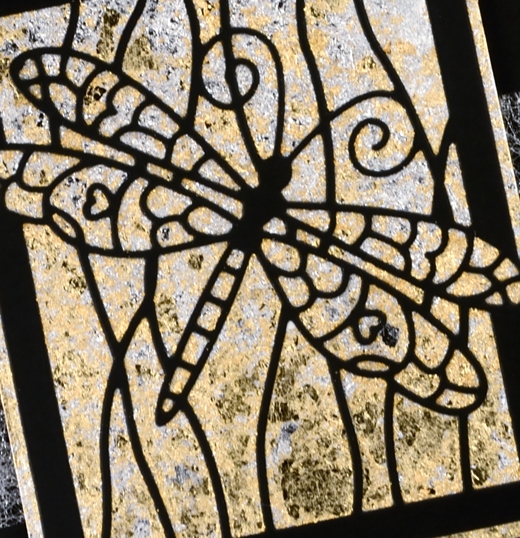
My second gilded card also features dragonflies, this time little silver ones. In my previous post I shared a card gilded in both gold and silver flakes; this time I just used silver because I think silver and blue look so very pretty together. I used stick it adhesive once again to attach the gilding to the watercolour panel and colorburst powders to create the background panel.
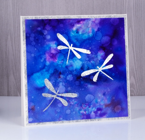
I sprinkled three colours of colorburst powder on watercolour paper then sprinkled with water. Once the colours were blending nicely I used a brush to spread the colour to the edges of the panel. I dried it with a heat tool then added droplets of water a few at a time and dabbed some of them up with a paper towel. I dried the panel in between each batch of water droplets so I could get a mass of water marks. I die-cut three dragonflies from stick it adhesive then applied them to the watercolour panel, removed the backing paper and rubbed silver gilding flakes on top. I burnished with a plastic scrubby pad to remove the excess flakes. It’s finished with a frame of silver spiderweb fabric that comes from France and happens to match the gilding flakes perfectly.
Supplies:
Dies: Flutters
Cardstock: Neenah solar white cardstock, hot pressed watercolour paper
Also: stick it adhesive sheets
Shimmery Stuff: silver spiderweb fabric, Nuvo silver bullion gilding flakes
Gilded Dragonfly
Posted: May 23, 2017 Filed under: Dragonfly Frame, Gilding Flakes | Tags: Gilding, Penny Black creative dies 11 Comments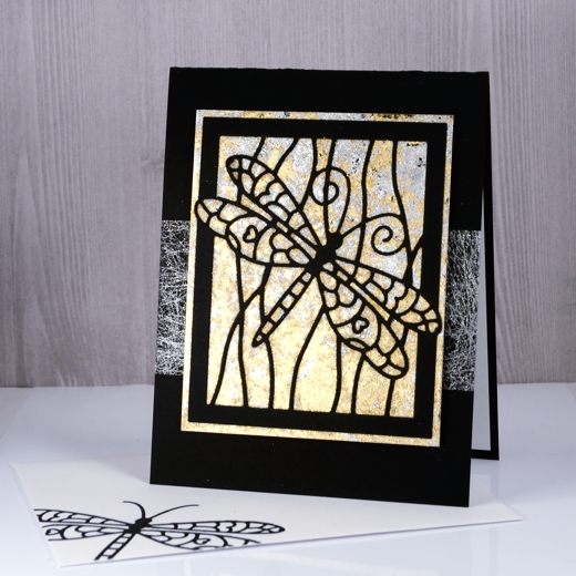
The lovely folk at The Foiled Fox have been spoiling me again, this time with gilding flakes. I tend not to add sparkly elements to all my cards but I do like the option of a little or sometimes a lot when a card asks for bling. I had no idea just how much I would like playing Midas with the Nuvo gilding flakes. They arrived on Friday, I experimented with them on Saturday and turned my panels into cards yesterday. If I didn’t have classes to plan and groceries to buy I would probably play with them more today.
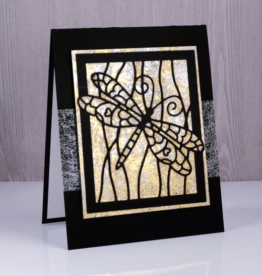
My initial experiments have resulted in six cards which I will share over the next little while. I played with a few techniques for adhering the gilding flakes and today’s is possibly the most effective so far. A word of warning, the gilding flakes are lighter than feathers and they do go everywhere! Jennifer McGuire suggested a swiffer cloth for clean up so I might just need to get one of those! To create the gilded background I cut a piece of ‘stick-it’ adhesive sheet larger than my dragonfly frame die and stuck it to a piece of white cardstock then removed the backing paper. Next I cut the dragonfly frame from black cardstock and positioned it on top of the adhesive rectangle on the white cardstock. I gently laid both silver and gold gilding flakes onto the adhesive panel and pressed lightly. The gilding adheres effortlessly to the ‘stick’it’, filling the entire area not covered by the black die cut. I burnished the flakes gently with a scrubby which breaks off excess pieces and makes sure all the adhesive is covered. The scrubby tends to turn the shiny silver and gold to brushed silver and gold so if you want maximum shine then burnish with your fingers or something smoother than a scrubby.
I trimmed the panel keeping a gilded border round the die cut frame. I wanted something extra behind the panel but not too much so I wrapped a strip of silver spiderweb fabric around my black card base then attached the gilded panel over the top. I finished the card with a white paper panel inside to write on and an envelope decorated with the die cut dragonfly. I am training myself to complete a card/envelope combo each time rather than have to catch up with envelopes at a later date. I have a booth in a craft market next month so most cards I make at present will be heading to Craft-Fest 2017 on June 17 here in Ottawa. More about the market in the days to come.
Supplies
Die: dragonfly frame (PB)
Cardstock: solar white, epic black (Neenah) textured white paper
Also: stick it adhesive (Ken Oliver), silver bullion gilding flakes, radiant gold bullion gilding flakes (Nuvo), silver spiderweb fabric from France
Brusho Balloons
Posted: May 15, 2017 Filed under: CAS, stencil cut, Uplifting | Tags: Brusho, Penny Black creative dies, Penny Black stamps 8 Comments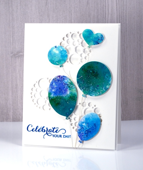
I have another card that utilises brusho experiments. If you have delved into the magic of brusho you probably have a pile of pretty brusho panels you don’t know quite what to do with. Experimenting with brusho is a bit addictive so it is rather easy to keep trying colour combinations with no project goal in mind. I decided to put a scrap of green, blue and purple brusho ‘mosaic’ to use as balloons. By brusho mosaic I mean the effect I get when I spritz over the sprinkled brusho only enough to activate it but not send it flowing all over the paper.
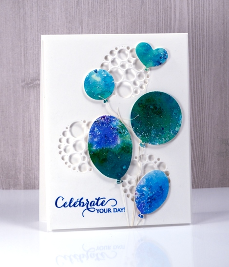
I used the ‘uplifting’ dies from Penny Black to cut out five balloons then added adhesive backed foam to each one. I cut circles of circles out of a panel of neenah solar white cardstock to create a background panel then cut circles from a piece of foam to position behind the panel so shadows would show inside the circles. The circles of circles are part of a new PB die set ‘stencil cut’.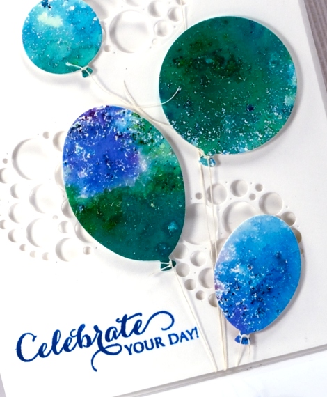
I tied a linen thread to each balloon and tucked the other ends under the background panel. The thread tying took me close to my fiddliness factor limit but I persevered and assembled the layers and added a sentiment. This happy card would work for any celebration so I am adding it to the Casology challenge this week ‘Commencement’.
Supplies
Stamps: A sweet day (PB)
Dies: uplifting, stencil cut (PB)
Paint: brusho crystals (Colourcraft)
Also: linen thread, fun foam
Distress Oxide Trials – one or two colours
Posted: May 5, 2017 Filed under: Blips, Felicity, Shades, Triple Banner | Tags: distress oxide inks, Penny Black creative dies, Penny Black stamps, WOW embossing powders 15 Comments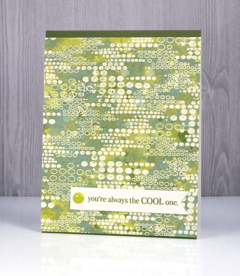
As I’ve been reading your comments about distress oxide inks I have noticed some of you are not sure you want them so have held off or only bought one or two to try. I decided to see what I could do with just one or two colours. I’ve been having so much fun with about half the colours I haven’t even opened them all yet and sadly spiced marmalade is currently hiding somewhere in my messy busy and productive workroom. All that to say, if you only have one or two colours, do some experimenting with them anyway; you might be surprised.
This green themed card is inked with only peeled paint distress oxide ink and yet there is a light and dark teal green, and dark and light olive tones as well. I was pretty impressed. I think the key to this effect is in the layering of colour. I pressed my ink pad on my craft mat, spritzed the ink then swiped my embossed panel through the ink. Colour only partially filled the panel; I dried it then repeated the process over and over. Each layer of ink reacts with the ink already on the paper and the un-inked areas on the paper. I also did some splattering of ink and water and some dabbing of water with a paper towel to lift a bit of colour. Because my panel was embossed I had to be careful not to reheat the embossing too much so I kept the heat tool moving. I love the effect around this ‘blips’ background stamp. A friend of mine used this stamp with great results recently by sprinkling brusho over the embossed image. Seeing her lovely card reminded me I had this stamp tucked away.
My second card uses only two distress oxide inks, worn lipstick and fired brick. I was hoping to do cards in just one colour but I wasn’t getting the same variety of colours from worn lipstick. My guess is that I spoiled my chances by covering the whole panel with my first layer of diluted ink rather than just part of the panel. I did manage to build up some different pinks over the top of the first layer but the differences were not as dramatic as shown on the green above. I will try again and use the same partial inking technique over and over and see what happens.
I did still manage to get some nice colour trapped inside the embossing creating light and dark petals and leaves. To provide just a bit more contrast I swiped it through some fired brick diluted ink a few times. When I press my ink on my craft mat then spritz it lightly it forms little beads of ink. Swiping through them spreads colour across the panel but pressing the paper down on top picks up little dots of ink, another cool effect I think.
I finished both cards with embossed sentiment banners and a few embellishments.
I have a growing list of suggestions from readers to try next week. Thanks for all your encouragement, tips and questions.
Supplies
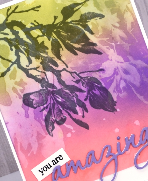
Stamps: Felicity, Blips, Amazing!, Special Thoughts (PB)
Dies: Triple Banner, Shades
Paper: hot pressed watercolour paper, Neenah natural white and epic black cardstock
Inks: versamark (Tsukineko) Distress oxide peeled paint, worn lipstick, fired brick (Ranger)
Also: WOW clear embossing powder, Studio Katia sparkling crystals, Simple stories enamel dots
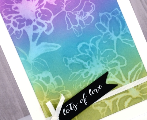
Distress oxide trials – Desaturation
Posted: May 3, 2017 Filed under: Effulgent, Feathery, full of glee, Tagged | Tags: distress oxide inks, Penny Black creative dies, Penny Black stamps 15 Comments
Can you tell I like the way ‘distress oxide trials’ sounds like an significant chemical experiment? That’s why I called today’s post ‘desaturation’ rather than just ‘stamping with water! The effect does come, however, from stamping with water. I think it is my favourite technique so far. I began by blending the inks onto hot pressed watercolour paper. They do blend nicely on neenah classic crest paper but they blend even better on watercolour paper. By blending I mean sponging ink onto the paper, also called inking by some crafters.
For the these three cards I sponged three colours onto the paper and overlapped them to get nice soft blended colours. The sponging doesn’t take long, it doesn’t leave marks shaped like the edge of your applicator and it creates intense colour.
After sponging my colours over the whole panel I put the panel into my MISTI, positioned my stamp then spritzed it with water. All the stamps used for these cards are red rubber; (slapstick cling from Penny Black, names listed below) I haven’t tried with clear stamps yet. The stamp just has to hold onto the water for the technique to work.
After stamping a water print onto the blended colour, I lifted the stamp and dabbed a paper towel over the print. It left a pale image on the coloured panel.
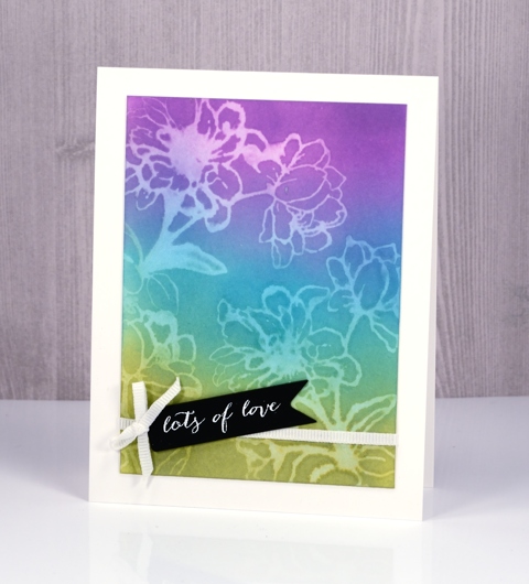
It’s not a really sharp image but it is definitely recognisable and I love the look.
The trials are not over but if you are looking for a technique to start with try some sponging; the finish is so rich and creamy. Then if you are feeling scientific try some desaturation as well. If you have thought of a technique you’d like me to try please leave me a comment below.
Supplies
Stamps: full of glee, feathery, Effulgent, stitched flowers, happy snippets (PB)
Die: tagged, omg (PB)
Inks: worn lipstick, broken china, fossilized amber, wilted violet, peeled paint distress oxide inks (Ranger) versamark, versafine onyx black & smokey gray (Tsukineko)
Papers: hot pressed watercolour paper, neenah solar white, neenah epic black, violet cardstock
Also: gold & white embossing powder, white ribbon, gold thread
The distress oxide trials
Posted: April 28, 2017 Filed under: Flower Frolic, Penny Black, stitched flowers, Tagged | Tags: distress oxide inks, Penny Black creative dies, Penny Black stamps, Tsukineko Versafine inks 14 Comments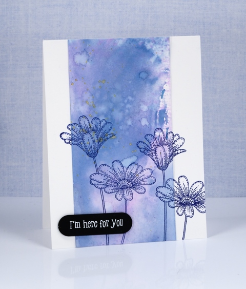
The trials have begun. Shauna at The Foiled Fox sent me some distress oxide inks to try. I have been intrigued by the videos and projects I’ve seen around the place so was keen to play with them myself. I started by mixing some diluted ink on a craft mat then swiped different papers through it. I chose bristol cardstock, hot pressed watercolour paper and neenah solar white 110lb cardstock.
The card above features the bristol cardstock. It picked up the colour well, the inks blended and the watermarks from splattering made nice light patches with dark edges. I used two main colours, a pink and a blue (what a surprise!) then I splattered a little yellow at the end of my experimenting.
The panel below is made from the hot pressed watercolour piece. The results were very similar but the blending was even smoother between the colours.
I chose not to make a card from the sample on neenah solar white. It worked but the colours did not blend or spread as nicely in my opinion. These are just the beginning of my experiments of course and only three colours but there is more to come. The inks blended just as beautifully as the original distress inks but dry opaque or semi opaque, perfect for a solid background.
Supplies:
Stamps: delicate flowers, stitched flowers, happy snippets
Dies: flower frolic, tagged
Inks: faded jeans, worn lipstick, fossilized amber distress oxide inks (Ranger) versafine majestic blue (Tsukineko)
Papers: hot pressed watercolour paper, bristol paper, stardream blue cardstock, black cardstock
Feathers
Posted: April 25, 2017 Filed under: Brusho, light as a feather, Skyward | Tags: Brusho, Penny Black creative dies, Penny Black stamps 4 Comments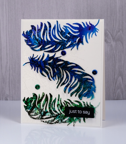
I’ve been wanting to make a feather card for ages and finally got round to it for today’s guest post on the Foiled Fox blog. I have told you before, but just in case you’re new here, I want you to know what a delightful place The Foiled Fox blog and store is. The blog features all sorts of lovely projects and the online store is full of fabulous art and craft supplies and they are always adding new products.
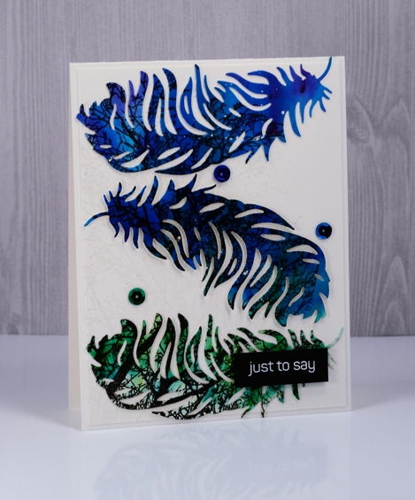
To create my feather card I worked on hot pressed watercolour paper and did all the painting and stamping before any of the die-cutting. I splattered masking fluid over the panel first then sprinkled three colours of brusho, spritzed that and watched it react and spread over the panel. I wanted the violet to blend into the blue, then the blue into the green so I tilted the panel and let the wet paint move. Once the panel dried I stamped the Penny Black ‘skyward’ stamp in black versafine ink.
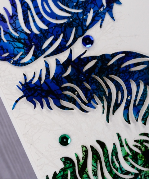
The background is also stamped with the skyward stamp and embossed in clear powder to create a subtle pattern. I popped the feathers up on the background panel, added some co-ordinating sequins and a little embossed sentiment.
Thank you, thank you to the crew at the Foiled Fox for having me on their blog again today. You can find links to the products used on today’s project listed below.
Supplies
Stamps: skyward, happy snippets
Dies: light as a feather
Inks: versamark, versafine onyx black
Paper: hot pressed watercolour paper, white cardstock
Paint: brusho violet, cobalt blue, leaf green
Also: white & clear embossing powder, masking fluid, sequins
Bamboo
Posted: April 20, 2017 Filed under: Alcohol Ink, bamboo cut out | Tags: Penny Black creative dies, Ranger Alcohol Ink, Yupo Paper 6 Comments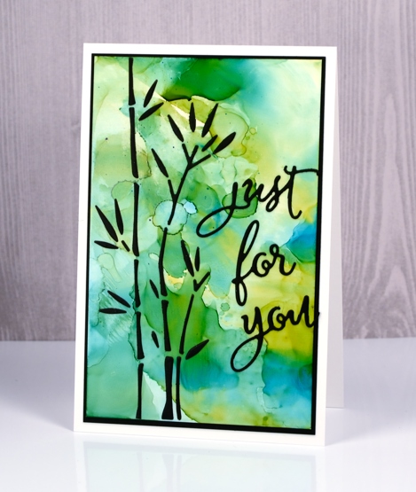
I have combined a new die, ‘bamboo cut out’ with an alcohol ink background to create this simple design. As the name of the die suggests, the die cuts out all the little pieces to make up some stalks of bamboo. The easiest way to make this card would have been to cut the bamboo out of the alcohol ink panel to reveal the black background behind and I would suggest using that method. For some strange reason however, I chose to cut the bamboo out of black cardstock and attach all the little pieces to the alcohol ink panel.
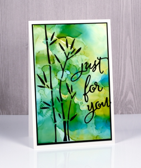
I put double sided adhesive on the back of the black cardstock before die cutting then held all the pieces together with a sheet of ‘press & seal’ so I could attach them to the alcohol ink panel but it was a tad fiddly!
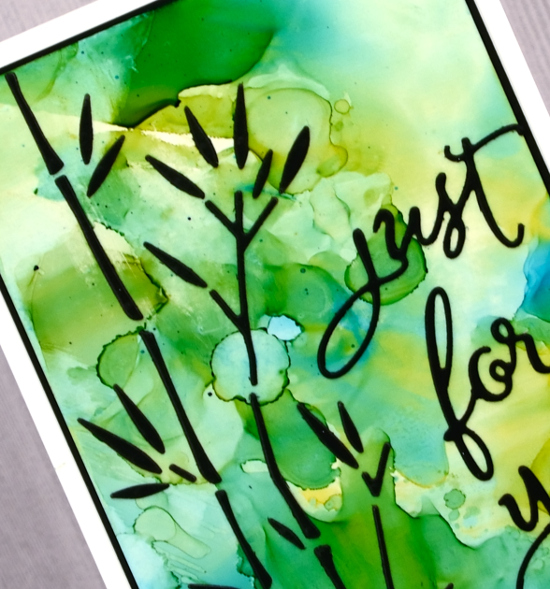
I made the alcohol ink panel on white yupo paper. I dropped some blue and yellow alcohol inks on a craft sheet, added some rubbing alcohol then swiped the yupo through it to pick up the blended coloured patterns. The colours reminded me of light through a forest so I chose the bamboo to be my feature image.
Supplies
Dies: bamboo cut out, for you
Inks: honeycomb & stream alcohol inks (Ranger)
Paper: white yupo paper, black cardstock
Also: stick it adhesive, rubbing alcohol
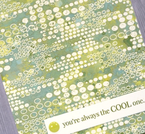
Felicity
Posted: April 19, 2017 Filed under: birds and banners, Felicity | Tags: Brusho, Penny Black creative dies, Penny Black stamps, WOW embossing powders 17 Comments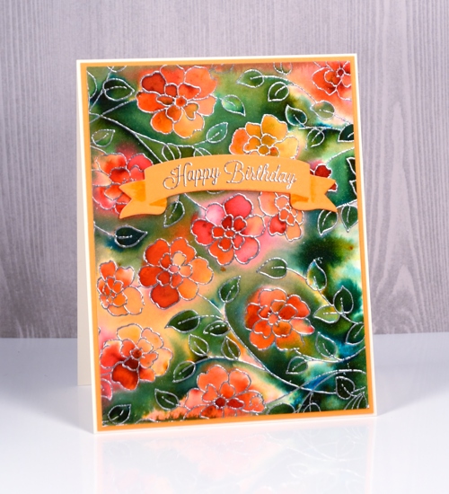
Today’s card looks like it was created with a background stamp, which is practically the case, but not quite. I used the new slapstick cling stamp, ‘Felicity’ and stamped it twice to more than fill a card front. The stamp is actually longer than my average card but a bit narrower. The organic arrangement of the flowers made it easy to stamp it twice and make it look like one big image. I stamped in versamark ink then embossed in silver powder on hot pressed watercolour paper. I taped it down then spritzed all over the panel with water. It wasn’t soaking wet but it was wet enough that the brusho I sprinkled on next started reacting straight away. I picked up some more brusho colours the other day to expand my collection and three out of four on this card are new to me. I sprinkled orange, sandstone and rose red over the flowers, spritzed again, tilted the panel to move the water and waited to see if I needed more. I did this a few times then switched over to sprinkling the olive green brusho over the rest of the panel. The olive green was more intense and the leaves on the panel are small so some areas got very dark, very quickly. I used a folded paper towel to remove liquid and colour where there was too much. I also tilted the panel so colour would flow down towards the closest embossed barrier which makes for nice dark contrasting areas next to some of the silver embossing.
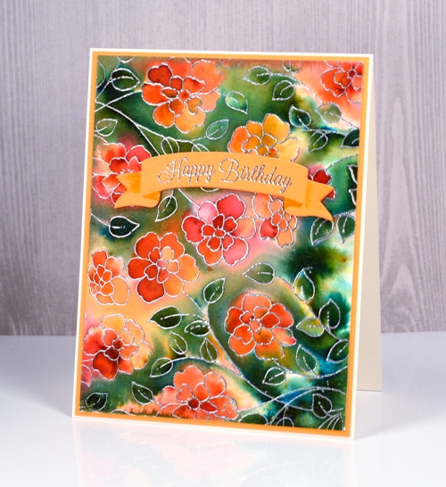
I let the panel dry naturally then trimmed it and matted with orange cardstock. I cut a curved banner from the new set ‘birds & banners‘ and embossed one of the co-ordinating stamps from the ‘banner sentiments‘ set in silver. The die cut banner looks folded so I used a marker to add a little shadow to the areas which appear to be behind the main section. I cut the same banner from orange fun foam so I could pop my sentiment up on the floral panel.
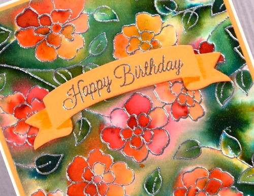
When I looked up the name of this new stamp, I was delighted to see it is called ‘Felicity’. I have a dear cousin called Felicity who I haven’t seen in many long years but I have fond memories of. I am going to try hard to actually send a ‘felicity’ stamped card to her, maybe this one.
Supplies
Stamps: Felicity, banner sentiments (PB)
Dies: birds and banners (PB)
Inks: versamark
Papers: hot pressed watercolour
Paints: orange, sandstone, rose red, olive green brusho
Added extras: Zing silver embossing powder
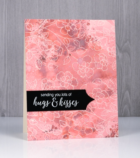
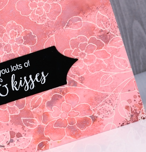
Flower medley
Posted: April 18, 2017 Filed under: birds and banners, flower medley | Tags: Nuvo crystal drops, Peerless Transparent Watercolors, Penny Black creative dies, Penny Black stamps, Tsukineko Versafine inks, WOW embossing powders 4 Comments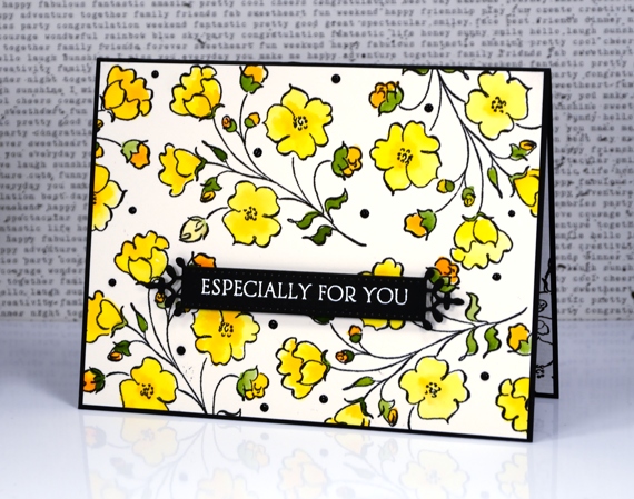
I’m sharing another card today made with products from the new Penny Black release ‘Celebrate.’ The flowers featured on today’s card were made with just one of the stamps from the new transparent set ‘flower medley’. I stamped it all over a piece of watercolour paper with black versafine ink then embossed in clear powder. I used my peerless watercolours to fill in all the flowers, buds and leaves.
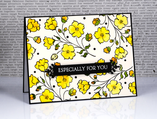
The fancy little banner you see is a diecut from the new set, ‘birds & banners’ which has a co-ordinating stamp set of nineteen sentiments. I embossed one in white on the banner then popped it up over the floral panel.
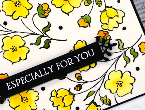
When I had put the card together on the black card base I decided it needed little dots of black ebony nuvo crystal drops to fill in a few spaces and look cute!
Supplies
Stamps: flower medley, banner sentiments
Dies: birds and banners
Paper: hot pressed watercolour paper, epic black neenah cardstock
Inks: onyx black versafine, versamark (Tsukineko)
Paints: peerless transparent watercolours
Also: ebony nuvo crystal drops, clear embossing powder, white embossing powder


