
No-line summer glow
Posted: May 28, 2019 Filed under: Penny Black, summer glow | Tags: Penny Black stamps, Ranger Distress inks 12 Comments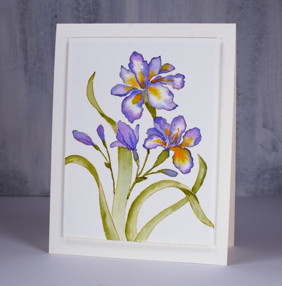
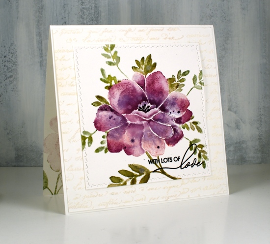
I’ve been doing quite a bit of no-line watercolour lately and this is one of my faves. I only wish that I had picked a different colour scheme; I’ve worked with this stamp before and used purple those times also. I have a rich burgandy giant iris in my garden (at least, I hope it is still in my garden) why didn’t I pick that colour scheme? I guess I will just have to do another one won’t I?
I used antique linen distress ink for my initial stamping and as you can see it has almost disappeared entirely. This technique is the focus of my next class here in Ottawa.
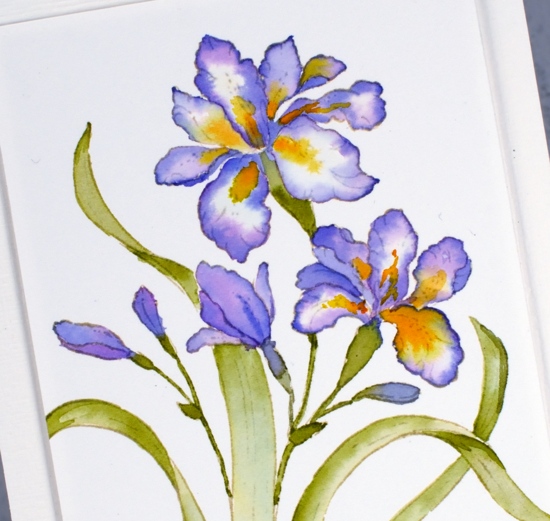
After stamping ‘summer glow’ on hot pressed watercolour paper I worked on one petal at a time and from the outside in with blueprint sketch and wilted violet around the edges and wild honey and spiced marmalade in the centres. I used peeled paint distress ink for the leaves. I used my glass mat as a palette for no-line watercolour and it works brilliantly; I pressed each inkpad face down on the glass and added a little water with a paintbrush. My mat is clear glass so I pop a piece of white paper underneath so I can see the inks’ true colours. I popped up the panel with adhesive backed foam on an embossed panel the size of my card base.
My irises have emerged despite the fact that the sun seems to only shine one or two days a week!
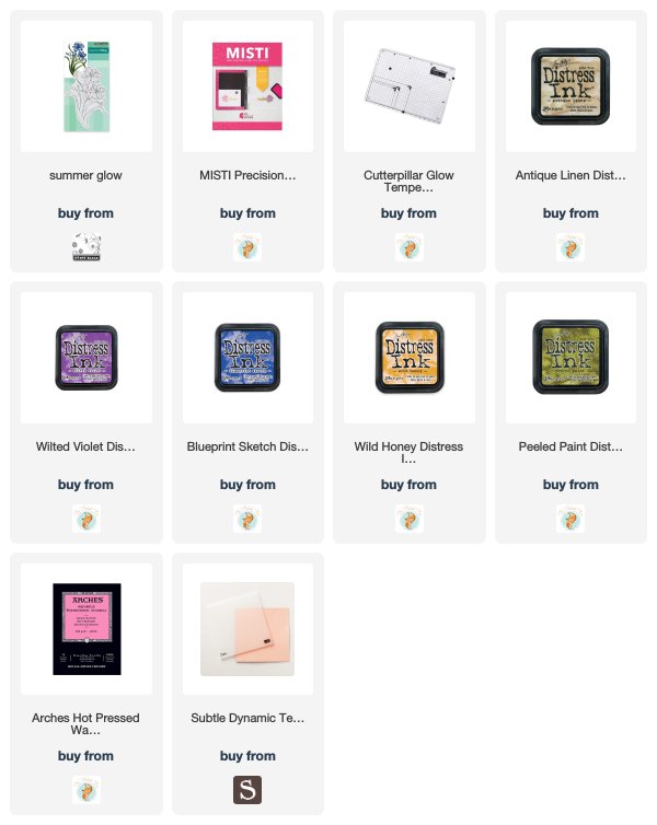
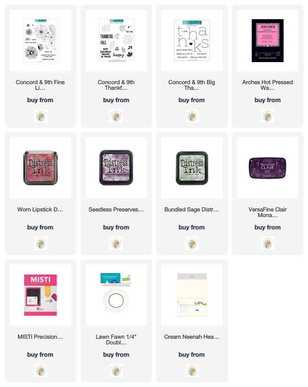
Supplies
Three colour leaf canopy – challenge reminder
Posted: May 24, 2019 Filed under: Altenew, Leaf Canopy | Tags: Altenew, Ranger Distress inks 6 Comments
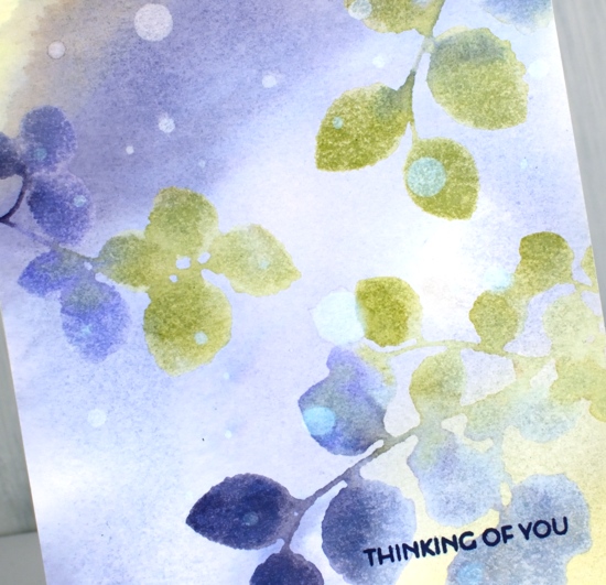
I have been bombarding you with three colour projects lately partly because I have a challenge running with the Foiled Fox but also because I love the simplicity of working with only three colours. Today I’m sharing here and on the Foiled Fox blog. I picked an analogous colour scheme which means the colours are all side by side on the colour wheel. The result is harmonious rather than bold and contrasting. I used stamps from the Altenew set ‘leaf canopy’ for both cards. Before I started stamping I pressed three distress ink pads face down on my glass mat and spritzed water over the inks until they started to run together. I swiped my panel of hot pressed watercolour paper through the colours, chipped sapphire, stormy sky and shabby shutters creating a soft blended background. I dried the panel completely before putting it in my stamp positioner. I inked the solid leaf stamps with the same three colours, spritzed them so the colours bled into each other on the stamp then closed the MISTI lid onto my panel and kept it down for 5-10 seconds. When I lifted it I had soft blurry leaf images. Any areas with excess ink pooling on them were easily fixed with the corner of a paper towel to sop them up. Again I dried the panel with a heat tool before stamping the outline leaves in chipped sapphire ink. I used my favourite sentiment from the same set and embossed it in white on navy cardstock. I used the Avery Elle simple sentiment dies again to cut it out – I can’t stop using them, I guess you have realised that by now!
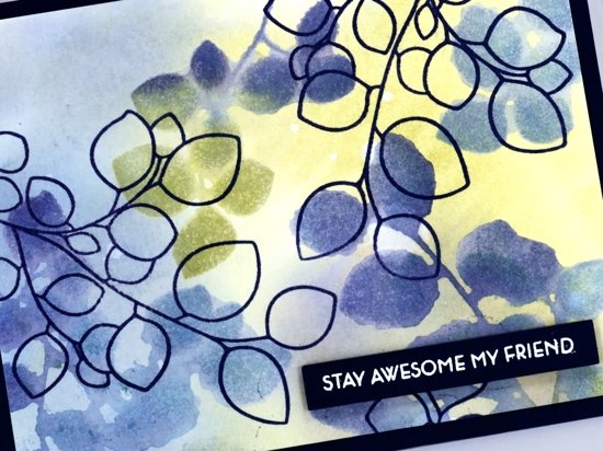
For my second card I switched one ink colour, instead of stormy sky I used shaded lilac so there are more purple tones in this one. I made the background the same way and did the stamping the same way but then took a bit of time adding water droplets strategically not in a splattery way. I wanted them to look random so I took care to place each one with a drop on the end of a paintbrush! I let them sit then absorbed the water with a paper towel leaving a pale circular watermark on the panel.
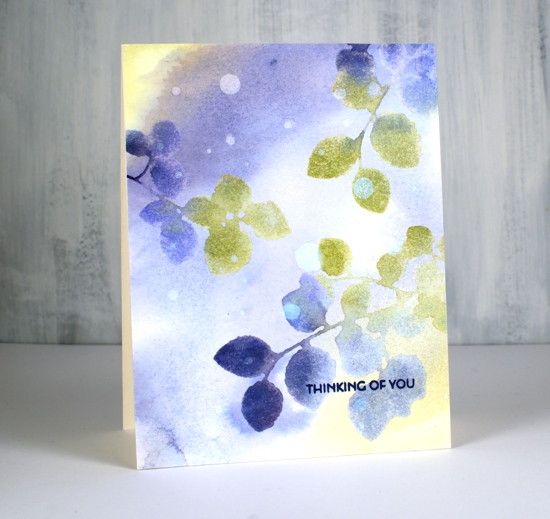
I kept this panel soft and dreamy and added a small sentiment in cobalt archival ink.
I hope this simple technique inspires you to play with three colours of ink and come up with a colourful panel of your own for the ‘Color Trio Challenge‘ on the Foiled Fox blog. There are some lovely cards linked there already, check them out then add your own.
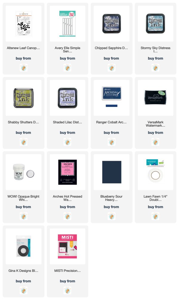
Supplies
Blooming Tulips
Posted: May 22, 2019 Filed under: blooming tulips, Penny Black | Tags: Penny Black stamps, Ranger archival inks, Ranger Distress inks 5 Comments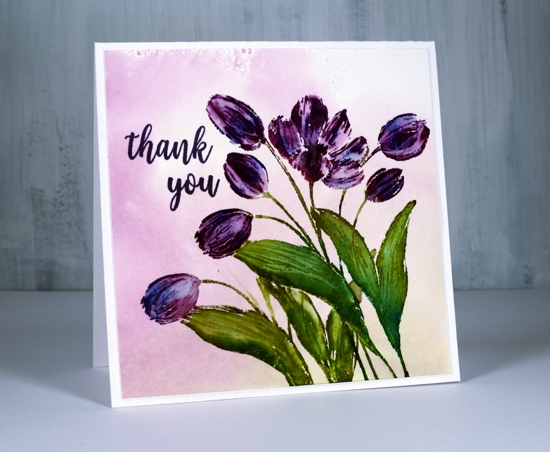
I just can’t stop serving you up three colour panels. This one is made up of green, purple and blue. Once again I used distress inks because if you’re blending, distress inks are always a good choice. In my last post I mentioned how I used archival inks along with the distress inks to give me a base image to stamp and paint over. I used archival ink on this card also but in a different way. It is so convenient having some archival inks in distress colours.
I began with a piece of hot pressed watercolour paper and pressed both the peeled paint and the seedless preserves ink pads down on my glass mat. I then spritzed a generous amount of water over the inks to dilute and spread them out. I swiped my watercolour panel through the ink then dabbed with a paper towel and dried with a heat tool to make a soft background for my stamped image.

With my stamp in the MISTI I inked the leaves in peeled paint distress ink and the tulips in seedless preserves. I added dabs of salty ocean ink to both the leaves and flowers, spritzed the stamp and stamped on the panel. I then blended with a paint brush which resulted in some variation of colour in leaves and tulips where the blue ink mixed with the main colours. I love how easy it was to get some variation with the salty ocean ink. Blue is a base colour for making green and purple so I knew it would blend nicely with both inks. With the panel still in the MISTI I was able to ink the tulips with dusty concord archival and the leaves with peeled paint archival ink and stamp some of the detail over the top of the blended colour. I used a black soot distress marker to darken the centre of the open tulip. To fill out the design a bit I did some masking and some partial inking to add another leaf and flower on the left hand side of the panel.A little stamp surgery on the thank you stamp from the PB ‘grateful sentiments’ set made it possible to have one word above the other tucking around the flowers.
If you have a recent three colour card on hand pop over to the challenge on the Foiled Fox blog and link it up. I would love to see it!
Supplies

Love’s glow
Posted: May 20, 2019 Filed under: Leaves, love's glow, stitched square & circles, Triple Banner | Tags: Penny Black creative dies, Penny Black stamps, Ranger archival inks, Ranger Distress inks 7 Comments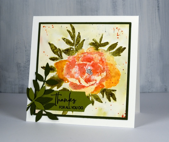
Here’s another new beauty from Penny Black. This one is a large rubber cling stamp called ‘love’s glow’. I’ve stamped it with a mix of archival and distress inks then added some die-cut extras on the corner. I think I might have gone a little over board with the splatter at the end but not enough to make me give up on the floral. There is a lot of shaded detail in this stamp so it is very helpful to stamp it in a medium to dark colour first on a scrap of paper so you can have the image off to the side while adding colour to your project. Before I started stamping I splattered some masking fluid on the hot pressed watercolour panel so the finished design would have some white dots here and there. You could use white paint at the end to get a similar effect. I used my MISTI so I could work on the oranges and reds separate from the green.
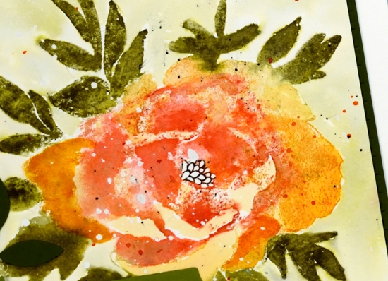
I stamped the flower first in archival spiced marmalade ink, it is one of the colours Ranger has recently brought out in mini archival packs. I learnt this trick from Jill Foster, just one of many tricks I have learnt from her! By stamping the flower first in archival I have an image on my paper that I can watercolour over but it will not be diluted and lost as I add water. Because I was using similar colours in distress inks the initial archival ink does not stand out as different. When I inked the stamp initially with archival ink I wiped any of the spiced marmalade that ended up on the leaves. To achieve the blended red and orange tones in the petals I inked and stamped the flower again in wild honey and festive berries distress inks. I then used a damp brush to blend the colours in the petals using my reference photo to help me when necessary.
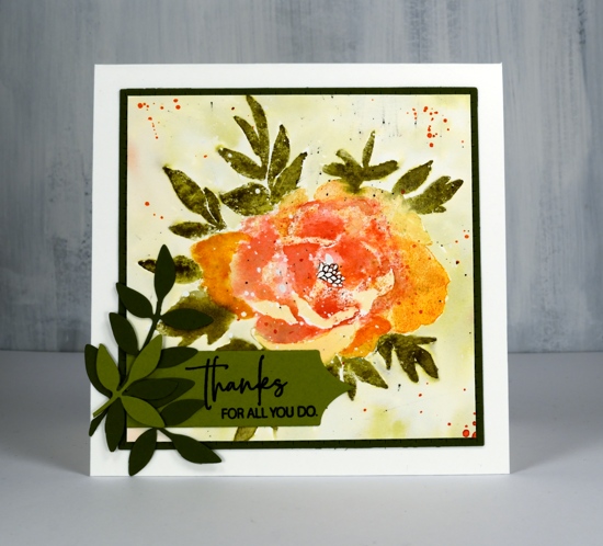
I followed the same process for the leaves stamping them first in archival peeled paint, then again in forest moss distress ink which I blended with water and a paint brush. I added definition to the centre with a black marker. Once the panel was dry I painted shabby shutters ink around the flower after first pressing my shabby shutters inkpad onto my glass mat and adding some water. I splattered with festive berries, forest moss and black soot ink. I trimmed the panel down to a square then die cut a square mat of olive green cardstock with the stitched square die.
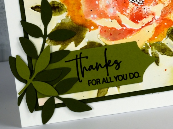
To finish off the card I added some green die cut leaves; I think these leaves might be from the first die sets I ever received from Penny Black. I’ve used them over and over. I cut a sentiment banner with one of the ‘triple banners’ set and trimmed one end so it could align with the mat. The sentiment is from the Best Mom set but I did some partial stamping to get only half the words on my banner.

I hope you are having a great Monday. I just want to remind you there is a sale happening at Foiled Fox all the long weekend and a ‘Color Trio challenge’ continuing until May 30.

Supplies
Watercoloured florals
Posted: May 17, 2019 Filed under: flower cascade, harmony, peaceful time, Penny Black | Tags: Penny Black stamps, Ranger Distress inks 8 Comments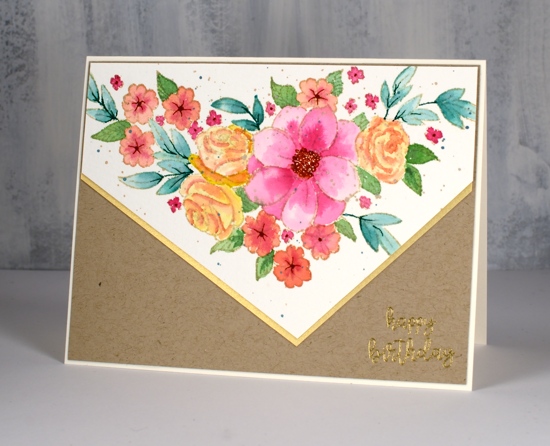
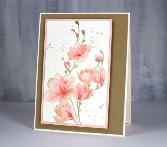
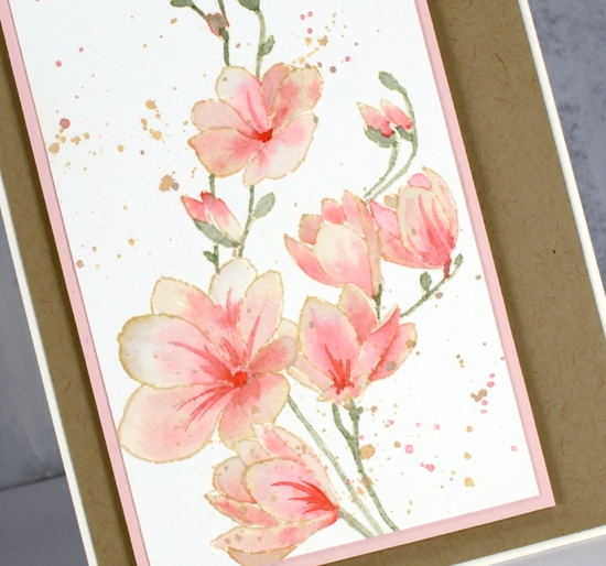
I’ve been doing some more watercolour with a limited colour palette. I am hosting a colour challenge with the Foiled Fox until the end of the month so I’ve been working with three colours whenever I get the chance. I’d love to see any three colour cards you’ve made added to our challenge link up. The card above was painted with only three colours, picked raspberry, fossilized amber and evergreen bough. The orange tones are a mix of pink and yellow, the blue/green leaves are evergreen bough, the other leaves are a mix of evergreen bough and fossilized amber.
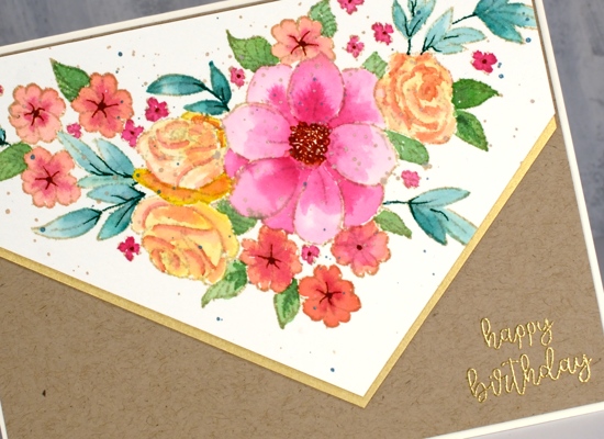
I stamped PB ‘flower cascade’ in antique linen ink which is perfect for no-line watercolour. After I had finished the painting I splattered some antique linen oxide and some metallic green paint over the panel. I completed the card with some kraft and shimmer gold cardstock and added a gold embossed sentiment.
I want to let you know that The Foiled Fox is having a sale all weekend so if you are wanting to do a little arty crafty shopping pop on over there.
My second card is also a three colour image painted with bundled sage, worn lipstick and antique linen inks. I stamped the image in antique linen ink then smooshed the distress ink on my glass mat so I could dilute and paint with it. I painted one petal at a time so I could blend dark to light and let it dry before painting an adjacent petal.
Have a great weekend and maybe try a colour trio card!
Supplies
Flower fantasy blossoms
Posted: May 15, 2019 Filed under: flower fantasy, Penny Black, winter branches | Tags: no-line watercolour, Penny Black creative dies, Penny Black stamps, Ranger Distress inks 6 Comments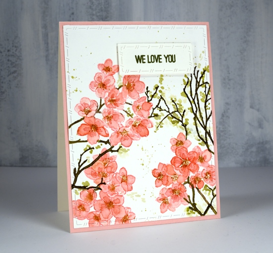
Blossoms are finally appearing in Ottawa! I even have a daffodil or two in my garden.
There are two blossom stamps on the PB ‘flower fantasy’ set and I paired them up to create this spring card. I used spun sugar distress ink to stamp the blossoms then painted the petals first with spun sugar ink then a second layer with worn lipstick ink. My painting is inside the lines for the first layer but I added the darker layer more loosely just wanting some extra depth in the flowers. I was working in my MISTI so I was able to ink the centres in rusty hinge ink and stamp them over the flowers once the painting was dry. This is an example of what is known as ‘no-line watercolouring’. Distress inks are great for this technique as you can stamp with them and then smoosh them on a glass mat or acrylic block and paint with the ink. The original stamped outline blends with the painting making the lines less obvious or disappear entirely. I often use antique linen distress ink for no-line watercolouring but the spun sugar did a good job for today’s panel.

To fill in the design I added some twigs using the ‘winter branches’ stamps and forest moss distress ink. I painted little dabs of shabby shutters and diluted forest moss ink around the twigs to look like leaves budding.

To add some subtle decoration I used the new stitched nested frames dies to cut the stamped panel and the sentiment strip. I stamped the sentiment in peeled paint archival ink; having archival inks in distress colours is a wonderful thing! The sentiment is from the ‘best mom’ stamp set and I think it is so nice to have a ‘we love you’ stamp as this card is going to a friend and will be from our whole family.
Supplies
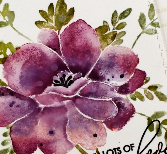
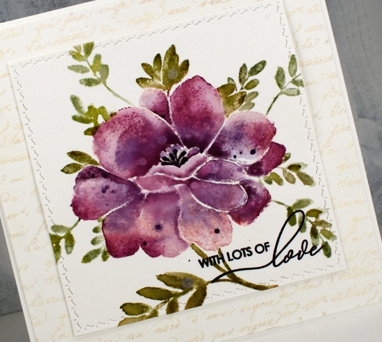
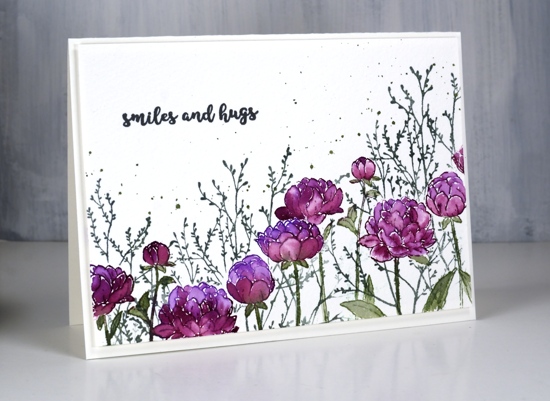
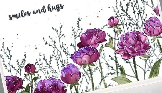
Fine line florals with distress inks
Posted: May 9, 2019 Filed under: Concord & 9th, fine line florals, thankful leaves turnabout | Tags: Concord & 9th, Ranger Distress inks 5 Comments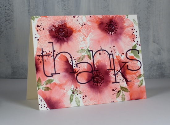
I have another card featuring the fine line florals set from Concord & 9th. I am using a similar technique as in my previous video but I’ve created a patterned panel that covers the whole card front this time. The single flower stamps from this set are made up of very fine radiating lines which look like transparent petals whether blended with water or not. I like the way part of each flower is still lined where as other sections are a soft blend of pink and purple ink. I’m using hot pressed watercolour paper which captures more of the fine lines than cold pressed does.
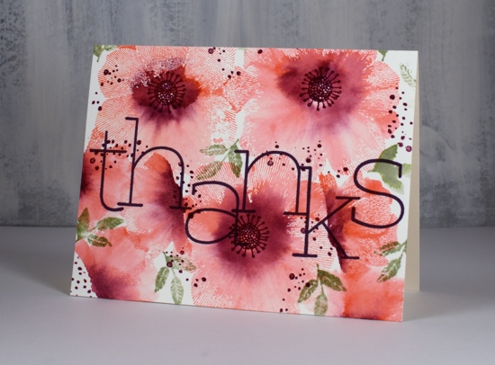
The Foiled Fox and I have a three-colour challenge happening during May and today’s card is features a simple pink, purple and green colour scheme which packs plenty of punch with its soft pinks through to dark purple. The stamp set includes flower centres and little splattery dots but no leaves so I pulled out a little spray of leaves from the C&9 turnaround leaves set.
I hope you get inspired to try this technique or try a three-colour card for our challenge.
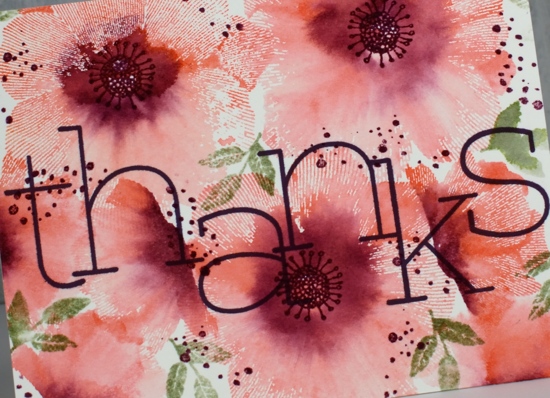
These fabulous big letters are from the C&9 ‘big thanks’ set and I love the font.
Thanks for dropping in today. Hope you have a creative day!
Supplies
Dreams of love
Posted: April 29, 2019 Filed under: dreams of love, Penny Black, Script, square and circles, Xmas sprigs | Tags: Penny Black creative dies, Penny Black stamps, Ranger Distress inks 12 Comments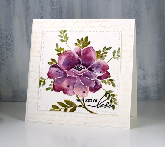
I think you can guess where this sweet floral came from. Penny Black has a new release, ‘Full Bloom’ and this is just one of the beauties I have to show you. As I often do with brushstroke stamps I pulled out distress inks for my first play with this stamp. I used three purple inks, milled lavender, seedless preserves and dusty concord to create variegated petals on this large flower. For the leaves I used a mix of peeled paint, forest moss and bundled sage. I would understand if you wondered whether I ever use any of the other greens, those three are definitely the first ones I reach for!
I used a stamp positioner and hot pressed watercolour paper and started by stamping the whole flower (but not the leaves) in milled lavender distress ink. On a stamp like this one it is sometimes hard to differentiate between petals and leaves when looking at the red rubber side of the stamp. I find it helpful to stamp it on scrap paper in a medium to dark ink as a reference. When doing partial inking as I did for this card, I ink all the petals then wipe off any ink that ended up on the leaves with a cloth or wet wipe. After stamping in milled lavender I inked the petals again, this time in seedless preserves ink and I did not cover all the petals. I gave the stamp a light spritz of water so the ink would blend when it layered over the previous stamping. Finally I inked it again in dusty concord keeping the ink concentrated around the centre of the flower not the edges. I then used a paintbrush and some water to blend the colours on each petal one at a time. To further define the petals I pressed the ink pads onto my glass mat so I could pick up ink with my paintbrush and add it to the edges or any areas where I wanted a strong shadow. I dried the panel before carefully inking the anthers with a black marker, unlike the rest of the image I wanted them sharp and defined rather than soft and blended. I also added distress stain drops and water drops while the panel was dry.
With the petals all finished I switched to the leaves and inked them with peeled paint and forest moss ink then blended them with water after stamping. I added a few more leaves of the same style using a stamp from the ‘Xmas sprig’ stamp set. To add them in I cut a rough post it note mask and positioned it over the petal edge before stamping the sprig in bundled sage and peeled paint inks.
To finish the card I die-cut the panel using the square from the PB ‘stitched square & circles’ die set and clear embossed a sentiment from PB ‘special sentiments’ in black ink. I framed the floral panel with a script stamped panel which I embossed with Ranger weathered white embossing powder. I have not had success with this embossing powder until now, totally user error by the way, there is nothing wrong with the product! The embossing powder is called ‘weathered white’ for a reason, when you emboss with it the effect is not glossy and it is not even. It is, as the name suggests, weathered! For a large background area like this script panel it adds texture and subtle colour. The card is quite large and fits into a 6″ square envelope. I inked the stamp in milled lavender and bundled sage ink to stamp a pale image inside the card and used the same inks to stamp the ‘sprig’ on the envelope.
I’m looking forward to inking this stamp again with different colours schemes and maybe a looser watercolour look.
Supplies
Loose Watercolour Florals
Posted: April 24, 2019 Filed under: Altenew, Concord & 9th, fine line florals, Leaf Canopy | Tags: Altenew, Concord & 9th, Ranger Distress inks, Tsukineko Versafine inks 9 Comments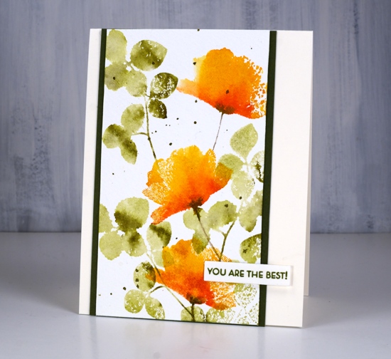
One of my favourite techniques is this simple floral card with a loose watercolour look. The foliage is from the Altenew set ‘leaf canopy’ and the flowers are from the Concord & 9th set ‘fine line florals’ (the same set I featured in a journal page last week). The flower stamp is very detailed with fine lines covering the whole stamp. Because I wanted a loose watercolour look I spritzed water on the inked stamp which meant I lost most of the fine lines. I do like the way a few of them remained giving the petals a slightly transparent look.
I tried the ink, spritz and stamp method a few times before creating this panel because it was easy to add too much water and end up with a splodge rather than a flower. The experiments only took a little time and a few pieces of watercolour paper so definitely not a waste.

In this close up you can see some of the texture of the cold pressed watercolour paper. Although I often use hot pressed I still reach for cold pressed at times because the rough texture adds interest particularly when using solid or semi solid stamps like these ones.
Supplies
Unfolding
Posted: April 22, 2019 Filed under: trees in bud, Unfolding | Tags: Penny Black stamps, Ranger Distress inks, Tsukineko Versafine inks 15 Comments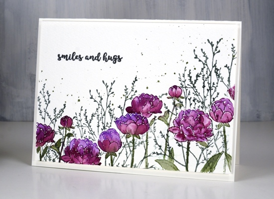
Like many card makers I have numerous boards on Pinterest filled with inspiration for future art and cards. I opened one such board yesterday looking for inspiration and decided to have all my flowers and foliage along the top of the card hanging down, then empty space below. I did all the painting with the flowers upside down but when I had finished it didn’t make sense to have the flowers upside down at all so here they are right side up.
Working on cold pressed watercolour paper I stamped the PB ‘unfolding’ stamp twice which involved masking a flower head in the middle of the panel so I could overlap the flowers. I inked the flowers with wilted violet and seedless preserves distress inks and the stems in bundled sage then blended all the stamping with a little water and a small paintbrush. I wanted extra colour in the petals so I pressed all three stamp pads on my glass mat so I could pick up ink for painting.
Once I had painted all the flowers I realised I would need a mask for each one so I could stamp background foliage. It didn’t take too much time to stamp and cut masks of the flower heads, I didn’t worry about masking the leaves. The foliage is PB ‘trees in bud’ stamped in iced spruce distress ink and the splatter is bundled sage. To finish the card I add a sentiment from the handy PB set, ‘banner sentiments’ in versafine clair morning mist and popped up the whole panel on foam over a hot pressed watercolour paper card base. Sometimes I want a frame around a panel but nothing as bold as a coloured mat would be so I pop the panel up creating what I call a ‘shadow frame’ simply because the small distance between panel and card base casts a subtle shadow.
Supplies
https://linkdeli.com/widget.js?1552642647875


