
No-line summer glow
Posted: May 28, 2019 Filed under: Penny Black, summer glow | Tags: Penny Black stamps, Ranger Distress inks 12 Comments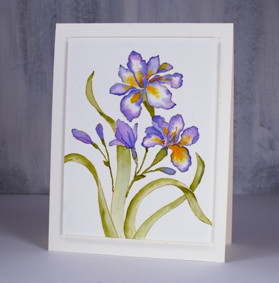
I’ve been doing quite a bit of no-line watercolour lately and this is one of my faves. I only wish that I had picked a different colour scheme; I’ve worked with this stamp before and used purple those times also. I have a rich burgandy giant iris in my garden (at least, I hope it is still in my garden) why didn’t I pick that colour scheme? I guess I will just have to do another one won’t I?
I used antique linen distress ink for my initial stamping and as you can see it has almost disappeared entirely. This technique is the focus of my next class here in Ottawa.
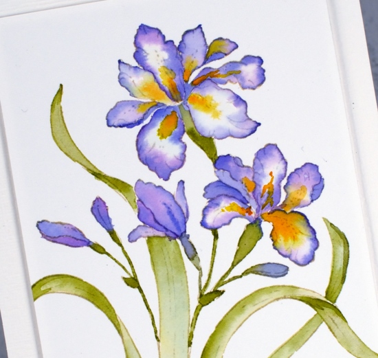
After stamping ‘summer glow’ on hot pressed watercolour paper I worked on one petal at a time and from the outside in with blueprint sketch and wilted violet around the edges and wild honey and spiced marmalade in the centres. I used peeled paint distress ink for the leaves. I used my glass mat as a palette for no-line watercolour and it works brilliantly; I pressed each inkpad face down on the glass and added a little water with a paintbrush. My mat is clear glass so I pop a piece of white paper underneath so I can see the inks’ true colours. I popped up the panel with adhesive backed foam on an embossed panel the size of my card base.
My irises have emerged despite the fact that the sun seems to only shine one or two days a week!
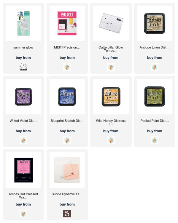
Supplies


Looks entirely hand drawn….amazing how the “no line” really is! Absolutely lovely work…but would like to see your burgundy iris too! Hoping summer comes to your area soon… I couldn’t deal with only a couple of days of sun 🙂
Thank you Marilyn, I am keen to try the burgandy colour scheme. Summer is definitely slow this year. Apparently gardens are about 4 weeks behind. The upside of that is that I am getting some much needed weeding done!
This is so very gorgeous. What a fantastic design.
Absolutely gorgeous, Heather! I love it! Irises were a favourite of my mums, especially purple ones.
Gorgeous irises Heather and the tradition colour we all think of is this pretty purple. I adore the no line colouring and the way the edge of each of the leave is darker which makes it stand out beautifully from the white background. We went to one of the garden’s locally which was open for charity and their was a beautiful yellow iris with three large dark red patterned petals and a pretty yellow feathery centre, so exotic and pretty. It was really striking and my husband took a photo of it. I am looking forward to see what other colour combinations you use. x
Thank you, Pat, I did a search for a yellow iris with large red patches and found a good photo. It’s beautiful, maybe I’ll try that one too.
Extraordinarily STUNNING, even for your talented hands! You’ve outdone yourself! Wow! xoxo
thank you, you’ve made my day!
Thank you for the sunshine this morning!! Another rainy day here and this is worth framing!!! I hope you find the time to do another color scheme also. Just lovely!!!!
This work of Art is so astonishingly beautiful, I have no appropriate ‘descriptors’ to use for comment! 😀 I LOVE the edge you achieved on each petal…and the yellow ‘tongues’ are so real they look almost 3-D. The leaves are wonderful with delicate detail! I love the colour and can’t wait to see your future colour combinations I LOVE IT, I LOVE IT!!!!♥
Oh wow! Brilliant colouring. This is a beauty!
I was excited when I saw you were guest on Penny Black. I look forward to this because the things I know: your cards are always beautiful, always unique, and always come with the most complete set of instructions!! Shows there is an awesome teacher behind those talented and creative works.
Tish