Poppy background watercoloured
Posted: August 29, 2019 Filed under: Ink to Paper, My Favorite Things, poppy background | Tags: Faber-Castell Polychromos Colour Pencil, Ink to Paper, My Favorite Things, Ranger Distress inks, sennelier watercolours 10 Comments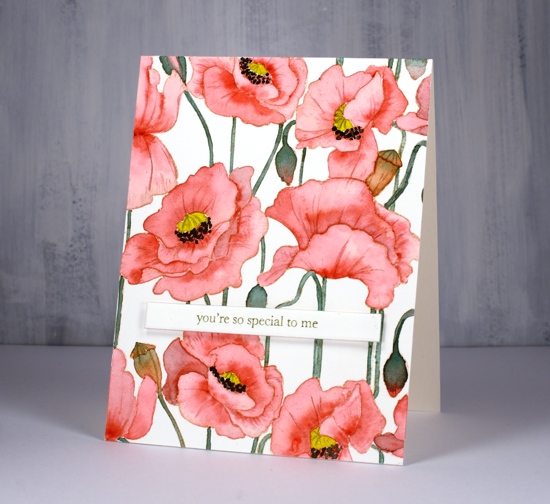
I did not plan to post this stamp two days in a row but it was there on the desk within reach and you have to admit it is perfect for no line watercolour because the outlines are so clear. So, instead of working on my to do list I painted on this card.
I stamped on hot pressed watercolour paper with antique linen distress ink for a pale but easily seen outline image. I decided to use my sennelier watercolours because they are lovely to work with. I used a red, a yellow, and a green. To make brown I mixed the red and green, then to make the black I added more red and green. The green I used for the stems and buds was not straight from the pan I mixed in a little red first to make it more olive toned. Once again I was happy with the results from sticking to a limited palette. You can definitely try the same approach with whatever watercolours you have on hand. If your green is a little bright, as mine was, add in a bit of red.
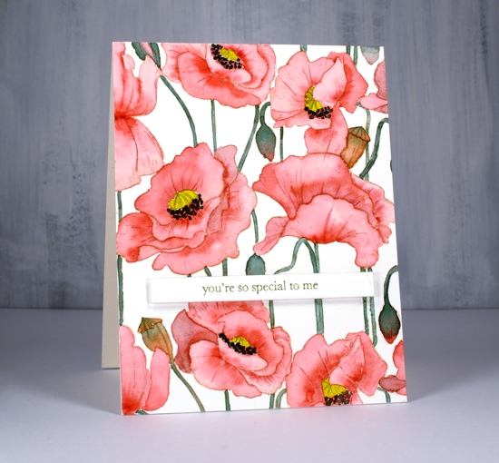
I painted the petals one at a time with diluted red and while each was wet I added more red where I wanted depth or shadow. I paid attention this time to whether I was painting buds or pods. I painted the buds with green blended into red and painted the pods in browns. I added a little of the mixed green to my yellow before painting the poppy centres and used my red+green=almost-black to paint the little black dots around the poppy centres.
After all the painting was done I added a bit more shading and veins on petals with polychromos coloured pencils.
I decided to use another of the lovely little sentiments from my new Ink to Paper ‘tagged’ sentiments set. To achieve a matching olive green on the sentiment I stamped with versafine clair shady lane ink but I stamped on a scrap first so I could get a pale ‘second generation’ print.
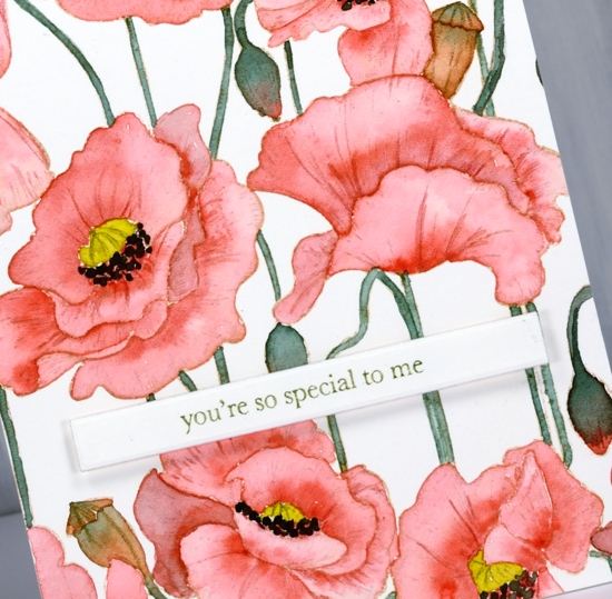
I hope you see how versatile this stamp is; it worked beautifully with the loose distress stain watercolour and the more precise no-line watercolour. I have an idea for a third look too.
Supplies
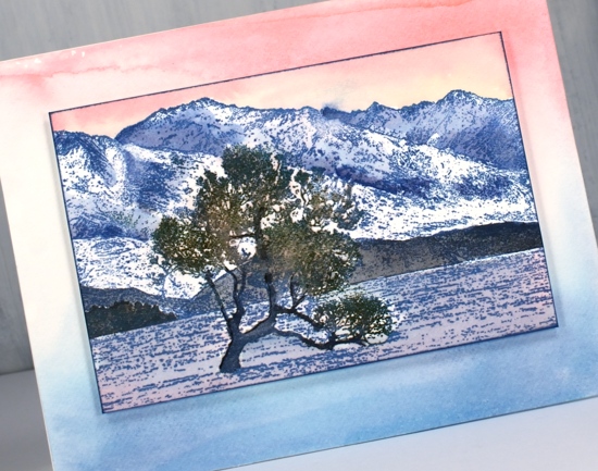
Lake Wanaka
Posted: August 26, 2019 Filed under: Darkroom Door, Lake Wanaka, Nature Walk, Stamped Landscapes | Tags: Darkroom Door stamps, Ranger Distress inks 4 Comments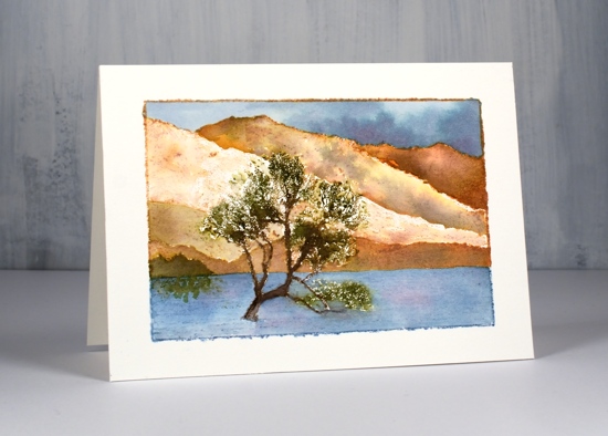
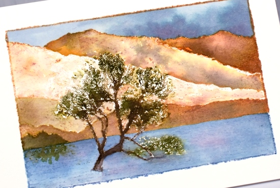
I have been creating with the new ‘Lake Wanaka‘ stamp from Darkroom Door. When I first saw this stamp I searched ‘Lake Wanaka tree’ and up came a range of inspiring images. Then I waited for the stamp to arrive so I could try to recreate some of the seasonal shots of this lake and tree in New Zealand.
For this first summer scene I worked with a hot pressed watercolour panel in my stamp positioner because I knew I was going to add inks step by step. I started by inking the lower (lake) portion of the stamp with stormy sky distress ink and the top portion of the stamp with tea dye distress ink. Next I worked with forest moss marker and ground espresso distress markers to add colour to the tree. This took a little while as the tree is made up of fine detail so I was only transferring a little ink at a time. Once the tree was defined I painted the lake with stormy sky and weathered wood ink. (smooshed onto my glass mat – I know you’ve probably got that step by now!) I switched to earth tones to paint the mountains and followed some of the definition of the stamp with rusty hinge, frayed burlap, vintage photo and tea dye inks. I painted a little stand of trees in the left corner with forest moss ink and added some reflections in the water. Once the mountains were dry I painted the sky with weathered wood, stormy sky and faded jeans ink.
For the sunset look below I used did less painting and worked with a base of one colour ink. I used faded jeans archival ink to stamp the whole image then painted more faded jeans distress ink into the shadows of the mountains, black soot ink over the foreground hills and faded jeans and spun sugar inks over the lake.
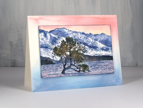
I used forest moss and ground espresso markers to ink the tree and stamp over the initial print and painted over the trunk also with ground espresso ink to make it bolder against the background. The sky is a mix of worn lipstick and spun sugar inks.
I decided to make a co-ordinating background panel by painting some worn lipstick, spun sugar and faded jeans distress stains onto my glass mat then swiping a piece of watercolour paper through it. I popped my stamped panel up on some dimensional tape.
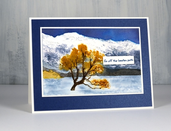
My autumn Lake Wanaka panel features the main tree and stand of trees in fossilized amber ink. I inked most of the stamp with a stormy sky marker but avoided the tree so I could use a fossilized amber marker to ink the foliage. I wanted to leave snow on the mountain tops so I did very little to that area but painted stormy sky and chipped sapphire shadows further down the mountains. Once again I painted the foothills in black soot ink. I used diluted stormy sky ink for the lake and chipped sapphire for a bold sky. When I was stamping the tree I spritzed the stamp to help the fossilized amber ink spread further.
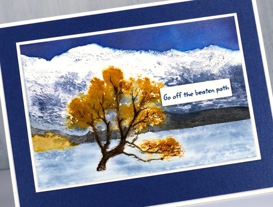
I finished the card off with white and navy mats and a little sentiment strip. I think you can probably guess why the sentiment is positioned right there. You’ve done the same I’m sure to cover a little bit that didn’t go the way you wanted it to!
Thank you for joining me today. I hope to be back before too long with more Lake Wanaka interpretations. Make sure you visit the Darkroom Door blog to see other creations featuring this stamp.
Supplies
Some kind of wonderful
Posted: August 16, 2019 Filed under: some kind of wonderful, The Stamp Market | Tags: Ranger Distress inks, The Stamp Market 11 Comments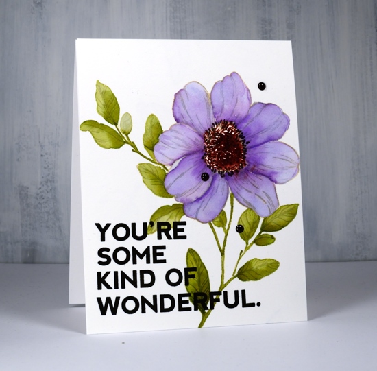
First project back in the workroom after many weeks away! Turns out I haven’t completely forgotten how to stamp or watercolour. That’s a relief as I am teaching a class tomorrow!
This pretty flower is from ‘The Stamp Market’ and the set is called ‘some kind of wonderful’ which is the cute sentiment included in the set. I decided to do some no-line watercolour to get myself back in the zone. I used antique linen distress ink because it works well to provide a pale outline to paint over and blends fairly well with most colours I might choose to paint with. It disappears better when painted with some colours than others. I added green to the leaves and the stamping turned green; I added lilac to the petals and the stamping remained light brownish. So it’s not perfect but I’m happy with the results.
I painted the leaves first with diluted peeled paint distress ink. I just smoosh the inkpad on my glass mat, add a little water and there’s my ‘watercolour paint’. I can make it lighter by adding more water or darker but not diluting it at all. I painted over the stem with undiluted ink and a brush that came to a nice pointy tip. Don’t try this if your brush doesn’t come to a nice pointy tip, you won’t be happy. Alternatively you can go over the stems with a matching marker.
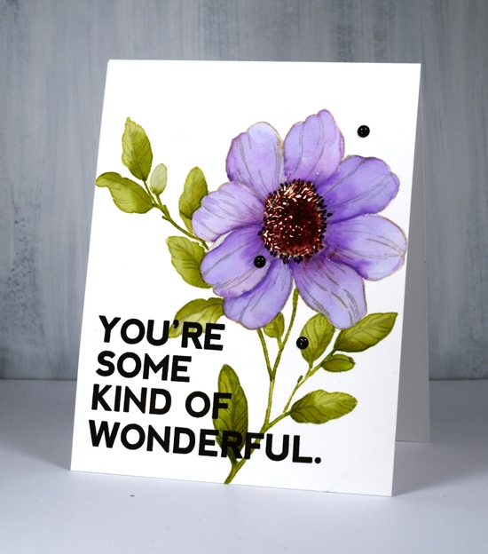
I kept the stamp and hot pressed watercolour panel in the misti as I worked so I was able to re-ink the middle of the flower with aged mahogany ink and stamp that for a dark centre. I blended the mahogany ink a bit with water but not too much because I wanted to keep some of the stamped detail.
I let the leaves and centre dry completely while I ate lunch then returned to work on the petals. I painted them all with shaded lilac, let them dry then added some depth with a mix of shaded lilac and wilted violet. When the petals were almost dry I drew little ‘carpels’ (maybe?) with a black soot distress marker. Drawing them in made it possible to neaten up the area between the flower centre and the petals which was a little scrappy and untidy.
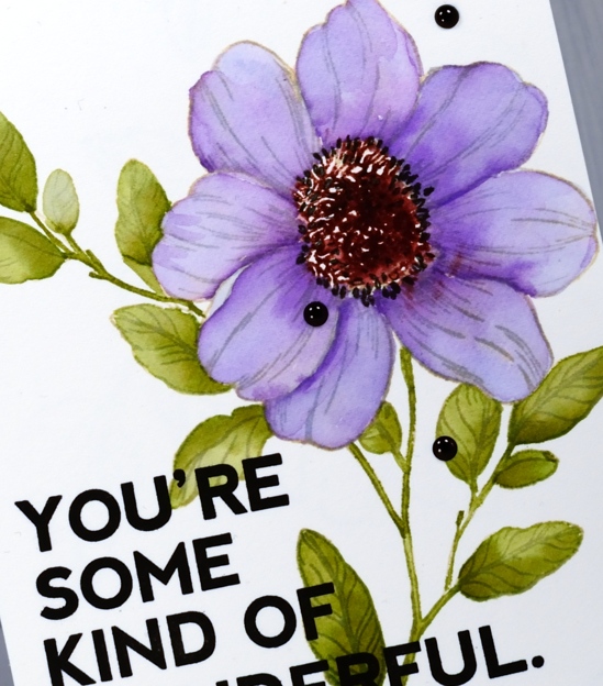
I decided to use the sentiment included in the set and in doing so discovered something very nifty. The sentiment that I thought was all joined together is actually four different stamps! I know! How handy is that? I occasionally do stamp surgery or tricky masking to get the word ‘you’re’ to be part of a sentiment combo. Now I have a stamp that says YOU’RE! (and one that says SOME and one that says KIND OF and one that says WONDERFUL) Isn’t that wonderful? I am thinking of all possibilities… Anyway I stamped the sentiment boldy in versafine onyx black and then added some black enamel dots to balance out that black boldness.
Supplies
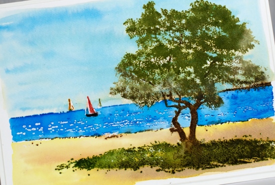
Sweet sails
Posted: August 14, 2019 Filed under: Penny Black, sweet sails | Tags: Penny Black stamps, Ranger Distress inks 10 Comments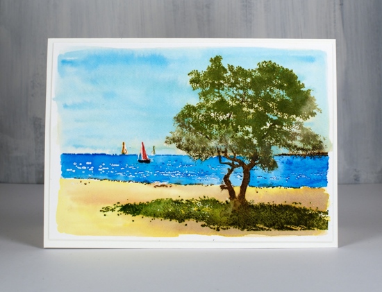
It is all about the scenery on the blog right now, I hope you don’t mind. I made five scenic cards back in June not knowing I would be making an unscheduled trip to Australia. I haven’t made any cards since June! I hope I remember how. This lovely sailboat stamp from Penny Black is called ‘sweet sails’ and I created a scene following a similar procedure as for my previous cards. With my watercolour panel in a stamp positioner I first inked the horizon line and water area in versamark and coloured the sailboats with distress markers (black soot, candied apple, fossilized amber) then stamped. I embossed the water with clear powder so the little dashes in the ocean would look like white caps. I painted over the embossing to cover the ocean area with salty ocean ink. Moving on to the tree, I inked with old paper, peeled paint and forest moss inks to build up depth and shadow. I used gathered twigs and ground espresso markers for the trunks and branches then did the grass with forest moss, mowed lawn and peeled paint inks.
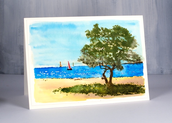
As with my recent scenic cards I let all the image stamping dry then inked the stamp with versamark and embossed in clear. This ‘seals’ in all the colour so I can paint sky and sand over the top. I used diluted salty ocean ink for the sky and fossilized amber, tea dye and gathered twigs inks for the sand.
I’m back in Canada now fighting off my jetlag one coffee at a time. Thank you for the kind messages many of you left in my comments over the last few weeks, I very much appreciate your thoughts and prayers.
Supplies
Ocean escape
Posted: August 7, 2019 Filed under: escape, Penny Black | Tags: Penny Black stamps, Ranger Distress inks 6 Comments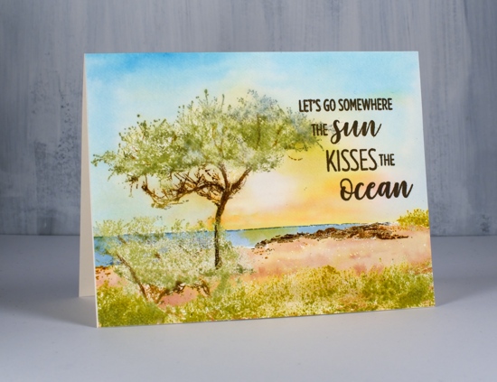
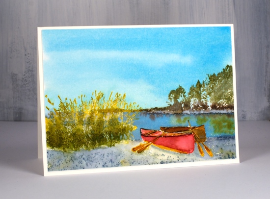
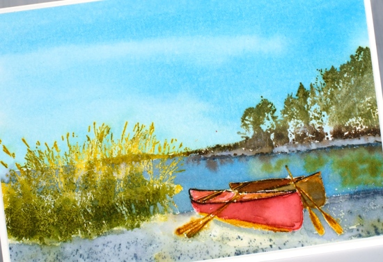
I have another scenic card to share featuring the new PB stamp ‘Escape‘. As you can imagine I was very happy to see these scenic stamps in the recent Penny Black release; I love to stamp and paint scenes. It does help to have a technique that enables you to work on the background separately from the foreground. I have used the same technique in the two cards already shared, plus this card and two more to come. It is very similar to a technique Jill Foster often uses and had demonstrated in numerous videos. I use a stamp positioner, I work on the foreground and middle ground images such as trees, grass, and canoes first and when they are completed I emboss over them with clear powder so I can paint the remaining spaces, usually sky, sea, sand or snow with inks or watercolour paints.
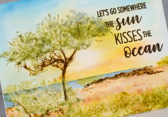
Once I am back in my workroom and reunited with my supplies I will try other techniques but I am happy with the way these scenes have worked out. For this particular card I worked on hot pressed watercolour paper and inked the grass and tree foliage with old paper distress ink then stamped. To build up depth and variety I added extra applications of old paper ink to the tree foliage and wild honey ink to the grass and scrubby areas. For the rocky outcrop and tree trunk and branches I used gathered twigs, rusty hinge and ground espresso inks and markers. The stamp includes a narrow line along the horizon which I inked with a stormy sky marker. Once all the stamping was done and dry I inked the whole stamp with versamark and embossed in clear. This step ‘seals’ the previous coloured stamping enabling me to paint or blend over the images without affecting the colours at all.
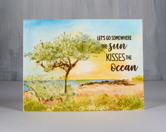
I painted the sky after adding masking tape along the horizon to protect the sea and land area. I wet the whole sky then painted salty ocean around the edges and scattered straw and wild honey ink in the centre. While the ink was still wet I blotted some colour out with a paper towel or thirsty brush to leave the bright, white sun. Once the sky dried I moved the masking tape an painted the sea in a mix of stormy sky and salty ocean ink then dropped a little wild honey ink under the ‘sun’. To finish I smooshed the tea dye and rusty hinge inks onto my glass mat so I could mix some sand colours to paint the ground. The stamp from ‘destination sentiments‘ set fitted the scene so I added it with ranger archival ground espresso ink.
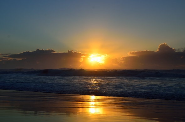
I took a few photos of a ‘Bonny Hills’ sunrise last week when visiting my brother and sister-in-law so I’ll leave you with one of those. My sister-in-law gets up every morning and takes the dog for a walk on the beach before she goes to work or starts her day. Two mornings I was there I slept way past sunrise and she showed me her beautiful photos later (kind but cruel!) Another morning I woke up ready to go and it was raining. The final morning I was there I joined her for her walk and enjoyed a lovely sunrise.
Supplies
Stamps: Escape (PB), Destination sentiments (PB)
Calm waters
Posted: August 5, 2019 Filed under: calm waters, Penny Black | Tags: Penny Black stamps, Ranger Distress inks 8 Comments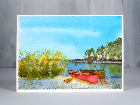
If you are stamping or painting canoes one of them has to be red doesn’t it? When I saw this scene in the recent PB release I knew I would stamp and paint it to have a red canoe. The stamp is called ‘calm waters‘.
I kept my hot pressed watercolour paper panel in the stamp positioner for almost the whole time I was working on this project because I was adding colour little by little. I started with the stand of trees across the lake and stamped them in old paper distress ink, it is a pale green over which I knew I could add darker inks. I added some peeled paint and forest moss ink to the stamp with markers to give shadow and depth to the trees then added ground espresso ink to the base of the trees and along the land jutting out behind the grass. On my last few applications of ink I spritzed a little water on the stamp to make the colours blend.
On the other side of the stamp I inked the grasses in fossilized amber ink, stamped then added some peeled paint ink to the base of the grasses again spritzing the stamp to blend the colour a little. I inked the water’s edge on the far side and the near side with weathered wood ink and blended it with a paint brush.
To do the canoes I inked first the red canoe with a candied apple distress marker and painted it with extra ink smooshed onto my glass mat. I stamped the base, paddles and seats in the canoe with fossilized amber and when the ink dried I outlined the canoe rim with a black soot marker. I stamped the second canoe with rusty hinge ink and mixed some with candied apple to paint the inside and outside.
As I had stamped the shore in weathered wood I was able to blend some of the ink with a paintbrush and water and add some fossilized amber here and there to give the shore grey and yellow tinges. After I had added all that colour I waited until the panel was dried then heat embossed it with clear powder before painting the sky and water.
With the embossing protecting the land and canoes I was able to paint the sky over the top half of the panel easily. I used salty ocean ink to make this scene a sunny one ( I think I’ll do another with a moody thunderstormy sky!) I used salty ocean for the lake also but added weathered wood to darken the blue. While the lake was still wet (when isn’t the lake wet!?) I dropped in some ground espresso and peeled paint ink to make soft reflections of the trees.
This technique is basically the same one I used for my windmill card but there was a lot more detail to work on with this scene before I embossed. If you don’t want a shiny embossed layer on your finished card you can iron it off when all the painting has been done. I ironed this panel face down onto a few pieces of computer paper which absorbed the sticky embossing. After my recent Australian themed scenic card, I think this one is a little more Canadian.
Supplies
Outback life
Posted: August 2, 2019 Filed under: country life, Penny Black | Tags: Penny Black stamps, Ranger Distress inks 23 Comments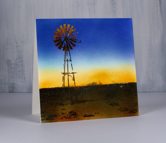
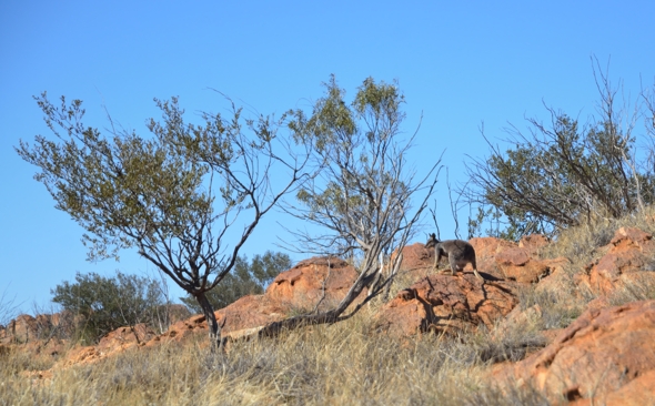
It’s been very quiet here on the blog as I have been in Australia since late June. The circumstances of the trip were unexpected and very sad but the time here with family has been precious. My husband and I along with his brother and sister spent most of July in Alice Springs which is a surrounded by desert in the middle of Australia. The landscape is not unlike the scene pictured above.
This stamp, ‘Country Life‘, is one of the scenic ones from the recent Penny Black ‘Dreaming’ release. It was probably not designed with the Australian outback in mind but that is the direction I decided to go. ( I made this card before I knew I was coming to Australia but it is a match for some of the scenery I’ve seen lately)
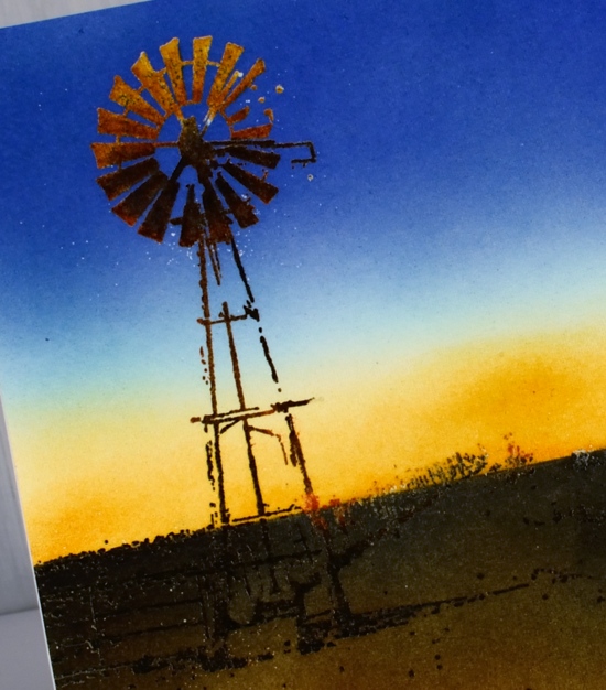
I started by stamping the windmill and grasses in wild honey, rusty hinge, gathered twigs and black soot distress ink. I used markers and ink pads to darken the colour moving down the structure. The base of the windmill and the grass silhouettes were completely black so they would be visible even when I added a dark background. The ‘wild honey’ sections of the windmill appear to be reflecting the last rays of sun in the evening. It is winter in Alice Springs right now so the days are short; I was surprised each day by the early nightfall. Once the windmill and scrubby bits of grass were stamped to my satisfaction I inked the whole stamp in versamark and embossed in clear powder. This is a technique I have seen Jill Foster use on scenic stamping. With all the colour on the windmill and grass ‘sealed’ in by embossing I was able to add all the background colour without altering the windmill or grass at all.
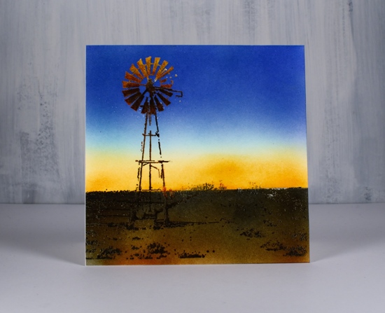
To create the background I placed a post-it note across the horizon and used brushes to blend a wild honey, salty ocean and blueprint sketch sky. I changed the position of the post-it to mask the sky so I could blend gathered twigs and rusty hinge ink over the ground.
Here’s a photo I took in Alice a couple of weeks ago. Blue skies every day and red dirt everywhere!
Supplies
Filled in Florals
Posted: July 8, 2019 Filed under: Concord & 9th, filled in florals, simple serif alphabet dies, Wendy Vecchi | Tags: Concord & 9th, Ranger Distress inks, Ranger Distress stains, Wendy Vecchi, WOW embossing powders 3 Comments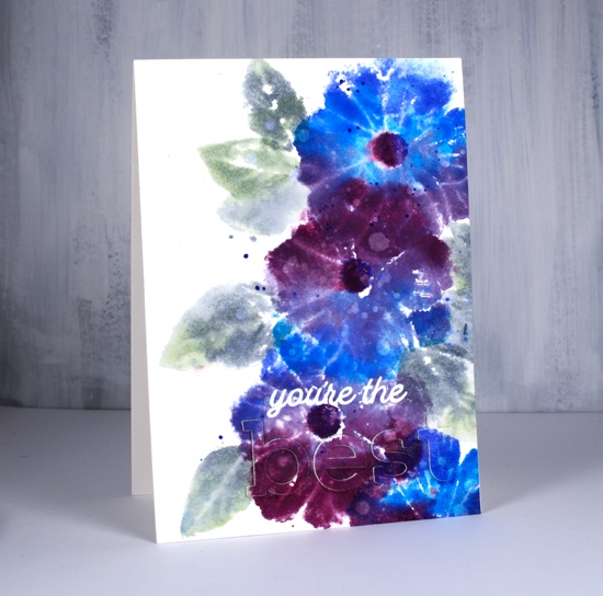
I’m on the Foiled Fox blog today showing off these lovely new stamps and dies from Concord & 9th. The stamps are from the ‘filled in florals‘ set and the dies from the simple serif alphabet set I love the size and shape of these letters and I am able to line them up neatly by using my new magnetic ‘staytion‘ so I won’t need to do the purposely wonky look every time!
I reached for some favourite distress stains to colour the big flower from the set. I used a stamp positioner but acrylic blocks would work fine too as precision is not key for this loose and watery look. As I’m still working with distress stain daubers I swiped the first colour across a third of the stamp, stamped on hot pressed watercolour paper then wiped off the stamp before inking with the next stain in the centre of the flower then repeating the process. I only spritzed the stamp lightly with water before I stamped the last colour on each flower as I didn’t want to flood the design but I did want to make sure the colours did a little blending with each other. I used a mix of blueprint sketch, salty ocean, seedless preserves and dusty concord stains on the flowers switching around the order and combo each time. I stamped the flower centres with blueprint sketch and seedless preserves ink. Is there a more beautiful colour combination than those two stains? I don’t think so!
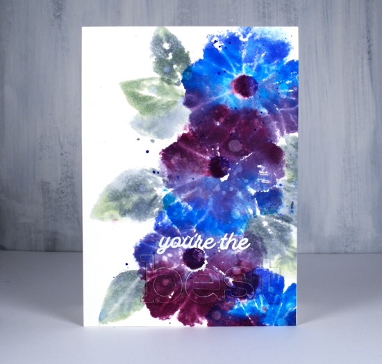
For the leaves I switched to an acrylic block and inked with bundled sage and iced spruce stains and a little spritz of water to make them soft and dreamy. I dried the whole panel before dropping water here and there all over, letting it sit and soak in then absorbing it with a paper towel to leave all those watermarks on the leaves and petals. Last but not least I added a splat or two in blueprint sketch and bundled sage.
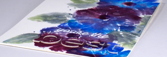
Once all those flowers were done I thought about the sentiment. I know I should consider the sentiment earlier in the process but I rarely do. I didn’t want to cover up too much of the design so I went for the subtle stacked letter die look. I cut the letters b e s t out of the panel and three more of each from blank watercolour paper then stacked them up and attached them on the card. I did some stamp surgery to separate ‘you’re the’ from one of the sentiment stamps in the ‘filled in florals’ set and stamped in versamark ink so I could emboss in white powder. The sentiment is fairly subtle when you look straight on but the recipient will be able to see and feel the texture of the raised letters.
Thank you for dropping in today, make sure you pop on over to the Foiled Fox for some extra details and to check out their lovely blog and store.
Supplies
Studio Katia birthday blog hop
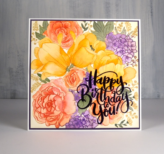
Posted: June 14, 2019 Filed under: floral garden, grid stencil, it's your birthday, Studio Katia | Tags: Peerless Transparent Watercolors, Ranger Distress inks, Studio Katia 77 Comments
Hello and welcome to Studio Katia 3rd Anniversary Blog Hop! You should have arrived here from May Sukyong Park‘s blog. I am excited to be celebrating with Studio Katia and to be featuring this gorgeous stamp, ‘Floral Garden‘. It’s a beauty and perfect for a range of different techniques. This new release includes 5 new Clear Stamp Sets and 1 set of Coordinating Dies, 1 new Stand Alone Creative Die, 2 new Stencils and lots of new Embellishments!
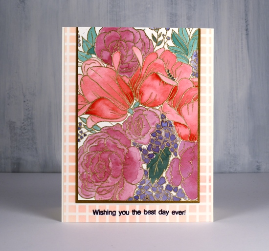
I used the emboss resist technique for one panel and no-line colouring for another. The stamp is a large square so I had the option of creating a big square card or a smaller rectangle card with a portion of the stamped design. I embossed the outline stamp in gold powder on hot pressed watercolour paper then did all the painting with my Sennelier watercolours. I’ve talked about colour choices on the blog before especially about keeping the colour count low to keep things looking cohesive.
I started by painting the tulips in red straight from the pan but all the other colours are mixed, usually with a bit of the original red, that way they work well beside each other. I used a green paint mixed with a little red, a purple/red mix on the roses then a blue/purple mix on the tiny flowers.
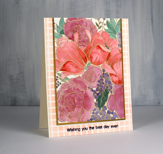
I trimmed the panel down and matted it with gold cardstock to match the embossing then layered it on a panel stenciled with festive berries ink through the SK grid stencil . I added a sentiment in dusty concord archival ink using a little stamp from the new ‘Its your birthday‘ set.

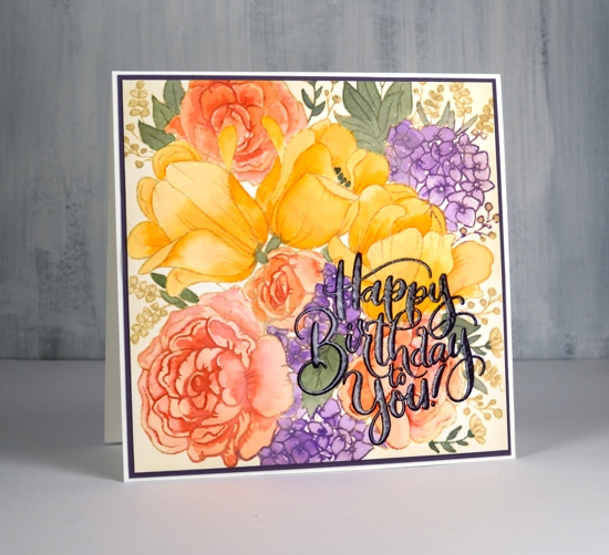
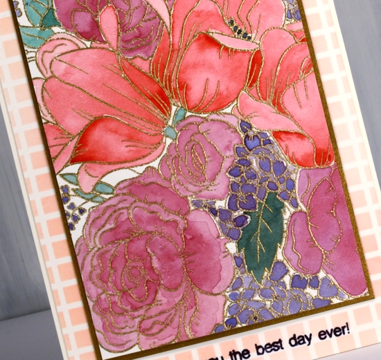
The no-line watercolour panel I stamped in antique linen on hot pressed watercolour paper. I used distress inks as paint by pressing them face down on my glass mat. I used wild honey and carved pumpkin inks for the tulips then mixed some wild honey with festive berries for the roses. As I kept my panel in the stamp positioner while painting I was able to ink the roses lightly with festive berries after I’d done some painting and re-stamp the outline for added definition. I painted the little flowers in wilted violet ink and over-stamped with the same ink so the outlines would be a little darker. I used two greens (iced spruce and bundled sage) for the leaves mixing them into darker and lighter tones. The tiny bell flowers around the edges are painted in antique linen. I also blended antique linen around the edges of the panel.
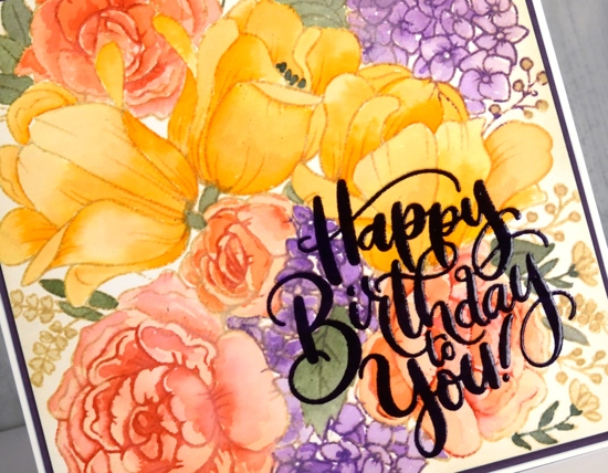
The sentiment is from the same ‘It’s your birthday’ set and I love that pretty lettering! I stamped in monarch versafine clair ink, clear embossed then stamped again in versamark and embossed once more in clear powder to make it extra shiny. Thanks for joining me today; keep reading for all the ways to win during this blog hop which runs today and tomorrow. Studio Katia has provided a $25 gift certificate for me to give away. Just leave a comment below to be in the running.

For more chances to win visit all the stops along the hop. Your next stop is with the wonderful Laura Bassen. If you get lost you can find the full hop list below or visit Studio Katia Blog!
There will be a $25 Gift Certificate offered at each stop of the Blog Hop
Supplies
https://linkdeli.com/widget.js?1559654439292
Bunches and bunches
Posted: June 3, 2019 Filed under: Penny Black, stitched nested frames, together | Tags: Penny Black creative dies, Penny Black stamps, Ranger Distress inks 10 Comments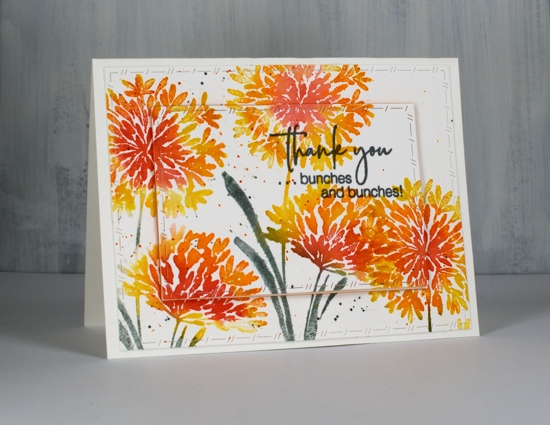
I’ve got something bright and breezy for you today. Even though the flowers on the PB ‘together’ stamp look like agapanthus to me and even though agapanthus do not come in orange or yellow, I chose this colour scheme anyway. The grey days continue here so I’m stamping sunshine instead!
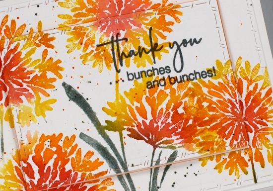
I worked in the stamp positioner so I could add a colour or two at a time and started by inking the centres of the flowers with festive berries, you could use the ink pads or the marker. I used the ink pad and wiped ink off any area where I didn’t want it. Around the festive berries I inked with ripe persimmon ink, spritzed the stamp and stamped on hot pressed watercolour paper. I wiped off the stamp then inked the outside petals in fossilized amber (my current fave yellow), spritzed and stamped again. Spritzing helps the colours blend and helps the ink give more solid coverage.
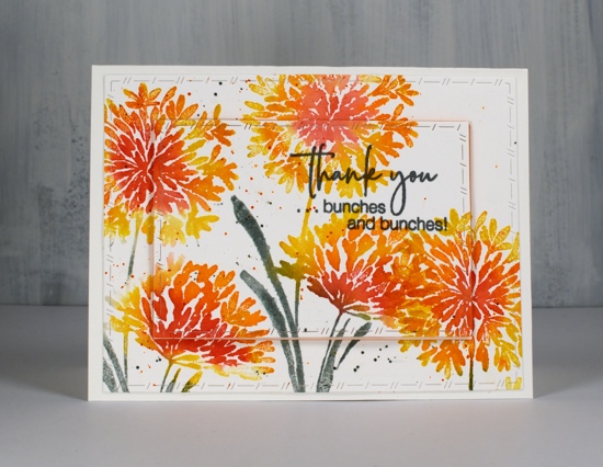
I inked the leaves in iced spruce because the time has come to hang out with other green inks; forest moss will always be special to me but there are other greens out there that need to be seen! I moved the panel and repeated the stamping to the left and to the right almost filling it with flowers. I added some orange and green splatter then die cut with the ‘PB stitched nested frames’ dies. The sentiment is inked in versafine clair misty morning ink because I thought the grey worked with the iced spruce leaves. The centre panel is popped up on a piece of foam for a bit of extra interest.
As I was choosing my sentiment with the words ‘bunches and bunches’ I was reminded of the word my mother used when she did my hair in two side ponytails. Up until grade 4 she did my hair every morning and it was usually ‘bunchies’! That was our name for the style shown below; I think we reserved the name ‘ponytail’ for just one. Did your mother do your hair in ‘bunchies’, if so what did you call them?
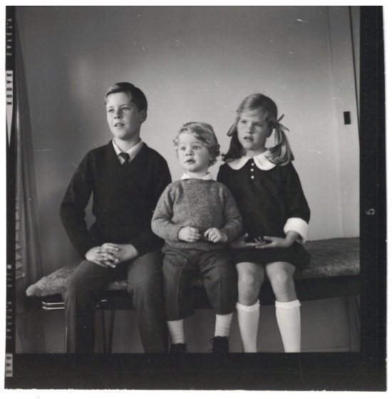
It’s quite the classic shot isn’t it? I guess the photographer told us to do that odd thing with our hands. I was six years old and my dress matched one my mother had.
Supplies