Flower fantasy blossoms
Posted: May 15, 2019 Filed under: flower fantasy, Penny Black, winter branches | Tags: no-line watercolour, Penny Black creative dies, Penny Black stamps, Ranger Distress inks 6 Comments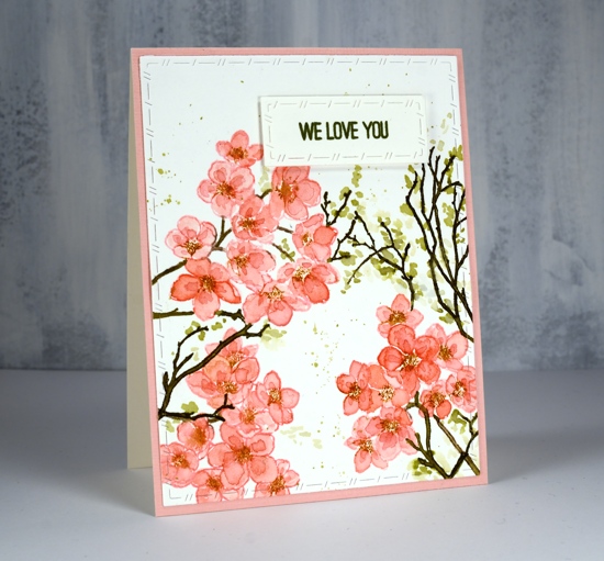
Blossoms are finally appearing in Ottawa! I even have a daffodil or two in my garden.
There are two blossom stamps on the PB ‘flower fantasy’ set and I paired them up to create this spring card. I used spun sugar distress ink to stamp the blossoms then painted the petals first with spun sugar ink then a second layer with worn lipstick ink. My painting is inside the lines for the first layer but I added the darker layer more loosely just wanting some extra depth in the flowers. I was working in my MISTI so I was able to ink the centres in rusty hinge ink and stamp them over the flowers once the painting was dry. This is an example of what is known as ‘no-line watercolouring’. Distress inks are great for this technique as you can stamp with them and then smoosh them on a glass mat or acrylic block and paint with the ink. The original stamped outline blends with the painting making the lines less obvious or disappear entirely. I often use antique linen distress ink for no-line watercolouring but the spun sugar did a good job for today’s panel.

To fill in the design I added some twigs using the ‘winter branches’ stamps and forest moss distress ink. I painted little dabs of shabby shutters and diluted forest moss ink around the twigs to look like leaves budding.

To add some subtle decoration I used the new stitched nested frames dies to cut the stamped panel and the sentiment strip. I stamped the sentiment in peeled paint archival ink; having archival inks in distress colours is a wonderful thing! The sentiment is from the ‘best mom’ stamp set and I think it is so nice to have a ‘we love you’ stamp as this card is going to a friend and will be from our whole family.
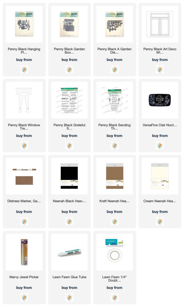
Supplies
Little gardens
Posted: May 3, 2019 Filed under: a garden, art deco window, Dies, garden box, hanging planters, Penny Black, window treatments | Tags: Penny Black creative dies, Penny Black stamps, Tsukineko Versafine inks 5 Comments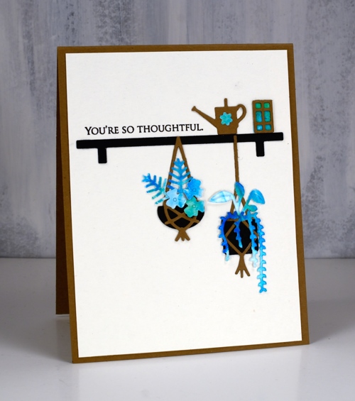
Today’s little garden cards contain unusually small die-cuts (for me) but I had fun arranging them and love the results. While I was putting these together I had Jill Foster’s video using the same die sets on pause in front of me so I could get inspiration from all her ideas. Make sure you check out Jill’s video; she includes plenty of tips and tricks and cool layouts.
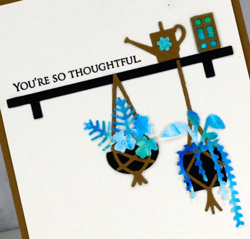
There are three ‘little garden’ sets that co-ordinate well and between them there are oodles of leaves, flowers, pots, hanging baskets and fixtures to choose from. I chose a limited palette of black, kraft and a blue/green patterned panel for all four cards. My patterned panel was a shaving cream marbled panel so I was able to get variation in colour without having to change cardstock.
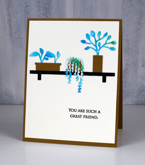
My garden box, a garden and hanging planters die sets are all still joined together so I cut everything from kraft, black and patterned then proceeded to create vignettes.
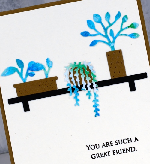
Once I had an arrangement that looked balanced I used my marvy jewel picker and lawn fawn glue tube to get everything attached to cream cardstock. The jewel picker saved my arthritic thumb joint; picking up little things is not good for it!
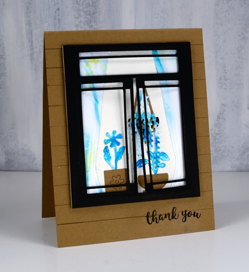
As you might imagine I still had plenty of little elements to spare after three cards and I remembered the ‘art deco window’ and ‘window treatment’ dies I had so I arranged another couple of pots inside the window and beside the patterned curtains.
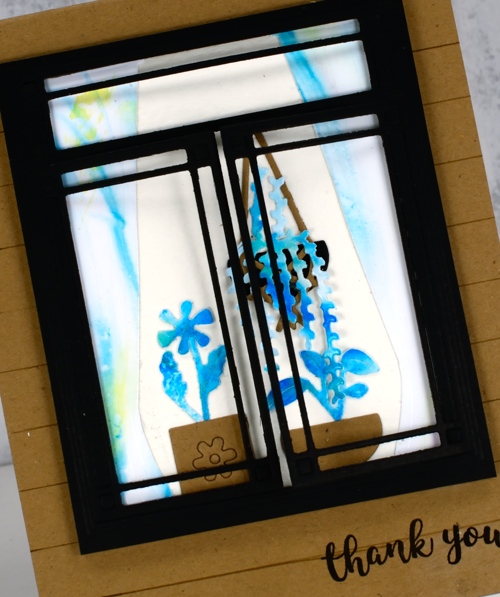
I ruled some lines on the kraft card base to make it look like wood panels on the side of a house. The window frame dies cuts a window that opens on each side which is a cute touch.
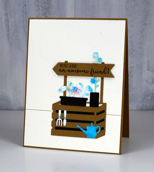
This last simple scene is created with elements from the ‘garden box die set’ along with leftovers from ‘a garden’ and ‘hanging planters’ sets.
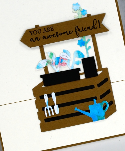
All the sentiments are stamped in versafine clair nocturne ink and taken from the ‘grateful sentiments’ and ‘sending thanks’ sets.
I had fun creating these little scenes despite the ‘fiddliness factor’ being a little higher than I am used to. I love the end result with the strong contrast between black, cream, kraft and blue/green pattern.
Supplies
Dreams of love
Posted: April 29, 2019 Filed under: dreams of love, Penny Black, Script, square and circles, Xmas sprigs | Tags: Penny Black creative dies, Penny Black stamps, Ranger Distress inks 12 Comments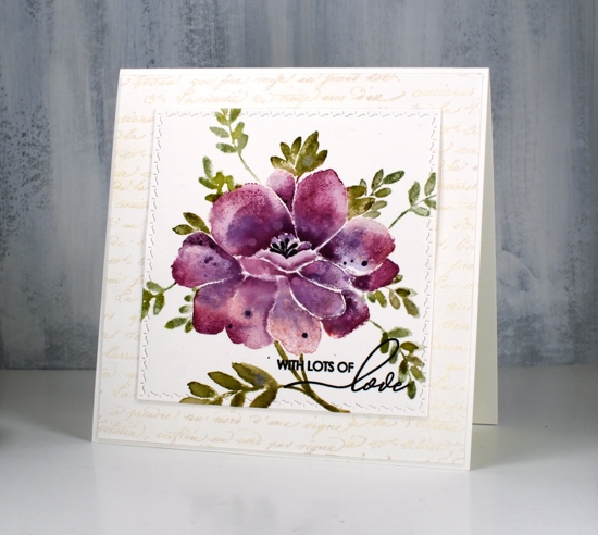
I think you can guess where this sweet floral came from. Penny Black has a new release, ‘Full Bloom’ and this is just one of the beauties I have to show you. As I often do with brushstroke stamps I pulled out distress inks for my first play with this stamp. I used three purple inks, milled lavender, seedless preserves and dusty concord to create variegated petals on this large flower. For the leaves I used a mix of peeled paint, forest moss and bundled sage. I would understand if you wondered whether I ever use any of the other greens, those three are definitely the first ones I reach for!
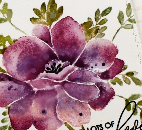
I used a stamp positioner and hot pressed watercolour paper and started by stamping the whole flower (but not the leaves) in milled lavender distress ink. On a stamp like this one it is sometimes hard to differentiate between petals and leaves when looking at the red rubber side of the stamp. I find it helpful to stamp it on scrap paper in a medium to dark ink as a reference. When doing partial inking as I did for this card, I ink all the petals then wipe off any ink that ended up on the leaves with a cloth or wet wipe. After stamping in milled lavender I inked the petals again, this time in seedless preserves ink and I did not cover all the petals. I gave the stamp a light spritz of water so the ink would blend when it layered over the previous stamping. Finally I inked it again in dusty concord keeping the ink concentrated around the centre of the flower not the edges. I then used a paintbrush and some water to blend the colours on each petal one at a time. To further define the petals I pressed the ink pads onto my glass mat so I could pick up ink with my paintbrush and add it to the edges or any areas where I wanted a strong shadow. I dried the panel before carefully inking the anthers with a black marker, unlike the rest of the image I wanted them sharp and defined rather than soft and blended. I also added distress stain drops and water drops while the panel was dry.
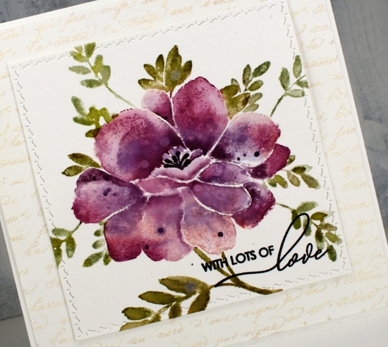
With the petals all finished I switched to the leaves and inked them with peeled paint and forest moss ink then blended them with water after stamping. I added a few more leaves of the same style using a stamp from the ‘Xmas sprig’ stamp set. To add them in I cut a rough post it note mask and positioned it over the petal edge before stamping the sprig in bundled sage and peeled paint inks.
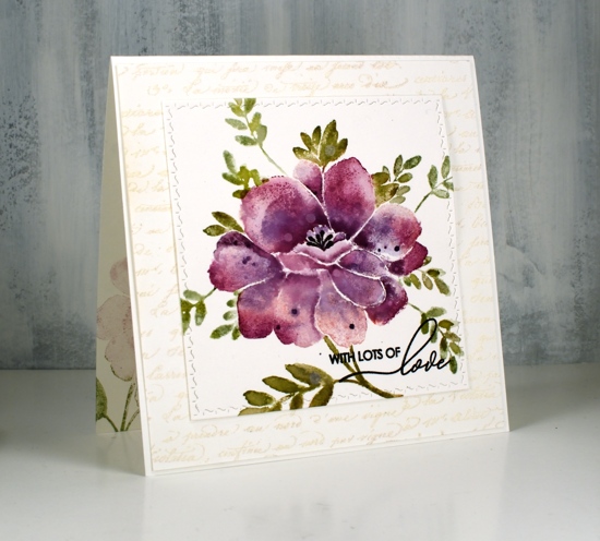
To finish the card I die-cut the panel using the square from the PB ‘stitched square & circles’ die set and clear embossed a sentiment from PB ‘special sentiments’ in black ink. I framed the floral panel with a script stamped panel which I embossed with Ranger weathered white embossing powder. I have not had success with this embossing powder until now, totally user error by the way, there is nothing wrong with the product! The embossing powder is called ‘weathered white’ for a reason, when you emboss with it the effect is not glossy and it is not even. It is, as the name suggests, weathered! For a large background area like this script panel it adds texture and subtle colour. The card is quite large and fits into a 6″ square envelope. I inked the stamp in milled lavender and bundled sage ink to stamp a pale image inside the card and used the same inks to stamp the ‘sprig’ on the envelope.
I’m looking forward to inking this stamp again with different colours schemes and maybe a looser watercolour look.
Supplies
Gelli butterflies and blossoms
Posted: April 10, 2019 Filed under: Alexandra Renke, cherry blossom, gelli plate, monarch, Script | Tags: gelli plate, Penny Black creative dies, Penny Black stamps, Tsukineko Versafine inks 3 Comments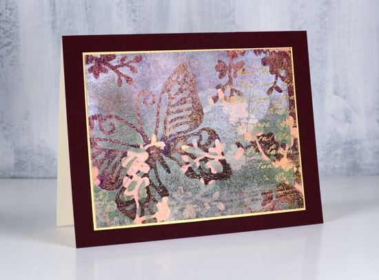
Thank you for all your lovely comments about my recent art journal page. I’m glad you enjoyed it. I have a couple more pages in process in my journals which I look forward to showing you in the future. I would love to hear from other art journallers. What are some of your favourite mediums and techniques?
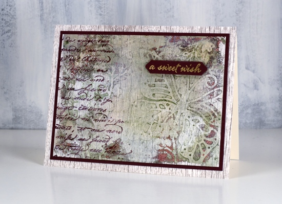
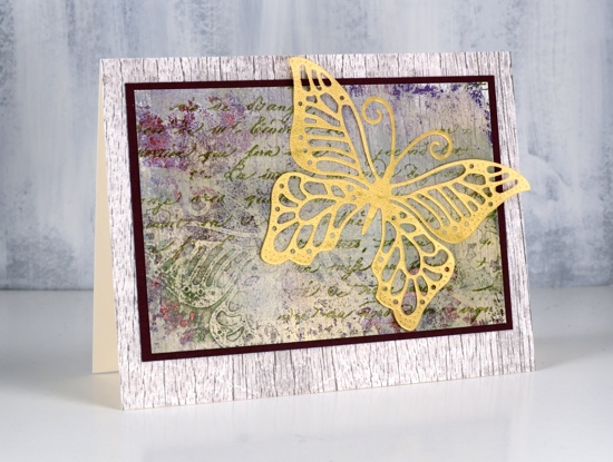
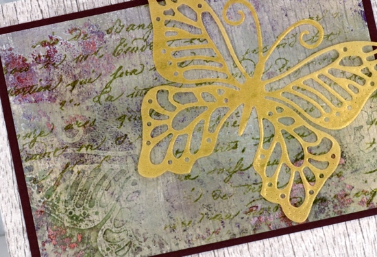
Today’s cards are made with my latest fave: the gelli plate! I am very much a beginner but learning as I go and watching the myriad of techniques shared on the Gelli Arts youtube channel. The panels in today’s cards were made by printing layer after layer while rearranging die cut paper butterflies and blossoms on top of each new layer of paint. The dies are Penny Black ‘monarch’ and cherry blossom’.
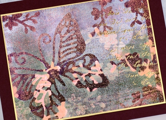
I wont’ try to describe my process because I don’t remember exactly what my order was or what paint colours I used. I know there was green, white, burgandy, gold and pink liquitex basic acrylics but there could have been more. Like many artistic techniques success with a layered gelli print can be knowing when to stop. Once I was happy with the one above I still had paint and pattern showing on the gelli plate so I added one more layer of paint then pulled a ghost print (I’m learning the lingo!) on patterned paper. The paper I chose was a woodgrain print from Alexandra Renke.
You can see the woodgrain print through the paint and pattern. I ended up matting both panels in burgandy cardstock then attaching them to a base panel of the same AR woodgrain paper.
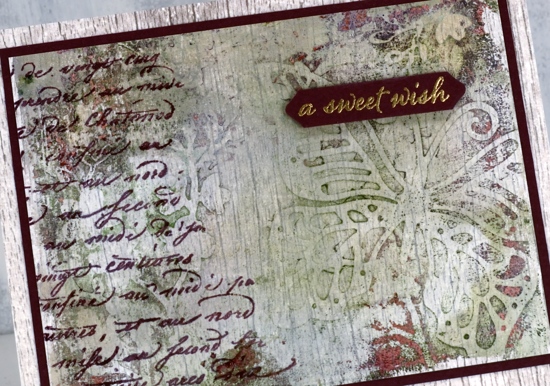
It’s always hard to capture shimmer on camera but all three panels have gold shimmer on them so I added some gold accents to each one. On the top panel I stamped the PB script stamp, embossed in gold powder and matted the panel with gold cardstock. On the card above I added a gold embossed sentiment from the PB set happy snippets and stamped the same script stamp in chianti versafine clair. On the card below I stamped the script stamp in shady lane versafine clair ink and added a gold vellum die cut butterfly, the same butterfly used as a mask in the gel printing process.
I love all the texture from the gelli printing process, the paint which builds up after several layers of printing adds so much interest
I did another butterfly and blossom print in a different colour scheme but I’ll share that another day. Thanks for dropping in.
.
Butterfly Garden
Posted: April 3, 2019 Filed under: butterfly garden, Penny Black, Tagged | Tags: Peerless Transparent Watercolors, Penny Black creative dies, Penny Black stamps, Ranger Distress inks, Tsukineko Versafine inks 3 Comments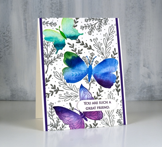
Butterfly garden is a new transparent set from Penny Black with a nice mix of butterflies, leaves and flowers. I chose to watercolour the butterflies first then mask them before adding background foliage. I stamped the top butterfly in shabby shutters distress ink, the middle in broken china and the bottom one in dusty concord on hot pressed watercolour paper.
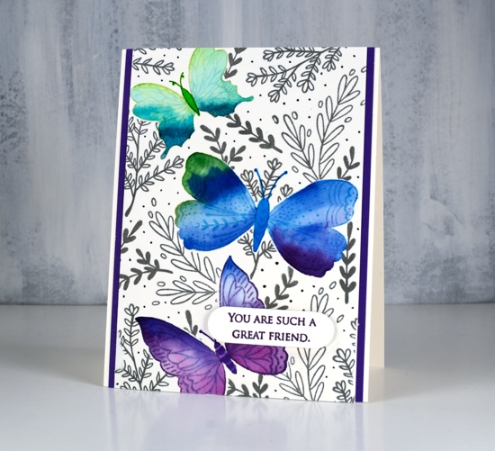
I used peerless watercolours to fill each butterfly with colour starting with a light green then blending to darker greens to fill the wings. I then added green first to the middle butterfly and blended into blue and a little bit of purple. The last one I blended from blue to purple. I stamped them again on masking paper, cut them out and covered the watercolouring before stamping leaves all over the panel in morning mist versafine clair ink. As I wanted to fill the panel with lots of stamping I used acrylic blocks so I could easily turn the stamps around to fit them in all the spaces. I drew little dots in grey marker to fill the background even more.
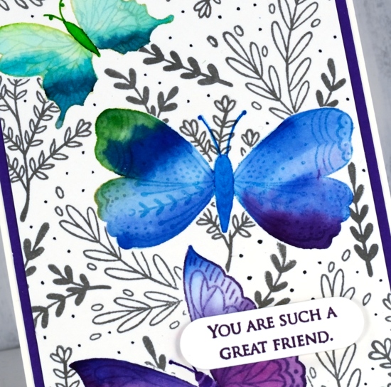
To finish the card I matted with purple cardstock, stamped a sentiment from the PB grateful sentiments set in monarch versafine clair, die cut it and popped it up with Gina K’s dimensional tape which adds just a little height without being too bulky.
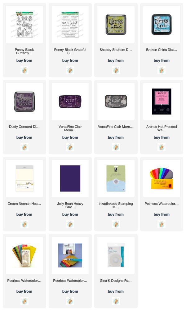
Supplies
Thanks for being thoughtful
Posted: March 1, 2019 Filed under: Penny Black, square frames, Unfolding | Tags: Penny Black creative dies, Penny Black stamps, Ranger Distress stains 5 Comments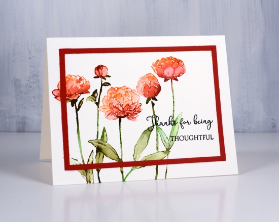
I have yet another distress stain no-line watercolour card for you today. I have received a few questions about my recent distress stain outline cards. Readers have asked if I stamped with ink of some kind first then painted the stain. Not for this card or the previous two. I ink the stamp with stain which is much more ‘liquidy’ than ink and stamp with a stamp positioning tool on watercolour paper. The stain soaks in a little but also sits on top of the paper for a short time. I try to blend straight away so I can take advantage of the wetness of the stain.
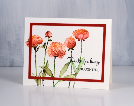
For this panel I inked the flowers with ripe persimmon and fired brick distress stain. You can paint both onto the stamp then print or you can do one colour then the other, allowing the stains to overlap a bit for some nice blending. I inked the leaves and stems with forest moss and mowed lawn then blended the leaves after stamping. If you have stains but haven’t tried inking your stamps with them it does create some pretty blends and the only outline colours are the ones you are blending into the petals and leaves.
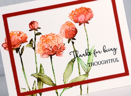
As with my other recent cards I added a sentiment in black ink and a simple frame cut with the square frames dies. The sentiment set is called ‘sending thanks’ and is a little set with lots of possibilities!
Thanks for dropping by this week; I’ll be back on Monday for a blog hop and other exciting news!
Supplies
To give you a hug
Posted: February 28, 2019 Filed under: flutterby, Penny Black, square frames | Tags: Penny Black creative dies, Penny Black stamps, Ranger Distress stains 10 Comments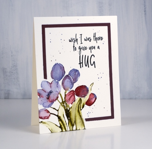
‘Tis the season for new floral stamps, even if it is not the season yet for new florals! I used my tried and true distress stain watercolour method for this little bunch of tulips. I inked the petals with dusty concord and festive berries distress stain. I often use a brush now and paint stain onto the stamp. That way I don’t contaminate the dauber top of my distress stains with other colours and if I’m using the spray stain I can just dip my paintbrush into the stain I have sprayed into a palette.
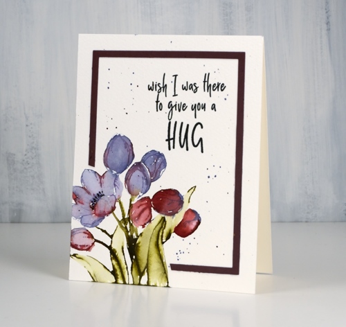
I try to paint straight after stamping so the stain is still wet on the watercolour paper and can be blended very easily to fill the petals and leaves.
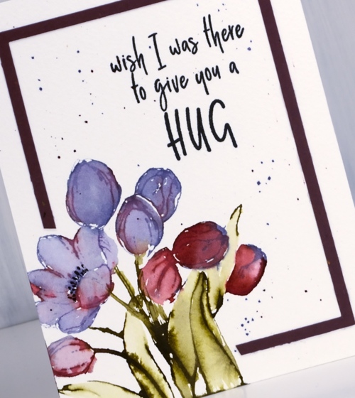
I added some splatter around the panel as my image was confined to one corner leaving a lot of empty space elsewhere. I used the ‘negative frame’ which is a bonus when I cut the whole set of ‘square frames’ from cardstock. I have kept my new square dies joined together in pairs so I can get these ‘negative frames’ easily. I didn’t want to cover my corner flowers so I snipped off some of the frame to wrap around the image instead.
Isn’t this a sweet sentiment?
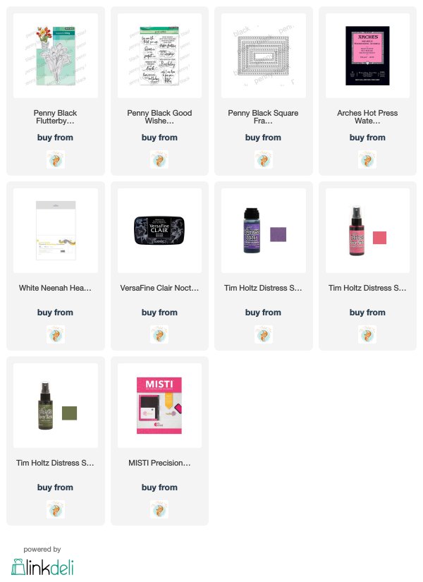
Supplies
Timeless
Posted: February 27, 2019 Filed under: square frames, timeless | Tags: Penny Black creative dies, Penny Black stamps, Ranger Distress stains 9 Comments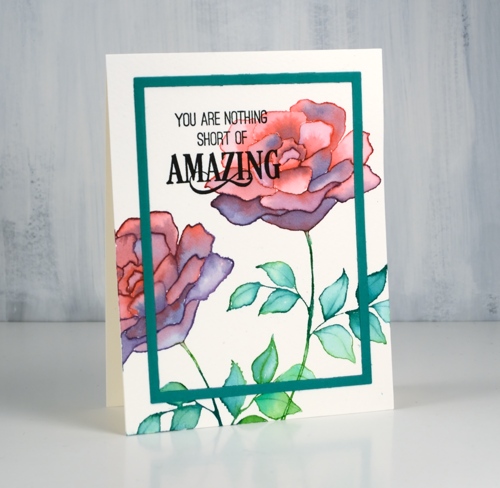
Today’s card features the ‘title stamp’ (like title track) from the new Penny Black release.This big bold rose stamp, ‘Timeless‘, is such a versatile one. I used blended distress stain for my card but it will be great for embossing, no-line colouring and pencil colouring as well.
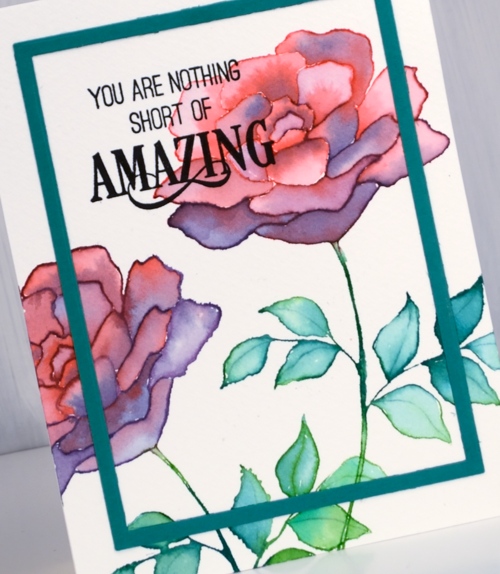
I used my stamp positioner so I could work with a few colours at a time but it would work without a positioner. I inked the top petals in festive berries distress stain, stamped on cold pressed watercolour paper then inked the lower petals with dusty concord stain and stamped again. If you still have the daubers you can ink direct to stamp but if you have the sprays you need to paint some stain on your stamp for this technique. You could use inks or markers but I like how wet the stamped image is when I use stain. I am able to use a brush and water immediately to blend the stain to fill the petals. You can see on some of the petals I added extra stain for shadow and depth
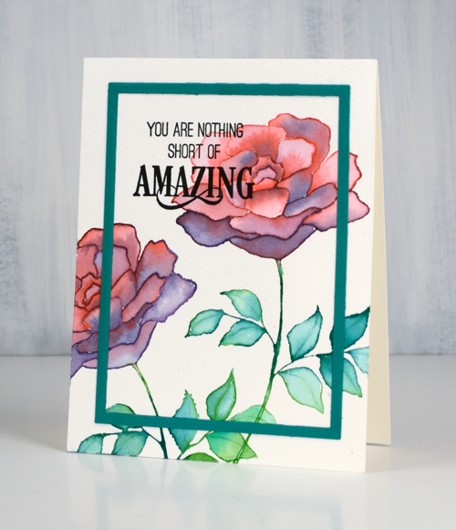
I stamped the leaves in two green stains and blended them also. I finished the panel off with a cool new sentiment then added a frame cut with the new ‘square frames‘ dies. I have kept my dies joined together so I will get both the decorative frames and the plain frames when I run it through the machine. It does mean that I get several frames each time I use it but that’s ok; I’m keeping them in reserve.
Supplies
Blue & blue
Posted: February 25, 2019 Filed under: Penny Black, radiant, together | Tags: Penny Black creative dies, Penny Black stamps, Ranger Distress stains, Tsukineko Versafine inks 7 Comments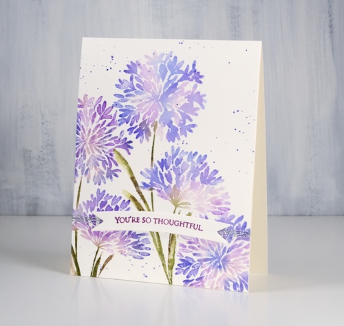
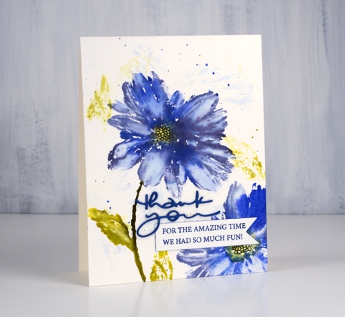
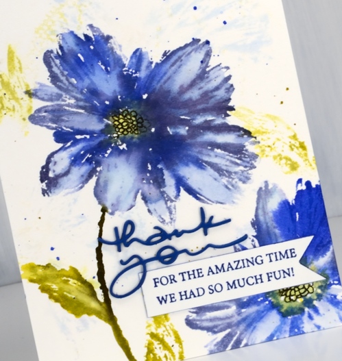
Blue flowers might just be my favourite, so of course I chose blue for some of the new flower stamps from Penny Black. My first card features the ‘Together‘ stamp which is lovely and reminds me of the agapanthus my parents often grew in their flower gardens.
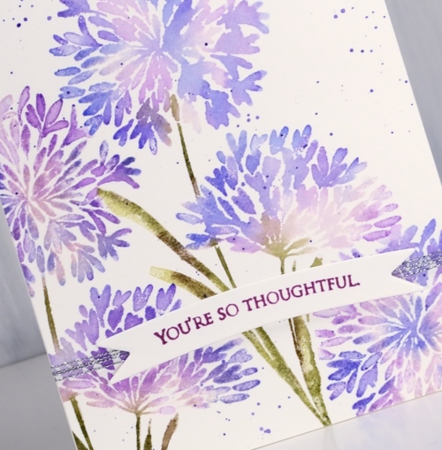
Both of today’s cards were made with distress stains either painted on or applied straight from the dauber.
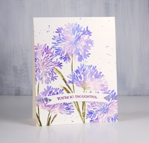
I start by painting the lightest stain onto the stamp then stamping. I clean the stamp and add another colour and stamp again. To protect a detailed area like a flower centre I wipe the ink off the stamp in that spot so I can use ink or marker later. When the image has all been stamped I blend petals and leaves with a paint brush and water. For both blue floral cards I splattered some stain over the panel to complete the design then stamped a sentiment on a banner in a co-ordinating colored ink. Both sentiments are from the delightful new ‘grateful sentiments‘ set
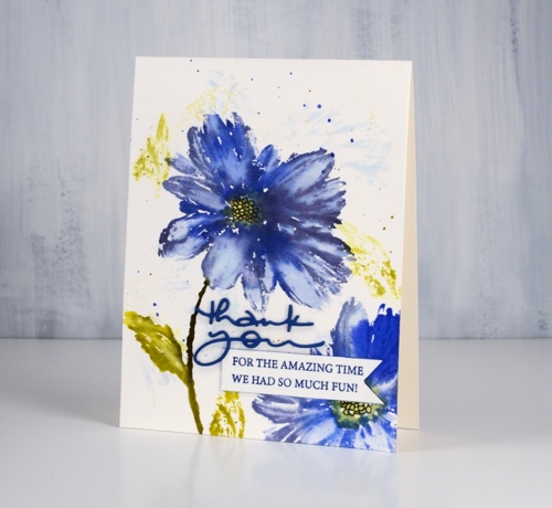
This large blue flower stamp is called ‘Radiant‘. For this card I started by wetting the watercolor panel so when I stamped on it with milled lavender and crushed olive distress inks I would get a diluted abstract print. I dried the panel before putting it in the stamp positioner to work on the bold print. For the bold stamping I used shaded lilac, blueprint sketch, dusty concord, crushed olive and scattered straw stains. Once the stain was dry I drew the centre of the flower with a black marker.
People often ask me if distress re-inkers can be used to create the same effects as the stains. I don’t own any re-inkers so I can’t tell you. I think it is probably time I got a few and did some comparisons. Stay tuned.
I am trialing a new supply linking system right now which looks and operates a little differently from what I was using. If you click on any of the supplies pictured below you will be taken to a complete list image where another click will take you to the Foiled Fox store. Buying through my affiliate links to the Foiled Fox store does not cost you any extra but earns me a commission. Please let me know if you have any thoughts or concerns with the new system. It is a trial and I am interested to know what you think.
Thanks for dropping by today.
Supplies
Blooming boots!
Posted: February 20, 2019 Filed under: blooming boots, square frames | Tags: Penny Black creative dies, Penny Black stamps, Ranger Distress stains 6 Comments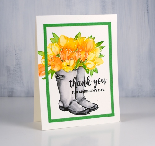
Penny Black has a new release; you probably saw some sneak peeks on the PB social media or maybe you saw this card as a peek on my instagram. The new release is called ‘Timeless‘ and it is full of spring and summer loveliness. To celebrate Penny Black is hosting a giveaway.
Isn’t this a cute stamp? Blooming boots! I guess boots could work as a vase if they were waterproof. I used distress stains to stamp this happy colour scheme but you could use any water soluble ink that blends well after stamping. I inked the tulips with mustard seed and spiced marmalade distress stains. Now that the daubers are discontinued I paint stain onto the stamp with a brush. After stamping the tulips I wiped the stamp and inked the leaves with mowed lawn stain. While the stamped stain was still damp I blended it with a brush and water then dried the panel.
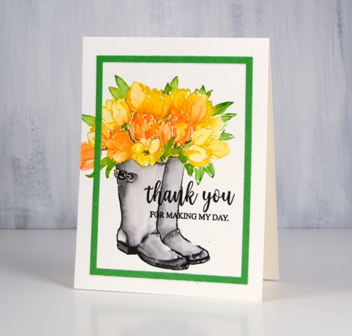
I painted black soot stain onto the boot part of the stamp then stamped and blended to fill the boots. By drying the rest of the stamping first I prevented the black stain from bleeding into the flowers and leaves. I used the new die set ‘square frames’ to cut a green frame. As my dies are not divided up they cut not only the decorative frames but also plain rectangles and that is what I used here. I finished the card with a sentiment from the super-useful new set ‘grateful sentiments’ in black versafine ink.
I am currently enjoying not tulips but a giant amaryllis; it is 80cm tall and each one of the five flowers measures 20cm across. It is huge and beautiful!
Supplies