
Blissful blossoms
Posted: January 18, 2019 Filed under: blissful blossoms, royal swirl | Tags: Penny Black creative dies, Penny Black stamps, Ranger Distress inks 14 Comments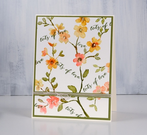
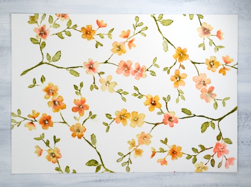
It is hard to believe I haven’t inked this pretty stamp before now. I made up for it by repeat stamping on a large panel to make into a set of cards. I put the 10″x 7″ hot pressed watercolour panel in my stamp positioning tool and ended up stamping PB ‘blissful blossoms’ four times.
Each time I stamped I followed the same order. First I inked the whole stamp in scattered straw distress ink and dabbed some wild honey and abandoned coral ink here and there on the flowers, spritzed it with water. After stamping I cleaned the stamp, then inked all the stems and leaves in peeled paint ink, spritzed and stamped again. I kept partially inking with markers, spritzing and stamping until the flowers were well coloured. Before moving the panel and stamp to do another print I blended over the stamping with a paint brush and water.
I repeated the process three more times to fill the panel. I was able to orient the stamp so the stems and flowers filled the space and looked like one big patterned panel.
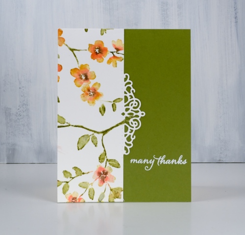
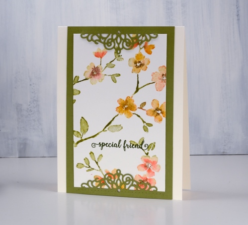
Once the panel was done I had to decide how to divide it for different designs. I could have done four of the same card but no, I wanted to come up with a few options. I pulled out a pretty PB die, a PB sentiment set and some green cardstock to create a set of five cards.
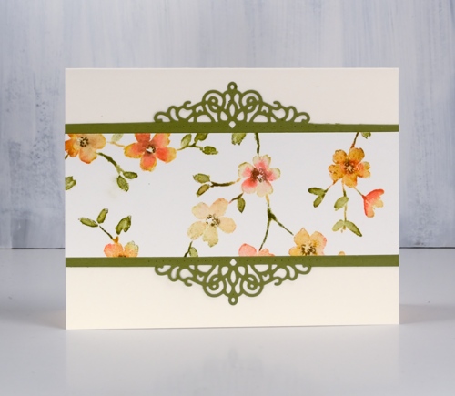
The decorative die does not cut right across, it cuts out the scroll work but scores either side for folding. On several of the cards I cut on the score line for a border instead of a fold.
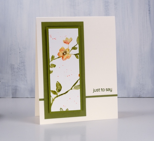
By double matting and popping up the panel even the last scrap became a card. All the sentiments are from the handy dandy ‘happy snippets’ set.
Supplies
Stamps: blissful blossoms, happy snippets (PB)


Dies: pop on a fold -royal swirl (PB)

Inks: scattered straw, dried marigold, abandoned coral, peeled paint, versamark, shady line versafine clair


Markers: peeled paint, dried marigold, abandoned coral, ground espresso

Cardstock: hot pressed watercolour, neenah cream, olive green


Also: Stamp positioner, white embossing powder, linen twine


Alcohol ink trio
Posted: January 15, 2019 Filed under: Alcohol Ink, Dragonfly Frame, Serenity | Tags: Penny Black creative dies, Ranger Alcohol Ink, Yupo Paper 11 Comments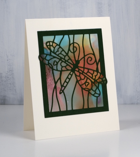
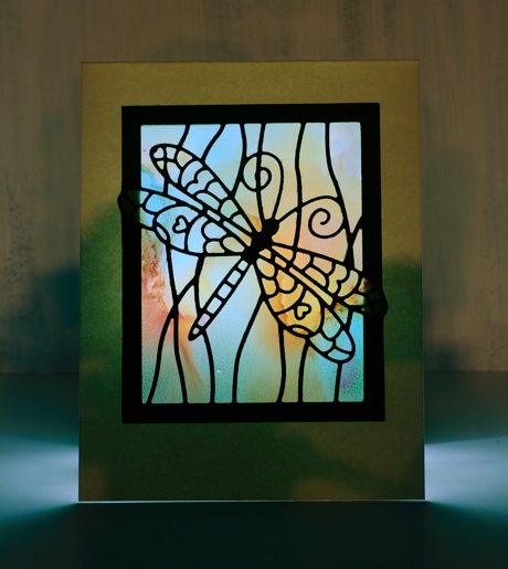
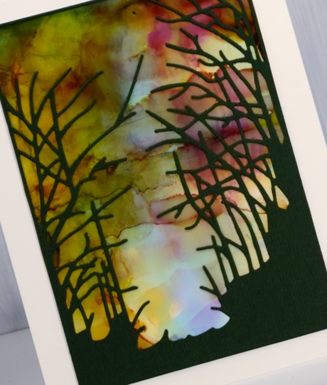
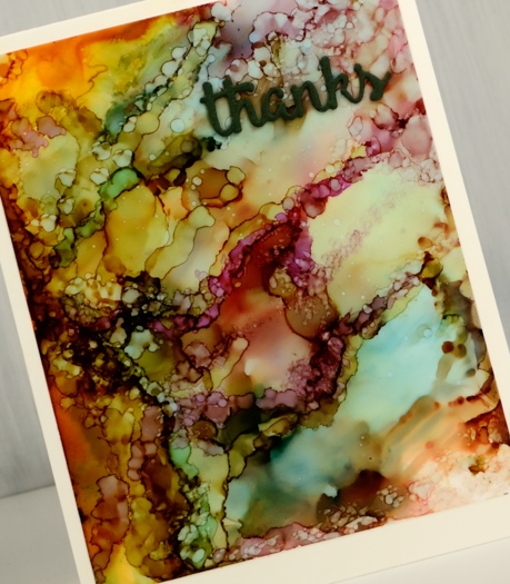
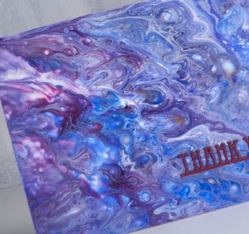
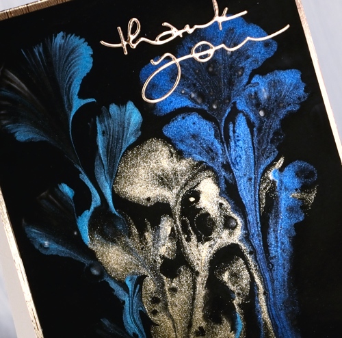
I created these alcohol ink panels months ago! They were the result of a primary colours experiment with pool (blue), raspberry (red) and honeycomb (yellow) alcohol inks and both heavy and light weight yupo paper. I restricted myself to the three colours to see what I could come up with and how they reacted with each other.
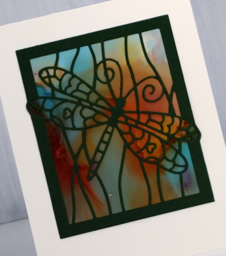
I was able to get very soft blends by adding rubbing alcohol and tilting the yupo around. This panel was done on light weight yupo which is translucent. When I held it up to the light the colours softened and looked like stained glass. I decided I had to cut the cardstock out behind the dragonfly ‘window’ so a light could be placed under the card to show off its soft blended colour. Not a real tealight mind you, remember this is paper crafting! I took a photo to give you an idea of the pretty stained glass effect you see with a soft light underneath.
The same colours appeared but with more lines by working the inks for longer. By that I mean that I kept adding and tilting and blending so there are more secondary and tertiary colours in the mix.
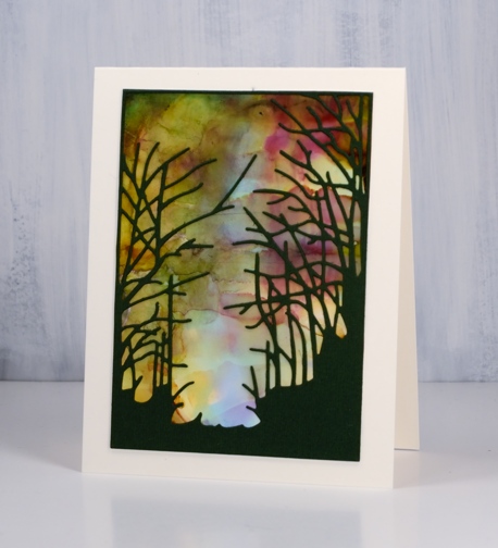
When it came to making the panels into cards I decided die cuts over the top was all I wanted to add. I used three Penny Black dies, dragonfly frame, serenity and heartfelt thanks. For all the cards I put double sided adhesive on the back of the green cardstock before die cutting the images and words.
In the final sample I was able to keep some of each ink colour distinct as well as each secondary colour (blue+yellow=green) (yellow+red=orange) (red+blue=purple). There is also a bit of brown which is is a tertiary colour made when a primary and a secondary mix.
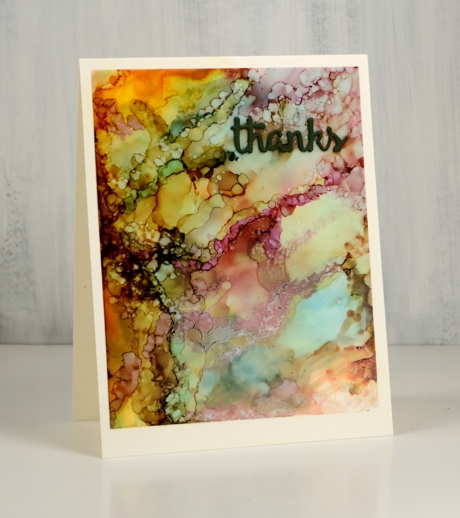
I created this panel by dropping the inks onto the yupo panel and letting them move and fill the space. When there was a good mix of colour patterning the whole area I switched to placing tiny drops of ink or rubbing alcohol onto the panel to create the bubble patterns. Each tiny drop expanded into a little circle or blob shape. The pattern looked very busy all on its own so I just added a small die cut word.
Supplies
Dies: serenity, dragonfly frame, heartfelt thanks (Penny Black)
Inks: pool, raspberry, honeycomb Ranger alcohol inks


Paper: yupo both light and heavy weight, neenah cream cardstock, green textured cardstock

![]()

Also: double sided adhesive, rubbing alcohol

Snow forest
Posted: January 4, 2019 Filed under: A Pocket Full, snow forest | Tags: Catherine Pooler inks, Penny Black creative dies, Penny Black stamps 6 Comments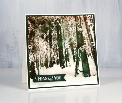
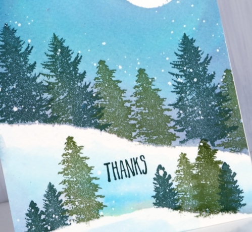
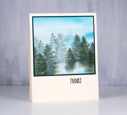
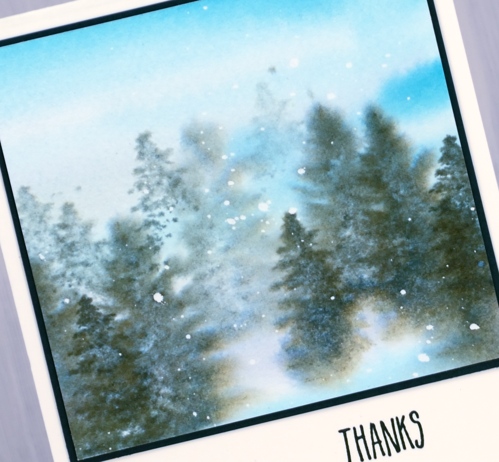
Snowy scenes and thank you cards will keep on popping up on the blog. This one made with the PB stamp, ‘snow forest’, was very simple to make. I put the stamp in the stamp positioner then inked part of it in Catherine Poolers ‘icing on the cake’ ink, stamped then randomly inked in ‘over coffee’, stamped and finally the same with ‘eucalyptus’ ink. With the whole image stamped I blended the larger distinct tree trunks with water to get the watercolour effect.
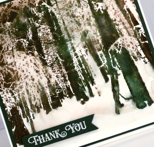
I ended up painting over some areas, not all, with water also which softened the contrasts but still left light and dark areas. I pressed the three inks onto my glass mat so I could pick up ink to paint the snowy forest floor.
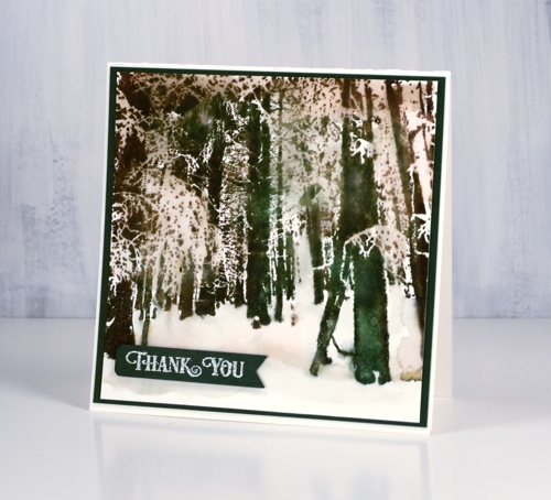
To complete the card I matted in dark green cardstock and die cut a banner for the sentiment. I embossed the sentiment with weathered white powder which gives an antique, and I think, snowy effect.
Supplies
Stamps: snow forest, banner sentiments


Dies: a pocketfull

Inks: eucalyptus, icing on the cake, over coffee (Catherine Pooler), versamark


Paper: hot pressed watercolour, green cardstock
Also: MISTI, weathered white embossing powder, glass mat


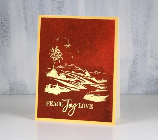
Home through the birches
Posted: January 2, 2019 Filed under: birches, Spread Cheer | Tags: Penny Black stamps, Ranger Distress stains, Tsukineko Versafine inks 11 Comments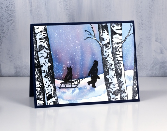
I really enjoy creating winter scenes and today’s card features stamps that lend themselves very well to scenic stamping. I used the PB ‘birches’ stamp and the boy from an older PB set, ‘spread cheer’. I began by embossing the large birch stamps on either side of a panel of hot pressed watercolour paper in versafine clair nocturne ink and clear powder. Next I splattered masking fluid over the panel to later look like snow.
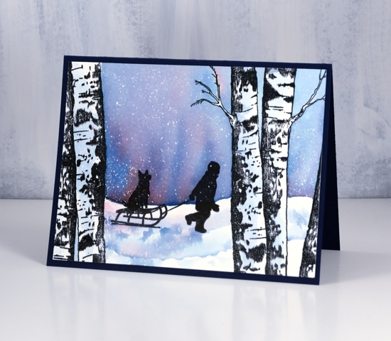
I painted water across the panel from left to right skipping the tree trunks, added distress stains, faded jeans and barn door, then blended the colours to create a winter sky. I painted some diluted blue stain on the tree trunks for a bit of shadow then let everything dry. I stamped the boy and his dog in nocturne inks several times to get a very solid black image over the embossing and stain that was already on the panel. After the black ink dried I painted some shadow with the same stains used for the sky.
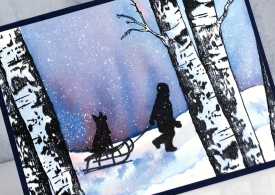
Once all the ink was dry I removed the masking fluid to reveal all the little dots of snow. I trimmed the panel to fit on a navy card base (although it looks black in the photos) and will add a white insert for writing my message inside.
Supplies
Stamps: birches, spread cheer (all PB)


Inks: nocturne versafine clair,

Stains: faded jeans, barn door


Paper: hot pressed watercolour paper, navy cardstock
Also: embossing powder, masking fluid, MISTI
![]()

Tweet wreath
Posted: December 31, 2018 Filed under: tweet wreath | Tags: Catherine Pooler inks, Penny Black creative dies, Penny Black stamps, WOW embossing powders 15 Comments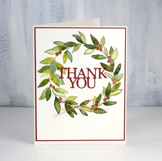
Appropriately my final card for the year is a thank you card. Thank you readers for dropping in here so regularly. Thank you for leaving me encouragement in the comments or by contacting me privately. Thank you to those who used my affiliate links to the Foiled Fox online store. Thank you to those who recommended my blog to a friend. Thank you to everyone who clicked over to the classes page and signed up for one of my classes in Ottawa or Toronto; creating with you is such a treat. I have made wonderful friends through classes and through this blog.
I will be making thank you card for a few weeks yet. Donations have continued to come in for the Dressember campaign against modern day slavery and my fundraising page stays active until the end of January. I am less than $300 away from my goal!
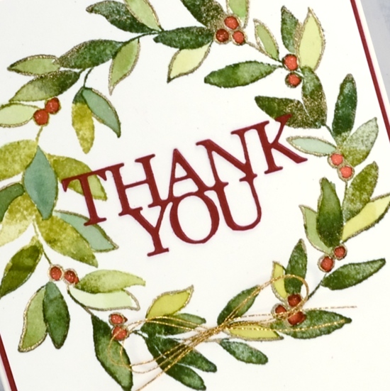
I used Catherine Pooler inks on the ‘tweet wreath’ from Penny Black. In the stamp positioner I dabbed a green ink on the wreath, spritzed it lightly with water, stamped then dabbed a different green in random places and repeated until the wreath was all green. I dried the watercolour panel and cleaned the stamp before inking the outline leaves and berries with a versamark pen. I stamped again and embossed the versamarked lines with gold embossing powder.
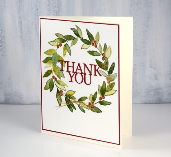
I pressed the CP inks onto my glass mat so I could pick up colour with a paint brush to paint inside the outline leaves and berries. The berries are CP peppermint scrub ink. To finish off the card I added double sided adhesive sheet to the back of some shimmery red cardstock then cut out the PB ‘so many thanks’ die. The large four word die looked too much inside the wreath so I trimmed off the lower half and just used two words. To add some shimmer to the berries I coloured over them with clear wink of stella pen. I matted the panel with the same shimmery red cardstock and, because it needed a little something, I added a gold cord bow.
Happy New Year!
Supplies
Stamps: tweet wreath

Dies:

Inks: eucalyptus, green tea, spruce, peppermint scrub inks (Catherine Pooler), versamarker


Paper: hot pressed watercolour, shimmer red
Also: MISTI, metallic gold rich embossing powder, clear wink of stella pen, glass mat, stick-it adhesive

![]()
Christmas red or white
Posted: December 28, 2018 Filed under: Christmas red | Tags: Penny Black stamps, Ranger Distress inks, Ranger Distress stains 13 Comments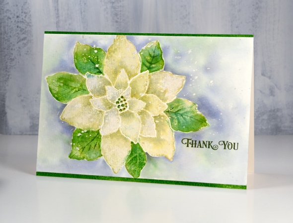
Ever since I received this stamp way back when the weather was warm, I wanted to try it as a ‘white poinsettia’ rather than the traditional red. The first card I made with it was red and when I used it in my Christmas class we stamped it red but now as a Christmas thank you I’ve made it white, or to be precise a yellowish, greenish white! I am sharing it over on the Foiled Fox blog today also. Make sure you pop over there to see enjoy all the beautiful wintry cards they have shared lately. Scroll back to see three gorgeous poinsettia cards made by Shauna Todd posted during December.
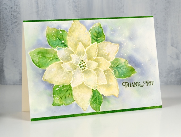
To create my ‘white’ poinsettia I stamped the whole ‘Christmas Red’ stamp from Penny Black in shabby shutters distress ink on hot pressed watercolour paper (which I had splattered with masking fluid earlier). With the stamp in the MISTI I inked the outer leaves with mowed lawn distress ink and stamped again. Shabby shutters ink is a pale green to start with so when I diluted it by blending with water I was able to make it a little paler. I blended one petal at a time and dabbed it with a paper towel while it was wet to remove more colour. Before the petals dried I picked up some extra shabby shutters ink off my glass mat and added some shadow where the petals were overlapped by another. I blended the leaves with water also and when they were dry added some definition with a fine brush and mowed lawn ink. I stamped the centre with mowed lawn ink and added some gold with a wink of stella pen.
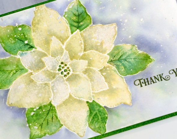
Once the flower was dry I painted around the edges with water then dropped in weathered wood distress stain and blended it to surround the whole image. I also dropped in some green ink here and there while the background painting was wet. When everything dried I removed the masking fluid and added clear wink of stella to all the petals to give them some shimmer. I stamped the ‘thank you’ from the PB ‘banner sentiments’ set in versafine clair shady lane ink. I am very happy to be making thank you cards as I have close to thirty donors to thank so far in my Dressember campaign raising money for the fight against human trafficking.
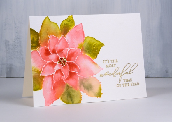
I am adding my pink and green poinsettia to the post just for interest and comparison. I used a similar process to the one described above but kept the background white as a base from some gold embossing. Thank you for dropping in today.
Supplies
Stamps: Christmas Red, banner sentiments (PB)

Inks: shabby shutters ,mowed lawn distress inks, versafine clair shady lane ink


Stain: weathered wood distress stain

Paper: hot pressed watercolour paper, neenah natural white
Also: gold wink of stella, clear wink of stella, masking fluid

![]()
Tools: MISTI, glass mat
Simple and Elegant
Posted: December 21, 2018 Filed under: lighting the way, three kings | Tags: Alexandra Renke cardstock, Penny Black stamps, WOW embossing powders 8 Comments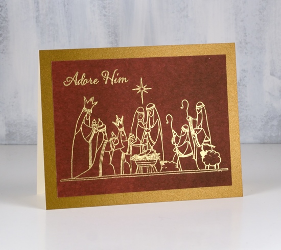
At this time of year any Christmas card making I’m doing has to be pretty simple and straightforward. But that doesn’t mean it can’t still be elegant or eye catching. I paired metallic embossing with richly coloured papers for these three nativity cards.
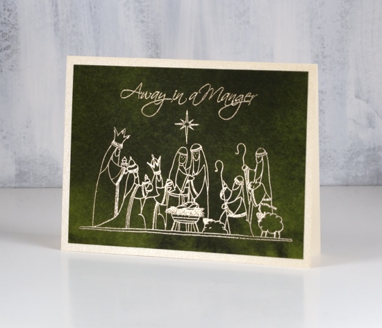
These papers from Alexandra Renke are solid colour but with the variation of a watercolour wash. They have enough interest to look like a sky but not fight with the detail of the picture stamps from Penny Black.
I always have a bit of a task matching a gold cardstock with gold embossing powder. On the top card the gold embossing powder on the dark red appeared to be an ‘old gold’ so I matted with a dark gold. On the last card I used a light gold card with the same embossing powder. The middle card features platinum embossing and a platinum mat around the deep green paper.
I hope you are further along than I with your Christmas card sending but as I say most years, December 25 is the first day of Christmas, there are twelve in total so I still have time to get my cards sent!
Supplies
Stamps: lighting the way, peaceful season, three kings (PB)


Paper: Alexandra Renke dark green, red and scarlet papers


Cardstock: neenah natural white, platinum shimmer, gold shimmer, pale gold shimmer
![]()
Ink: versamark ink
Embossing powder: gold metallic rich, platinum

Paint pouring or string painting?
Posted: December 18, 2018 Filed under: paint pouring | Tags: paint pouring, Penny Black creative dies, Penny Black stamps, Yupo Paper 9 Comments
I have seen a little bit of chat in comments about my recent paint pouring panels. Are they what we know as paint pouring or are they string painting? I am a newbie at this so I’m not the best one to ask. I do have one more string painting panel for you today along with what is known as a ‘dirty pour’. I thought both turned out rather nice and this is just adding to my desire to try all these methods again plus a few more techniques I have found on the interwebs.
The string paint pouring panel above was completed with just the two colours, a base of deep pink paint on a yupo panel then a piece of string dipped in white paint, laid in twists and turns on the wet panel then carefully dragged off leaving a trail of paint behind it.
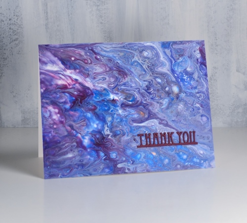
This second panel is a ‘dirty pour’ created when several colours are poured into a cup together, cup is turned upside down onto the yupo panel then lifted to let the paint escape in all directions. A little tilting this way and that can change the size and shape of the pattern but really I didn’t do much; the magic just happened. I also didn’t do much to turn the panels into cards, a tiny sentiment stamped in monarch versafine clair ink on the top card and a stacked die-cut sentiment on the second card.
I know I keep mentioning this but I would like to thank my card making, blog reading friends for supporting me in the Dressember campaign this year. I am wearing a dress every day this month and my fundraising total is steadily moving towards the $1800 goal I have set for myself. Readers of this blog have blown me away with their involvement. The money raised world wide will be given in grants to organizations doing amazing work in the locating, rescuing and empowering of human trafficking victims. If you would like to give to this life changing work visit my campaign page here. If you would like to check and see the daily dresses, I’m posting them on Pinterest and Instagram. I’m sending out cards to all my donors so one of today’s cards could be yours!!
Supplies
Paper: heavy weight yupo (legion), neenah solar white cardstock, purple cardstock

Stamp: snippets (PB)

Die: deco frame (PB)

Also: stick it adhesive sheets (for the little die-cut)
Crisp or misty
Posted: December 12, 2018 Filed under: majestic mountains, pine cones | Tags: Darkroom Door stamps, Ranger Distress stains, Tsukineko Memento inks, Tsukineko Versafine inks 11 Comments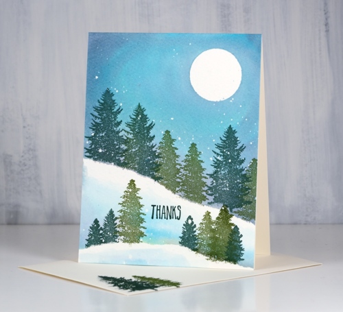
I pulled out the wonderful new trees from Darkroom Door’s ‘majestic mountains’ set to create today’s cards. I wanted to create two forest scenes, one on a crisp cold night, the other on a misty day. There are some similarities in the techniques and inks as well as differences which enabled me to create both looks. I began both times with cold pressed watercolour paper splattered with masking fluid. I like to have a few circles cut from frisket film on hand to mask a moon so I positioned one in the top right corner then tore a post-it note and positioned it diagonally across the panel. I stamped the two larger trees in versafine clair inks along the edge of the post-it mask so the trunks did not show and used one green for the largest tree and another green for the smaller.
Next I removed the post-it mask and painted water along the lower edge of the stamping and upwards to fill the sky. Then while the paper was wet I added weathered wood, faded jeans and old paper distress stains to fill the sky. Once I had the sky blended I used the post-it mask again as an edge to stamp more trees including one of the smaller ones from the ‘majestic mountains’ set. Again after removing the post-it mask I painted water and blended some of the three stains into the water to create shadows behind the trees and snowbanks. To finish it off I dried the panel, removed the frisket film and masking fluid then added a sentiment from the DD ‘pine cones’ set.
Although the colours and stamps are very similar I worked very much ‘wet into wet’ to create the second card. I painted water and diluted stain over most of the panel adding stripes of faded jeans, weathered wood and old paper. While it was wet I stamped the trees repeatedly with memento northern pine ink making first and second generation impressions to get dark foreground and lighter background images. Each time I inked the stamp I wiped ink off the trunk so it would not stamp, that way the trees all looked like they were in deep snow.
Believe it or not both panels started out the same size but a blot here and a mistake there meant this second one underwent some downsizing.
You might have noticed a stamped envelope in the first photo. I am going to try hard to stamp an envelope and my name on the back of the card as soon as I complete it. I have never been good at this but it makes a lot of sense to do it!
Supplies
Stamps:majestic mountains, pine cones (Darkroom Door)


Inks: northern pine memento, shady lane & rain forest versafine clair


Stains: faded jeans, weathered wood, old paper


Paper: cold pressed watercolour paper, neenah natural white, dark green

Also: masking fluid, glass mat
A little more paint pouring
Posted: December 11, 2018 Filed under: Dies, paint pouring | Tags: paint pouring, Penny Black creative dies, Yupo Paper 9 Comments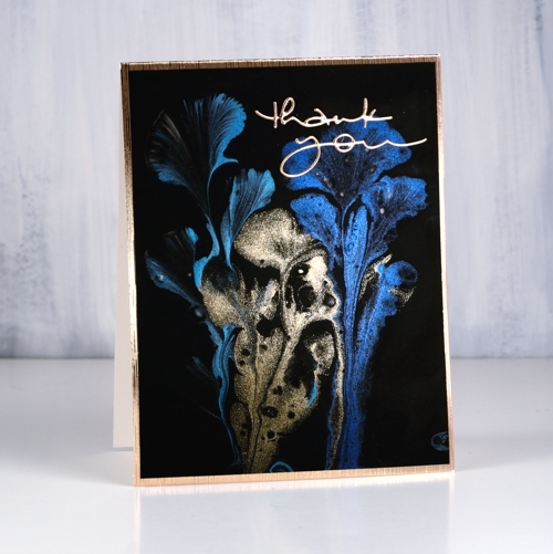
Yes, I have more from my paint pouring adventure to share! This one was done with metallic paints as you can see. When you pour or in this case ‘drag’ them onto the base colour the metallics don’t look very shiny but as they dry, well, you can see how lovely they are. To turn this one into a card I searched through my gold cardstock to find a match with the gold paint. I am a bit fussy with gold cardstock, some is too coppery, some too brown, too yellow, too light, too dark; you get the idea. The one that matched the best this time is a textured gold made by Tonic and it has a white back so I turned it into the card base. I also die-cut a ‘thank you’ from the same cardstock.

As I mentioned yesterday I won’t go into the how-to of paint pouring this time around but if I keep doing it I will definitely share what I learn. For those of you who have done some paint pouring this one was done by dipping some crochet thread in coloured paint, laying it on a base of black paint and gently pulling it through the black paint and off the panel.
I’m not sure of the brand of paints as I don’t own any (yet) but the matte colours came from a dollar store and the metallics from an art store. I was pleasantly surprised to find how many of the supplies could be bought from a dollar store or hardware store.
I have another paint pourer to recommend today and as I said yesterday be prepared to disappear into youtube land for quite some time! Mixed Media girl’s paintings are also mesmerising.
Supplies
|

https://linkdeli.com/widget.js?1549439153802
Paper: heavy weight yupo (legion), gold satin cardstock (tonic)

Die: many thanks (PB)

Also: stick it adhesive sheets (for the little die-cut)


