
Whimsy and Watercolour
Posted: February 24, 2025 Filed under: Classes, Hand drawn, Hand painted, sennelier watercolours, Watercolour | Tags: Classes, Fabriano Watercolour Paper, sennelier watercolours 3 Comments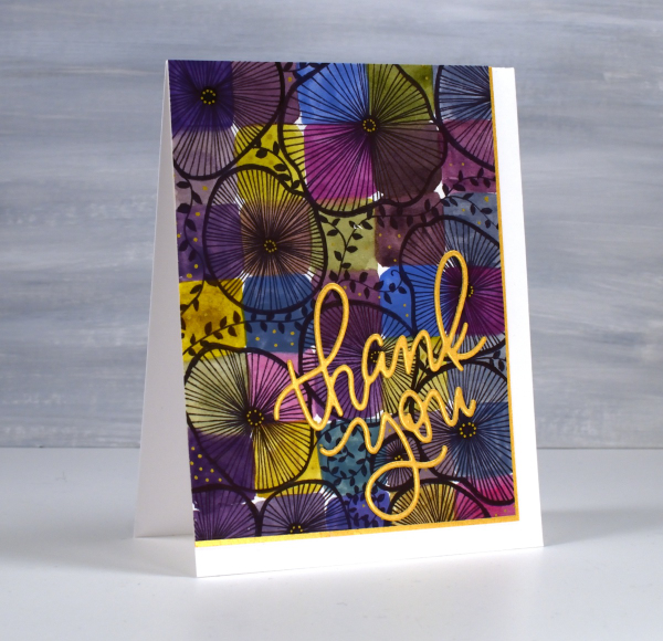
As I mentioned in January I have been playing with watercolour techniques then adding whimsical doodles over the top. Today’s card is another example. I switched the order in the title of the blog post because the whimsy has over powered the watercolour in this panel even though both elements are still obvious.
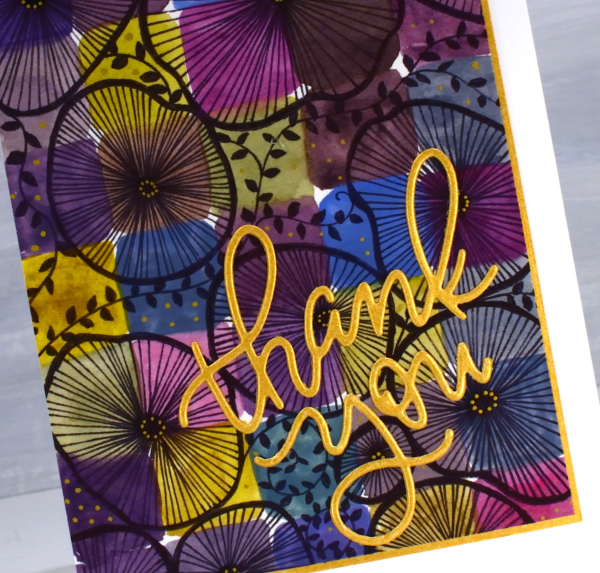
I used only three paint colours to paint the squares on the watercolour paper, some touching while wet, resulting in soft blends. All the colours you see were mixed from the same three paints – a blue, a pink and a mustard. The doodling was done with a black fine tip pen and a gold gel pen.
Even though the gold details from the gel pen are a minor part of the design they were the catalyst for choosing a gold mat and sentiment. In my upcoming in-person class I am teaching design principles and assembly techniques for card making and this thank you card is one of my examples. ( I wish I could remember who makes that pretty thank you die, but I’m not sure)
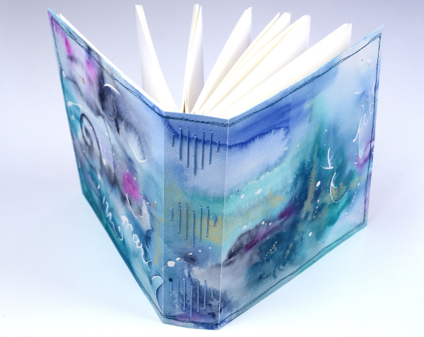
A New Handmade Book
Posted: February 7, 2025 Filed under: Finetec paints, Hand painted, Handmade book, sennelier watercolours | Tags: Fabriano art journal, Fabriano Watercolour Paper, Handmade book, sennelier watercolours 6 Comments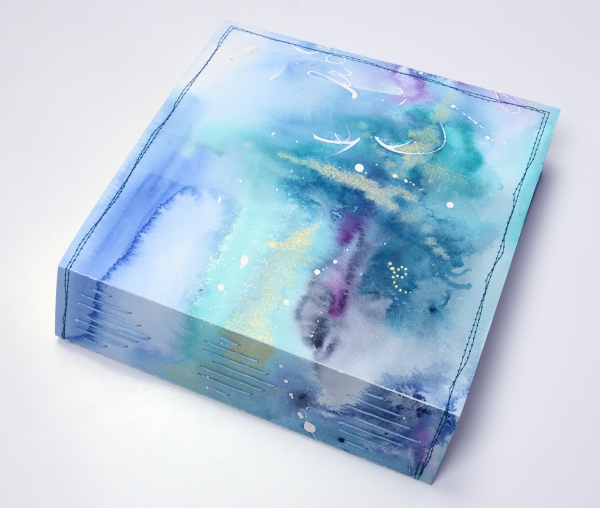
I’ve completed another challenge with Ali Manning in her Handmade Book Club. I have written before about Ali’s wonderful teaching. The most recent class was no exception. It was called ‘Valentine Palooza’ as a nod to the February timing and the cute heart binding on the spine of the book. The Handmade Book Club offers some free classes, some short challenges open to non-members (I have now done four of these) and a monthly or yearly membership ( something I would like to join at some point).
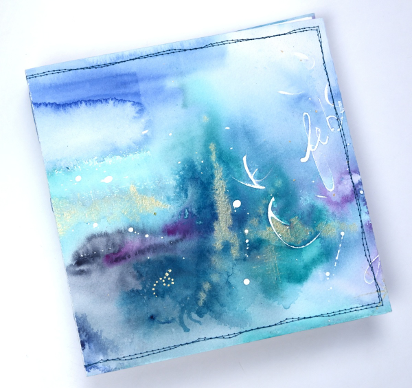
For this most recent challenge I chose to use cold pressed watercolour paper for the cover and hot pressed watercolour paper for the signatures. I watercoloured the cover in a loose abstract style over the top of some masking fluid words and squiggles. As I write this I realise I didn’t take any photos of the inside cover. Both the back and front covers fold over to make the cover more sturdy so my watercolour patterns continue inside.
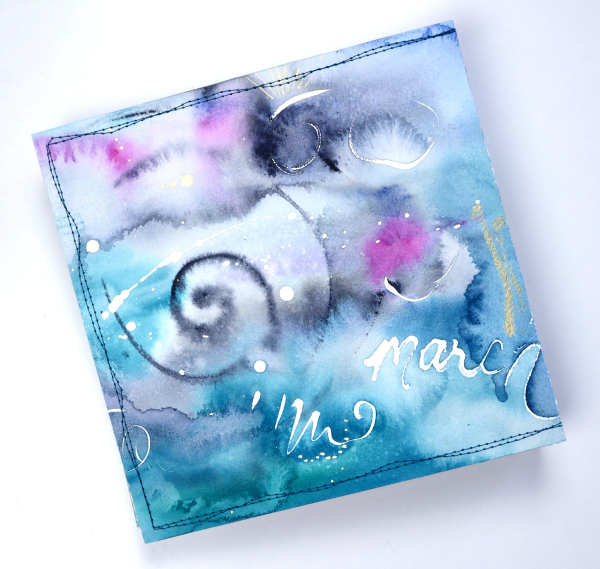
This cover was inspired by Tiffany Sharpe’s lovely stitched and watercoloured cover. I made my book 7″x7″ which was different to the rectangular examples in the workshop but all the steps are the same once you work out your dimensions. I have now made three 7×7 watercolour journals and like the page size for art journalling.
I’m playing with watercolour techniques a lot at present in preparation for my upcoming in person class on Watercolour Techniques. You will see some of the technique samples turned into cards eventually and some will be the base for future journal pages. You can see the other books I have made here: Mixed Media Journal, Coptic Journal, a second Coptic Journal, and Scrappy Journal.
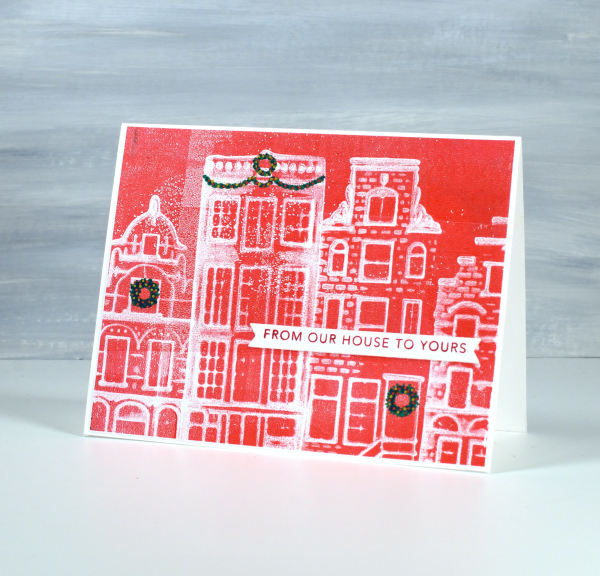
From my House to Yours
Posted: January 29, 2025 Filed under: gel press, online class, Taylored Expressions | Tags: gel press, gel printing, online class, Taylored Expressions 3 Comments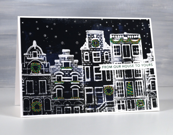
I know it is a month since Christmas but I’ve been waiting to share these last few designs with you. Because of the Canadian postal strike this black & white card arrived in Australia just last week!
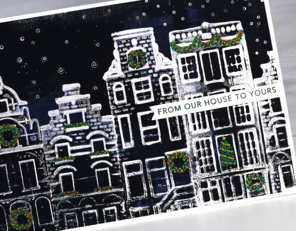
You might find these designs a bit familiar if you happen to own any of the china houses that KLM airlines once gave away on flights or if you have collected similar houses when travelling in the Netherlands. I got together with a friend to do some gel printing and we printed four of her little houses on the gel plate to create Dutch themed Christmas cards.
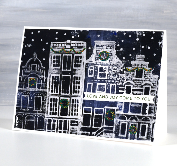
It took some trial and error to work out the best technique but it turned out that pressing the houses firmly into the paint covered gel plate worked well, as more texture appeared in the final print. If you are looking for an introductory gel printing class I have an online one called Gel Print Journey. Although it doesn’t include little Dutch houses it is full of ideas for what to print and how to get different effects. In honour of these cute cards I just created a discount code for Gel Print Journey which will give you 40% off until the end of February. Just use the code GELPRINT2025 at check out for the discounted price.
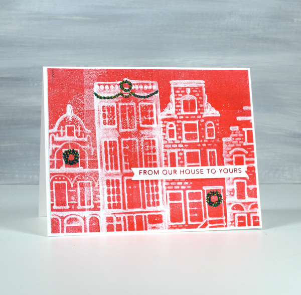
I drew the little wreaths and swags on afterwards with posca paint pens then added sentiments from Taylored Expressions Simple Strips Christmas stamp. I am always looking out for new things to print. Leave me a comment if you’ve had some great gel printing discoveries.
The bookshelf card
Posted: January 28, 2025 Filed under: Hand drawn, Watercolour | Tags: Fabriano Watercolour Paper, Hand drawn, Hand painted 2 Comments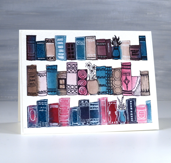
Last year I taught a workshop called ‘Watercolour & Whimsy’ where we experimented with colour mixing in art journals and on watercolour panels, some of which we turned into cards later. This panel began very simply as I mixed three or four paints to make a range of different colours. Because I stuck with a few paints I knew they would all look cohesive on the panel.
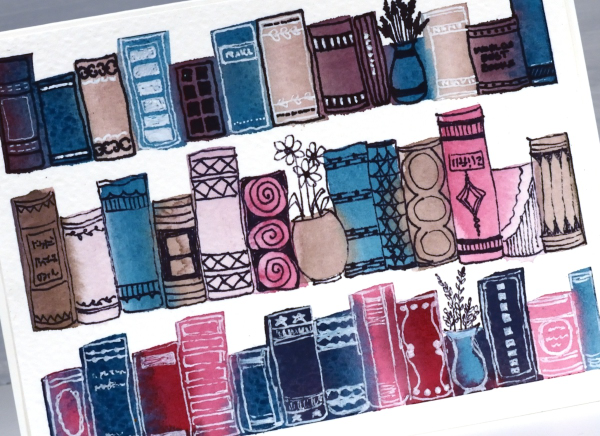
I used a half inch flat brush to paint rough rectangles in lines. I was inspired by schlemmer.art but where she turned her rectangles into houses, I turned mine into books!
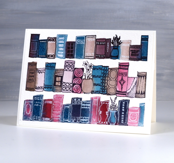
I used a black fine tip pen and a white gel pen to decorate the book spines and turned three paint strokes into vases instead of books. A simple idea to paint, a relaxing theme to doodle and something I will definitely try again.
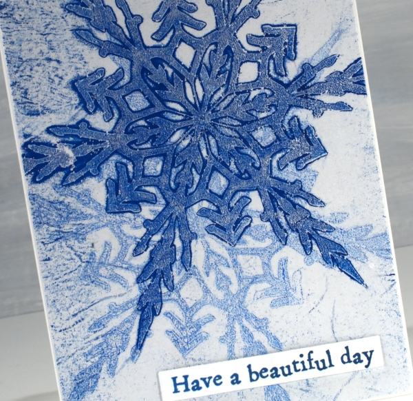
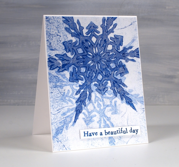
Rustic Snowflakes
Posted: January 20, 2025 Filed under: AALL & Create, Echidna Studios, gel press, snowflake digital stamp set | Tags: AALL & Create, Echidna Studios, gel press, gel printing 2 Comments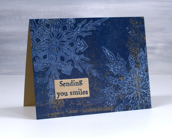
Another snowflake print for you because, of course I didn’t stop at one or two! There are six different snowflakes in the Echidna Studios ‘snowflake digital stamp set‘ so the gel printing possibilities are definitely endless. I created snowflake masks using the Cricut and Grafix matte duralar.
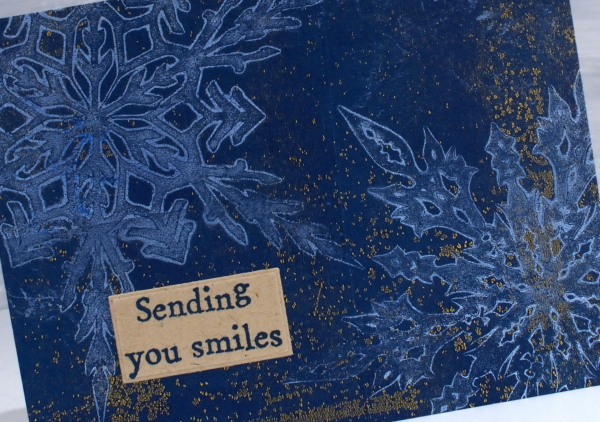
I hope to soon make a video showing my process but to put it briefly, I cover the gel plate in a layer of white paint, lay the masks on top and then remove paint using some tissue paper which lifts paint all around and within the patterned mask. I remove the masks, let the paint dry then pull the print on kraft paper with dark blue paint. The combination of white, blue and kraft is rustic and beautiful in my opinion. The quirky sentiment is another from the AALL & Create ‘everyday sentiments’ set.
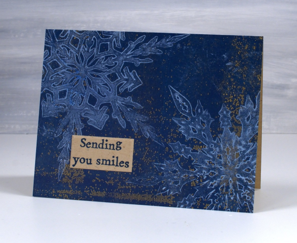
I have some Australian family visiting this week so I plan to be playing with real snow not gel printed snow! Have a great week.
Watercolour and Whimsy
Posted: January 17, 2025 Filed under: Hand drawn, Hand painted, Moda Scrap | Tags: Hand drawn, Hand painted, sennelier watercolours 6 Comments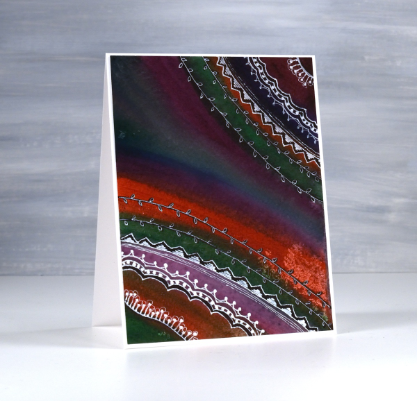
Last year I taught a class called watercolour and whimsy. The watercolour part focused on colour mixing and how to limit your palette and get cohesive results. The whimsy part included stenciling and doodling. The truth is we spent most of our time on the watercolour leaving little time for the whimsy.
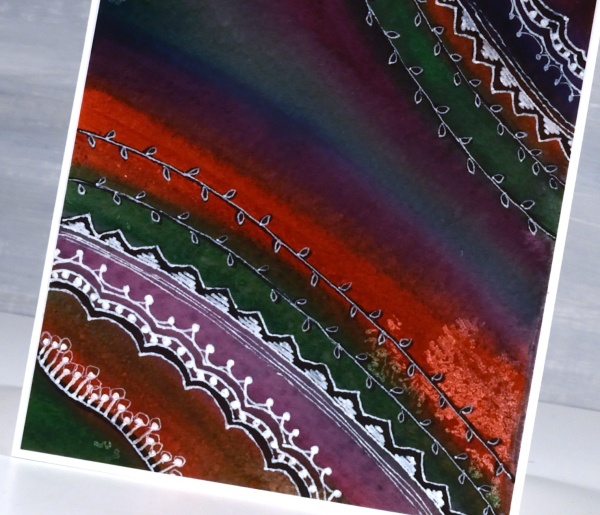
I have gone back to my panels to finish the doodling details. Most were done on cold press watercolour paper with a mix of pan paints and tube paints. For each panel I chose several colours that would not necessarily look great together straight out of the pan/tube but with some mixing ending up looking like they were born to be together. This first one is a favourite. I love the way a deep green, a purple, an orangey red and a blue ended up looking so good together.
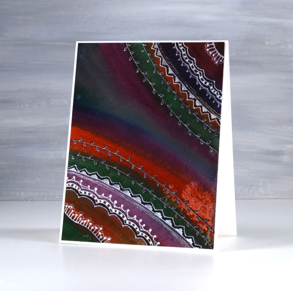
I did most of the doodling with a white gel pen with some black sharpie underneath here and there for more contrast. I have more cards to share made as part of the same class. The watercolour colour mixing part of the process is very relaxing and enjoyable. I haven’t added sentiments to either of these cards but I can add one before sending if I wish.

On the panel above and below, I painted again with a limited palette but touched each brush stroke to a previous stroke so that colours flowed into each other. The result was blends, watermarks and harder lines.
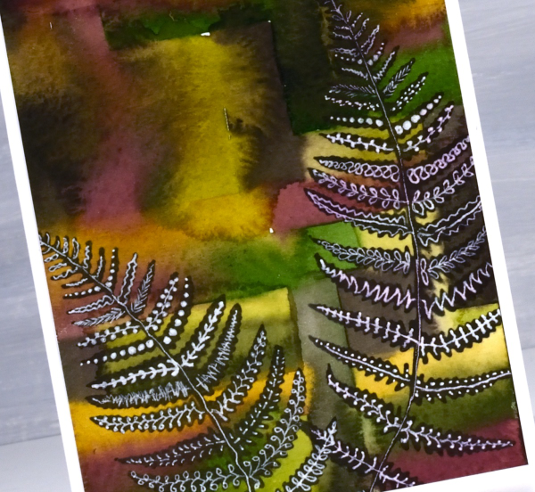
To add some whimsy I blended black ink through fern stencils. They are homemade stencils created die-cutting into grafix stencil film with dies from the Moda Scrap ‘fern die set‘.
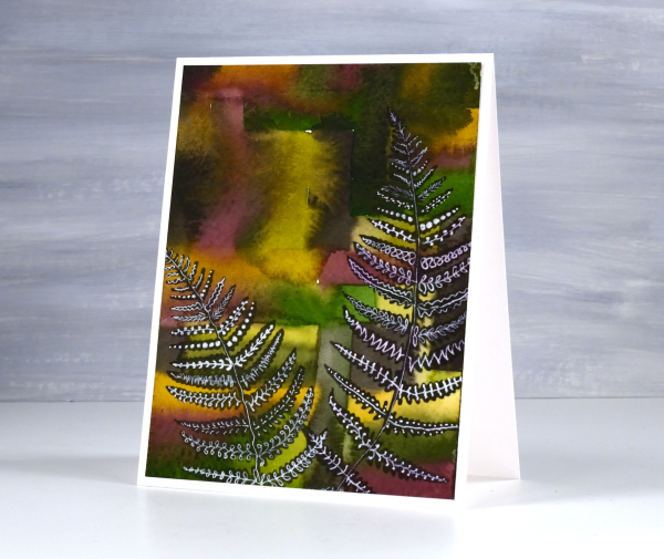
Once the black ink was dry I doodled different patterns on the fronds with white gel pens. This post includes affiliate links from Foiled Fox. If you buy through these links I receive a small commission at no extra cost to you.
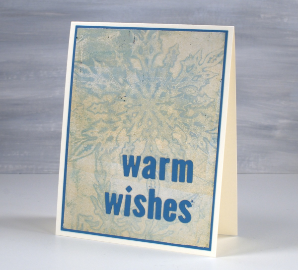
Snow on snow on snow
Posted: January 13, 2025 Filed under: cricut, Echidna Studios, gel press, grafix, My Favorite Things, snowflake digital stamp set | Tags: cricut, Echidna Studios, gel press, gel printing, grafix 6 Comments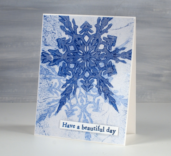
Today’s cards were gel printed using snowflake masks I cut on the cricut using the Snowflake Digital Stamp Set from Echidna Studios. I love how detailed these snowflakes are; there are six in the set and I have printed them, foiled them, cut them and now gel printed with them.
I remember when I first saw the six pointed detail of a snowflake that had landed on me. It is not always possible but occasionally the flakes are very distinct and separate instead of in clumps and I am always amazed by their beauty.
I cut my stencils from Grafix matte dura-lar as it is semi-transparent and light weight. On the panel above I made a pale print with blue and white then, after it had dried created a dark print on the plate which I pulled on the same paper but with a transparent medium (either transparent white paint or more likely matte medium). The little sentiment is from AALL & Create ‘everyday sentiments’ set.
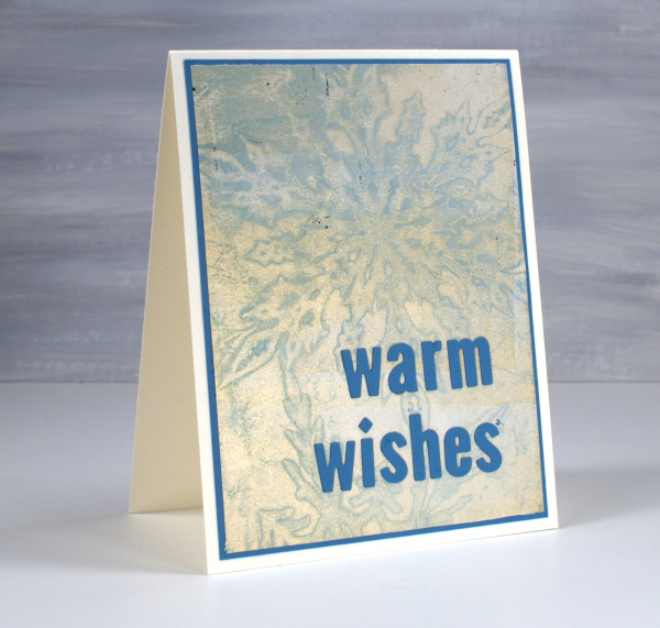
On this second card I used a pale blue paint which didn’t give me a very bold print but pulling it with gold paint created a soft shimmery effect.
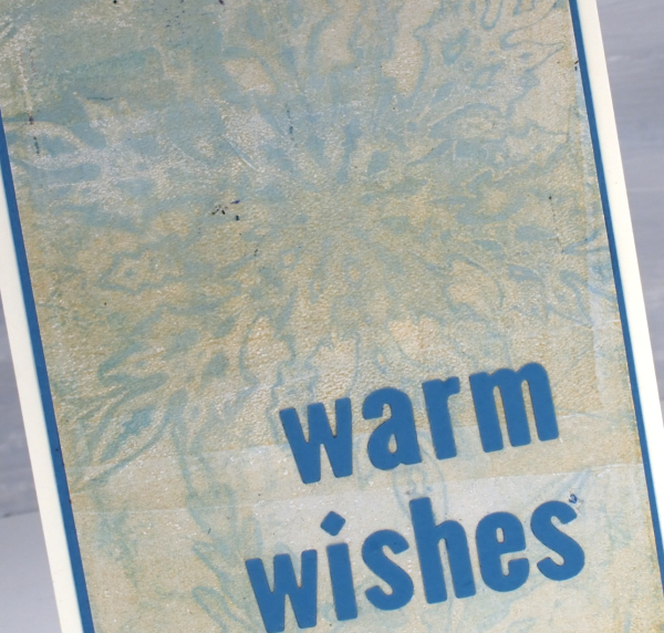
Always looking for the matchy-matchy, I found a scrap of cardstock in the same blue tone and cut a mat and sentiment using MFT little lowercase letter dies.
City Buildings gel print
Posted: January 10, 2025 Filed under: city buildings, gel press, The Crafters Workshop | Tags: gel press, gel printing, Penny Black stamps, The Crafter's Workshop 3 Comments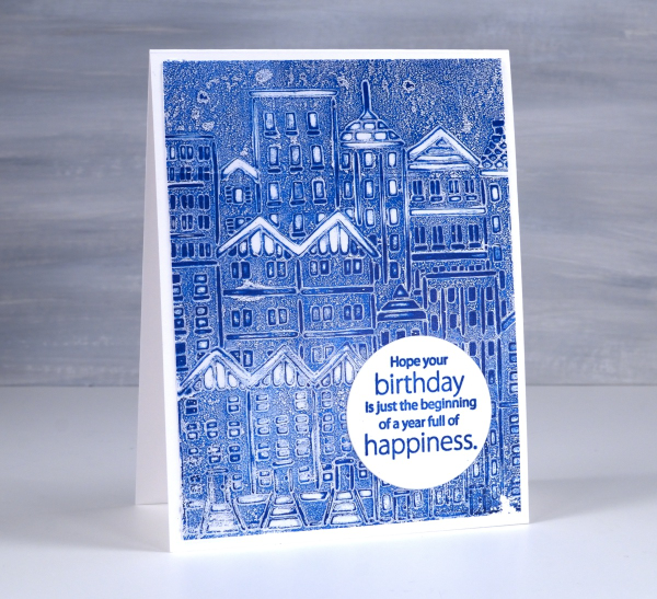
Quite a simple gel printed card but the freshness of blue and white seems to lend a brightness to it. I used the TCW ‘city buildings’ stencil on a gel plate with blue paint.
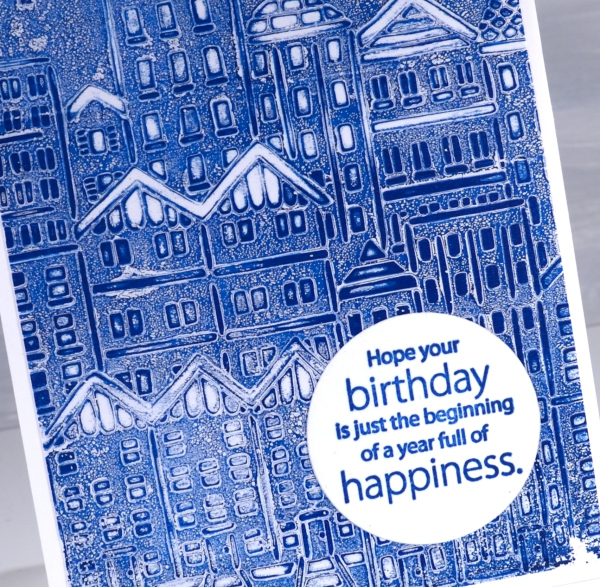
My most used technique with stencils on the gel plate is to lay the stencil on the paint covered plate, remove paint from the spaces in the stencil with tissue paper then pull the print with another layer of paint.
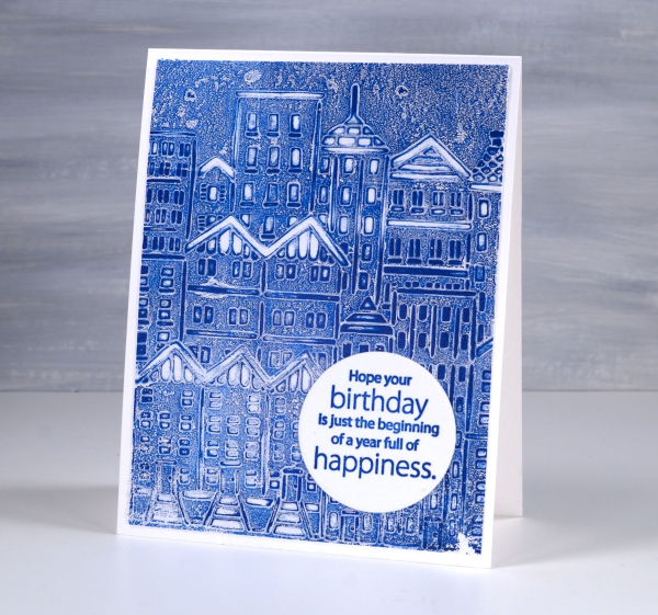
When I looked through my tray of sentiments I found this one already stamped in blue on a circle. The colour is a perfect match so I was pretty happy. The circle is a nice contrast to all those angles and lines. The sentiment comes from the Penny Black ‘better with age‘ sentiment set. This post includes affiliate links from Foiled Fox. If you buy through these links I receive a small commission at no extra cost to you.
The Calendar Card
Posted: January 9, 2025 Filed under: Collage cards, simply perfect mix & match sentiments, Spellbinders | Tags: collage, Spellbinders 8 Comments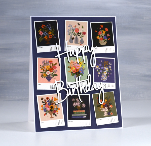
I’ve always liked the thumbnail page on a calendar. There’s something about seeing all the pictures in miniature which I find very cute. So when I bought a desktop calendar for a friend’s birthday I decided to remove the thumbnail page and create the card from the tiny month images.
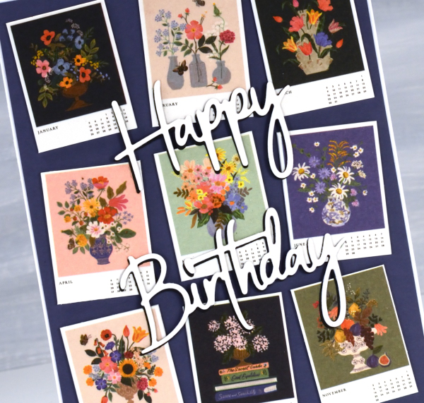
The calendar is made by the Rifle Paper company and the paintings are quite delightful.
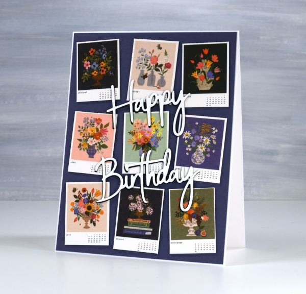
I stacked a white die-cut sentiment on a black one to help it stand out against the busy background. The dies are Spellbinders ‘simply perfect mix & match’ sentiment dies.
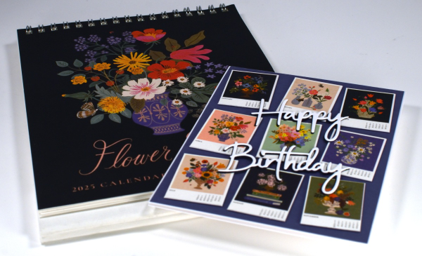
This gift has the added feature that if the recipient wishes, she can give me back the calendar pages as the months pass and I will turn them into cards for her to use. I enjoyed coming up with this card and idea and will be going through my calendar collection in the future to find both thumbnails and full pages I can turn into cards. In some ways I have come full circle; I made cards from calendars when I first started card making as a child.
Winter Wedding cards
Posted: January 6, 2025 Filed under: cricut, Gilding Flakes, Penny Black, Skyward | Tags: cricut, Gilding, Penny Black stamps 6 Comments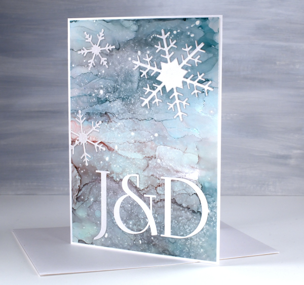
We attended a New Year’s Eve wedding last week and a couple of days before I realised I had no wedding cards on hand. I went to the ‘pile of possibility’ which is a shoebox full of panels yet to be made into cards. There are watercolour, alcohol ink, collage and stamped panels in the box.
The galaxy style alcohol ink panel above caught my eye along with what I think is a stamped and gilded panel which you’ll see below. Both seemed fancy enough for wedding cards…but how to use them?
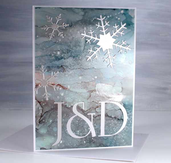
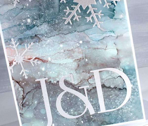
The gilded panel below was very pretty alone so I didn’t want to add much to it. The alcohol ink panel was also pretty but worked well with die-cut silver snowflakes.
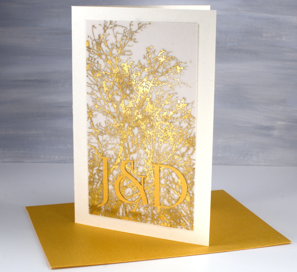
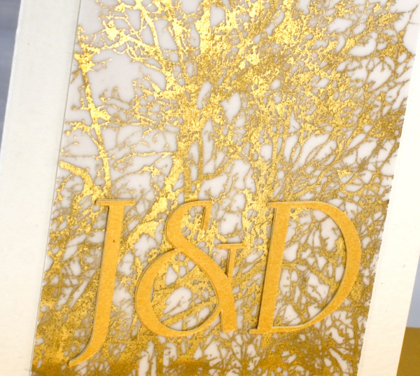
The panel on the card above features the Penny Black stamp ‘skyward‘ stamped on vellum with sticky glue ink and gilded either with foil or gilding flakes( sorry I can’t remember which.) It looked quite magical so I might just have to try and gild a stamped image again to see what happens. I hunted for a font that was similar to the one featured on the wedding stationery then cut initials using the cricut. The font I chose (which is not an exact match) is Linotype Rowena Pro Medium. I had a gold envelope which matched and a pearly silver one for the other card.
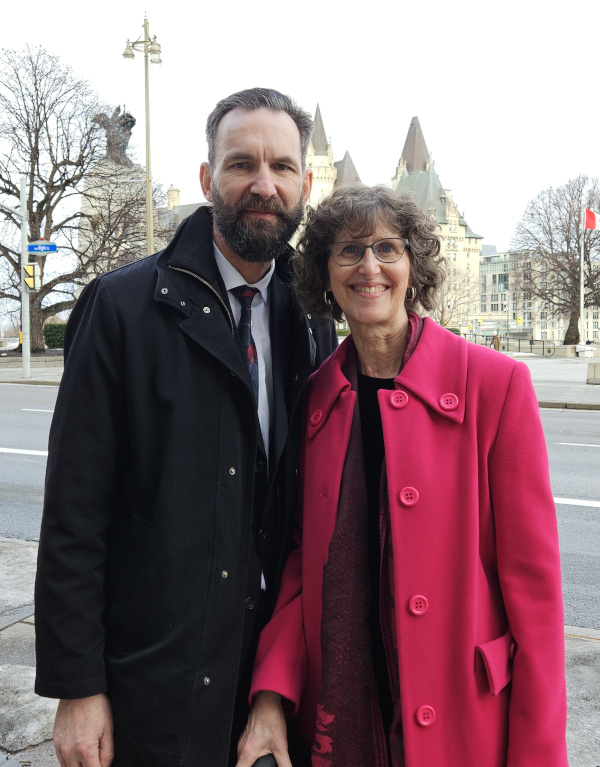
The wedding was lovely, ceremony at the church in the morning, party to ring in the new year at night!
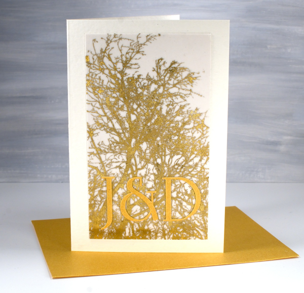
Although it would have been good to have wedding cards on hand already I enjoyed customising these two for the bride and groom. And speaking of weddings, it is my wedding anniversary today. My husband and I were married on a summer’s day 35 years ago in Canberra. We looked a bit older and colder at last week’s wedding!
This post includes affiliate links from Foiled Fox. If you buy through these links I receive a small commission at no extra cost to you.


